Dr. Dénes Csala
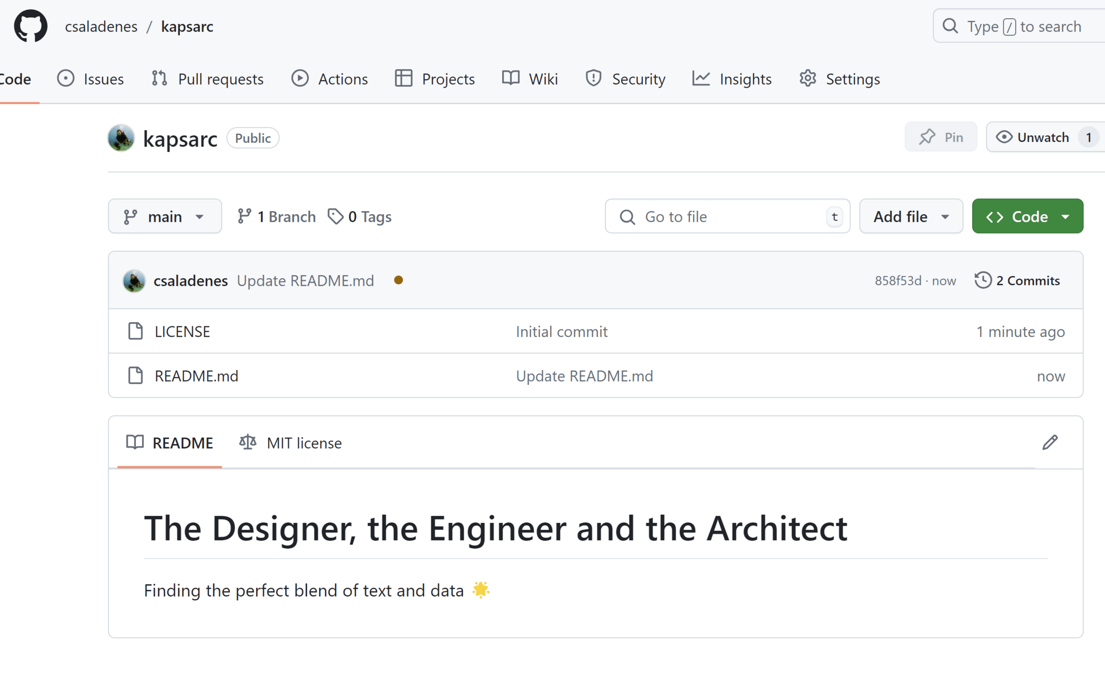
The Designer, the Engineer and the Architect:
Finding the perfect blend of text and data 🌟
31st July 2024

A KAPSARC candidacy submission

Contents
For this task, I have prepared this small website that presents my data storytelling philosophy. Throughout I have reimagined the presentation of some of the datasets found on KAPSARC data portal.
Contents
The submission has 3 parts,
centered around the pillars of
making our visual communication
beautiful, scalable and impactful
1. in Mission, I present my aim, supported by the visualization science
2. in Visualize I present 3 distinct approaches to the redesign task
3. in Automate I explain the code used and show how to make the solution scalable
4. in Reach and Teach I explain how do I use the visualization to create broader impact
Mission
aid decision making by being a leading example for communicating (difficult) energy economics concepts
through data, in a way that is
beautiful, scalable and impactful
Challenge
100+ models spread across domains
1339+ datasets, 1M+ data points
data → lesson in 10 minutes
followed by decision makers
1-2 person core team
beautiful / easy to read | scalable /replicable | impactful
attention poverty
"What information consumes is rather obvious: it consumes the attention of its recipients. Hence, a wealth of information creates a poverty of attention, and a need to allocate that attention efficiently among the overabundance of information sources that might consume it."
Herbert Simon (as quoted by Hal Varian)
Scientific American, 1995
based on the UW CSE442 course and PARC UIR
Portrait of Herbert Simon - Richard Rappaport CC BY 3.0

Mitchell Kapor, freely quoted
information overload
visualisation = understanding
"The ability to take data - to be able to understand it, to process it, to extract value from it, to visualize it, to communicate it - that's going to be a hugely important skill in the next decades, ...because now we really do have essentially free and ubiquitous data."
Hal Varian, Chief Economist, Google
The McKinsey Quarterly, 2009
based on UW CSE442
Hal Varian - Joi Ito CC BY 2.0

Viusalize
information overload
visualization → a language for data
use the entire visualization zoo → but
⭐ bar chart is best chart ⭐
beautiful / easy to read | scalable /replicable | impactful
needs a Designer
use the visual language correctly 🧑💻
every dataset is unique 📊
curate / distill what's important💻
chart suitability / design 🍰
data author ignorance 😅
beautiful / easy to read | scalable /replicable | impactful
dashboard with Grafana
interactive with D3.js
similar to current Flourish
Automate
embed needs → CMS → Wordpress
rapid prototyping → Vega-Lite
custom charts in D3 → iframe
pipeline in python / Jupyter
beautiful / easy to read | scalable /replicable | impactful
needs a Engineer
conform to existing systems 🧑💻
every dataset is unique 📊
no way around manual charts 💻
but we automate what we can 🤖
designer stubbornnes 😅
beautiful / easy to read | scalable /replicable | impactful
everything is available on GitHub
using only open source tools:
Grafana/InfluxDB, D3.js, Vizzu, python/Jupyter
Docker containerized: scalable
Reach & Teach
KAPSARC Data Portal
courses in Editing and Dataviz
Data catalog
KAPSARC API
Explore → Create → Share
beautiful / easy to read | scalable /replicable | impactful
needs an Architect
audience from ministers to students 🎩
spoken / printed word too 📚
latest, but traceable data 🏗️
a hub - not a silo 🪢
data + story 🚀
beautiful / easy to read | scalable /replicable | impactful
this presentation is available on GitHub
using only open source tools:
natural, 2D navigation using reveal.js
interactive embeds: impactful
Dr. Dénes Csala
The Designer, the Engineer and the Architect:
Finding the perfect blend of text and data 🌟
31st July 2024

A KAPSARC candidacy submission

