Dr. Csala Dénes
Finding the perfect blend of text and data 🌟 experiences
from the

SGPE, Crieff
11th January 2024

Assistant Professor
University of Bristol
Lancaster University
Data Visualization Expert
Economics Observatory


Questions
▼
Lead Editors
▼
Experts
▼
Core editors
▼
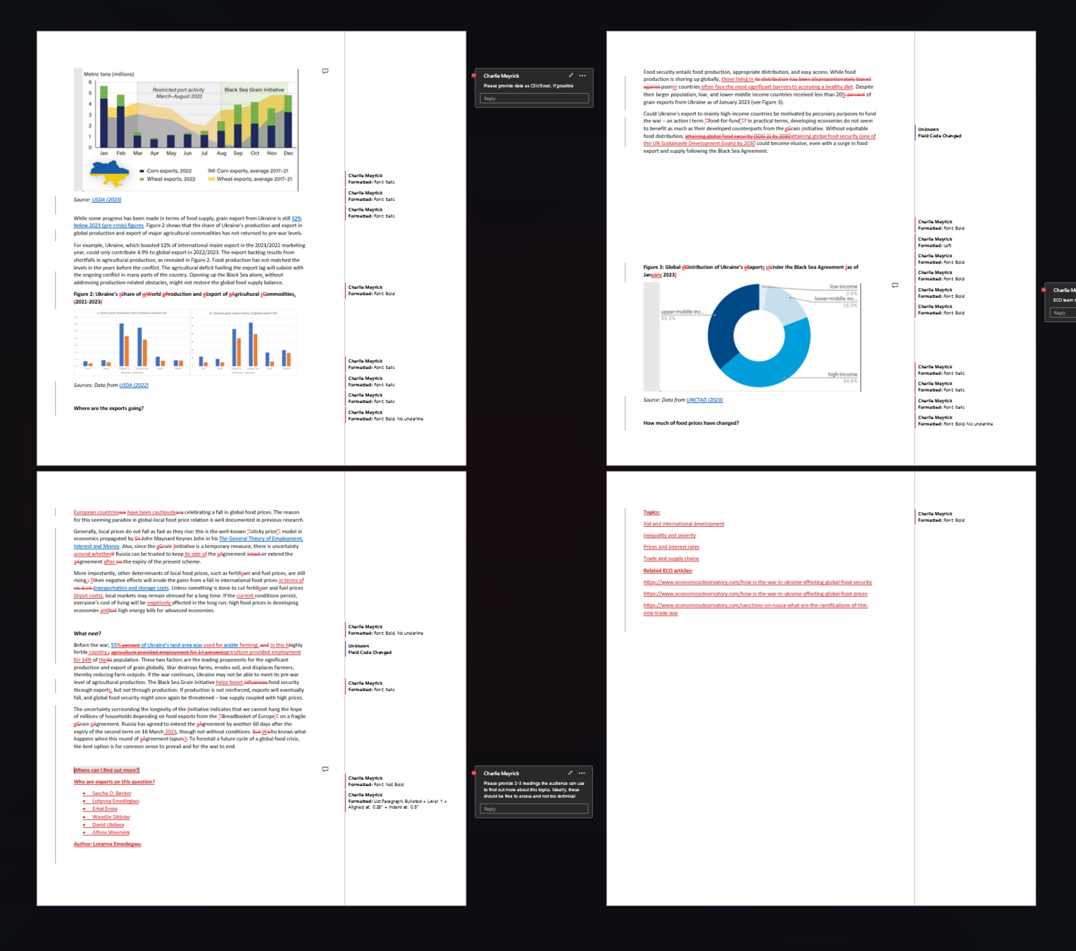
Author draft
▼
Text, Charts
▼
Article
Science communication
Writing classes
Dataviz classes
Joint workshops
ONS
HM Treasury
Cabinet Office
DE, DHSC, ...
Beyond the Observatory
ECO at COP26
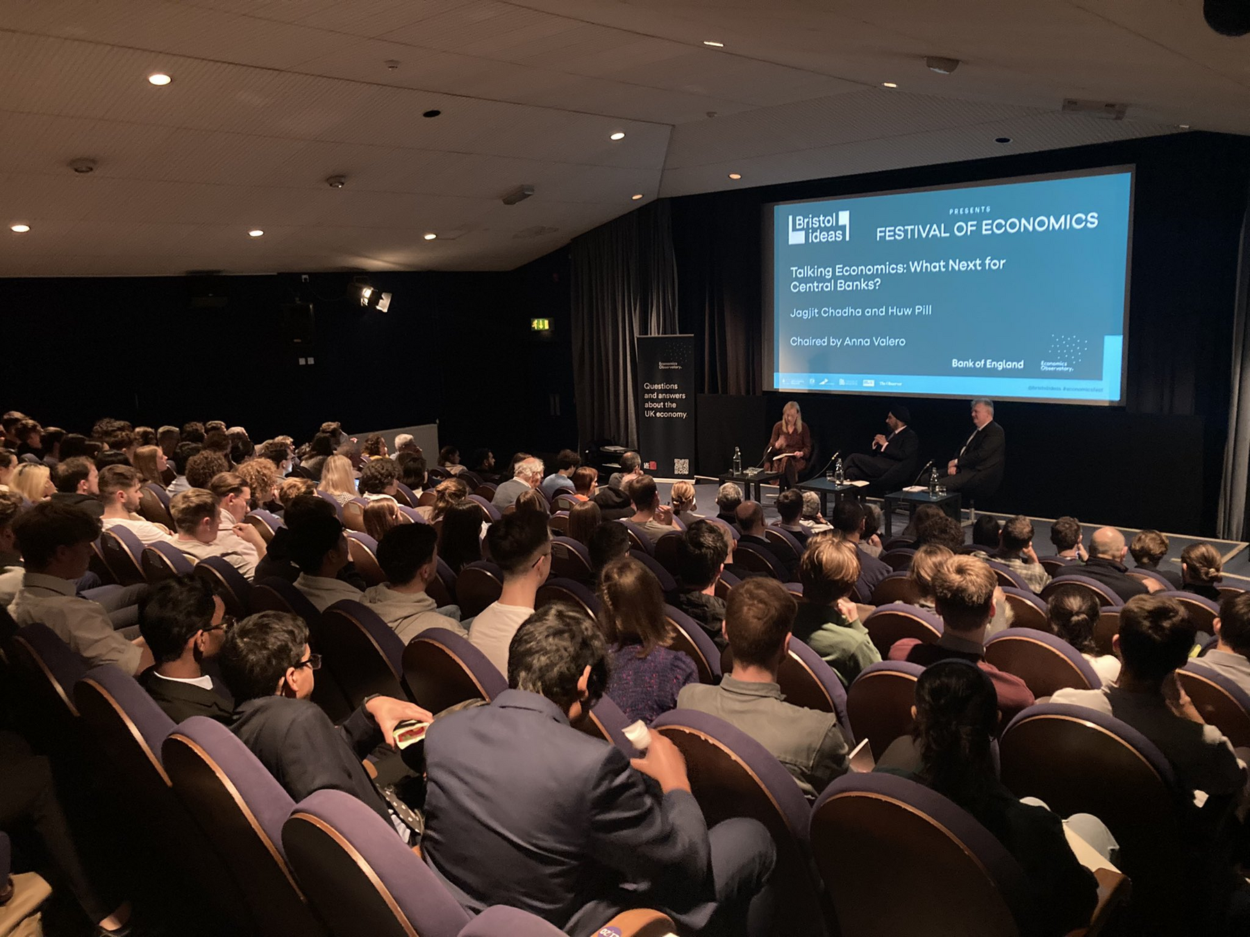
Talking Economics
ECO magazine
Data Hub
Science communication
Writing classes
Dataviz classes
Joint workshops
ONS
HM Treasury
Cabinet Office
DE, DHSC, ...
Beyond the Observatory
ECO at COP26
Talking Economics
ECO magazine
Data Hub
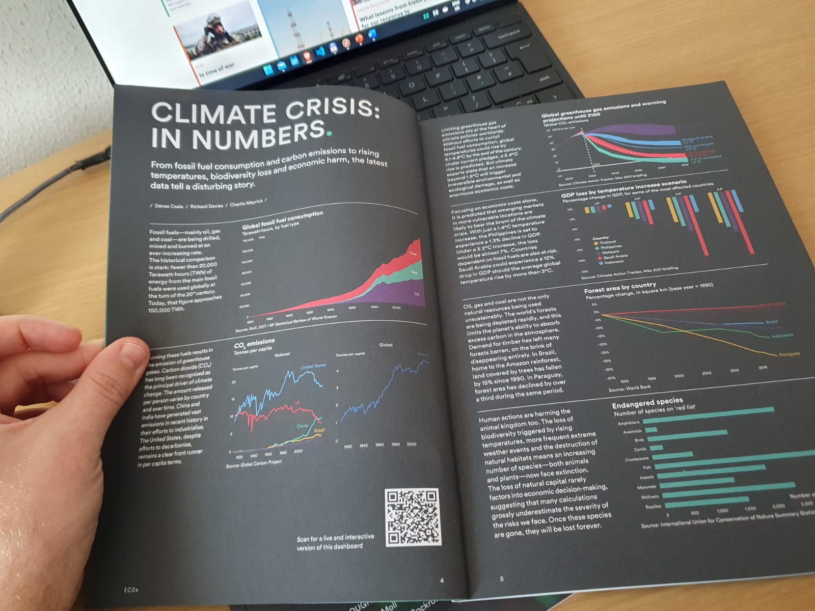
Mission
leading example for communicating (difficult) economics concepts
through data, in a way that is
beautiful, scalable and impactful
Challenge
1 article per day
100+ experts across the globe
1 million readers per year
followed by decision makers
6 person core team
beautiful / easy to read | scalable /replicable | impactful
beautiful / easy to read | scalable | replicable
beautiful / easy to read | scalable | replicable
beautiful / easy to read | scalable | replicable
needs an Editor
source verification / message 💬
no way around manual editing 📝
data availability / tracing 📊
author stubbornness 😅
beautiful / easy to read | scalable | replicable
Challenge
1 article per day
100+ experts across the globe
1 million readers per year
followed by decision makers
6 person core team
beautiful / easy to read | scalable /replicable | impactful
Viusalize
information overload
visualization → a language for data
use the entire visualization zoo → but
⭐ bar chart is best chart ⭐
beautiful / easy to read | scalable /replicable | impactful
1 ZB
ZETA-EXA-PETA
TERRA-GIGA-MEGA
Northeastern, 2016

attention
at tension

attention
at tension

Is it snowing
in Budapest?
quarter of a second
Sabine Kastner et al., Princeton, 2018
250 millisec


attention poverty
"What information consumes is rather obvious: it consumes the attention of its recipients. Hence, a wealth of information creates a poverty of attention, and a need to allocate that attention efficiently among the overabundance of information sources that might consume it."
Herbert Simon (as quoted by Hal Varian)
Scientific American, 1995
based on the UW CSE442 course and PARC UIR
Portrait of Herbert Simon - Richard Rappaport CC BY 3.0

Mitchell Kapor, freely quoted
information overload
visualisation = understanding
"The ability to take data - to be able to understand it, to process it, to extract value from it, to visualize it, to communicate it - that's going to be a hugely important skill in the next decades, ...because now we really do have essentially free and ubiquitous data."
Hal Varian, Chief Economist, Google
The McKinsey Quarterly, 2009
based on UW CSE442
Hal Varian - Joi Ito CC BY 2.0

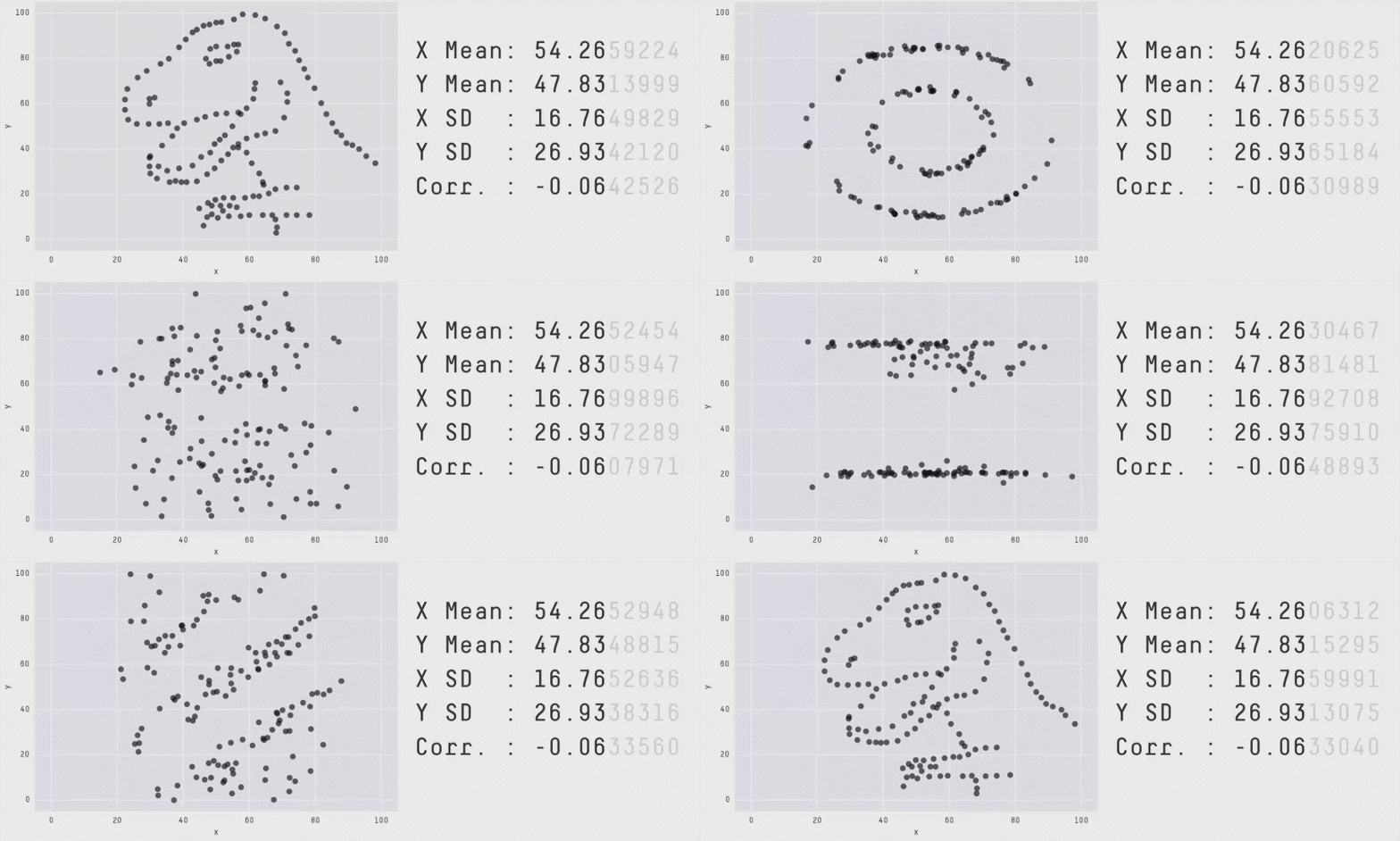
big data =
big responsibility
Datasaurus, Alberto Cairo, Autodesk, 2016
Bernardo:
Well, good night.
If you do meet Horatio and Marcellus,
The rivals of my watch, bid them make haste.
picture superiority effect

Allan Paivio, 1971
based on David McCandless, Information is Beautiful, 2012
sight
touch
hear smell
taste



encode
decode
data visualisation = signal system
message
based on Jacques Bertin, Sémiologie Graphique, 1967
which rectangle is lighter?
212, 212, 212
+2 %
207, 207, 207
which circle is larger
how many
times?
6
how many times?
sensation=\newline intensity^x
sensation-intensity curve
Stanley Smith Stevens, 1957

electric shock
weight
taste
length
area
smell
volume
intensity ➡
sensation ➡
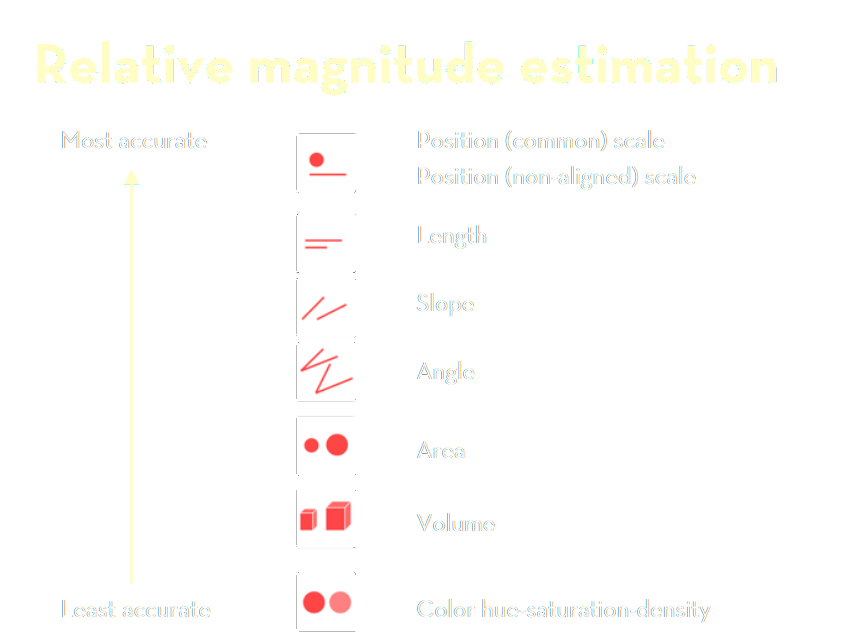
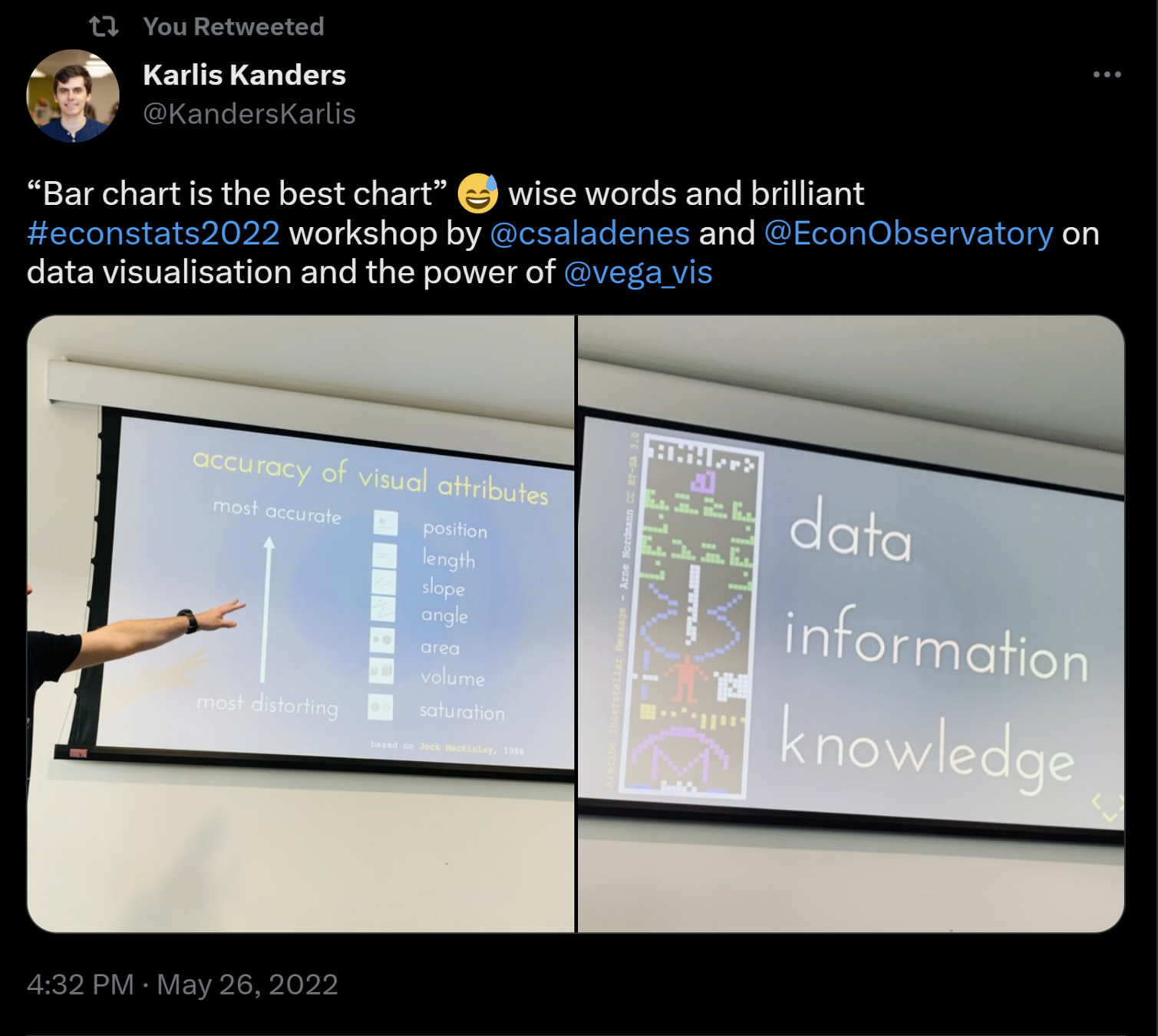
accuracy of visual attributes
most accurate
most distorting
based on Jock MacKinlay, 1986
position
length
slope
angle
area
volume
saturation
half(mis)information

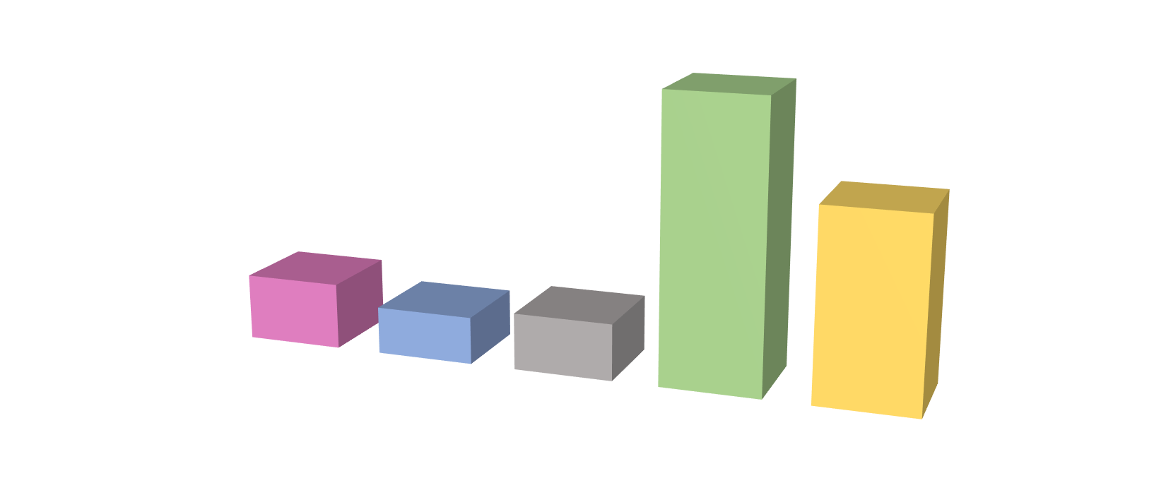
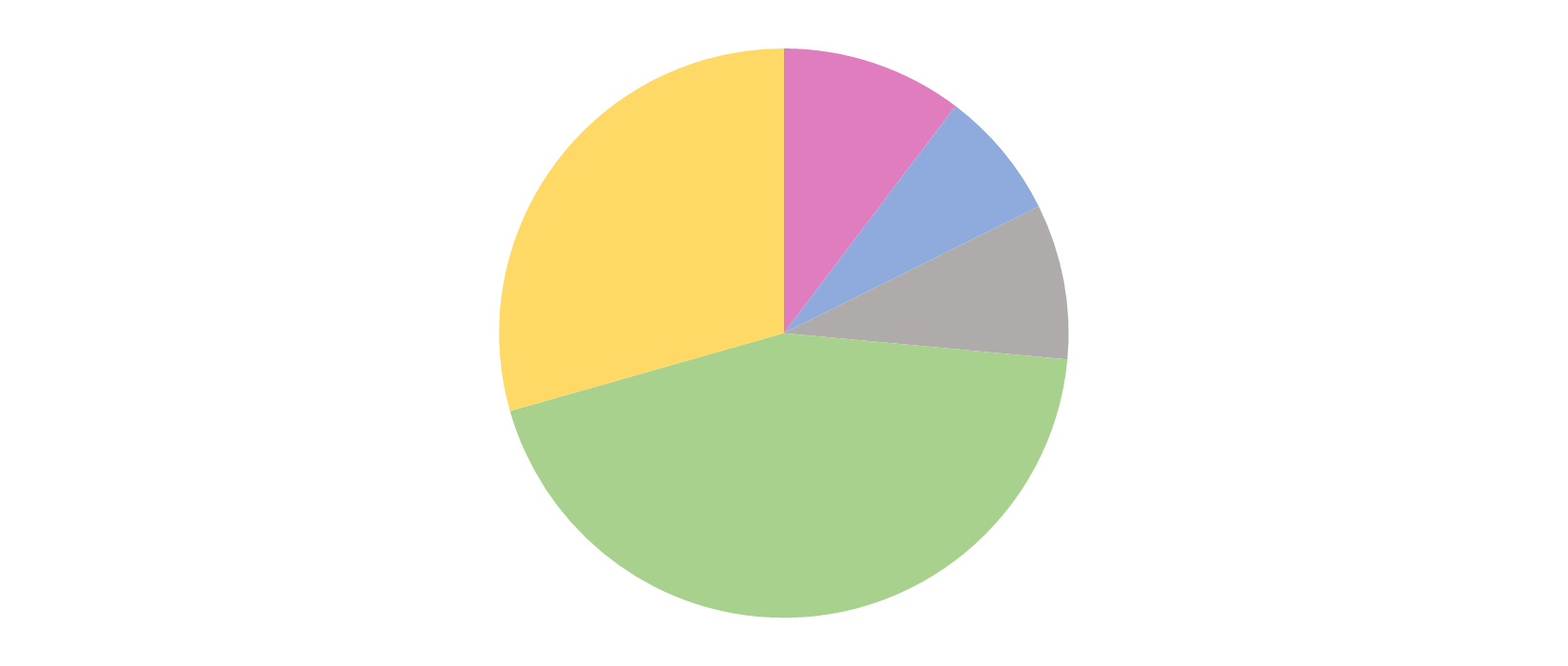
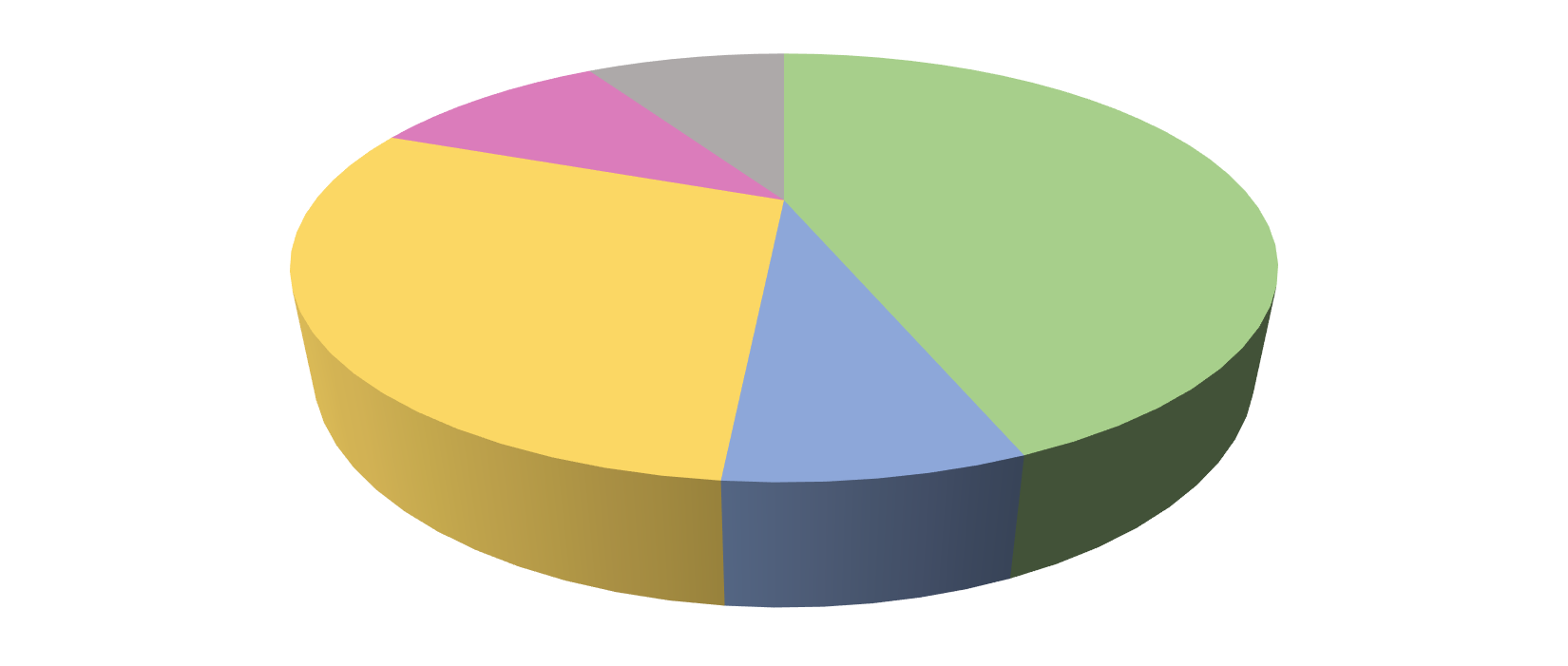
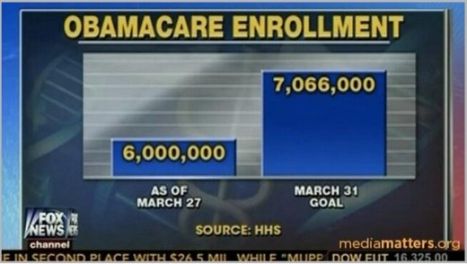
half(mis)information
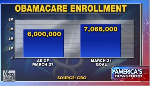
half(mis)information
half(mis)information


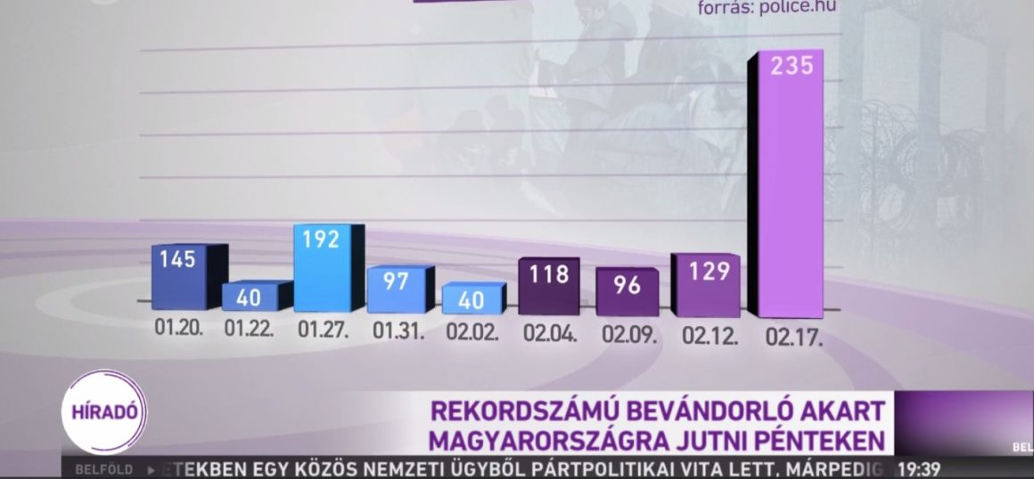
half(mis)information
A record number of refugees attempted to to enter the country on Friday
half(mis)information
needs a Designer
use the visual language correctly 🧑💻
every dataset is unique 📊
curate / distill what's important💻
chart suitability / design 🍰
author ignorance 😅
beautiful / easy to read | scalable /replicable | impactful
Challenge
1 article per day
100+ experts across the globe
1 million readers per year
followed by decision makers
6 person core team
beautiful / easy to read | scalable /replicable | impactful
Automate
writing needs → CMS → Wordpress
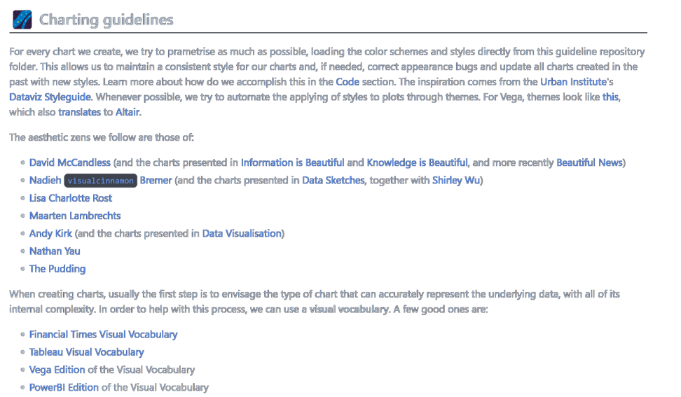
usually Vega-Lite (actually Altair)
custom charts in D3 → iframe
pipeline in python / Jupyter
beautiful / easy to read | scalable /replicable | impactful
beautiful / easy to read | scalable /replicable | impactful
beautiful / easy to read | scalable /replicable | impactful
needs a Engineer
conform to existing systems 🧑💻
every dataset is unique 📊
no way around manual charts 💻
but we automate what we can 🤖
designer stubbornnes 😅
beautiful / easy to read | scalable /replicable | impactful
leading example for communicating (difficult) economics concepts
through data, in a way that is
beautiful, scalable and impactful
Reach & Teach
ECO magazine
courses in Editing and Dataviz
Chart repository
ECO API
Explore → Create → Share
beautiful / easy to read | scalable /replicable | impactful
beautiful / easy to read | scalable /replicable | impactful
beautiful / easy to read | scalable /replicable | impactful
beautiful / easy to read | scalable /replicable | impactful

data: where we are now
beautiful / easy to read | scalable /replicable | impactful
data: where we are going

beautiful / easy to read | scalable /replicable | impactful
a Hub - not a Silo
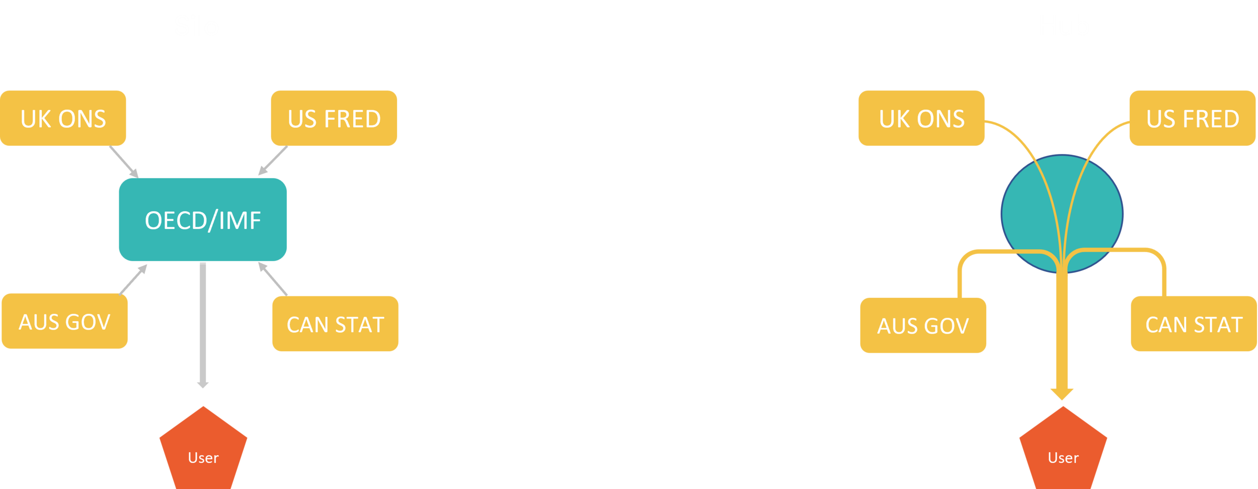
Original source
Up-to-date
Automatic
Free of CORS errors
Simple URL structure
Free of keys
beautiful / easy to read | scalable /replicable | impactful
needs an Architect
audience from mayors to students 🎩
spoken / printed word too 📚
latest, but traceable data 🏗️
a hub - not a silo 🪢
data + story 🚀
beautiful / easy to read | scalable /replicable | impactful
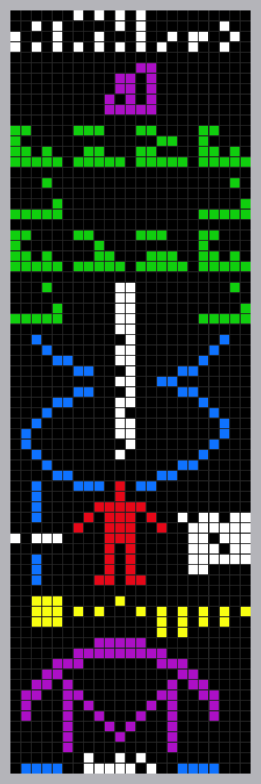
Arecibo Interstellar Message - Arne Nordmann CC BY-SA 3.0
data
information
knowledge
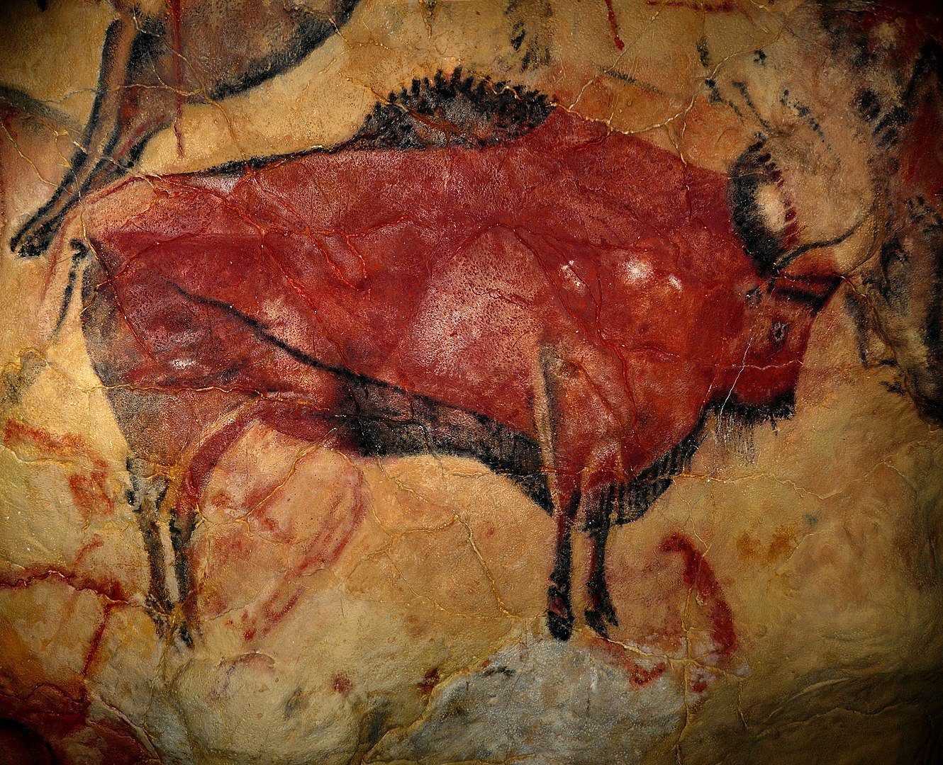

Altamira cave painting, i.e. 36 000
Ted Chiang, Eric Heisserer, Martine Bertrand, Stephen & Christopher Wolfram "Louise", in the alien language designed for movie Arrival, 2016 CC A-NC 4.0
Finding the perfect blend of text and data 🌟 experiences
from the

Dr. Csala Dénes

SGPE, Crieff
11th January 2024

Assistant Professor
University of Bristol
Lancaster University
Data Visualization Expert
Economics Observatory


