#100Devs - CSS Review + Homework (cohort2)
This is a live streamed presentation. You will automatically follow the presenter and see the slide they're currently on.
This is a live streamed presentation. You will automatically follow the presenter and see the slide they're currently on.
Who's going to carry the boats and the logs?
Make It Better
Next Day
Day 3
Day 6
Hi Leon,
It was a pleasure meeting you last night! The event was so well done and it was exciting meeting such an amazing group of people - I hope you are enjoying a well deserved break after pulling it all together!
Also, I don't know if you saw this yet, but someone just bought a $375k first edition pokemon booster box and it wound up being fake! The Gaurdian covered it and I remember you mentioned being a big fan. Hope you have a great rest of the week!
Cheers,
Bob
Email Follow Up 1 > Email Follow Up 2 > Last Email
1 Week
2 Weeks
1 Month
Hi Leon,
It was a pleasure meeting you last night! The event was so well done and it was exciting meeting such an amazing group of people - I hope you are enjoying a well deserved break after pulling it all together!
As I mentioned last night, I'm just starting my engineering career and would love to learn from successful people such as yourself. Please let me know if there might be a time you are free to grab a virtual coffee over the next week or two. Before 9am or after 5pm tends to work best for me, but happy to accommodate what works for you. Thanks!
Also, I don't know if you saw this yet, but someone just bought a $375k first edition pokemon booster box and it wound up being fake! The Gaurdian covered it and I remember you mentioned being a big fan. Have a great rest of the week!
Cheers,
Bob
Due by Mar. 29th
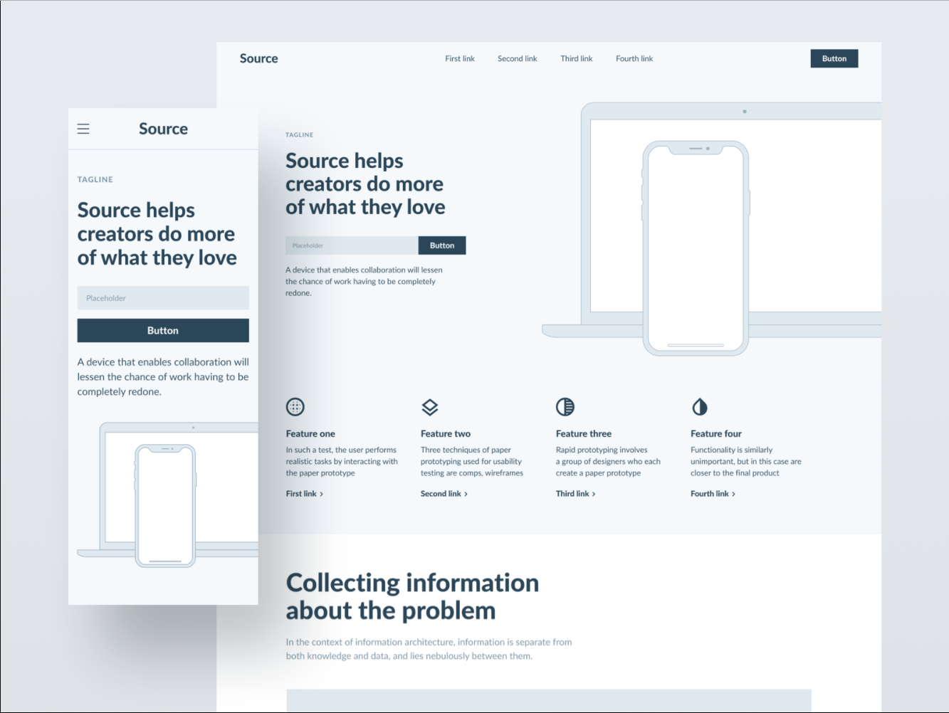
Mobile Responsive Too
Mobile Responsive Too
Mobile Responsive Too
💪🏽 Make it mobile responsive too
*STRONG DISCLAIMER*
According to the United States Department of Commerce, about 22 million Americans--roughly 35% of the nation's rural residents--lack access to broadband.
(2017)
p{
  color: red;
  font-weight: bold;
}p{
color: red;
font-weight: bold;
}
p{
color: blue;
}
What comes below, can override what came above
section > p {
  color: red;
}<section>
<p>Hello, Twitch!</p>
</section>section p {
color: red;
}<section>
<article>
<p>Hello, Twitch!</p>
</article>
</section>p + p {
color: red;
}
<section>
  <p>Hello, Twitch!</p>
  <p>Hello, Youtube!</p>
</section>#zebra {
color: red;
}Only one id with the same value per document
<section>
  <p>Hello, Twitch!</p>
  <p id="zebra">Hello, Youtube!</p>
</section>.bob {
color: red;
}Multiple with same value allowed per document
<section>
  <p class="robot">Hello, Twitch!</p>
  <p id="zebra" class="bob">Hello, Youtube!</p>
  <p class="bob">Goodbye, Mixer!</p>
</section>#pizza p span.gone {
color: red;
}<section id="pizza">
<p class="jumanjiOriginalMovie">Hello, Twitch!</p>
<p id="car" class="hello">Hello, Youtube!</p>
<p>Goodbye, <span class="gone">Mixer!</span></p>
</section>#dietCoke p.robot.unicorn + .bob {
color: red;
}<section id="dietCoke">
<p class="robot unicorn">Hello, Twitch!</p>
<p id="zebra" class="bob dominosPizza">Hello, Youtube!</p>
<p class="bob">Goodbye, Mixer!</p>
</section>#dietCoke > .robot + .dominosPizza + .bob {
color: red !important;
}<section id="dietCoke">
<p class="robot unicorn">Hello, Twitch!</p>
<p id="zebra" class="bob dominosPizza">Hello, Youtube!</p>
<p class="bob">Goodbye, Mixer!</p>
</section>not that kind...
By css-tricks
Mobile Responsive Too
Mobile Responsive Too
Mobile Responsive Too
💪🏽 Make it mobile responsive too
vs.
Everything as a percentage
EMs & REM
html{
  font-size: 62.5%;
}
section{
  font-size: 20px;
}

p{
  font-size: 1em
}

vs.

p{
  font-size: 1rem;
}
<section>
<p>Spam dominos in chat</p>
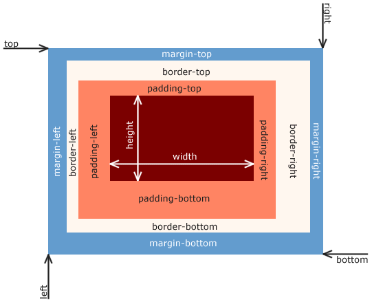
</section>Font size of the parent, in the case of typographical properties like font-size, and font size of the element itself, in the case of other properties like width.
- mdn
@media screen and (max-width: 600px) {
    h1 {
        color: blue;
    }
}