I går
Astro
Hvor er vi?
- Hvad er en component i Astro?
- Hvad er props?
- Hvad er et <slot />?
- Hvad er scoped styles?
- Hvordan starter man en dev-server (live server)?
- Hvordan stopper man dev-serveren?
- Er Astro smart (eller har det i det mindste potentiale)?
Opbygning
Astro-components
├── src/
    └── components/
    	└── Header.astro
    	└── CardSection.astro
    	└── Card.astro
    	└── Button.astro
    	└── Footer.astro
Opbygning
Astro-components
<!-- Card.astro -->
<li>
  <h3>Animation</h3>
  <p>
    Learn the latest animation techniques to create stunning motion
    design and captivate your audience.
  </p>
  <a href="/animation" class="btn" data-variant="ghost">Get started</a>
</li>
Opbygning
Astro-components
---
import Card from "../components/Card.astro";
---

<Card />
<Card />
<Card />
<Card />
<Card />
<Card />
Components
Props
---
const { title, description } = Astro.props;
---

<article>
  <h2>{title}</h2>
  <p>{description}</p>
</article>
Saml props op
---
import Card from "../components/Card.astro";
---

<Card title="Jeg er en overskrift"
      description="Jeg er en beskrivelse"
/>
Send props til Card-component
Components
Props
---
import Card from "../components/Card.astro";
---

<Card title="Jeg er en overskrift"
      description="Jeg er en beskrivelse"
/>

<Card title="Jeg er anderledes"
      description="Også mig..."
/>
Components
Scoped styles
---
const { title, description } = Astro.props;
---

<article>
  <h2>{title}</h2>
  <p>{description}</p>
</article>

<style>
  h2 {
    color: red;
  }
</style>
---
const { variant } = Astro.props;
---
<button class={variant}>
<slot />
</button>
<style>
.secondary {
background: red;
}
</style>dynamisk
<button>
  <slot />
</button>
<Button variant="secondary">Knap</Button><button>
<slot />
</button>Knap<Button variant="secondary">Knap</Button><button>
<slot />
</button>Knap
øvelse
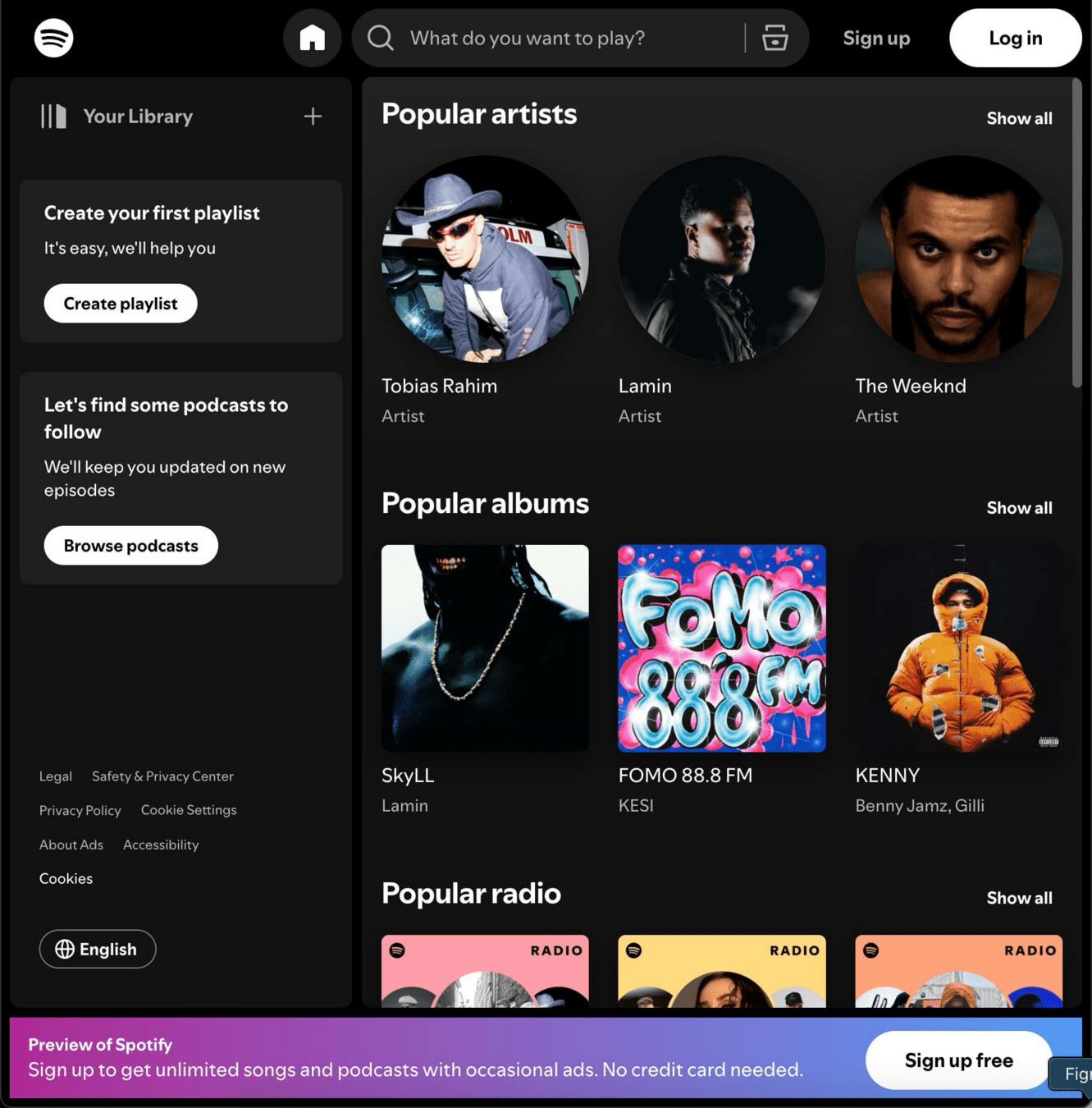
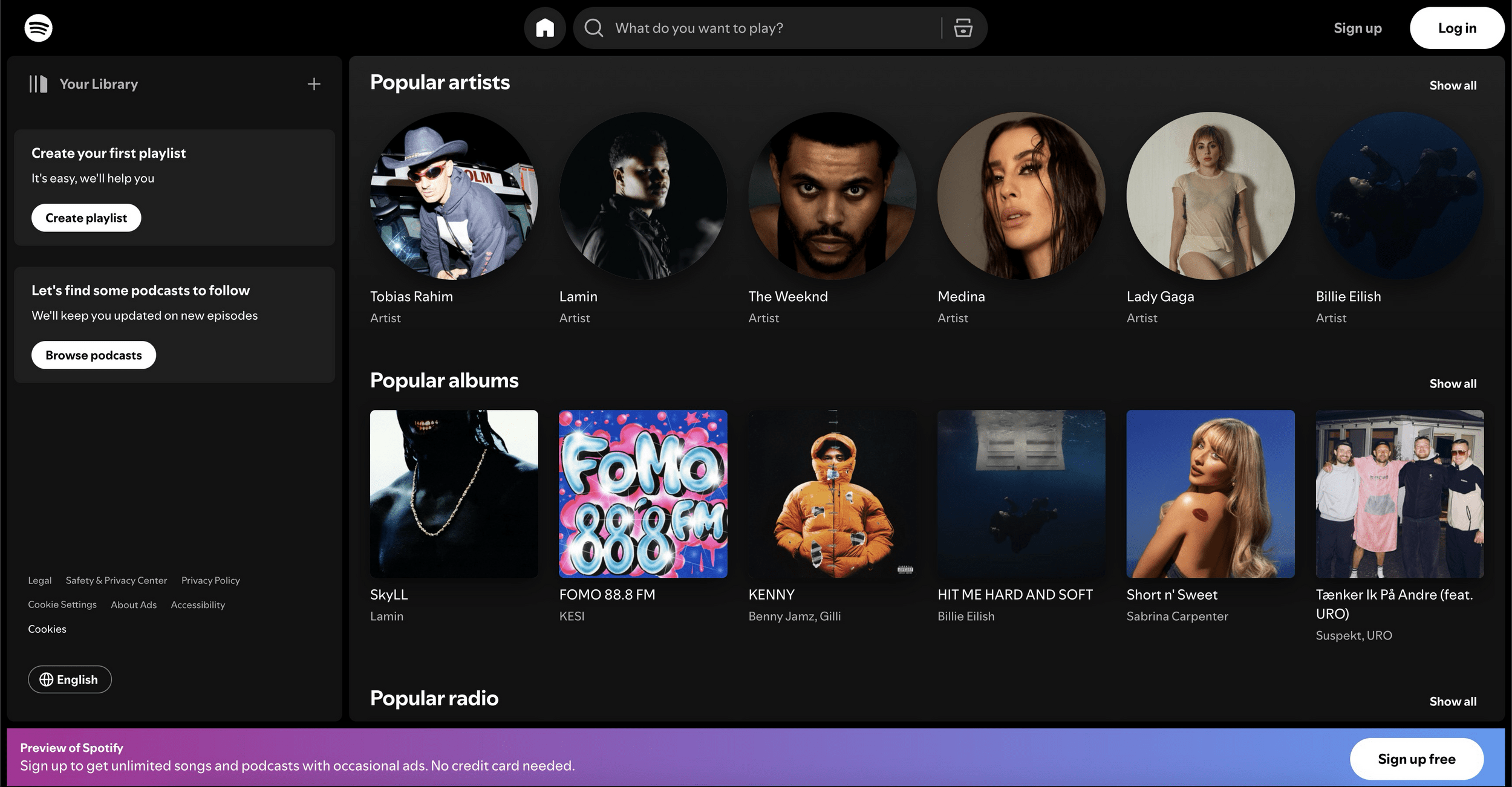
Spotify i Astro
Sæt dig sammen med sidemakkeren og kig på min løsning (se mere på Fronter).
Giver min tilgang mening?
øvelse
Push dit site til Netlify
Opret en gratis konto på Netlify.app og læg dit site live

Layouts & Conditionals
Astro
Pages
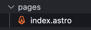
speciel mappe
Pages
- I /pages-mappen findes diverse (under)sider
- Filer, der ender på .astro eller endda .html
- Sider i /pages begynder altid med små bogstaver, selvom de har endelsen .astro (til forskel fra components)
- Der kan linkes imellem siderne med et normalt a-tag:
<nav>
  <a href="/">Home</a> <!-- index.astro -->
  <a href="/search">Search</a> <!-- search.astro -->
</nav>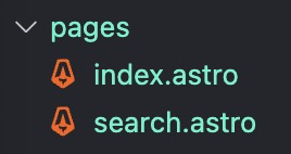
Genbrugelige sideskabeloner
Layout-components
<html lang="en">
  <head>
    <meta charset="utf-8" />
    <link rel="icon" type="image/svg+xml" href="/favicon.svg" />
    <meta name="viewport" content="width=device-width" />
    <meta name="generator" content={Astro.generator} />
    <title>Search</title>
  </head>
  <body>
    <h1>Search</h1>
  </body>
</html>
point of interest
---
import MainLayout from '../layouts/MainLayout.astro';
---
<MainLayout title="Search">
  <h1>Search</h1>
</MainLayout>
point of interest
skabelon med prop
Genbrugelige sideskabeloner
Layout-components
---
const { title } = Astro.props;
---
<html lang="en">
  <head>
    <meta charset="utf-8" />
    <link rel="icon" type="image/svg+xml" href="/favicon.svg" />
    <meta name="viewport" content="width=device-width" />
    <meta name="generator" content={Astro.generator} />
    <title>{title}</title>
  </head>
  <body>
    <slot />
  </body>
</html>
prop
---
import MainLayout from '../layouts/MainLayout.astro';
---
<MainLayout title="Search">
  <h1>Search</h1>
</MainLayout>
Genbrugelige sideskabeloner
Layout-components
---
const { title } = Astro.props;
---
<html lang="en">
  <head>
    <meta charset="utf-8" />
    <link rel="icon" type="image/svg+xml" href="/favicon.svg" />
    <meta name="viewport" content="width=device-width" />
    <meta name="generator" content={Astro.generator} />
    <title>{title}</title>
  </head>
  <body>
    <slot />
  </body>
</html>
---
import MainLayout from '../layouts/MainLayout.astro';
---
<MainLayout title="Search">
<h1>Search</h1>
</MainLayout>sideindhold her
Genbrugelige sideskabeloner
Layout-components
We conventionally use the term “layout” for Astro components that provide common UI elements shared across pages such as headers, navigation bars, and footers.
Genbrugelige sideskabeloner
Layout-components
Layout-components
---
const { title } = Astro.props;
---
<html lang="en">
  <head>
    <meta charset="utf-8" />
    <link rel="icon" type="image/svg+xml" href="/favicon.svg" />
    <meta name="viewport" content="width=device-width" />
    <meta name="generator" content={Astro.generator} />
    <title>{title}</title>
  </head>
  <body>
    <Header />
    <Sidebar />
    <main>
   	  <slot />
    </main>
    <Footer />
  </body>
</html>
Layout-components
Conditional rendering
Vis eller skjul indhold baseret på bestemte betingelser

Conditionals
<article>
  <h2>...</h2>

  <p class="badge">New</p>

  <img />
</article>
Conditionals
<article>
  <h2>...</h2>


  <img />
</article>
Astro can conditionally display HTML
<p class="badge">New</p>---
const visible = true;
---
<article>
<h2>...</h2>
<img />
</article>{}&&visible<p class="badge">New</p>Conditionals
---
const visible = true;
---
<article>
  <h2>...</h2>


  <img />
</article><p class="badge">New</p>{}&&visibleConditionals
---
const visible = true;
---
<article>
  <h2>...</h2>


  <img />
</article>
<p class="badge">New</p>{}&&visiblehvis visible er sand
Conditionals
---
const visible = true;
---
<article>
  <h2>...</h2>


  <img />
</article>vis HTML
<p class="badge">New</p>{}&&visibleConditionals
---
const { newBadge } = Astro.props;
---
<article>
  <h2>...</h2>

  {newBadge && <p class="badge">New</p>}

  <img />
</article>
<CategoryCard
newBadge={true}
...
/>Conditionals
---
const { newBadge } = Astro.props;
---
<article>
  <h2>...</h2>

  {newBadge && <p class="badge">New</p>}

  <img />
</article>
<CategoryCard
newBadge={true}
...
/>
<CategoryCard
...
/>Conditionals
---
const { title } = Astro.props;
---
<article>
  {title && <h2>{title}</h2>}

  <img />
</article>
<Card
title="Card Heading"
description="Lorem..."
/>
<Card
description="Lorem..."
/>Conditionals
Conditionals
Dynamiske klasser
<Component
isActive={true}
...
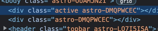
/>---
const { isActive } = Astro.props;
---
<div class={isActive && "active"}>
...
</div>hvis isActive er sand -> "active"
activeConditionals
Dynamiske klasser
Developer Tools
---
const { isActive } = Astro.props;
---
<div class={isActive && "active"}>
  ...
</div>activeConditionals
Dynamiske klasser
Developer Tools
---
const { isActive } = Astro.props;
---
<div class={isActive && "active"}>
  ...
</div>activeConditionals
Dynamiske klasser
Tema-opgaven
Kom i gang
Den færdige løsning
- En landingpage
- En oversigt over koncerter eller kunstnere ('liste view')
- 'Single view' visninger af koncerter eller kunstnere

Tekniske krav
- <META NAME="robots" CONTENT="noindex,nofollow">
- Git og branches skal bruges (så I får noget erfaring)
- Sitet skal være responsivt
- Hostes på Netlify

Mandag
I morgen
Resten af dagen
Projektarbejde
- Installér Astro
- Lav en layoutfil
- Opret pages
- Planlæg components
- Skriv den grundlæggende, generelle CSS
- Læg en plan, hvem tager hvad
- Læg det på GitHub og tilføj “collaborators”
- Klon GitHub repo til gruppens øvrige medlemmer og
- kør npm install, når der er klonet (ellers virker det ikke!)
Én af jer opretter et projekt, og de andre kloner og kører npm install
GitHub-organization?