CRAFTING UI
Frontend Design
The fundamentals
Overblik og recap
Agenda
The Cascade
Selectors
Nesting
The Cascade
Selectors
Agenda
-
Blive bedre til CSS
-
Forstå, hvordan Nesting hjælper med organisering
-
Blive bedre til at bruge
-
Øvelser, øvelser og flere øvelser for at opbygge praktisk erfaring
Nesting
Selectors
Nesting
-
Forstå bedre
-
Blive bedre til CSS og udvide kendskabet
-
Forstå, hvordan hjælper med organisering
-
Øvelser for at opbygge praktisk erfaring
The Cascade
Agenda
Agenda
The Cascade
Reset
Mål: Forstå the cascade bedre
Inheritance
Specificity
Cascade Layers
... og venner
<!DOCTYPE html>
<html lang="da">

  <head>...</head>

  <body>

    <h1>Heading 1</h1>

    <main>

      <h2>Heading 2</h2>
      <p>Lorem ipsum dolor sit.</p>

      <section>

        <h3>Hello</h3>
        <p>Lorem ipsum dolor sit amet consectetur.</p>

      </section>

    </main>

  </body>

</html>
main {
color: green;
font-size: 1.1rem;
border: 1px solid blue;
}
section {
border: inherit;
}
section p {
color: red;
font-size: 1rem;
}Inheritance
Inheritance
Properties, der nedarves:
-
color
-
font-family
-
font-size
-
font-weight
-
line-height
-
list-style
-
text-align
html {
  color: gray;
  line-height: 1.5;
  font-family: system-ui, sans-serif;
}

h1,
h2,
h3 {
  color: #000;
  line-height: 1.1;
  font-family: "My Display Font";
}
Standard styles
Overskrivning
God praksis
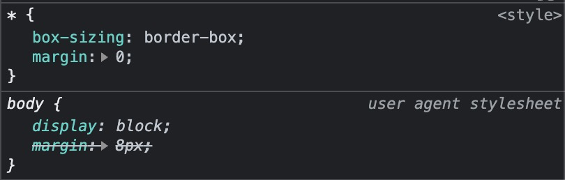
* {
	margin: 0;
	box-sizing: border-box;
}

img {
	display: block;
	max-width: 100%;
	height: auto;
}
Hvorfor gør vi det?
God praksis
html {
	display: block;
}
head {
	display: none;
}
body {
  display: block;
  margin: 8px;
}
h1 {
  display: block;
  font-size: 2em;
  margin-block-start: 0.67em;
  margin-block-end: 0.67em;
  font-weight: bold;
}
a:-webkit-any-link {
  color: -webkit-link;
  cursor: pointer;
  text-decoration: underline;
}
Defaults
User Agent Stylesheet
En masse regler er defineret, inden du selv har skrevet én linje CSS
Browser
(
)
Defaults
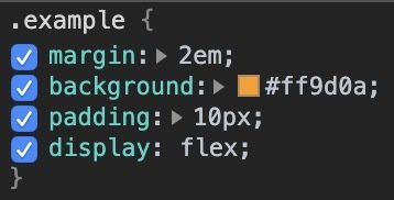
.example {
  display: flex;

}

.example > .child {

}
Defaults
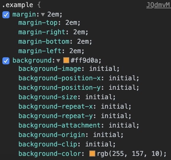
.example {
  display: flex;
  align-items: stretch;
  justify-content: normal;
  align-content: normal;
  align-items: normal;
  flex-direction: row;
  flex-wrap: nowrap;
}

.example > .child {
  flex-grow: 0;
  flex-shrink: 1;
  flex-basis: auto;
}
Defaults
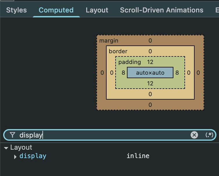
Hvorfor sker der ikke noget?
DevTools har ofte svaret
Det perfekte diagnosticeringsværktøj
CSS Reset
Et bedre udgangspunkt
CSS Reset
Et bedre udgangspunkt
"Starter"
starter.css
body {
    margin: unset;
    min-height: 100svh;
}
img {
vertical-align: middle;
max-width: 100%;
height: auto;
}html {
font-family: system-ui;
line-height: 1.5;
color: #3b3b3b;
}* {
margin: 0;
box-sizing: border-box;
}starter.css
body {
  min-height: 100svh /* 100dvh */;
}

...
* {
margin: 0;
box-sizing: border-box;
}
img {
display: block;
max-width: 100%;
height: auto;
}:not(progress, meter) {
border-style: solid;
border-width: 0;
}Temaets reset
Cascade Layers
Mål: Forstå principperne bag
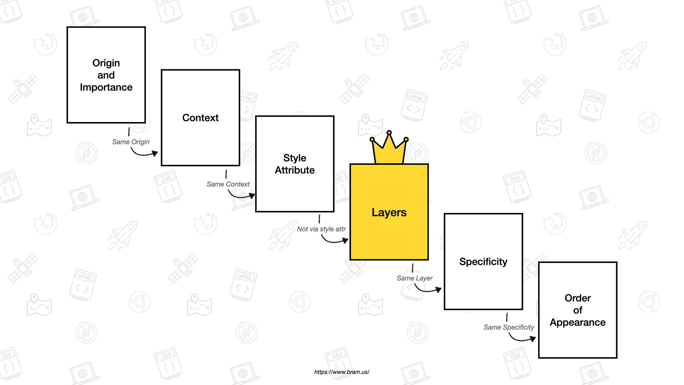
Cascade Layers
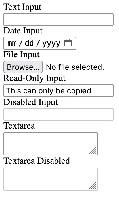
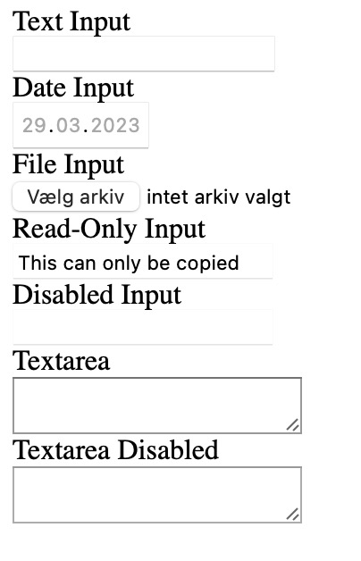
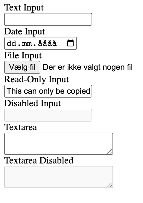
Visuel ensretning
Jeres tur
The cascade
- Tilføj en blå border på 4px til .my-input
- Kig i DevTools for at finde fejlen
- Lad den være åben
The cascade
Author styles

0,0,0
0,0,1
🤷♂️
Cascade layers
Layer A
Layer B
Layer C
Cascade layers
Layer A
Layer B
Layer C
input[type="text"] {
  border: 1px solid gray;
}
.my-input {
border: 4px solid blue;
}Højeste prioritet
Laveste prioritet
Cascade layers
Layer A
Layer B
Layer C
input[type="text"] {
border: 1px solid gray;
}.my-input {
border: 4px solid blue;
}Højeste prioritet
Laveste prioritet
Cascade layers
Layer A
Layer B
Layer C
input[type="text"] {
border: 1px solid gray;
}.my-input {
border: 4px solid blue;
}Højeste prioritet
Laveste prioritet
Cascade layers
@layer reset {
/* ... other reset rules */
input[type="text"] {
border: 1px solid gray;
}
}
@layer components {
/* ... other component rules */
.my-input {
  border: 4px solid blue;
}
}input[type="text"] {
border: 1px solid gray;
}.my-input {
border: 4px solid blue;
}Layer A
Layer B
Cascade layers
@layer reset, components, utilities;
@layer reset {
/* ... other reset rules */
input[type="text"] {
  border: 1px solid gray;
}
}
@layer components {
/* ... other component rules */
.my-input {
  border: 4px solid blue;
}
}Cascade layers
@layer reset, components, utilities;
@layer components {
/* ... other component rules */
.my-input {
border: 4px solid blue;
}
}
@layer reset {
/* ... other reset rules */
input[type="text"] {
  border: 1px solid gray;
}
}1
2
3
Cascade layers
@layer reset, global, components, utilities;Cascade layers
@layer reset, global, components, utilities;
Hvert projekt

Projektspecifikt?
Projektspecifikt!
One-offs, hvert projekt?
Cascade layers
@layer reset, global, components, utilities;

@layer reset {
  ul[class] {
    margin: 0;
    padding: 0;
    list-style: none;
    text-align: start;
  }
}

@layer utilities {
  .flow {
    > * + * {
    	margin-top: 1em;
    }
  }
}
eksempel
Cascade layers
øvelse
ul[class] {
  margin: 0;
  padding: 0;
  list-style: none;
}
Cascade layers
øvelse
.flow {
  > * + * {
    margin-top: 1rlh;
  }
}
Cascade layers
øvelse
ul[class] {
  margin: 0;
  padding: 0;
  list-style: none;
}

.flow {
  > * + * {
    margin-top: 1rlh;
  }
}
0,1,1
0,1,0
Cascade layers
øvelse
@layer reset, global, components, utils;Cascade layers
øvelse
-
Oversæt selectoren (ItsLearning)
-
Refleksion i plenum
Øvelser
Cascade Layers
Mål: Blive bedre og udvide kendskabet samt vurdere kvalitet og vedligeholdelse
:has()
Mål: Blive bedre og udvide kendskabet
Cascade Layers
artcle:has(img) {}

p:not(.lede) { ... }

article > :is(.class, #id) { ... }

article > :where(.class, #id) { ... }
:is(), :where(), :not()
:has()
article:has(h2) { ... }

article:has(h2, h3) { ... }

article:has(h2):has(h3) { ... }

article:not(:has(h2)) img { ... }

article:has(> :nth-child(3)) { ... }
:has()
Hvad styler vi her?
:has()
body {
  display: grid;
}

body:has(main + aside) {
  grid-template-columns: 1fr 300px;
}
Playground
:has()
"Kom i gang"-øvelser

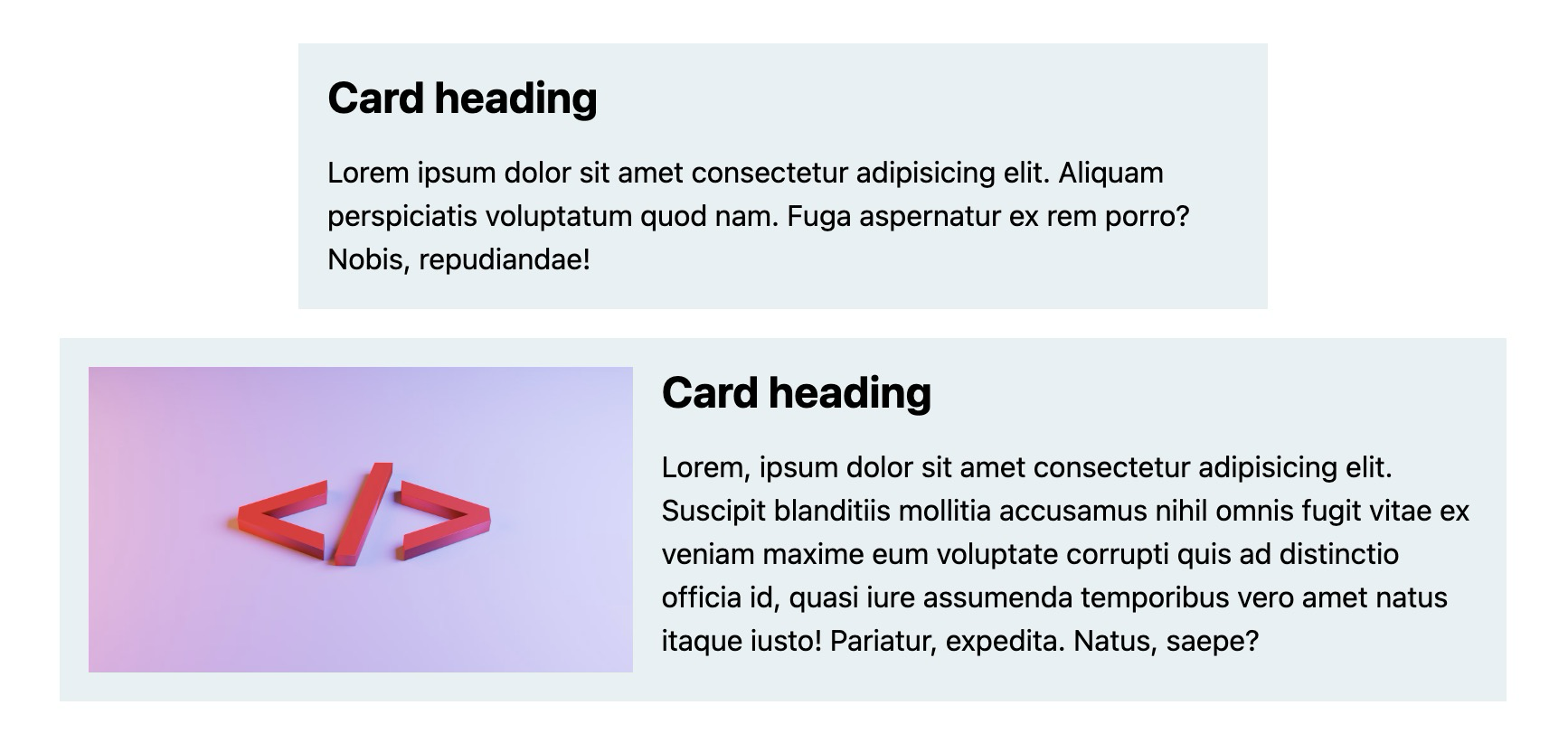
:not(:has(img))
i kombination med :not()
:has()
combinators
(mellemrum)
+
~
>
:has()
combinators
p + figure {
  ...
}

figure ~ p {
  ...
}
<div>
<p>Hello</p>
<figure></figure>
<h2>Hello</h2>
</div>
<div>
<p>Hello</p>
<h2>Hello</h2>
<figure></figure>
<p>Hello</p>
</div>:has()
combinators
p:has(+ figure) {
  ...
}

figure:has(~ p) {
  ...
}
<div>
<p>Hello</p>
<figure></figure>
<h2>Hello</h2>
</div>
<div>
<p>Hello</p>
<h2>Hello</h2>
<figure></figure>
<p>Hello</p>
</div>:has()


display: contents?
:has()
display: contents;
p:has(img) {
  display: contents;
}
<article>
<img>
</article><p></p>:has()
display: contents;
p:has(img) {
  display: contents;
}
<article>
<img>
</article><p></p>:has()
display: contents;
p:has(img) {
  display: contents;
}
<article>
<img>
</article><p></p>Opfører sig nu som barn af <article>
:has()

:has()
quantity queries
ul:not(:has(> li:nth-child(5))) {
  display: flex;
  justify-content: center;
}:has()
:has()
:has()
:has()
Nesting
Mål: Forstå, hvordan det hjælper med organisering
Nesting
section {
  border: 2px solid red;
}

section
  color: red;
}
h2 {Nesting
section {
  border: 2px solid red;


    color: red;

}
h2 {
  color: red;
}
Nesting
section {
  border: 2px solid red;


    color: red;
  }
}>h2 {<section>
<h2></h2>
<h3></h3>
<p></p>
<article>
<h2></h2>
</article>
</section>Nesting
section {
  border: 2px solid red;


    color: red;
  }
}>h2 {<section>
<h2></h2>
<h3></h3>
<p></p>
<article>
<h2></h2>
</article>
</section>Nesting
section {
  border: 2px solid red;


    color: red;
  }
}
h2, h3 {<section>
<h2></h2>
<h3></h3>
<p></p>
<article>
<h2></h2>
</article>
</section>Nesting
:is()
:where()
:nth-child()
.
>
+
~
[data-*]
&
Symboler
Nesting
h1,
h2 {
  & span {
    color: blue;
  }
}
& === :is(h1, h2)Nesting
h1 {
  color: red;

  @media (width > 500px) {
    color: blue;
  }
}
Nesting
h1 {
  @media (width > 500px) {
    color: blue;
  }

  color: red;
}
Nesting
h1 {
  article & {
    color: red;
  }
}
Nesting
h1 {
  color: blue;

  article & {
    color: red;
  }
}
if / else
<h1>I'm blue</h1>

<div class="parent">
  <h1>I'm red</h1>
</div>
Nesting
h1 {
  color: blue;

  article & {
    color: red;
  }
}
if / else
<h1>I'm blue</h1>

<article>
  <h1>I'm red</h1>
</article>
Nesting
h2 {
  color: blue;

  section :nth-last-child(2 of &) {
    color: red;
  }
}
Please don't
Nesting
a {
  background: red;

  &:hover {
    background: blue;
  }
}
Co-location
Please do
Nesting
.btn {
  padding: 0.5rem;

  &:is(:hover, :focus-visible) {
    background: blue;
  }
}
Co-location
Please do
Nesting
.container {
  display: grid;
  gap: 1rem;

  @media (width > 600px) {
    grid-template-columns: repeat(3, 1fr);
  }
}
Co-location
Please do
Nesting
Omskriv til nesting

Nesting
Al logik skal være i article
article {
  /* nesting logik */
}
section:nth-child(...) {
article {
}
}✅
🚫
Nesting
Al logik skal være i .article