CRAFTING UI
Frontend Design
Tegn med kode
Datavisualisering og UI-grafik



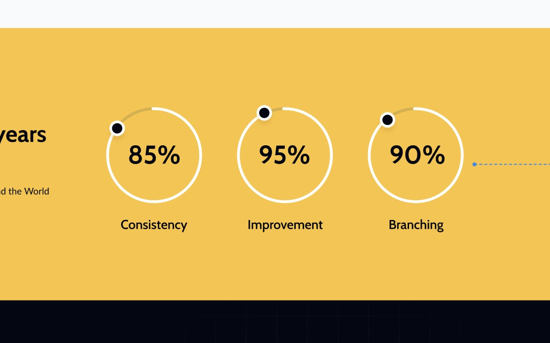
Datavisualisering
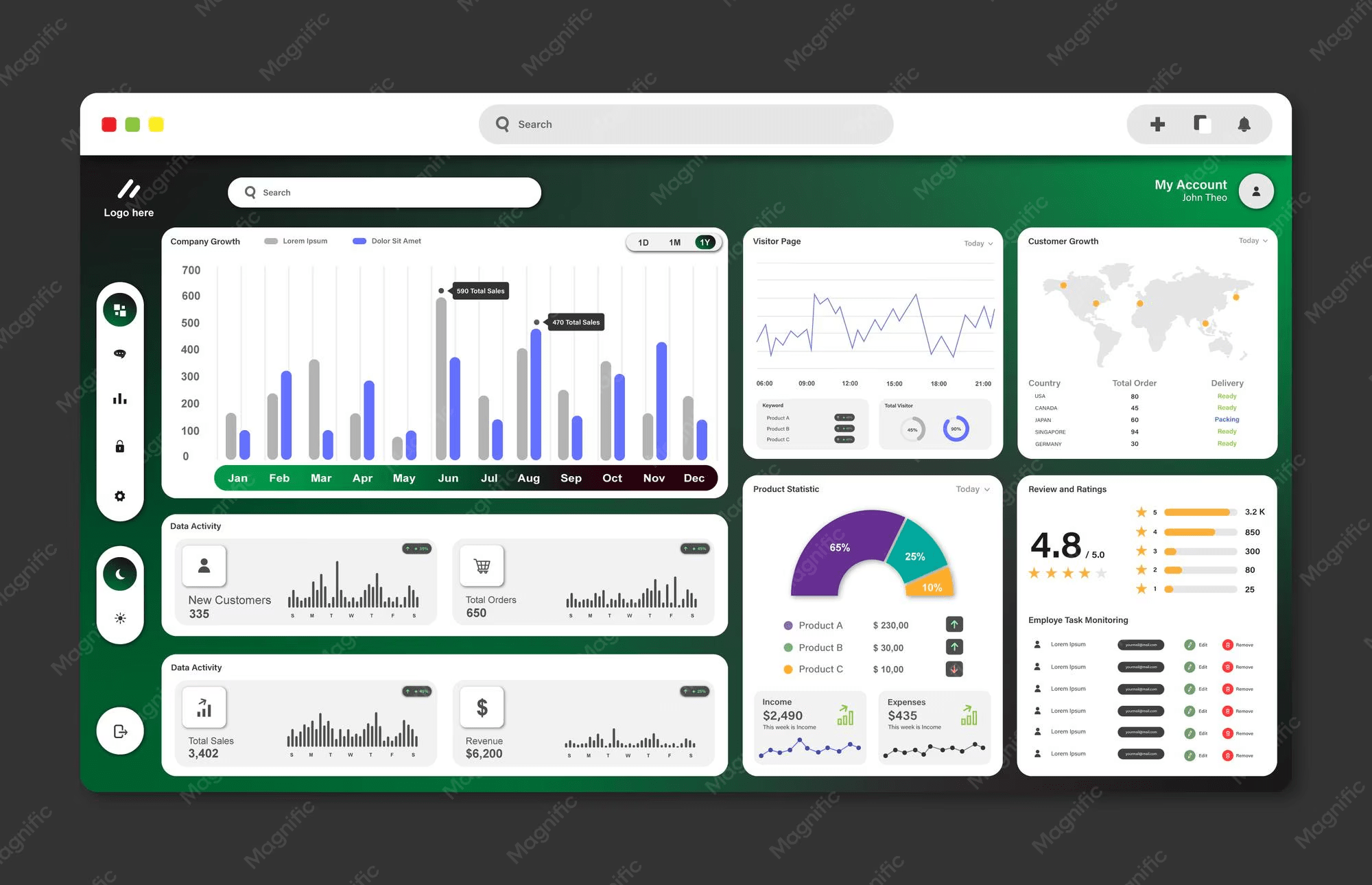
Datavisualisering
Det handler ikke kun om at vise data men om at designe den måde, data forstås på.
- gør kompleks data læsbar, sammenlignelig og handlingsbar
- fremhæver mønstre, relationer og afvigelser
- fører (måske) til øget engagement
Vælg form efter budskab
- Doughnut → del af helhed
- Søjler → sammenlign størrelser
- Linje → se retning og mønster
Datavisualisering
Data før grafik. Grafikken er et ekstra lag.
Datavisualisering
<figure>
  <figcaption>Erfaring pr. år</figcaption>
  <ul>
    <li>2023: 14 %</li>
    <li>2024: 26 %</li>
    <li>2025: 69 %</li>
  </ul>
</figure>
Hvis grafen forsvinder, skal data stadig kunne forstås
Datavisualisering og UI-grafik
CSS
SVG
Vores værktøjkasse
Typed attr()
Farvemanipulation
shape()
Gradienter
offset-path
<path>
<circle>
pathLength
stroke-dasharray
stroke-dashoffset
border-area
Pseudo-elementer
Farvemanipulation
color-mix() & Relative Color Syntax
color-mix()
color-mix()
Relative Color Syntax
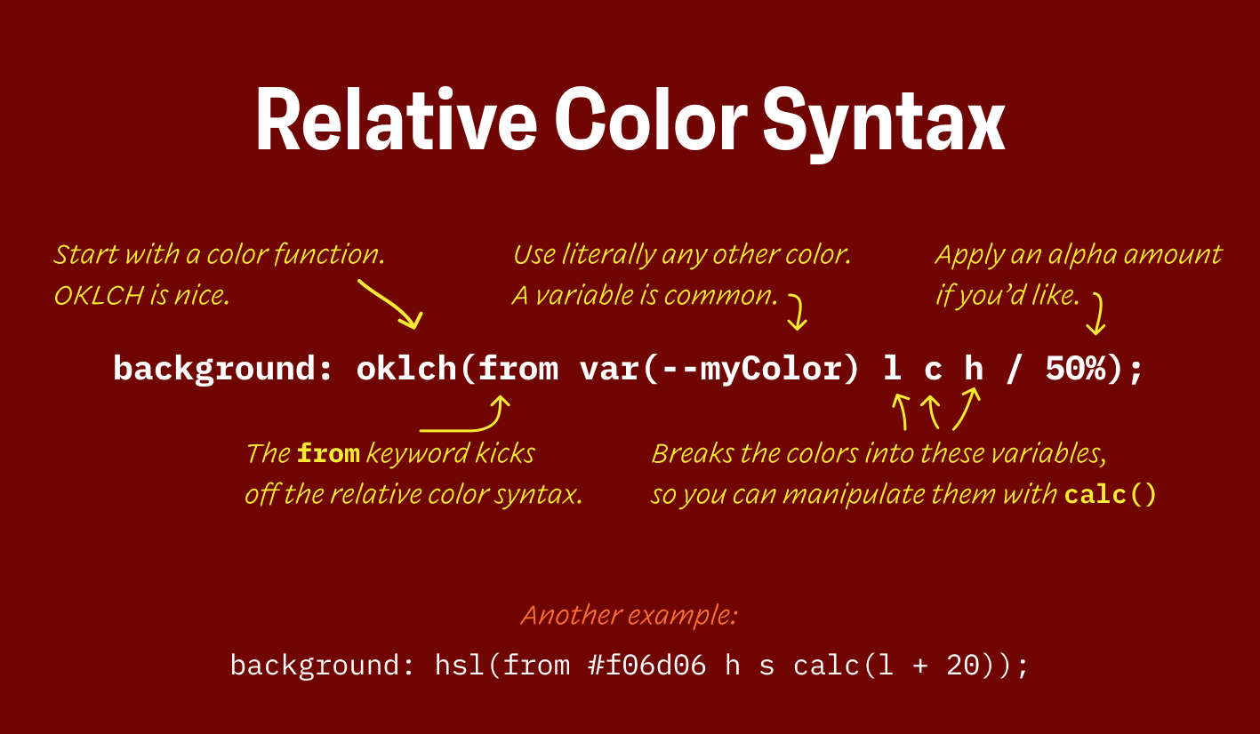
Relative Color Syntax
Relative Color Syntax


hover- og active-state
Relative Color Syntax
Relative Color Syntax
Relative Color Syntax
a::after {
  content: '(opens in new tab)';
}
Pseudo-elementer
::before, ::after
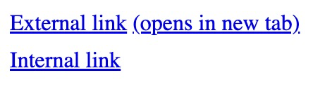
a[href^="http"]::after {
  content: '(opens in new tab)';
}
Pseudo-elementer
::before, ::after
Pseudo-elementer
::before, ::after
a[href^="http"]::after {
  content: '(opens in new tab)';
}
Øvelse
nav.innerHTML += `<a href=${c.link}>${c.name}</a>` + " / ";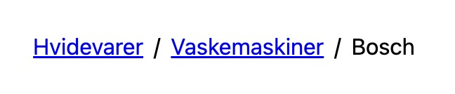
Pseudo-elementer
Øvelse
Pseudo-elementer
Øvelse
li + li::before {
  content: '/';
}
Pseudo-elementer
Øvelse
li + li::before {
  content: '/';
}
Pseudo-elementer
li:has(a)::after {
  content: '/';
}
li:has(+ li)::after {
content: '/';
}li:not(:last-child)::after {
content: '/';
}:not(:first-child)::before {
content: '/';
}Pseudo-elementer
Pseudo-elementer
Fra temaopgaven
Fra streng til datatype
[data-color]::after {
  content: attr(data-color);
}
Typed attr()
<h2 data-color="red"></h2>Indsætter strengen "red"
Fra streng til datatype
[data-color] {
  color: attr(data-color type(<color>));
}
Typed attr()
Sætter tekstfarven
Fra streng til datatype
[data-color] {
  color: attr(data-color type(<color>), #fff);
}
Typed attr()
fallback
@scope
Fra streng til datatype
[data-color] {
  color: attr(data-color type(<color>), #fff);
}
Typed attr()
<h2 data-color="red">
  Make me red
</h2>
@scope
Fra streng til datatype
[data-color] {
  color: attr(data-color type(<color>), #fff);
}
Typed attr()
<h2 data-color="oklch(0.6 0.3 29)">
  Make me red
</h2>
@scope
Fra streng til datatype
Typed attr()
klik her
<div data-length="5rem"></div>div {
width: attr(data-length type(<length>));
&::after {
content: attr(data-length);
}
}Units vs. Types
Typed attr()
@scope
Units vs. Types
Typed attr()
<angle>
<color>
<custom-ident>
<image>
<integer>
<length>
<length-percentage>
<number>
<percentage>
<time>
Types of type()
Typed attr()
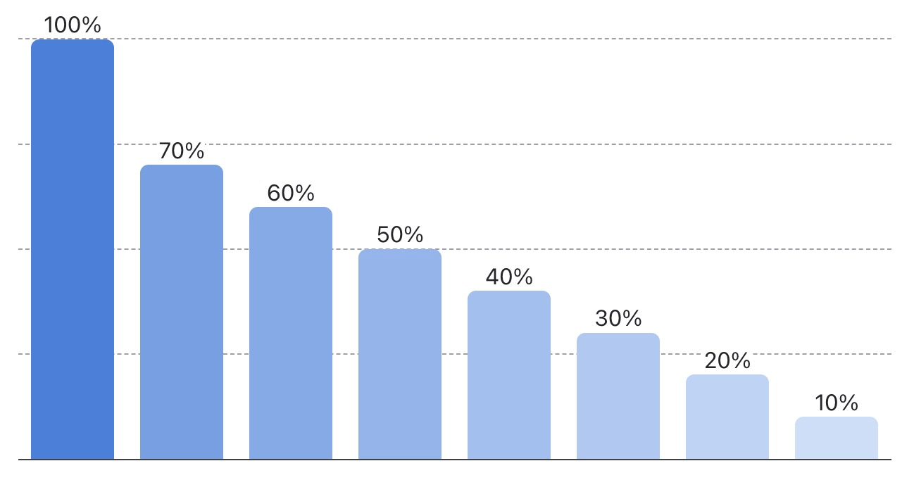
article {
display: grid;
grid-template-columns:
repeat(8, 1fr);
height: 300px;
}
div:nth-child(1) {
height: 100%;
}
div:nth-child(2) {
height: 70%;
}
...<article>
<div></div>
<div></div>
...
</article>Ikke så fleksibelt
10%20%30%40%50%60%70%100%article {
display: grid;
grid-template-columns:
repeat(8, 1fr);
}
div:nth-child(1) {
height: 100%;
}
div:nth-child(2) {
height: 70%;
}
...<article>
<div style="height: 100%"></div>
<div style="height: 70%"></div>
...
</article>Data kommer typisk fra JS
10%20%30%40%50%60%70%100%bar.style.height = `${percent}%`div {
height: var(--height, 0%);
}<article>
<div style="--height: 100%"></div>
<div style="--height: 70%"></div>
...
</article>Det kunne ligeså godt se sådan ud
10%20%30%40%50%60%70%100%bar.style.setProperty("--height", `${percent}%`)<article>
<div data-percent="100"></div>
<div data-percent="70"></div>
...
</article>Eller sådan her
(en moderne løsning)
div {
height: attr(data-percent %, 0%);
}10%20%30%40%50%60%70%100%bar.dataset.percent = percentattr()
div {
  width: attr(data-length type(<length>));
  &::after {
    content: attr(data-length);
  }
}
attr(data-number type(<number>), 0)
attr()
div {
height: attr(data-percent %), 0%);
}
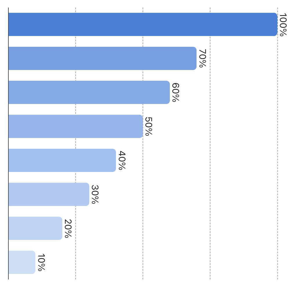
Lad os bygge en
responsiv Bar Chart
.bars {
display: grid;
grid-template-columns: repeat(8, 1fr);
height: 300px;
}Step 1: Orientering
Basic grid
<article class="bars">
<div class="bar" data-percent="100"></div>
<div class="bar" data-percent="70"></div>
<!-- ... -->.bar {
height: attr(data-percent %); /* 70% */
}Step 2: attr()
Sæt højden i %
<article class="bars">
<div class="bar" data-percent="100"></div>
<div class="bar" data-percent="70"></div>
<!-- ... -->.bar {
height: attr(data-percent %, 0%); /* 0% */
}Step 2: attr()
Husk fallback!
<article class="bars">
<div class="bar" data-percent="100"></div>
<div class="bar"></div>
<!-- ... -->.bar {
background:
color-mix(#3980DD attr(data-percent %, 0%), #DAE9FC);
}Step 3: color-mix()
Procent-værdien styrer baggrundsfarven
.bar {
--percent: attr(data-percent %, 0%);
background:
color-mix(#3980DD var(--percent), #DAE9FC);
height: var(--percent);
}Step 4: Housekeeping
Organiser med variabler
.bar {
&::after {
content: attr(data-percent) "%";
position: absolute;
top: -1lh;
inset-inline: 0;
justify-self: center;
}
}Step 5: pseudo-element
Vis procent-værdien
.bars {
@container (width < 400px) {
writing-mode: sideways-rl;
height: 100%;
}
}
.bar {
min-width: 40px;
}Step 6: writing-mode
Gør den responsiv
writing-mode
div {
  width: attr(data-length type(<length>));
  &::after {
    content: attr(data-length);
  }
}writing-mode: sideways-lr | sideways-rl etc.
writing-mode
med flow-relative properties
writing-mode
med flow-relative properties
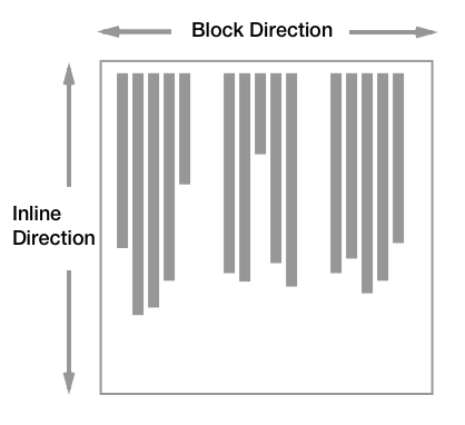
width
max-width
height
max-height
margin-left
margin-right
padding-top
top
inline-size
max-inline-size
block-size
max-block-size
margin-inline-start
margin-inline-end
padding-block-start
inset-block-start
writing-mode
med flow-relative properties
.bars {
  @container (width < 400px) {
    writing-mode: sideways-rl;
    height: 100%;
  }
}

.bar {
  min-width: 40px;
}
Step 6: writing-mode
Gør den responsiv
.bars {
  block-size: 300px; /* erstatter height */

  @container (width < 400px) {
    writing-mode: sideways-rl;
    block-size: 100%; /* erstatter height */
  }
}

.bar {
  min-inline-size: 40px; /* erstatter min-width */
  &::after {
    inset-block-start: -1lh; /* erstatter top */
  }
}
Step 7: Logical props
Gør boksmodellen flow-relativ
.bars {
  @container (width < calc((40px + 1rlh) * 8)) {
    /* ... */
  }
}

.bar {
  margin-inline: .5rlh;
  min-inline-size: 40px;
}
Tip
Brug calc() i @container
bar width
.bars {
  background:
    repeating-linear-gradient(
      to bottom,
      gainsboro 0 1px,
      transparent 0 25%
    );
}
Step 8: Gitterlinjer
Linjer med repeating-gradient
.bars {
  background:
    repeating-linear-gradient(
      var(--angle, to bottom),
      gainsboro 0 1px,
      transparent 0 25%
    );
}
Step 8: Gitterlinjer
Fix linjer på små skærme
.bars {
  background:
    repeating-linear-gradient(
      var(--angle, to bottom),
      gainsboro 0 1px,
      transparent 0 25%
    );
  @container (inline-size < 400px) {
    --angle: to left;
  }
}
Step 8: Gitterlinjer
Fix linjer ved breakpointet
Hvordan virker det?
.bars {
  background:
    repeating-linear-gradient(
      to bottom,
      gainsboro 0 1px,
      transparent 0 25%
    );
}
to bottom
0
1px
25%
(180deg)
Tegn med gradienter
Koniske, lineære, radiale
Tegn med gradienter
Koniske, lineære, radiale
Tegn med gradienter
.gradient-progress {
  background: linear-gradient(
    90deg,
    [FARVE 1] [PROCENT],
    [FARVE 2] 0
  );
}
Tegn med gradienter
linear-gradient progress
Tegn med gradienter
mask
Gitter
Fra temaopgaven
Gitter
Conic-gradient()
Doughnut chart
Fra temaopgaven
SVG
Fra bokse og gradients til koordinater, former og strokes.
Doughnut chart
viewBox giver os et stabilt koordinatsystem
<svg viewBox="0 0 100 100">
  <circle cx="50" cy="50" r="50" />
</svg>
Vi tegner en circle med koordinaterne: centerpunkterne for x og y: 50, 50
radius: 50
x og y
cx og cy
stroke
stroke-width
stroke-dasharray
stroke-dashoffset
stroke-linecap
fill
pathLength
SVG-attributter
SVG Playground
Offset-path
.parent {
  .child {
    offset-path: border-box;
  }
}
Offset-path
svg {
  circle {
    offset-path: circle([COORDINATES]);
  }
}