STYLING
FORMS
Front-end elective,
3rd Semester
But first...
An extensive talk about
CORS
by Jonas Holbech
But first...
An extensive talk about
CORS
by Jonas Holbech
But first...
An extensive talk about
CORS
by Jonas Holbech
Styling
Search for a topic of interest...
Search
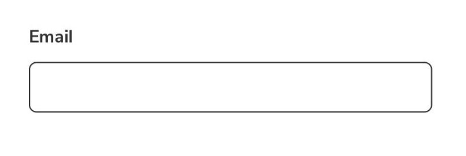
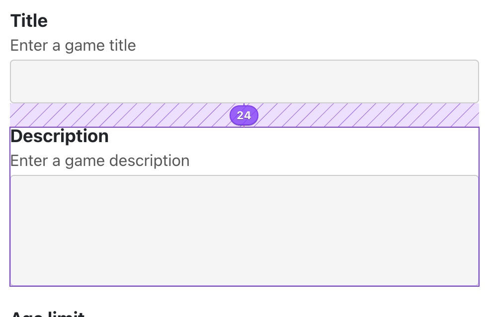
HTML forms
Styling
A better user experience
HTML forms
Frontend elective, 3rd SEM
Search
Search for a topic of interest...
HTML forms

style
CSS
UI States
What are states?
-
"Situations"
-
Two or more circumstances
-
"On or Off"
-
"To do", "doing", "done"
-
Improves UX (sometimes)
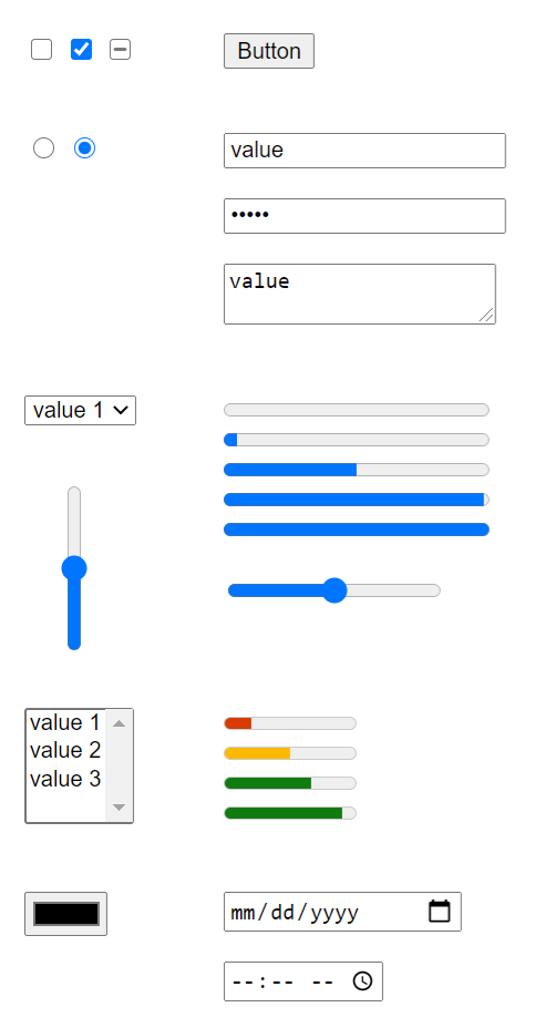
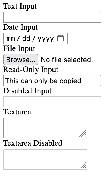
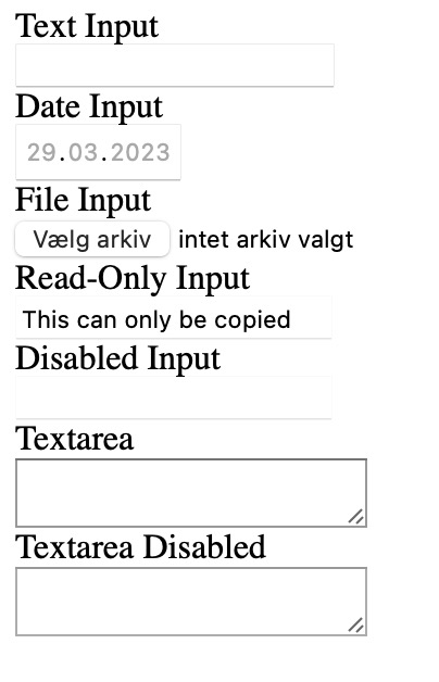
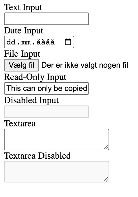
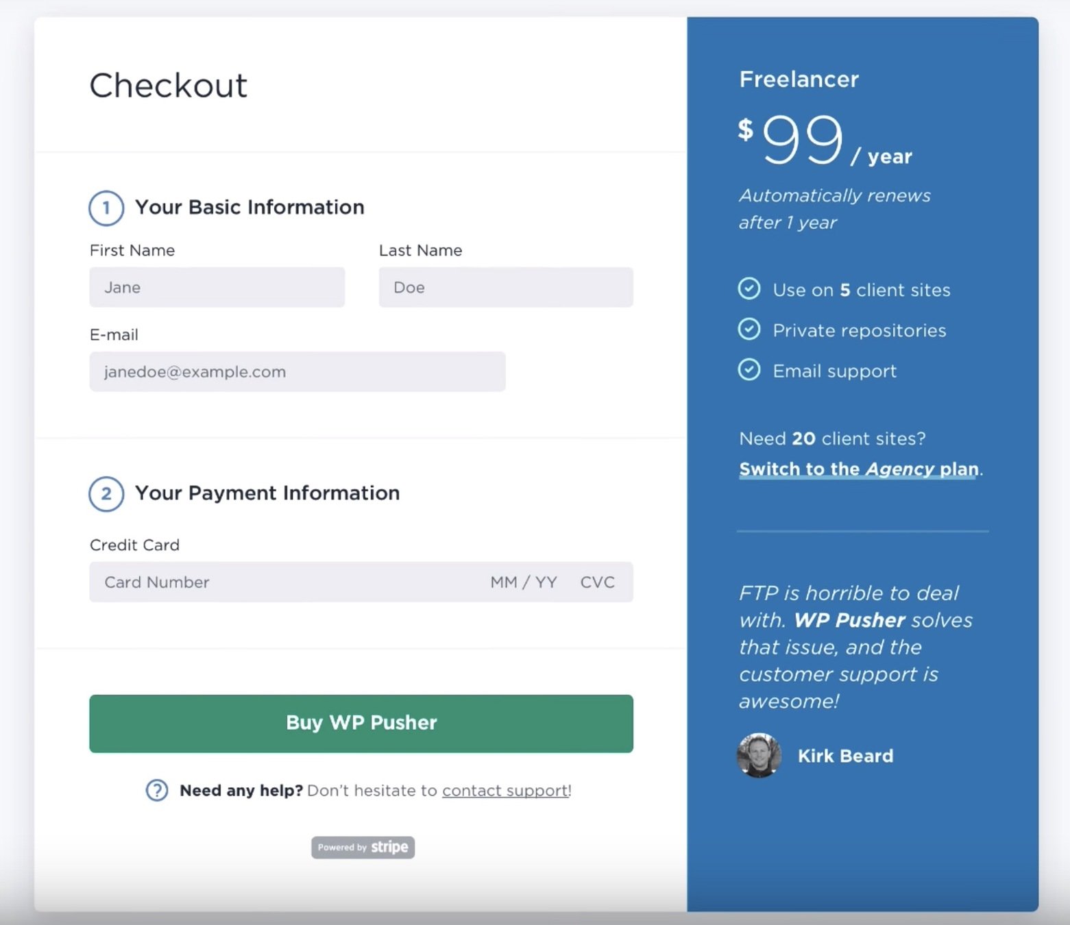
Input states

HTML Forms
Styling Forms
Last time
Today
Mostly HTML
Mostly CSS
Today's focus
- Understand form states
- Styling techniques
- Style organization
- Basic accessibility principles
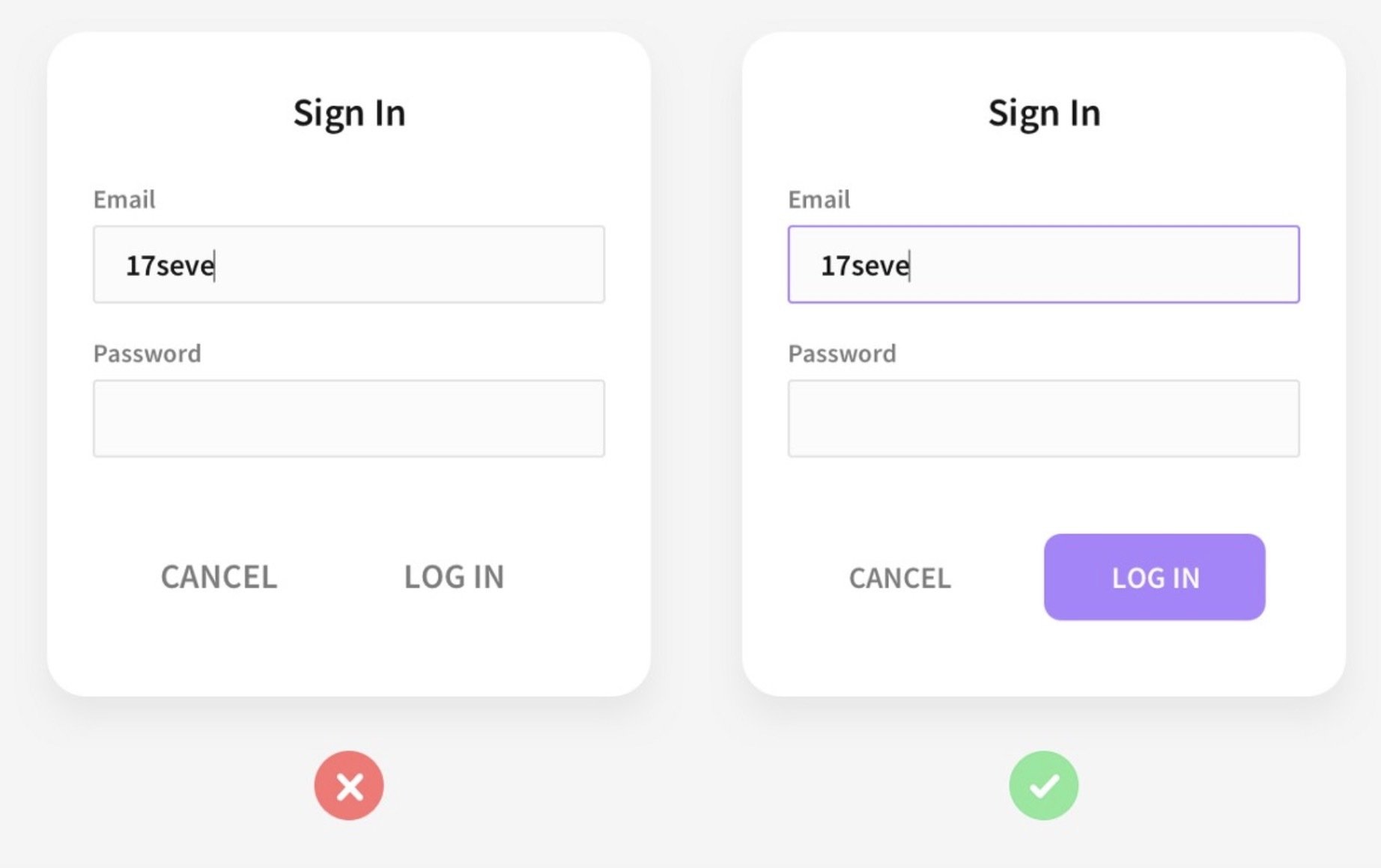
Pseudo-classes
A CSS pseudo-class is a keyword added to a selector that specifies a special state of the selected element(s). For example, :hover can be used to change a button's color when the user's pointer hovers over it.
Pseudo-classes
Pseudo-classes
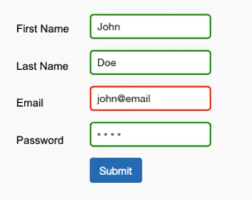
:valid
represents any <input> or other <form> element whose contents validate successfully
input:valid {
  border-color: green;
}
needs "required"
Pseudo-classes
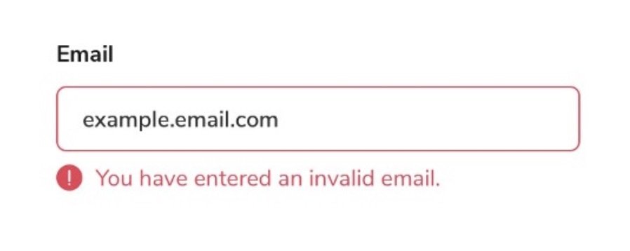
:invalid
any <input> or other <form> element whose contents fail to validate.
input:invalid {
  border-color: red;
}
needs "required"
Pseudo-classes = states
Pseudo-classes = states

Pseudo-classes = states
What Jonas sees
Pseudo-classes = states
Pseudo-classes / states
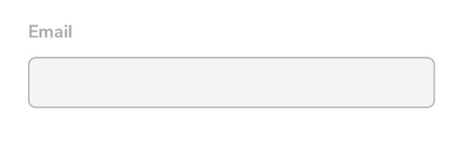
:disabled
represents any disabled element
:checked
selector represents any radio, checkbox, or option element that is checked or toggled to an on state
:focus
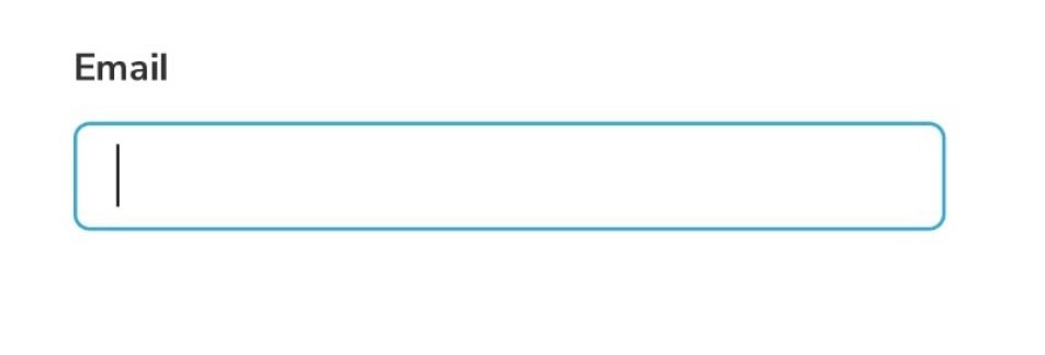
represents an element that has received focus
:placeholder-shown
represents any <input> or <textarea> element that is currently displaying placeholder text.
:not(
:not(
:not(
:not(
)
)
)
)
Pseudo-classes / states
:disabled
doesn't represents any disabled element
:checked
selector represents any radio, checkbox, or option element that is not checked or toggled to an on state
:focus
represents an element that hasn't received focus
:placeholder-shown
represents any <input> or <textarea> element that is currently not displaying placeholder text.
:not(
:not(
:not(
:not(
)
)
)
)
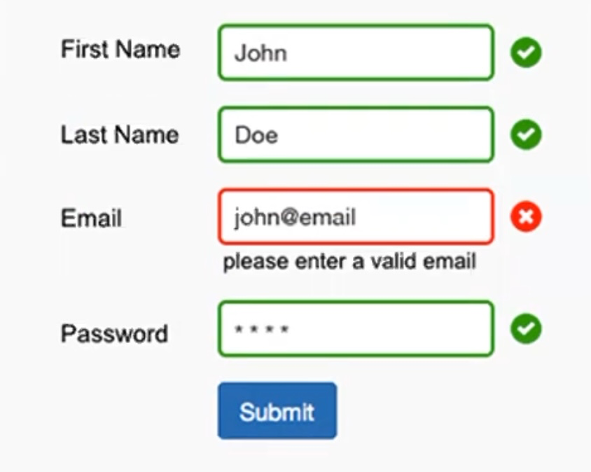
input:invalid:not(:focus, :placeholder-shown) { ... }Placeholder-shown
input:invalid:not(:focus, :placeholder-shown) ~ .error-message { ... }JS is required to adhere to A11y standards
:has()
.form-group:has(input:invalid) { ... }.form-group:has(input:not(:focus, :placeholder-shown):invalid) .error-message { ... }.form-group:has(input:not(:focus, :placeholder-shown):invalid) label { ... }:has()
.form-group:has(input:invalid) { ... }.form-group:has(input:not(:focus, :placeholder-shown):invalid) .error-message { ... }label:has( + input:not(:focus, :placeholder-shown):invalid) { ... }:has()
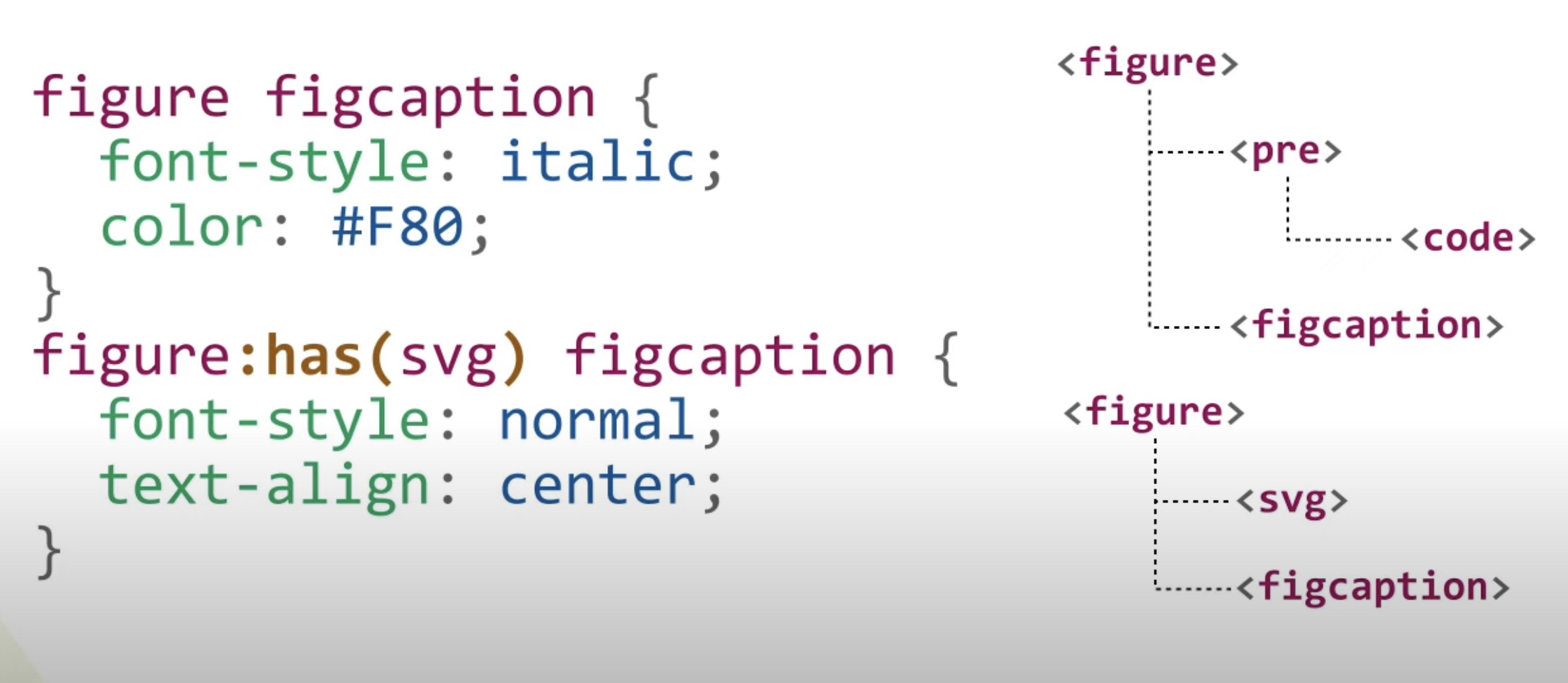
:has()
:has()
label {
  color: var(--color);
}

.form-field:has(:invalid) {
  --color: red;
}

.form-field:has(:valid) {
  --color: green;
}
:has()
:has()
:has()
:has()
Browser compatibility
🫢
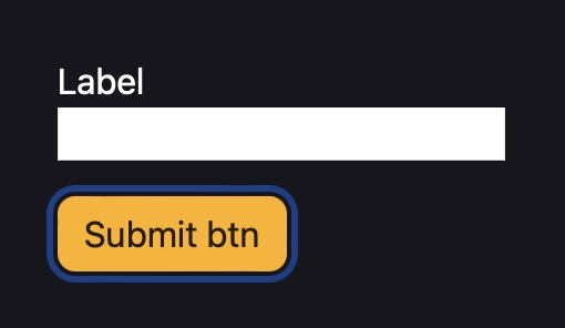
form:focus-within {
  border-color: blue;
}
.form-control:focus-within .hint {
color: red;
}:focus-within
:focus-within
Exercise
Focus states
Focus states
Safari 💩
Focus states
Firefox 💩
Focus states
:focus-visible {
  outline: 2px solid #000;
  outline-offset: -2px;
  box-shadow: 0 0 0 2px #fff, inset 0 0 0 3px #fff;
}

input {
  appearance: none; /* Safari fix */
}
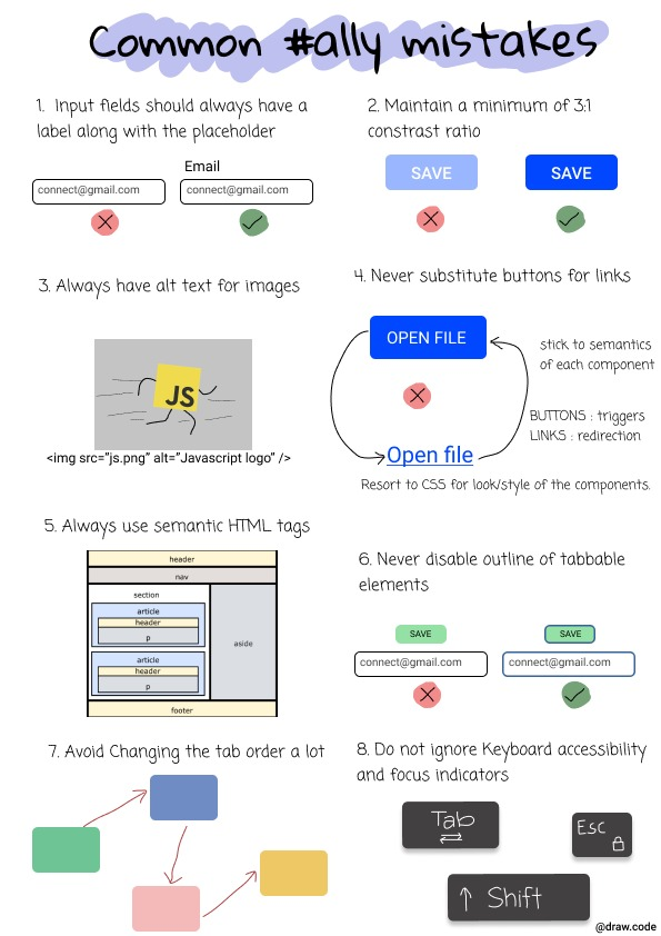
Add “states” (aka. pseudo-classes) to your form
- :focus-visible
- :valid
- :invalid (with error messages)
- :disabled
- :has
Add styles for the following pseudo-classes:
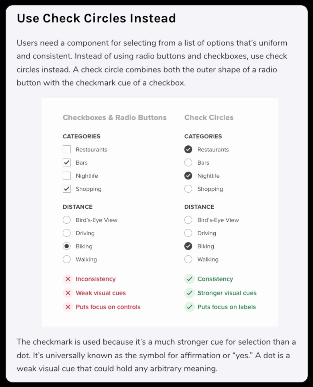
Checkbox "hack"
Custom Checkboxes / Radios
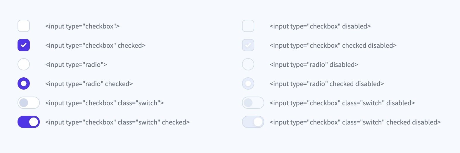
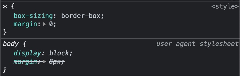
User Agent styles


UA styles
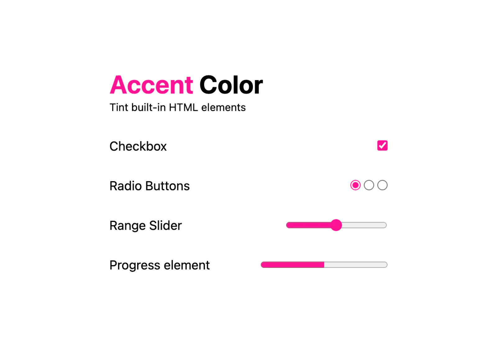
:root {
  accent-color: deeppink;
}doesn't work in Safari 💩
it does actually now (15.4) 🎊
but...
UA styles
form {
  accent-color: deeppink;
}Rule of Least Power
Customize
input {
  appearance: none;
  ...
}

/* Checked state */
input:checked::before {
  ...
}
Remove browser styles
Style custom checkmark with pseudo-elements
Helpful resources
Make it interesting
Reduces cognitive load
Make it interesting
Animated checkmark
Animated checkmark
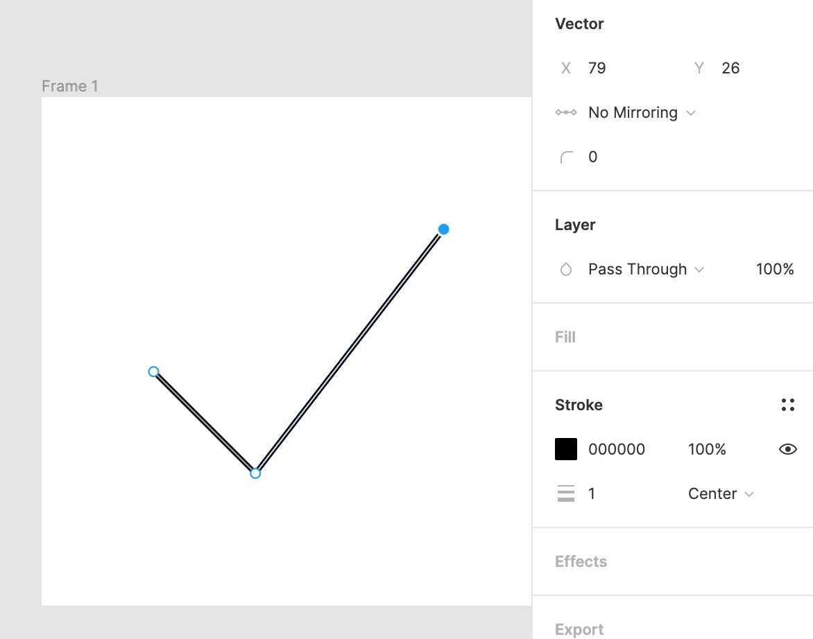
Preparing an SVG in Figma / Illustrator / XD
Animated checkmark
Animated checkmark
Animated checkmark
Resources
Task 2 (optional)
Craft your own form design
- Style the form elements in your video game form
- Style the different states with the corresponding pseudo-classes
- Customize your form controls (e.g. radio, checkbox, etc)

Default:
:focus
Buttons
Custom checkboxes and radio buttons
:invalid
:disabled
Craft your own form design
Craft your own form design
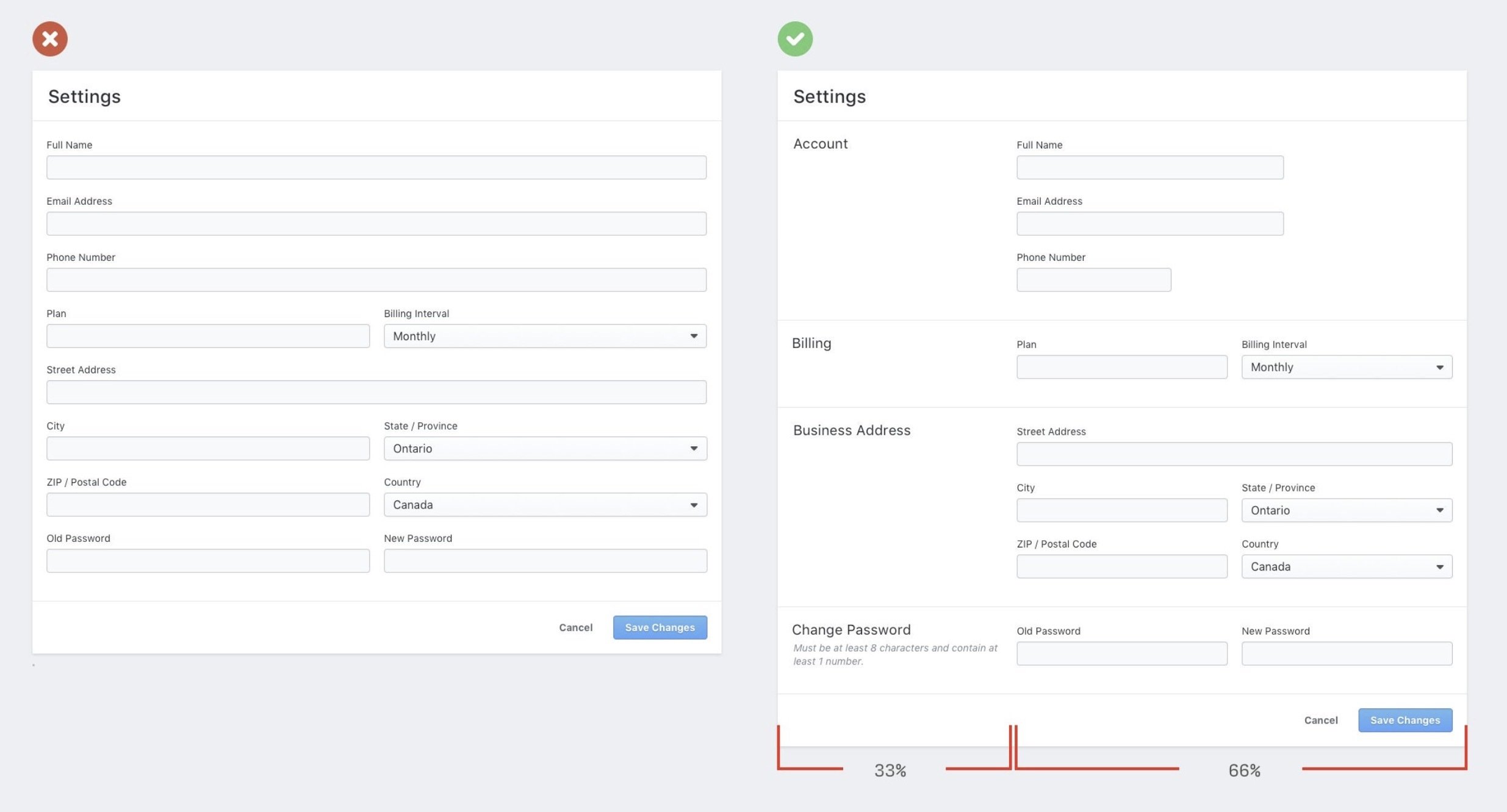
Style organization
reset
Style organization
form,
fieldset,
legend,
input,
button,
textarea,
select {
  margin: 0;
  padding: 0;
}

input,
button,
textarea,
select {
  font-family: inherit;
  font-size: max(16px, 1em);
}

button {
  appearance: none;
  border: 1px solid;
  background: transparent;
  cursor: pointer;
}

input[type="text"],
input[type="email"],
textarea {
  appearance: none;
  border: 1px solid;
  background: transparent;
}
reset
Origin
Style organization
Your styles (Author styles)
0,0,0
0,0,1
🤷♂️
Cascade layers
Cascade layers
@layer reset {
  /* ... other reset rules */

  input[type="text"] {
    border: 1px solid gray;
  }
}

@layer components {
  /* ... other component rules */

  .my-input {
    border: 4px solid blue;
  }
}
order matters
Cascade layers
@layer reset, components, utilities;


@layer reset {
  /* ... other reset rules */

  input[type="text"] {
    border: 1px solid gray;
  }
}

@layer components {
  /* ... other component rules */

  .my-input {
    border: 4px solid blue;
  }
}
configure up front
1
2
3
Cascade layers
@layer reset, components, utilities;


@layer components {
  /* ... other component rules */

  .my-input {
    border: 4px solid blue;
  }
}

@layer reset {
  /* ... other reset rules */

  input[type="text"] {
    border: 1px solid gray;
  }
}
configure up front
1
2
3
Cascade layers
@layer reset, components, states;

@layer components {
  /* Buttons, inputs etc. */
}

@layer states {
  /* Make sure stats override, no matter specificity count */
  :disabled {
    background-color: #ddd;
    color: #999;
  }

  :focus-visible {
    outline: 2px solid var(--focus-color, currentColor);
    outline-offset: 2px;
  }
}
A sensible CSS reset
Default styling
:root {
--theme-color: 258 29% 43%;
--accent-color: 180 50% 43%;
}
input {
font-family: inherit;
font-size: max(16px, 1em);
padding: 0.25em 0.5em;
background-color: #fff;
border: 2px solid hsl(var(--theme-color));
}
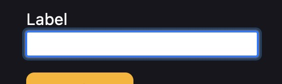
input:is(:focus-visible, :hover) {
border-color: hsl(var(--accent-color));
}A sensible CSS reset
Default styling
input:is([type="checkbox"], [type="radio"]) {
  appearance: none;
  /* custom styling */
}
A sensible CSS reset
Or with accent-color
form {
  accent-color: var(--theme-color, hotpink);
  /* checkbox, radio, progress, range etc. */
}
A sensible CSS reset
Form layout
form {
  display: grid;
  gap: 1.5rem;
}

.form-group {
  display: grid;
  gap: .3125rem;
}
form {
  display: flex;
  flex-wrap: wrap;
  gap: 1rem;
}

form > input {
  flex: 1 1 10ch;
}

input[type="email"] {
  flex: 3 1 30ch;
}.container {
container-type: inline-size;
}
@container (width > 25rem) {
.newsletter { ... }
}
Extensions
axe Accessibility Linter

Error Lens
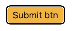
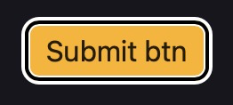
Buttons
Differentiate between primary and secondary buttons
Buttons
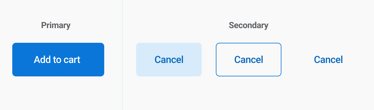
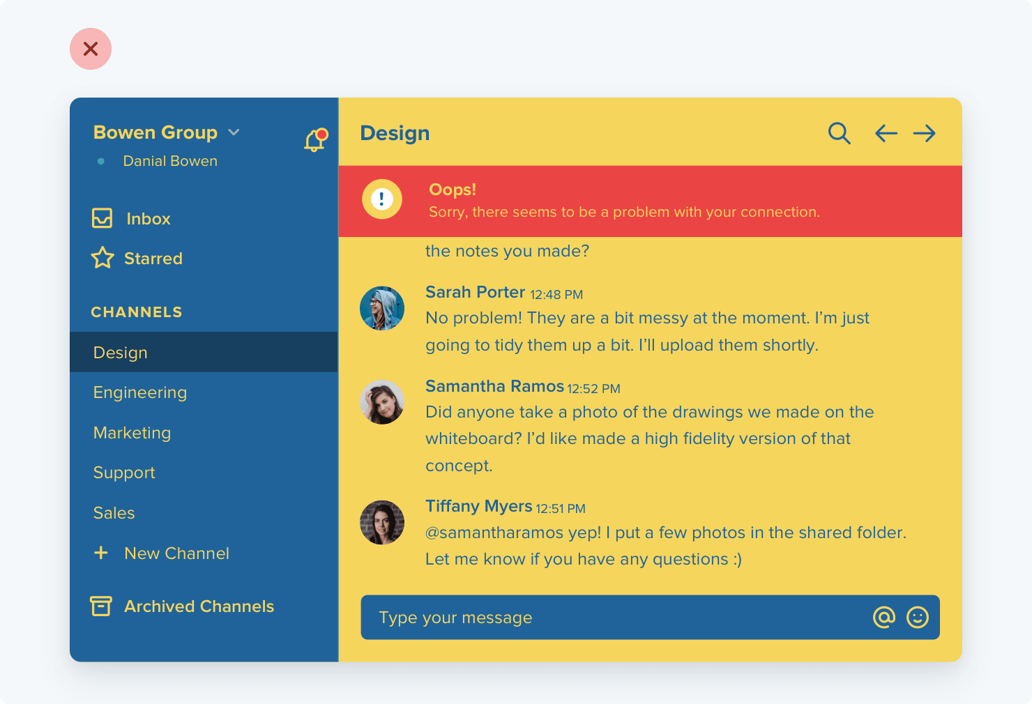
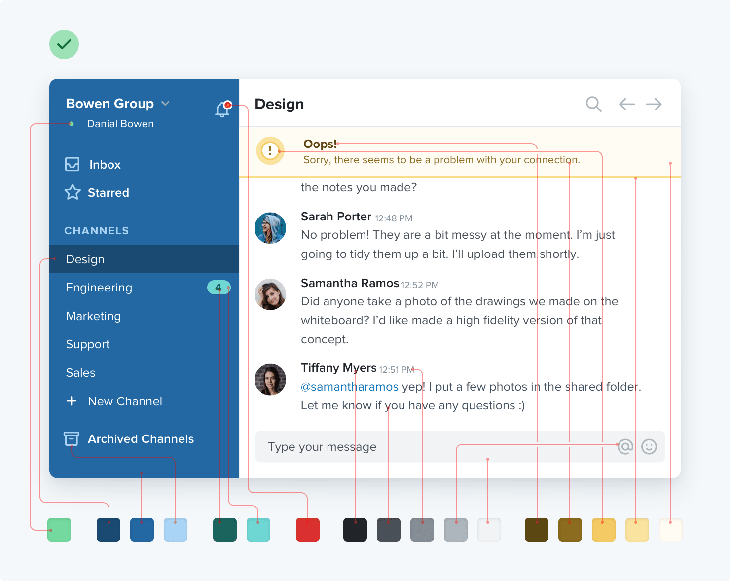
User Interface
Make your form look & feel nice
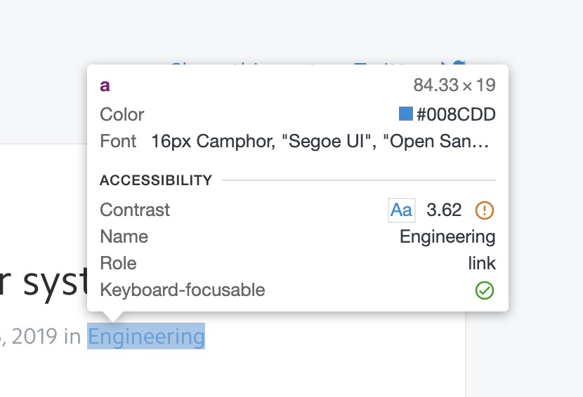
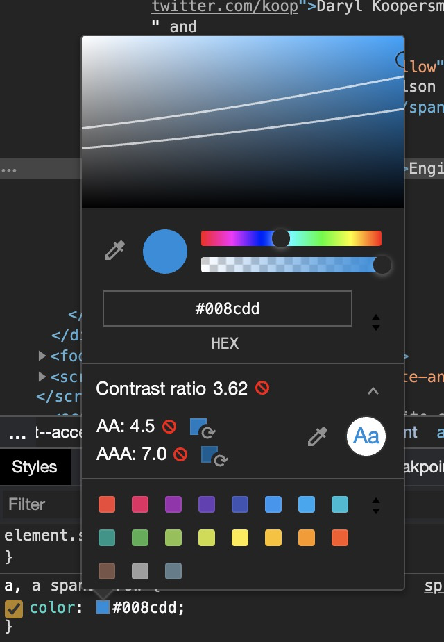
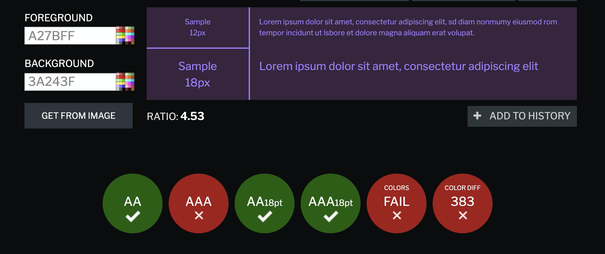
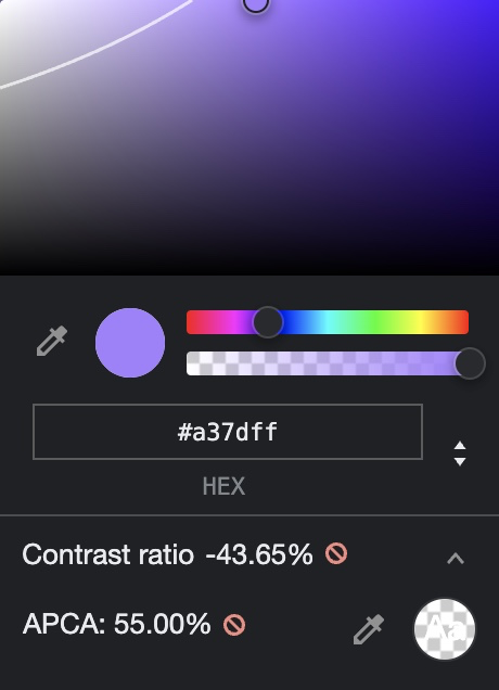
Contrast
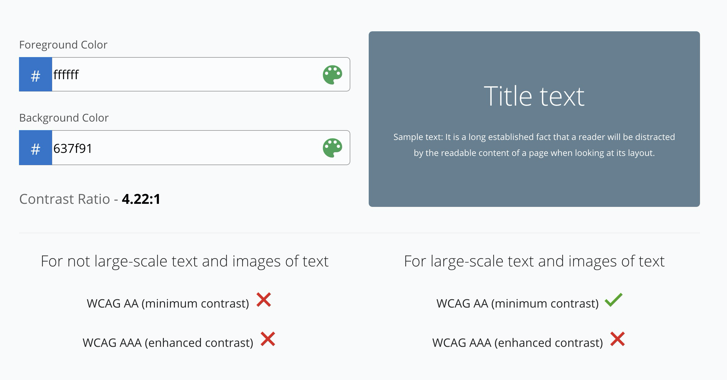
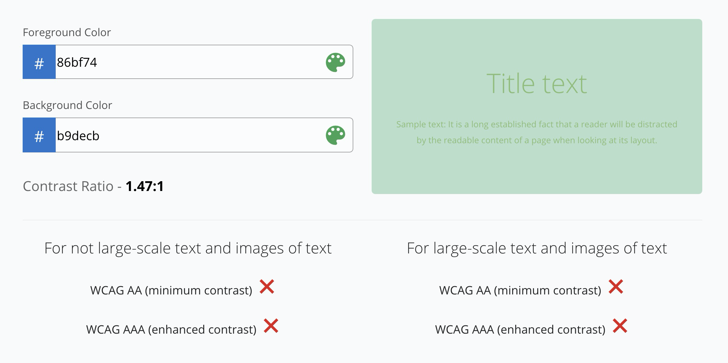

Too many websites are too hard to read for too many people
Contrast
Contrast
Contrast
Contrast
Contrast


Contrast
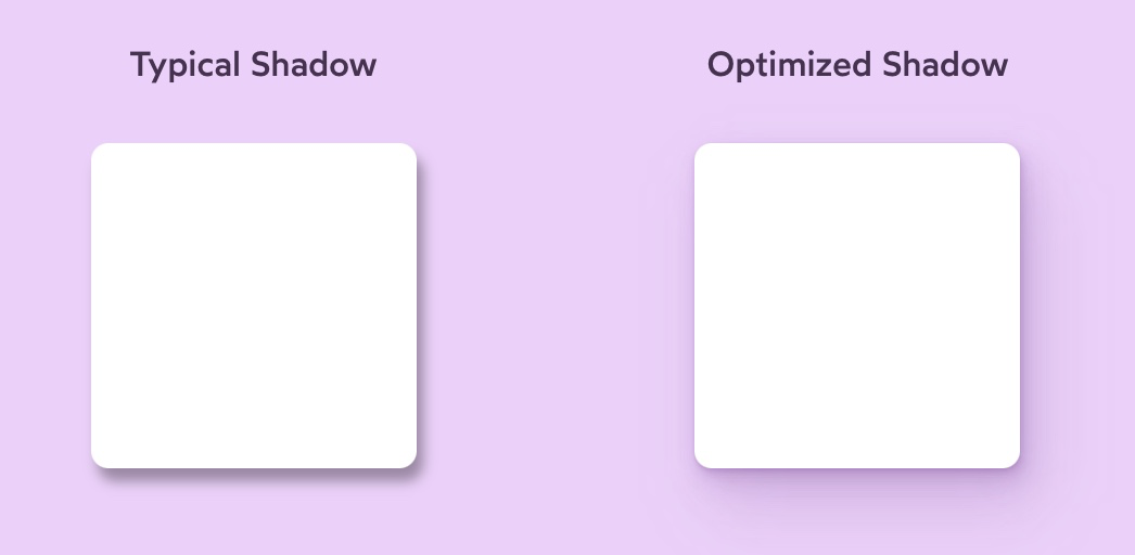
DevTools
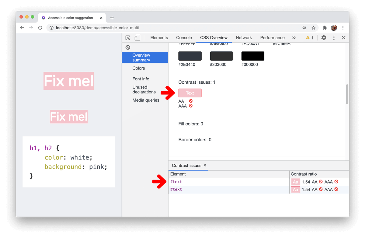
DevTools
DevTools
Resources

Layout & style

Layout & style

Tiny helpers
Line Height
@media (prefers-color-scheme: dark) {
  /* Dark styles */
}
Dark mode
html {
  --background-color: #222;
  --foreground-color: #fafafa;
}

@media (prefers-color-scheme: dark) {
  html {
    --background-color: #fafafa;
    --foreground-color: #222;
  }
}

body {
  background-color: var(--background-color);
  color: var(--foreground-color);
}
Dark mode

@media (prefers-color-scheme: dark) {
  /* Dark styles */
}
Dark mode
Color palette
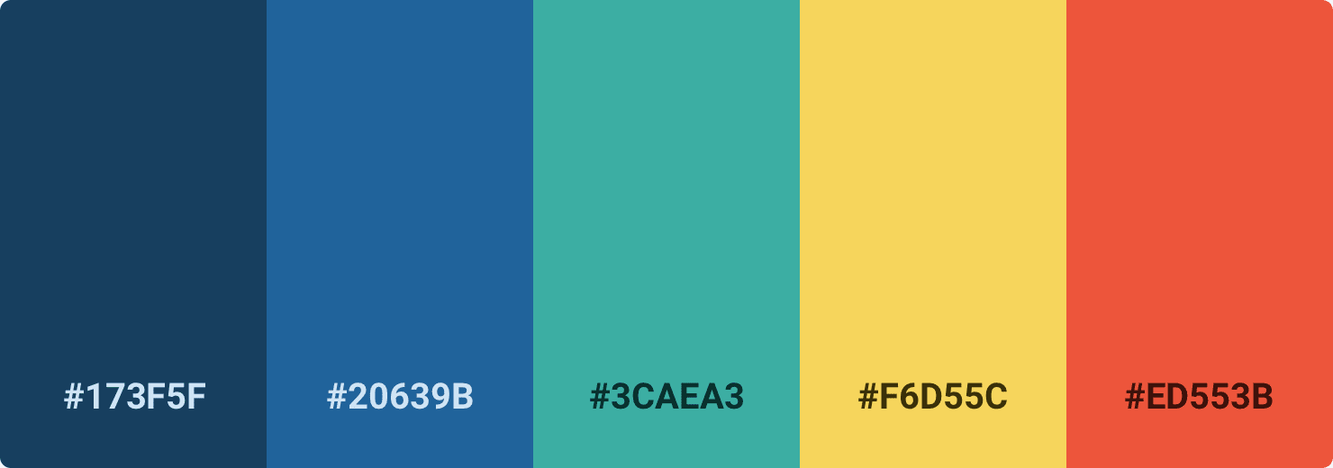
Color palette
💩
Color palette
💩
Color palette
Color palette
Color palette
Color palette