TailwindCSS
3. semester
The Cascade
En React-udvikler
Tailwind CSS
Løsning
(næsten)
Tailwind CSS
Utility-framework
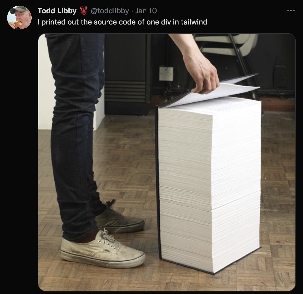
- Ét stort stylesheet (opinionated)
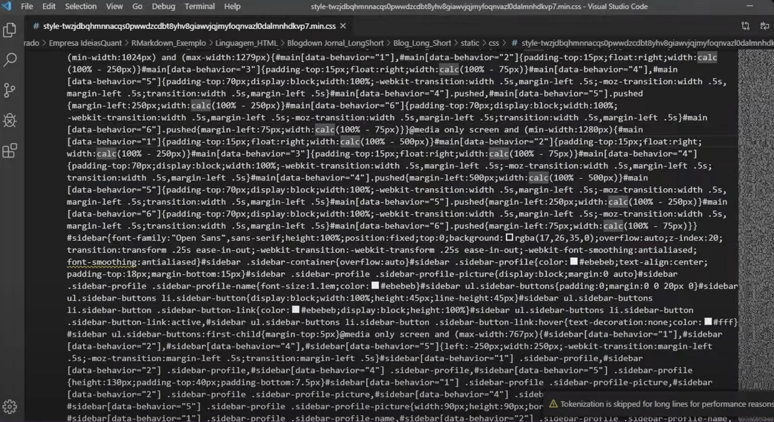
- Men fjerner ubenyttet CSS (~10kB)
- Mobile- og utility-first (hjælpeklassser)
- Selv-dokumenterende (cirka)
- Kan konfigureres
har truffet mange valg på forhånd, så du slipper for at konfigurere alting selv
Tailwind CSS
Lad os prøve

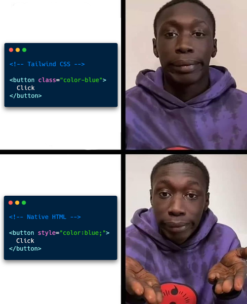
Er det ikke bare inline-style?
🤪
Bliver min HTML ikke uoverskuelig?
🤪
Flytter jeg ikke bare mængden af kode fra et stylesheet til HTML?
🤪
Hvorfor Tailwind?

Hvem bruger
Tailwind CSS?

Flytter jeg ikke bare mængden af kode fra et stylesheet til HTML?
🤪
Constraints & consistency
👏🏻
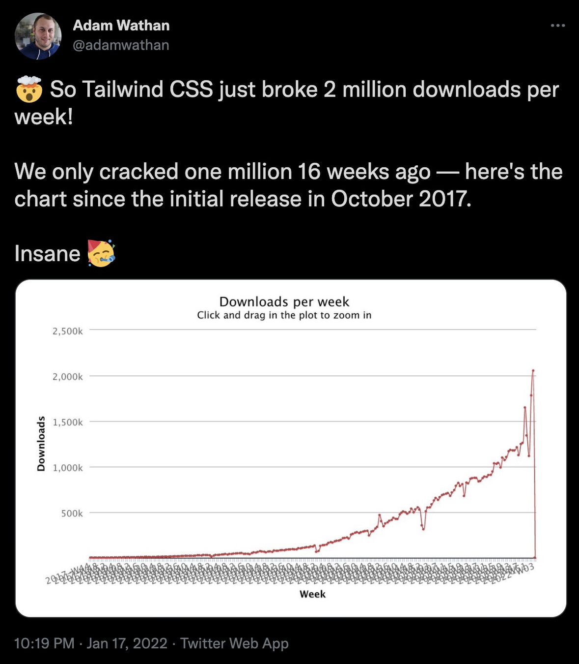
Performance
👏🏻
The hardest thing about programming is naming stuff!
Bedste argument
👏🏻
Tailwind CSS
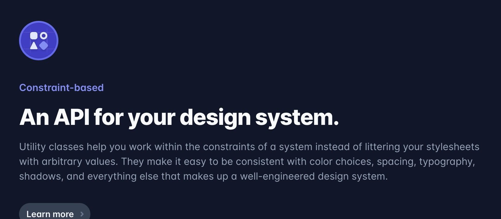
<section>
  <svg>...</svg>

  <h2>Constraint-based</h2>

  <p>An API for your design system.</p>

  <p>Utility classes help you work within the constraints...</p>
...
Hvilke HTML-tags ser I?
<section>
  <svg>...</svg>

  <h2>Constraint-based</h2>

  <p>An API for your design system.</p>

  <p>Utility classes help you work within the constraints...</p>
...
"kicker"
Semantik først
<section>
  <svg>...</svg>

  <h2>Constraint-based</h2>

  <p class="text-4xl font-extrabold">An API for your design system.</p>

  <p>Utility classes help you work within the constraints...</p>
...
"kicker"
Semantik først

Hvorfor Tailwind?
I virkeligheden
- Fordi CSS er svært
- For at afspejle branchen
- Det er en industri standard
- Det er performant
- Det gør det "let" at have consistency
- "Det er sjovt" — citat Jonas
Lad os dykke ned...
RTFM

Opgave
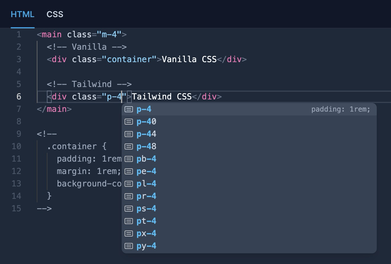
Fra CSS til Tailwind og tilbage igen
Oversæt CSS til Tailwind, så et tilsvarende HTML-element får samme styling. Og omvendt.
Layout i Tailwind CSS
øvelse
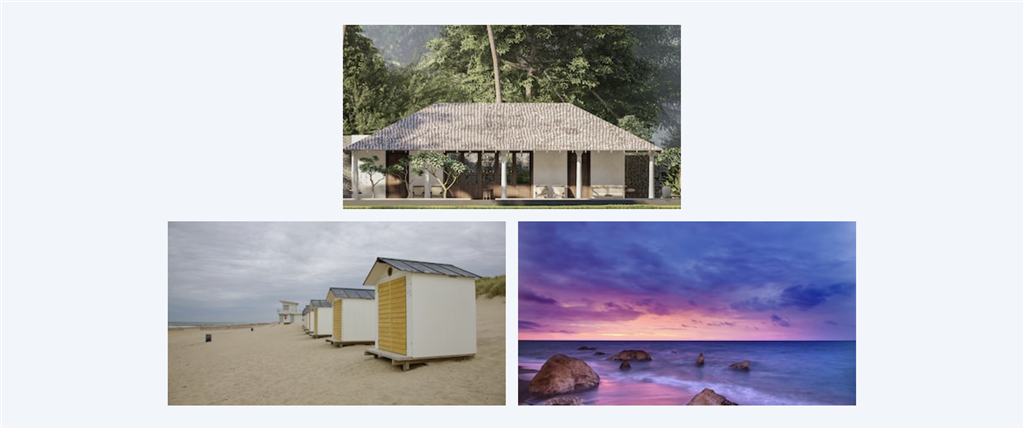
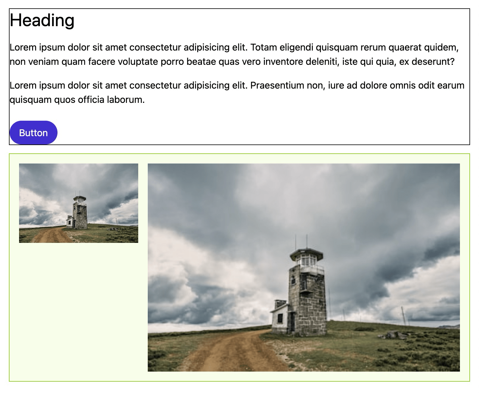
Style med Tailwind CSS
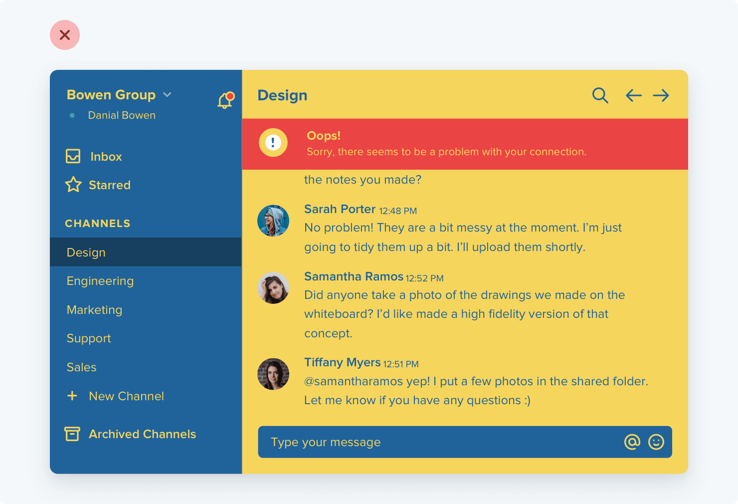
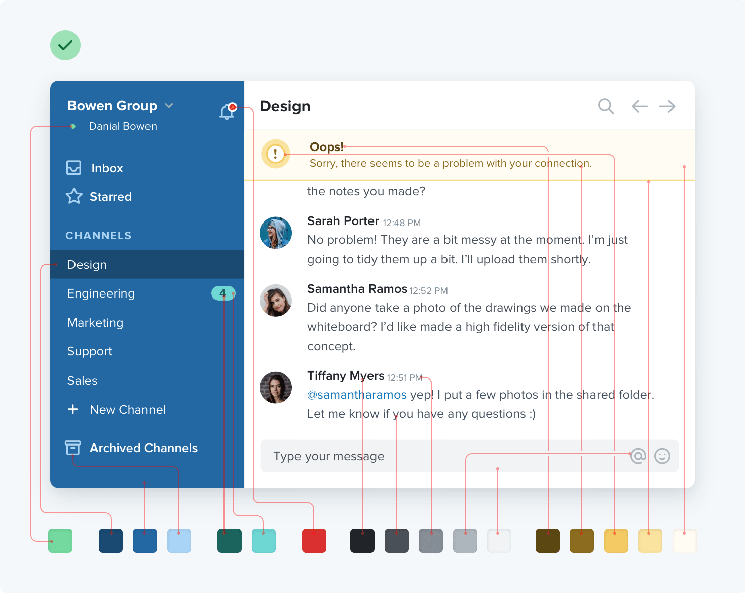
Genskab følgende design med TailwindCSS. Det skal ikke være 100 % én til én, men så tæt på, som muligt.

bg-slate-900
bg-blue-500
text-blue-200
Lad den forblive åben...
Dark Mode
øvelse
Dark Mode-klasser
Byg videre på øvelsen. Brug dark-præfiksen,
så kortet har en "dark mode"-variant. Du vælger selv, hvordan den skal se ud.
...fortsat...

Responsive Design
øvelse
Breakpoints i Tailwind CSS
Genskab følgende design med TailwindCSS. Det skal ikke være 100 % én til én, men så tæt på, som muligt.
Arbitrary stuff
Arbitrary values & variants
Genskab flow-space mm.
Arbitrary values & variants
<section class="space-y-[1.3rem] bg-[#bada55]">
  <h2 class="text-[3rem] text-(color:--my-var)">Constraint-based</h2>
  <p class="text-(length:--my-var)">An API for your design system.</p>
</section>Skræddersy Tailwind
/** @type {import('tailwindcss').Config} */

export default {
  content: ["./index.html", "./src/**/*.{js,ts,jsx,tsx}"],
  theme: {
    extend: {},
  plugins: [],
};
Skræddersy Tailwind
/** @type {import('tailwindcss').Config} */

export default {
  content: ["./index.html", "./src/**/*.{js,ts,jsx,tsx}"],
  theme: {
    extend: {},
  plugins: [],
};
Tailwind Config
/** @type {import('tailwindcss').Config} */

export default {
  content: ["./index.html", "./src/**/*.{js,ts,jsx,tsx}"],
  theme: {
    extend: {},
  plugins: [],
};
Følg med på https://play.tailwindcss.com/
@import "tailwindcss";

@theme {
  /* ... */
}
Tailwind Config
@import "tailwindcss";
@theme {
--color-custom: #5000ca;
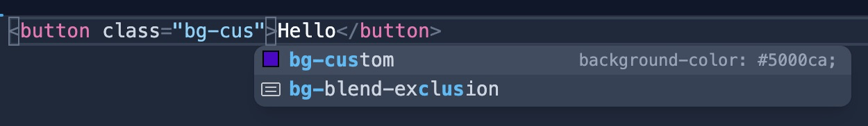
}Tailwind Config
Fjerner alle farver
@import "tailwindcss";

@theme {
  --color-*: initial;
  --color-custom: #5000ca;
}
Tailwind Config
Tailwind Config
Tokens
colors
@import "tailwindcss";
@theme {
--color-*: initial;
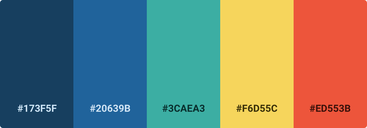
--color-primary-dark: #173f5f;
--color-primary-light: #20639b;
--color-secondary: #3caea3;
--color-tertiary: #f6d55c;
--color-accent: #ed553b;
}
colors
colors
💩
colors
💩
colors
100
200
300
400
500
600
700
800
colors
100
200
300
400
500
600
700
800
colors
100
200
300
400
500
600
700
800
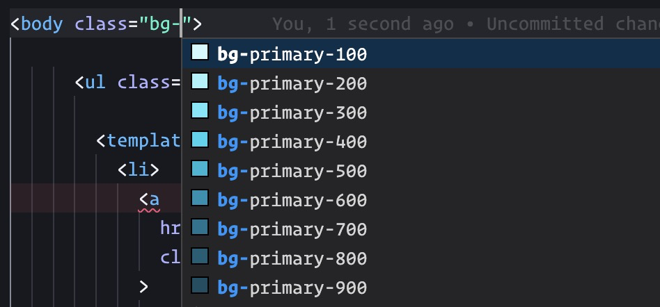
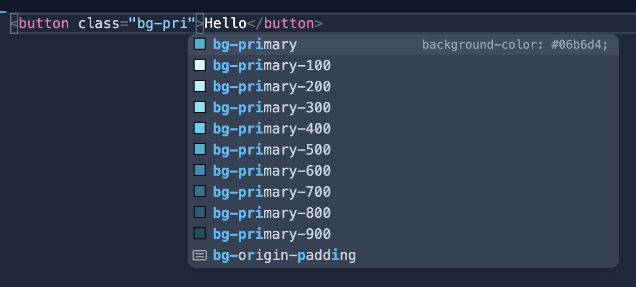
@import "tailwindcss";

@theme {
  --color-*: initial;
  --color-primary-100: #cffafe;
  --color-primary-200: #a5f3fc;
  --color-primary-300: #67e8f9;
  --color-primary-400: #22d3ee;
  --color-primary-500: #06b6d4;
  --color-primary-600: #0891b2;
  --color-primary-700: #0e7490;
  --color-primary-800: #155e75;
  --color-primary-900: #164e63;
  --color-primary: var(--color-primary-500);
}
colors
100
200
300
400
500
600
700
800
colors
100200300400500600700800colors
100200300400500600700800colors
200
500
800
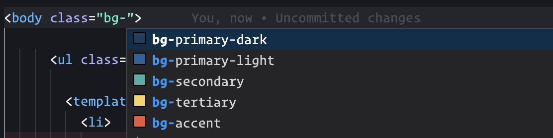
/** @type {import('tailwindcss').Config} */

export default {
  content: ["./index.html", "./src/**/*.{js,ts,jsx,tsx}"],
  theme: {
    colors: {
      // ...
      primary: {
        light: '#67e8f9',
        DEFAULT: '#06b6d4',
        dark: '#0e7490',
      },
      // ...
    },
    extend: {},
  plugins: [],
};
colors
@import "tailwindcss";

@theme {
  --color-*: initial;
  --color-primary-light: #67e8f9;
  --color-primary: #06b6d4;
  --color-primary-dark: #0e7490;
}
colors
@import "tailwindcss";

@theme {
  --color-*: initial;
  --color-primary-light: oklch(from var(--color-primary) calc(l * 1.2) c h);
  --color-primary: #06b6d4;
  --color-primary-dark: oklch(from var(--color-primary) calc(l * .8) c h);
}
colors
Aliases
@import "tailwindcss";
@theme {
--color-surface-1: var(--color-stone-50);
--color-heading: var(--color-stone-950);
--color-body: var(--color-stone-600);
--color-accent: var(--color-lime-400);
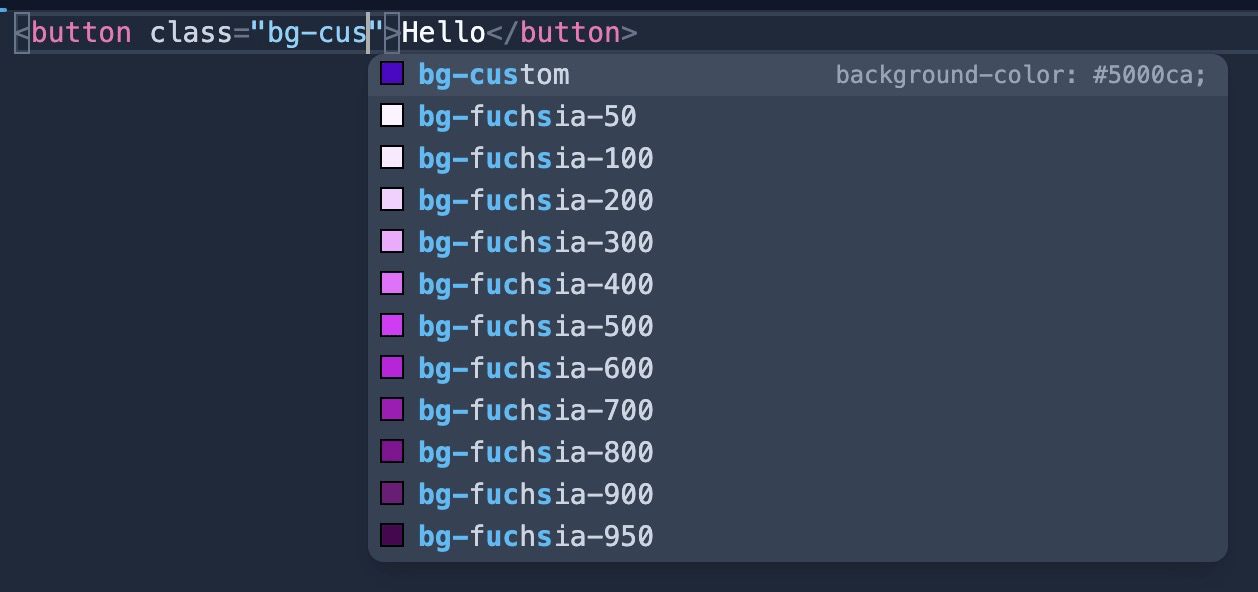
}<button class="bg-accent">Hello</button>
<div class="bg-surface-1">
<h2 class="text-heading">Hello</h2>
<p class="text-body">Lorem ipsum dolor sit amet.</p>
</div>Aliases
@import "tailwindcss";

@theme {
  --color-surface-1: var(--color-stone-50);
  --color-heading: var(--color-stone-950);
  --color-body: var(--color-stone-600);
  --color-accent: var(--color-lime-400);
}
<button class="bg-accent">Hello</button>
<div class="bg-surface-1">
<h2 class="text-heading">Hello</h2>
<p class="text-body">Lorem ipsum dolor sit amet.</p>
</div>Aliases w/ light-dark()
@import "tailwindcss";

@theme {
  --color-surface-1: var(--surface-1);
  --color-heading: var(--ink-2);
  --color-body: var(--ink-1);
  --color-accent: var(--color-lime-400);
}

:root {
  color-scheme: light dark;
  --ink-1: light-dark(var(--color-stone-600), var(--color-stone-200));
  --ink-2: light-dark(var(--color-stone-950), var(--color-stone-50));
  --surface-1: light-dark(var(--color-stone-50), var(--color-stone-800));
}
Toggling Dark Mode
@custom-variant dark (&:where([data-theme=dark], [data-theme=dark] *));øvelse
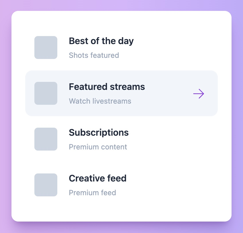
Tailwind List
Genskab følgende design med TailwindCSS. Det skal ikke være 100 % én til én, men så tæt på, som muligt. Lav også en mørk variant som kan toggles via knappen.