Behind the Illusions
Impossibly high-performance layout animations
.css .css__conf .css__conf--au .css__conf--au__2018 .css__conf--au__last
Manoela Ilic
Rachel Nabors
Lea Verou
Val Head


Early inspiration
loading...

- Escaping from CSS constraints
- Disappearing from browsers
- Reappearing in 5 years, maybe
CSS is magic
.disappear {
  display: none;
  visibility: hidden;
}
.midair {
float: left;
}.center-div {
position: absolute;
margin: auto;
top: 0;
right: 0;
bottom: 0;
left: 0;
width: 100px;
height: 100px;
}
.center-div p {
position: relative;
top: 50%;
transform: perspective(1px) translateY(-50%);
}
.container {
display: flex;
align-items: center;
justify-content: center;
height: 100vh;
}
.outer-div {
display: table;
position: absolute;
height: 100%;
width: 100%;
}
.mid-div {
display: table-cell;
vertical-align: middle;
}
.center-div {
margin: 0 auto;
width: 300px;
height: 100px;
}Illusions, not hacks
Animating position
Animating size
Animating gradients
Animating on curves
Animating border-radius
without top/right/bottom/left
without width/height
without color
without motion/offset path
without ... fear
60FPS
- Avoid layout (use transform)
- Avoid repaint (use opacity)
- Avoid being dogmatic (measure!)

FLIP
Invert
Last
First
Play
First
const box = document.querySelector('#box');

const first = box.getBoundingClientRect();

// {
//   top: 400,
//   left: 100,
//   width: 200,
//   height: 200,
//   ...
// }
A
Last
// ... execute change

const bigBox = document
  .querySelector('#big-box');

const last = bigBox.getBoundingClientRect();

// {
//   top: 0,
//   left: 0,
//   width: 500,
//   height: 500,
//   ...
// }
B
Invert
100px
400px
- deltaX = last.left - first.left = 100
- deltaY = last.top - first.top = 400
- deltaW = first.width / last.width = 0.4
- deltaH = first.height / last.height = 0.4
0.4
0.4
const deltaX = first.left - last.left;
const deltaY = first.top - last.top;
const deltaW = first.width / last.width;
const deltaH = first.height / last.height;
B
Play
// WAAPI

bigBox.animate([
  {
    transformOrigin: 'top left',
    transform: `
      scale(deltaW, deltaH)
      translate(deltaX, deltaY)
    `
  },
  {
    transformOrigin: 'top left',
    transform: 'none'
  }
], {
  duration: 300,
  easing: 'ease-in-out',
  fill: 'both'
});
const parentDelta = // ...
const childDelta = // ...
const relativeDelta = {
top:
childDelta.top - parentDelta.top,
left:
childDelta.left - parentDelta.left,
...childDelta
};FLIP-FLOP
THONG
First last invert play
& first last outer play
Transform hierarchies of nested groups
CSS Patterns
Predictable layout
.mostly-everything {
  box-sizing: border-box;
}
.maybe-everything {
position: relative;
}* {
box-sizing: border-box;
position: relative;
}
Smooth easings
.enter {
  animation-timing-function:
    cubic-bezier(0, .5, .5, 1);
}
.move {
animation-timing-function:
cubic-bezier(.5, 0, .5, 1);
}.exit {
animation-timing-function:
cubic-bezier(.5, 0, 0, 1);
}Layered grids
.some-layer {
/* define the grid */
display: grid;
grid-gap: 10px;
grid-template-rows: auto 300px;
grid-template-columns: 3fr 1fr;
grid-template-areas:
'🤔 🤔'
'🤷♀️ 🍺'
'👞 👞';.some-layer {
/* position the layer */
position: absolute;
height: 100%;
width: 100%;
top: 0;
left: 0;
}Background elements
.background {
  /* layer it */
  position: absolute;
  height: 100%;
  width: 100%;
  top: 0;
  left: 0;
.background {


  /* style it */
  background-color: var(--bg, transparent);
  border-radius: inherit;
}
🤔 Can also be a pseudoelement
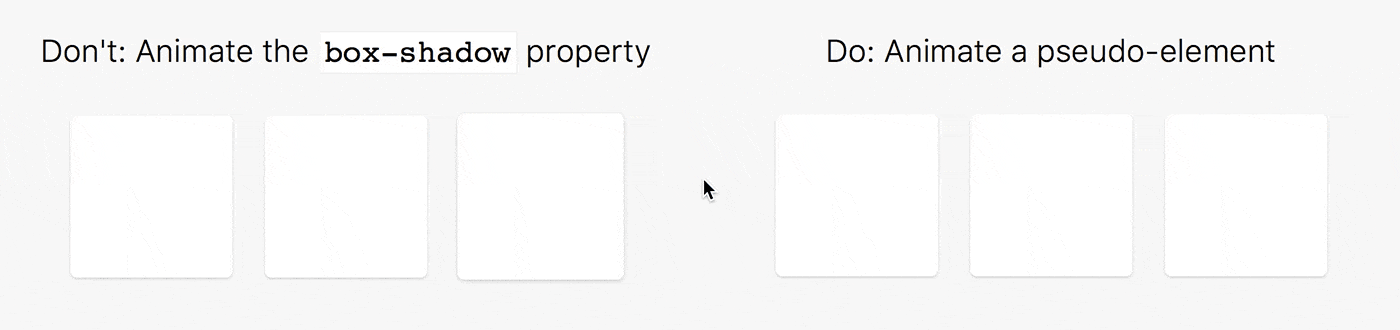
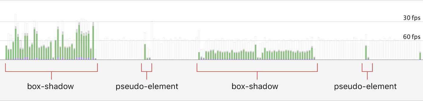
Shadow elements
.background:before {
  content: '';

  /* layer it */
  position: absolute;
  height: 100%;
  width: 100%;
  top: 0;
  left: 0;

  /* style it */
  box-shadow:
    0 .5rem 1rem rgba(0, 0, 0, 0.1);
  opacity: 1;
}
Finite state machines
[data-state="loading"]
Let's Get STarted
Animating Border-Radius
Border radius transitions
Scaling element = scaling radius 😞
Animate width + height? 🤔
Animate border-radius! 😅
It's okay. Measure!
X radius = first X radius ✖ width ratio (e.g., 2)
Y radius = first Y radius ✖ height ratio (e.g., 1.5)
@keyframes flip-border {
  from {
    border-top-left-radius:
      8rem 6rem;
    border-top-right-radius:
      8rem 6rem;
    border-bottom-left-radius:
      8rem 6rem;
    border-bottom-right-radius:
      8rem 6rem;
  }
  to {
    border-radius: 4rem;
  }
}
Border radius transitions
Curved Motion Paths
Inverse rotations
.wrap { // container
  transform-origin: 0 -20vmin; // 𝚫y
  animation: wrap-curve 1s;
  will-change: transform;
}
@keyframes wrap-curve {
  from { transform: none; }
  to { transform: rotate(-90deg); }
}
.box { // layer
animation: box-curve 1s;
will-change: transform;
}
@keyframes box-curve {
from { transform: none; }
to {
transform:
rotate(90deg)
translateX(20vmin); // 𝚫x - 𝚫y
}
}𝚫y
𝚫y
𝚫x
𝚫y - 𝚫x
insert codepen
Source: codepen.io/shshaw/pen/pWwrmM
Expand & Collapse
Height and width
Just don't. Please.
⚠️ Triggers layout & many developers
.sinful-layout-animation {
  transition: height .3s ease-in-out;

  // contain the layout to let the browser know
  // that height changes are isolated
  contain: layout;
}
If you must...
🏳
🏳
Scale & inverse scale
.parent {
  transform-origin: top left;
  transform: scale(2);
}

.child {
  transform-origin: top left;
  transform: scale(.5);
}
⚠️ Requires a lot of JS for non-linear easings
⚠️ Can't animate to zero height or width
Sliding layers
.parent {
  overflow: hidden;
  transform: translate(-50%, -50%);
}

.child {
  transform: translate(50%, 50%);
}
⚠️ Requires a lot of elementary-level math
Clip-path
@keyframes clip-flip {
  from {
    clip-path: polygon(
      20% 20%,
      80% 20%,
      80% 80%,
      20% 80%
    );
  }
  to {
    clip-path: polygon(
      0% 0%,
      100% 0%,
      100% 100%,
      0% 100%
    );
  }
}
⚠️ Triggers repaint
Introducing Flipping
<div data-flip-key="box-1"><div data-flip-key="box-1">const flipping = new Flipping();
// before a layout change happens
flipping.read();
// something that changes layout
selectPhoto();
// after a layout change happens
flipping.flip();const flipping = new Flipping();
const flippingSelectPhoto =
flipping.wrap(selectPhoto);
// read and flip!
flipppingSelectPhoto();Flipping quick start
- Selects:
- Currently visible "flip" elements
- or a custom active selector:
new Flipping({
  activeSelector:
    el => el.matches('.active *')
});Flipping v1
npm install flipping --save
yarn add flipping --saveflipping.onFlip('some-key', state => {
console.log(state);
state === {
type: 'MOVE',
key: 'some-key',
element: // flipped element,
bounds: {
top: 100,
left: 10,
width: 250,
height: 135,
// ...
},
delta: {
top: 10, // moved 10px up
left: -20, // moved 20px right
width: 2, // increased width 2x
height: 1, // height unchanged
// ...
},
animation: // current animation
index: 3,
previous: // previous state
start: // start time
parent: // parent state
data: // ...
};
});- But there is power in animation
- The power to create experiences that go beyond mere linked documents
- The power to immerse users in an illusion of life.
Thank You CSSConf AU!
- Animating the Unanimatable - Joshua Comeau
- FLIP your Animations - Paul Lewis
- Pixels are Expensive - Paul Lewis
- Improving User Flow Through Page Transitions - Luigi de Rosa
- Smart Transitions in User Experience Design - Adrian Zumbrunnen
- What Makes a Good Transition? - Nick Babich
- Motion Guidelines in Google's Material Design
- Shared Element Transition with React Native
Resources