design principles
Typography
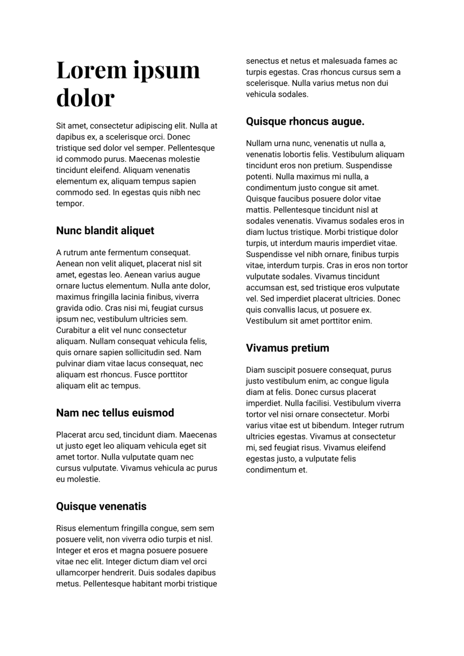
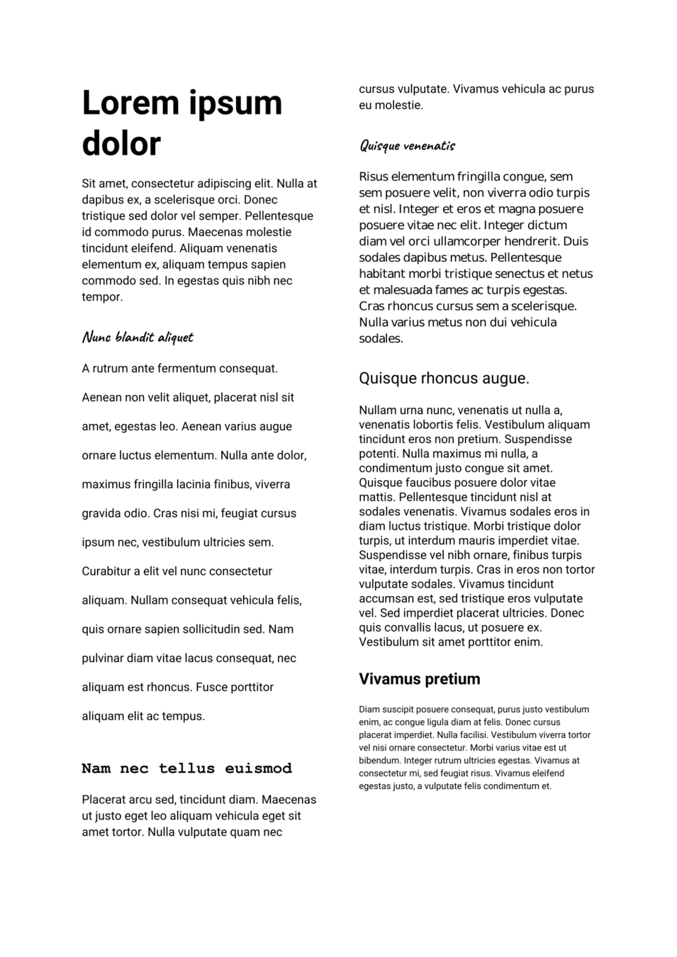
How understanding typography & hierarchy can help you better convey information
Font families
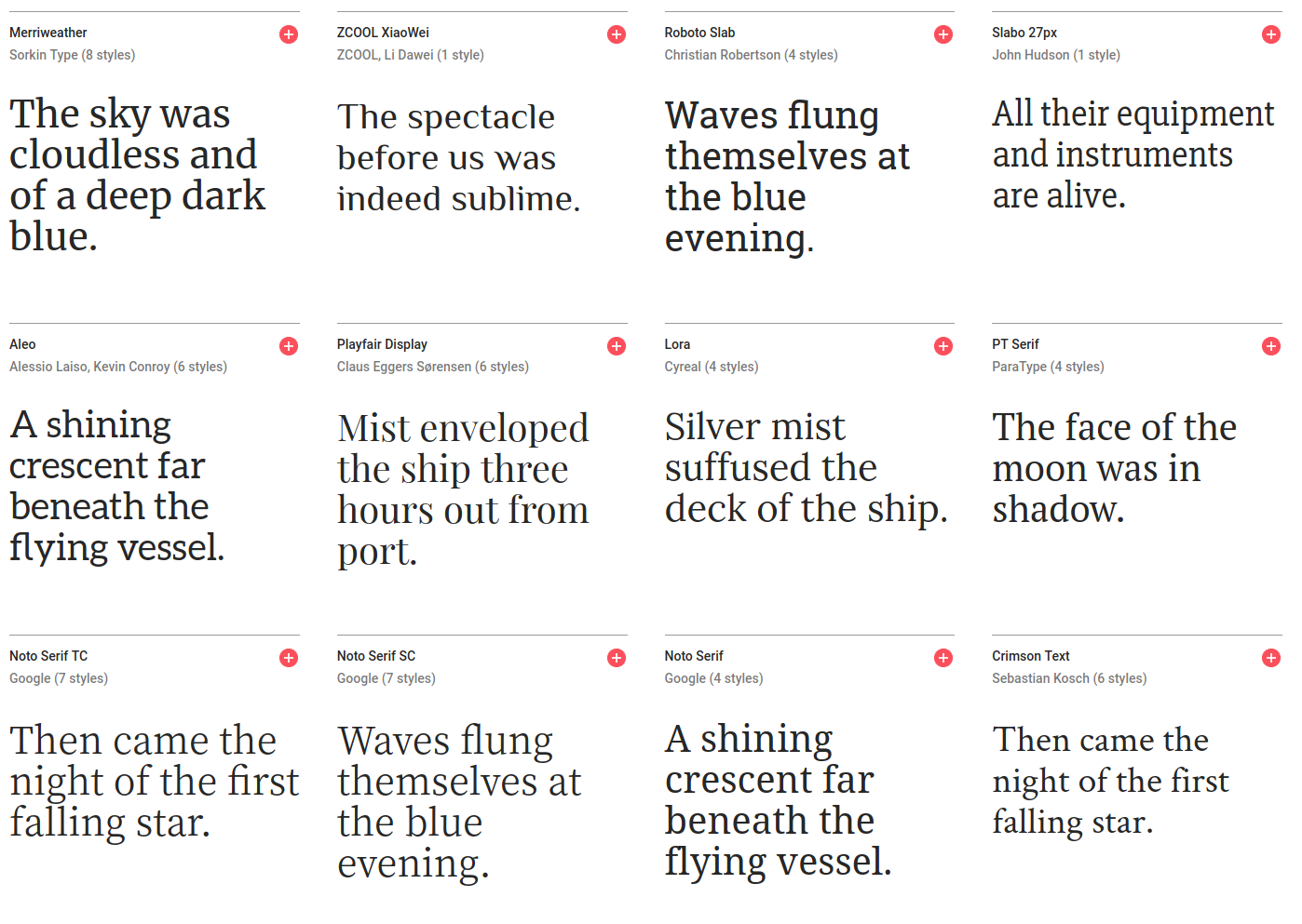
Serif
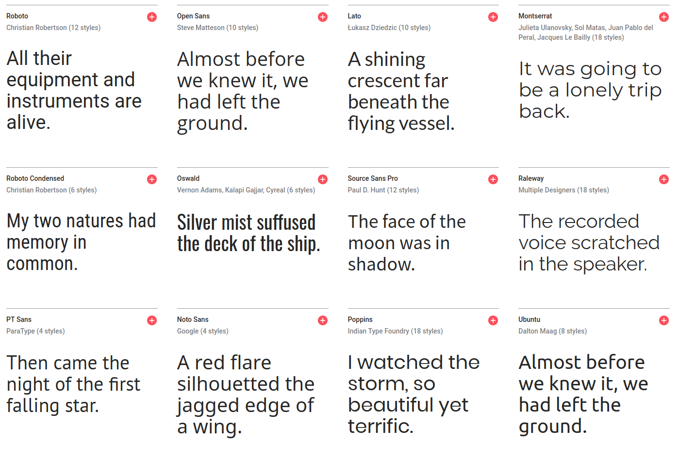
Sans-serif
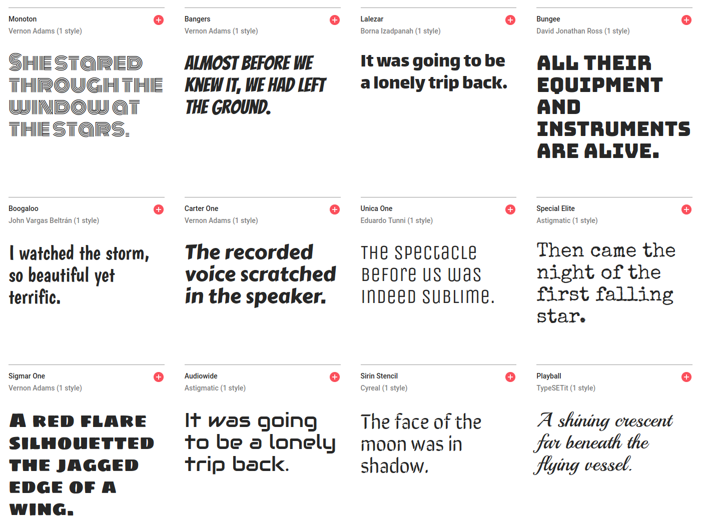
Display
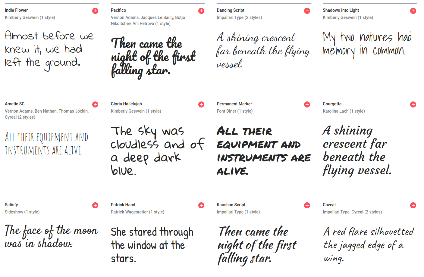
Script
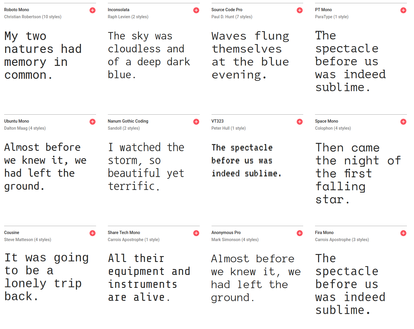
Monospaced
Weights
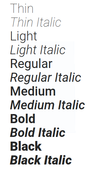
different weights for different emphasis
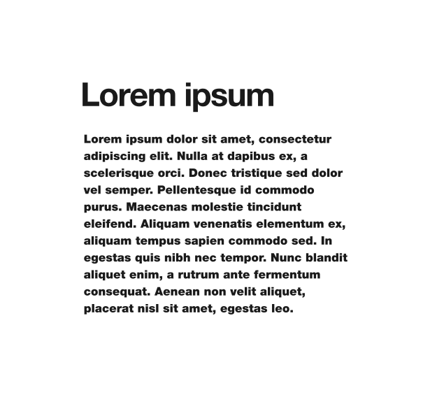
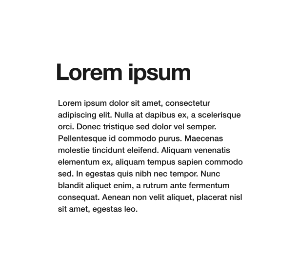


Alignment
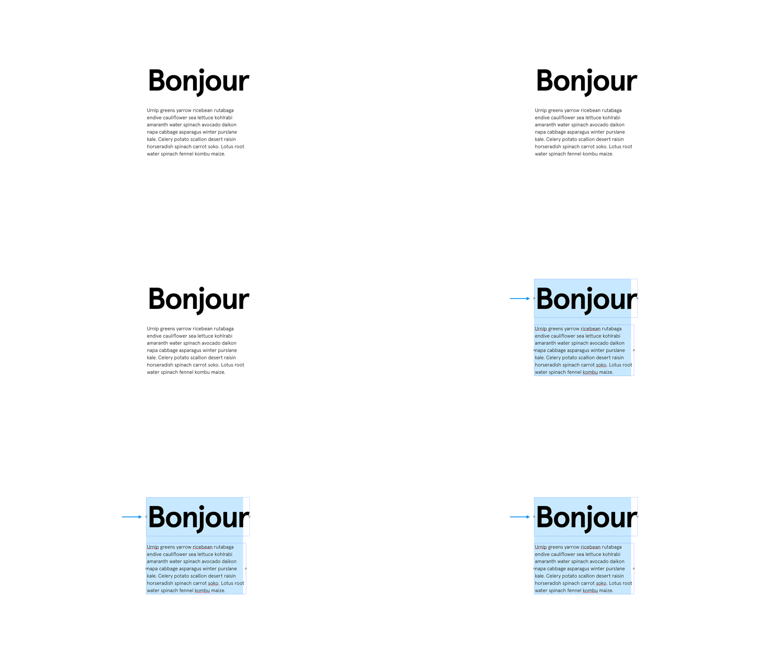


Spacing

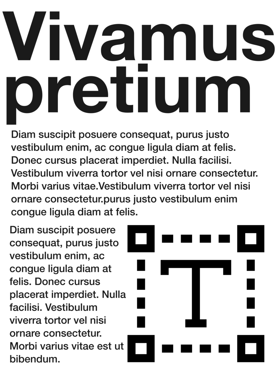
Kerning is the space between letters.
Sometimes, just subtle adjustment can make a whole difference




Don't be afraid
Of adjusting the letter spacing, specially when using headers and titles. Usually, it's necessary !
Don't be afraid
Of adjusting the letter spacing, specially when using headers and titles. Usually, it's necessary !
Sometimes, you can use the extra spacing for a dramatic
EFFECT
specially when going full caps on your titles
Sometimes, you can use the extra spacing for a dramatic
EFFECT
specially when going full caps on your titles
Lorem ipsum dolor sit amet, consectetur adipiscing elit. Nulla at dapibus ex, a scelerisque orci. Donec tristique sed dolor vel semper. Pellentesque id commodo purus.
Lorem ipsum dolor sit amet, consectetur adipiscing elit. Nulla at dapibus ex, a scelerisque orci. Donec tristique sed dolor vel semper. Pellentesque id commodo purus.
Lorem ipsum dolor sit amet, consectetur adipiscing elit. Nulla at dapibus ex, a scelerisque orci. Donec tristique sed dolor vel semper. Pellentesque id commodo purus.
Too much !
Just righ
Too tight !
Big text usually needs the spacing to me manually adjusted
Big text usually needs the spacing to me manually adjusted
Justification
When in doubt, always justify left !
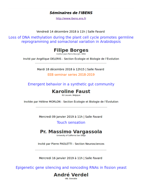

Consistency


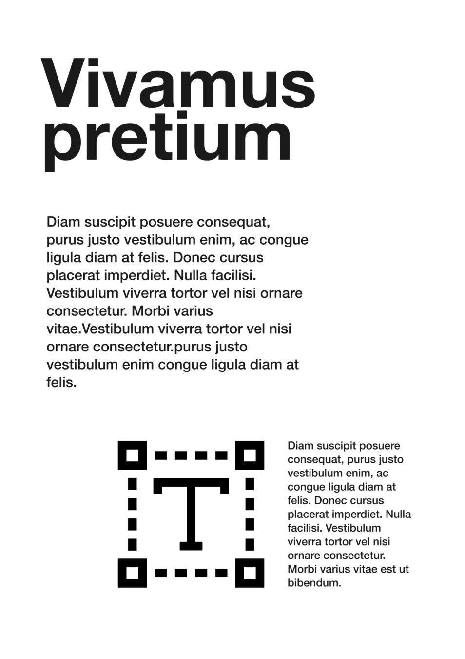
White space
