mock ups
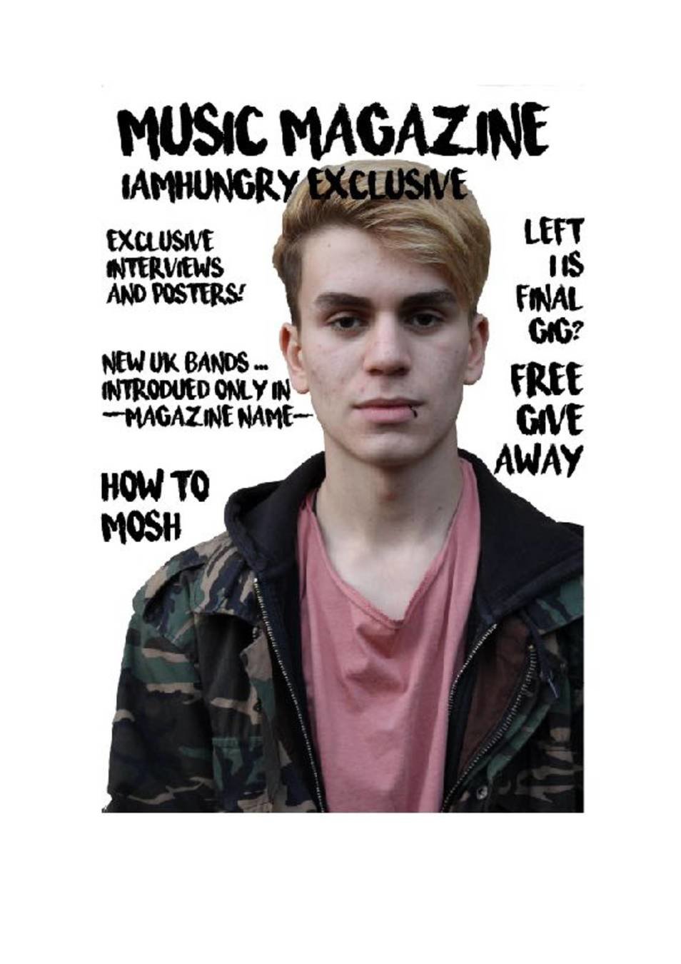
Front cover attempt 1:
I have followed the conventions of having a main image that is a medium close up of the main singer of the exclusive band
I have included a few of the main articles to gain interest.
By cutting out the person from the background it makes him less washed out and more clear
Next time I want to experiment with the background and see how that changes the affect of the image.
I would prefer to try different colour text on top of and around the image to see if it gives a less cluttered more thought out style.
Once I have worked out the name I will develop a logo. I also want to try the different fonts i have experimented with to see what different effects they make.
Due to the image having a bit of pink from the shirt, I may experiment with the uses of pink which could tie together the image and the text.
I will also try to experiment with different photos and use more photoshop to create different end results, editing and manipulating the images.
I believe this front cover is lacking creativity and they eye catching element. I am not sure if I like the text on the image (iamhungry exclusive) but i will try to experiment further with it.
construction
I first cut out the model using the magnetic lasso tool on photo shop. I then put the image onto pages to insert the text. I decided to put the text around the model like found in Q magazine etc. I didn't want it to cluttered and for my first test I didn't want to add to much colour.
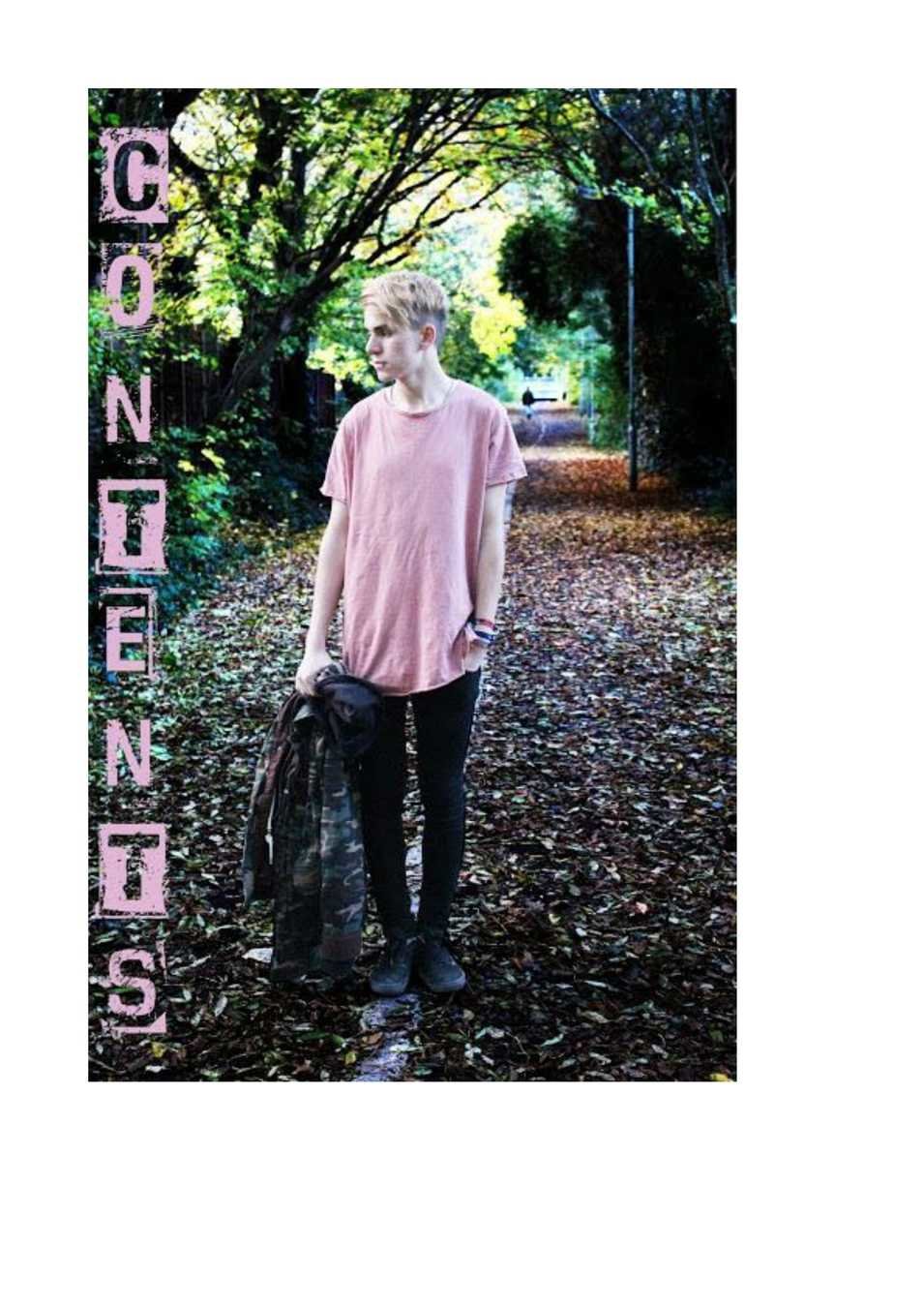
Contents attempt 1
I believe the contents is the simplest page to produce. I like having the text down the side as it is very clear.
This image doesn't have the real contents in however as it was to dark and bright in different places for the writing to work.- next time I will try to use a different image with a similar style
I like the edited background contrasting to the main image
The pink font works well with the image creating harmony between the image and text.
In my next contents page I am going to continue to use light and dark but also try different photos
construction
For this image I first edited the whole image, looking only at the background. I then created a path around the model cutting them out and reverting back to how they originally looked in the image and then making them even brighter than before. I then aded the text, letter by letter to create the downward lettering.
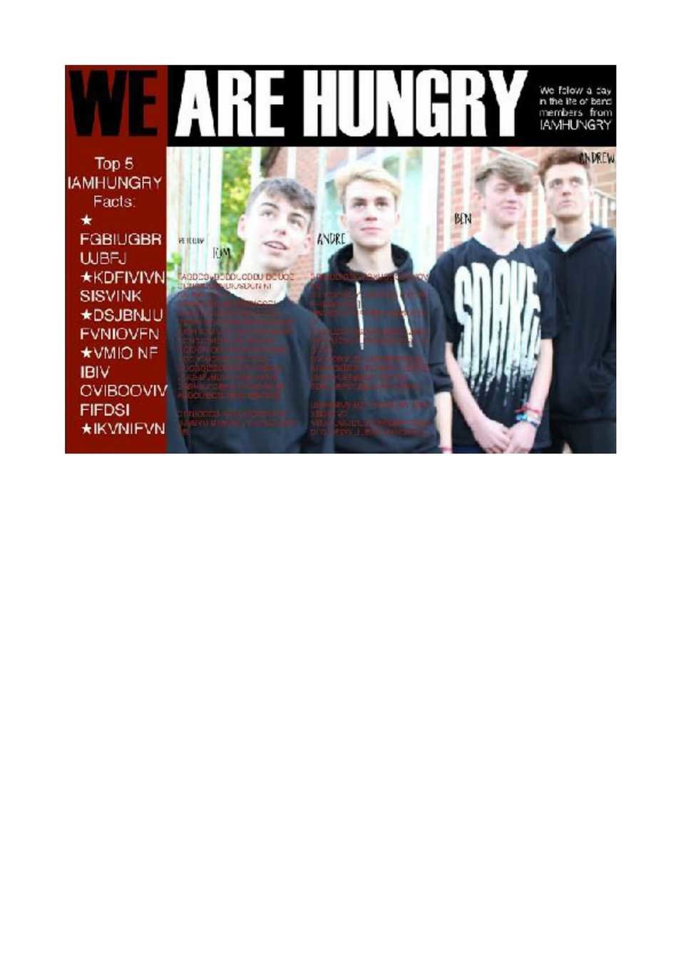
Double Page Attempt 1
I like the play on words
I don't like the blurred image and don't feel that works with text onto.
I like the colour change in the title with the change of background. However I don't feel red reprints the band and their style.
I like the label of each of the members
For the next magazine I am going to cut out the band and use an image where it represents them as a band and as individuals with laughter and jokiness.
Next time I am going to try a more open and bright look to draw the eye towards the page
construction
For this double page I first inserted the main image onto a pages document. I then added the two coloured rectangles as a border. After that I then added text creating catchy and punchy lines.
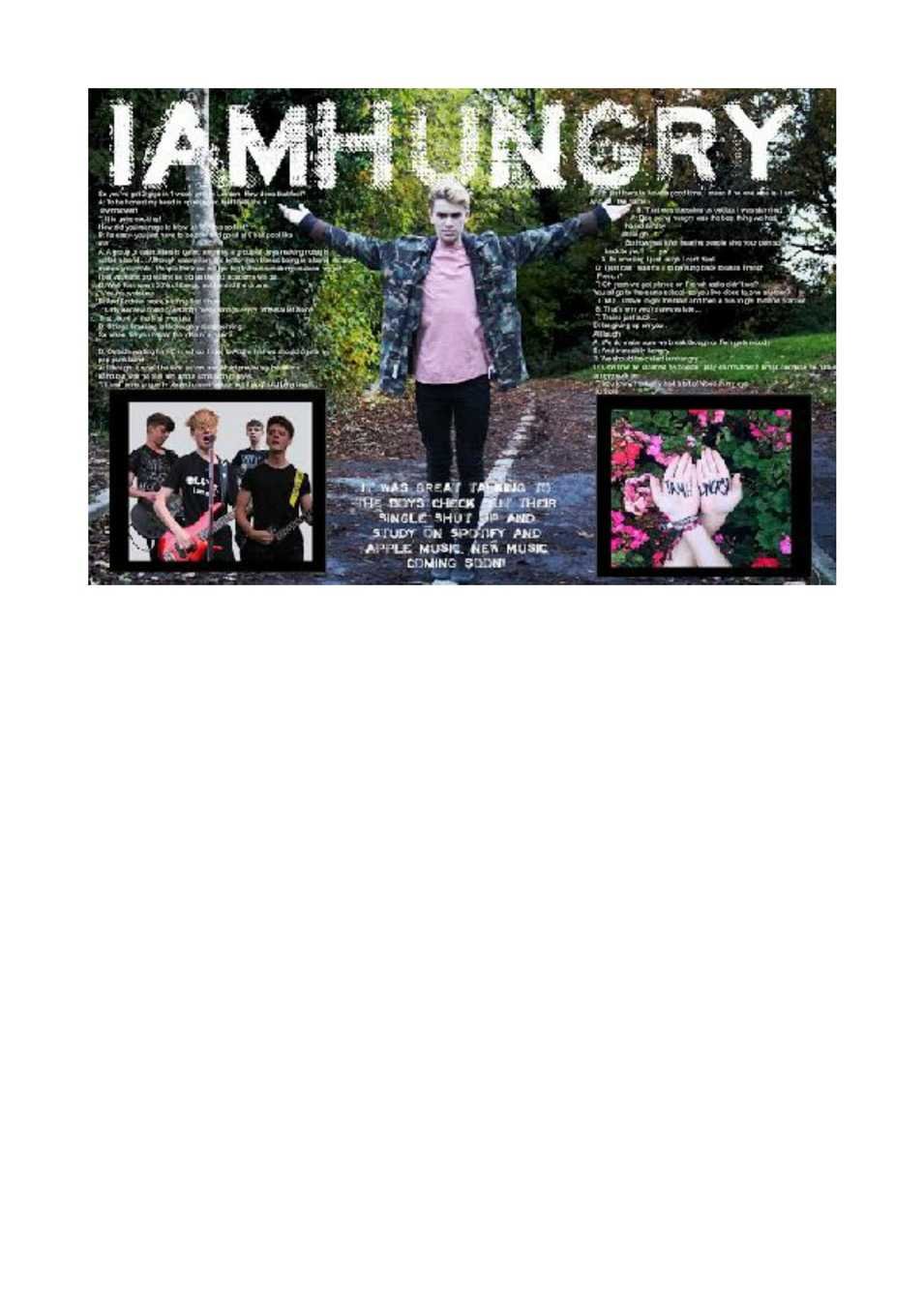
Double Page Attempt 2
I like the use of the real band logo as it helps them with promotion and draws people to the page.
I like having the whole band in the magazine as its an artel about all of them
I like them playing their instruments as it shows them doing what they are known for and helps people understand what they play.
Due to the image having lots of colours I feel they are quite mashed together and contrasting ruining the style of the page.
Next time I will use an image with the whole band together and see if it create a sleeker and less messy look.
I was not sure what text I was going to put but left a large space for it so it would not become cluttered.
I do like the white background as it follows the bands style and looks clean with no unprofesstionalism
construction
For this image I first cut out all of the individual on photoshop using the path tool and using quick selection with feathering on the hair to make it look more realistic. I then placed them all together on a white background, followed by the Iamhungry logo.
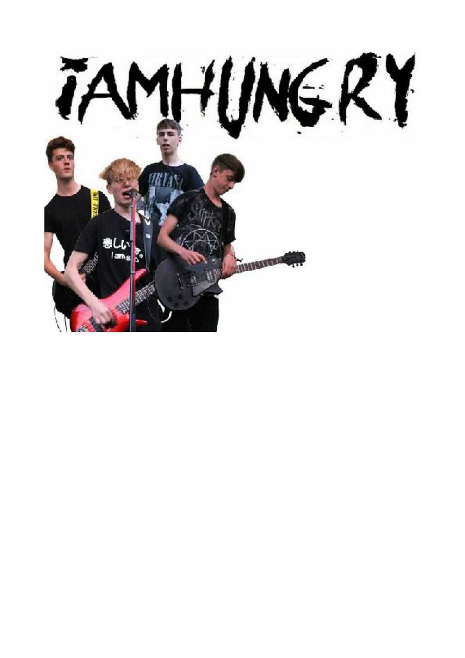
Double Page Attempt 3
I used a large title however I don't like that it isn't the bands logo as it draws away from the fact it is a band article.
The image of my model in the middle is compositionally appealing to the eye and draws your attention towards the article on either side.
The two black boxes even out the page as it is very symmetrical throughout.
I dont likt images in the corners are I feel they are messy and take away from the centre image.
I think I will use an image of the whole band for the double page as this doesn't seem to be focused enough on them when the whole article is with all of them speaking.
I willl use the tight text around the image for my next double page.
construction
To create this page I first cut out the central model and edited the background, much like I did for the contents page. I then added the two images and added a black border to make them stand out. I then added the tightly fitting text around the image.