Album cover analysis
- 'Wonderland' by McFly (2005)
Analysis on album front cover - Wonderland (2005)
The album name and the art clearly correlates on the album with it linking to the fictional story 'Alice in Wonderland'. This is shown through the unusual animals, use of cards and painted flowers. The reason this may have been done is it makes the audience more curious about the type of songs the album holds with 'Alice in the Wonderland' being known for its bizarre and strange narrative and visuals.
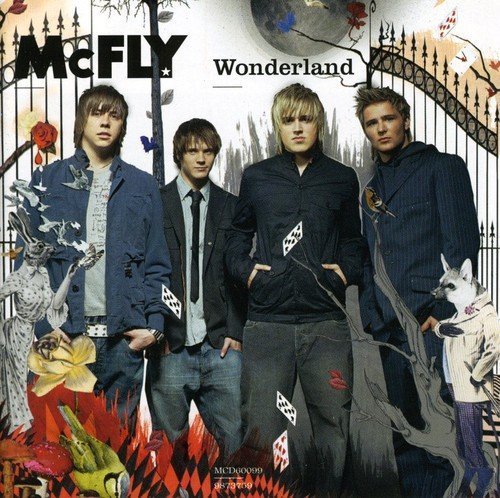
The colour of the background is a clear white which creates a lifeless undertone. This is further shown through the colour of the trees which are a pale grey. The reason this may have been done is it makes the peculiar elements of the cover,such as the animals dressed in human clothes, catch the potential buyers eyes more and makes the band stand out with the contrast from white background to darker colours they are wearing.
The framing of everything is clearly thought out with the band being the largest thing on the cover and directly in the centre. This tells buyers straight away what the band looks like. Furthermore, the clothing they are wearing is all coordinated to a certain colour/ style which is typical in boy bands. The use of clothing on this cover insinuates that the album is serious along with the band mates facial expressions. This can be seen as true with a song 'She Falls Asleep' on the album being about a girl who commits suicide.
The use of gates with the long shot of band members in the entrance symbolising the band inviting the audience to listen to their album. Furthermore, with the album being strongly narrative based the use of gates suggests that the audience will be drawn into another world to listen to the stories told within the songs.
The typography of the bands main logo has being changed to black to fit the dark theme. The size of their logo is larger and bolder than the album name which suggests that the band that produced the album is more important than the albums name. But also it makes it's distinct to their fans who will want to buy it, meaning more sales.
The use of a bright pattern in the corner contrasts to the rest of the cover. This may have been done to show the range of styles and themes within the album with bland/dark colours reflecting the ballads and the unusual elements which have taken influence from 'Alice in Wonderland' reflecting the more upbeat, rocky songs.
This album cover holds a lot of things within it making it look crowed with the strange pattern in the left hand corner, animals in clothes and the band in the centre. This could mirror the songs the album holds with the range of styles from the heavy guitar songs to orchestral instrumentals.
This cover presents the band as people who want to be noticed for their creativity with the bizarre imagery. But also how they want to be taken seriously shown through their facial expressions and body language.
CD back cover
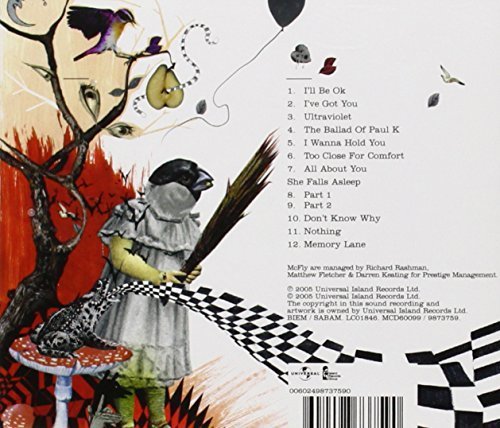
The pure white background carries onto the back which makes the images stand out more. Also, it ensures that the song titles are easy to read.
The use of the red rising on the left hand side of the back cover could symbolise fire. The reason this may have been done is it could it could imply burning passion which could link to the songs being about love. However, it could also suggest the anger the breakup songs have.
The use of mushrooms can link to 'magic mushrooms' which when someone eats them they become delusional. This links to the bizarre things happening around the mushroom with the strange bird and eyes as leaves. Furthermore, this links to the album title 'Wonderland' as it is clearly a fantasy world presented on the back cover.
The layout for the track list is simple and ordered so it is easy to navigate around. The placement of it on the right hand side is done so the artwork and the track list do not clash. Making it so people buying the product can appreciate the peculiar art and easily know how to find the songs.
The use of the black and white checkered path can link to chess which is a logic game. This contrasts to the rest of the albums artwork as it is illogical and full of random things.