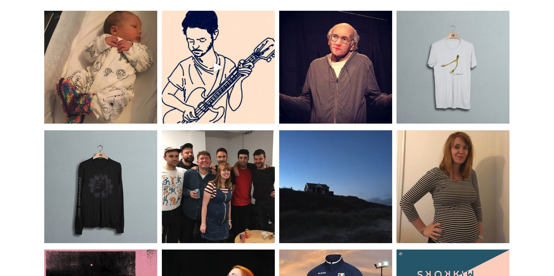
POST 2
How effective is the combination of my music video and website?
THE HEADER

THE HEADER
The header of the website is very important as it is the first thing the audience sees of the actual website. It offers a lot of the best parts of what a website can do- a huge image of the band to build identity, interactable icons for moving between photos and going to different sections and pages, buying opportunities arising from these interactions, the navigation bar, and even cross media convergence with the social media block on the right. All of these things aid the audience's enjoyment and immersion in the website, and thus the band itself.
This works well as a useful function of the website by itself, but it also works well alongside the music video, as people who see the music video and enjoy it (i.e. our target audience) are likely to look for more information on the artist, inevitably finding the website, a hub for the band and everything to do with them. Then, the very first section of the site provides all of these things to click and buy and so on, and immediately pulls them in. Through the default header image, they even have the option to purchase the song from the music video they just watched, or even the whole album, available to them right away, without even having to reach the music section.
Stylistically the header is very important too. Carol Vernallis talks about the audio-visual aesthetic of music videos, and this header establishes the website's aesthetic to be the same as the music video's. This creates synergy and a consistent brand across both media products, further enhancing their effectiveness together beyond the practical things mentioned above- now, both the music video and website feel and look like a contained "universe" for the band as well as acting like one.
THE HEADER
This clip from our music video should show some of this synergy. It shows no practical information on the band, which is what the website does instead of the video, but it creates interest in the artist and contains a lot of identity information. Pinks, purples, blues, and whites all feature fairly prominently, as they do in the website header, for example. You can fullscreen the video with the bottom right icon.
THE HEADER
On the left, you can see the front cover of "Antisocialites' by Alvvays. It shares its aesthetic and branding with the rest of the band's media products, including colour scheme and mise-en-scène. In the centre you can see the website header- while it doesn't have the exact film grain effect of the other two products, it still works in synergy with them through its similar old-school aesthetic, with the old guitar and amp, as well as the vintage movie poster, and the same colour scheme- plus, it displays a picture of the album in the website's style, next to a flashing interactable 'ORDER' button to lead to a purchasing option. It also has a navigation bar at the top for easy access to more purchasing options and information on the band. The website is a happy medium between the album's specific film-like aesthetic and the band's overall aesthetic. On the right is the music video for "Dreams Tonite." It is a single from the album, and shares aesthetic and so on with the rest of the campaign. Blue, yellow, red, and off-whites feature in it, as in the other products, and it even has a film-grain effect like the album. It shares a love of older technology with the website, by displaying some analogue cameras. You can fullscreen the video with the bottom right icon.


THE VIDEO

THE VIDEO
A music website must display all of an artist's work to properly fulfill its role as a hub for said artist. Thus this section provides an important function of the website by simply and clearly showcasing one of the band's main products, the music video for their hit single from their most recent album release.
Despite being, as mentioned before, quite a simple showcase of the music video and not much more, this part of the website is still actually very important in the effective combination of media products. The music video is one of the main products of the band, and it is accessible and very enjoyable, a great vehicle for identity and aesthetic and so on, and it is good for reaching and appealing to the audience. However, people finding out about the band from the album or from a friend etc. might not have seen it- yet, they are likely to find the website. Then, they can simply scroll down slightly from the top of the page (or use the navigation bar, which never leaves their sight and follows their scroll down) and reach the showcase of the music video. It is obviously very important, as it is alone and with a special banner, and once they watch it the audience should be thoroughly immersed in the band, in that the video showcases aesthetic, style, identity etc. in a detailed, enjoyable, and concise package. Then the audience is free to continue browsing, maybe even purchasing the album or single as they reach the very next section!
THE VIDEO
This is the header and music section of Echosmith's website. The music video for a single from their recent album is displayed in a huge form factor, drawing attention to it in the same way we have drawn attention to our music video, although Echosmith opted for size whereas we went with decoration. The music section, allowing for purchase of said single and album, is located directly below the video. People visiting the website as a hub for the band cannot miss these two things.

THE MUSIC

THE MUSIC
While purchasing opportunities are, by design, everywhere on the site, the music section is important as it is where most people will go to purchase the music, or where most people will stop and consider buying it. This section, then, must draw them in and convince them to do so- thus it shows off the front of the album, with all of the appeal and draw of that (covered in the other webtool,) and provides the opportunity to both interact by clicking one of the music players, as well as further enjoy the band's media products, in this case their music. It does all of this in a clear and easy to read box.
This section also has great synergy with the music video, as it shows off the single that the video is built from. The music section enables the Diversion part of Blumler and Katz' uses and gratifications theory, which states that an audience member is more likely to buy into a product if it provides enjoyment- someone who has enjoyed either the music in this section or the music (and visuals) in the video will thus also enjoy the other, therefore providing two opportunities for Diversion in one package so to speak. Anyone who enjoys these things is likely a member of the target audience who will then choose and use the artist's media products, possibly even buying the album from this very same section.
THE MUSIC
Here you can see the Music and Video sections of Miike Snow's website, positioned directly next to each other. This aids the synergy between the two products- someone who has experienced one can easily experience the other, all in one short segment of the website. Clicking on the songs and videos is also an opportunity for interactivity.

THE TOURS

THE TOURS
The tours section is strategically placed- it is just below the main products, where casual fans and interested people will reach, and where most of the basic buying options are. Then, the tours section immediately appears for those interested enough to go further- these people are the exact kind of people who might want to see the band on tour. Another purchasing opportunity is instantly presented to the target audience and they can further buy into the brand of the artist which has been built up by the website over time. This section fulfils another important function of the website- it is yet another purchasing opportunity, separate from the main purchasing opportunity of the band's music. This is important because the audience needs many interactions and buying opportunities available to them to maximise the artist's profit, especially considering the rising contribution of tour tickets towards a modern artist's overall revenue when compared to artists of decades past who had more of a focus on their albums.
The brand shown here is important, according to David Gauntlett, who postulates that a band's identity must be built up for them to be successful. By now, the audience has scrolled past and thus likely seen the music video, and they will be familiar with the band's identity anyway from the header and rest of the website. Then the tours section simply cements this identity with yet another image of the band showcasing their group and individual personality; this could even be considered part of Richard Dyer's star theory. He states that an artist's personality must go past just their music and basic products; and by showing off the band in the image in this section, and informing the audience they have this personality in real life and while touring, they are further established as not just a music artist but as a star with a unique identity that the audience can buy into- either by purchasing the music or, even better, a tour ticket. This is very effective synergy across the band's campaign.
THE TOURS
The tour poster which comprises the majority of the Tour section of Sheppard's website. This single image is brimming with personality and identity, from the specifically chosen fonts and colour scheme, to the varying fashion choices, poses, facial expressions and so on of each member of the band. It confirms the band's identity, assures the audience that they are like this live, and provides information on how to pay for a tour ticket to see them live, thus fulfilling everything its section of the website should do- working either by itself or with the rest of the band's campaign to draw in audience members, while providing an opportunity for them to spend their money.

THE ABOUT SECTION

THE ABOUT SECTION
This is a very important section for identity and personality, and thus very important when considering how to attract the target audience through certain techniques laid out in media theories. We need to establish the band's identity, according to Richard Dyer, if we want our artist to be a star, and thus have their own brand which the audience can buy into. To establish this identity, we look to the Personal Relationship and Personal Identity sections of Blumler and Katz' uses and gratifications theory- Relationships states that the audience wants to connect with the artist, and by finding out more things about each band member in this section, they can do that very very easily. Identity states that the audience wants to see themselves reflected in the artist, and by seeing that the band members are indeed real people with personalities and opinions and so on, just like any other person and indeed like the audience themselves, this section also does this really well. Therefore it is an important section of the website in establishing the personalities and, as mentioned earlier, brand of the band.
This section is also effective in combination with the music video, as it does all of the above on top of the personality establishment of the music video. The video shows off the band's fashion and style and so on, which is one facet of Relationships and Identity. Then, this part of the website expands on that with more and different details about the band, more personal and informative things, and fills in any blanks. Thus they work in synergy to paint an overall picture of the band, their image and identity, which is in turn important for attracting and holding the attention of the target audience, giving them something to buy into. By themselves and together they reach and appeal to the audience very well.
THE ABOUT SECTION
A clip from our music video. It should show off the visual side of our band's identity- in this short segment alone there are multiple solo shots of the lead personality (the singer,) shots to build up her relationship with her brother, solo shots of the rest of the band, multiple colours, props including some cardboard props, different costumes, fashions, and styles, and a general air of energy, dynamism, and fun. This establishes one part of our band's overall identity- it is up to the website, especially the about section, to establish the rest.
THE ABOUT SECTION
The about section of Best Coast's website. It is very text-heavy, comprising a short biography of the duo and how they came to create their most recent album. Then, the larger lower section is an extract from an article in which the lead singer talks all about herself and the album. These things fill in the gaps left by the band's various music videos- you can see them perform and sing and so on, get a feel for their mood and aesthetic and similar, but not know any of the context behind it all, and context is what this section provides.

THE EVENTS

THE EVENTS
The events section is yet another important section for building up the artist as a star, according to Richard Dyer. He stresses building personality and a brand outside of the music, which the events section is all about- there is the option to meet the band at different real life places, as well as information about the singer's visits to different things she cares about, including a charity. There is below the line marketing, such as the mutually-beneficial appearance on Radio 6, and even a purchasing opportunity due to the tour announcement. All of these things maximise the artist's brand, and therefore their profits, which is a vital function of the website.
All of this works with the video, which presents a more perfect and slightly artificial identity for the band built up in studios and similar, at least in comparison to the real-life appearances and live interviews of this section. Thus the audience get both the perfect and realistic versions of the band through the combination of the products, and mix them in their head to reach the final, more effective star personality of the band. They can then buy into and/or participate with this star brand through one of the events here, such as the tour or contest pages, or one of the other many purchasing opportunities throughout the website.
THE EVENTS
Alvvays' website is similar to a blog. The main blog section is like a hybrid news and events section- they announce tours, advertise purchasing opportunities, interact with fans and answer questions, post about things they care about (including the aforementioned tours,) and post pictures and images they like. It helps build up their brand while marketing their products at the same time.

THE NEWS

THE NEWS
The news section is key for cross media and technological convergence. Aside from the social media block that follows you down the page, this is one of the first major blocks of social media and interactivity with the band directly that you see. When people say the website is a hub, this is what they mean. You can get the thoughts of band members directly through Twitter, and you can subscribe to their personal newsletter as an opportunity for interactivity. The newsletters themselves offer further interactivity and are a gateway to purchasing opportunities- the Tweets of course also offer interactivity, and purchasing opportunities too, as people can retweet, reply, and see offers and shop links posted by the band. This maximises identity AND profit.
This also has synergy with the music video in different ways. The most simple and obvious is that things like the music video and its single can be promoted through social media and newsletters, and thus form part of a successful campaign. Another way would be through aesthetic- the music video has a few key colours, and some DIY-style props and effects. This section, and even the profile picture of the Twitter account, shares this, with the subscription box even having a stickytape graphic.
THE NEWS
A clip from our music video. You can see some of the similar key colours, such as pink and blue, as well as cardboard props like the slot machine and coin, as well as other things that contribute to the DIY homemade aesthetic like the handheld camera. These design choices carry over between this part of the website and the music video.
THE NEWS
This is a part of Alvvays' Twitter. Here, they are promoting their song through below the line marketing, as it is appearing on a radio station, and also showing off their political views by showing disdain for controversial far-right new organisation Breitbart. Thus, in just two Tweets, the artist has marketed their brand and a product as well as showing off part of their identity. Social media is an important tool, by itself and in tandem with other products, for these reasons.

THE NEWS
Part of Alvvays' blog. Here, they feature their mailing list and its subscription box, as well as a tour. Just by looking at this section of the website, interested audience members can interact by joining the newsletter, opening themselves up to more marketing by the artist in the future, or even interact with the tour and take part in a purchasing opportunity.

THE SHOP

THE SHOP
The shop is one of the most straightforward and basic yet highly effective ways of marketing and making money. In the past, album sales made up the vast majority of profit- nowadays, tours and merchandise play a significantly larger role than before. Thus, offering a wide variety of merchandise is a very good way of showing off different facets of the artist and their aesthetic, while offering many many purchasing opportunities all in one place. People have so many options, from purchasing a physical album, to a t-shirt related to the music video, to a bobblehat to capture the lead singer's style. The audience is bombarded with references and links to the rest of the products as well as the band's style and personality, all the while being tempted with the simple interaction of one click to take them to the purchasing page.
As mentioned above, the products in the shop link to the media products of the band. The t-shirts and some other products contain the band's logo, as seen on the album cover, and one shirt references the album's single that the music video is based around. This further maximises appeal and profit because the target audience, who sees and enjoys those other media products, can then (possibly even on top of buying the digital album) buy some kind of physical product to further immerse themselves in the band they like, which is more lucrative than the audience only buying the artist's hit single. If they buy the single, the rest of the album, and some merchandise through all of the interactive purchasing opportunities present in this section and the rest of the website, the band will increase their revenue by a lot more.
THE SHOP
Alvvays' store from their website. In just this small section of the shop, you can buy three versions of their most recent album, two kinds of band t-shirt, and even a tour t-shirt. Anyone visiting here will be presented with all of these listings to interact with, click the one most relevant to them, and then hopefully take the opportunity to purchase the merchandise, whether because they were on a recent tour, or because they like the band's music, aesthetic, fashion etc.

THE MAIN GALLERY

THE MAIN GALLERY
The gallery is another major place to get involved with the band and their aesthetic. Someone hearing of the band for the first time, visiting from a friend's suggestion, a music article, etc. or even from the album, will not have an in-depth knowledge of the artist's style and fashion and so on. The gallery immediately deals with this by displaying large images of each of the band members, in a gesture suggesting their personality and in typical clothes. Interacting with these figures yields full galleries for each member, further cementing the personality and style established on the main page. This is an important function of the website, which must act as a hub for the artist, and provide all of the information, images, and so on that the audience might want.
Of course, the gallery must work well with the music video- it does this by playing off of the audio-visual aesthetic of the video. Carol Vernallis' theory states that a music video has a certain look, and the band members share this look across all the images in the gallery. If the audience relates to or aspires to this look, as they should if they are a target audience member and have watched the video displayed prominently at the top of the page, then they are more likely to keep browsing and interact with one of the many purchasing opportunities around the site.
THE MAIN GALLERY
The photo section of Deap Vally's website. It works in tandem with the rest of the band's website, media products, and campaign by providing real and everyday pictures of the artist, to offset the artificial and psychedelic aesthetic that usually accompanies the band, and which comprises the website. In this way the website acts as a hub by offering this more down-to-earth view of the artist, while not betraying the overall aesthetic.

THE CIRCLE GALLERY

THE CIRCLE GALLERY
The circle gallery is an extension of the main gallery, which performs most of the same functions, but as the images aren't hidden behind a button as with the main gallery, and as the boxes for the images are stylised circles, it contributes more to the look of the website. Plus, it is even more focused on interactivity, as it both allows you to click to expand to the full image gallery as with the previous gallery section, but also cycle through the circles with a small animation just by moving your mouse over the arrows, no clicking required. This provides both Diversion and Surveillance- these parts of uses and gratifications theory refer to enjoyment for the audience and providing information to the audience respectively. The images inform people about what the band is like, shows some images of where they've been and so on, but does it in a fun and interactive way that draws the audience in.
It also works with the other media products. This gallery shows many screenshots and even behind the scenes parts from our music video right there on the main website page, no clicking required. If people haven't seen the video yet, this should make them more interested, and encourage them to immerse themselves in the band's media products more. This in turn makes them more likely to enjoy the artist and take advantage of one of the many purchasing opportunities. It also "pulls back the curtain" on the band's personalities in the music video, assuring the audience that the band members are in real life as they appear in the video, ensuring all the work done reaching and appealing to them isn't wasted.
THE CIRCLE GALLERY
The minimalist Instagram-linked gallery of Los Campesinos' website. It shows the band in real situations, behind the scenes in the real world rather than on the set in the artificial world of their music videos, as well as interactable videos and images they want to share for their audience's enjoyment such as clothing and landscapes that they like. These things help tie the band to reality, allowing the audience to relate to them more, connect with them on a human level, and enjoy them more. The audience can get the stylised version of the band through their music videos, and the real version through this part of the website.
THE CONTACT SECTION
THE CONTACT SECTION
The contact section offers yet another chance to interact with the band, by allowing people who have scrolled through the whole page assessing the artist to now make the choice to commit to engaging with the band. It also offers other information and channels to reach the band, as well as all the necessary legal information- this fulfils the Surveillance part of Blumler and Katz' uses and gratifications theory, which asserts that the audience is more likely to choose and use a media product or even engage with an entire campaign if they are provided with useful, necessary, and desired information. The contact section does all of this in a very concise and effective way.
Despite being mostly informative and serving a function of the website, this section does still have synergy with the rest of the campaign. The record label is prominently featured, as it is on the back of the album cover with the legal information located there, and the very bottom of the page shows the social media once more, so that if you want to engage with the band and see all the content posted there, you can leave the website you just finished with and go there instead, and be immersed in the opinions and thoughts and so on of the band to supplement what has already been seen, as well as have more purchasing opportunities through social media posts.
THE CONTACT SECTION
Los Campesinos' contact page, with legal information, a lot of social media links, and two ways to contact the band members themselves- an e-mail address, and a dedicated fan mail form. This page avoids being boring by allowing fans and audience members to reach out and interact with the band, rather than just being a page of legal information, however it does not neglect this useful and necessary information either.
