Fresh Hot CSS Features!
(AKA things you may have missed
in the last 5+ years)
Slides:

Vibe Check
-
display:flex;
-
display:grid;
-
var(--custom-property);
-
@container
-
@layer :has()<select>
No, but seriously...
Why so many improvements?
Interop 2025
This talk will cover:
- Custom Properties
- CSS Grid
- Nesting
- Logical Properties
- :has()
- @container
- @layer
-
<select>
Custom Properties
(AKA CSS Variables)
body {
  color: #000000;
  background-color: #ffffff;
}

.invert {
  color: #ffffff;
  background-color: #000000;
}
Custom Properties
The Original Way
// _vars.scss
$color-ink: #000000;
$color-paper: #ffffff;

// _style.scss
body{
  color: $color-ink;
  background-color: $color-paper;
}

.invert{
  color: $color-paper;
  background-color: $color-ink;
}
Custom Properties
Preprocessed Variables (SCSS)
:root{
  --color-ink: #000000;
  --color-paper: #ffffff;
}

body{
  color: var(--color-ink);
  background-color: var(--color-paper);
}

.invert{
  color: var(--color-paper);
  background-color: var(--color-ink);
}
Custom Properties
Modern CSS
Custom Properties
Support:

Custom Properties
More Info:
Bonus round?
@property
(AKA type safe custom properties)
(Bonus Round)
@property
@property --my-color{
  syntax: "<color>";
  inherits: true;
  initial-value: black;
}

p{
  color: var(--my-color);
}
@property
@property
Support:
@property
More Information:
CSS Grid
(AKA Better layout tools)
CSS Grid
CSS Grid
Bootstrap 5 Example
CSS Grid
Using Grid
CSS Grid
Example: Bar charts
(Credit: Miriam Suzanne)
CSS Grid
Example: Mondrian Art
(Credit: Jen Simmons)
CSS Grid
Example: Center Things
CSS Grid
Support

CSS Grid
More Information:
- MDN: https://developer.mozilla.org/en-US/docs/Learn/CSS/CSS_layout/Grids
- CSS-Tricks: https://css-tricks.com/snippets/css/complete-guide-grid/
- Grid By Example: https://gridbyexample.com/
- Layout Breakouts with CSS Grid: https://ryanmulligan.dev/blog/layout-breakouts/
Nesting
(AKA like sass! but not like sass!)
Nesting
/* before.... */

.wrapper .title{
  /* styles */
}

.wrapper .content{
  /* styles */
}

.wrapper .actions{
  /* styles */
}
Nesting
/* after.... */
.wrapper {

  .title{
    /* styles */
  }
  .content{
    /* styles */
  }
  .actions{
    /* styles */
  }
}
Nesting
Support:

Nesting
More Information:
Logical Properties
(AKA It's Okay to forget Left and Right)
Let's talk about
RTL Languages
Logical Properties
Logical Properties
Block
Inline
Logical Properties
Block properties
- *-block
- *-block-start (*-top)
- *-block-end (*-bottom)
Inline properties
- *-inline
- *-inline-start (*-left)
- *-inline-end (*-right)
Logical Properties
Logical Properties
Logical Properties
Properties for sizing
- block-size
- inline-size
- max-block-size
- max-inline-size
- min-block-size
- min-inline-size
Properties for margins
- margin (logical Experimental keyword)
- margin-block
- margin-block-end
- margin-block-start
- margin-inline
- margin-inline-end
- margin-inline-start
Properties for paddings
- padding (logical Experimental keyword)
- padding-block
- padding-block-end
- padding-block-start
- padding-inline
- padding-inline-end
- padding-inline-start
Properties for borders
- border-block
- border-block-color
- border-block-end
- border-block-end-color
- border-block-end-style
- border-block-end-width
- border-block-start
- border-block-start-color
- border-block-start-style
- border-block-start-width
- border-block-style
- border-block-width
- border-color
- border-inline
- border-inline-color
- border-inline-end
- border-inline-end-color
- border-inline-end-style
- border-inline-end-width
- border-inline-start
- border-inline-start-color
- border-inline-start-style
- border-inline-start-width
- border-inline-style
- border-inline-width
- border-style
- border-width
Properties for border radius
- border-radius
- border-start-start-radius
- border-start-end-radius
- border-end-start-radius
- border-end-end-radius
Properties for positioning
- inset
- inset-block
- inset-block-end
- inset-block-start
- inset-inline
- inset-inline-end
- inset-inline-start
Properties for size containment
- contain-intrinsic-block-size
- contain-intrinsic-inline-size
Properties for scrolling
- overflow-block
- overflow-inline
- overscroll-behavior-block
- overscroll-behavior-inline
Properties for floating
- clear (inline-end and inline-start keywords)
- float (inline-end and inline-start keywords)
Other properties
- caption-side (inline-end and inline-start keywords)
- resize (block and inline keywords)
- text-align (end and start keywords)
Logical Properties
Support:

Logical Properties
More Information:
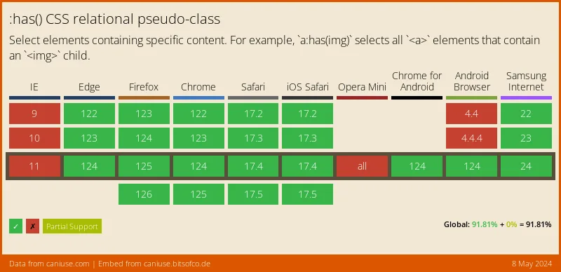
:has()
(AKA "The Parent Selector")
A Common Problem
.input-wrapper:has(input:invalid)
<div class="input-wrapper">
<input type="email" value="alex" />
</div>
:has()
This:has(a.solution)
:has()
Support:
:has()
More Information:
@container
(AKA box-size media queries)
@container
@container
@container
@container
@container
@container
@container
.blue-box{
  display:grid;
  grid-template-columns: 1fr;
}

@media screen and (min-width: 450px) and (max-width: 1023px){
  .blue-box{
    grid-template-columns: 1fr 1fr;
  }
}

@media screen and (min-width: 1024px) and (max-width: 1439px){
  .blue-box{
    grid-template-columns: 1fr;
  }
}

@media screen and (min-width: 1440px){
  .blue-box{
    grid-template-columns: 1fr 1fr;
  }
}
@container
.blue-box-wrapper{
  container-type: inline-size;
  container-name: blue-box;
}
.blue-box{
  display:grid;
  grid-template-columns: 1fr;
}

@container blue-box (min-width: 450px) {
  .blue-box {
    grid-template-columns: 1fr 1fr;
  }
}
@container
@container
Support:
@container
More Information:
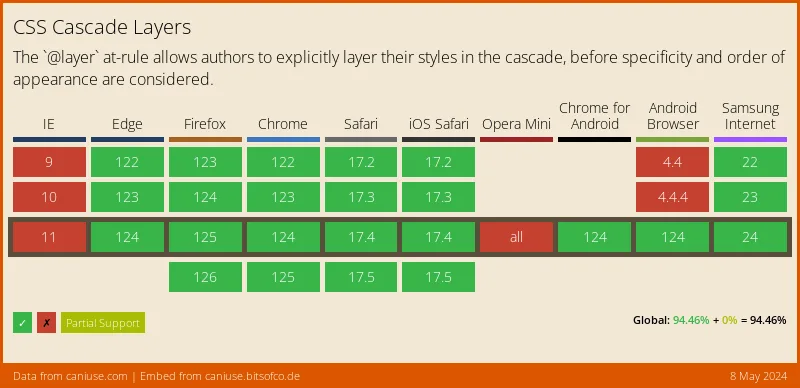
@layer
(AKA Stop using !important)
@layer
.text-red{
  color:red;
}

.my-class{
  color:blue;
}
@layer
.text-red{
  color:red !important;
}

.my-class{
  color:blue;
}
@layer
.my-class{
  color:blue;
}

.text-red{
  color:red;
}
@layer
.my-wrapper .my-class{
  color:blue;
}

.text-red{
  color:red;
}
@layer
@layer style, utility;

@layer style {
  .my-wrapper .my-class{
    color:blue;
  }
}

@layer utility{
  .text-red{
    color:red;
  }
}
@layer
@layer style, utility;

@layer utility{
  .text-red{
    color:red;
  }
}

@layer style {
  .my-wrapper .my-class{
    color:blue;
  }
}
@layer
@layer framework, style, utility;

@import url('framework.css') layer(framework);

@layer utility{
  .text-red{
    color:red;
  }
}

@layer style {
  .my-wrapper .my-class{
    color:blue;
  }
}
@layer
Support:
Yay! It was finally resolved by CSSWG to add strong custom cascade layers in #CSS, using a ^ symbol at the beginning, like
— Roma Komarov (@kizu.front-end.social.ap.brid.gy) February 12, 2025 at 12:16 PM@layer ^top, which will make it possible to put things over the default layer: https://github.com/w3c/csswg-drafts/issues/6323#issuecomment-2654364266
@layer
@layer
More Information:
color functions
(AKA "Can you make that
a little lighter?")
color functions
/* in scss */

$primary: #639;
$primary-hover: lighten($primary, 25%);

body{
  background-color: $primary;
}

body:hover{
  background-color: $primary-hover;
}
color functions
/* compiled CSS */

body {
  background-color: #639;
}

body:hover {
  background-color: #a679d2;
}
color functions
color functions
:root{
  --c-primary: #639;
  --c-primary-hover: hsl(from var(--c-primary) h s calc(l + 25));
}

body{
  background-color: var(--c-primary);
}

body:hover{
  background-color: var(--c-primary-hover);
}
color functions
color functions
color functions


color functions
More Information:
- color-mix() MDN: https://developer.mozilla.org/en-US/docs/Web/CSS/color_value/color-mix
- relative colors MDN: https://developer.mozilla.org/en-US/docs/Web/CSS/CSS_colors/Relative_colors
- Lea Verou - Generating text colors with CSS: https://lea.verou.me/blog/2024/contrast-color/
- Daniel Yuschick - https://www.smashingmagazine.com/2022/06/simplify-color-palette-css-color-mix/
The <select> Element
Part of the
HTML 2.0 standard
in 1995
Things Achieved by Humanity Since 1995
- Sequencing of the Human Genome
- 23 missions to mars
- Taken a photo of a black hole
- Proved the existence of the Higgs Boson
- The entire life cycle of the iPod
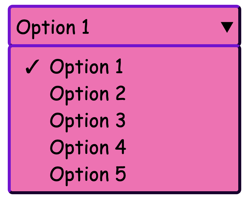
And yet, we can't make a <select> do this:
Customizable Selects
(Aka FREAKING FINALLY)
Customizable Selects
A Basic Select with some style
Customizable Selects
appearance: base-select
Customizable Selects
::picker(select)
Customizable Selects
<selectedcontent>
Customizable Selects
Baseline Support
Customizable Selects
More Information:
- MDN: https://developer.mozilla.org/en-US/docs/Learn_web_development/Extensions/Forms/Customizable_select
- Chrome for Developers (Adam Argyle): https://developer.chrome.com/blog/a-customizable-select
- OpenUI: https://open-ui.org/components/customizableselect/
Thank You!
Jon Neal - For making an app that says the date when features were added to the browser
Slides:
Deets:
Alex Riviere
- @fimion on GitHub, CodePen
- @fimion@notacult.social on mastodon
- @dangitalex.wtf on bsky
- alex.party
CodePens:
Anchor Positioning
(AKA "Put this thing next to that thing")
?
<button
        type="button"
        class="tooltip-button">
  ?
</button>
Anchor Positioning
A Common Problem
?
Look at me, I'm a tooltip!
<button
        type="button"
        class="tooltip-button">
  ?
</button>
<p class="tooltip">
  Look at me, I'm a tooltip!
</p>
Anchor Positioning
A Common Problem
?
Look at me, I'm a tooltip!
<button
        type="button"
        class="tooltip-button">
  ?
</button>
<p class="tooltip">
  Look at me, I'm a tooltip!
</p>
Anchor Positioning
A Common Problem
?
Look at me, I'm a tooltip!
<button
        type="button"
        class="tooltip-button">
  ?
  <p class="tooltip">
    Look at me, I'm a tooltip!
  </p>
</button>
Anchor Positioning
A Common Problem
?
Look at me, I'm a tooltip!
<button
        type="button"
        class="tooltip-button relative">
  ?
  <p class="tooltip absolute">
    Look at me, I'm a tooltip!
  </p>
</button>
Anchor Positioning
A Common Problem
| Data | Data | Data |
|---|---|---|
| Data | Data | Data |
| Data | Data | Data |
?
Look at me, I'm a tooltip!
Header 1
?
Header 2
?
Header 3
Anchor Positioning
A Common Problem
Anchor Positioning
A simple example
.tooltip-button {
  anchor-name: --tooltip-button;
}

.tooltip {
  position: absolute;
  position-anchor: --tooltip-button;
  left: anchor(right);
  align-self: anchor-center;
}
Anchor Positioning
A simple example (forked from web.dev)
Anchor Positioning
A different way
.tooltip-button {
  anchor-name: --tooltip-button;
}

.tooltip {
  position: absolute;
  position-anchor: --tooltip-button;
  left: anchor(right);
  align-self: anchor-center;
}
Anchor Positioning
A different way
.tooltip-button {
  anchor-name: --tooltip-button;
}

.tooltip {
  position: absolute;
  position-anchor: --tooltip-button;
  position-area: right center;

}
Anchor Positioning
A different way
Anchor Positioning
Baseline Support
Anchor Positioning
More Information:
- MDN: https://developer.mozilla.org/en-US/docs/Web/CSS/CSS_anchor_positioning/Using
- Chrome for Developers (Una Kravets): https://developer.chrome.com/docs/css-ui/anchor-positioning-api
- CSS Tricks (Juan Diego Rodríguez): https://css-tricks.com/css-anchor-positioning-guide/
Popover API
(Aka Menus not Selects)
Popover API
Basic Popover
Popover API
Manual Popover Options
Popover Api
Baseline Support
Popover API
Basic Popover
Popover Api
Popover with Anchor Positioning
Popover API
More Information:
Slides:
Deets:
Alex Riviere
- @fimion on GitHub, CodePen
- @fimion@notacult.social on mastodon
- @dangitalex.wtf on bsky
- alex.party
CodePens:
@scope
(AKA scoped styles)
@scope
<style>
p{
  color:red;
}
</style>
<p>This is red text!</p>
@scope
<style>
p{ color:red; }
</style>
<p>This is red text!</p>

<div>
  <style>
    @scope{
      p{ color: blue; }
    }
  </style>
  <p>
    This text is blue!
  </p>
</div>
@scope
@scope
Support:*

* Full support planned in Interop 2025
@scope
More Information:
Slides:
Deets:
Alex Riviere
- @fimion on GitHub, CodePen
- @fimion@notacult.social on mastodon
- @dangitalex.wtf on bsky
- alex.party
CodePens:
min(), max(), clamp()
(AKA write fewer media queries)
Definitions
- min(): Give me the minimum value from a list of number values
- max(): Give me the maximum value from a list of number values
- clamp(): Give me a number value based on a dynamic measurement, but stop at the minimum and maximum sizes given.
min() Example
max() Example
clamp() Example
min(), max(), clamp()
Support

min(), max(), clamp()
More Information:
- MDN:
- Stephanie Eckles: https://moderncss.dev/practical-uses-of-css-math-functions-calc-clamp-min-max/
- Ryan Mulligan: https://ryanmulligan.dev/blog/layout-breakouts/
Slides:
Deets:
Alex Riviere
- @fimion on GitHub, CodePen
- @fimion@notacult.social on mastodon
- @dangitalex.wtf on bsky
- alex.party
CodePens:
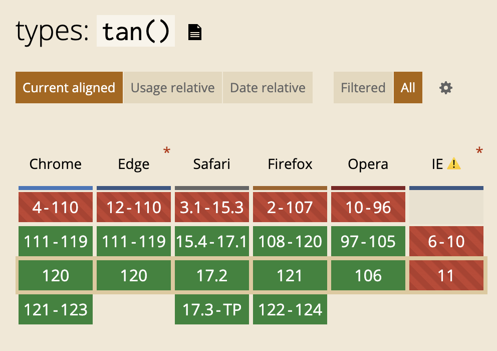
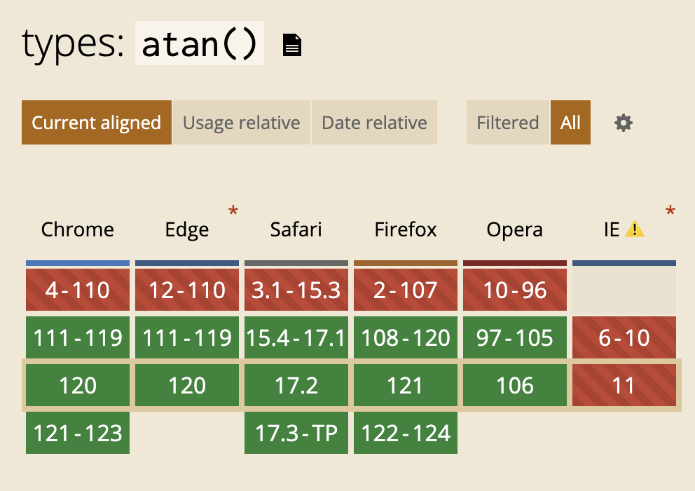
Trig Functions
(AKA math for very smart people)
Trig Functions
-
sin()
-
cos()
-
tan()
-
asin()
-
acos()
-
atan()
-
atan2()
Trig Functions
Support:


Trig Functions
More Information:
- MDN:
- sin : https://developer.mozilla.org/en-US/docs/Web/CSS/sin
- cos: https://developer.mozilla.org/en-US/docs/Web/CSS/cos
- tan: https://developer.mozilla.org/en-US/docs/Web/CSS/tan
- asin: https://developer.mozilla.org/en-US/docs/Web/CSS/asin
- acos: https://developer.mozilla.org/en-US/docs/Web/CSS/acos
- atan: https://developer.mozilla.org/en-US/docs/Web/CSS/atan
- atan2: https://developer.mozilla.org/en-US/docs/Web/CSS/atan2
- Web.dev: https://web.dev/articles/css-trig-functions
Slides:
Deets:
Alex Riviere
- @fimion on GitHub, CodePen
- @fimion@notacult.social on mastodon
- @dangitalex.wtf on bsky
- alex.party
CodePens: