Forms and Conventions of the digipak

Forms & Conventions Breakdown

(e.g: Rihanna - Good Girl Gone Bad)
(Continued)


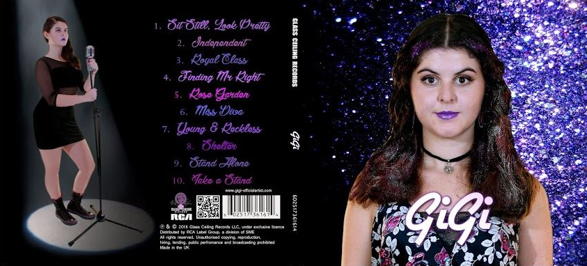
-Rihanna's 'Good Girl Gone Bad' was a good example to use, and I feel it follows a very typical form - and includes very typical conventions - of an album from the pop genre. We largely followed these conventions - including the institutional logos, names (including on the spine) and information; as well as a variation of shots and increased prominence for the artist's name.
-There were also a couple of exceptions, though, including expanding the purple in our colour scheme to include a range of shades, and also developing convention by including a QR code in conjunction with the barcode to add a more contemporary touch.

Synergy across digipak panels
-Synergy is absolutely crucial to a successful marketing campaign, and we aimed to achieve this across our digipak panels through consistency in our branding, and in GiGi's artist identity.


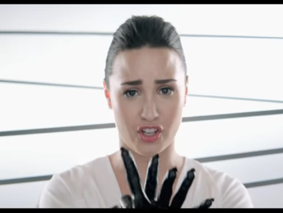
-A useful existing example of synergy is Demi Lovato's self-titled 2013 album 'Demi' (Deluxe Edition). There is clear synergy through both consistent branding and artist identity between the digipak panels . Not only that, but what Lovato described as a "fashion-based" theme continues from across the digipak onto the CD and into the music video for her main single 'Heart Attack'.
-This was also a convention seen in the high saturation visuals of Meghan Trainor's album 'Title' - a theme which continued into music videos such as 'Lips Are Moving', 'All About That Bass' and 'Dear Future Husband'
-We ensured we used a consistent visual motif - or theme - through the use of glitter, although perhaps we challenged convention slightly by not including it on the back cover as well. This glitter theme was continued in an advertisement on the website. Meanwhile, we used 2 consistent background images with one continuing across the inside panels, and one across the outside.
Synergy in our own product
-We made sure we included some aspects which created synergy with the video. In terms of artist identity, the use of green (alongside typical shades in colour scheme of purple and white) reflected the colours of the Suffragette movement - which continued her feminist messages put across in the video.


(continued)
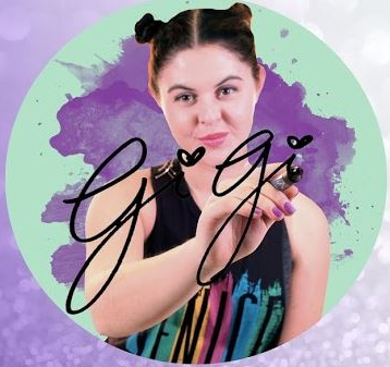
-We consistently used GiGi's typical logo and colour scheme to create synergy with the website (and to some extent the video through the extensive use of purple), though developed this by also including GiGi's signature on one of the inside panels.
-Clearer links with the video include the LS shot of GiGi on the back cover with the same microphone, pose and costume as her performance. She also has the same makeup & purple lipstick on the front and back cover that she had in the video.

Focal Image
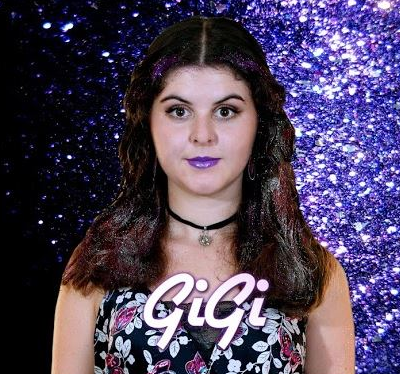
-Another very common convention of female pop soloists' albums is the use of an eye-catching & recognisable focal image on the front panel of the digipak. This is especially true for debut albums, in order to clearly establish who they are to the audience.
-We felt it would be helpful to use a number of female artists' album covers - especially debut albums - for inspiration, and we too decided to use an image which would be seen clearly through its MCU framing, and its interesting use of the glitter motif.
Our own focal image:


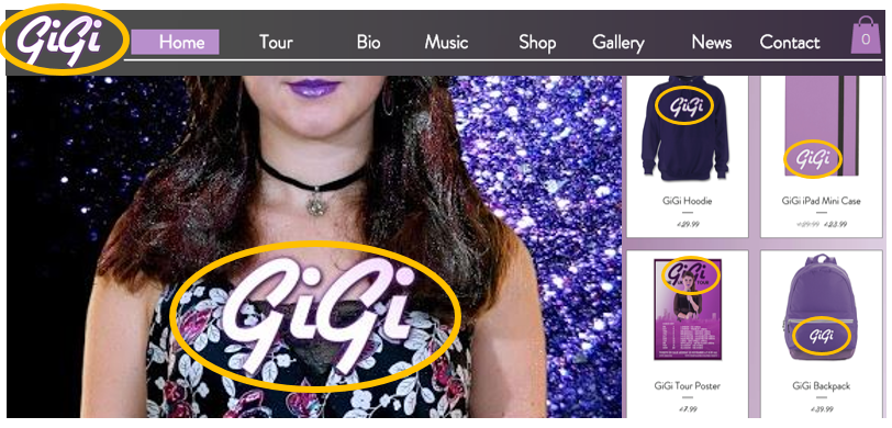
Logo/Consistent Brand
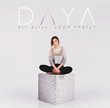
-Another notable convention is the consistent & recurring use of an artist's logo or signature typeface & branding across a number of platforms - including the digipak. Daya's logo, for instance, can be seen on her debut EP, as well as the website and merchandise products.
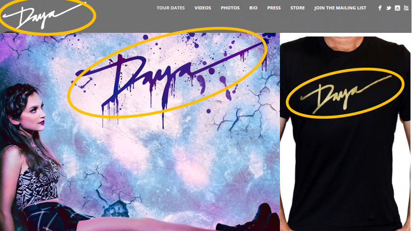
-We perhaps challenged convention slightly, as artists (including Daya on her debut album) sometimes use a different font on a digipak than to the rest of their branding, though we didn't do so - mainly because as a debut artist releasing an eponymous album, we wanted to establish her name and brand early.
Institutional Information
We followed convention and included institutional information, taking inspiration from a number of existing albums...
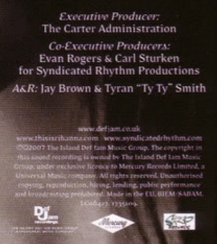
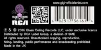

-A key convention present on every album is the inclusion of institutional information, which is vital to establish which label the artist belongs to, through the use of:
- Record Company Name
- Record Company Logo
- Distribution Company Name
- Distribution Company Logo
- Barcode
- Copyright Info
...including Demi Lovato's 'Here We Go Again' (bottom left) and Rihanna's 'Good Girl Gone Bad' (right).