Side by Side
Use the arrow keys or spacebar to go to the next slide.
Make this presentation full screen for best effect.

This component is used to display two cards next to one another (stacked on mobile) which gives your content a different look and feel. There are also a lot of flexibility when it comes to using this component. As of right now, by default, this component is available on the following content types:
- Homepage
- Landing page
- Basic inner page
- News
Overview
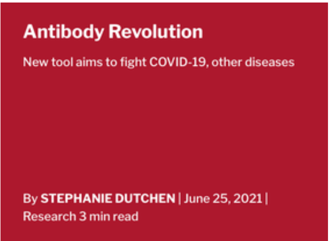
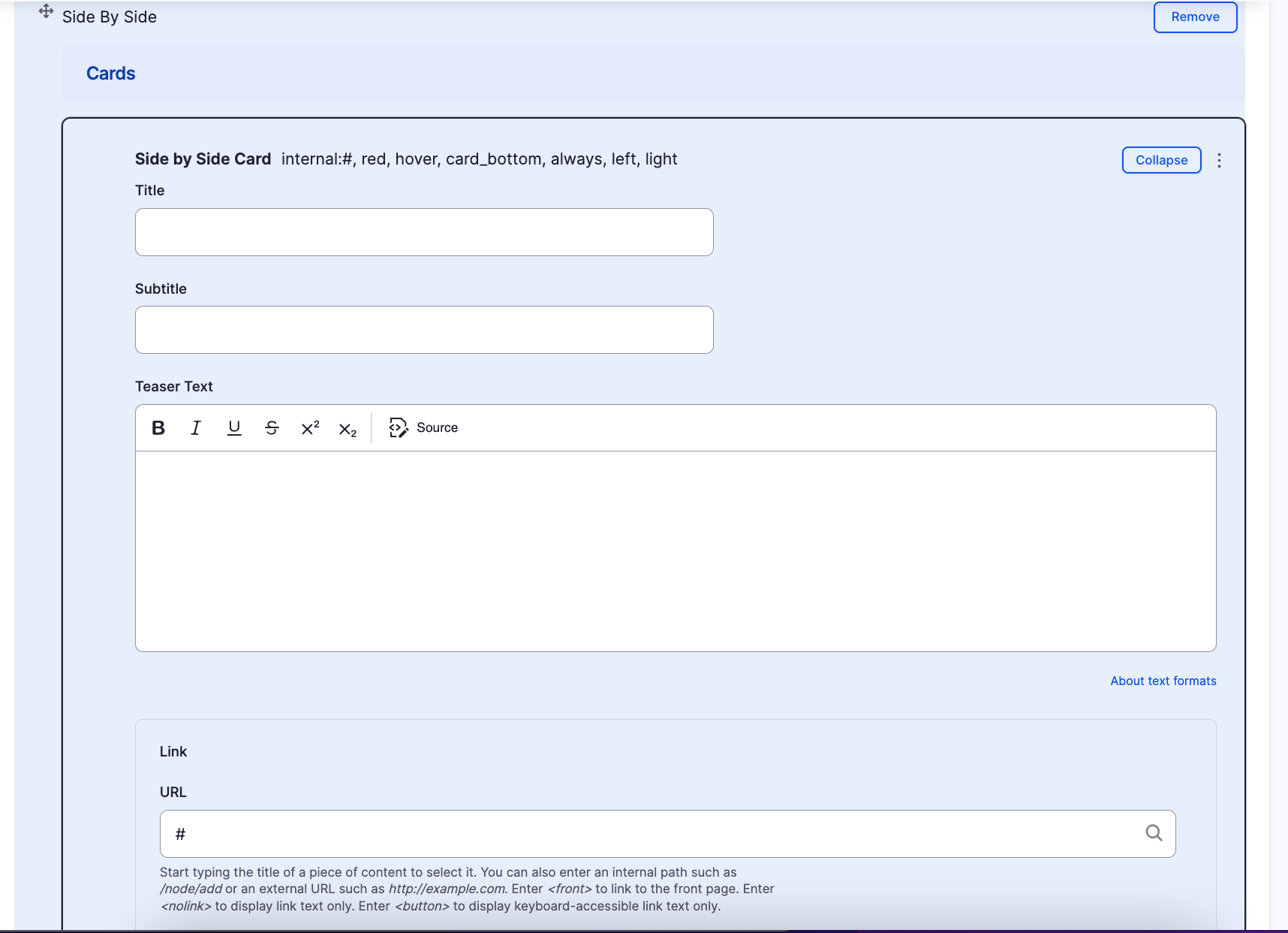
- Title - Title of the card
- Subtitle - Additional text that displays directly below the title field
- Teaser Text - Brief text describing the card
- Link - The link field is optional. If both fields have values filled in, the entire card will become a link. If both fields are left empty, no link will be rendered
- URL - Where the card should link to
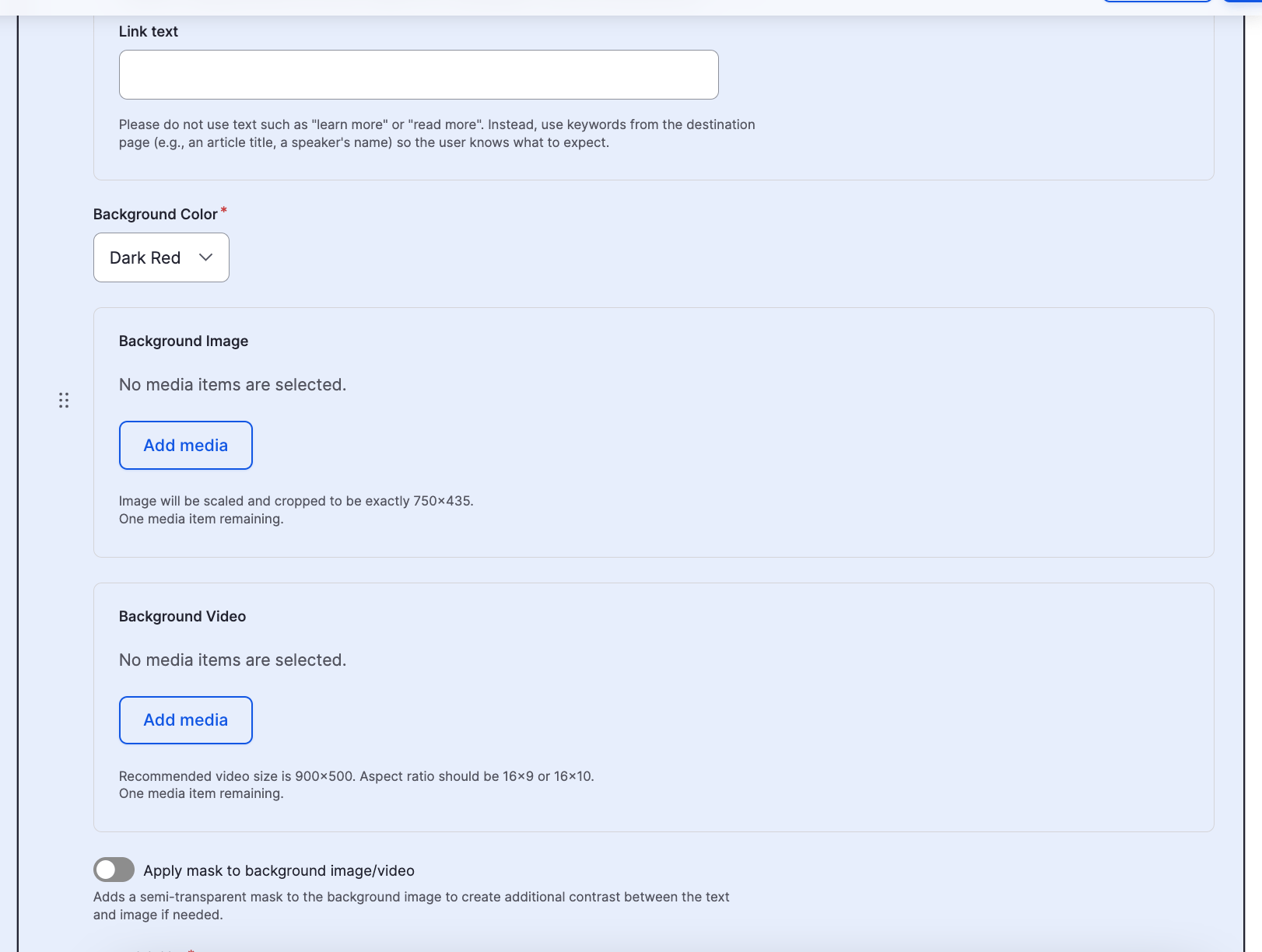
- Link text - The label the displays within the card. Typically a descriptive call to action other than "read more" or "click here"
- Background Color - The background color of the card. Used only when a background image or video isn't used. Options include:
- Dark Red
- Dark Gray
- White
Side by Side Fields
Side by Side Background Color Examples


Dark Red
Dark Gray
White
Side by Side Fields (cont.)
-
Background Image - Allows for a background image to be used on the card. Image will be scaled and cropped to be exactly 750x435
-
Background Video - Allows for a background video to be used on the card. Recommended video size is 900x500. Aspect ratio should be 16x9 or 16x10
-
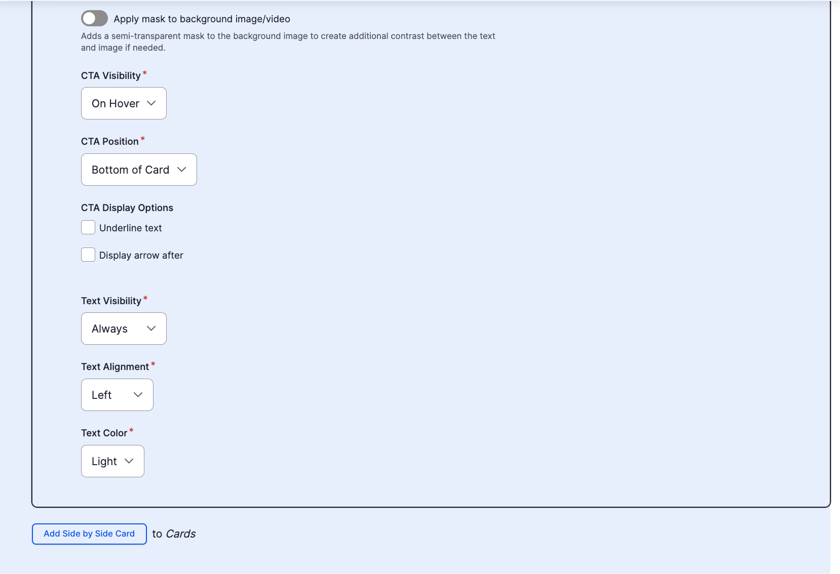
Apply Mask to background image/video - Adds a semi-transparent mask to the background image to create additional contrast between the text and image if needed
-
CTA visibility - Controls the visibility of the link field's text. Options include:
-
On hover - text displays when the user hovers over the card with their mouse cursor or focuses within the card when navigating via keyboard.
-
Always - text always visible regardless of user interaction
-
-
CTA position - Controls the position of the link field's text within the card. Options include
-
Bottom of the card
-
Below the subtitle
-
Side by Side Fields (cont.)
-
CTA Display Options - Allows special treatment to be applied to the link field's text. Options include
- Underline text
- Button
-
Text Visibility - Controls the initial visibility of ALL text within the card. Options include:
- Always - text is always visible
- On hover - text is initially hidden until the user hovers over the card with their mouse cursor or focuses within the card via keyboard
- Text Alignment - Controls the alignment of all of the text within the card. Options include left, right, or center.
-
Text Color - Controls the color of the text. Options include:
- Light - used when the selected background color is darkk or when the background image/video is on the darker side
- Dark - used when the selected background color is white or when the background image/video is on the light side
Side by Side Component (backend)
Congratulations!
You have completed the
Side by Side Walkthrough
use the back button to go back to where you were