Table of Contents
Use the arrow keys or spacebar to go to the next slide.
Make this presentation full screen for best effect.
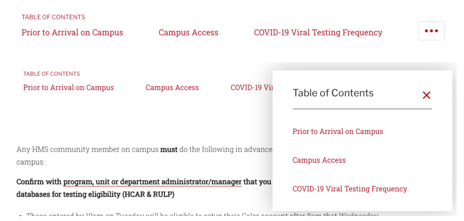
This component is used to display a table of contents that follows the user as they scroll. The current selection that is being viewed is highlighted. As of right now, by default, this component is available on the following content types:
- Home page
- Landing page
Overview
- Title - The label that shows above the links within the table of contents. Defaults to "Table of Contents".
- Links - You can add up to 15 links
- URL - The URL should point to a component within the current page that is being edited. This needs to match the value entered in the Anchor ID input of the target component - proceeded with a hash # symbol. It's important that only letters and numbers are used. Dashes or underscores can be used to replace spaces
- Link Text - The text that you'd like to use for the anchor link
Table of Contents Fields
Congratulations!
You have completed the
Table of Contents Walkthrough
use the back button to go back to where you were