Analysis of a digipak-Mumford and sons
Use of Images
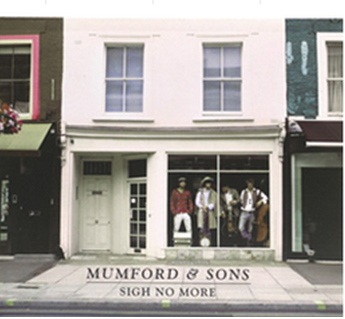
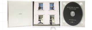
The image on the front of the digipak shows the 'Mumford and Sons' group in a shop window. The shot of the group is an extreme long shot therefore showing off the location as well as the group. I think that it is quite unusual that the group don't appear to be the centre of attention as they are placed in a window which doesn't catch the audiences attention straight away therefore I think this digipak cover is quite unique. By being placed in a window however it connotes that they are something to look at.
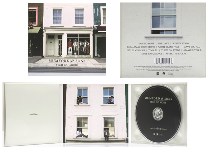
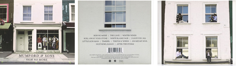
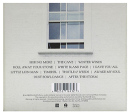
Within the digipak the left panel it is quite plain containing only a symbol however the indie genre is simplistic. On the middle panel there is a long shot used showing each member of the group sat in a different window of the what appears to be a shop shown on the front cover which therefore creates continuity. The panel on the right where the cd appears to be contains a white background which is very simple however on the cd itself the symbol that appears on the left panel is also found on the CD. On the back of the digipak there is an image of one of the windows which appears both on the front cover and within the digipak again showing continuity throughout the digipak. The shop that is used on the front is typical to the types of houses that you would expect to see in an indie music video.
Use of Fonts
There are 3 different fonts used throughout the Mumford and Sons digipak. The font used for the group name is a serif font which is very simplistic typical of the indie genre. The other digipak I researched also contained a simple sans serif font for the artists name therefore suggesting it is stereotypical for the genre.
The font for the name of the CD is in a smaller font then the groups name which therefore attracts the audience to the groups name first as it stands out more.The font is again serif and connotes an adult target audience due to it being mature.
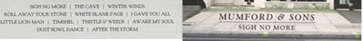
There is also another font used for the song names and this is also a serif font.The similar fonts help to create a continuity showing that all the parts of the digipak belong together.
Colour
All the fonts on the digipak are black which connotes maturity and the indie genre. The black coloured font also stands out against the white background. All colours used throughout the digipak are very plain mainly being black and white such as the white shop, white background where the CD goes and on the left panel. These colours connote the type of the genre the digipak is which is indie as the indie genre is very mature and simple.

Layout
The layout of the digipak isn't overcrowded instead it is minimalistic. The name 'Mumford and Sons' is placed underneath the image of the group in a reasonable size which doesn't take up a lot of space. The name of the album is placed in a smaller font just below the groups name neatly. On the back of the digipak the names of the songs are in neat rows giving it a professional look.There are also 3 images throughout the digipak which are suitable for the indie genre. Within the digipak the layout is simple containing only one image on the centre panel and the CD on the right panel.
Location and Clothing
The location for the photos is typical of the indie genre. The image on the front of the digipak and inside the digipak include a white building that you would expect to see within an indie music video. The clothing worn by the members of the group is stereotypical of the indie genre. The 2 members on the left are wearing country hats, while the one on the far left is also wearing a chequered shirt connoting the indie genre. The man on the far right is holding a guitar also connoting the indie genre as it is what you would expect to hear within in an indie song.