{the jump}
Intro to Flexbox
Session 7b
Agenda
- Homework & Errors
- Spotting CSS Errors (console & vs_code)
- Intro to flexbox
- Codealong: Deliveroo
Spotting a CSS Error
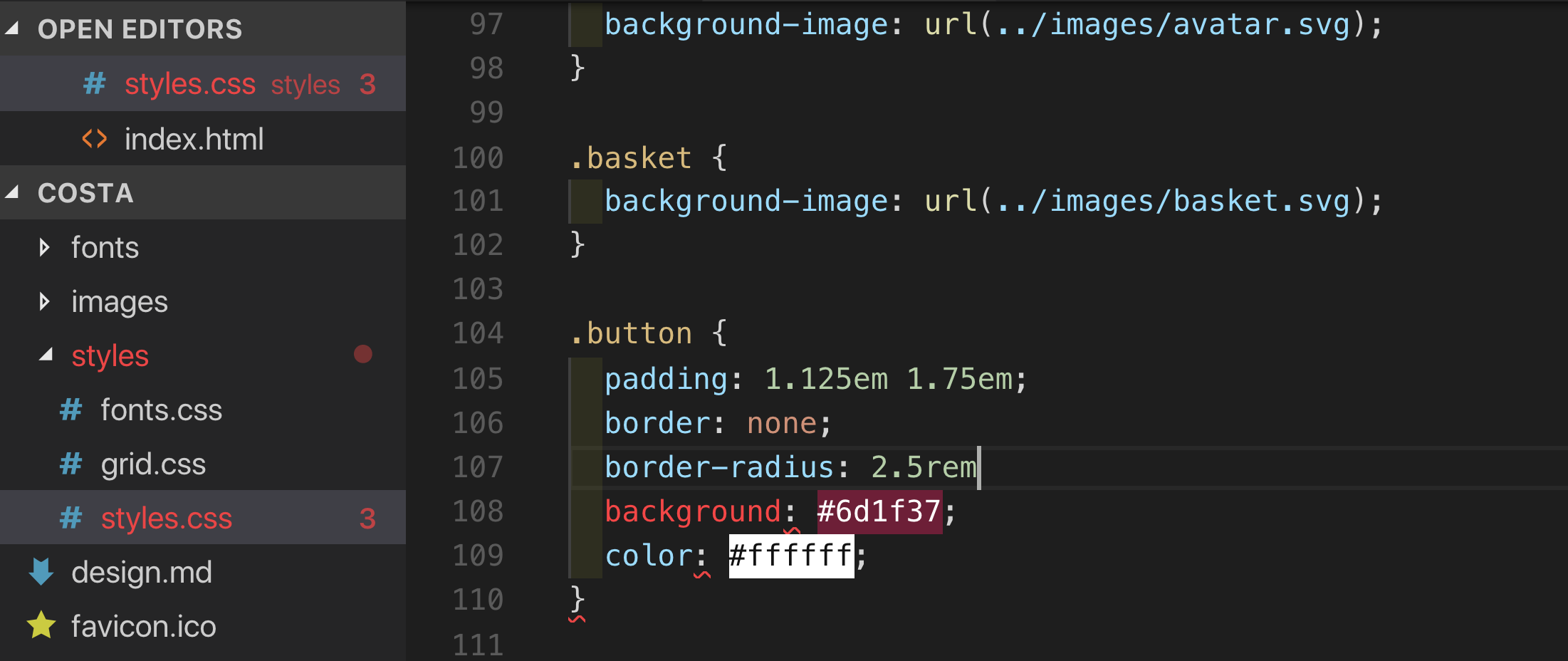
In the Editor

Missing Semicolon
- Look out for red squiggles and red filenames in the file tree.
- Look for discolouration in syntax highlighting (e.g. 'background')
- Coding requires precision: You cannot expect your code to work with errors in it!
Red Squiggles
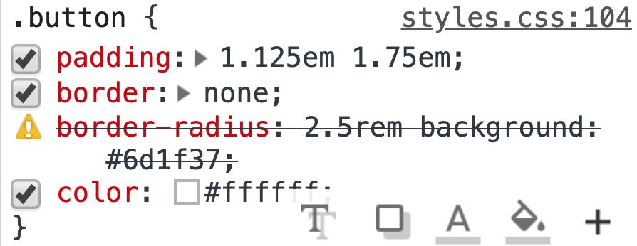
In the Browser

Missing Semicolon
- Look out for yellow triangles. (Hover for reason)
- Because no; it thinks background declaration is part of border-radius value.
- Border radius then fails and background is never seen
Red Squiggles
Fairness
Sidenote: When CSS fails
- If you write something in CSS that that browser does not understand it will just fail to parse it and move on
- If you write 2 declarations with the same property (one of which is new and the browser doesn't understand) then it will only parse the one it does
- This leads to us being able to progressively enhance
- You need to put the new thing after
- When CSS BREAKS (due to a big syntax error) styles will fail on the page from that point on.
.something {
  display: block;
  display: flex; /* non-supporting browsers will ignore */

/* because of missing closing brace all rulesets below fail to be parsed
p {
  width: 50%;
  inline-size: 50%; /* non-supporting browsers will ignore */
}
Vendor Prefixes
The major browsers use the following prefixes to allow them to trial things before committing themselves on the official property name:
- -webkit- (Chrome, Safari, newer versions of Opera, almost all iOS browsers including Firefox for iOS; basically, any WebKit based browser)
- -moz- (Firefox)
- -o- (old pre-WebKit versions of Opera)
- -ms- (Internet Explorer and Microsoft Edge)
p {
  -webkit-transition: all 4s ease;
  -moz-transition: all 4s ease;
  -ms-transition: all 4s ease;
  -o-transition: all 4s ease;
  transition: all 4s ease;
}- To avoid manual deployment autoprefixer or prefixfree
- For browser feature detection: @supports (historical: Modernizr)
Flexbox
What is it and why is it useful
- Flexbox is a one-dimensional layout system
- The 'flex' is because it allows elements to auto-distribute space
- Fixes problems with height
- Adds easy vertical centring
- Also, auto margins work in both dimensions
- It is meant for parts of an application
- but it can (and is currently) used by many websites as the site-wide layout system
-
Difference between it and CSS Grid
- Flexbox is one dimensional, which means that it only 'thinks' in one direction (string demo)
- Grid can think in 2 directions
- (Remember that CSS grid is not the same as 'a grid system'
From now on in, whenever you are trying to put things next to each other:
FLEXBOX
Demos & Resources
- Guide
- Physical demo
- Wes Bos Course (free)
-
flexbugs - a community resource for fixing bugs
Concepts & Commands
- Flexbox controls how the inside of an element lays out its children (and is therefore a display property)
- You will mostly give general commands from that element (the flex container) to control the immediate child elements within (aka flex items)
- Sometimes you will make micro-adjustments for individual items using item-specific commands
- Flexbox puts items onto a line. The direction the line runs in is called the main axis. The direction perpendicular to that line is called the cross axis.
Container (parent) Commands
- display: [inline-]flex; - makes a block or inline element with flexbox rules for the positioning of its immediate child elements
- flex-direction - determines the direction of the main axis
-
flex-wrap - determines if the items wrap onto a new line
-
flex-flow: is the short version of wrap and direction.
-
flex-flow: is the short version of wrap and direction.
- justify-content - where items are positioned along the main axis
- align-items - where items are positioned on the line's cross axis
- align-content - where all the lines themselves are positioned within the flex container itself (height must be > content height)
-
[row/column-]gap - the gutters between the flex items (demo)
- (% doesn't work if size of container is not known, see here for more)
Item (Child) Commands
- order - for overriding the 'source order' (e.g. bring to front of line or swap places) (default is 0)
-
flex-grow - ratio of how item will take up spare space on the line
- default: 0
-
flex-shrink - ratio of how item will give up spare space on the line
- default: 1
-
flex-basis - default size of an element before the remaining space is distributed.
- replaces width/height because you don't know the direction the line runs in. (default: 'auto', which will try to use them)
- CSS lengths or intrinsic sizing. (Or 0)
- flex - shorthand for grow/shrink/basis
- align-self - determines where this item sits on the cross-axis
Usage in Page Creation
- A basic page layout
- gutters/gaps (with margins)
Debugging
- Occasionally you will get misaligns in your CSS and but not be able to see why
- To debug this see this pen for strategies on how to cope.
- Often this comes from something like a flex container's children not wrapping