{the jump}
Tables and Forms
Session 3
Tables
Tables are:
- A way of showing data
- used to be the way we laid out pages
- Accessible
- compared with something like d3 graphs
Table Structure (* = optional)
- Begins with a <table> tag
- <caption> * (must be the first child of the table tag)
-
<colgroup>* (defines a group of columns to style)
- demo (nth child tho)
- <thead>* (the header element, for multiple head rows)
- <tfoot>* (defines the footer)
- <tbody>* (used if there is tfoot or thead)
- thead, tbody & tfoot are to allow scrolling if table is long
- can have multiple (demo)
Table cells
- Put inside table rows <tr>
- Can be <td> (table data - standard table cell)
- or <th>* for header cell (that gives the title of that row or column)
Examples
<!-- Simple table with header -->
<table>
  <tr>
    <th>First name</th>
    <th>Last name</th>
  </tr>
  <tr>
    <td>John</td>
    <td>Doe</td>
  </tr>
  <tr>
    <td>Jane</td>
    <td>Doe</td>
  </tr>
</table>
<!-- Simple table -->
<table>
<caption>People</caption>
<tr>
<td>John</td>
<td>Doe</td>
</tr>
<tr>
<td>Jane</td>
<td>Doe</td>
</tr>
</table><!-- Table with thead,
tfoot, and tbody -->
<table>
<thead>
<tr>
<th>Header content 1</th>
<th>Header content 2</th>
</tr>
</thead>
<tbody>
<tr>
<td>Body content 1</td>
<td>Body content 2</td>
</tr>
</tbody>
<tfoot>
<tr>
<td>Footer content 1</td>
<td>Footer content 2</td>
</tr>
</tfoot>
</table>Scope
What the heading applies to.
Can be set to:
- row
- col
- colgroup
- auto
<table>
  <colgroup>
    <col style="background-color: #0f0">
    <col span="2">
  </colgroup>
  <tr>
    <th scope="col">Product</th>
    <th scope="col">Width</th>
    <th scope="col">Height</th>
  </tr>
  <tr>
    <th scope="row">mini</th>
    <td>200</td>
    <td>100</td>
  </tr>
  <tr>
    <th scope="row">maxi</th>
    <td>500</td>
    <td>300</td>
  </tr>
</table>
Spans
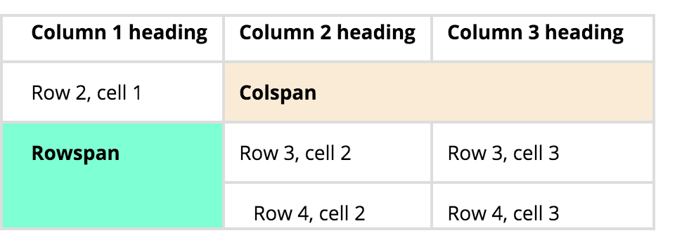
colspan and rowspan allow you to bridge gaps
<table>
    <tr>
        <th>Column 1 heading</th>
        <th>Column 2 heading</th>
        <th>Column 3 heading</th>
    </tr>
    <tr>
        <td>Row 2, cell 1</td>
        <td colspan="2">Row 2, cell 2, also
            spanning Row 2, cell 3</td>
    </tr>
    <tr>
        <td rowspan="2">Row 3, cell 1, also
            spanning Row 4, cell 1</td>
        <td>Row 3, cell 2</td>
        <td>Row 3, cell 3</td>
    </tr>
    <tr>
        <td>Row 4, cell 2</td>
        <td>Row 4, cell 3</td>
    </tr>
</table>
Making Tables Accessible
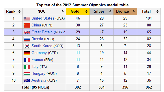
Task: Create League Table

HTML FORMS
What are they for?
- They allow you to input information into the system
- typically log in, sign up, etc.
- By default that data is sent to the server
- synchronously
- via http(s)
A typical form
  <form method="GET">
    <label for="firstName">First Name</label>
    <input type="text" name="firstname" id="firstName" placeholder="First name">

    <button type="submit">Submit</button>
  </form>
Form attributes of note:
- action - where a form sends its data, e.g. signup.php (default: same/current url)
- method - how it sends it there (GET, POST, etc.)(default: GET)
- enctype - the MIME type. i.e. how it's encoded. (If you have a file upload on your form then use multipart/form-data)(default: x-www-form-urlencoded; can be overridden by formenctype on button)
Input
Attributes:
-
name - determines the name of that piece of data.
- used in auto-complete
-
type: what it is (look here)
- beware number (text and special characters)
- affects virtual keyboards
- value - determines the value in the box
- placeholder - the grey text that appears in the box. DOESN'T get submitted as a value. Disappears when you start typing.
<!-- standard text box -->
<input type="text">

<!-- password input -->
<input type="password">

<!-- number input -->
<input type="number">

<!-- email input -->
<input type="email">

<!-- tel input -->
<input type="tel">
Textarea
For large blocks of free-form text, like messages or address input
'rows' and 'cols' determine how much text is visible before scrolling.
Text between tags becomes text in the box (no value attribute)
For placeholder to work tag ends must be touching
<textarea name="textarea" rows="10" cols="50">
Write something here
</textarea>
Labels
- Labels are there to explain form elements to the user.
- They make the form accessible.
- Placeholder is not a replacement for label.
- They can wrap in various ways.
- the 'for' attribute should match the 'id' attribute of the input to which it refers. It is not needed if label wraps input
<label for="first_name">First Name</label>

<input type="text" id="first_name" name="first_name"
placeholder="What is your first name?">


<!-- or -->

<label for="first_name">
    First Name
    <input type="text" id="first_name" name="first_name"
    placeholder="What is your first name?">
</label>
Radio Buttons
These are there for 'OR' choices, like 'adult/child'.
They will only work if the 'name' attribute is set to the same thing.
The 'value' attribute is what is sent.
'checked' attribute selects it by default.
<input type="radio" name="status"
    value="adult" id="adult">

<input type="radio" name="status"
    value="child" id="child">
Checkboxes
These are there for 'AND' choices, like sports.
Again, the 'name' attribute should be set to the same thing.
Again, the 'value' attribute is what is sent.
'checked' attribute selects it by default.
<input type="checkbox" name="sport"
    value="badminton" id="badminton">

<input type="checkbox" name="sport"
    value="sailing" id="sailing"
checked="checked">

<input type="checkbox" name="sport"
    value="football" id="football">

<input type="checkbox" name="sport"
    value="rugby" id="rugby">
Selects
- Originally for single choices from a list of options.
- Can be set to accept multiple in HTML5 using the 'multiple' keyword
- Use if you want to save space. (Use if more than 6 items, but depends on UX)
- options
- value attribute = value for system
- can group with optgroup
<select name="title">
    <option value="0">Mr.</option>
    <option value="1">Mrs.</option>
    <option value="2">Dr</option>
    <option value="3">Prof.</option>
</select>

<select name="hobbies" multiple>
    <option value="squash">Squash</option>
    <option value="climbing">Climbing</option>
    <option value="chess">Chess</option>
    <option value="dogging">Dogging</option>
</select>

<label for="dino-select">Choose a dinosaur:</label>
<select id="dino-select">
    <optgroup label="Theropods">
        <option>Tyrannosaurus</option>
        <option>Velociraptor</option>
        <option>Deinonychus</option>
    </optgroup>
    <optgroup label="Sauropods">
        <option>Diplodocus</option>
        <option>Saltasaurus</option>
        <option>Apatosaurus</option>
    </optgroup>
</select>
Inputs & Buttons
- Originally buttons were meant to be something that could be customised to do something on the page, like simple javascript.
- <input type="submit"> was how you submitted a form
- Now you can use <button type="submit">
- You can add icons to buttons, you can't to inputs, because its content is html, not system based
<!-- old ways -->

<input type="submit" value="save!">
<input type="reset" value="Reset!">
<input type="button" value="open menu">


<!-- new ways -->

<button type="submit">Sign up!</button>
<button>Show menu</button>
<button type="reset">Reset</button>
Fieldsets & Legends
- Fieldsets outline a choice
- Legends give titles to those choices
<form>

    <fieldset>
        <legend>Name</legend>
        <label for="first_name">First Name</label>
        <input type="text" id="first_name"
            name="first_name">

        <label for="last_name">Last Name</label>
        <input type="text" id="last_name"
            name="last_name">
    </fieldset>

    <fieldset>
        <legend>Gender</legend>
        <label for="male">Male</label>
        <input type="radio" id="male"
            name="gender" value="male">

        <label for="female">Female</label>
        <input type="radio" id="female"
            name="gender" value="female">

        <label for="other">Other</label>
        <input type="radio" id="other"
            name="gender" value="other">
    </fieldset>

    <button type="submit">Submit</button>

</form>
Task
Make a t-shirt ordering form.
Must have:
- Title (select)
- Name
- Address (textarea)
- size: xs, s, m, L, XL (pick one)
- gender: (m / f / other)
- Patterns: 'back print', 'front print', 'details' (none, 1 or many)
Use <form method="POST" action="https://form-reader.netlify.app/.netlify/functions/formReader"> as the form tag
Advanced Forms
The <datalist> element
- mdn
- Allows a type of auto-suggest
- Good for 'data purity' but not foolproof
<label for="course-level">Dive Course Level</label>
<input list="course-level-options" id="course-level" name="course-level">

<datalist id="course-level-options">
    <option>Discover Diving</option>
    <option>Open Water Diver</option>
    <option>Sports Diver</option>
    <option>Rescue Diver</option>
    <option>Dive Master</option>
</datalist>
Text
Validation options
Disabled attribute
- mdn
- disabled="disabled" (disabled) or disabled="" (enabled)
- BUT, you should just use a 'boolean attribute' (i.e. just write disabled)
- You can put it on: <button>, <command>, <fieldset>, <keygen>, <optgroup>, <option>, <select>, <textarea> and <input>
- disabled fields are NOT submitted
readonly attribute
- mdn
- Like disabled, only the element is still focussabled (and hence accessible) and the value will be submitted
- It's often the opposite of <input type="hidden"> where you want the user to see that there's a value being submitted in the form, usually based on a choice or information that they have previously provided when filling out the form
'required' attribute
- mdn
- The form cannot be submitted unless a value is passed
- This is down to HTML5 constraint API
'autocomplete' attribute
More Validation
Netlify Forms
Painlessly add form handling with 1 word! (docs)