Tidyr; R Markdown
Joel Ross
Winter 2021
INFO 201
Course Feedback
Today's Objectives
By the end of class, you should be able to
- Use tidyr to organize data into the proper shape
- Reflect on Data Feminism Ch 3
- Generate dynamic reports with R Markdown
Q&A Poll (20min max):
Assignment A2: COVID
A chance to work with and analyze COVID data directly from the New York Times. Practice asking questions of data!
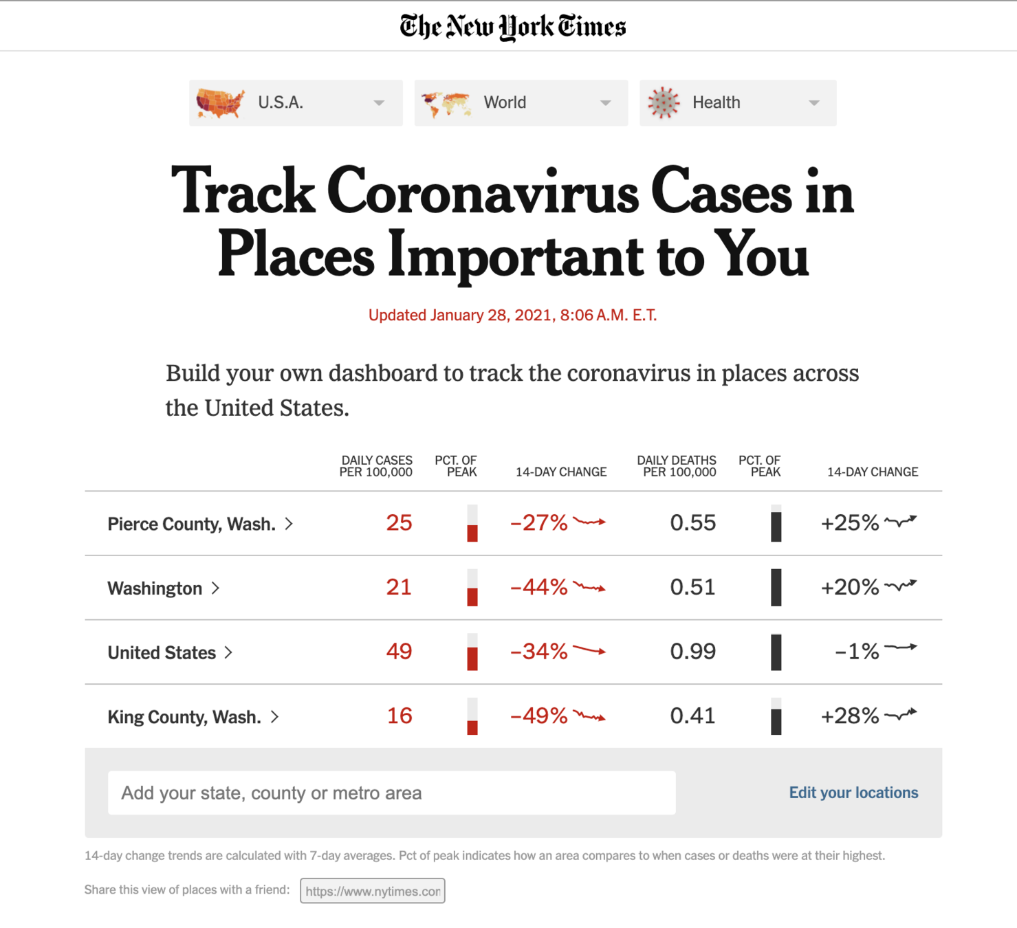
New York Times
All data sources have bias; no data is "objective"
Consider a data set...
What does each row represent?
Consider a data set...
Now what does each row represent?
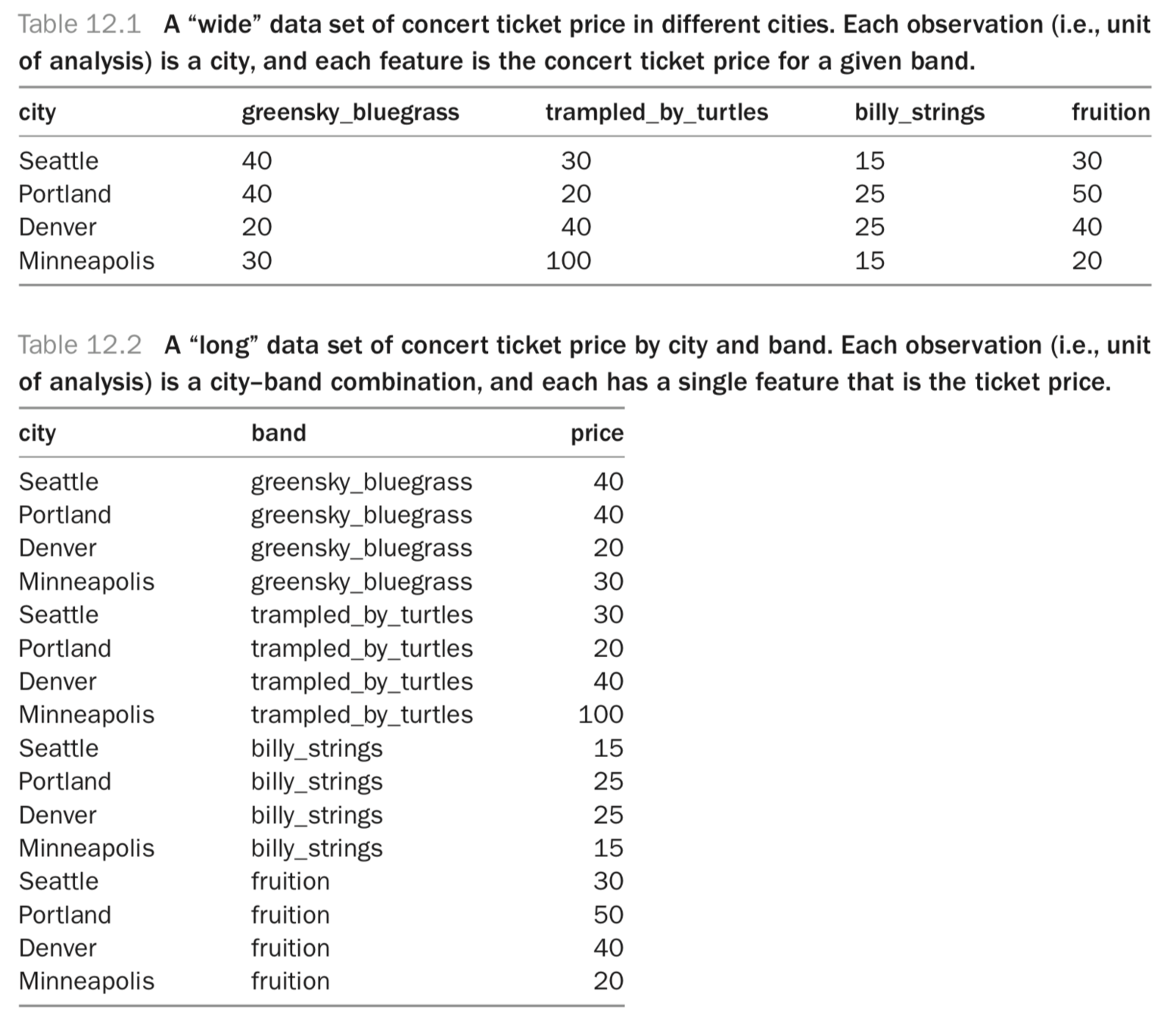
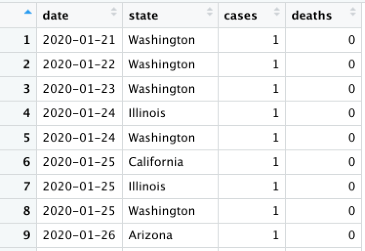
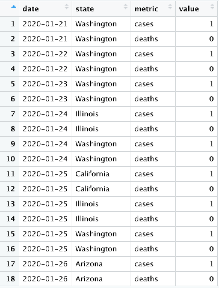
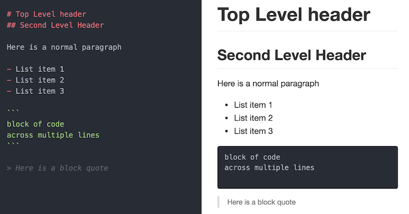
Data Shape
4 rows x 4 cols
= 16 prices
16 rows x 1 col
= 16 prices
tidyr
We can convert between
wide and
long data (and vice versa) using the
tidyr package.
Note: The reshaping functions gather() and spread() have been replaced by the simpler pivot_longer() and pivot_wider() functions respectively
# load the tidyr library
library("tidyr")
pivot_wider()
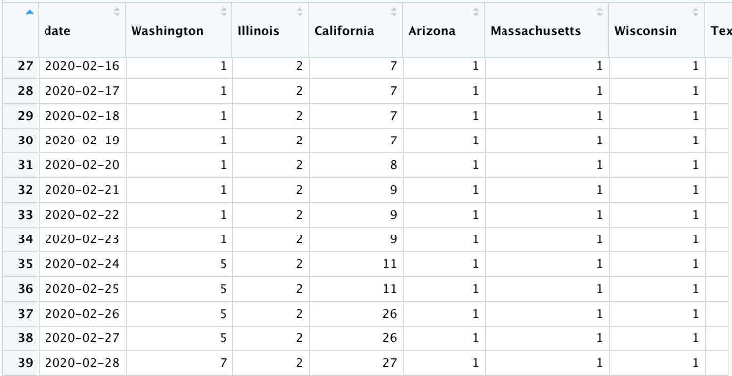
Convert from long to wide (spread) using pivot_wider(). This creates new columns from existing rows.
state_cases_df %>% pivot_wider(
  # What column(s) will be the unique identifier?
  id_cols = c(date), # can be a vector!

  # Which coluumn do the new column-names come from?
  names_from = state,

  # Which column do the new column-values come from?
  values_from = cases
)
pivot_longer()
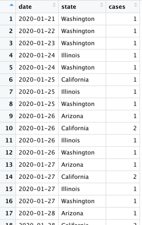
Convert from wide to long (gather) using pivot_longer(). This creates more rows from existing columns.
state_df %>% pivot_longer(
  # What column(s) will new values from from?
  cols = c(cases, deaths), # can be a vector!

  # What should you name the new (label) column?
  names_to = "metric"
)
Data Presentation
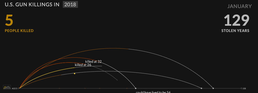
Elevating Emotion
A statement of profound truth [is] revealed to us through our own emotion
Elevating Emotion
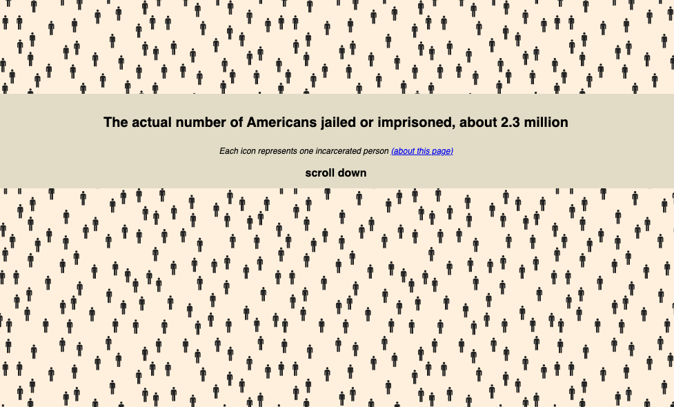
What is the purpose of each of these data presentations?
All design has ideology
Haraway calls [the god trick] a trick because it makes the viewer believe that they can see everything, all at once, from an imaginary and impossible standpoint. But it’s also a trick because what appears to be everything, and what appears to be neutral, is always what she terms a partial perspective. And in most cases of seemingly “neutral” visualizations, this perspective is the one of the dominant, default group. Think back to the presumption of whiteness as default that we discussed in the introduction, or—for an example of an actual visualization—to the redlining map discussed in chapter 2. This is a good example of the god trick at work.
Own your own subjectivity
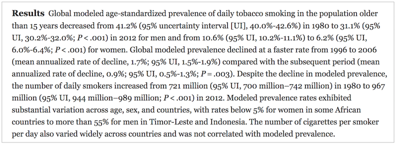
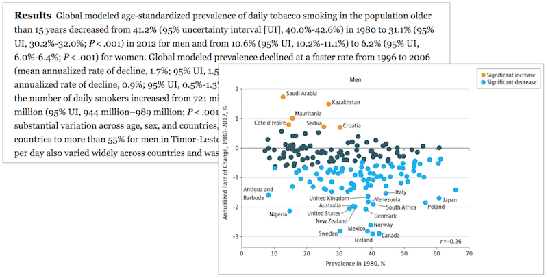
How many numbers are in this summary?
Data Presentation
Data Reports
Data reports have hundreds (thousands!) of variables, dozens of representations (tables or graphics)
We need to update our report when the data or analysis changes
Copy and Paste?

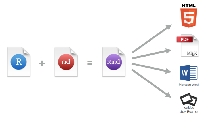
R Markdown
An R package (framework) for dynamically generating documents from code. Formatted text, executed code, and displayed graphics are seamlessly integrated.
Markdown

Markdown is a simple syntax for specifying how plain text should be formatted.
Make this executable!
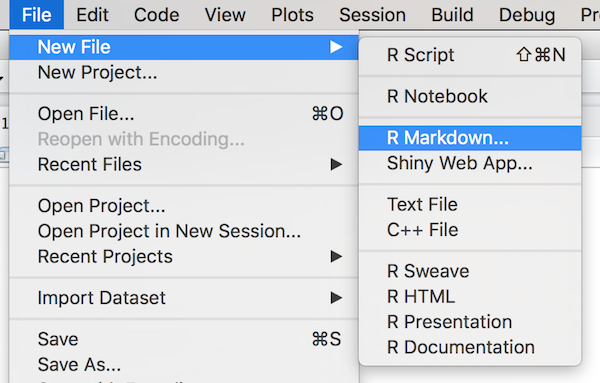
Rmd Files
R Markdown document source code is written in
.Rmd files. These can be created through R Studio.
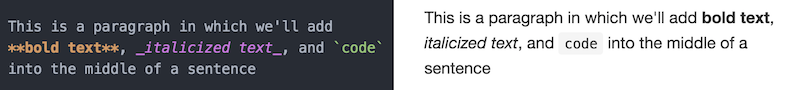
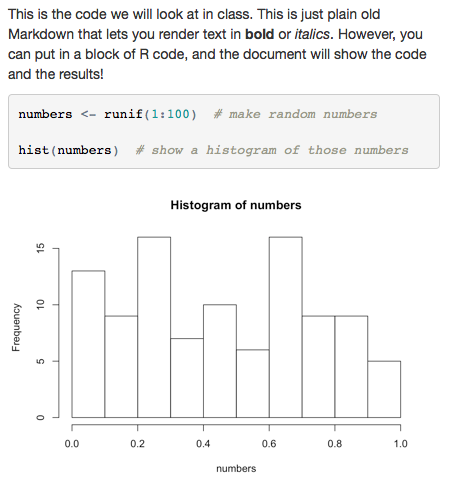
Markdown and Code
This is the code we will look at in class. This
is just plain old Markdown that lets you render
text in **bold** or _italics_. However, you can
put in a block of R code, and the document will
show the code and the results!


```{r example}
numbers <- runif(1:100)  # make random numbers

hist(numbers)  # show histogram of the numbers
```
We write Markdown code as normal in the document, but include
{r} next to code blocks (chunk) to execute!
chunk label
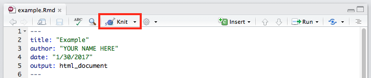
Knitting
R Markdown files are converted into readable documents (e.g., HTML) using the
knitr library. This library handles the code execution and producing the output.


Markdown and Code
This is the code we will look at in class. This
is just plain old Markdown that lets you render
text in **bold** or _italics_. However, you can
put in a block of R code, and the document will
show the code and the results!


```{r example}
numbers <- runif(1:100)  # make random numbers

hist(numbers)  # show histogram of the numbers
```
knitr Options
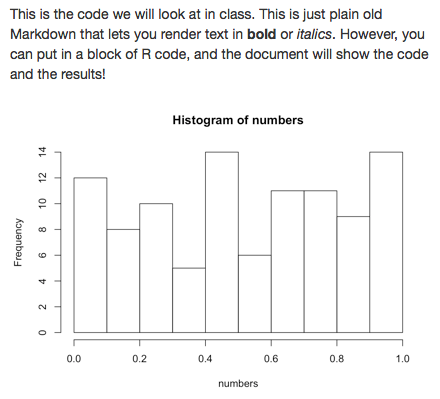
This is the code we will look at in class. This
is just plain old Markdown that lets you render
text in **bold** or _italics_. However, you can
put in a block of R code, and the document will
show the code and the results!


```{r example, echo = FALSE}
numbers <- runif(1:100)  # make random numbers

hist(numbers)  # show histogram of the numbers
```
Specify options after a comma in the
{r} to specify what content should be rendered.
Do not echo (show) the code
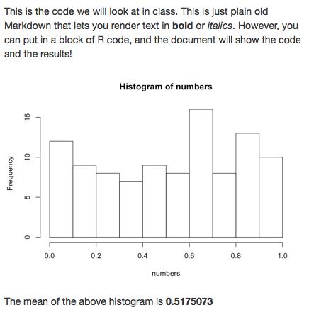
Inline Code
This is the code we will look at in class. This
is just plain old Markdown that lets you render
text in **bold** or _italics_. However, you can
put in a block of R code, and the document will
show the code and the results!


```{r example, echo = FALSE}
numbers <- runif(1:100)  # make random numbers

hist(numbers)  # show histogram of the numbers

numbers_mean <- mean(numbers)  # save the mean
```

The mean of the above histogram
is **`r numbers_mean`**
Include expressions (e.g., variables) in
inline code blocks by prepending them with
r
Rendering Strings
Don't print specific strings of text! Instead, save them in a variable and use inline R to render them.
```{r do_not_do_this, echo = FALSE}
# Don't do this
print("Hello world")
```
```{r do_this, echo = FALSE}
msg <- "**Hello world**" # contains Markdown!
```
Below is the message to see:
`r msg`Rendering Lists
Outputted strings render Markdown syntax, so you can use that to create Markdown lists.
```{r list_example, echo=FALSE}
markdown_list <- "
- Lions
- Tigers
- Bears
- Oh mys
"
```

`r markdown_list`
```{r pasted_list_example, echo=FALSE}
animals <- c("Lions", "Tigers", "Bears", "Oh mys")
# Paste `-` in front of each and join the items together
# with newlines between
markdown_list <- paste("-", animals, collapse = "\n")
```
`r markdown_list`Rendering Tables
Use the
knitr::kable() function to render a data frame as a formatted table.
```{r kable_example, echo=FALSE}
library(knitr)  # load the package (once per document)

# make a data frame
letters <- c("a", "b", "c", "d")
numbers <- 1:4
df <- data.frame(letters = letters, numbers = numbers)

# "return" the table to render it
kable(df)
```
Analysis vs. Presentation
Best practice: do your analysis in a separate
.R file and then use
source() to load that file and call its functions from your
.Rmd.
### In `analysis.R`

data <- read.csv("my_file.csv", stringsAsFactors = F)

# produce data frame to show
results_table <- data %>%
  filter(criteria) %>%
  select(my_cols)

make_scatterplot <- function() {
  plot(data)  # return a scatterplot
}
# In `report.Rmd`
```{r setup, include=F}
library(knitr)
source("analysis.R") # load analysis file
```
```{r table, echo=F}
kable(results_table) # render the table
```
```{r plot, echo=F}
make_scatterplot() # call function to get plot
```Action Items!
-
A2: COVID due next week
-
Read: Programming Skills Ch 20 (required)
-
Read: Data Feminism: Chapter 4
Next: multi-player git