Responsive CSS
Joel Ross
Spring 2023
View of the Day
-
Project Draft 1 overview
-
Q&A (pollev)
-
Flexbox Review (code together!)
-
CSS Review (code in groups!)
-
Media Queries Demo (code together!)
Project Draft 1
The complete HTML & CSS. A static "screenshot" of what your app will look like.
- Include all of your "pages"!
- Can include just a single example of a "details" page
- May need to copy/paste shared elements (navbars) for now
- Include all sections and components (forms, etc)
- Skip user login forms; we'll provide that through a library
- Be clear what the user will "do" with your app -- where do instructions/etc go?
Project Draft 1
Code requirements:
- Well-written, semantic HTML
-
Significant CSS & styling
- Must include a flexbox or grid (Bootstrap is okay)
-
Accessible
- Check your alts and headings!
-
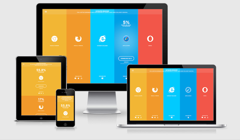
Responsive
- Must include a meaningful media query!
Project Draft 1
Working as a group:
- All group members are responsive for all aspects of the project. Projects are graded as a single piece of work.
- Do not divide up work by language -- everyone needs to contribute to both HTML and CSS
- Everyone needs to check everything. Don't think of it as "Megha's page" or "Henry's page". It is your group's project
- Must use git to code collaboratively. We will be checking for commits from all group members.
- Each individual needs to demonstrate understanding of the material.
Q&A
Updating Lecture Code
# switch to starter branch to get new starter code
git checkout starter

# download new starter code
git pull

# switch back to main branch for coding
git checkout main

# merge in new starter code (use default msg)
git merge starter --no-edit

# code and enjoy!
Get the starter code from the starter branch, but do all of your work on main.
More Flexbox Examples
Any other cleanup we should do to this page?
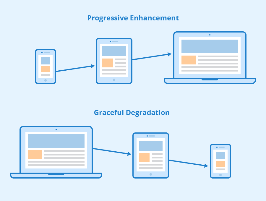
Viewport <meta>
Include the viewport meta element to allow your code to control responsive appearances (rather than the browser).
<head>
  <meta charset="utf-8"> <!-- always need this -->
  <meta name="viewport" content="width=device-width, initial-scale=1, shrink-to-fit=no">

  <!-- more head elements, including <link> ... -->
</head>
Media Queries
/* A Media Query */
@media (min-width: 768px) {
   /* these rules apply ONLY on screens 768px and wider */

   /* a normal CSS rule */
   body {
      font-size: 1.5em;
      background-color: beige;
   }

   /* another CSS rule */
   .mobile-call-icon {
      display: none; /* don't show on large displays */
   }
}
Action Items!
-
Read: through Chapter 9
-
Problem Set 03 due Wednesday
-
Problem Set 04 due next week
Next: CSS Frameworks (Bootstrap)