Flexbox
Joel Ross
LIS 549
In this video...
-
Flexboxes!
Flexbox
A flexbox is an element that allows you to flexibly customize the layout of its children.
An element is made into a flexbox by giving it the display: flex CSS property.
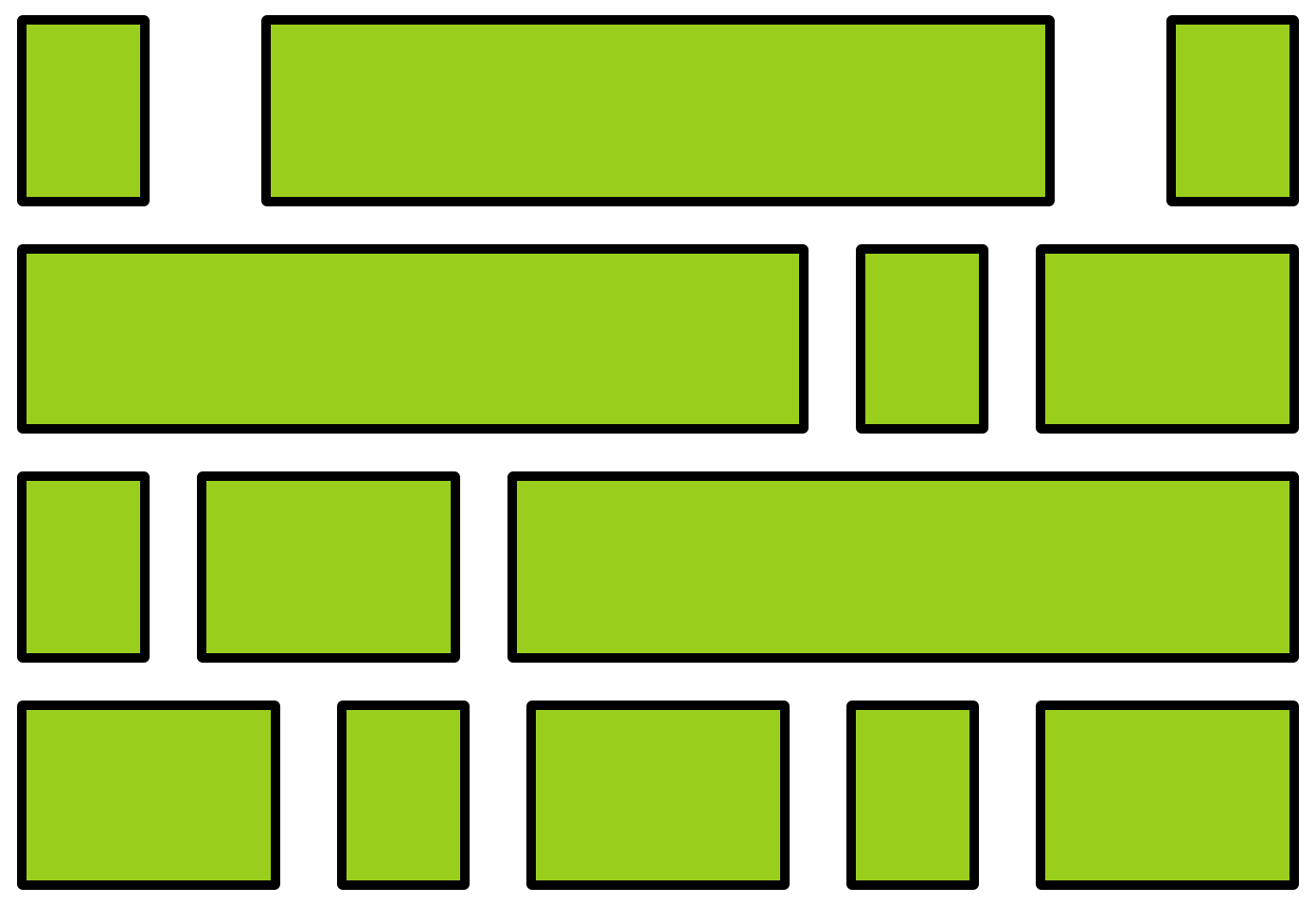
flexbox
child elements
Flexbox Properties
Customize the layout of the flexbox's children by given the flexbox additional CSS properties. For example:


flex-wrap
justify-content
Child Properties
You can also customize the children of the flexbox (the elements that are inside the box) by giving them additional CSS properties. For example:
flex-grow

Flexbox vs. Children
Don't get the flexbox (sometimes called the flex container) mixed up with the child elements (sometimes called the flex items) that are inside of it!
- The flexbox specifies how its children are positioned.
- The child elements specify how much space they should take up.
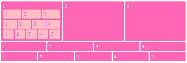
Nesting Flexboxes
A flexbox can contain other flexboxes inside of it!
That is: a child of a flexbox can itself be a flexbox (specifying how its children are positioned).
But a flexbox only influences its children, not its grandchildren! A flexbox lays out its child boxes; what happens inside those boxes is their own business.
Using Flexboxes
Flexboxes are great solutions for:
- Centering block elements (use justify-content)
- Creating "columns" for a page"
- Making an element fill a space larger than its content (use flex-grow)
- ... and more!
Flexboxes are not great solutions for:
- Having block elements stack on top of each other (just use normal elements!)
- Adding specific spacing between elements (use margin/padding)
- ... doing anything else that the browser does by default!