Rapid UI Development with Blazor (and Tailwind CSS)
Many code problems are caused by premature abstraction
Naming a CSS class is defining an abstraction
Tailwind offers a fast way to iterate your design using utility classes
Make the button more 'button like'
bg-blue-300
text-white
p-4
m-8
rounded-md
shadow-lg
https://tailwindcss.com/docs
text-xl
text-2xl
my-8
px-4
Add 'interactivity' with pseudo-class variants
Give your button a different look on hover
hover:
Hover Variant
Handle different screen sizes with breakpoints
sm:
Breakpoints
md:
lg:
xl:
640px
768px
1024px
1280px
Lean on .NET 6 Hot Reload to quickly iterate your design
Refactor markup into separate components to simplify your UI code
Refactor the button markup into a separate component
Render multiple instances of the button on the original page
Make each button have different text
Code that's easy to move is easy to refactor
Use parameters to pass values to your component
<FancyButton text="Click me"></FancyButton><button>@Text</button>
[Parameter]
public string Text { get;set; }FancyButton.razor
Use ChildContent RenderFragments to 'inject markup' into your components
<FancyButton>Click me</FancyButton><button>@ChildContent</button>
[Parameter]
public RenderFragment ChildContent { get;set; }FancyButton.razor
Design (and render) a 'Panel' component for a dashboard
A Panel
Some interesting panel content (could be anything really)
Weather
Forecast
Active Users
Weekly Sales
A Panel
Some interesting panel content (could be anything really)
<button>@ChildContent</button>

[Parameter]
public RenderFragment ChildContent { get;set; }Design (and render) a 'Panel' component for a dashboard
Flex is really useful for controlling layout
(once you grasp the basics)
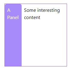
<div class="flex …">
    <div>A Panel</div>
    <div>
        Some interesting content
    </div>
</div>
<div class="flex …">
    <div>A Panel</div>
    <div>
        Some interesting content
    </div>
</div>
<div class="flex flex-col …">
<div>A Panel</div>
<div>
Some interesting content
</div>
</div>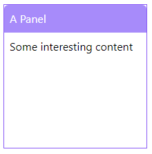

<div class="flex …">
    <div>A Panel</div>
    <div>
        Some interesting content
    </div>
</div>
<div class="flex flex-col …">
<div>A Panel</div>
<div class="border">
Some interesting content
</div>
</div>

<div class="flex …">
    <div>A Panel</div>
    <div>
        Some interesting content
    </div>
</div>
<div class="flex flex-col …">
<div>A Panel</div>
<div class="flex-1">
Some interesting content
</div>
</div>
Make the panels flow across the page
Weather
Forecast
Active Users
Weekly Sales
flex
flex-row
flex-col
Container
Bonus options
flex-wrap
gap-x
For some cases, CSS Grid is a better option (and easier to understand)
Weather
Forecast
Active Users
Weekly Sales
grid
grid-cols-2
grid-rows-2
New requirement: We need 'important' panels
Modify the existing Panel component so it can be 'normal' or 'important'
Important panels should look 'different' to 'normal' panels.
Make at least one of your panels important
Important panels revisited
Start over :)
Make it possible to have an important panel.
This time you cannot make any changes to the existing Panel component
Break Time!
Different ways to manage 'variation' in components
- Conditional logic
- Completely separate components
- Specialised overrides/variations
Add an 'inactive' panel to the dashboard
Create a new 'specialised' component which renders the panel with different styles (to visually show it is 'inactive')
Feel free to use Important Panel for inspiration
A Panel
Some interesting panel content (could be anything really)
Links, buttons here
Action bar
Implement an Action Bar (in the primary Panel component)
Implement an Action Bar (in the primary Panel component)
A component can have multiple Parameters of type RenderFragment
An alternative way to declare content for render fragments…
Tips
<YourComponent>
    <ChildContent>
        <h3>Hello World</h3>
    </ChildContent>
</YourComponent>
A Panel
Some interesting panel content (could be anything really)
Links, buttons here
<div class="flex flex-col">
    <div>@Title</div>
    <div class="flex-1">
        @ChildContent
    </div>
    @if (Actions != null)
    {
        <div>
            @Actions
        </div>
    }
</div>
@code {
[Parameter]
public string Title { get; set; }
[Parameter]
public RenderFragment ChildContent { get; set; }
[Parameter]
public RenderFragment Actions { get; set; }
}Panel.razor
<div class="flex gap-4">
<Panel Title="Panel A">
<ChildContent>
A Panel
</ChildContent>
<Actions>
<a href="/">View</a>
</Actions>
</Panel>
<ImportantPanel Title="Panel B">
Panel
</ImportantPanel>
</div>Index.razor
<Panel Title="@Title" PrimaryBackgroundColor="bg-red-400">
@ChildContent
</Panel>ImportantPanel.razor
@code {
[Parameter]
public string Title { get; set; }
[Parameter]
public RenderFragment ChildContent { get; set; }
}<Panel Title="@Title" PrimaryBackgroundColor="bg-red-400"
Actions="@Actions">
@ChildContent
</Panel>
ImportantPanel.razor
@code {
    [Parameter]
    public string Title { get; set; }

    [Parameter]
    public RenderFragment ChildContent { get; set; }

    [Parameter]
    public RenderFragment Actions { get; set; }
}<Panel Title="@Title" PrimaryBackgroundColor="bg-red-400"
Actions="@Actions" ChildContent="@ChildContent">
</Panel>
ImportantPanel.razor
@code {

    [Parameter]
    public string Title { get; set; }

    [Parameter]
    public RenderFragment ChildContent { get; set; }

    [Parameter]
    public RenderFragment Actions { get; set; }

}
<Panel Title="@Title" PrimaryBackgroundColor="bg-red-400">
<ChildContent>
@ChildContent
</ChildContent>
<Actions>
@Actions
</Actions>
</Panel>ImportantPanel.razor
@code {

    [Parameter]
    public string Title { get; set; }

    [Parameter]
    public RenderFragment ChildContent { get; set; }

    [Parameter]
    public RenderFragment Actions { get; set; }

}Use attribute splatting to let your component handle any parameter
Attribute Splatting for Render Fragments?
Component re-use can lead to 'God components'
Smaller, simpler components
- Are easier to reason about
- Have fewer reasons to change
- Are easier to compose together
Take a look at this Kanban board
How might you refactor this into smaller components?
- Spend a few moments exploring the code
- Look for 'seams'
Extract the card into its own component
Refactor the card into its own component
Use the new component in place of the original markup (in the Kanban board)
Structure is hard to see when it's spread between multiple components
Push layout classes 'up' where possible
Classes like gap-x and flex in containing elements enable children to remain layout agnostic
- Look for seams (markup you can extract)
-
Try moving the markup into a separate component
- Use Parameters to bring in any data that's needed
- Implement callback(s) to signal 'events' back to up to the parent component
A repeatable process for refactoring your components
Build a products page
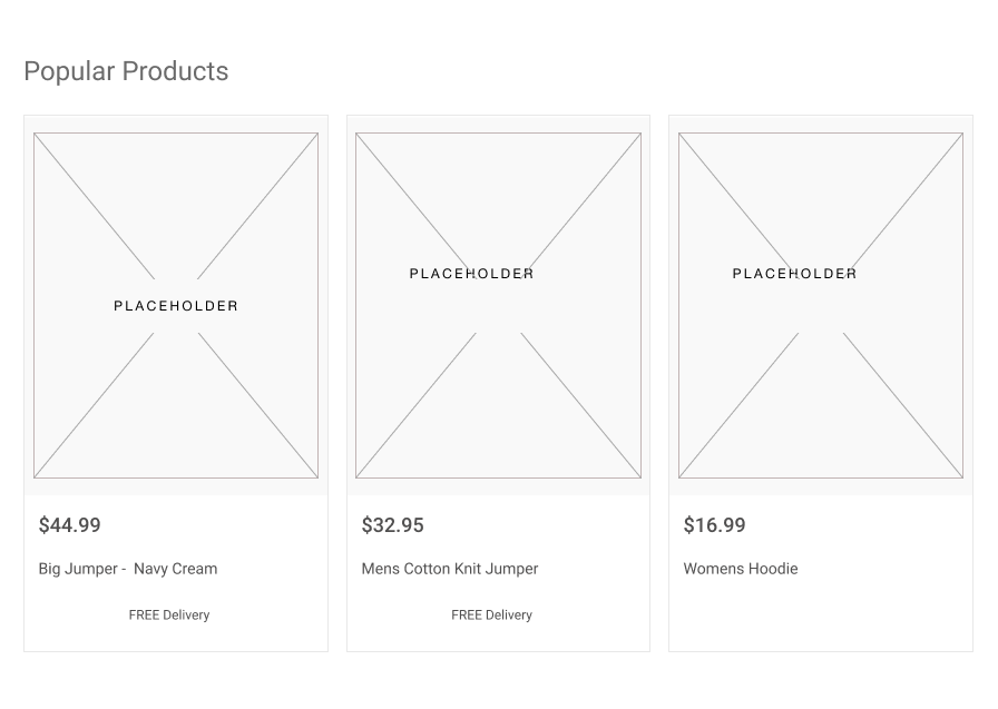
Keep all the markup in the main page (for now)
Build the UI "in situ" to avoid premature abstractions
Then refactor (to simplify the UI)
Refactor the product "card" into its own component

Resist the temptation to re-use "similar" components
Make a component work hard to prove it really is the same thing
Kanban 'card' != Product 'card'
https://github.com/Practical-ASP-NET/BlazorTailwindTemplate
Useful Links
Tailwind dotnet new project template
Break Time!
Keep related code and UI as close as possible
A
B
Connascense
"Born Together"
A
B
Locality Matters
A
B
public class WorkItem
{
    public void AssignToUser(User assignedBy, User assignedTo)
    {
        // assign task to user

        if (assignedTo.Role == "manager")
        {
            // send manager email
            // to let them know they've been asked to look at something
        }
    }
}
Connaescense of Value
A
B
public class User
{
    public string Role { get; set; }
    public bool IsManager => Role == "Manager";

    public void AssignManagementRole()
    {
        Role = "Manager";
    }
}
A
B
public class WorkItem
{
    public void AssignToUser(User assignedBy, User assignedTo)
    {
        // assign task to user

        if (assignedTo.IsManager)
        {
            // send manager email
            // to let them know they've been asked to look at something
        }
    }
}
Software Engineering Topic of the Day #26
https://cloudnative.ly/connascense-9b3972c57415
https://connascence.io/
Useful Links
Watch out for
side effects
in components making it harder to refactor
ProductList
Fetch list from API

Fetch list from API
ProductList
Product Id
ProductCard
Fetch specific details from API

Fetch list from API
ProductList
Product Id
ProductCard
Fetch specific details from API
Price
Delivery
Fetch price from API
Product Id
Product Id
Fetch Delivery Cost from API
Fetch list from API
Fetch specific details from API
Fetch price from API
Fetch Delivery Cost from API
Fetch list from API
Fetch list from API
ProductDetails { id, imageUrl, description, price }
ProductDetails { id, imageUrl, description, price }
ProductDetails { id, imageUrl, description, price }
Fetch list from API
ProductDetails { id, imageUrl, description, price }
DeliveryCost { price }
PriceDetails { price }
Fetch list from API
ProductDetails { id, imageUrl, description, price }
Price
Price
Organise components by feature for easier ongoing development
Features
  - Components
  - Feature A
    - Components
    - Index.razor
  - Feature B
    - Components
    - Index.razor
  Index.razor
Features
- Components
- Profile
- Components
- Index.razor
- Dashboard
- Components
- Index.razor
Index.razorFeatures
- Components
- Profile
- Components
- Achievements.razor
- Avatar.razor
- Index.razor
- Dashboard
- Components
- Panel.razor
- ImportantPanel.razor
- Index.razor
Index.razorProfile
Dashboard
Components
Panel.razor
Index.razor
Index.razor
Courses
Features
Components
Panel.razor
Profile
Index.razor
Index.razor
Features
  - Components
  - Profile
    - Components
      - Achievements.razor
      - Avatar.razor
    - Index.razor
  - Dashboard
    - Components
      - Panel.razor
      - ImportantPanel.razor
    - Index.razor
Index.razorFeatures
- Components
- Panel.razor
- ImportantPanel.razor
- Profile
- Components
- Achievements.razor
- Avatar.razor
- Index.razor
- Dashboard
- Components
- Index.razor
Index.razor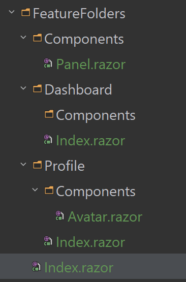
https://jonhilton.net/blazor-component-folder-structure/
Atomic Design is a useful way to think about the hierarchy of your UI
Open API makes it much easier to consume an API
You can use Refit to connect to your API with less boilerplate code
Wire up the boards list component to the API
Make a call to Api.GetBoards()
(note, the method is async)
Render the list of boards in the UI (using the data returned from the Api call)
Watch out for nullable reference types
https://devblogs.microsoft.com/dotnet/
embracing-nullable-reference-types/
Automatically generate your client to save even more code (and time)
Auto-generate a Refit client from the Donatello API
From the command line/terminal
dotnet tool install -g refitgenerator
cd ExampleClient
regen -u https://donatello-9hwr4.ondigitalocean.app/swagger/v1/swagger.json
Where 'ExampleClient' is a folder in which you're happy to create the client!
https://github.com/velorien/refitgenerator
Useful Links (Refit)
https://github.com/reactiveui/refit
Refit
Refit generator (from OpenApi Schemas)
NSwag is another option for generating clients
Q and A
(AKA phew, we made it!)