Data Theory
Karl Ho
School of Economic, Political and Policy Sciences
University of Texas at Dallas
Data Visualization
Data Literacy
-
Data generating process
-
Graphic grammar
-
Statistical judgement
What to visualize and how?
Data Literacy
-
Data generating process
-
How data are generated
-
Distribution
-
Missing values
-
Bad data (Quartz guide to bad data | GitHub)
-
- Data are not simply “found” but are produced through social, technical, and methodological processes (Gitelman 2013, Raw Data is an Oxymoron).
-
Implications for visualization: Every graph carries assumptions from sampling, measurement, and coding decisions.
-
Example: Census data vs. Twitter API data—each is shaped by institutional and technical design.
“Data do not exist independently of the ideas, instruments, practices, contexts, and knowledge used to generate them” (Kitchin 2014, The Data Revolution).
Data Literacy
-
Graphic grammar
-
Bad charts deliver incorrect message
-
Poor design
-
Color
-
Label
-
Font
-
Scale
-
Dimensionality
-
-
Leland Wilkinson (2005) provides a theoretical foundation:
-
Visualization = Mapping data → aesthetic attributes → perceptual objects.
-
- Hadley Wickham’s ggplot2 operationalizes this grammar.
- Key idea: A graph is not “just a picture” but a systematic composition of layers.
“A statistical graphic is a visual display that shows quantitative and categorical information” (Wilkinson 2005, p. 22).
Data Literacy
-
Statistical understanding
-
Size does (not) matter
-
Representativeness does
-
Forecast/prediction minded
-
Explanation
-
Causality vs. correlation
-
- Visualization is inseparable from statistical reasoning.
Gary King et al. (2000): “Statistical analyses do not interpret themselves; interpretation is the substantive act of turning data into knowledge.”
-
Visualization can mislead if statistical uncertainty, distributions, or context are ignored.
-
Cleveland (1985) emphasizes exploratory data analysis (EDA) as a form of statistical thinking with graphics.
Data Scales
Measurement levels (Stevens 1946):
-
Nominal (categories)
-
Ordinal (rankings)
-
Interval (equal units, no true zero)
-
Ratio (absolute zero, full comparability)
Data Scales
Data scales affect visualization choices:
-
Nominal → bar charts, mosaics
-
Ordinal → ordered barplots, dot plots
-
Interval/Ratio → histograms, scatterplots, line charts
Colin Ware (2012): “Perceptual tasks are the foundation for graphical design: what people can and cannot perceive determines what graphics can and cannot do.”
Data Made, Data Found
-
Small data
-
Big data
What determines size of data?
What distinguishes types of data?
What is good data?
Data Made, Data Found
-
Small data: Carefully sampled surveys, experiments.
- Advantage = control, inference. Limitation = scale.
-
Big data: Sensor logs, social media, administrative records.
-
Advantage = volume, real-time analysis. Limitation = bias, lack of representativeness.
-
-
Visualization challenge:
-
scalability of graphics (e.g., from scatterplots to heatmaps, from static charts to interactive dashboards).
-
Alberto Cairo (2016): “Big data is not necessarily better data. More is not always more.”
Understanding data theory is essential to effective visualization.
-
Data literacy grounds us in how data are produced.
-
Grammar of graphics gives us a structured language for design.
-
Statistical judgment keeps our visuals honest.
-
Awareness of scale, type, and size (small vs. big data) ensures clarity and validity.
“Above all else, show the data.”
- Edward Tufte (2001)
Big data and small data:
actions
individuals
interactions
transactions
individuals
individuals
individuals
individuals
individuals
individuals
individuals
individuals
individuals
individuals
individuals
individuals
individuals
individuals
individuals
individuals
individuals
individuals
individuals
individuals

Network structure
(Legislative Yuan in Taiwan)
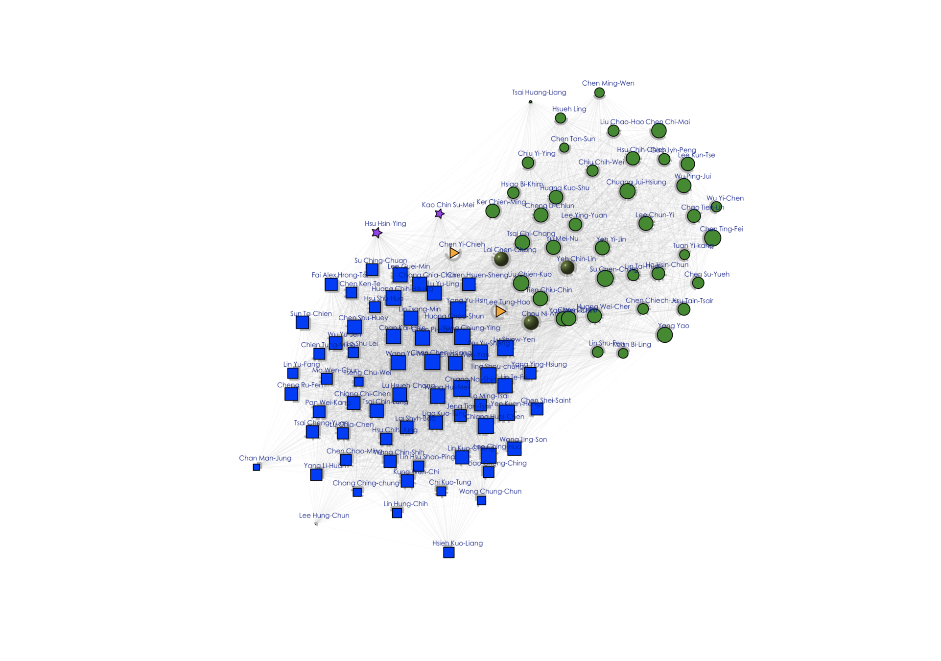
Network structure (Legislative Yuan)
- Colors and shapes represent members of parties.
- Size indicates importance in terms of number of bills and mobilization of cosigners
- Positions indicate distances from other networks and within own network.
- Lines between nodes represents interactions (sponsor/cosponsor)
Let the dataset change your mindset.
- Hans Rosling
Hans Rosling
Swedish physician and statistician
Founded Gapminder Foundation
Visualize historical data on public health and poverty
Hal Varian
Chief Economist, Google
Professor of Economics, University of California, Berkeley.
Big Data: New Tricks for Econometrics
Machine Learning and Econometrics

If you’re not doing something different, you’re not doing anything at all.
- Edward Tufte
It comes with the package, to reconcile [yourself] to life’s inevitable trade-offs and heartaches.
Could data analytics add value to your research?
The first thing is "it will do no harm". Visualized data must not obscure the findings or confuse the readers.
JavaScript: D3 Library
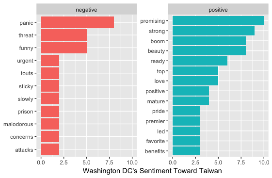
Sentiment Analysis