Introduction
Karl Ho
School of Economic, Political and Policy Sciences
University of Texas at Dallas
Data Visualization
Preamble
What you get from this class:
-
Data literacy
-
Visual thinking
-
Mastering data visualization
What is required:
- Full attendance
- Full participation
- Original works
Budgeting considerations
-
Team work: like Hackathon weekly
-
Reading load: ~ one book weekly
-
Coding load: varies but data product weekly
-
No exams or quiz
- Assignments (post on GitHub website)
- Projects (individual and team)
-
If you cannot make these commitments, consider dropping it now and spare the seat for those on waiting list
Learning objectives
At completion of this course, students will be able to:
1. Understand data theory
2. Be familiar with principles behind effective data visualization
3. Read complex data through educated eyes
4. Communicate message in data effectively using advanced visualization techniques
5. Build data visualization applications
Overview
This course is a comprehensive training on data visualization from data literacy to advanced data presentation designs. Members will learn to communicate data patterns, deliver data messages and insights via visual representations. This course starts with data theory, principles and concepts of visualizing data, followed by different approaches and best practices in data visualization. This is a programming-based course and students will write codes with programming tools to generate charts, animated graphs and interactive contents such as dashboards. Topics on new developments and tools of data visualization will also be covered.
Readings
There will be a lot of readings in this class. You will advance from general understanding of data to scientist level of understanding data.
Policy on using generative AI
There are generally three policies on governing using generative AI in course setup:
-
Prohibiting AI Use
-
Allowing AI Use Without Restrictions
-
Permitting AI Use with Disclosure
Policy on using generative AI
- Michigan
"In principle you may submit AI-generated code, or code that is based on or derived from AI-generated code, as long as this use is properly documented in the comments: you need to include the prompt and the significant parts of the response. AI tools may help you avoid syntax errors, but there is no guarantee that the generated code is correct. It is your responsibility to identify errors in program logic through comprehensive, documented testing. Moreover, generated code, even if syntactically correct, may have significant scope for improvement, in particular regarding separation of concerns and avoiding repetitions. The submission itself should meet our standards of attribution and validation.
Policy on using generative AI
2. Harvard
Certain assignments in this course will permit or even encourage the use of generative artificial intelligence (AI) tools, such as ChatGPT. When AI use is permissible, it will be clearly stated in the assignment prompt posted in Canvas. Otherwise, the default is that use of generative AI is disallowed. In assignments where generative AI tools are allowed, their use must be appropriately acknowledged and cited. For instance, if you generated the whole document through ChatGPT and edited it for accuracy, your submitted work would need to include a note such as “I generated this work through Chat GPT and edited the content for accuracy.” Paraphrasing or quoting smaller samples of AI generated content must be appropriately acknowledged and cited, following the guidelines established by the APA Style Guide. It is each student’s responsibility to assess the validity and applicability of any AI output that is submitted. You may not earn full credit if inaccurate on invalid information is found in your work. Deviations from the guidelines above will be considered violations of CMU’s academic integrity policy. Note that expectations for “plagiarism, cheating, and acceptable assistance” on student work may vary across your courses and instructors. Please email me if you have questions regarding what is permissible and not for a particular course or assignment.
Policy on using generative AI
3. Carnegie Mellon University
You are welcome to use generative AI programs (ChatGPT, DALL-E, etc.) in this course. These programs can be powerful tools for learning and other productive pursuits, including completing some assignments in less time, helping you generate new ideas, or serving as a personalized learning tool.
However, your ethical responsibilities as a student remain the same. You must follow CMU’s academic integrity policy. Note that this policy applies to all uncited or improperly cited use of content, whether that work is created by human beings alone or in collaboration with a generative AI. If you use a generative AI tool to develop content for an assignment, you are required to cite the tool’s contribution to your work. In practice, cutting and pasting content from any source without citation is plagiarism. Likewise, paraphrasing content from a generative AI without citation is plagiarism. Similarly, using any generative AI tool without appropriate acknowledgement will be treated as plagiarism.
Policy on using generative AI
4. UTD (some courses)
Cheating and plagiarism will not be tolerated.
The emergence of generative AI tools (such as ChatGPT and DALL-E) has sparked large interest among many students and researchers. The use of these tools for brainstorming ideas, exploring possible responses to questions or problems, and creative engagement with the materials may be useful for you as you craft responses to class assignments. While there is no substitute for working directly with your instructor, the potential for generative AI tools to provide automatic feedback, assistive technology and language assistance is clearly developing. Course assignments may use Generative AI tools if indicated in the syllabus. AI-generated content can only be presented as your own work with the instructor’s written permission. Include an acknowledgment of how generative AI has been used after your reference or Works Cited page. TurnItIn or other methods may be used to detect the use of AI. Under UTD rules about due process, referrals may
be made to the Office of Community Standards and Conduct (OCSC). Inappropriate use of AI may result in penalties, including a 0 on an assignment.
Policy on using generative AI
Using generative AI may not save time, but will improve quality and deepen thought process.
As a “language” for the eye, graphics benefits
from the ubiquitous properties of visual perception. "
- Jacques Bertin
Data visualization - a different Data Science training
This course is not:
-
application-based course
- No Excel, Tableau, Power BI
- short course for creating charts only
This course is:
- theory-based reading seminar
- programming-based coding camp
Why not teaching application?
-
This graduate course is not a two-day workshop teaching how to use an application to create charts.
-
It builds strong foundation on data, design and graphic theory.
-
It trains "educated" perception and "thinking eyes".
Approaches in data visualization
-
Data journalism
-
Business Intelligence/Analytics
-
Computer science
-
Data Science
What is data visualization?
This is a course in the Social Data Analytics and Research (SDAR) series training students in:
-
Data Literacy
-
Understand data theory
-
Manage data
-
Analyze data
-
-
Data Skills
-
Programming
-
Tools
-
Data Story:
Source: Yau 2011
- Color
- Font
- Size
- Family
- Axis
- Vertical
- Slant
- Canvas
- Size
- Theme
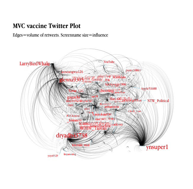
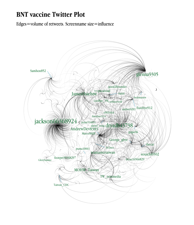
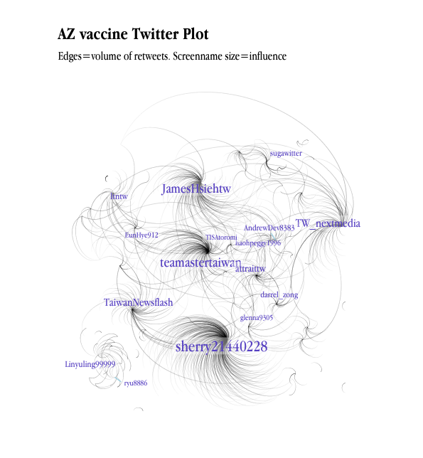
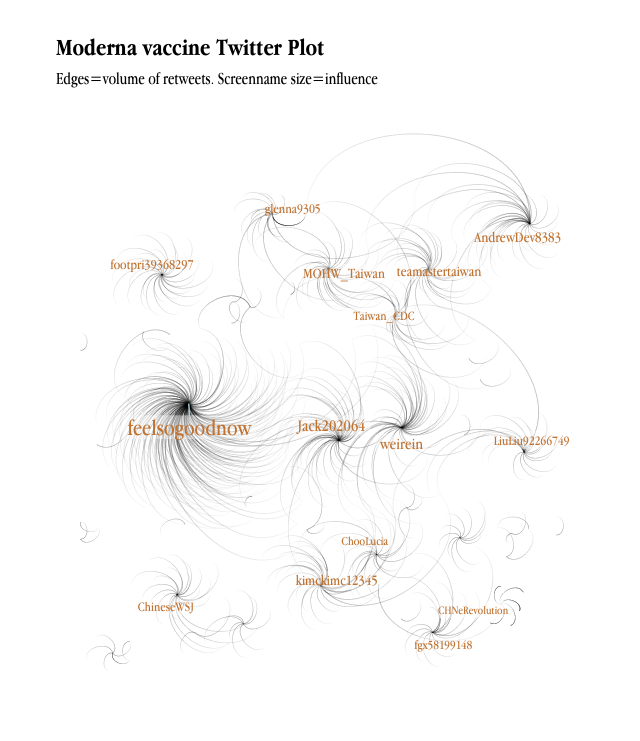
Analytics using Twitter data
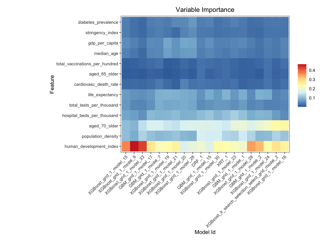
Automated Machine Learning
Automated Machine Learning
Replicating Rosling
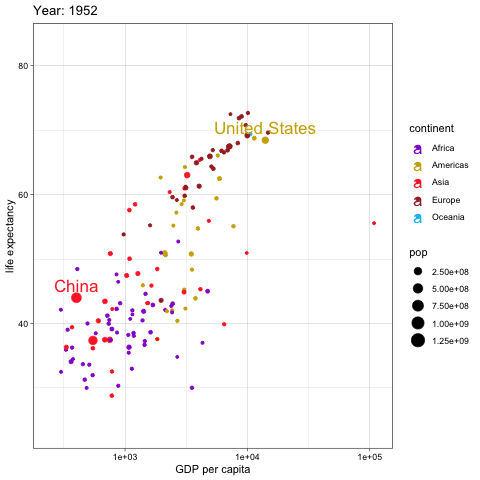
Replicating Rosling
What is data visualization?
Objectives:
-
Understand data theory
-
Be familiar with principles behind effective data visualization
-
Read complex data through educated reviews
-
Communicate message in data effectively using advanced visualization techniques
What is data visualization?
-
Data visualization is to deliver a message from your data.
-
It is like telling a story using the chart or data applications.
-
Sometimes the data is huge or the story to too long to tell.
-
Visualization provides an ability to comprehend huge amounts of data. The important information from more than a million measurements is immediately available.
What to visualize in data?
-
Data Generating Process
-
Property
-
Distribution
-
Pattern
-
Differences
-
Relationship
-
Dimensionality
Elements of a Chart
-
Dimensionality
-
How many dimensions are there?
-
-
Relationships
-
Strength
-
Fit
-
Error bands
-
Panels
-
What is data visualization?
-
Learn to read your data
- Visual thinking
- Educated eyes
What is data visualization?
Data visualization is to communicate data patterns, findings and insights via visual representation of data. It is well beyond just creating a chart but to train "Thinking Eyes" and build data literacy.
How much information does this picture present?

Multibeam sonar backscatter data draped on bathymetry off Santa Monica Calif. Yellow is high backscatter. Santa Monica sewer pipe and diffuser is visible in upper part of image (y-shaped feature). Red-brown dots represent color-coded fish abundance as determined from trawl data.
Source: https://tinyurl.com/ydhqtr8f
What do we learn from the image?
• Visualization provides an ability to comprehend huge amounts of data. The important information from more than a million measurements is immediately available.
What do we learn from the image?
-
Visualization often enables problems with the data to become immediately apparent.
-
Visualization commonly reveals things not only about the data itself but also about the way it is collected.
-
With an appropriate visualization, errors and artifacts in the data often jump out at you.
-
For this reason, visualizations can be invaluable in quality control.
What do we learn from the image?
-
Visualization facilitates understanding of both large-scale and small-scale features of the data.
-
It can be especially valuable in allowing the perception of patterns linking local features.
What do we learn from the image?
Visualization facilitates hypothesis formation, inviting further inquiries into building a theory
(Colin Ware 2012, Ch. 1)
Messages:
-
Gradual rise?
-
Abrupt Drop of Ranking?
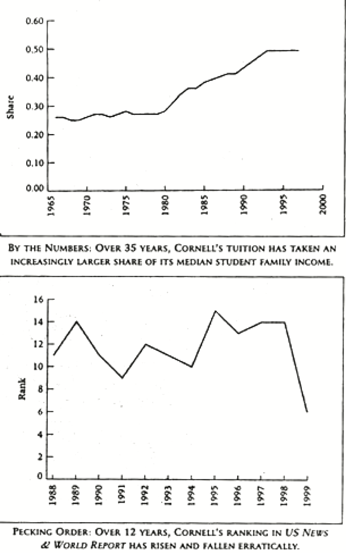
Source: Chris Adolph, also Johnson, R.R. and Kuby, P.J., 2011. Elementary statistics. Cengage Learning.
Look closer
Look closer
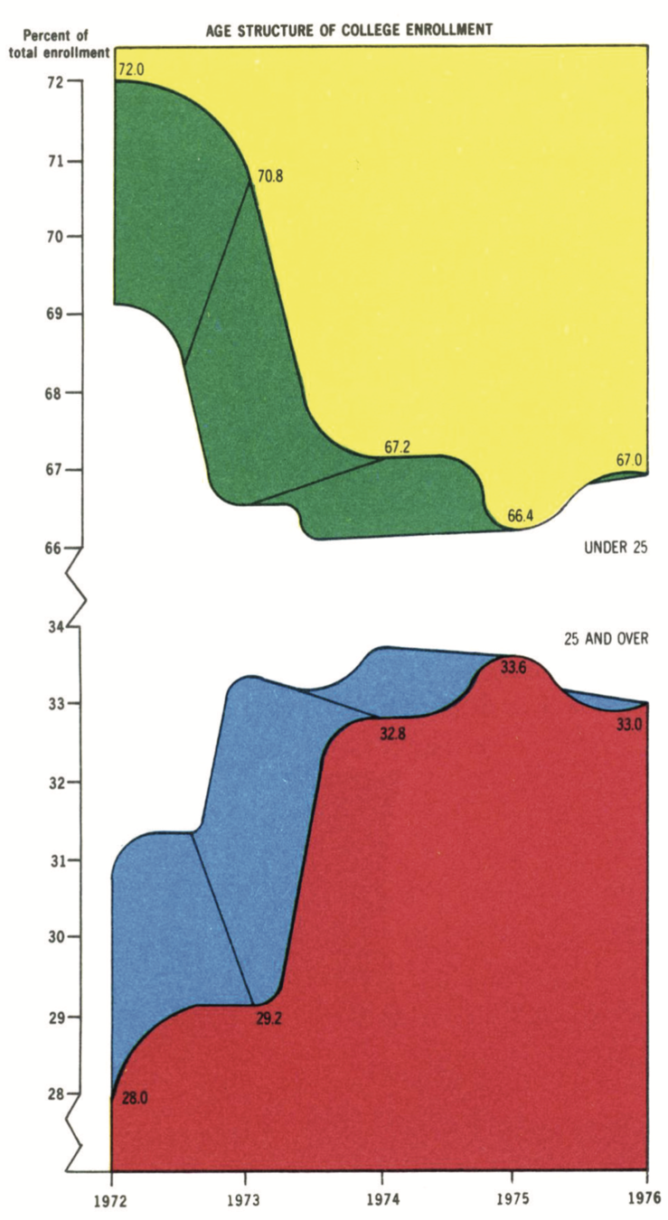
Message:
-
Age structure of college enrollment
-
How much data are presented in multiple colors?
Source: Edward R. Tufte. 2001. The Visual Display of Quantitative Information. Graphics Press. 2nd ed.
Source: https://en.wikipedia.org/wiki/Charles_Joseph_Minard
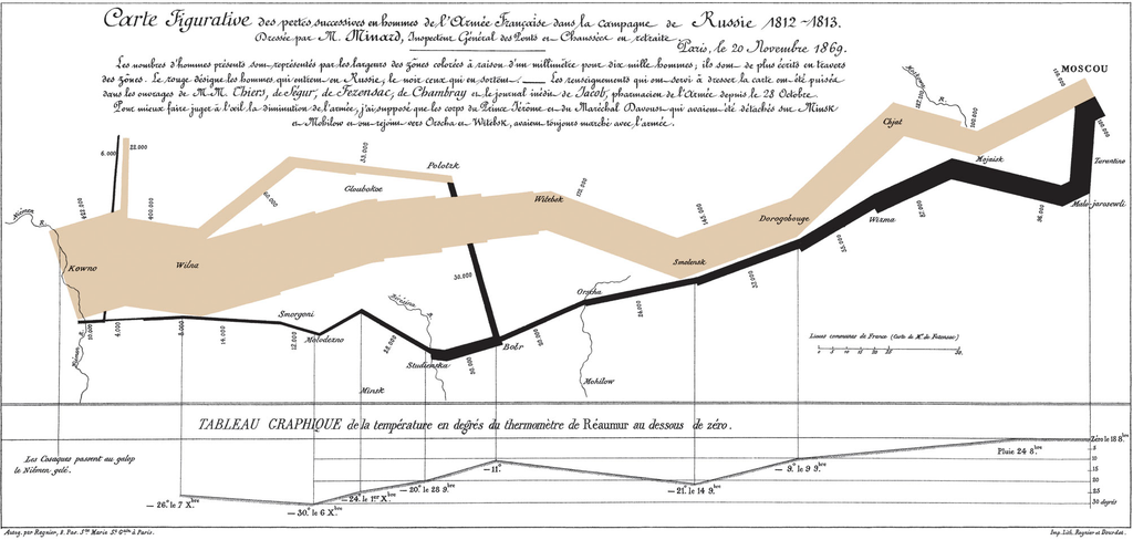
One of the best data visualizations in history
Charles Joseph Minard, in mapping Napoleon's march on Moscow
Source: https://en.wikipedia.org/wiki/Charles_Joseph_Minard
One of the best data visualizations in history
How much information?
1. Latitude of army & features (Y-coordinate) . 2. Longitude of army & features (X-coordinate)
3. Size of army (width of line, numerals) . 4. Advance vs. Retreat color of line
5. Division of army splitting of line 6. Temperature linked lineplot
7. Time linked lineplot
Source: https://en.wikipedia.org/wiki/Charles_Joseph_Minard
One of the best data visualizations in history
Combines narrative & analysis:
a technique mostly lost until this century
- May be a spurious relationship here: time and temperature
- Note the deaths at river crossings – usually, these rivers would be frozen Did Napoleon choose too warm a winter to invade Russia?
- Chris Adoph
Source: https://en.wikipedia.org/wiki/Charles_Joseph_Minard
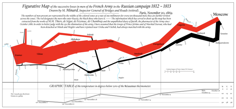
Source: https://en.wikipedia.org/wiki/Charles_Joseph_Minard
Know your data: data types
-
Numeric data
-
Scale
- Nominal
- Ordinal
- Interval
- Ratio
-
- Categories
- Events
- Time series
Quantitative vs. Qualitative Data
-
Numbers vs. Labels
-
Quantity vs. Quality
-
Ordinal, Interval, Ratio vs. Nominal
-
e.g. Yes/No--> Qualitative
-
e.g. How much--> Quantitative
Quantitative vs. Qualitative Data
-
Higher quantity means higher quality?
-
Higher quality leads to higher quantity?
Time series data
-
Nature
-
Temporal dependency: non-stationarity autocorrelation
-
Periodicity: seasonality, cycle
-
-
Zeros -> events?
-
Scale linearity

Time series data
-
Nature
-
Temporal dependency: non-stationarity autocorrelation
-
Periodicity: seasonality, cycle
-
-
Zeros -> events?
-
Scale linearity
Event count data
-
Nature
-
Distribution
-
Bounds
-
No upper bounds
-
One lower bound: zero
-
-
Zeros
-
-
Continuous vs. discrete
-
Intervals vs. duration
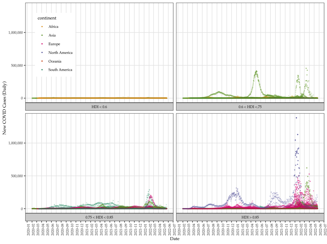
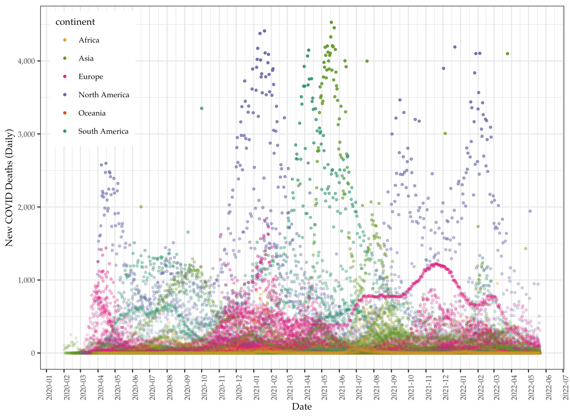
Data: Daily COVID deaths
Adelson's Checker-Shadow
Colors of A and B boxes different?
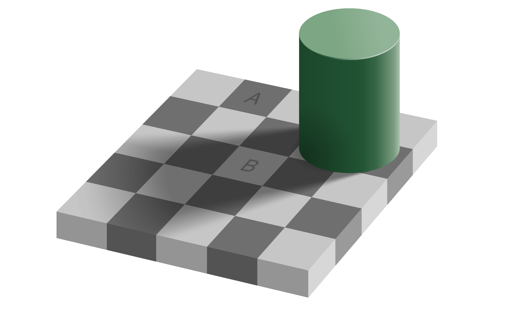
Adelson's Checker-Shadow
Colors of A and B boxes different?

Coffer Illusion by Anthony Norcia

See any circles? How many?
Coffer Illusion by Anthony Norcia
See any circles? How many?
-
Swedish physician and statistician
-
Founded Gapminder Foundation
-
Visualize historical data on public health and poverty

- Visual Display 1982
Edward Tufte
William Cleveland
-
12 rules of data visualization

