Data Visualization in Practice
Karl Ho
School of Economic, Political and Policy Sciences
University of Texas at Dallas
Workshop prepared for National Chung Hsing University
December 19, 2020
Overview
Module 1:
- Know your data
- Grammar of graphics
- Science of Data Visualization
Module 2:
- Functionalist approach:
- Distribution
- Composition
- Comparison
- Relationship
Module 3:
- Dashboard
- Reactive
- Interactive
What is data visualization?
-
Learn to read your data
- Visual thinking
- Educated eyes
How much information does this picture present?
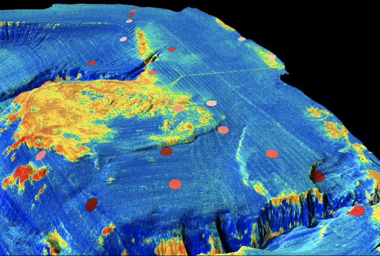
Multibeam sonar backscatter data draped on bathymetry off Santa Monica Calif. Yellow is high backscatter. Santa Monica sewer pipe and diffuser is visible in upper part of image (y-shaped feature). Red-brown dots represent color-coded fish abundance as determined from trawl data.
Source: https://tinyurl.com/ydhqtr8f
What do we learn from the image?
• Visualization provides an ability to comprehend huge amounts of data. The important information from more than a million measurements is immediately available.
What do we learn from the image?
-
Visualization often enables problems with the data to become immediately apparent. A visualization commonly reveals things not only about the data itself but also about the way it is collected. With an appropriate visualization, errors and artifacts in the data often jump out at you. For this reason, visualizations can be invaluable in quality control.
What do we learn from the image?
-
Visualization facilitates understanding of both large-scale and small-scale features of the data. It can be especially valuable in allowing the perception of patterns linking local features.
What do we learn from the image?
Visualization facilitates hypothesis formation, inviting further inquiries into building a theory.
(Colin Ware 2012, Ch. 1)
Data Story:
Source: Yau 2011
- Color
- Font
- Size
- Family
- Axis
- Vertical
- Slant
- Canvas
- Size
- Theme
Data Story:
Data
Message
Mechanical process
Data Messenger Message
> >
= =
Know your data: data types
-
Numeric data
-
Scale
- Nominal
- Ordinal
- Interval
- Ratio
-
- Categories
- Events
- Time series
Quantitative vs. Qualitative Data
-
Numbers vs. Labels
-
Quantity vs. Quality
-
Ordinal, Interval, Ratio vs. Nominal
-
e.g. Yes/No--> Qualitative
-
e.g. How much--> Quantitative
Quantitative vs. Qualitative Data
-
Higher quantity means higher quality?
-
Higher quality leads to higher quantity?
What to visualize in data?
-
Data Generating Process
-
Property
-
Distribution
-
Pattern
-
Differences
-
Relationship
-
Dimensionality
Elements of a Chart
-
Dimensionality
-
How many dimensions are there?
-
-
Relationships
-
Strength
-
Fit
-
Error bands
-
Panels
-
Time series data
-
Nature
-
Temporal dependency: non-stationarity autocorrelation
-
Periodicity: seasonality, cycle
-
-
Zeros -> events?
-
Scale linearity

Time series data
-
Nature
-
Temporal dependency: non-stationarity autocorrelation
-
Periodicity: seasonality, cycle
-
-
Zeros -> events?
-
Scale linearity
Event count data
-
Nature
-
Distribution
-
Bounds
-
No upper bounds
-
One lower bound: zero
-
-
Zeros
-
-
Continuous vs. discrete
-
Intervals vs. duration
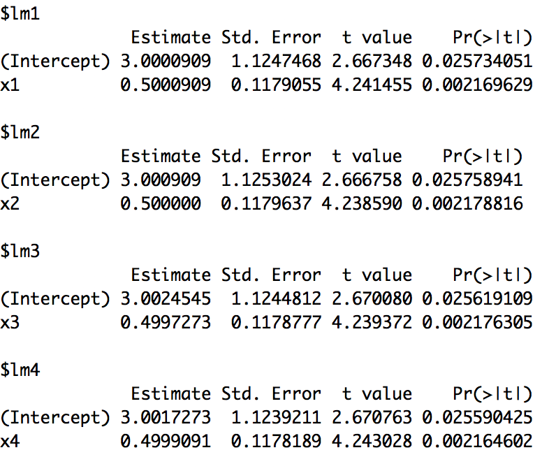
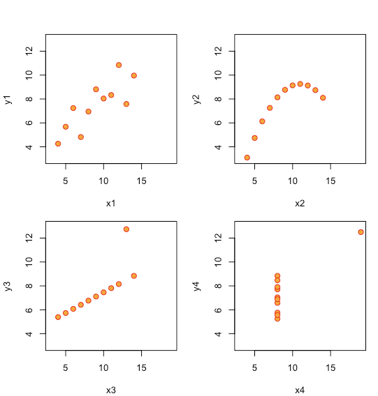
Anscombe example (1973)
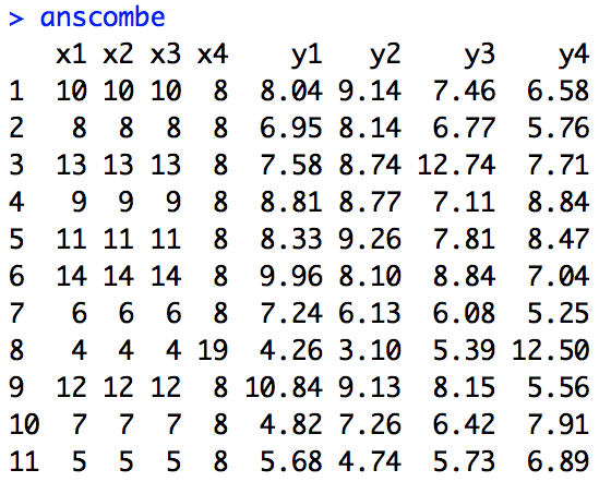
Anscombe example (1973)
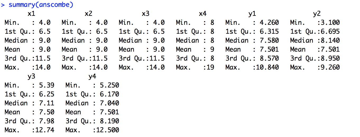
Anscombe example (1973)
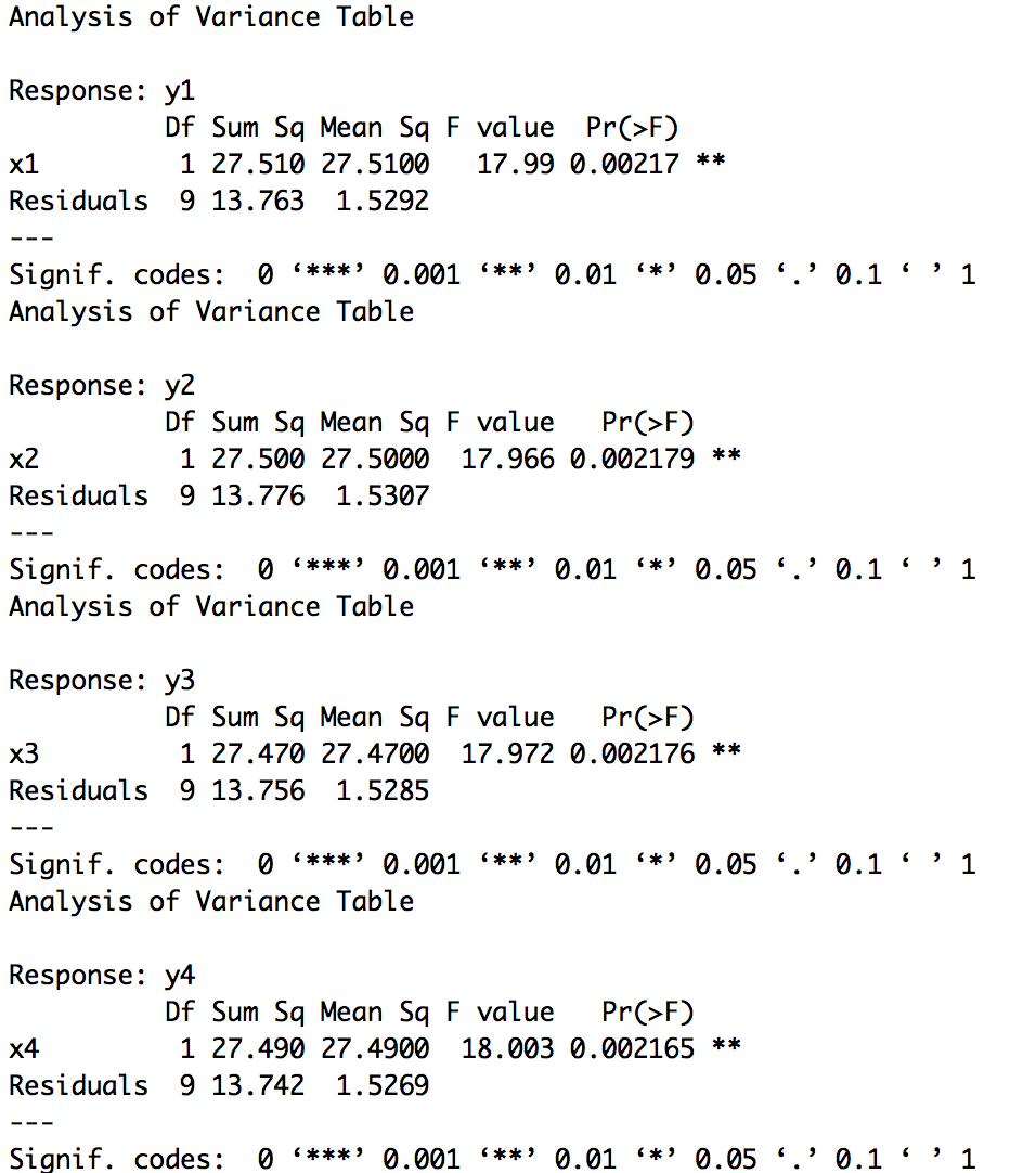
Anscombe example (1973)
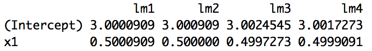
Anscombe example (1973)
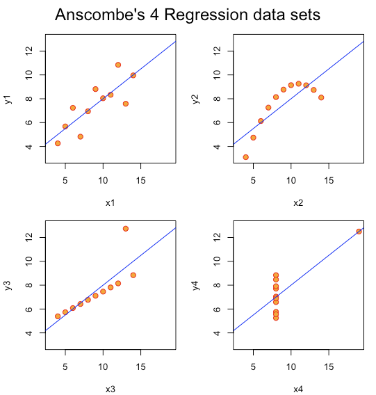
Tufte: Same relationship? (2001)
Tufte: Same relationship? (2001)
Source: https://en.wikipedia.org/wiki/Charles_Joseph_Minard
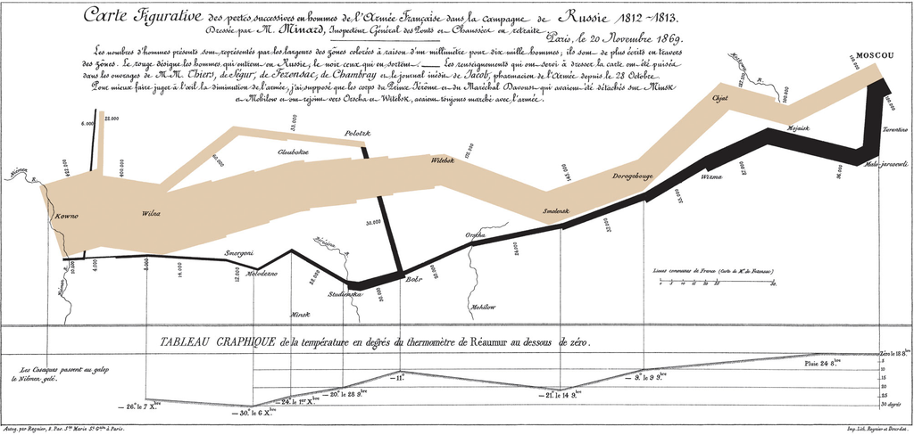
One of the best data visualizations in history
How much information?
1. Latitude of army & features (Y-coordinate) . 2. Longitude of army & features (X-coordinate)
3. Size of army (width of line, numerals) . 4. Advance vs. Retreat color of line
5. Division of army splitting of line 6. Temperature linked lineplot
7. Time linked lineplot
Adelson's Checker-Shadow
Colors of A and B boxes different?
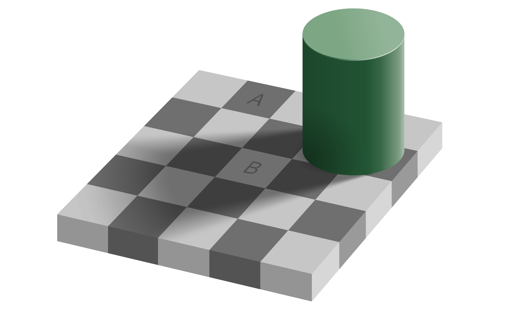
Adelson's Checker-Shadow
Colors of A and B boxes different?

Coffer Illusion by Anthony Norcia

See any circles? How many?
Know your data: Data Literacy
-
Data generating process
-
Graphic grammar
-
Statistical judgement
-
Data generating process
-
How data are generated
-
Distribution
-
Missing values
-
Wrong data
-
Know your data: Data Literacy
-
Graphic grammar
-
Bad charts deliver incorrect message
-
Poor design
-
Color
-
Label
-
Scale
-
Dimensionality
-
Know your data: Data Literacy
-
Statistical understanding
-
Size does (not) matter
-
Representativeness does
-
Forecast/prediction minded
-
Explanation
-
Know your data: Data Literacy
Functional Approach
-
What to plot?
- Quantitative/Numeric data
- Qualitative/Categorical data
-
One variable: Univariate
- Distribution
- Composition
-
Two or multiple: Multivariate
- Comparison
- Relationship
Thought starter
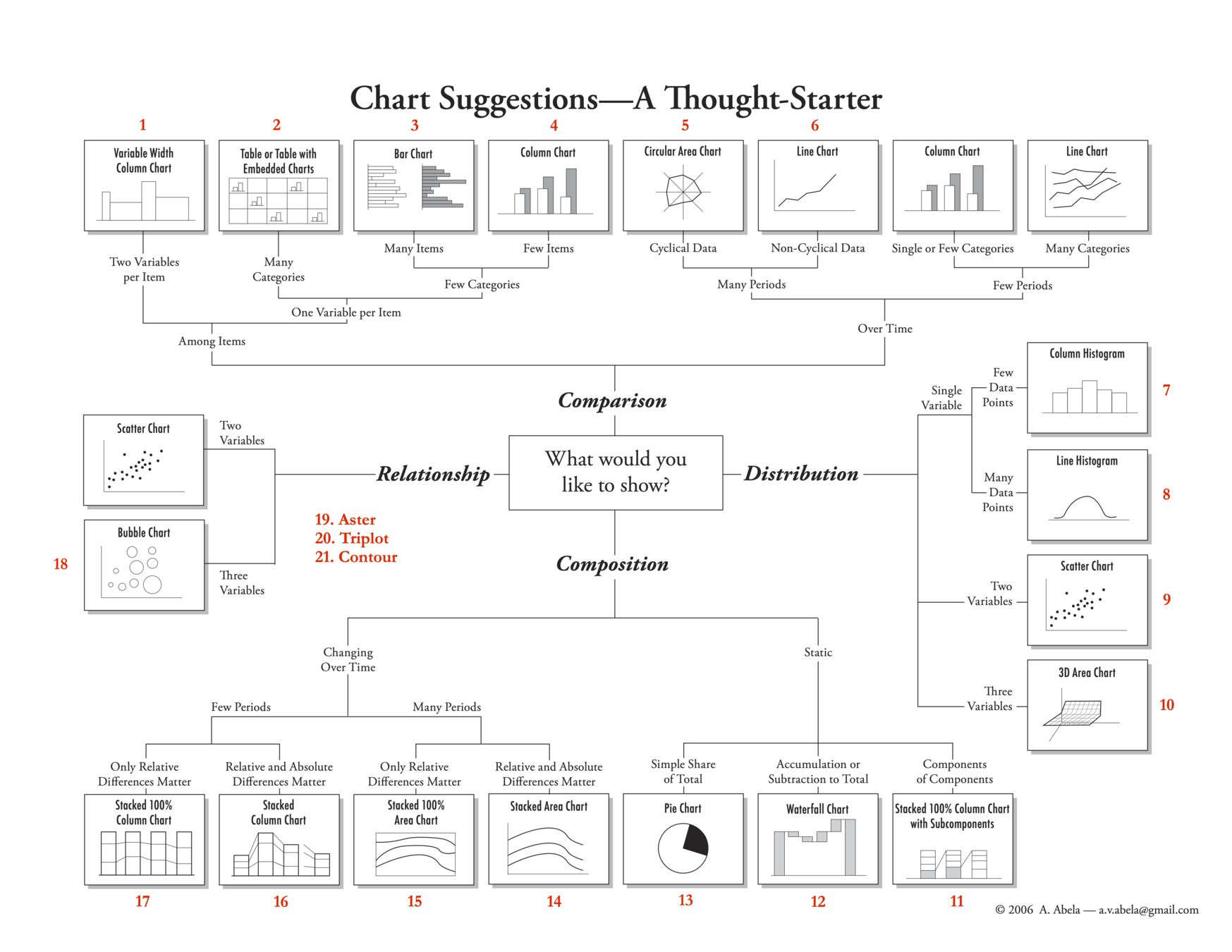
Thought starter
Financial Times: Visual vocabulary
-
Deviation
-
Correlation
-
Ranking
-
Distribution
-
Change over time
-
Magnitude
-
Part-to-Whole
-
Spatial
-
Flow
Financial Times: Visual vocabulary
-
Deviation
-
Correlation
-
Ranking
-
Distribution
-
Change over time
-
Magnitude
-
Part-to-Whole
-
Spatial
-
Flow
Module 3
-
Creating a Dashboard using Shiny
-
Reactivity
-
Interactive charts using Plotly
Overview
-
What is Shiny?
-
Components of Shiny
-
Structure of Shiny app
-
Publicizing Shiny app on GitHub
What is Shiny?
A Shiny app is a web page (UI) with user interface connected to a computer running a live R session (Server).
Users can design the UI, which provide interactive interface to visualize data (by running R code).
Shiny app = R + Interactivity + Web hosting
Presenting interactive data and charts
Shiny deployment
-
RStudio Shiny server (http://www.shinyapps.io )
-
Needs Shiny account (connect via GitHub/Google)
-
-
Pro Shiny account (commercial)
-
Install own Shiny server (https://github.com/rstudio/shiny-server)
- Linux server
- Free and open source
Shiny reference and resources
-
Shiny user guide online: (https://docs.rstudio.com/shinyapps.io/index.html)
- Shiny Cheatsheet (RStudio)
Components of Shiny
-
User Interface (ui.R) — The UI is the frontend that accepts user input values.
-
Server function (server.R) — The Server is the backend that process these input values to finally produce the output results that are finally displayed on the website.
-
shinyApp function — The app itself that combines the UI and server components together.
Layout and interface
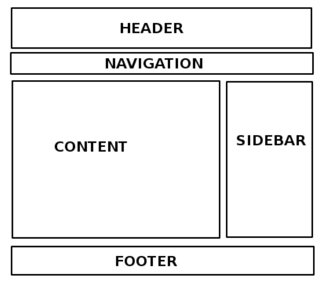
- Design & explore UI framework
- Inputs within the UI framework
- Outputs within the UI framework
- Assemble UI with HTML/CSS/... widgets
- Adjustment of the layout scheme
Structure of Shiny program
# install.packages("shiny")
# install.packages("shinythemes")

library(shiny)
library(shinythemes)
# Create User Interface
ui <− fluidPage ()

# Build R objects displayed in UI
server <− function(input , output){}

# Create Shiny app
shinyApp(ui = ui, server = server)
-
ui: Nested R functions that assemble an HTML user interface for the app (some HTML knowledge needed)
-
server: A function with instructions on how to build and rebuild the R objects displayed in the UI
-
shinyApp: Combines ui and server into a functioning app
ui.R
-
Nested R functions that assemble an HTML user interface for the app
- Example:
- ui = creates the user interface object
-
fluidPage() function create the layout page that includes:
- input
- output
-
fluidPage() function create the layout page that includes:
- ui = creates the user interface object
library(shiny)
ui = fluidPage(
  numericInput(inputId = "n", "Sample size", value = 50),
  plotOutput(outputId = "hist"))
server.R
-
Composed of R codes to process input and generate output:
- Example:
- Read in the data from input (from ui.R)
- Create the chart (i.e. histogram)
- Example:
server = function(input , output){ output$hist = renderPlot ({
    hist(rnorm(input$n)) })}
shinyApp()
-
Combine ur.R and server.R and execute
- Example:
- Output in plot window ready for publishing
- Example:
shinyApp(ui = ui , server = server)Reactivity
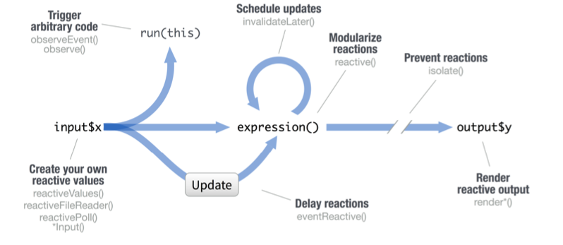
Reactive values work together with reactive functions. Call a reactive value from within the arguments of one of these functions to avoid the error
Operation not allowed without an active reactive context.
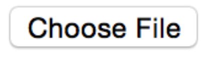
fileInput(inputId, label, multiple, accept)
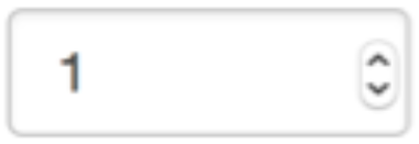
numericInput(inputId, label, value, min, max, step)
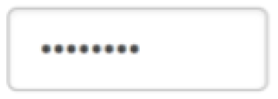
passwordInput(inputId, label, value)
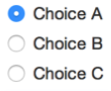
radioButtons(inputId, label, choices, selected, inline)
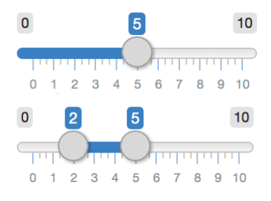
selectInput(inputId, label, choices,
selected, multiple, selectize, width, size) (also selectizeInput())
sliderInput(inputId, label, min, max, value, step, round, format, locale, ticks, animate, width, sep, pre, post)