Karl Ho
School of Economic, Political and Policy Sciences
University of Texas at Dallas
Data Visualization and Machine Learning
Prepared for Geoscience Seminar hosted at the Department of Geosciences, School of Natural Sciences and Mathematics University of Texas at Dallas, September 14, 2023
-
Karl Ho is:
- Professor of Instruction at University of Texas at Dallas (UTD) School of Economic, Political and Policy Sciences (EPPS)
- Co-founder of the UTD Social Data Analytics and Research program (SDAR)
- Founder of DataGeneration.org
- Author of Data Programming
- Co-Principal Investigator of the Hong Kong Election Study project
- Website: karlho.com (talks, lecture, publications)
Speaker bio.
This is a survey of the two fast emerging fields in Data Science and how the literature is building on common development areas and applications.
-
New trends in combining the two such as ML4VIS
-
How machine learning can improve data visualization in data processing, communicating insights and interact with users to improve experience.
-
How data visualization can facilitate machine learning model interpretability and bridge explanation and prediction.
-
New directions and strategies of designing new data science training program to incorporate both to ready new generation of data scientists in different disciplines from medical research to social sciences.
Overview:
Illustrations:
-
COVID data: combined with Automated ML to improve data modeling
-
Polarization in Taiwan: use AML improve model choice
Overview:
Geoscience applications

Source: Lary, David J., Amir H. Alavi, Amir H. Gandomi, and Annette L. Walker. 2016. “Machine Learning in Geosciences and Remote Sensing.” Geoscience Frontiers 7(1): 3–10. https://linkinghub.elsevier.com/retrieve/pii/S1674987115000821 (September 14, 2023).
Geoscience applications
Source: Lary, David J., Amir H. Alavi, Amir H. Gandomi, and Annette L. Walker. 2016. “Machine Learning in Geosciences and Remote Sensing.” Geoscience Frontiers 7(1): 3–10. https://linkinghub.elsevier.com/retrieve/pii/S1674987115000821 (September 14, 2023).


The State of the Art in Integrating Machine Learning into Visual Analytics (Endert et al. 2017)
The vision
- Visual analytics systems combine machine learning or other analytic techniques with interactive data visualization to promote sensemaking and analytical reasoning.
- People can make sense of large, complex data.
- Synergy between machine learning and visual analytics for impactful future research directions.
The State of the Art in Integrating Machine Learning into Visual Analytics (Endert et al. 2017)
The vision

The State of the Art in Integrating Machine Learning into Visual Analytics (Endert et al. 2017)
The vision

The State of the Art in Integrating Machine Learning into Visual Analytics (Endert et al. 2017)
The vision

The State of the Art in Integrating Machine Learning into Visual Analytics (Endert et al. 2017)
The vision
Interpretability and visualization in machine learning (Vellido 2019)
Problem of ML
- Data overabundance and new methodologies for data management and analysis pose some serious challenges. One of them is model interpretability and explainability, especially for complex nonlinear models.
- In some areas such as medicine and health care, not addressing such challenge might seriously limit the chances of adoption, in real practice, of computer-based systems that rely on machine learning and computational intelligence methods for data analysis.
Interpretability and visualization in machine learning (Vellido 2019)

Interpretability and visualization in machine learning (Vellido 2019)

Interpretability and visualization in machine learning (Vellido 2019)

ML techniques to achieve a better design, development, and evaluation of visualizations (Wang et al 2022).
ML4VIS
Two questions:
- What visualization processes can be assisted by ML?
- How ML techniques can be used to solve visualization problems?
Three big areas and seven Main Visualization Processes Employing ML:
ML4VIS

Source: Wang, Qianwen, Zhutian Chen, Yong Wang, and Huamin Qu. 2022. “A Survey on ML4VIS: Applying Machine Learning Advances to Data Visualization.” IEEE Transactions on Visualization and Computer Graphics 28(12): 5134–53.
Seven Main Visualization Processes Employing ML:
ML4VIS
Source: Wang, Qianwen, Zhutian Chen, Yong Wang, and Huamin Qu. 2022. “A Survey on ML4VIS: Applying Machine Learning Advances to Data Visualization.” IEEE Transactions on Visualization and Computer Graphics 28(12): 5134–53.
ML4VIS

ML4VIS

ML4VIS

ML4VIS

ML4VIS

ML4VIS

ML4VIS
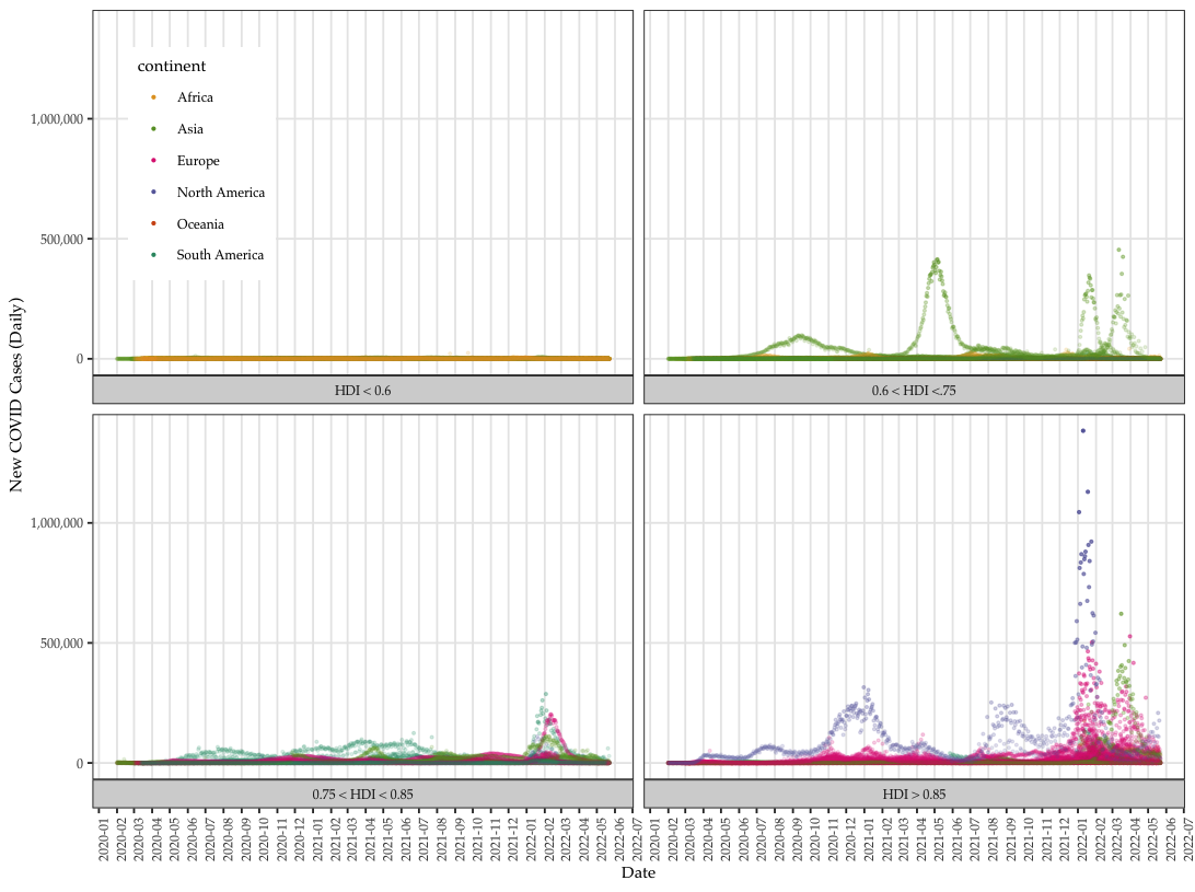
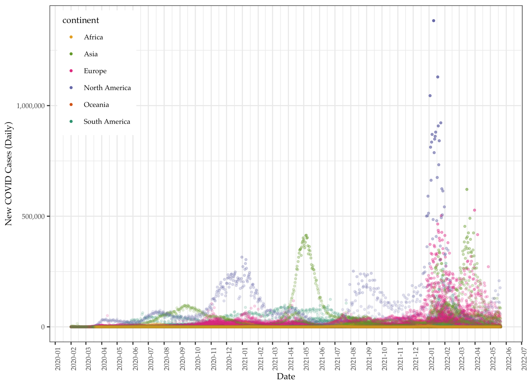
We collect global COVID data from the Our World in Data project, which makes available daily pandemic data from all countries available in real time.
- The data set comes with a series of daily variables (individual) including total (cumulative) and new cases (per million), deaths (per thousand), vaccination, and other longer-term variables (aggregate) such as GDP per capita, proportion of aged 65 or above, human development index (HDI), etc.
- There are a total of 225 units, with 212,580 cases (as of late October, 2022) and 67 variables.
- We use the peak-day data for modeling, which is on 1/20/2022. On that day, the United States having most COVID cases among all countries the recorded a cumulated 97,410,671 cases.
Illustration: COVID data
Data: Daily COVID deaths
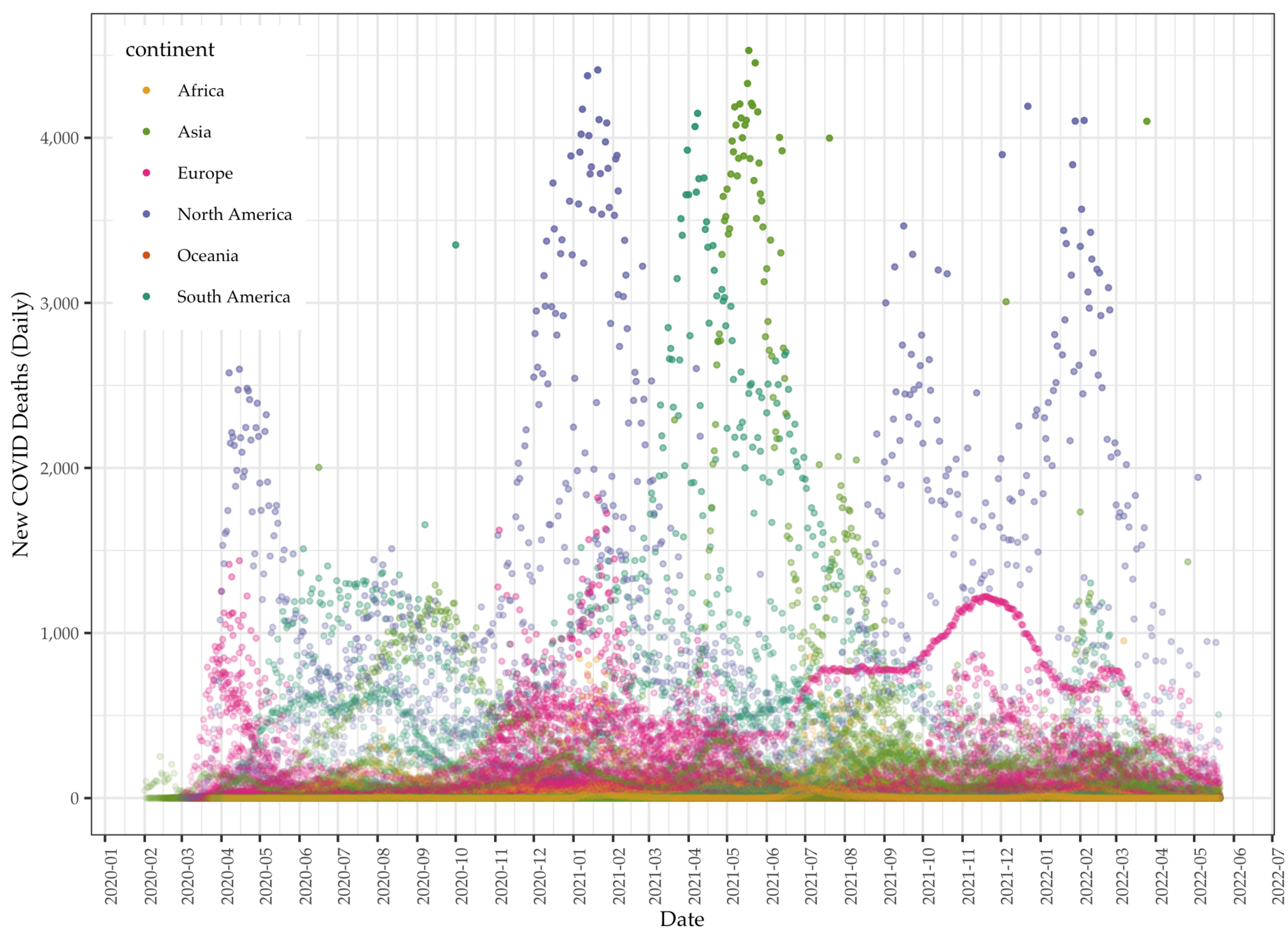
Data

Data
- We focus on aggregate instead of daily data to identify predictors of total cases of COVID (per million).
- COVID data vary tremendously over countries and time. Singling out cumulative or total cases to regress on country-level variables allows modeling the COVID data per individual countries' characteristics
- OWID data point to one direction: how developed the country is and the number of COVID cases and death.
- The general trend is the more developed the countries are the more affected by COVID.
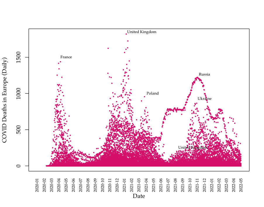
Data: Death data (Europe)
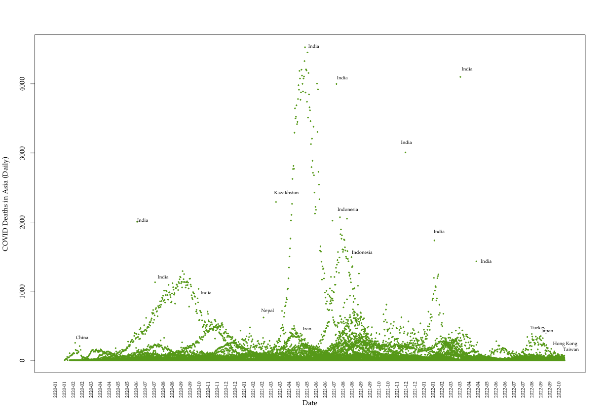
Data: Death data (Asia)
Most recent Data: Deaths (Asia)
Automated Machine Learning
- Automated machine learning applies multiple algorithms and modeling methods including:
- validation
- training and testing data partitioning
- pruning for tree models
- constraints application
- The process compares model efficacy using a series of metrics to determine stopping and selection recommendations including MSE, AUC and RMSE.
- We use \(H_2O.ai\) to model the COVID cases with 13 predictors.
Automated Machine Learning
Automated Machine Learning
Automated Machine Learning
COVID data using isoreg classification
Data: Total cases per million
Data: Daily COVID deaths
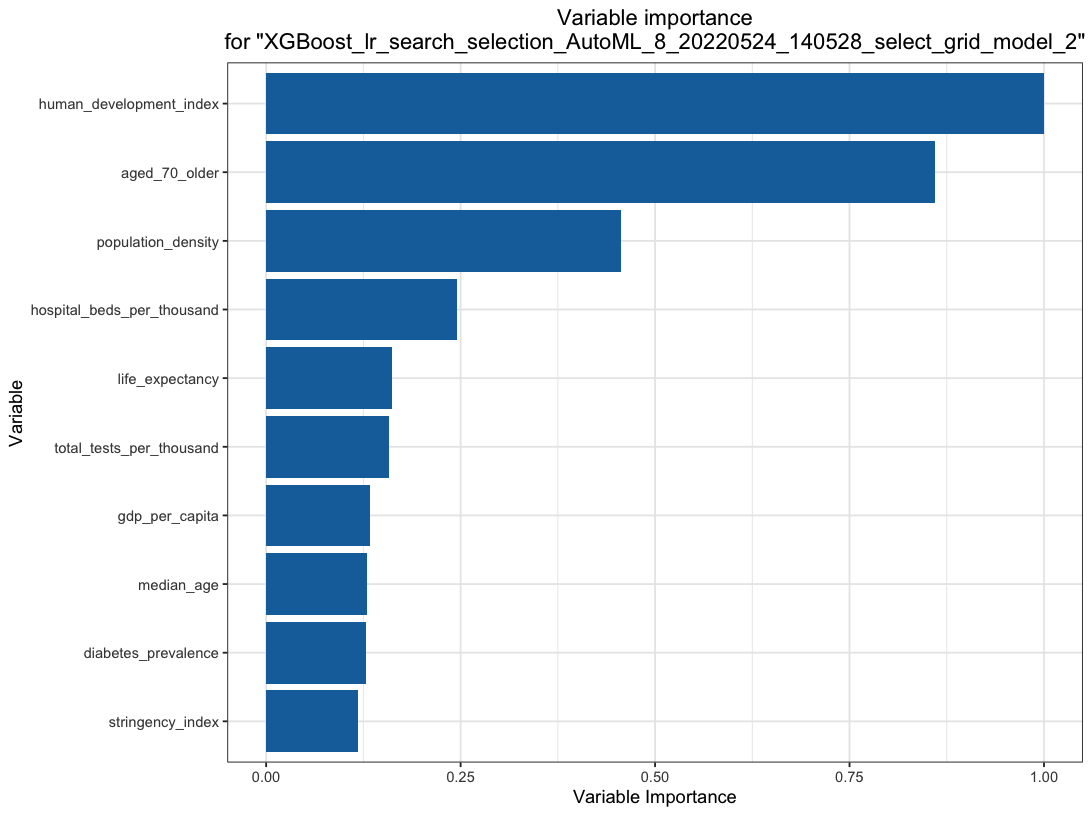
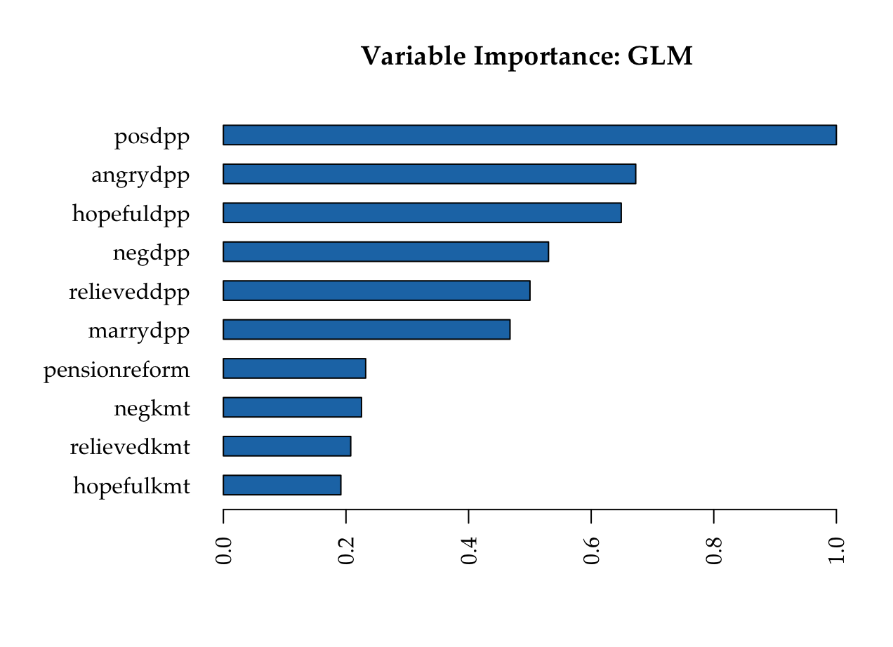
Most important variables: GLM
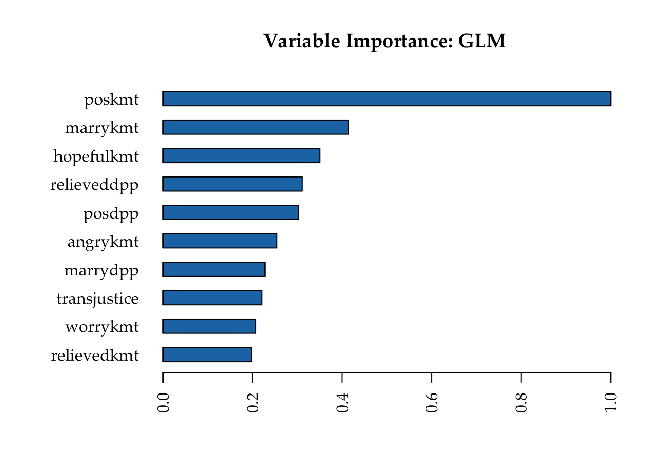
KMT
DPP
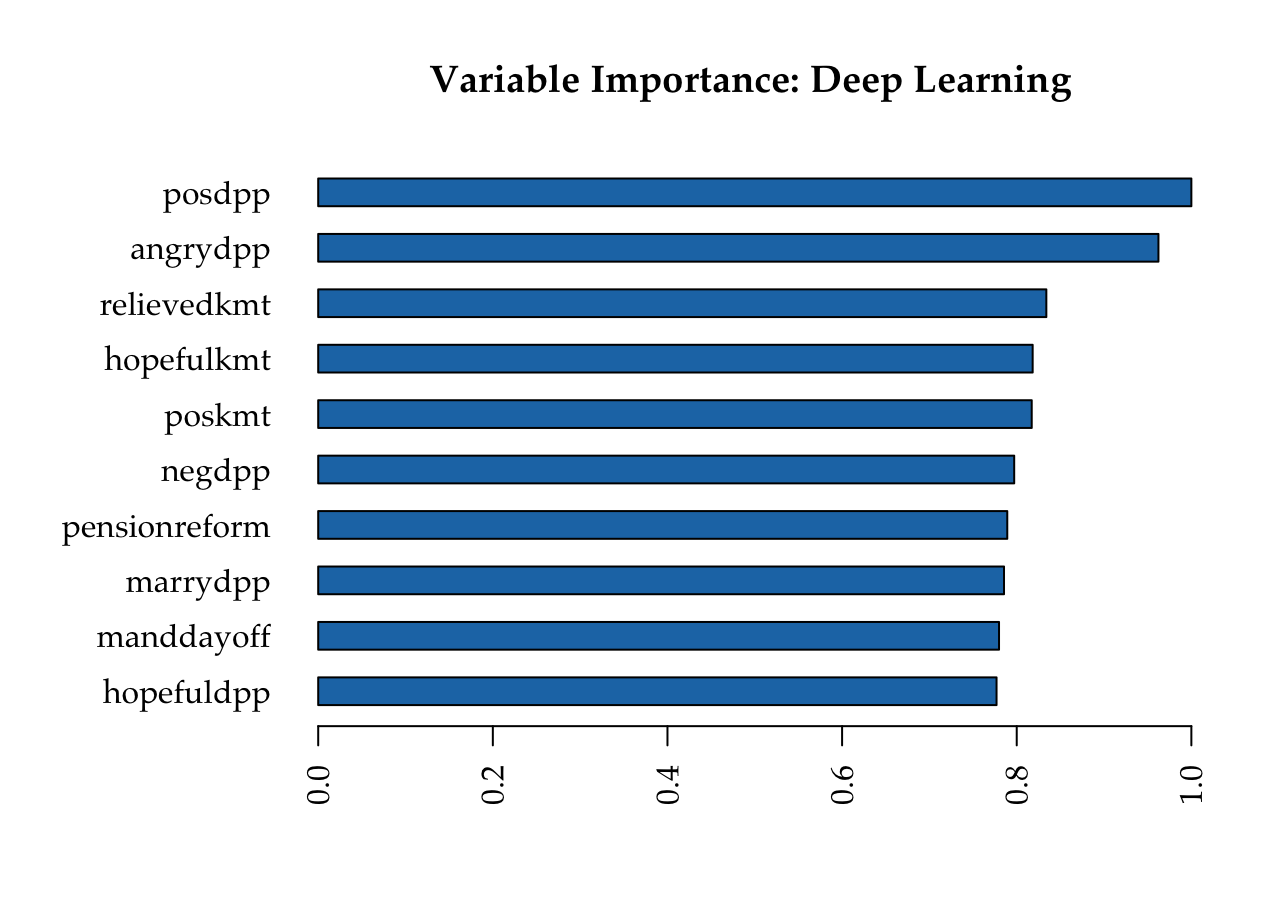
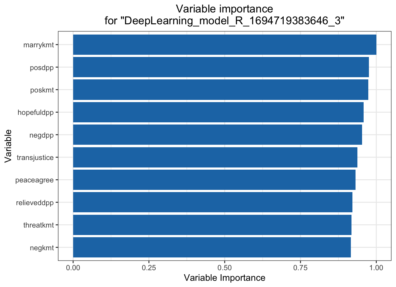
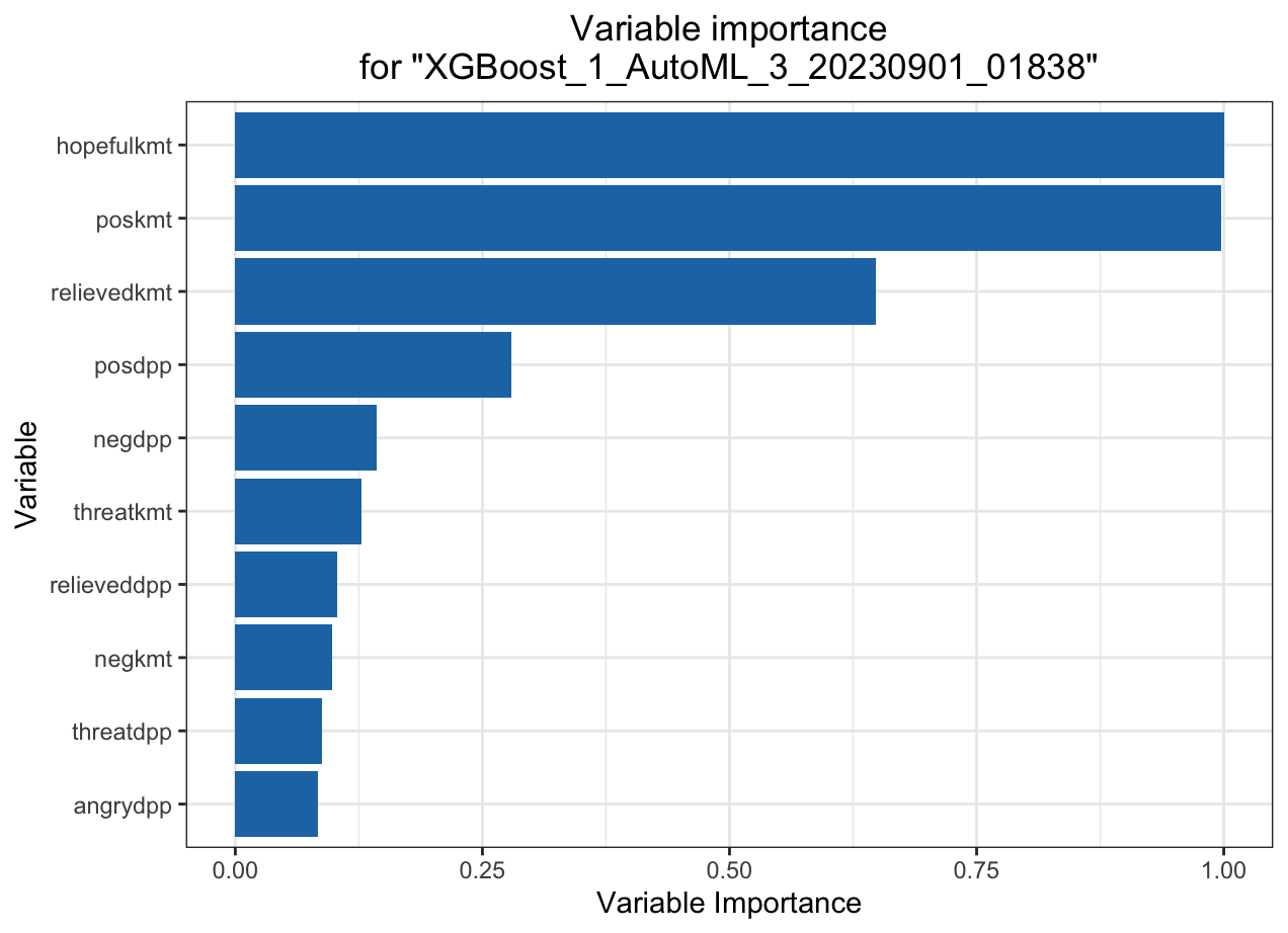
Deep learning model (NN)
KMT
DPP
MSE: 0.05650798
RMSE: 0.2377141
LogLoss: 0.190111
Mean Per-Class Error: 0.07756352
AUC: 0.9773588
AUCPR: 0.9645369
Gini: 0.9547177
MSE: 0.05053361
RMSE: 0.2247968
LogLoss: 0.1659664
Mean Per-Class Error: 0.08273317 AUC: 0.9781768
AUCPR: 0.9399842
Gini: 0.9563536
Automated Machine Learning: KMT
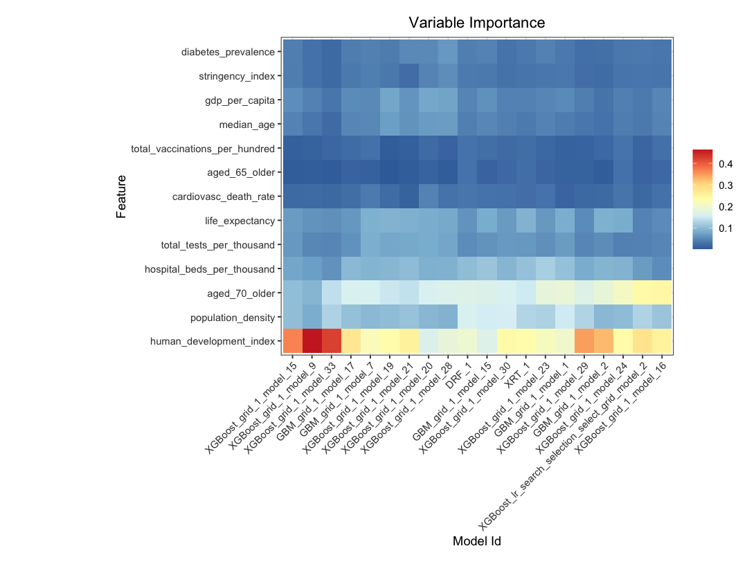
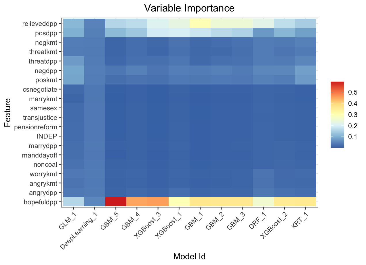
Variable importance heatmap shows variable importance across multiple models. Some models return variable importance for one-hot (binary indicator) encoded versions of categorical columns (e.g. Deep Learning, XGBoost). In order for the variable importance of categorical columns to be compared across all model types we compute a summarization of the the variable importance across all one-hot encoded features and return a single variable importance for the original categorical feature. By default, the models and variables are ordered by their similarity.
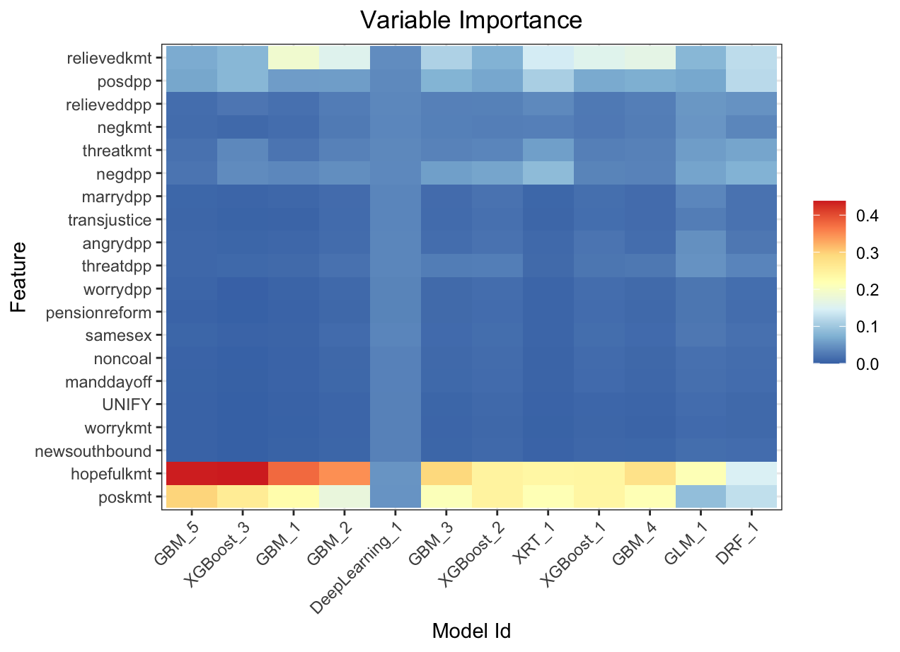
Automated Machine Learning: KMT
Variable importance heatmap shows variable importance across multiple models. Some models return variable importance for one-hot (binary indicator) encoded versions of categorical columns (e.g. Deep Learning, XGBoost). In order for the variable importance of categorical columns to be compared across all model types we compute a summarization of the the variable importance across all one-hot encoded features and return a single variable importance for the original categorical feature. By default, the models and variables are ordered by their similarity.
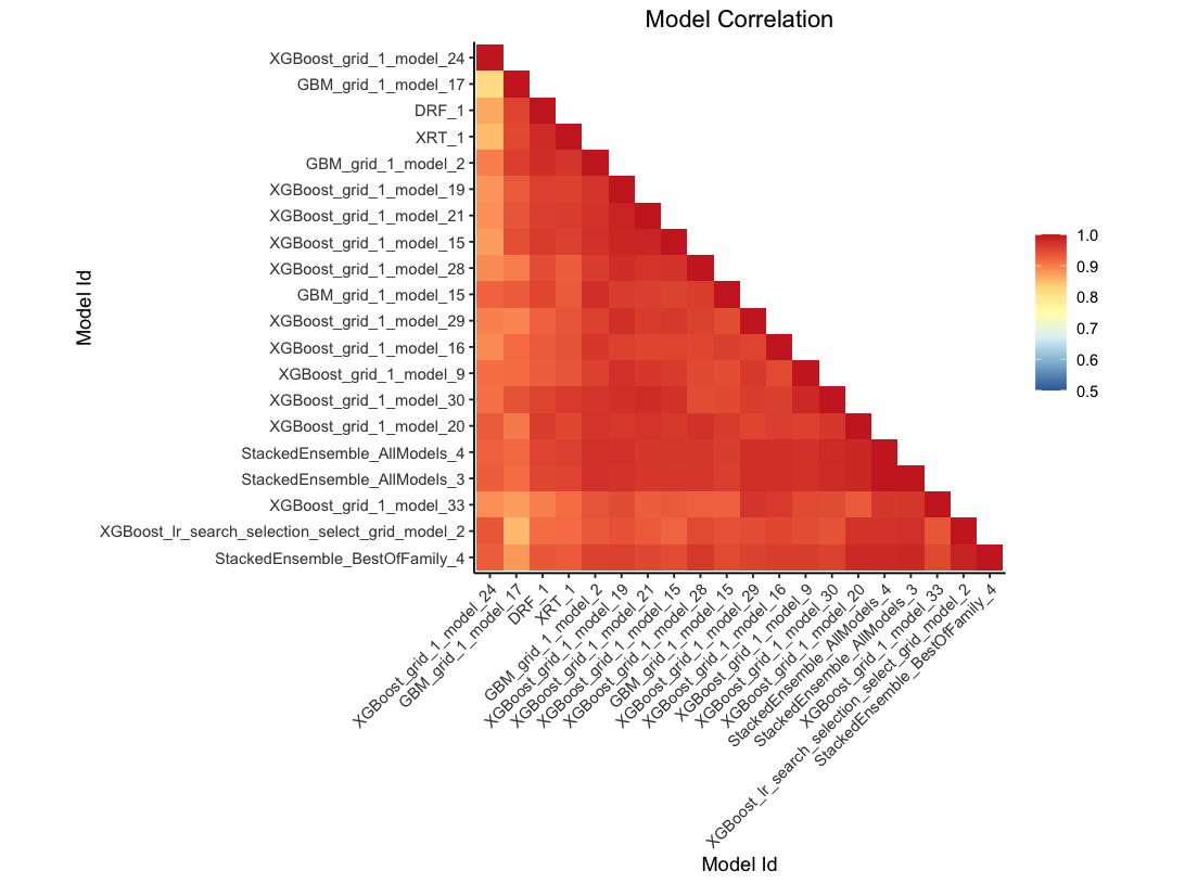
This plot shows the correlation between the predictions of the models. For classification, frequency of identical predictions is used. By default, models are ordered by their similarity (as computed by hierarchical clustering).
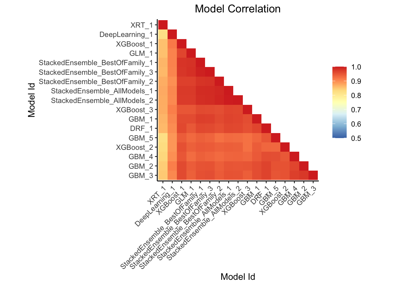
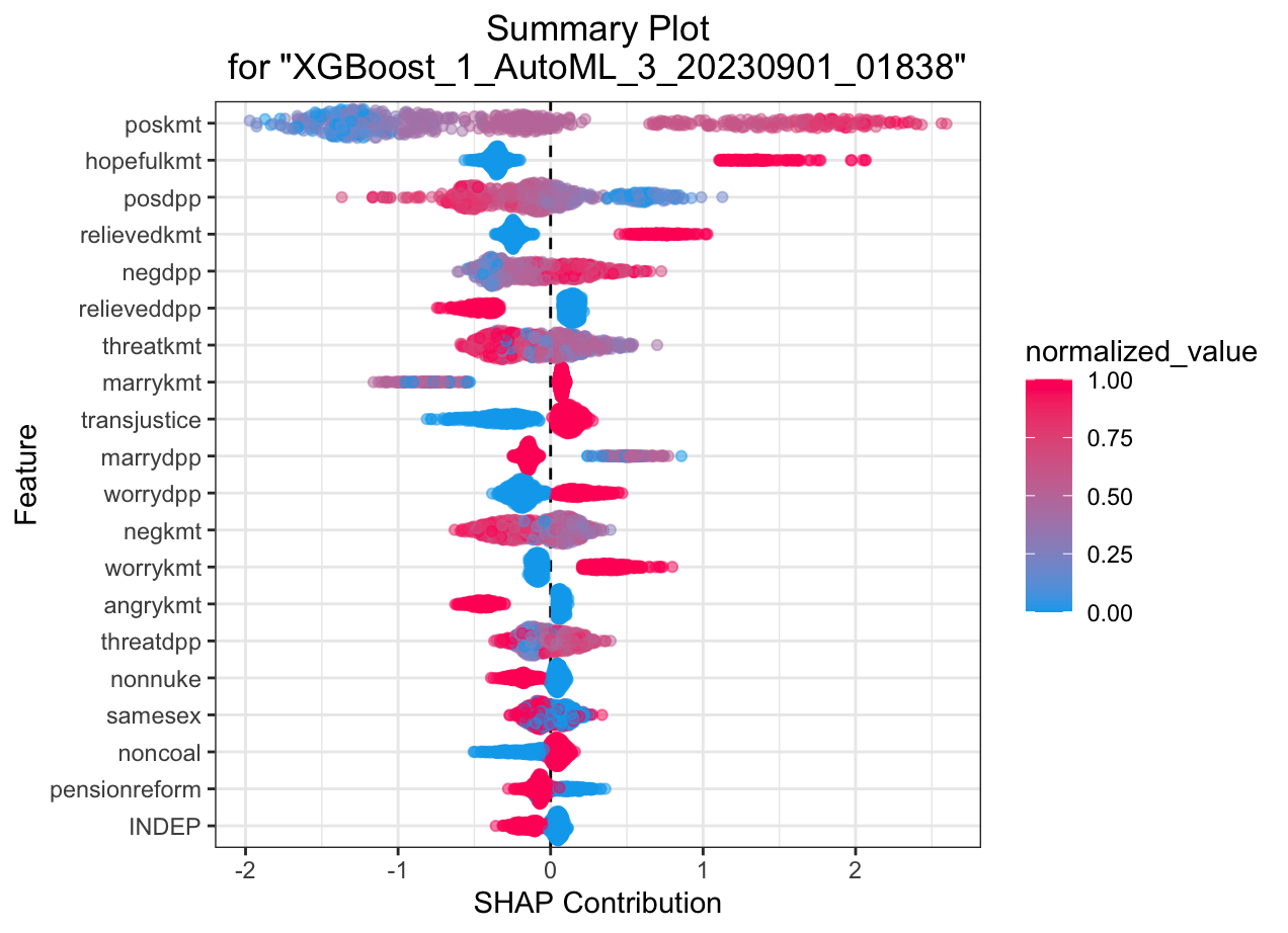
Automated Machine Learning: KMT
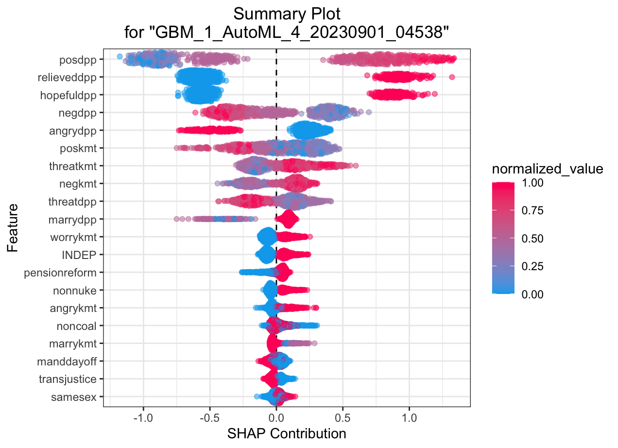
SHAP summary plot shows the contribution of the features for each instance (row of data). The sum of the feature contributions and the bias term is equal to the raw prediction of the model, i.e., prediction before applying inverse link function
Automated Machine Learning: KMT
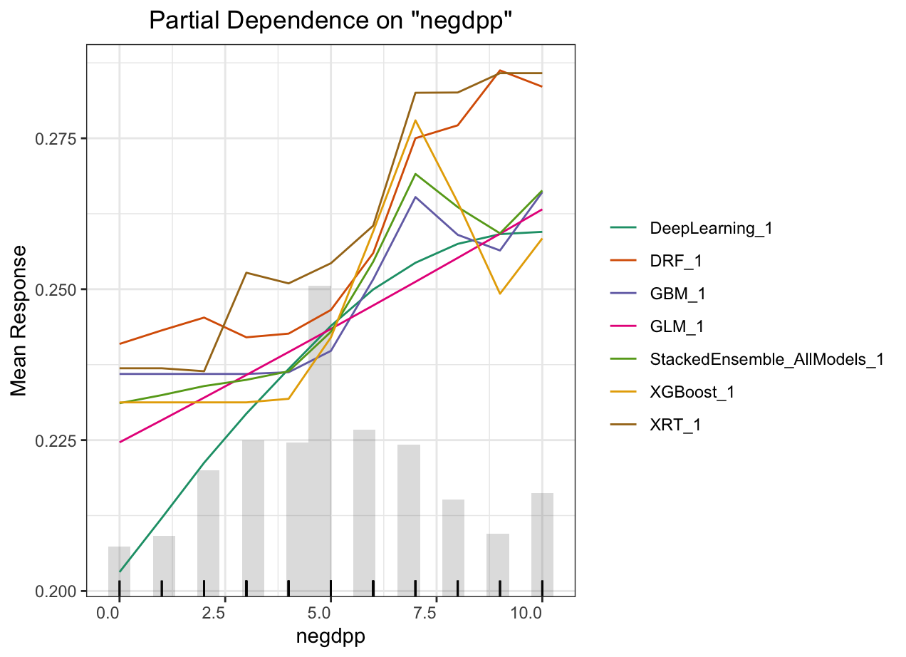
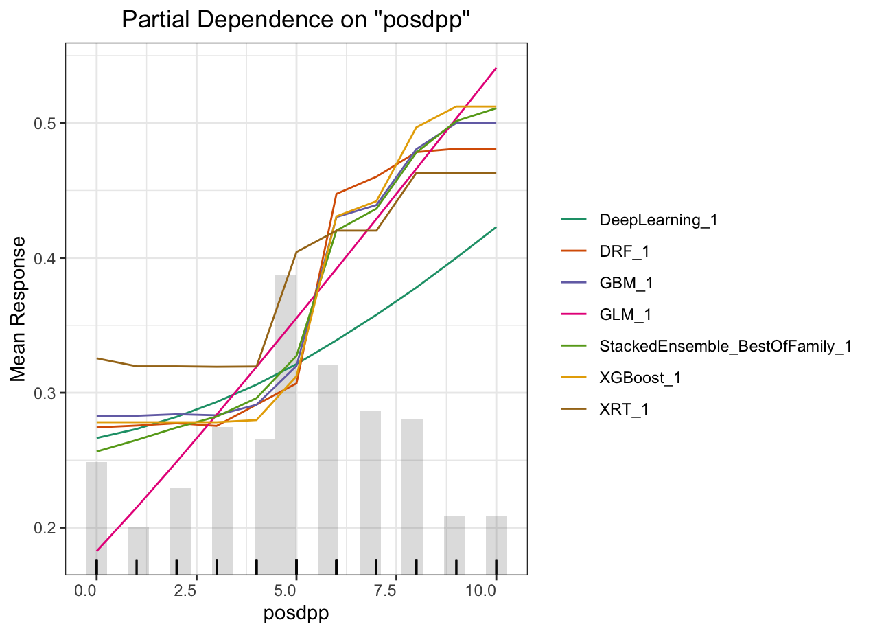
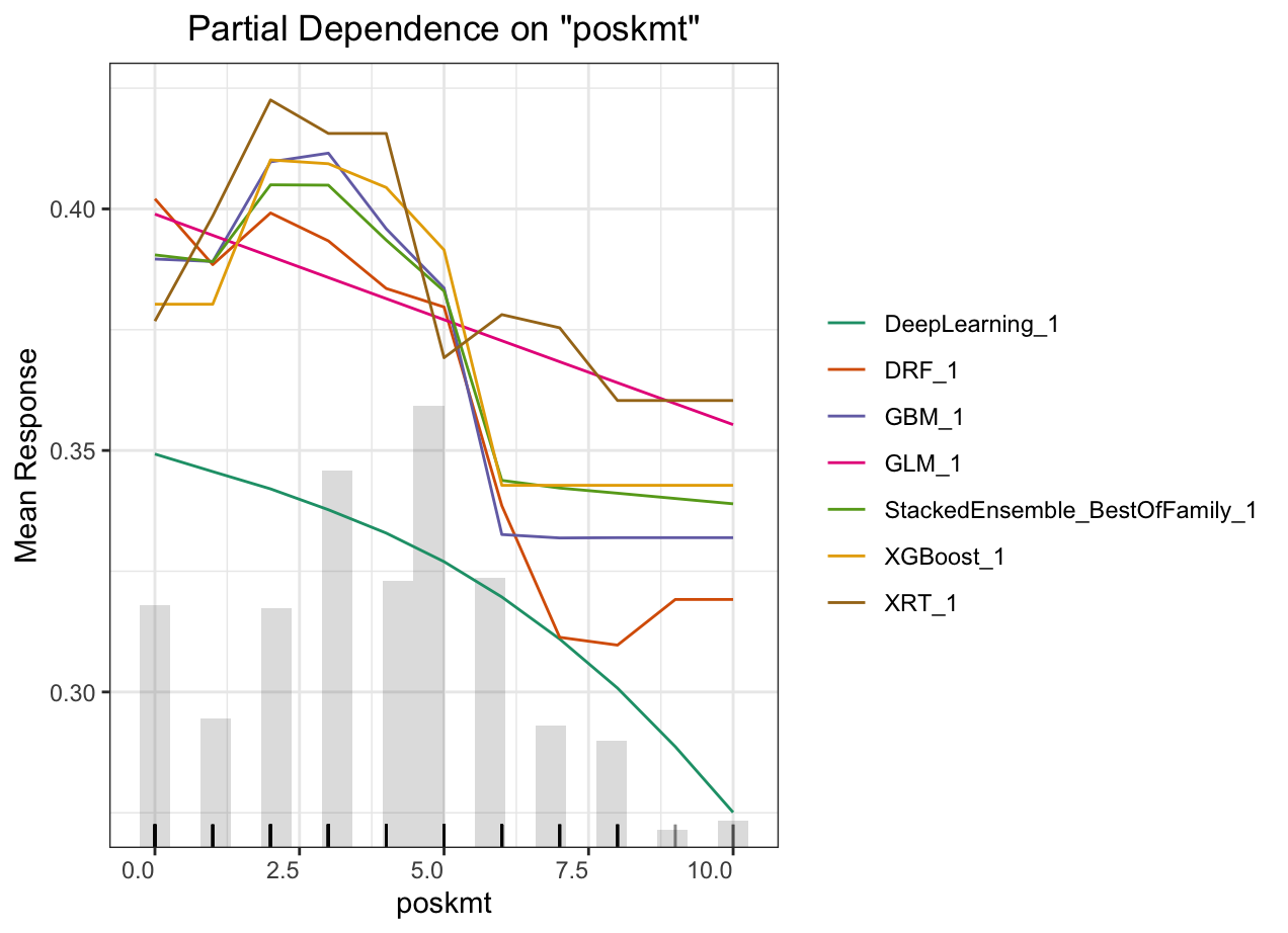
Partial dependence plot (PDP) gives a graphical depiction of the marginal effect of a variable on the response. The effect of a variable is measured in change in the mean response. PDP assumes independence between the feature for which is the PDP computed and the rest.
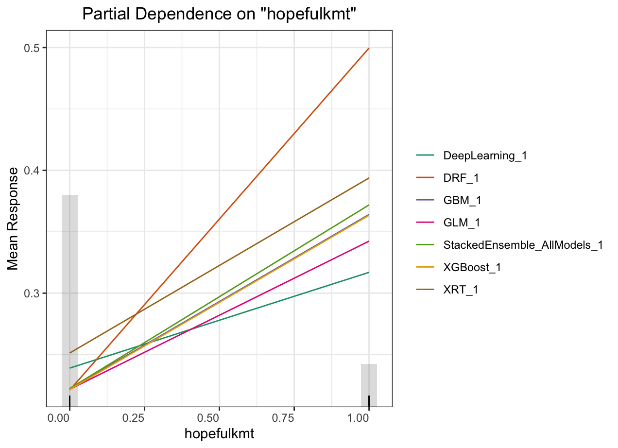
Automated Machine Learning: KMT
Partial dependence plot (PDP) gives a graphical depiction of the marginal effect of a variable on the response. The effect of a variable is measured in change in the mean response. PDP assumes independence between the feature for which is the PDP computed and the rest.
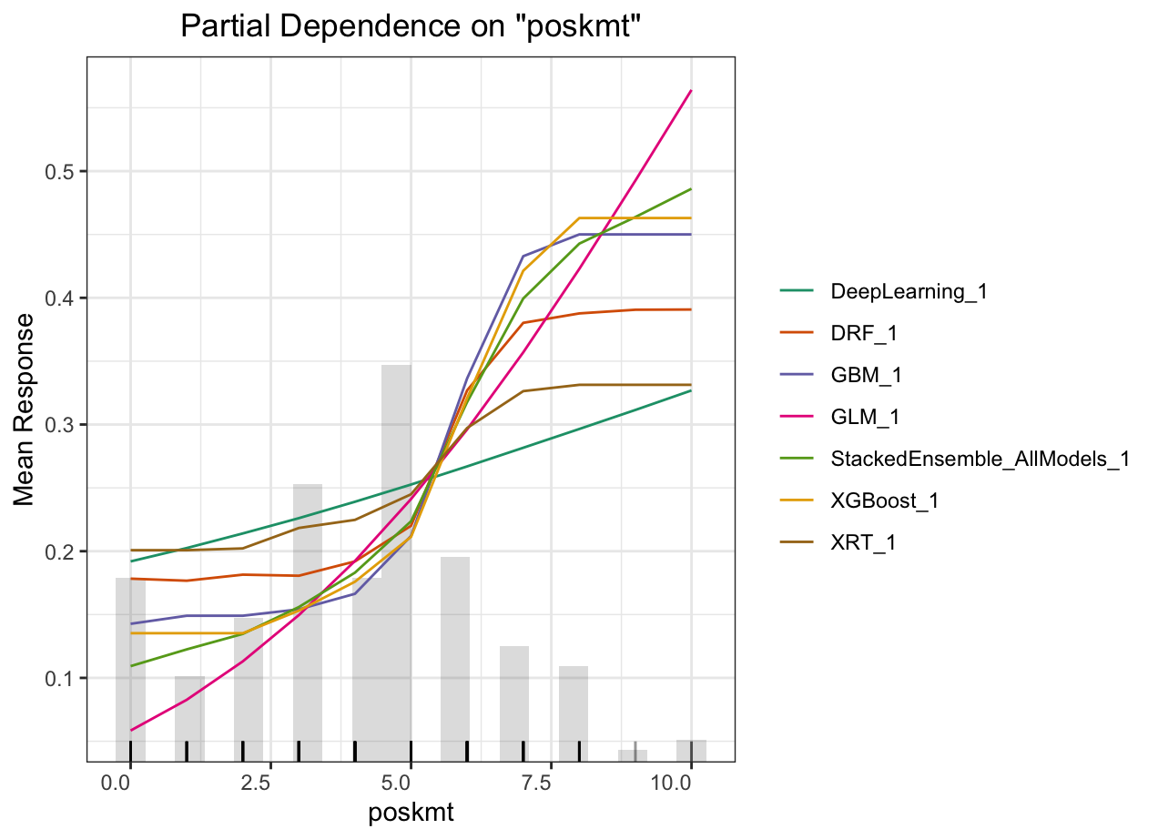
Automated Machine Learning: KMT
Partial dependence plot (PDP) gives a graphical depiction of the marginal effect of a variable on the response. The effect of a variable is measured in change in the mean response. PDP assumes independence between the feature for which is the PDP computed and the rest.
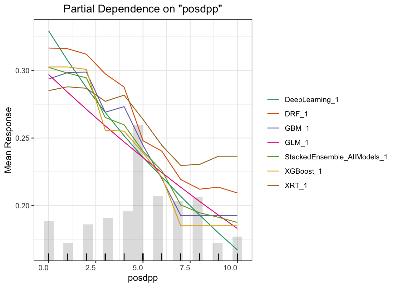
Automated Machine Learning: KMT
Partial dependence plot (PDP) gives a graphical depiction of the marginal effect of a variable on the response. The effect of a variable is measured in change in the mean response. PDP assumes independence between the feature for which is the PDP computed and the rest.
Automated Machine Learning: KMT
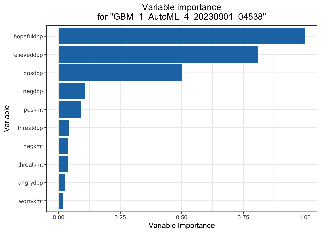
Automated Machine Learning: DPP
Automated Machine Learning: DPP
Automated Machine Learning: DPP
Automated Machine Learning: DPP
Takeaways
How to bridge and converge the two subfields in Data Science:
- Both are used for raising questions and providing answers
- Data visualization turns complexity into comprehensible messages. It is exploratory in nature.
- Machine learning is primarily for classification and prediction. It is generally understood as a "black-box" process.
- Through data visualization designs, ML can be more "explanable" and interpretable.
- ML can pipe into automated interactive data visualization.
Insights for Data Science programs
Both Data visualization and Machine learning training programs warrant solid foundation of what, how and why.
- Data visualization
- Data theory
- Graphics theory
- Cognitive science (perception systems)
- Development (i.e. like creating an app)
- Machine Learning
- Statistical learning theory
- Advanced modeling (e.g. Lasso, regularization)
- Interpretation+explanation
- Causal inference
References
Endert, A. et al. 2017. “The State of the Art in Integrating Machine Learning into Visual Analytics.” Computer Graphics Forum 36(8): 458–86. https://onlinelibrary.wiley.com/doi/abs/10.1111/cgf.13092 (September 7, 2023).
Lary, David J., Amir H. Alavi, Amir H. Gandomi, and Annette L. Walker. 2016. “Machine Learning in Geosciences and Remote Sensing.” Geoscience Frontiers 7(1): 3–10. https://linkinghub.elsevier.com/retrieve/pii/S1674987115000821 (September 14, 2023).
Talbot, Justin, Bongshin Lee, Ashish Kapoor, and Desney S. Tan. 2009. “EnsembleMatrix: Interactive Visualization to Support Machine Learning with Multiple Classifiers.” In Proceedings of the SIGCHI Conference on Human Factors in Computing Systems, CHI ’09, New York, NY, USA: Association for Computing Machinery, 1283–92. https://dl.acm.org/doi/10.1145/1518701.1518895 (September 7, 2023).
Vellido, Alfredo. 2020. “The Importance of Interpretability and Visualization in Machine Learning for Applications in Medicine and Health Care.” Neural Computing and Applications 32(24): 18069–83. https://doi.org/10.1007/s00521-019-04051-w (September 7, 2023).
Wang, Qianwen et al. 2021. “Visual Analysis of Discrimination in Machine Learning.” IEEE Transactions on Visualization and Computer Graphics 27(2): 1470–80.
Wang, Qianwen, Zhutian Chen, Yong Wang, and Huamin Qu. 2022. “A Survey on ML4VIS: Applying Machine Learning Advances to Data Visualization.” IEEE Transactions on Visualization and Computer Graphics 28(12): 5134–53.
Thank you!
Wait... are you sure you have no questions?