Process of making the artist logo
Kelsey, Maisie and Clare
Research
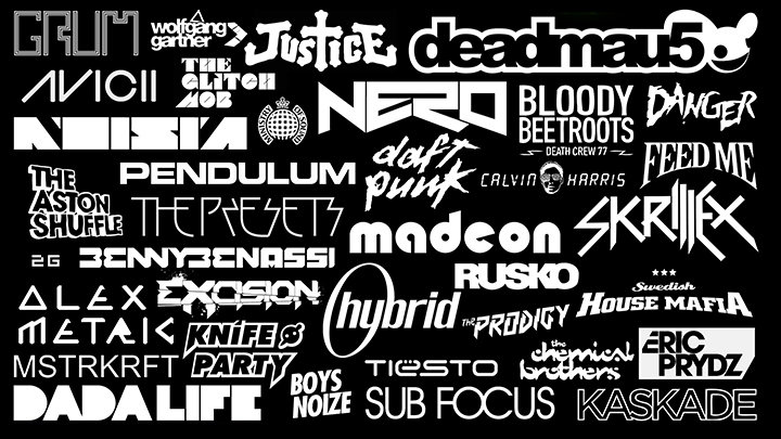
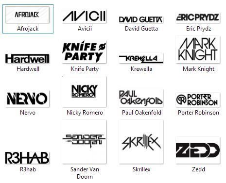
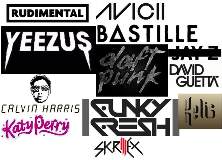
Before drafting our logo initial ideas, a big thing for us was to look at other current artists logos. We discovered that the artists logos are usually just simple with normally just the artists name wrote in fancy writing. However, normally the artists logo is unique to them - and no two logos are the same. For example, Jay Z's logo has a line through his name - whereas, Katy Perry has pink, girly writing which has hearts around it. The logo usually shows some of the artists personality.
Process of making the logo
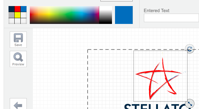
To make the logo we used the website 'freelogoservices.com'.
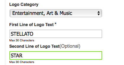
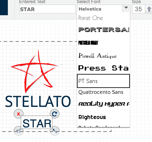
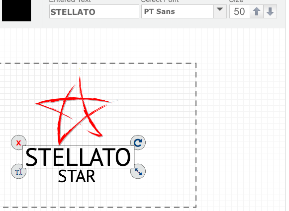
We next changed the font to 'PT Sans' - which is a similar font to what we used on our album cover.
First of all, we chose the logo category which related to the music industry - so it would bring up relevant logo designs for what we were looking for. We also put the words which we wanted on our logo (the artists name).
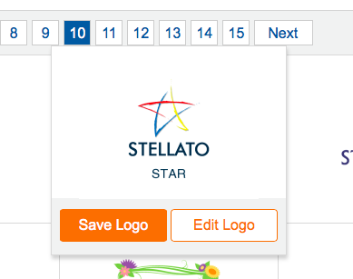
We found on page 10, the desired logo design which we wanted to edit.
We next changed our font to 50, to come into proportion with the star.
We next changed the stars colour to red - to match the energy we have created throughout our work.
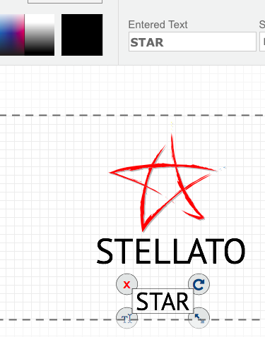
We changed our font colour to black so it wasn't a colour that clashed with the red star.