Album Website Forms & Conventions
Conventions of the Website
1. Graphic - includes lots of images
2. Usability - easy to navigate
3. Interactive sections
4. Purchasing opportunities - merchandise/albums/singles
5. Menu bar
Here are some examples


We found that similar artists' websites featured a lot of images and looked very interesting. The lesser known artists included images from social media like instagram and facebook.
My website
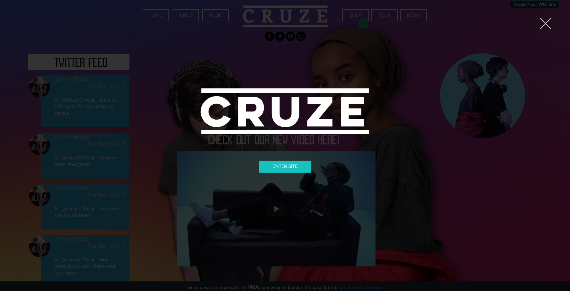
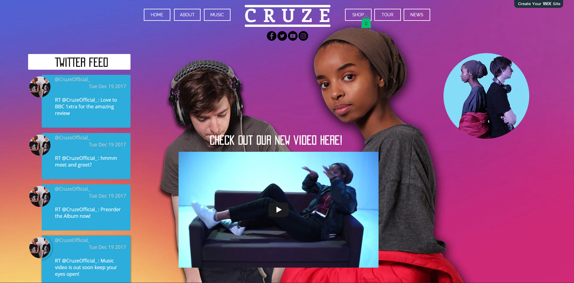
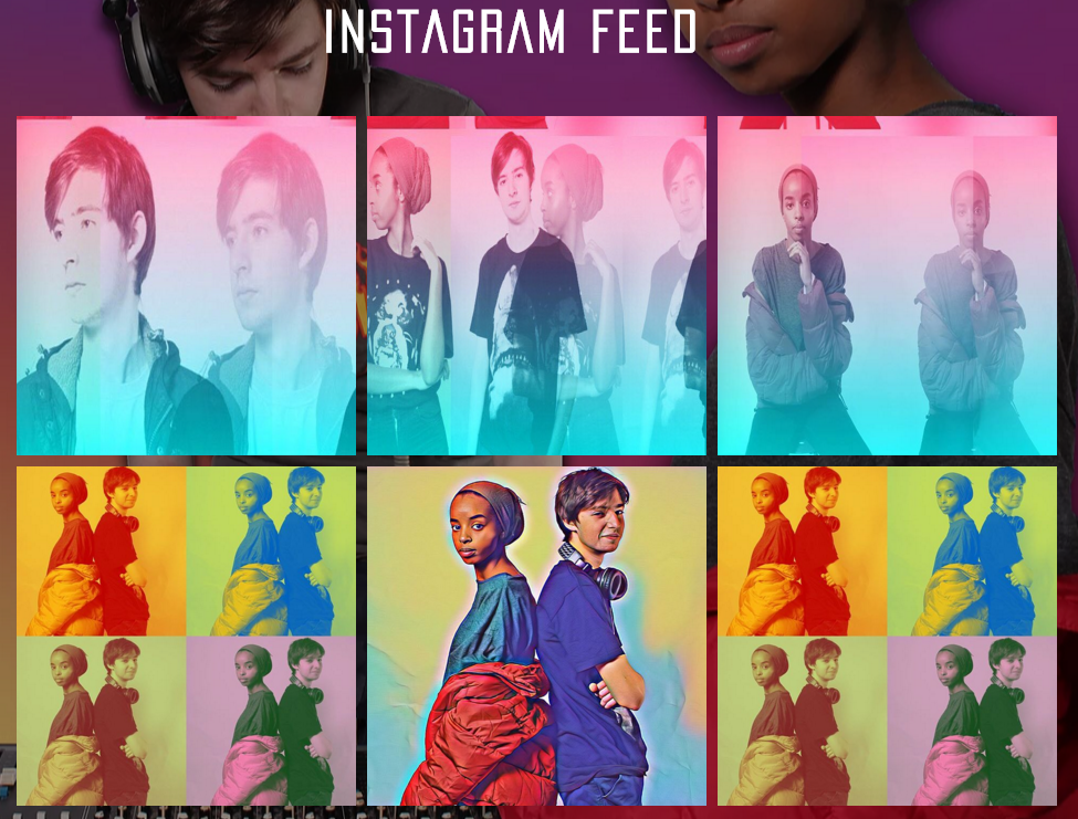
We tried to make website as aesthetically appealing as possible as we felt this would look attractive to the audience we were hoping to reach. We also included images from social media as we felt it would make them engage with our artists social media.
Navigating
It is very important to have an easy to use menu bar as this makes sure our website is easy to navigate, it ensures that there is a consistent look over the various pages throughout the website and it ensures every page can be easily accessible.


Our menu bar
Below is our menu bar, we were very pleased with how it come out and felt that it looked very professional and it was consistent over the pages.

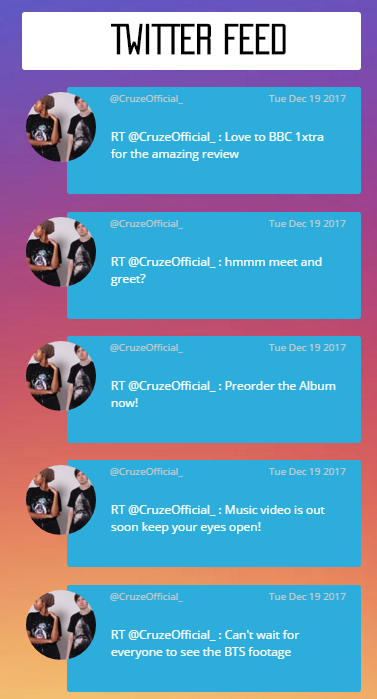
Interactive Section
The interactive section is useful as it gives the audience a chance to interact with the artists and it allows the artists to have more platforms to engage with the audience.
Purchasing Opportunities
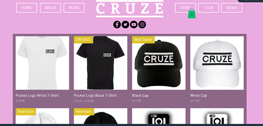
Here is our "Cruze Shop" which includes, t-shirts, hats, key chains, beanies and backpacks. As our artist is new, the merchandise is relatively inexpensive, especially compared to Ariana Grande's products say which has prices like £65 and £100
