Magazine Front Cover Analysis...
What did we want our photo to look like?
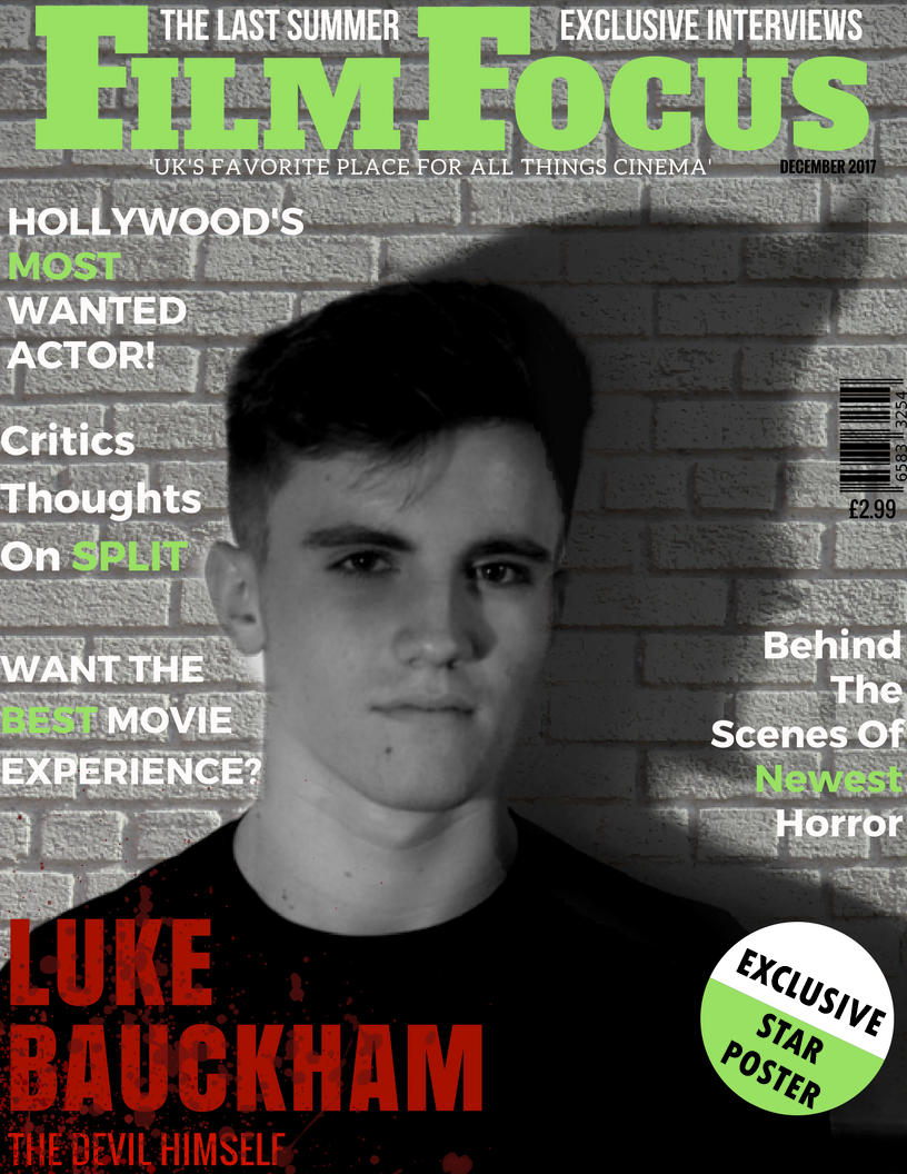
We wanted to ensure that our Magazine cover looked very similar to the poster and the text of the trailer, to show a continuance of the branding, but we also wanted to remind the audience that the magazine is a company within itself, and therefore some colours will be different. We also wanted to use a photo of the main protagonist in the story, played by Luke Bauckham, as he would be considered a USP. To get the right photo, we took about 10, and chose the one that fit best with the text around it. We also wanted to ensure, using the colour of the text, and the photo, that the genre of the movie was clearly put across, without giving any of the plot away. To choose the name for our magazine cover, we conducted a survey, and the favourite came out as ‘Film Focus’ Using alliteration in a title of a magazine, makes it more likely to stick in an audience members head, therefore remembering it in the future. We also conducted some research into codes and conventions of magazine covers to ensure we had things such as barcodes and the price, which are necessities.
Text
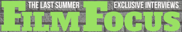
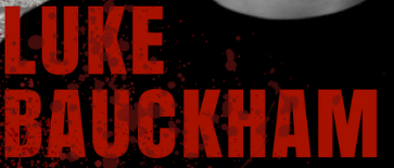
The piece of text that stands out the most is the master head ‘Film Focus’. This is due to the fact that we made the text big, bold and in an eye-catching colour. When we first started the editing of the cover, the master head was red, but we changed it to a bright green, as to remind the audience that the magazine is a different company to the one making the film, and so will have its own colours. The name of the USP, actor Luke Bauckham’s name, is in a dark red colour, with a blood splatter on the top, which fits in with our films genre.
Just below the title, we have included a sell line of ‘UK’S FAVOURITE PLACE FOR ALL THINGS CINEMA.’ We have put this piece of text in white, which will match the rest of the text on the cover, apart from the titles. This line is enticing, as being the ‘Uk’s Favourite’ it is the most popular.
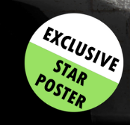
On the left hand side of the magazine cover, we have ensured to highlight our buzzwords in the same colour as the magazine title, such as ‘exclusive’ ‘best’ and ‘most’(wanted). These words will immediately grab the audience’s attention and make them want to purchase the magazine. We have also included a sticker, again with the buzzword ‘exclusive’ in the same colour as the title.
Mise-en-scene used?
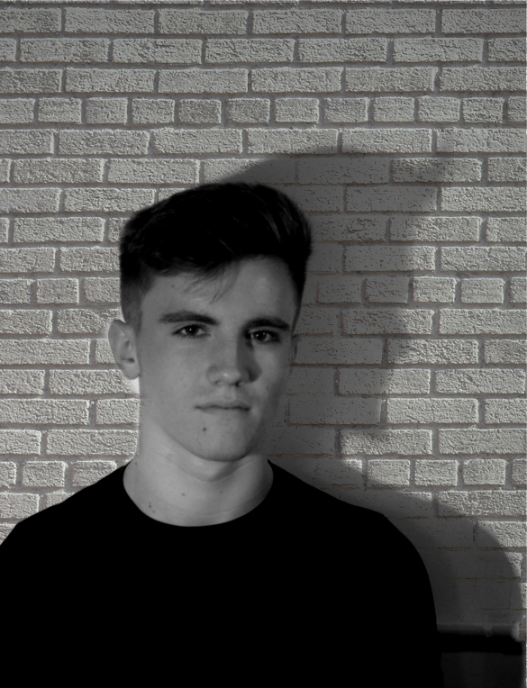
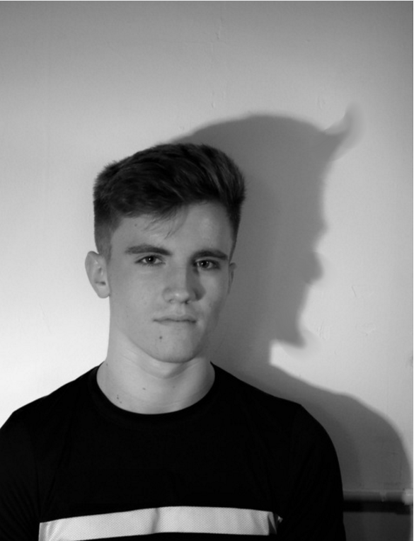
We used no props in our film poster, as we did not want the focus taken away from the actor. The photo was taken up against a white wall, but we edited this so he was infront of a brick wall, to make the character look isolated and alone. He is also in dark colours, to represent the fact that he is a dark character. The facial expression that we asked the actor to use is blank and expressionless. This is so that none of his feelings are given away, so the audience are intrigued to what his character is like.
Just behind the actor is his shadow. We decided to turn this shadow into the devil, to create an enigma code. This will make the audience question, what has he done so wrong, to be considered as bad as the devil.