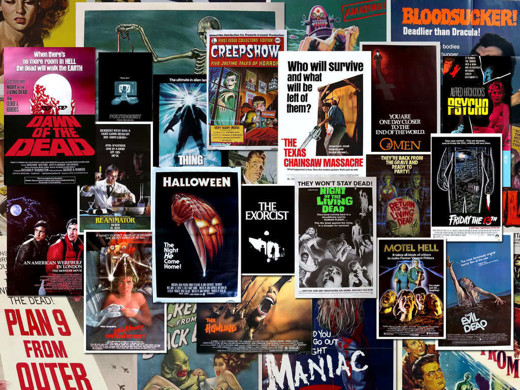
Film Poster Analysis...
What did we want our photo to look like?
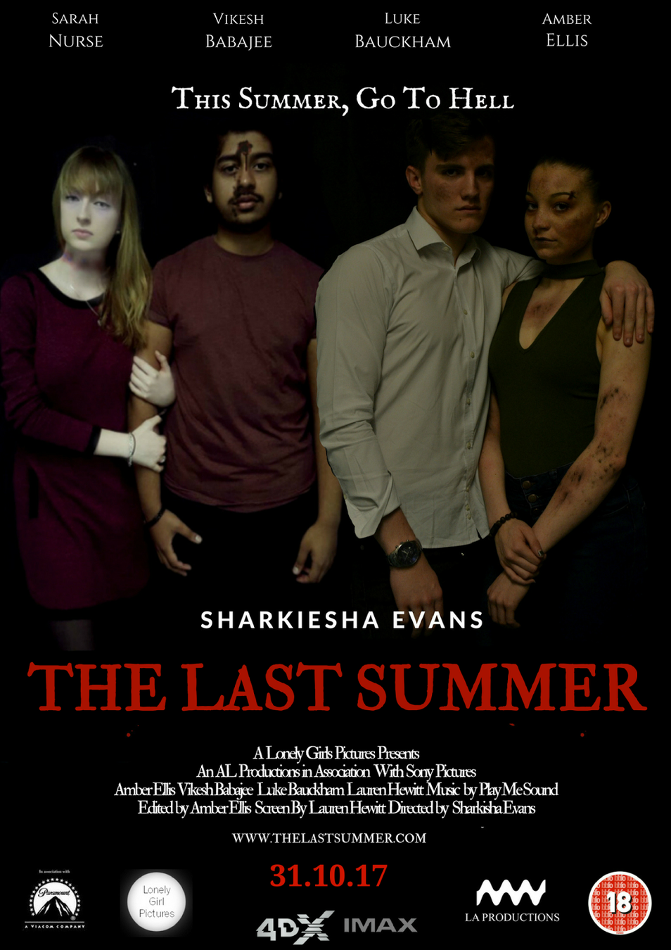
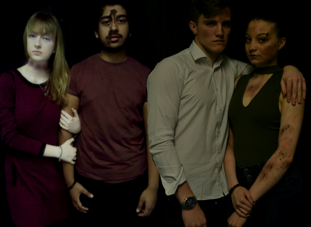
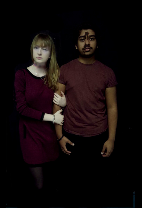
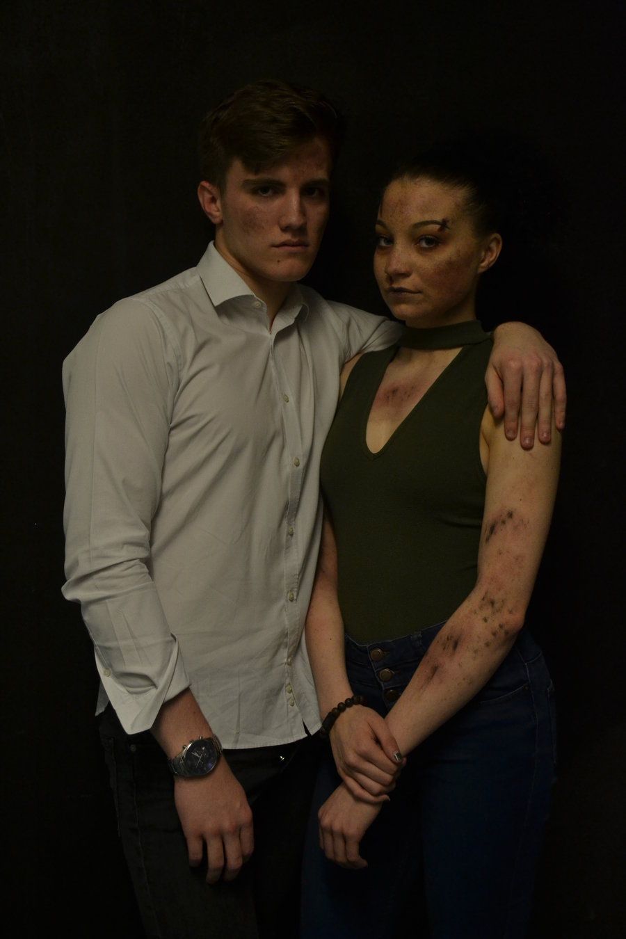
The first thing that we wanted to ensure that we had was a photo that we could work our text around easily on the film poster. For this, we arranged a few days after school that we would dedicate to different actors photos. (We took the photos for both the magazine and the poster at this point, to save time) The shot that we wished to create was a group photo of the main characters all together, but looking as if they have been seriously harmed (I had a rope burn round my kneck as I was hung in the trailer, Vikesh has a bullet hole on his head as he was shot, and Amber was covered in mud as she was buried alive) We took two separate photos of each ‘couple’ and added them together during the editing process. We decided not to have Sarah in this shot, as it would give too much away about the film, as it comes out that she is the killer, but this is not made obvious in the trailer.
We decided to have a black background for our film poster, as it keeps the continuity across the rest of the texts. It is also to put further emphasis on the genre, keeping to colours of horror (black, red and white) obvious at all times.
Text
Looking at the text we used, the main piece is the title of the movie ‘The Last Summer’ it is placed in the centre of the poster, so that it gains most of the audience’s attention straight away. The font that we used, we wanted to keep as close to the fonts used for the trailer and the magazine cover to it is obvious they are all advertising the same product. The colours used for the text are red and white to stand out from the black background and show the convention of horror movie colours.
The names of the actors are placed at the top of the poster (as to be easy to spot) and they are written in a plain, easy to read font, in the colour white; this is so it will be an obvious contrast to the background colour.


Mise-en-scene used?
There were no props used in our film poster, as we did not want to over complicate the photo and make it look to busy. However, we did use costume and makeup. The special effects make-up that we used allowed us to create the wounds for each character, which you see that they have gained after you watch the trailer. The costumes differ from actor to actor to fit their character type. For example, we chose a white shirt and dark coloured trousers for Kyle (Luke Bauckham) so that we could emphasise the bruises on him in comparison to his light t-shirt, and it is also to show that his character is formal, and likes to dress well. For Natalie (Amber Ellis) she wore a black dress, which shows that even though they are a couple, her and Kyle are too very different people looking at their opposite colour choices. The dress also highlights the dark markings on her arms and chest, as they are similar colours. Lastly, Chelsea (Myself) and Dave (Vikesh Babajee) wore similar colours to show that they are a closer couple than the other two.
Proxemics
Looking at the proxemics of the shot, we wanted to make sure that the way that each character is standing has significance. As you can see, my character is clinging onto the side of her partner. That shows she is very needy, as his body language is facing outwards, paying her no attention. For the other couple, the male has is arm around the female, which shows some sort of affection, but she is giving him nothing in return, showing that she is cold towards him.
At the bottom of the poster, we decided to place the credit block, as this is a lot of text, and we did not want the focus taken away from the main title and image. As well as this, we placed the release date, along with the many institutional logos, and BBFC rating. These are things that you would typically find on a film poster, therefore were a necessity to add. Lastly, we added a website, so that audience members can find out more about the film online, again adding to the advertising and branding.
Including the Conventions