CSS - Thunderdome
Leon Noel
Who's going to carry the boats and the logs?

#100Devs
Agenda
-
Questions?
-
Review - How To Network
-
Review - CSS Basics
-
Review - CSS Layout
-
Learn - Responsive Basics
-
Build - Responsive Website
-
Homework - Layouts
Questions
About last class or life

!newsletter
Trough Of Sorrow
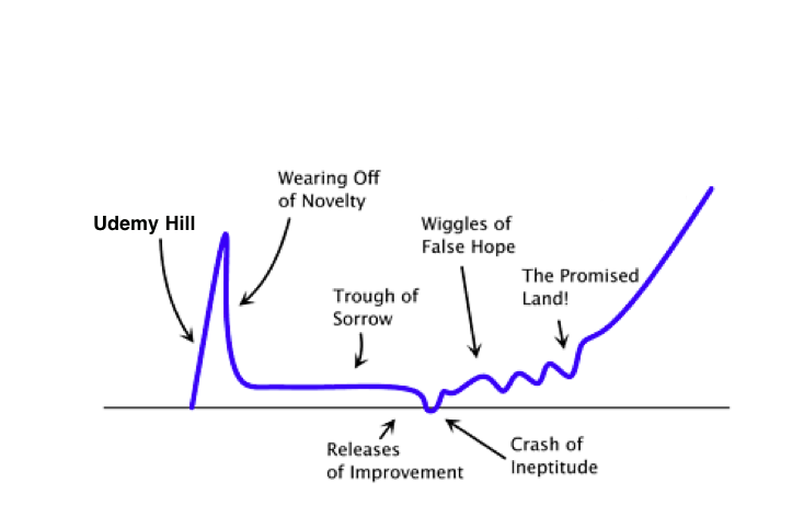
Manage Frustration
Consistency
Taking Care Of Yourself

Submitting Work

I DON'T WANT IT
Make It Better
Networking
3 Individuals Already In Tech
2 Coffee Chats
Stranger > Acquaintance > Friend > Referral > Coworker

Meet > Email > LinkedIn > Twitter
Next Day
Day 3
Day 6
Normal Follow Up

Hi Leon,
It was a pleasure meeting you last night! The event was so well done and it was exciting meeting such an amazing group of people - I hope you are enjoying a well deserved break after pulling it all together!
Also, I don't know if you saw this yet, but someone just bought a $375k first edition pokemon booster box and it wound up being fake! The Gaurdian covered it and I remember you mentioned being a big fan. Hope you have a great rest of the week!
Cheers,
Bob
Email Follow Up 1 > Email Follow Up 2 > Last Email
1 Week
2 Weeks
1 Month
Want A Coffee Chat?

Hi Leon,
It was a pleasure meeting you last night! The event was so well done and it was exciting meeting such an amazing group of people - I hope you are enjoying a well deserved break after pulling it all together!
As I mentioned last night, I'm just starting my engineering career and would love to learn from successful people such as yourself. Please let me know if there might be a time you are free to grab a virtual coffee over the next week or two. Before 9am or after 5pm tends to work best for me, but happy to accommodate what works for you. Thanks!
Also, I don't know if you saw this yet, but someone just bought a $375k first edition pokemon booster box and it wound up being fake! The Gaurdian covered it and I remember you mentioned being a big fan. Have a great rest of the week!
Cheers,
Bob
USE THE SHEET!

Coding Challenges

Daily - Starting Next Week
Paid Client
Due by Mar. 29th

Homework
Layout 1

Layout 2

Layout 3

Layout 4

Layout 5
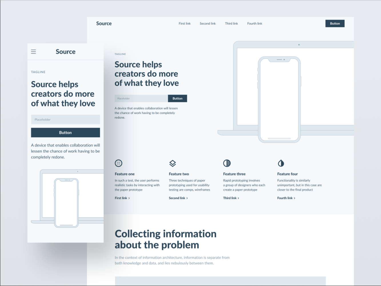
Mobile Responsive Too
Layout 6

Mobile Responsive Too
Layout 7

Mobile Responsive Too
Layout Push
💪🏽 Make it mobile responsive too

Watch:
Independence Day
Shit Just GOT REAL

You can't read someone else's book about some theory on how to do shit...
Those that want to be a seal will be a seal
You have to go into those dark chambers that we often shut off and you gotta open them up and fight that fucking demon - get in there talk to that mother fucker and say what's up
Weeding out the 'weak' to bring the strong together....
*STRONG DISCLAIMER*
Never saw someone carry a boat or log by themselves
Who's gonna carry the boats and the logs
Just because...

The Golden Rule
SEPERATION OF CONCERNS
-
HTML = Content / Structure
-
CSS = Style
-
JS = Behavior / Interaction
Progressive Enhancement

According to the United States Department of Commerce, about 22 million Americans--roughly 35% of the nation's rural residents--lack access to broadband.
(2017)
CSS
Where does CSS go?
-
Inline
-
In the head
-
In a separate file
CSS BREAK DOWN
p{
  color: red;
  font-weight: bold;
}
What is this?
p{
  color: red;
  font-weight: bold;
}
p{
  color: blue;
}
CSS is read top to bottom
What comes below, can override what came above
This is called the Cascade
Selecting By Relationship
section > p {
  color: red;
}
To select an element that is the direct descendent of another element use
parent > child
<section>
  <p>Hello, Twitch!</p>
</section>
Selecting By Relationship
section p {
  color: red;
}
To select an element that is inside of another element without being directly descended use parent element
parent child
<section>
  <article>
    <p>Hello, Twitch!</p>
  </article>
</section>
Selecting By Relationship
p + p {
  color: red;
}
To select an element that is the next sibling use
previous sibling + next sibling
<section>
  <p>Hello, Twitch!</p>
  <p>Hello, Youtube!</p>
</section>
IDs & Classes

IDs
#zebra {
  color: red;
}
IDs are used for selecting distinct elements
Only one id with the same value per document
#idName
<section>
  <p>Hello, Twitch!</p>
  <p id="zebra">Hello, Youtube!</p>
</section>
Classes
.bob {
  color: red;
}
Classes are for selecting multiple elements
Multiple with same value allowed per document
.className
<section>
  <p class="robot">Hello, Twitch!</p>
  <p id="zebra" class="bob">Hello, Youtube!</p>
  <p class="bob">Goodbye, Mixer!</p>
</section>
Specificity

#pizza p span.gone {
  color: red;
}
<section id="pizza">
<p class="jumanjiOriginalMovie">Hello, Twitch!</p>
<p id="car" class="hello">Hello, Youtube!</p>
<p>Goodbye, <span class="gone">Mixer!</span></p>
</section>Specificity

#dietCoke p.robot.unicorn + .bob {
  color: red;
}
<section id="dietCoke">
<p class="robot unicorn">Hello, Twitch!</p>
<p id="zebra" class="bob dominosPizza">Hello, Youtube!</p>
<p class="bob">Goodbye, Mixer!</p>
</section>Specificity

#dietCoke > .robot + .dominosPizza + .bob {
  color: red !important;
}
<section id="dietCoke">
<p class="robot unicorn">Hello, Twitch!</p>
<p id="zebra" class="bob dominosPizza">Hello, Youtube!</p>
<p class="bob">Goodbye, Mixer!</p>
</section>The Box Model
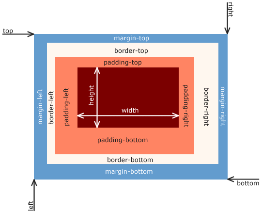
Time For Some
Layouts
not that kind...

🚨 Let's Talk About Floats 🚨

Floats

By css-tricks
Let's Talk
How to approach Layouts

🚨 WARNING 🚨
Layout 1

Layout 2

Layout 3

Layout 4

Layout 5

Mobile Responsive Too
Layout 6

Mobile Responsive Too
Layout 7

Mobile Responsive Too
Layout Push
💪🏽 Make it mobile responsive too

Watch:
Independence Day
Responsive Websites

Fixed Vs. Responsive

vs.
Fluid
Elastic
Content Decisions
What makes a site responsive?
Fluid
Everything as a percentage

Elastic
EMs & REM
html{
  font-size: 62.5%;
}
section{
  font-size: 20px;
}

p{
  font-size: 1em
}

vs.

p{
  font-size: 1rem;
}
<section>
<p>Spam dominos in chat</p>
</section>Font size of the parent, in the case of typographical properties like font-size, and font size of the element itself, in the case of other properties like width.
- mdn
Content Decisions
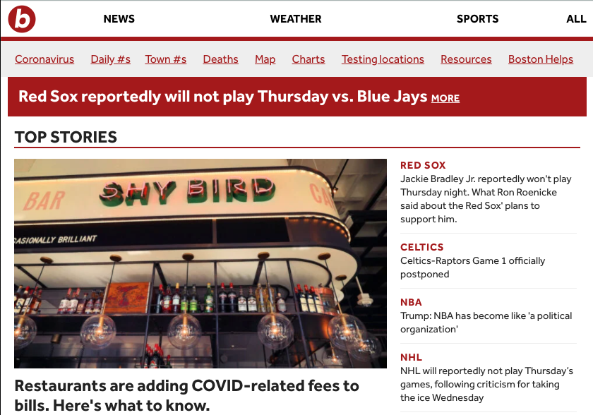

How do we make content decisions?
Media Queries
@media screen and (max-width: 600px) {
    h1 {
        color: blue;
    }
}
Dig Deep, Fight The Suck, Carry The FUCKING Logs
