CSS - Responsive Basics
Leon Noel

#100Devs
"If she don't love me What can I do?
Just put on my best pair of shoes
Because, oh, I'm me"
Agenda
-
Questions?
-
Learn - How To Network (Part 1)
-
Review - CSS Fundamentals
-
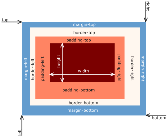
Review - Box Model
-
Review - Float 😱
-
Review - Three Simple Layouts
-
Learn - Responsive Basics
-
Learn - Flexbox 🎉
-
Homework - Flexbox Froggy + Movie
Questions
About last class or life

Checking In

Like and Retweet the Tweet
!checkin
Friends?

Study Community Survey:
"I'm officially employed as a full-time software engineer... well, technically, the role is "consultant" and the position is "software engineer"! I started my journey in Leon's last cohort as a single mom, an unemployed real estate agent during the pandemic, with two awesome kids, a noisy little dog, and a BIG DREAM.
Those of you on the other side of 40: you can do this. Listen to everything Leon tells you to do and then just do it. Those of you with family obligations: just keep going... take needed breaks, find support where you can get it. Those of you with mental health profiles: I hear you loud and clear (GAD/SAD, unmedicated). Neurodiverse folx: my peeps we're all in it together and we've got this!
There are so many people who helped me keep going, I don't want to name names because I'm sure I'll forget super-important folx (I'm on a lunch break and have to do tons of stuff). But I mean this sincerely: I am eternally grateful for my cohort friends and our amazing, dedicated teacher @Leon."
CONGRATS! OCC (Jennifer)!

Submitting Work

None Today
Serious Money...

Thank you!
!unban

You may appeal your ban by filling out this form: https://bit.ly/100devs-unban
Networking

3 Individuals Already In Tech
2 Coffee Chats
Stranger > Acquaintance > Friend > Referral > Coworker

How to talk good for folx who don't talk too good?

How To Meet People

Events

Start on Meetup.com and then find local boards
Conferences

Google Interest + Conference or #100devs-events
(plenty are free or you can get a scholar/hard-ship)
Community Groups

Local is always better
Apps

Lunchclub
Bumble Bizz
Friends & Family

Meet > Email > LinkedIn > Twitter
Next Day
Day 3
Day 6
Normal Follow Up

Email Follow Up 1 > Email Follow Up 2 > Last Email
1 Week
2 Weeks
1 Month
Want A Coffee Chat?

USE THE SHEET!

Pro Moves

RSS Feed
Questions ?
Part 2 - Thursday w/ Examples

TURN IT UP!

The Golden Rule
SEPERATION OF CONCERNS
-
HTML = Content / Structure
-
CSS = Style
-
JS = Behavior / Interaction
CSS
Where does CSS go?
-
Inline
-
In the head
-
In a separate file
CSS BREAK DOWN
p{
  color: red;
  font-weight: bold;
}
What is this?
p{
  color: red;
  font-weight: bold;
}
p{
  color: blue;
}
CSS is read top to bottom
What comes below, can override what came above
This is called the Cascade
Selecting By Relationship
section > p {
  color: red;
}
To select an element that is the direct descendent of another element use
parent > child
<section>
  <p>Hello, Twitch!</p>
</section>
Selecting By Relationship
section p {
  color: red;
}
To select an element that is inside of another element without being directly descended use parent element
parent child
<section>
  <article>
    <p>Hello, Twitch!</p>
  </article>
</section>
Selecting By Relationship
p + p {
  color: red;
}
To select an element that is the next sibling use
previous sibling + next sibling
<section>
  <p>Hello, Twitch!</p>
  <p>Hello, Youtube!</p>
</section>
IDs & Classes

IDs
#zebra {
  color: red;
}
IDs are used for selecting distinct elements
Only one id with the same value per document
#idName
<section>
  <p>Hello, Twitch!</p>
  <p id="zebra">Hello, Youtube!</p>
</section>
Classes
.bob {
  color: red;
}
Classes are for selecting multiple elements
Multiple with same value allowed per document
.className
<section>
  <p class="robot">Hello, Twitch!</p>
  <p id="zebra" class="bob">Hello, Youtube!</p>
  <p class="bob">Goodbye, Mixer!</p>
</section>
Specificity

#pizza p span.gone {
  color: red;
}
<section id="pizza">
<p class="jumanjiOriginalMovie">Hello, Twitch!</p>
<p id="car" class="hello">Hello, Youtube!</p>
<p>Goodbye, <span class="gone">Mixer!</span></p>
</section>Specificity

#dietCoke p.robot.unicorn + .bob {
  color: red;
}
<section id="dietCoke">
<p class="robot unicorn">Hello, Twitch!</p>
<p id="zebra" class="bob dominosPizza">Hello, Youtube!</p>
<p class="bob">Goodbye, Mixer!</p>
</section>Specificity

#dietCoke > .robot + .dominosPizza + .bob {
  color: red !important;
}
<section id="dietCoke">
<p class="robot unicorn">Hello, Twitch!</p>
<p id="zebra" class="bob dominosPizza">Hello, Youtube!</p>
<p class="bob">Goodbye, Mixer!</p>
</section>The Box Model

Let's Code
The Box Model

Time For Some
Layouts
not that kind...

🚨 Let's Talk About Floats 🚨

Floats

By css-tricks
Let's Code
Simple Layouts

Layout 1

Layout 2

Layout 3

Responsive Websites

Fixed Vs. Responsive

vs.
Fluid
Elastic
Content Decisions
What makes a site responsive?
Fluid
Everything as a percentage

Elastic
EMs & REM
html{
  font-size: 62.5%;
}
section{
  font-size: 10px;
}

p{
  font-size: 1em
}

vs.

p{
  font-size: 1rem;
}
<section>
<p>Spam dominos in chat</p>
</section>Font size of the parent, in the case of typographical properties like font-size, and font size of the element itself, in the case of other properties like width.
- mdn
Content Decisions


How do we make content decisions?
Media Queries
@media screen and (max-width: 600px) {
    h1 {
        color: blue;
    }
}
Let's Code
A Media Query

Important Addition To The Template
<meta name="viewport" content="width=device-width, initial-scale=1">How can we make this responsive?

Minimum Of 3 Media Queries
Let's Code
Make It Responsive

The Magic Of Flexbox

A One-dimensional Layout Model

css-tricks.com: Complete Guide To Flexbox
Let's Code
A Flexbox Example

Test CS:GO Server

24/7 Office
Homework
