THE INSIDE IMAGES

THESE ARE THE INSIDE IMAGES I CREATED
INSPIRATION
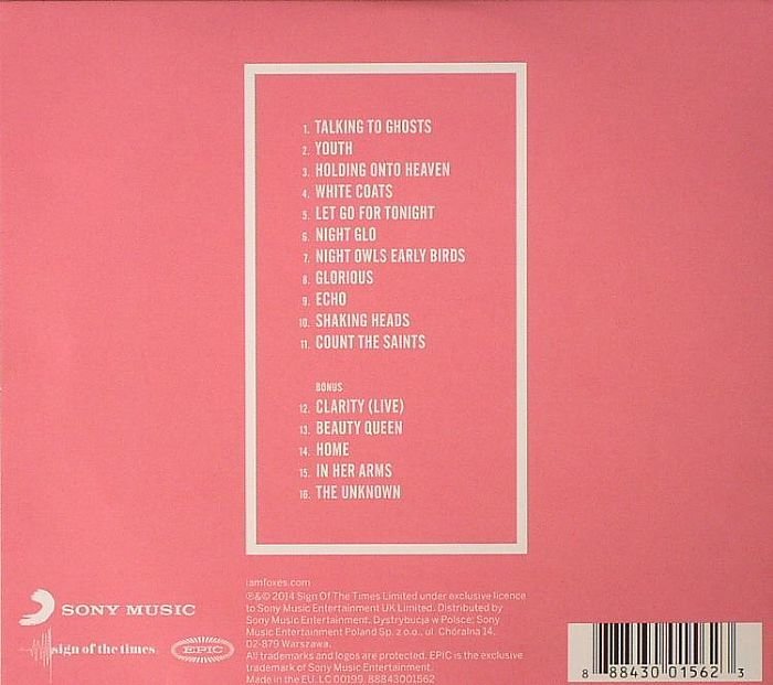
FOXES - GLORIOUS
(BACK COVER)
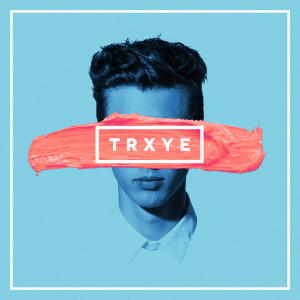
TROYE SIVAN - TRXYE (FRONT COVER)
MY ALBUM
(BACK COVER)
HOW I USED THESE AS INSPIRATION TO CREATE MY PRODUCTS
CONSISTENCY
For my back cover, I used some lines to create a frame around the text to form a border. I then decided to use a similar design to this on my inside images to ensure that the whole digipak had continuity throughout. I used Foxes' album Glorious as the basis for the design of the inside images because this ensured that the products related to the back cover and therefore looked like a real product, and ensured it looked professional because of how the parts linked together. I also used the same font that I used on the back cover of my product because this again ensured that the different parts of the digipak were consistent and looked real. I decided to use the same image that I used on the discs for my digipak on the inside images, because I felt that they were a little lost and unorganised as all other parts were
TRXYE - TROYE SIVAN
This is the front cover of Troye Sivan's third EP TRXYE, which I think looks really interesting and different to other existing products because of how 'artsy' it looks. The stripe of paint is the main focus within the mise en scene of this front cover, which highlights the name of the EP. The style of the text and the way in which it is surrounded is something that I used as inspiration when creating my inside images. Although I had already looked at the album Glorious by Foxes, I decided to look at other products to see if this style was the one that I really wanted and to see if this design would work. Because of this product, I decided to use capital letters to make the images stand out and used lyrics from the song which is used in the music video to demonstrate continuity through the products; the image used on the inside images are used on the discs, which again shows continuity through the product and also makes it look more like a professional piece. Differently to this design used on Sivan's EP, I didn't use an image of my artist on the inside images because I didn't want to overuse her as I felt I might have done, so instead used the same image that I used on the discs from my digipak.
WHY I FOLLOWED AND CHALLENGED CONVENTIONS
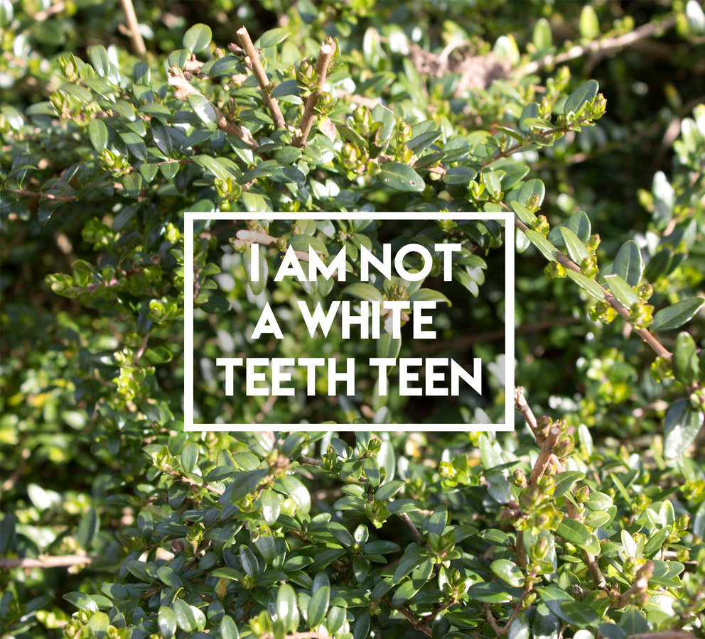
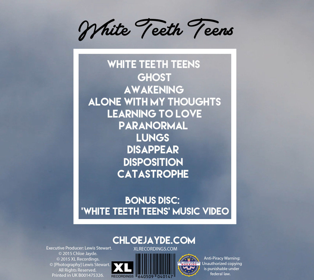
After looking at these products, I created these two inside images for my digipak. I think these are conventional because of how they both include an image that relates to another part of the digipak product. They are also very different to other products because I haven't seen this type of design in an album before, so this is a very interesting use of the inside of the digipak. I used lyrics from the song White Teeth Teens because this is the song for which I have created a music video for, so illustrates continuity between the products I have created. This will, in turn, ensure that the product looks really professional and like a realistic product. To go along with the images I have used on the front and back cover of my digipak, I took an image of a bush to fit in with the natural theme of the album. I also used the same font that I used on my back cover because this again showed continuity within the digipak. I challenged conventions when creating these images because the image is usually of the artist; this is something I didn't want to do because the digipak already consisted of 6 images of her and I didn't want it to look overcrowded.
NICKI MINAJ - THE RE-UP
BRITNEY SPEARS - MY PREROGATIVE
IMAGES LABELLED AND WHY THEY WORK AS PART OF MY DIGIPAK
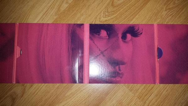
LYRICS FROM THE MAIN SONG
LINES CREATING A FRAME
BACKGROUND
As I have created these products for the inside of my digipak, I thought that I would go into more detail about why I chose to use specific things and how I think this looks like a professional and real product. To illustrate continuity - which is very conventional within a digipak because this ensures the product looks professional and as though it has been made by an official institution - I have used lyrics on these images that are from the main song off my album which I have created a music video for (White Teeth Teens). I also used the same font I used on the back cover because this ensures that each part of the product relates to one another, and therefore again illustrated continuity. Again, ensuring that the inside images connected with other parts of the digipak and that the album flowed as a whole product because it has been included on the back cover and the discs, I added white lines around the text to create a border. I really like how this acts as a border/frame because it makes the image look more organised; giving it a neat, tidy and professional finish. For the background, I use the same picture I used for the discs of my digipak because I felt that if I only used this image once, it would look really out of place and would make the product a lot less effective.