How effective is the combination of your main product and ancillary texts?
Looking back at other album covers


At the beginning of our research we looked at existing album covers which when making our digi pack we looked back at in order to know what we needed to include so it conformed to conventions
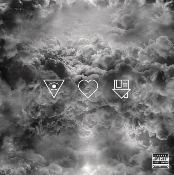
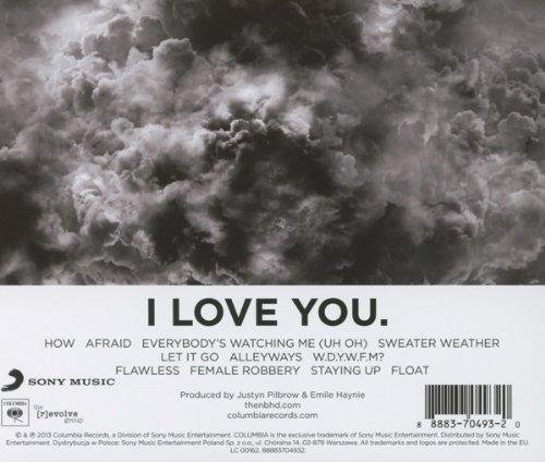
The Neighbourhood - I Love You
-Back and front match, both have simple design and same colour scheme
- Focus on the track list on the back via being on a white background contrasting off dark
- Consistent font, which is plain and black which also stands out from the white
- Has a barcode, record label and copy right notice.
- No image of the band and very plain album cover,very enigmatic.
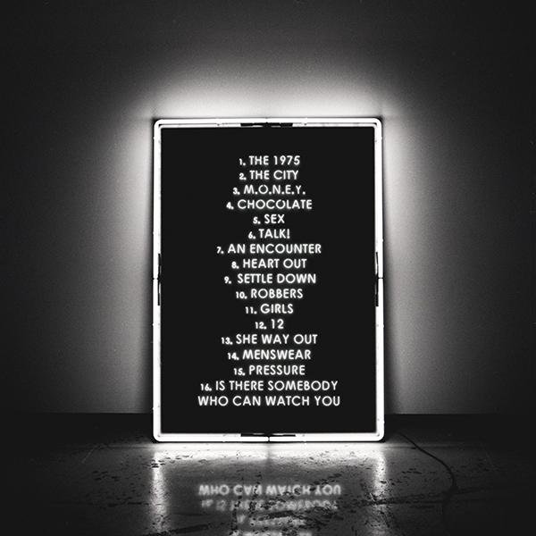
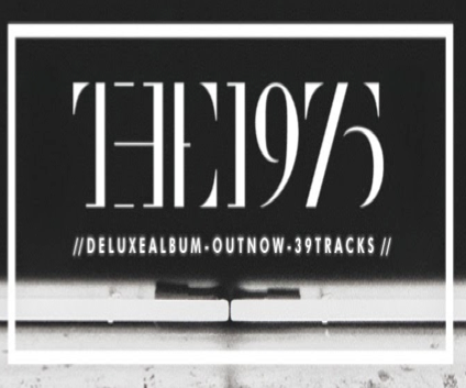
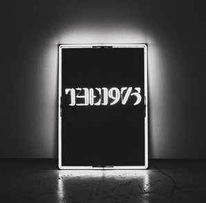
The 1975 - The 1975
- Back and front cover match
- Simplistic, dark design
- Track list is highlighted via the bright light contrasting off it
- Text is consistent style/font, blocked and white which stands out from low key setting
- As there is a very simple design with no image of the artist, it is very enigmatic.
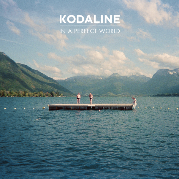
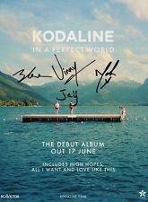
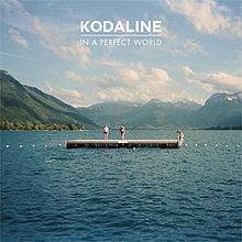
Kodaline - In a Perfect World
- Bright with the back cover being darker than the front cover
- The darkness of the back cover emphasises the track list which is centred and white in font, this is also a running font style
- There is a bar code, copyright information and record label at the bottom
- Not much on the album cover making it very simplistic and giving a calm feel
Looking back at Adverts
I will now look at the album advert which goes with the albums on the previous slide to recall if there was any recurring themes. (I could not do it for 'The Neighbourhood' as never found the ad)


The 1975
- Same font as there was on the front and back of the album cover
- White font on the black background making it stand out like on the album cover
- There is the theme of a square with a white outline which adds emphasis to the information which has been applied to both the album and the advert
- Very simple and does not reveal the artist, like the album cover so there is still the remain of enigma
Kodaline
- Same image as there was on the front of the album cover
-There is the same style font that is recurring through both album cover and advert
- Still gives that calm feel as it is simple and white font stands out from background
- Does not reveal the artist, very ambiguous
Looking back at Target Audience
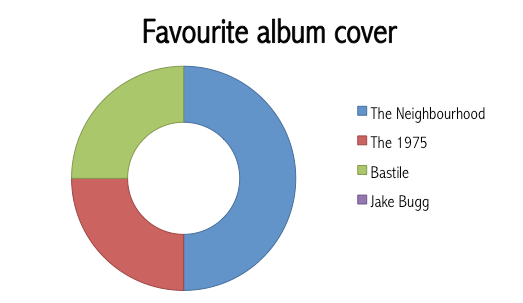
Our target audience has been very important and we have needed to consider them all throughout our research, planning and production. We asked them about their preferences for album covers and adverts and considered their responses when producing our digi pack and advert.
We found that their favourite album cover was 'The Neighbourhood' so we thought that it would be effective to follow this type of design in order for our digi pack to be effective and appealing.

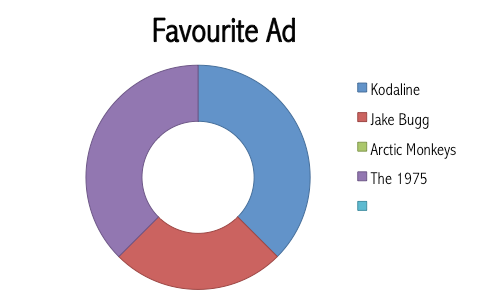


We also asked them their favourite advert so once more we can use this to know what theme we should go for on our advert. This also enabled us to see if they liked to see the same theme on both the album cover and album and by this response they do as both adverts follow their album cover design.
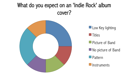
Asking them what they expected to see on the ad and album cover gave us a more direct response so we got a much deeper view on what they wanted
Starting to make Links


We took inspiration from all the album covers and adverts we looked at, but the two in particular we took inspiration from: The 1975 and The Neighbourhood.
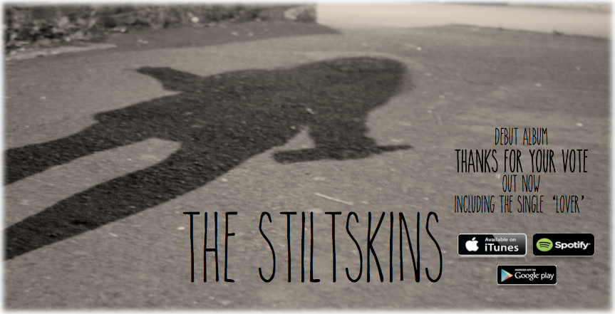
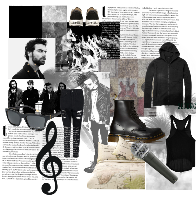
Our front cover is dark in colour, which is generic with little design which too is generic. There is the main focus on design and titles, like 'The 1975' and 'The Neighbourhood' as there is no image of the band/artist emphasising that the focus is on the music and the artist can be represented through design, they don't have to have an image of them to represent them. There is a running theme of light as in the front cover of our album, the shadow was produced and highlighted because of the light and on 'The1975' album cover there is the use of light to add emphasis to the title of the album.
Our advert too is dark in colour and has the same design as the album cover which is conventional to our genre, it also allows for recognition for the artist. There is the same use of text on the advert as there is on the album cover as this font is what is used to represent our artist and is their signature font. This is like 'The 1975' where they use the same font on both their album and advertisement.
They are ambiguous album covers and adverts as not much is revealed on them and are very simplistic. For example, 'The Neighbourhood' album cover does not specifically say what the name of the album is, it is in code and the rest of the album is very simple. On our album cover and advert, no one knows who the silhouette belongs to. On our advert and 'The 1975' advert, there is a lot of focus on the title, like on our album the title is quite faded into a shadow theme where as on our advert, the title is bold and darker.
Looking back at the Music Video
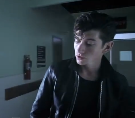
Our music video is the main text that is being used to promote and represent our artist. Our music video, allowed us to create themes and styles that we wanted to also include in our digi pack and advert in order to create an effective combination of texts.
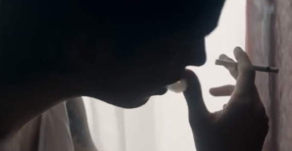
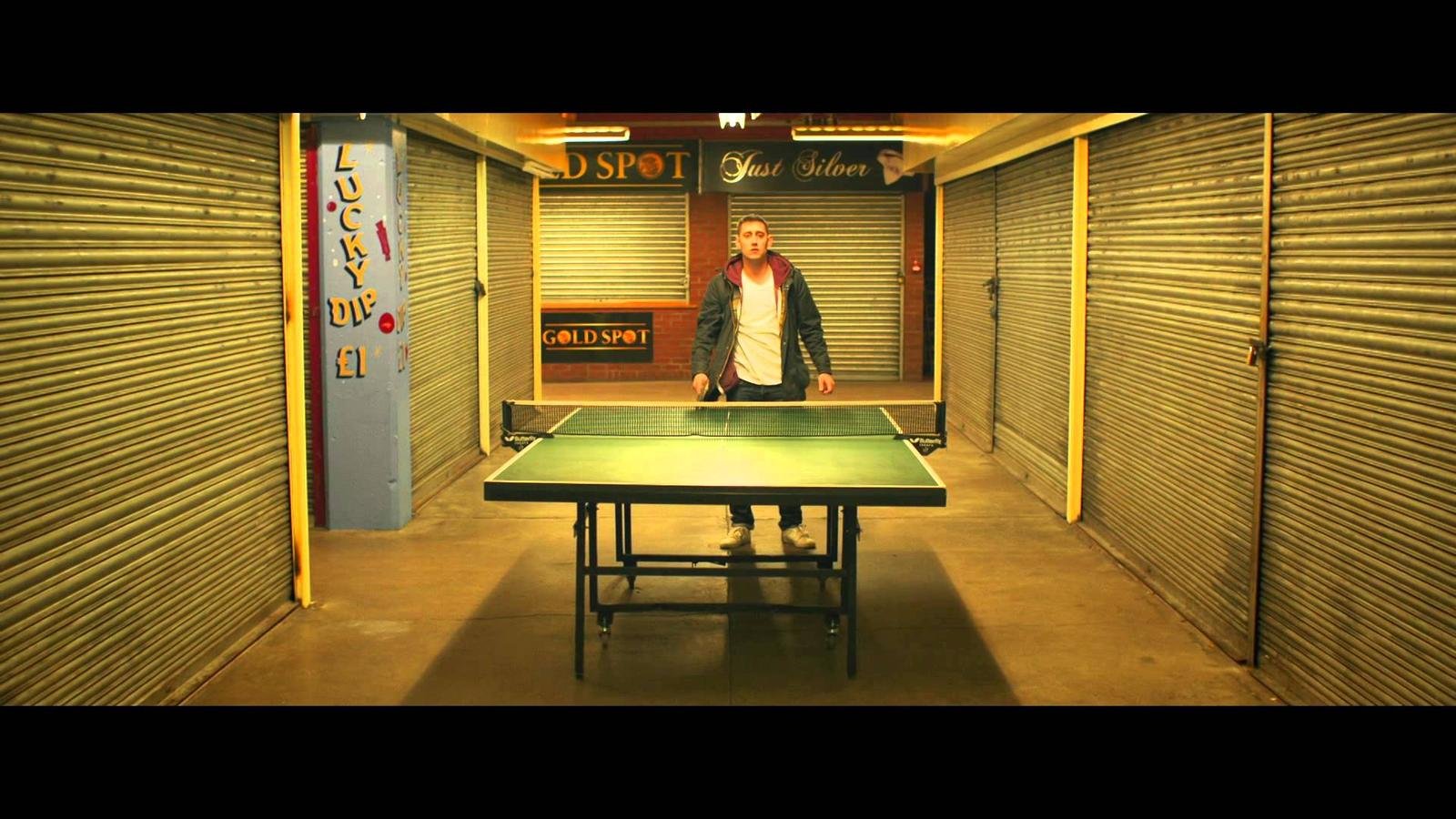
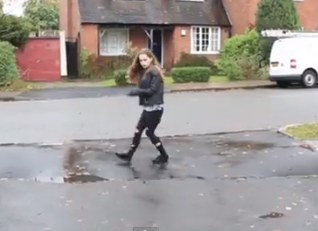
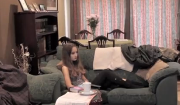
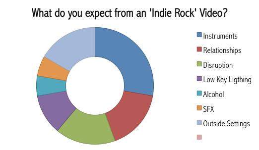
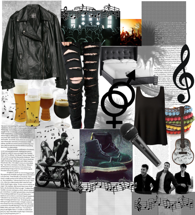
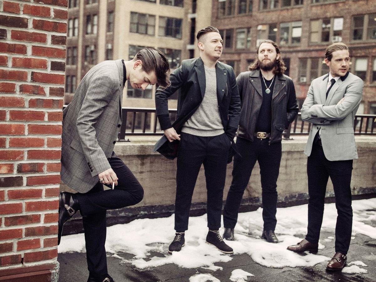
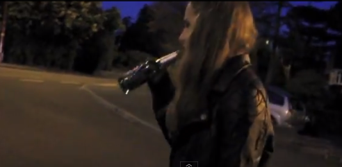
We also developed conventions of our genre and included the stock themes of isolation, unhealthy relationships, injury and disruption. With the help of the use of stock settings of domestic and streets. All combining with the stock iconography shown in our genre; Cigarettes, Alcohol
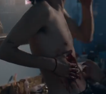
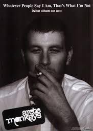
I found that the music videos in our genre would link very well with its other texts. For instance, there would be themes of the video in the digi pack or advert like the lighting or theme of isolation. Like, Kodaline, the music video is high key in lighting and there is the theme of escapism which is also shown through the digi pack and advert as there is an isolated setting and looks like a place for escapism with high key lighting. Then, there is the Arctic Monkeys album cover which resembles the music video as there is a rough lifestyle portrayed in the video and is also shown on the album cover via the male smoking a cigarette. The lighting in the music video is also low key which is then highlighted on the album cover which is dark in colour. This continuous theme between the music video, album and advert is what we wanted to achieve as we think it is important as it is representing and promoting the artist. We did achieve this as our music video consists of a lot of low key lighting which is also produced on our digi pack and advert alongside the theme of isolation which is dominant in our music video and the stock setting of streets which too is prominent in our music video.


Album cover
Advert
Link to Music Video
Colour and Lighting
In our music video, digi pack and advert there is the consistent theme of low key lighting and dark colours used from clothing our characters wear, the lighting used in the video, the font used and the overall colour scheme of the digi pack and advert.
For starters, we used low key lighting and a dark colour scheme as this is what our target audience expected to see in the 'Indie Rock' genre.
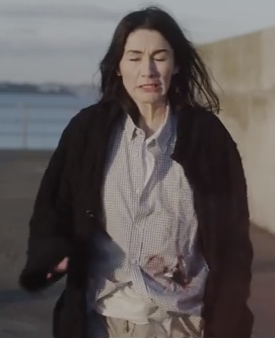
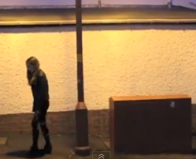
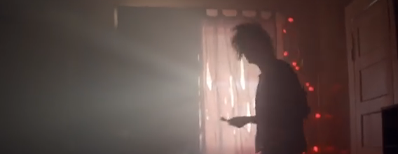
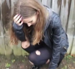
Then, we decided to use the darker colour scheme throughout our digi pack and advert as it is conventional to our genre. It then links in nicely with our music video as a lot of the video is low key and so is the costume. The darkness represents our band as isolated, which is reinforced via Alice and also conforms to the stock theme of isolation which is also prominent on our album cover and advert as it is very simple and there is only one silhouette. This again links well with our music video as the key theme is isolation and loneliness, meaning that the digi pack and advert go well with the music video.
The colour of the costume is typically dark which is generic as it conveys a rough, unclean look which we wanted for our artist and then Alice. This highlights how Alice portrays our artist well as Alice has the rough look.
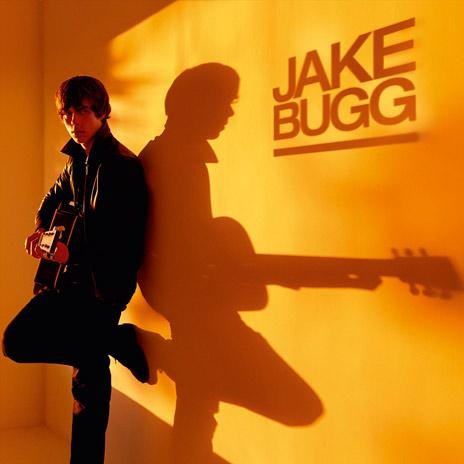
To have a consistent colour scheme across the music video, digi pack and advert is conventional in our genre, for instance, the Jake Bugg video has high key lighting which then in order does the digi pack and advert. This is also the same for 'The 1975' as their music videos tend to be very low key and then this is then highlighted across their digi pack and advert as it is a dark colour scheme. So we followed the same theme and it works very effectively as it creates a band identity and it does not create confusion as it represents the artist in a consistent way.
We decided to have the advert as a brighter colour than the digi pack so that it stands out more from where it is being displayed, but there is not much difference in colour.


Theme and Setting
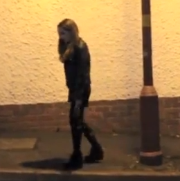
Across our digi pack, advert and music video there is the consistent theme of streets and isolation. These themes have been highlighted via the use of setting and framing.
Alice in our music video is framed alone a lot connoting isolation, so then in our Digi pack and advert we decided to include someone who is alone and isolated by having nothing else in the frame except the silhouette and then the associated iconography of alcohol and cigarettes.
The theme of isolation is also exaggerated via the use of the stock setting, 'streets' which is used across all of the texts we produced as it is generic and what was expected. Streets are used to highlight isolation of a character, so by incorporating this in our music video it connotes Alice is feeling lonely. We then used the street scene on our digi pack and advert as it represents our artist and is conventional in our genre, also creating a good link with our music video as it was the most dominant setting used in our music video. The use of isolation on our digi pack and advert also creates enigma as nothing is revealed.
The theme of isolation is also a common theme across other digi packs and adverts in our genre, for instance, the 'Jake Bugg' album cover and advert frames Jake Bugg alone in the frame connoting isolation and also pull focus onto him as the artist. This is also the same for the 'Kodaline' digi pack and advert, it is a very isolated setting with not many people framed creating a sense of peace and enigma as one wonders why they are out in the middle of no where with not many people around.
Because of these themes and settings it can be argued that it portrays our artist in a negative way because streets have negative connotations. But, it could be argued that it portrays our artist in a positive, realistic way as they are portrayed as isolated connoting that they do not set out to cause trouble, or hang out with big groups of people. It is also a realistic representation as our artist likes to remain isolated and is not a fan of being around big groups. It can also be argued that it is developing the stereotype of our target audience hanging around on the streets and some are quite isolated.


Iconography
We have used the same recurring iconography across our digi pack, advert and music video. Consisting of alcohol and cigarettes.
The use of alcohol and cigarettes throughout our texts represents our artist in a realistic way as they like to smoke and drink, although in our music video, Alice turns to these substances because she is depressed whereas our group likes to use these substances for pleasure.
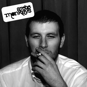
Associating our target audience and band with this iconography may produce negative connotations but this iconography is associated with the 'Indie Rock' genre so it is expected, not necessarily creating negative connotations. But, on the other hand, this iconography is what our target audience associated with the genre. For instance, there is an image of a man smoking on the front cover of the 'Arctic Monkeys' digi pack and this links in with the music video as there is smoking and cigarettes to be seen. It also matches with the rough lifestyle that these music videos are trying to portray, also seen in 'The 1975'.
This iconography is also what our target audience can associate with as it is a part of the everyday life and it is these substances are most of the time used by our target audience, but they will have different purposes. Some may use the substance for pleasure while others will use it as a coping mechanism like Alice.

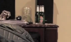


On the front cover of our album and on our advert with have included the iconography of cigarettes and alcohol which links in with the music video and represents our band without having our band in the image.

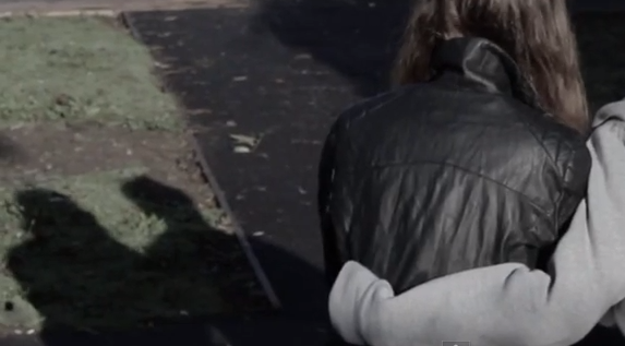
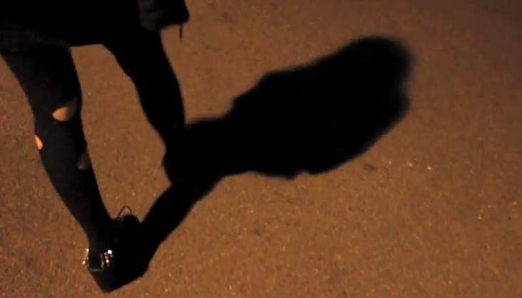
Use of Shadows
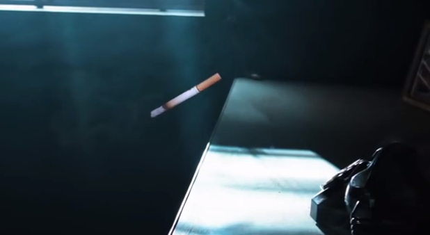
Throughout our music video, advert and album cover, there has been the use of shadows within the frame.
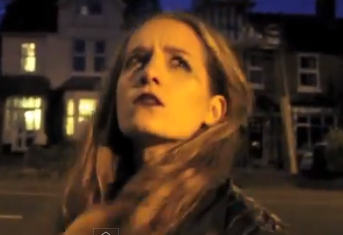
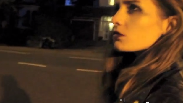
The shadows used within the music video help to put emphasis on the character(s) and also connotes loneliness and isolation as there are no other shadows present and to see a shadow clearly only really happens when there is nothing in the way or in the surrounding area.
The use of Alice and Luke's shadows at the start of the music video helps emphasise their relationship and contrasts with the rest of the music video where we just see Alice's shadow, showing how she wasn't always lonely or isolated.
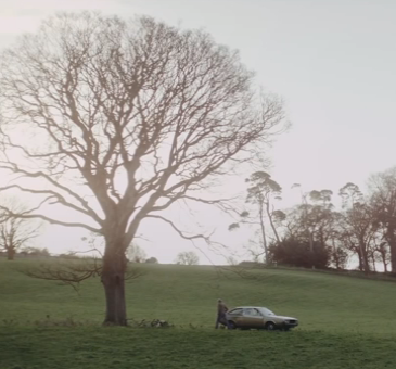
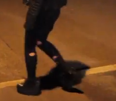
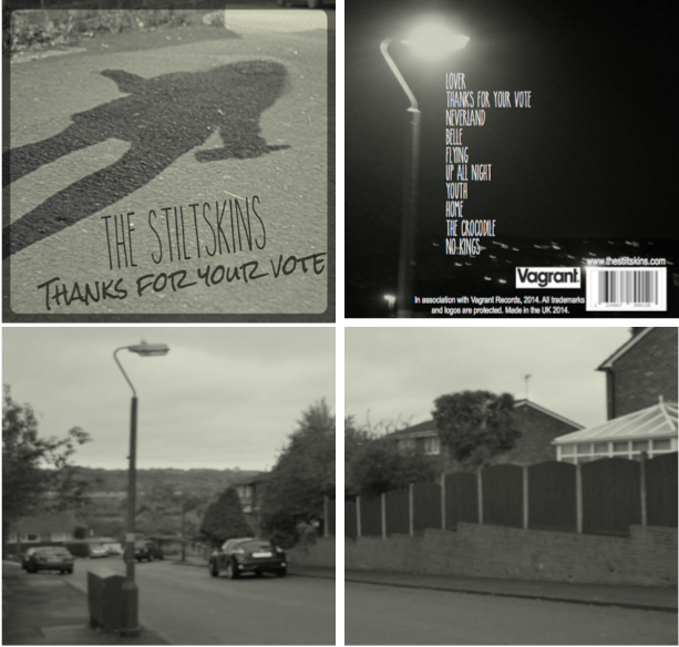
We then continued the use of shadows into our album cover and advert, which helped to emphasise the isolation and also represent our band without actually using them on our album or advert. The shadow theme worked on the album as on the back of the album we had an image of a street light with the light coming from it, then on the front we had the image of the shadow which made it look like the street light was illuminating someone but we do not know who it is. Creating an enigma as not much is revealed on the album cover nor advert. The streetlight was also present within the music video, so there are many elements that are connected and used within our texts.
The shadows make the texts all work well together as it continues the theme of isolation etc while representing the artist. The shadow really makes one aware of what type of people our band members are and can also make easier associations between the texts as they all have the same elements.
How do the texts represent our audience?
Because of the simplicity of our design on our Digi pack and advert, our target audience will not feel embarrassed about buying the album or having it on their shelf as it is not explicit or does not have an embarrassing image or sexual content within the image.
It can be argued that the combination of texts represent our target audience in a negative way as they are being associated with negative iconography. But, this iconography is associated with everyday life and many people, even people older than our target audience, associate with this iconography. It is just because there is the stereotype that young people do not know how to handle alcohol and cigarettes and only use them for pleasure and social reasons.
Alice shows that some young people do have issues and have no other way to deal with the stress in their life so have to take drastic measures as she is not drinking and smoking for pleasurable reasons. Only to numb the pain and try and cope with her stress and sadness. Stress is very dominant in our target audience's lives which is challenging stereotypes that young people live a carefree life.
The theme of isolation gives the impression that our target audience aren't all about going out with big groups of friends and causing trouble which can give a positive opinion of our target audience. But, it could be argued that they look like they bring these troubles to themselves because of the way they act hence no sympathy is given. But, when watching the music video, it can be seen that Alice is worthy of sympathy as she did not really bring this upon herself as she had no one. But, Luke can give a negative stereotype to young males as he is the cause of Alice's downfall. But, then some may argue that Alice should have been stronger and gives a negative impression towards females as she has let a male ruin her life.
I feel that we have represented our audience in a positive way and in a way that is realistic, like our band, as our band did not want to be portrayed in a negative way.


How do the texts represent our artist?
Our texts represent our artist in the way that they wanted to be represented and in a realistic way. This is shown via the use of costume in our music video, for instance, Alice is representing our artist and the costume she wears is equivalent to what our band wears, dark, rough clothing.
The digi pack and advert is simplistic and nothing extravagant because our artist wants the focus to be on the music and not the band. Also, this links with the theme of isolation as our lead singer prefers not to be in a big group.
The music video, digi pack and advert could give a negative representation of our artist due to the iconography but this is what they are associated with and they do not want to lie as they want to be realistically represented and care about their music.
Our artist are like other 'Indie Rock' bands especially like 'The 1975' and 'Arctic Monkeys' as they wear dark clothing and have the same associated iconography and themes which is portrayed in their videos and digi packs also. Meaning that our band and their texts are conforming to conventions and are not completely unique and should not be singled out and have negative representations as many other bands are just like them in the genre.

Do the texts serve their purpose?
The texts do serve their purpose as they promote the artist in a real way that conforms to codes and conventions and what is appealing to our target audience.
The advert promotes the band and the album in a way that is conventional and not offending to the audience. It tells of when the album will be released, where it can be bought and who's album it is. This was important as our audience needed to know this information and know which band it was in order for them to go out and buy the right album. The advert conforms to the conventions of our genre and the other adverts in our genre are obviously effective as the bands are well known and are well promoted. I feel that the advert does serve its purpose because of the information that is placed on it and the image.

The Digi pack entails everything that an album cover should have, the band name, album name, track list and an image. This is conventional for an album cover, and the purpose of an album cover is to represent the artist and the type of music that is expected from the album which I feel our album cover does well as one can see that it is not a rap album or dance album as it strongly conforms to the 'Indie Rock' genre. Due to this I feel that our Digi pack serves its purpose as it represents our artist in a realistic way and includes all the information that is needed on an album cover.
The music video also includes all the conventions of the genre and tells a narrative while creating enigma and representing the artist while having a fast pace with many flashbacks. Pace is very important to a music video so by having a fast pace it allows for more interest and knowledge that it is a music video and not a short film etc.. I feel that because of the non-chronological narrative and fast pace it serves its purpose to entertain like music videos should.
When combining all of the texts, they all serve their purpose of entertaining and representing the artist. This is due to there being a consistent theme throughout and colour scheme and font meaning there is band identity and when watching the music video or looking at the advert, one will be able to make the links that this is for the band 'The Stiltskins'.
How effective is the combination of texts overall?
Because of how all 3 texts serve their purpose, the combination of texts is effective. The music video is the main basis that we worked from in order to make a cohesive package and get the overall effectiveness. The music video enabled us to know the main themes, settings and style that we wanted for the digi pack and advert. Because of this, we managed to have a running theme of street, isolation and youth which was effective as there was no confusion and there was a much better band identity created of which our audience can relate to and know what the artist is like without seeing the bands image placed everywhere.
The combination of all 3 texts are effective as nothing seems out of place and all of the package relates to each other well. I feel that to have made an effective, cohesive package we needed to produce a conventional, well thought out music video, which I think we did do as otherwise we would have been stuck on what themes we should have gone with and the type of style we wanted and how we wanted to promote our artist.