Q5.HOW DID YOU ATTRACT/ADDRESS YOUR TARGET AUDIENCE?
Colour Theme
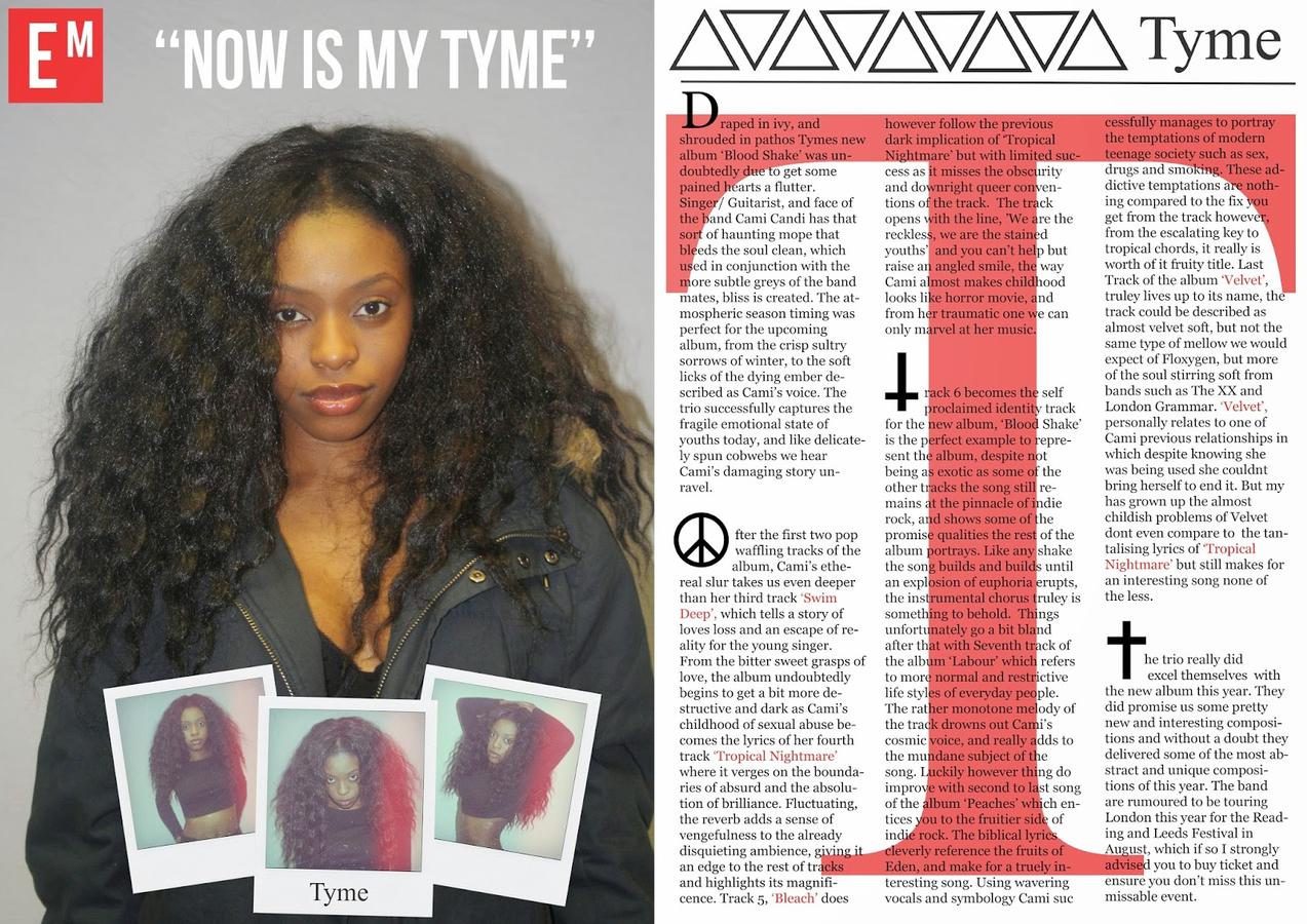
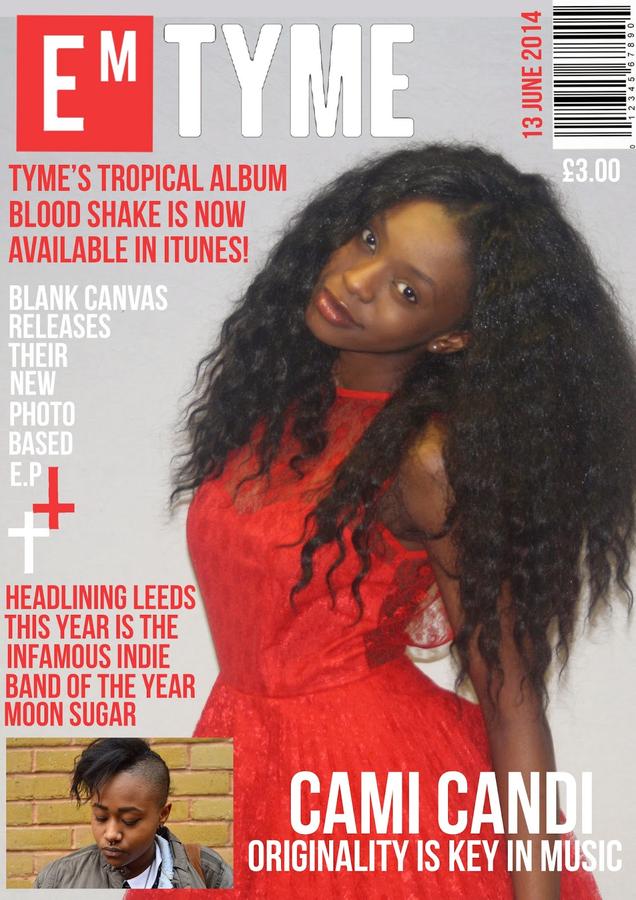
One of the method I tried to attract and address my target audience was through the use of consistency when it came to my colour theme. I primarily used the tradition black white and red colour theme to ensure my product retained a professional and high end quality to it. In addition one of the benefits of using a tradition theme is that due to its neutral properties it didn't favor a sex and therefore stuck to my unisex target market. I wasn't however afraid to mix colours that related to my genre such as small quantities of blue and yellow to help relate to my indie genre.
My magazines
lANGUAGE
I PURPOSELY USED PROVOCATIVE AND PROMOTIONAL LANGUAGE TO ATTRACT MY TARGET AUDIENCE AND TO ENSURE I ADDRESS THERE NEEDS FOR A INDIE ROCK MAGAZINE,''THAT RETRO SCENE, TOURING LONDON, AN UNMISSABLE EVENT!!''. I ALSO USED A RANGE OF PUNCTUATION INCLUDING EXCLAMATION MARKS TO EXAGGERATE AND DRAW SPECIAL ATTENTION TO CERTAIN PIECES OF INFORMATION. MY WRITING DOES HOWEVER CONTINUE A FORMAL APPROACH TO KEEP UP WITH THE SAME WRITING FORMALITY OF MAGAZINES SUCH AS NME.
cOSTUMINg
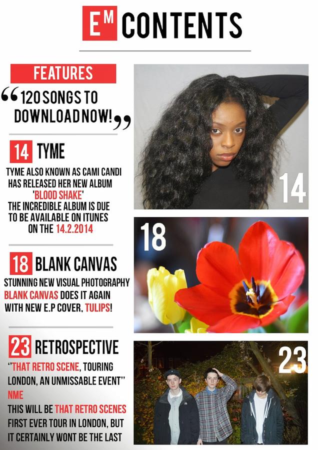
Costuming also has a large roll in addressing my target audience as it allows them to relate and therefore entices them into to buying it. Being indie rock i dressed my artist in a range of outrageous and rebellious outfits including a bold red dress, with flora lace for the front cover, an over sized navy Topman coat, complimented only with underwear for my double page spread, and a plain black crop top with a short denim skater skirt for my contents. as for my other models/artists i used a range of mid end fashion items such as checkered shirts, skinny black jeans and denim jackets. I purposely used brands such as Topman, American Apparel and River island as they are typically thought as indie fashion retailers and would therefore attract consumer in to buying my magazine.
Symbolism
I INCORPORATED MANY DIFFERENT SYMBOLS THAT CAN BE OFTEN FOUND IN INDIE CULTURE. THESE INCLUDED SYMBOLS SUCH AS THE PEACE SIGN, CROSSES, SKULLS, FLOWERS, EYES AND THE ANTI CHRIST. THESE SYMBOLS CAN BE FOUND IN MANY INDIE CLOTHING BRANDS or displayed in many indie music videos. tHese are well RECOGNIZED symbols and would help to attract more of the indie society.
LAYOUT
After analyzing many magazine covers i quickly began to favor some more then others due to their format and layout. I actually became attached to the format both NME and Q magazine for their elegant yet rock and roll feel to it. I then decide to embed this quality into my magazine so hopeful my target audience would also fall for the same charm.this in turn would attract and address me target audience.