Ancillary Production Pitch
Lorita Abazi
Overall Theme/Style
In 5 words (okay, maybe a little more than five.)
Authentic
Simplistic (yet effective)
Reflective (of the artist)
Distinctive
Deep (through connotations)
Magazines That Will Feature My Artist's Album?
- Q Magazine - This magazine is not restricted by a genre. They explore all new releases and upcoming artists of all genres.
- DIY Magazine - This magazine is dedicated mainly to Alternative but includes elements of Indie/Folk which is ideal for our artist as he is a perfect mixture of the three genres.
- IMR Magazine - This magazine is strictly for Indie artists/bands and is purely focused on reviewing Indie music.
Inspirations?

Ed Sheeran's Front Cover
As this was Sheeran's first commercial album, I think it was a very smart move to include an extreme close up of his face as a clear introduction to him as an artist.
I liked the extreme close up shot aspect of this front cover. Therefore, I drew inspiration from this and will also feature a close up shot of my artist on my front cover.
Ben Howard & Ed Sheeran's Back Cover
I have drawn inspiration from the back covers of Ben Howard's album 'Every Kingdom' and Ed Sheeran's '+'.
Both of these covers use a very simplistic background where they use a plain background with a colour that is part of the colour scheme that the album has taken up.


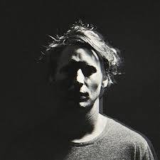
Ben Howard's Front Cover
I drew a lot of inspiration from this photo, too. I like the idea of having one side of the body in the dark and having the other in light. It suggests that the album conveys all sides of the artist and is very personal to the artist, himself. This concept is what I want to connote through the album cover of my Indie/Folk/Alternative artist.

Inside Panels
I want my inside panel to look a little like this. I like the merge of two different images of the artist doing different things as it connotes the idea that this album will reveal all sides of the artist which is what I want to convey through the digipak. The black and white colouring also matches my colour scheme of black, white and grey.

Conventional Indie Inside Panels
As you can see, on the inside panels of albums of Indie artists, it is common to not feature an image of the artist as there is a stronger focus on the music which is why Ben Howard used an image of a stage and audience he performed to, drawing attention to his live performance skills and musical talents, rather than appearance.

This is why I will use either a blurred image of my artist (like Ben Howard) or of a certain scenery that connotes towards his music as it is unconventional to feature an image of the artist on each panel.
How Many Panels?
I will be using only 4 panels as Indie artists remain commercially simplistic and appear very humble. They do not draw attention to their appearance and to the appearance of their album, but draw focus onto their musicality and music skills which are portrayed through their albums.