INTROduction TO HTML & CSS
COMP 126: Practical Web Design & Development for Everyone
SETUP
Download & install
a text editor: I recommend Visual Studio Code, but if you already use something else and prefer to continue doing so, that's fine (details here)
Chrome and Firefox (if you don't have them), and find/turn on (if needed) their developer tools
Codepen
There are lots of online platforms that allow you to quickly get your code up in a browser for testing. In this class, I'll use Codepen for lecture demos and code sharing. Please create an account at https://codepen.io/ and follow my account by searching for username
tkjn.
Anatomy of a website
your content in a .html file,
+ HTML tags for structure,
+ CSS declarations for styling,
+ JavaScript or other scripting language/s for behavior & interactivity,
+ a browser to display it in
= website
HTML
HyperText Markup Language: used to describe and differentiate the content and structure of a web page
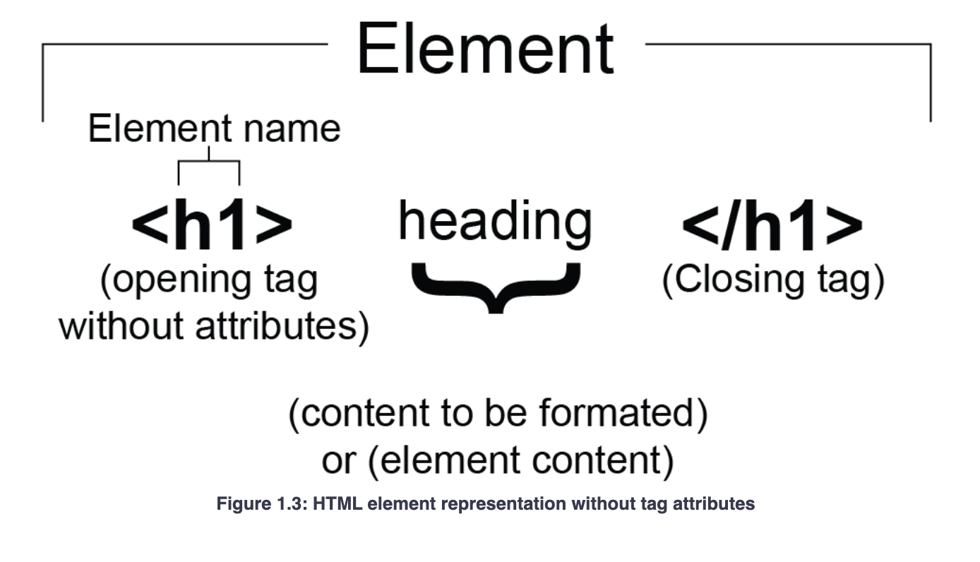
Elements & Tags
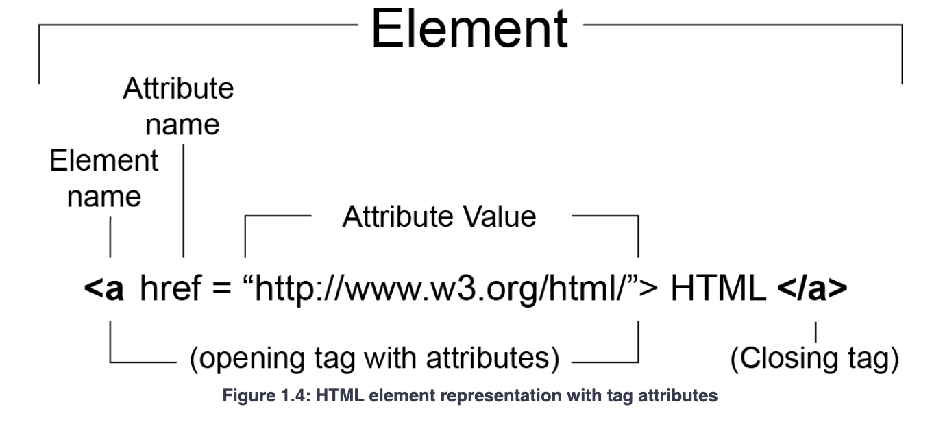
Attributes
HTML Comments
<!-- the browser/parser ignores any HTML
you place between these symbols -->
Get in the habit of commenting your code frequently and often
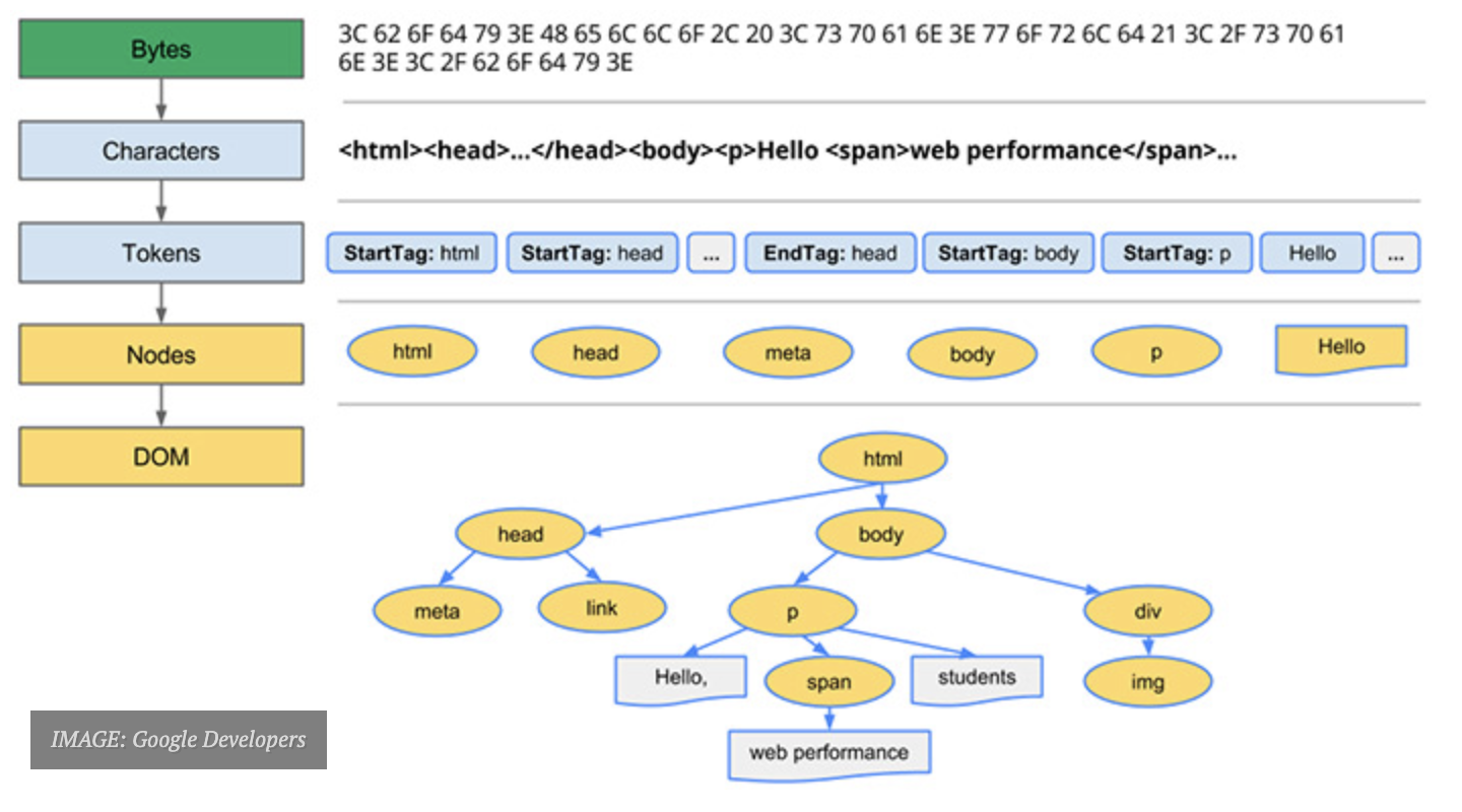
The HTML DOM
HTML5 elements you'll use a lot
<h1>top level header</h1>
<h2>header level 2</h2>
<h3>header level 3</h3>
<h4>header level 4</h4>
<h5>header level 5</h5>
<h6>header level 6</h6>

<p>paragraph text</p>

<a href="some url">link</a>

<ul>
  <li>list item</li>
  <li>list item</li>
  <li>list item</li>
</ul>

<div>generic blockcontent container</div>

<span>generic inline text container</span>

<img src="path to image"
     alt="text describing image">
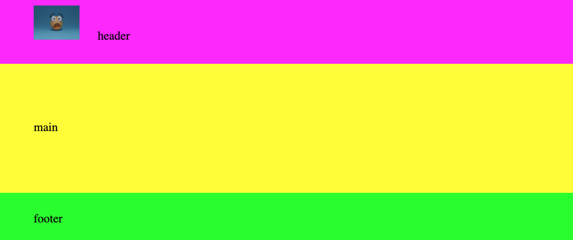
<header>the content of
  your header</header>

<nav>your navbar</nav>

<main>the main content
  of the page</main>

<section>a group of
  related content</section>

<aside>a sidebar</aside>

<article>a textual article
  </article>

<footer>the conten of
  your footer</footer>
<!DOCTYPE HTML>
<html lang="en">
<head>
<meta charset="utf-8">
<meta name="viewport" content="width=device-width,
initial-scale-1, shrink-to-fit=no">
<title>This appears in the browser tab</title>
</head>
<body>
All your content goes here
</body>
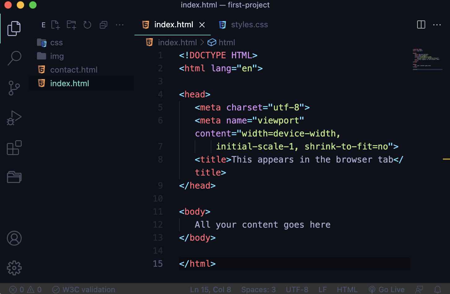
</html>HTML Starter Code
Let's set up a file structure & add our starter code
FILE PATHS
paths, URLS, Locations
ABSOLUTE URL: TO AN EXTERNAL WEBSITE/LOCATION

<a href="https://www.google.com/">Link to Google</a>

RELATIVE URL: TO SOMETHING IN YOUR PROJECT DIRECTORY

<a href="contact.html">Link to another page
  in your website</a>

<a href="pages/contact.html">Link to another page
  in your website inside a folder called "pages"</a>

STYLESHEETS

<link rel="stylesheet" href="css/styles.css">

IMAGES

<img src="img/elephant.png" alt="image of an elephant">
Absolute paths/URLs...
point to specific locations on the Internet but outside your project and usually start with http:// or https://. In web dev, relative paths are more flexible (and thus more stable), so we use them whenever possible. But we use absolute paths when we need to link to, for example...
-
external web sites
-
CDNs (content delivery networks): stylesheets, fonts, icons, and other assets hosted publicly by trusted sources (e.g., Google, Bootstrap)
-
Media hosted elsewhere, not in your project's file structure
Relative paths/URLs...
point to documents or locations within your project's file structure, relative to the location of the html page you are viewing. We usually use relative paths to link to
-
stylesheets located within your project's file structure (inside the same root directory)
-
images and media files located within your project's file structure (inside the same root directory)
-
other html documents in your file structure--i.e., between pages in your website
-
/ : up to root directory & start there
-
../ : up one level & start there (../../ etc)
for images...
| Path | Description |
| <img src="pic.jpg"> | "pic.jpg" is located in the same folder as the page you're working on |
| <img src="img/pic.jpg"> | "pic.jpg" is located in the "img" folder that is in the same folder as the file that you're working on |
| <img src="/img/pic.jpg"> | "pic.jpg" is located in the "img" folder at the root directory level |
| <img src="../pic.jpg"> | "pic.jpg" is located in the folder one level up from the current folder |
for CSS...
| Path | Description |
| <link rel="stylesheet" href="styles.css"> | "styles.css" is located in the same folder as the page you're working on |
| <link rel="stylesheet" href="css/styles.css"> | "styles.css" is located in the "img" folder that is in the same folder as the file that you're working on |
| <link rel="stylesheet" href="/css/styles.css"> | "styles.css" is located in the "css" folder at the root directory level |
| <img src="../styles.css"> | "styles.css" is located in the folder one level up from the current folder |
CSS,
or "Cascading Style Sheets". CSS handles the styling of a website, allowing us to consider and organize our design concerns separately from those of structure and content (the HTML)
A rule (or rule set) is made up of one or more HTML element selectors plus a declaration block.
A declaration block is made up of one or more declarations.
A declaration is made up of a property and a value.
h1 {
  background: pink;
  font-size: 1.5em;
}
selector
property
value
Rule Set
{
  background: pink;
  font-size: 1.5em;
}
Declaration Block
font-size: 1.5em;
Declaration
declaration block
declarations
THE SYNTAX
the cascade
h1 {
 font-size: 2rem;
 color: blue;
}

h2 {
 color: red;
}
The browser reads CSS from top to bottom.
Therefore, styles lower down on the stylesheet override those that appeared above them.
adding CSS to your HTML
-
Uses the style attribute on individual HTML elements
-
Old school; NOT a preferred method
Adding CSS to html inline (do not do)
Adding CSS in the <head>: rarely do
-
This is also not ideal; it makes your HTML docs messy and long
-
Best used only with demos or single-page sites that require very few declarations
Adding CSS to HTML via an External stylesheet: This is the way.
WHY? because good web devs separate their concerns
- HTML is for content & structure
- CSS is for styling
- JS is for behavior & interactivity...
and these things should be dealt with and organized separately (for lots of reasons: readability, clarity, workflow, semantics)
CSS SELECTORS
<h1>top level header</h1>
<h2>header level 2</h2>
<h3>header level 3</h3>
<h4>header level 4</h4>
<h5>header level 5</h5>
<h6>header level 6</h6>

<p>paragraph text</p>

<a href="some url">link</a>

<ul>
  <li>list item</li>
  <li>list item</li>
  <li>list item</li>
</ul>

<img src="path to image"
     alt="text describing image">
<header>the content of
  your header</header>

<nav>your navbar</nav>

<main>the main content
  of the page</main>

<section>a group of
  related content</section>

<aside>a sidebar</aside>

<article>a textual article
  </article>

<footer>the content of
  your footer</footer>
review: HTML elements
& many more...full HTML element reference here
<header>the content of
  your header</header>

<nav>your navbar</nav>

<main>the main content
  of the page</main>

<section>a group of
  related content</section>

<aside>a sidebar</aside>

<article>a textual article
  </article>

<footer>the content of
  your footer</footer>
sectioning elements

localsolar.io: what's what?
<div>
  <h1>
    A div is a generic container.
  </h1>
</div>

<p>A paragraph
  <span>element</span>
  can contain a span.
</p>
p {
property: value;
}img {
property: value;
}selects all <p> elements
selects all <img> elements
To make every single instance of a standard HTML element on a page receives a certain style, use its standard HTML element/tag name as your selector.
Selecting by element name
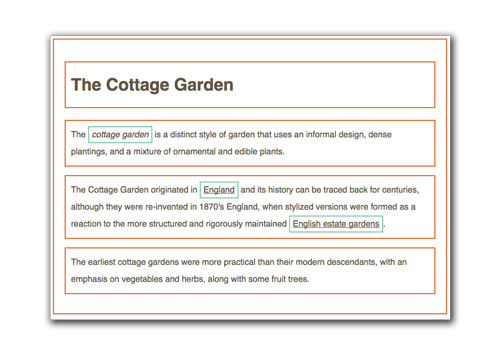
<section>
  <p>text text text</p>
</section>
section > p {
color: red;
}To select an element that is the direct descendant of another element , use
Selecting by relationship
parent > child
<section>
 <article>
  <p>text text text</p>
 </article>
</section>
section p {
color: red;
}To select an element that is inside another element but not its direct descendant, use
Selecting by relationship
parent child
<section>
  <p>text text text</p>
  <p>text text text</p>
</section>
p + p {
color: red;
}To select an element that is inside another element but not its direct descendant, use
Selecting by relationship
sibling + next sibling
more on these "combinators"
<section>
  <p id="warning">this is the
  only red paragraph element on
  this page</p>
</section>
#warning {
color: red;
}IDs are special attributes used to name a single instance of an element so you can select it individually. Only one ID with the same value can be used per HTML document.
Selecting by ID
<section>
<p class="purple">this text
will be purple</p>
<p id="warning">this text
will be red</p>
<p class="purple">this text
will be purple</p>
</section>.purple {
color: purple;
}
#warning {
  color: red;
}Classes are special naming attributes like IDs, but classes can be reused to select as many instances of an element as you want.
We use classes much more often than IDs.
Selecting by Class
#call.first.contact {
    background-color: aqua;
}
elements with a mix of ids & classes
You can combine classes and IDs
elements with both an id and a class
#contact.call {
  color: blue;
}
elements with two classes
.first.second {
  color: yellow;
}
<div id="contact" class="call"></div><div class="first second"></div><div id="call" class="first contact"></div>...style elements based on their current states
Pseudo-classes
element being hovered over
a:hover {
  color: yellow;
}
elements that are the "first child" of a parent element--there are variations for other child statuses
p:first-child {
  color: red;
}
element selected via keyboard or switch, not cursor
a:focus {
  color: blue;
}1. !important rule: is it present?
when rules conflict...
2. Specificity of the selector
3. Source order: the last rule on the stylesheet wins
.style1 {
  background-color: aqua;
  color: black;
  border: none !important;
}
p {
background-color: black;
color: white;
padding: 10px;
}
.style1 {
background-color: aqua;
color: black;
border: none;
}
#style2 {
background-color: pink;
border: 2px solid black;
}p {
background-color: green;
color: white;
padding: 10px;
}
p {
background-color: gray;
}priority is given via these three factors, in this order
SPECIFICITY
-
inline styles (styles directly in the HTML): most specific of all
-
id selectors
-
class selectors, attribute selectors, pseudo-class selectors
-
normal element tag name and pseudo-element selectors
-
the * selector (selects all elements): least specific of all
from most specific to least:
specificity demo
the display property
-
in CSS, there are two primary types of default element: inline and block
-
each has different default behaviors
-
inline and block are values of the display property: e.g., {display: inline;}
-
inline elements: img, a, br, em, strong, span
-
block elements: p, h1-h6, ul, li, div, HTML5 structural-semantic elements, almost everything else
inline vs. block elements
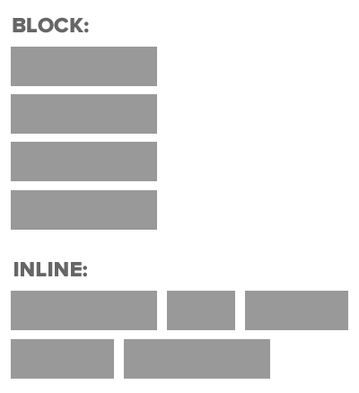
inline vs. block:
default behaviors
using the display property
-
{display: inline;} turns element into an inline element: can't assign width & height
-
{display: block;} turns element into a block element
-
{display: inline-block;} makes element a block element (can assign width & height) that behaves like an inline element (runs L to R, no line break)
-
{display: contents;} makes the element's container disappear; contents become the child of the element the next level up in the DOM
-
there are lots more display values, (including {display: flex;} and {display: grid;} which we'll get to later); full list here
the CSS Box Model
EVERYTHING IS BOXES
THE CSS BOX MODEL
BOX MODEL PROPERTIES
The box that contains the content. Usually block-level. Width must be set by you; height is determined by the content unless you set it.
Can be set to any width. The border adds to the overall width & height of the content unless you use {box-sizing: border-box;}.
The space between the content itself and the border/outer edge of the box.
The space between the outer edge/border of an element and the outer edge/border of the next closest element/box. Btw, {margin: 0 auto;} applied to a block element is a nice trick to center it in the browser.
BOX MODEL DEMO
BOX-SIZING DEMO
create...
FONT MEASUREMENT UNITS
fixed
pixels and points: set units that never change
relative
fluid
em & rem: set units, but determined by values set on the parent or root element
%, vh & vw: scales upon viewport resizing based on various factors
MEASUREMENT UNITS
-
1px: fixed; size in pixels
-
1pt: fixed; 1/72 of an inch, used in print media, but not much online anymore
-
1em: relative; 1x text size of the parent element
-
1rem: relative; 1x text size of root element (i.e., <html> or the user's browser preferences; often 16px)
-
1%: fluid; if used on a font, it's 1% of the element's text size; if on width/height, it's 1% of the parent element's width/height
-
1vh & 1vw: fluid: 1/100th of the viewport's height or width
-
SO WHICH ONE DO I USE? Think fluid for containers and element widths, relative for fonts, fixed for small details. But there's room for exceptions and your preferences.
COLOR BASICS
HSL/HSLA
.color-rgb {
color: rgb(128, 80, 200);
}

.color-rgba {
color: rgb(128, 80, 200, 0.1);
}
RGB/RGBA
.color-hsl {
color: 187, 73%, 39%;
}
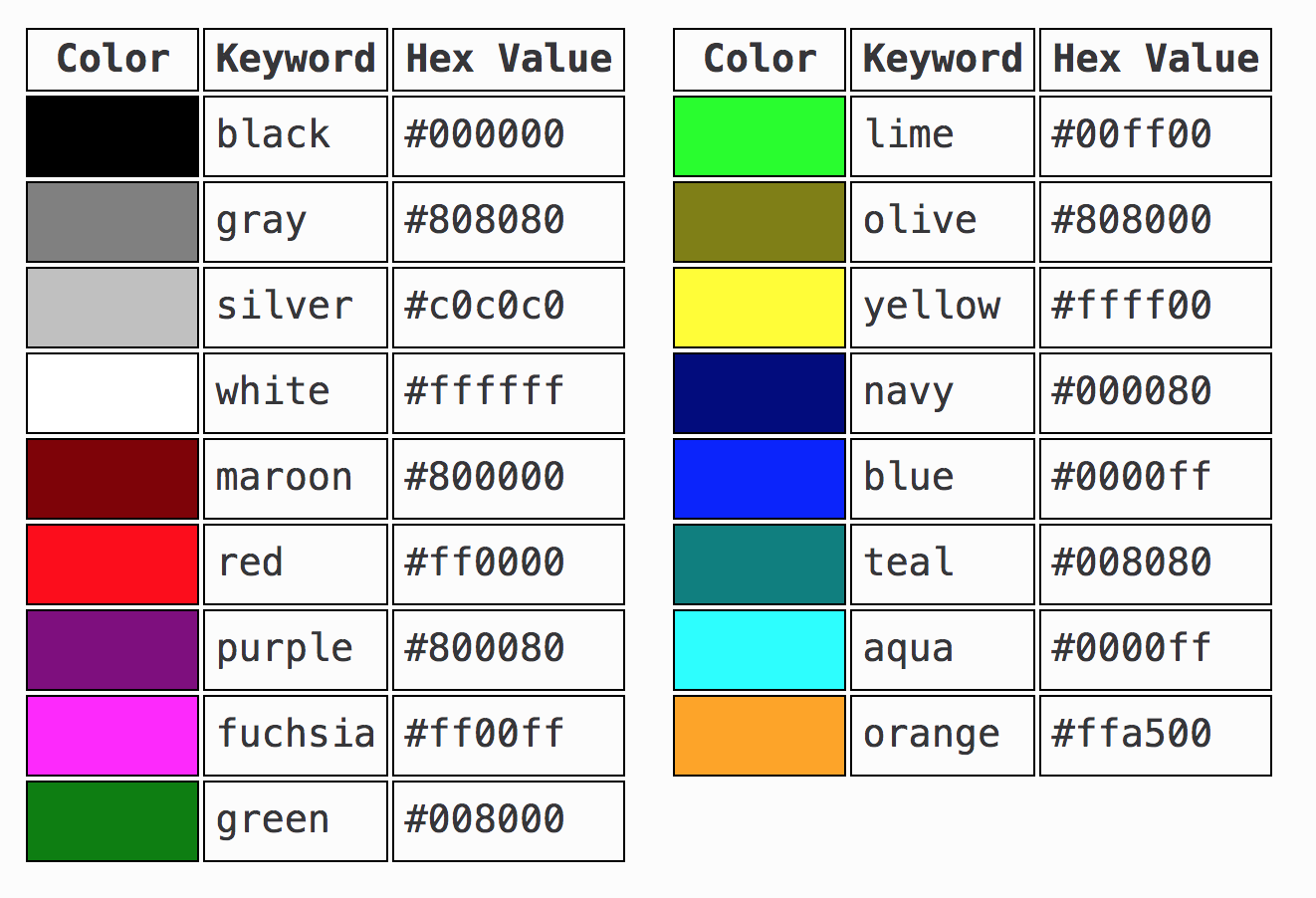
.color-hsla {
color: 187, 73%, 39%, 0.1
}HTML keywords
 .color-hex {
color: #1B9AAA;
}
HEX
Let's experiment with Coolors...
TYPOGRAPHY BASICS
font-family
 .text {
font-family: "Nunito Sans", sans-serif;
}
font-size
.text {
font-size: 16px;
}
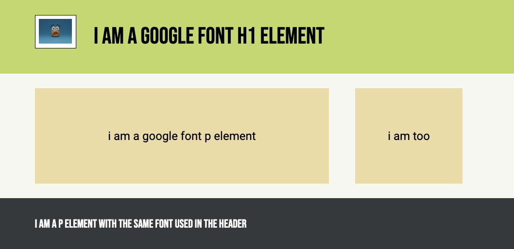
or: em, rem, %, vh, vw...Let's add a Google Font...
adding on...