Communication of statistics through visualisations
Statistics explained visually
November 18
2019
Maarten
Lambrechts
Eurostat
Luxembourg
Maarten Lambrechts?
Today
What do users want?
Why data should be visualised and how
Lunch
Datavisualisation pitfalls & the Dataviz Checklist
Making make-overs
9:30-10:45
11:00-12:30
12:30-14:00
14:00-15:30
15:30-17:00
Disclaimer
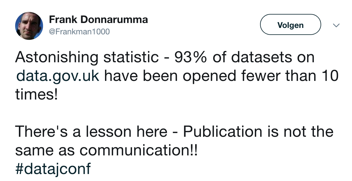
Who in the room has made charts for Statistics Explained?
My apologies
What do users want?
I
Users want answers to their questions

Lisa
16 year old schoolgirl
Addicted to her mobile phone
Assignment on SDG poverty in EU
'Pfff.... Poverty? What do I know about that?'
'What? A scatterplot? I thought someone spilled her latte over that page 😂'

Jonathan
37 years old journalist
Reads 3 economical newspapers each day
Needs story for a special on European SDG targets
'Ok, chef, article will be ready in 2 hours'
'Yes, I'll find the data for the chart to illustrate the article'
What are sustainable development goals?
What is poverty?
Is poverty a big problem in Europe?
Where in Europe is poverty the worst?
What is the goal and how will we reach it?
Is the EU going to reach the poverty SDG?
What aspect of poverty is doing the worst?
Which countries are the worst performers?
What groups of people are most at risk?
Where is the data for my chart?

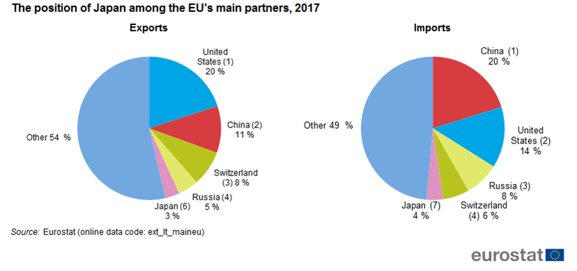
Margareth
42 years old business analyst
Consulting for the Japan Chamber of Commerce
'Where is the data? I need the data!'
'A visualisation is worth a 1000 words'

Alan
63 year old professor
Research: 'Japan-UK trade: a good marriage?'
'Wait, let me get my reading glasses'
'Right mouse click... How do I do that again?'
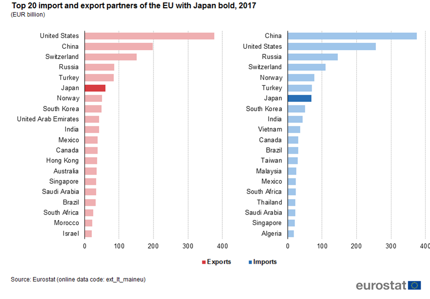
What kind of products are traded between Japan and EU?
How is this changing?
Which countries are most connected to Japan with trade?
How is this changing?
Where can I get the data?
How much are Japan and UK trading?
How is this changing?
What products are Japan and UK trading?
Takeaways
Chart Design
Add a clear and descriptive chart title
Use appropriate chart type
Use color smartly
Respect hierarchies in the data visually
Be consistent (colors, chart types, ...)
Targets are often the story
Sort on the data
One chart, one message
Takeaways
CHART INTEGRATION
Element of the page a lot of people look at first
Charts should be self sufficient: have a title, units, keys
Don't bury the lead, support it with a visualisation
Ensure good interplay between text and charts
When you use visual language ('clusters', 'outliers', 'big gap', ...), think about making a visualisation
Offer data link in all views
Why data should be visualised
and how
II
Why visualisation?
- Interpreting numbers becomes easier
- Trends become clearer
- Let users contextualise themselves
- Message is supported and amplified
- Augments reliability
- Makes long text breath
- Replaces lengthy paragraphs full of numbers
- Easy sharing of message
- Can be aesthetically pleasing
- Draws attention
Chart integration
Take a Stats Explained article
With the different users and their possible questions in mind, answer the following questions:
- If you would have to pick 1 chart to go with the text, which one would it be? Why?
- What charts are missing from the article in your view? Are there claims or explanations in the text that lend itself well to be visualised?
- Look for 'Figure 1', 'Figure 2', ... in the text. What does the text say about what you see on the chart? Is that clearly visible in the chart?
- Do the charts tell a story? Or are they just meant for looking up values or countries?
When not to use visualisation
When you want to offer quick lookup of values. Use a table for that
When you don't have a clear goal for the chart. Ask yourself: 'For whom and why am I making this visualisation? What questions does the chart answer?'
When you have too little data
Chart design
How to choose a chart type?


.PNG)
,_by_sex,_2014_(%25)_HLTH17.png)
_HLTH17.png)

Pitfalls
&
more design tips
III
Seen so far:
Descriptive titles
Appropriate chart type
Smart color use
Sorting
Be consistent
One chart, one message
What else?

Make text run horizontally

Always show units

Choose an appropriate aspect ratio

One chart, one message
No double axes

Don't cut bars

_YB17.png)
Guide your reader: where does he/she need to look?
_YB17.png)
Label directly

.png)
Axes, axes labels and grids should be supportive, in the background
.png)

_new.png)
Be careful with stacked charts
_RYB17.png)
,_EU-28,_2014.png)
_RYB17.png)
Data density shouldn't be too low nor too high

Charts should tell something
_RYB17.png)
Respect and show the data structure and hierarchy

Experiment, but guide the reader
_YB17.png)
Correlations are powerfull
but dangerous

-Figure3.png)
Tell the story, with the title, annotations and colors
Think about fonts
Introducing:
The Datavisualization Checklist

Sketch & draft
Get feedback
Adapt
Makeover
IV
Take a Statistics Explained article
Think about how visualization could improve the article.
Consider:
- The datavisualisation checklist
- The pitfalls in data visualisation
- Appropriate chart types
- Chart integration, text-visualisation interplay
- Consistency (colors, forms, ...)
- Telling a story with visualisations
- Different user profiles and the questions they might have