Data visualisation
15 June 2018
@maartenzam
P&V
What? WHY? How?
On the menu
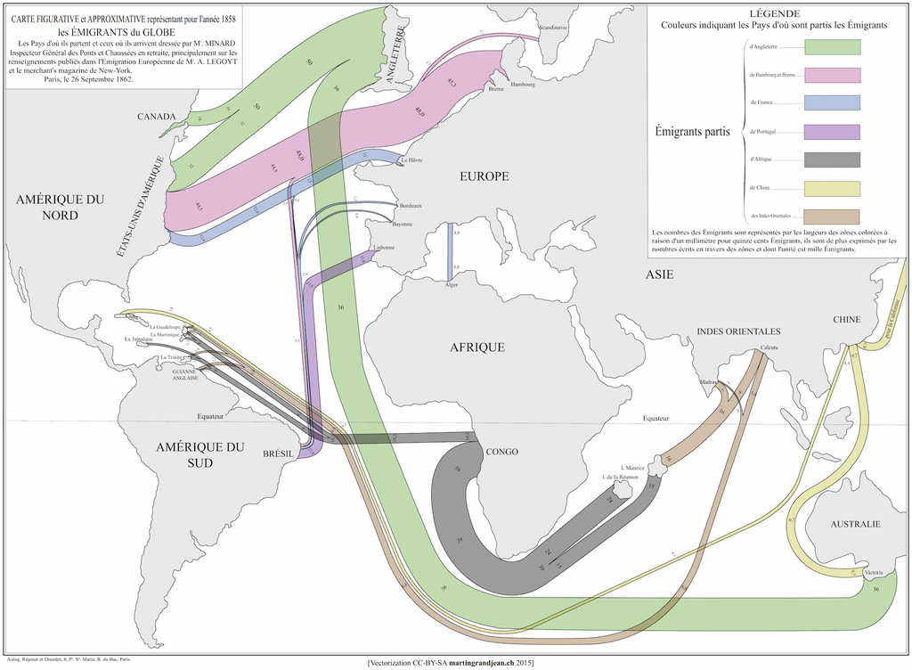
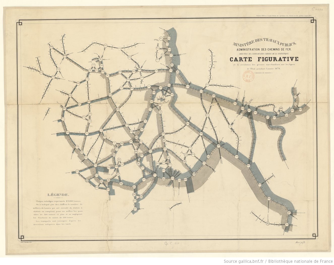
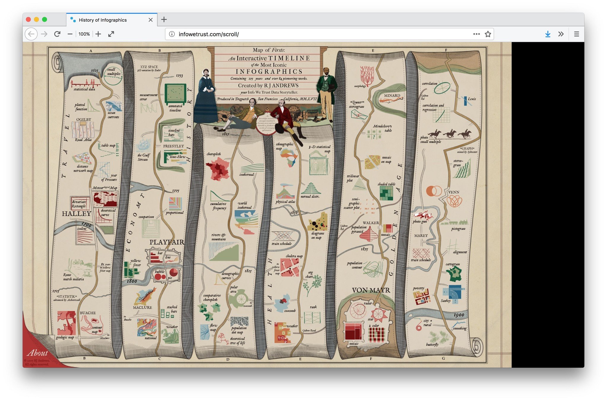
A little bit of history
Why visualise?
The secret
15 data visualisation pitfalls
The Datavisualisation Checklist
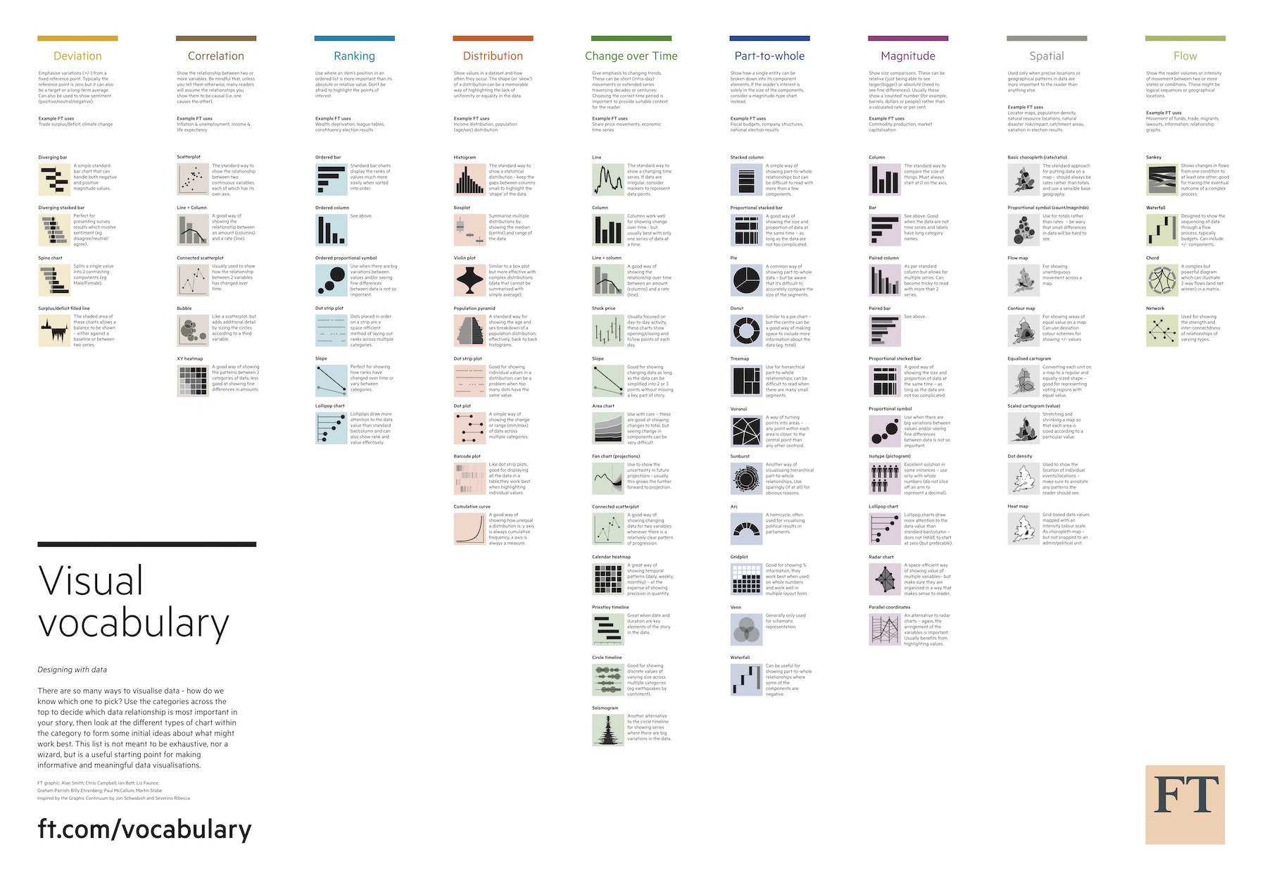
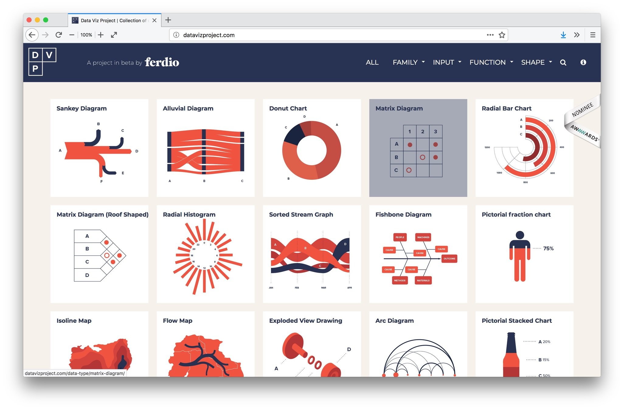
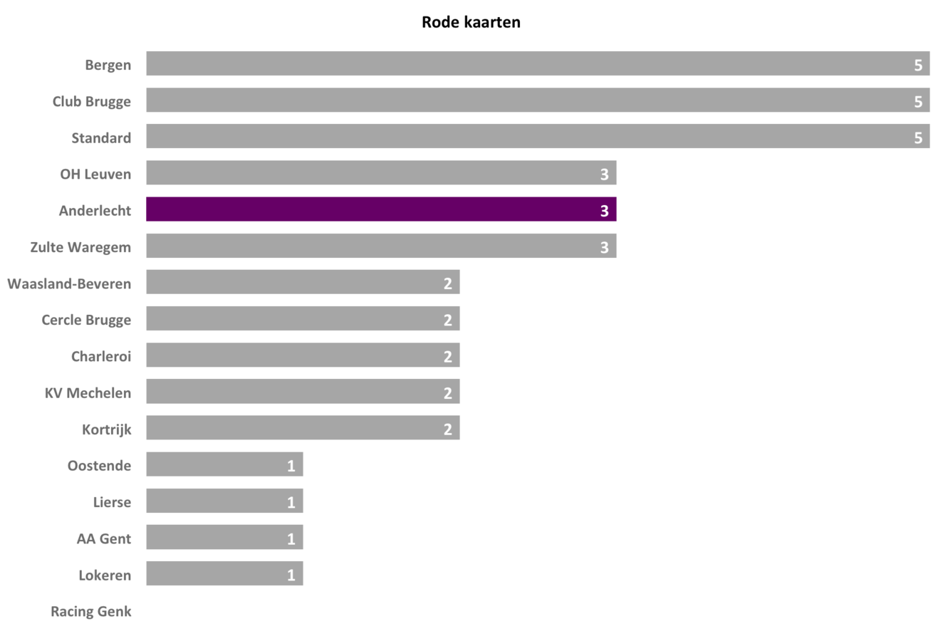
Going beyond bars and lines
Dashboard design
Maarten Lambrechts?
A little bit of history
"As knowledge increases amongst mankind, and transactions multiply, it becomes more and more desirable to abbreviate and facilitate the modes of conveying information from one person to another, and from one individual to the many."
William Playfair, 1786
"Everything that can be expressed in numbers can be represented by lines."
John Playfair


Why visualise?
| Party | Oct 2010 | Sep 2012 | May 2013 | Oct 2013 |
|---|---|---|---|---|
| N-VA | 28,2 | 36,3 | 32,1 | 27,9 |
| CD&V | 17,6 | 18,5 | 17,4 | 19 |
| SP.A | 14,9 | 14,5 | 14,7 | 13,4 |
| VB | 12,6 | 9,5 | 10,6 | 10,6 |
| VLD | 14 | 10,7 | 10,1 | 13,8 |
| Groen | 7,1 | 7,9 | 9,5 | 10 |
| LDD | 3,7 | 1,3 | 0,4 | 1,3 |
| PVDA | 5 | 5 | 2,5 | 3,9 |
| Andere | 2 | 1,2 | 2,6 | 0,1 |

| x1 | y1 | x2 | y2 | x3 | y3 | x4 | y4 |
|---|---|---|---|---|---|---|---|
| 10 | 10 | 10 | 8 | 8.04 | 9.14 | 7.46 | 6.58 |
| 8 | 8 | 8 | 8 | 6.95 | 8.14 | 6.77 | 5.76 |
| 13 | 13 | 13 | 8 | 7.58 | 8.74 | 12.74 | 7.71 |
| 9 | 9 | 9 | 8 | 8.81 | 8.77 | 7.11 | 8.84 |
| 11 | 11 | 11 | 8 | 8.33 | 9.26 | 7.81 | 8.47 |
| 14 | 14 | 14 | 8 | 9.96 | 8.10 | 8.84 | 7.04 |
| 6 | 6 | 6 | 8 | 7.24 | 6.13 | 6.08 | 5.25 |
| 4 | 4 | 4 | 19 | 4.26 | 3.10 | 5.39 | 12.50 |
| 12 | 12 | 12 | 8 | 10.84 | 9.13 | 8.15 | 5.56 |
| 7 | 7 | 7 | 8 | 4.82 | 7.26 | 6.42 | 7.91 |
| 5 | 5 | 5 | 8 | 5.68 | 4.74 | 5.73 | 6.89 |


The secret
Preattentive processing
868888609462834719714449648
122286651978794222484779908
939340243123007392183390116
351684124962334339709749742
            868888609462834719714449648
122286651978794222484779908
939340243123007392183390116
351684124962334339709749742
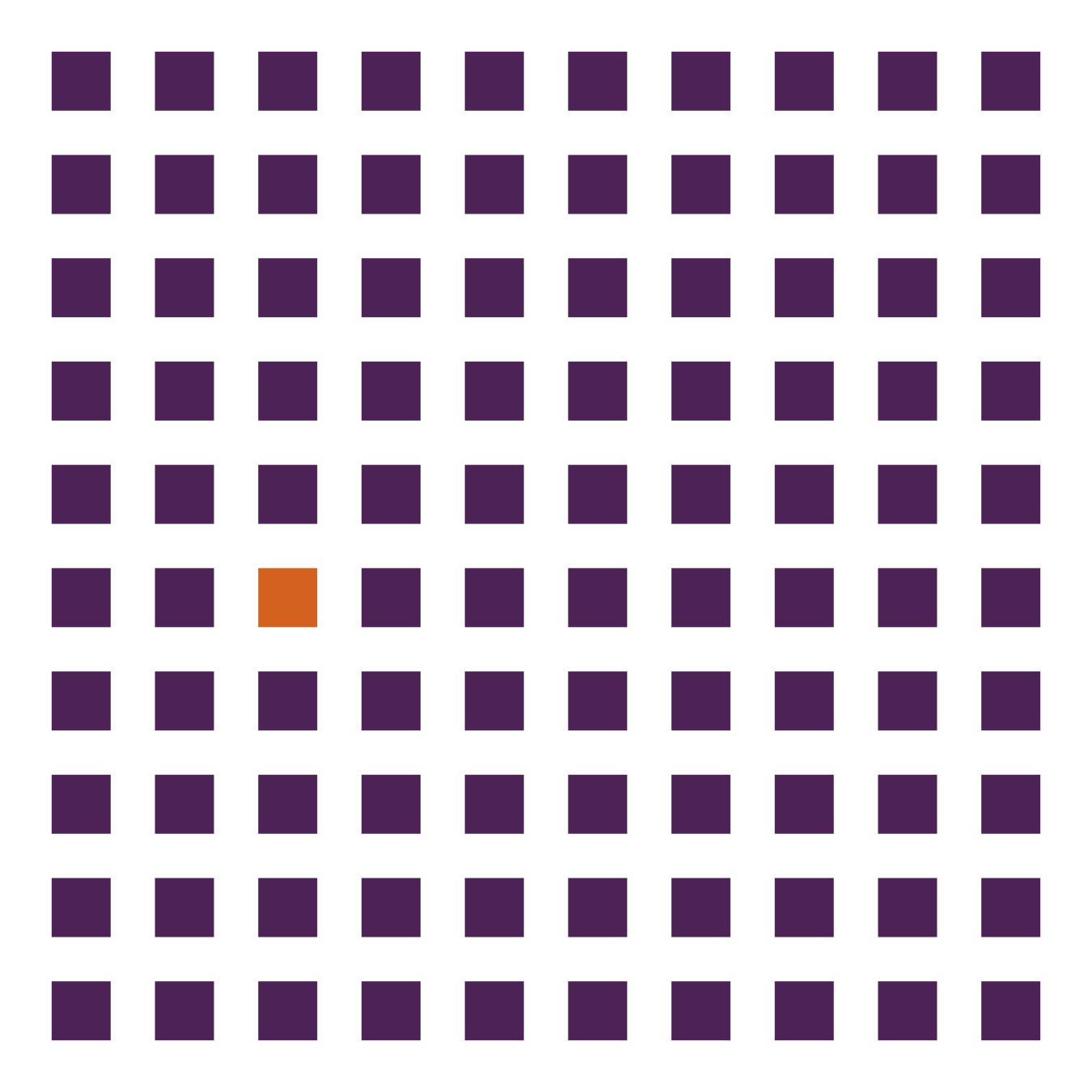
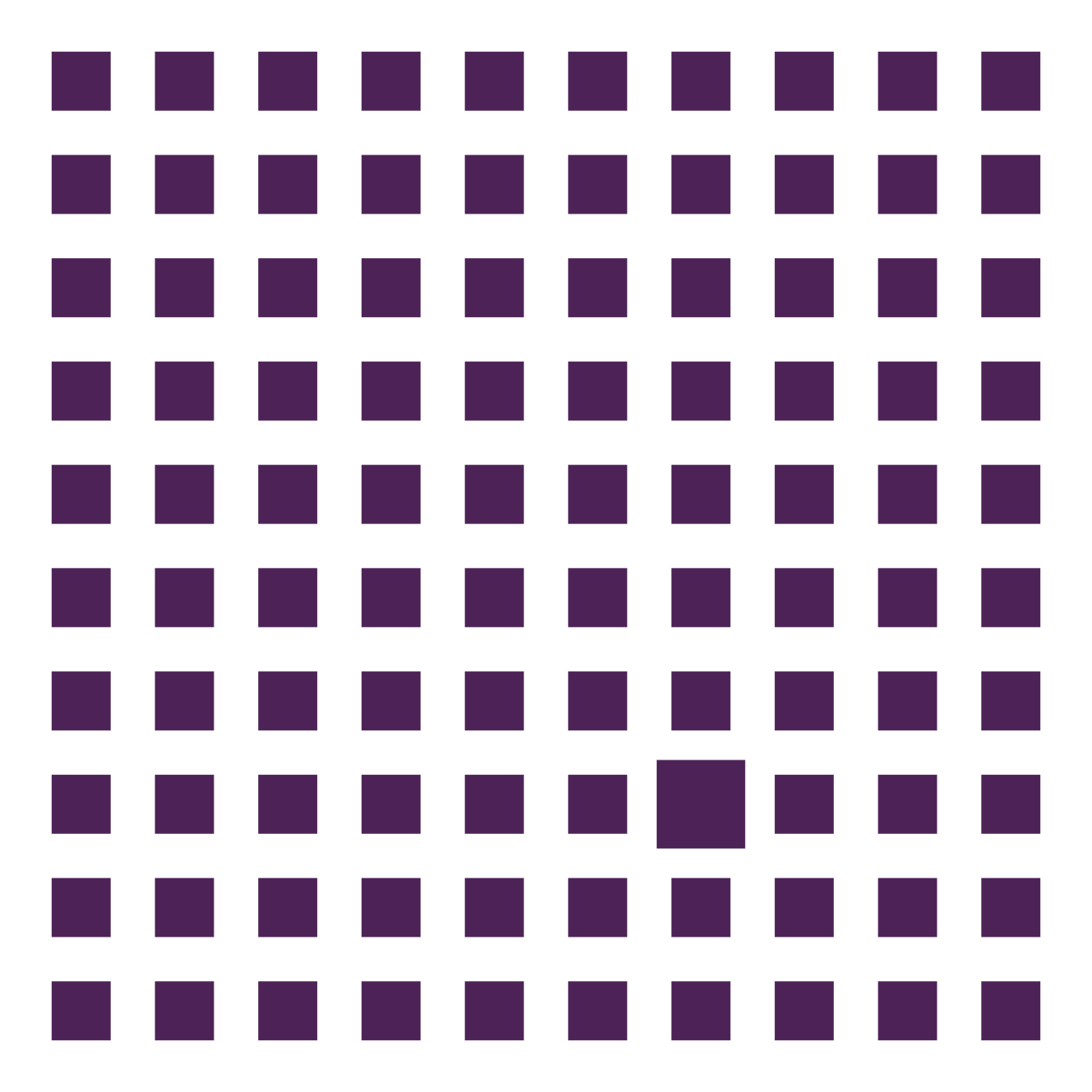
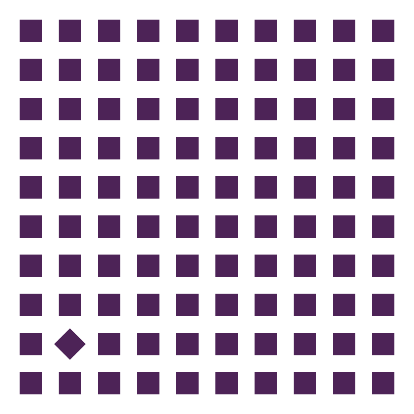
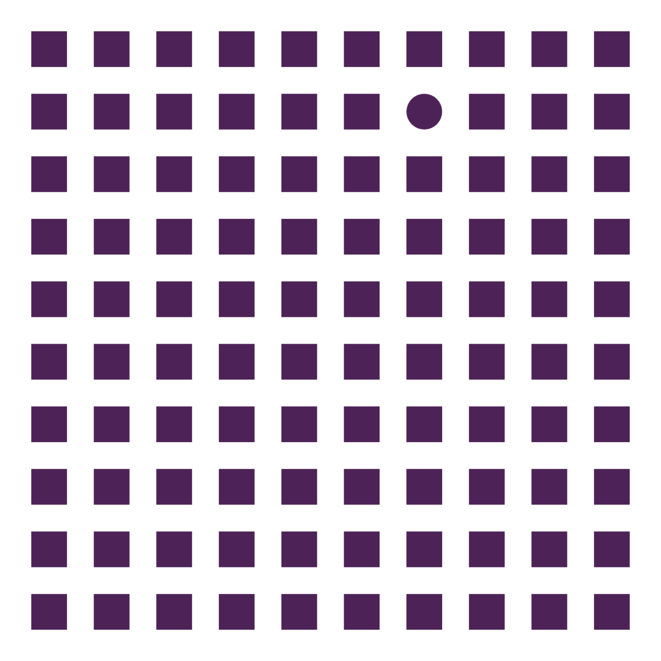
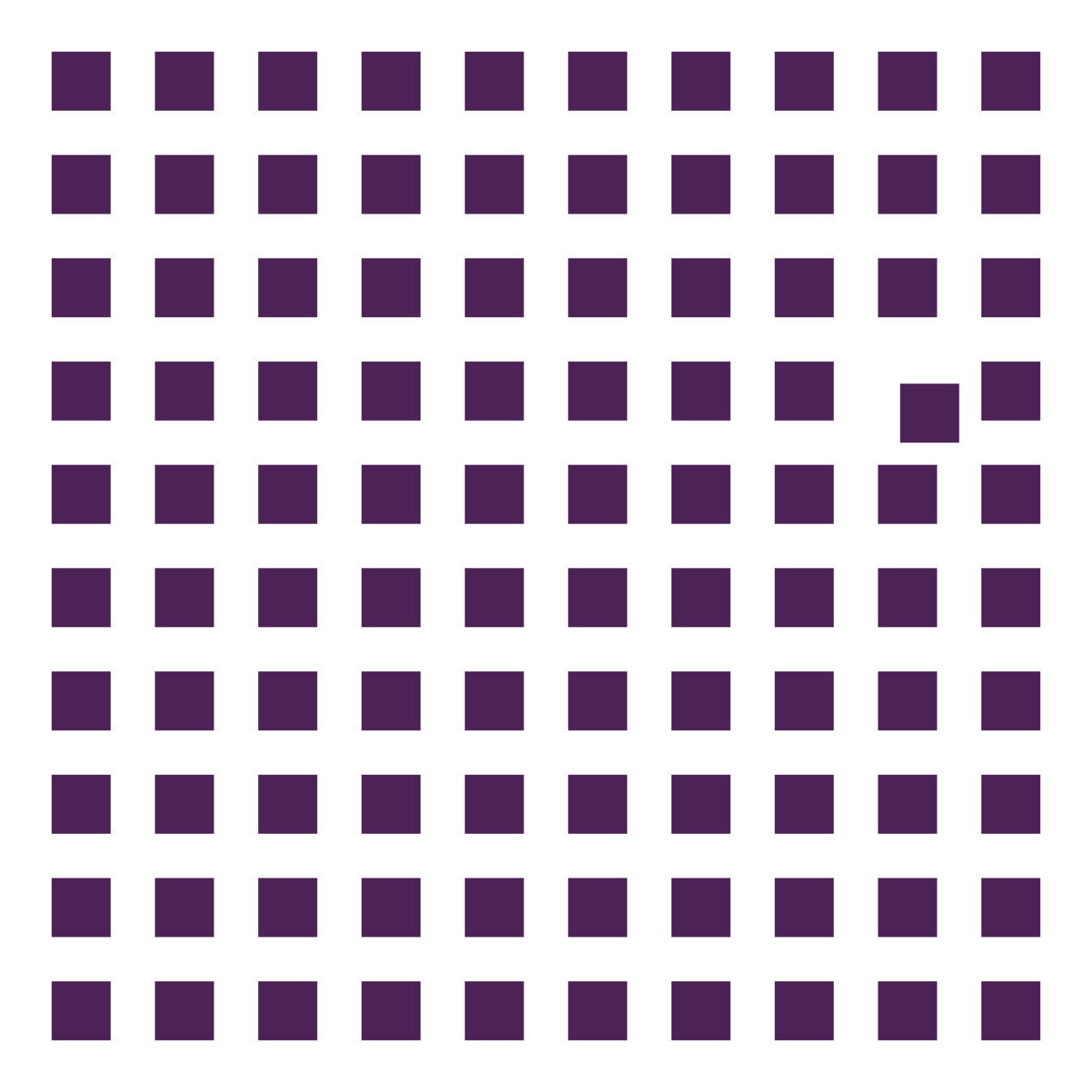
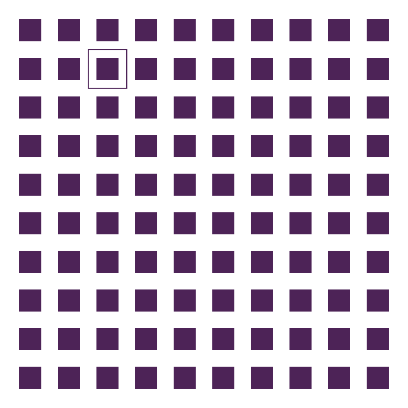
Color
Size
Position
Rotation
Shape
Enclosure
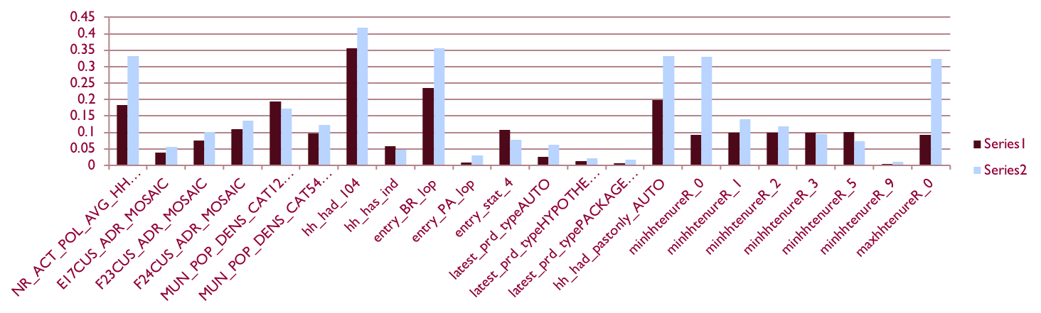
15 datavisualisation pitfalls


Chart choosers


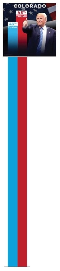
2. Don't cut bars


3. Don't cut time axes


4. Label directly


5. Use colors deliberately


6. Avoid chart junk


7. Scale circles by area, not by radius


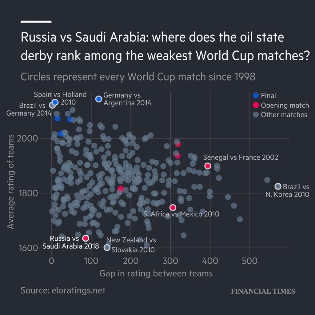
8. Tell the story


9. Don't double the axes
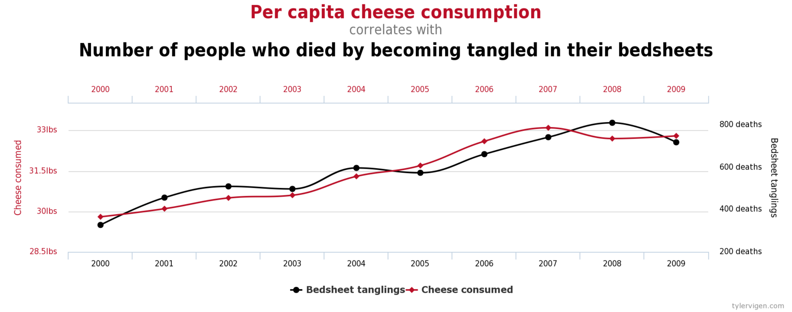
Correlation is not causation


10. Don't do 3D
Accept when you're the New York Times
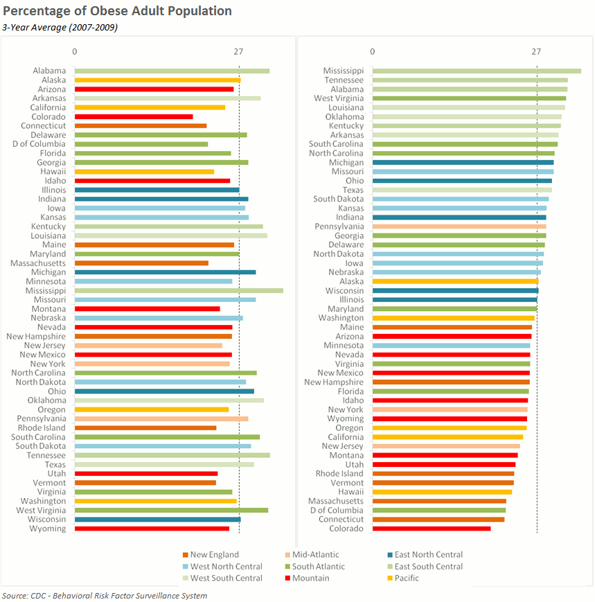
11. Sort on the data


12. Normalise data (per capita, ...)


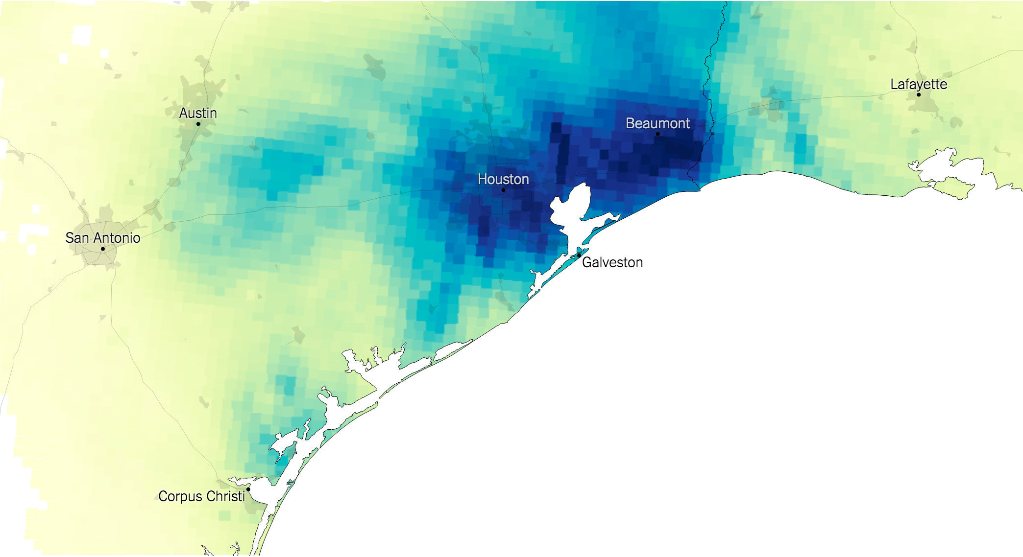
13. Sometimes the best map is no map


14. All maps lie
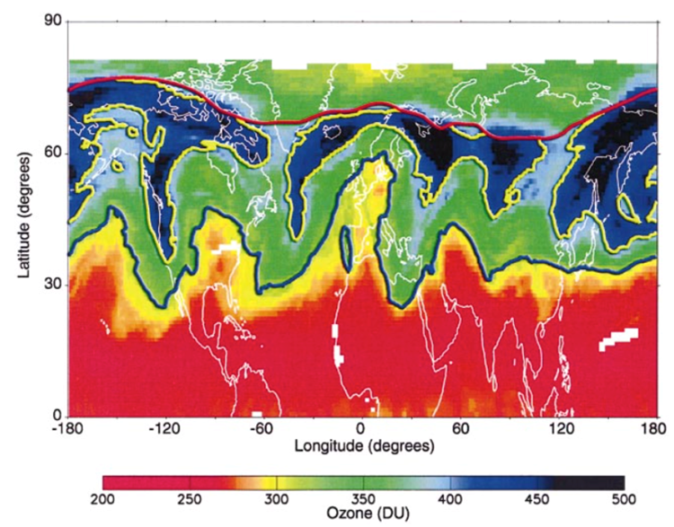
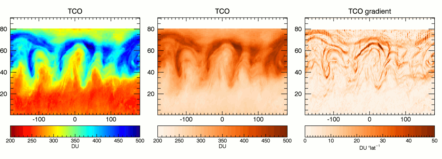

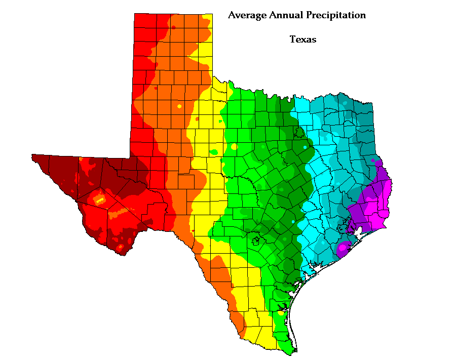
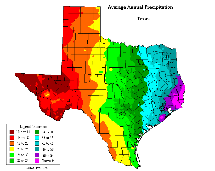
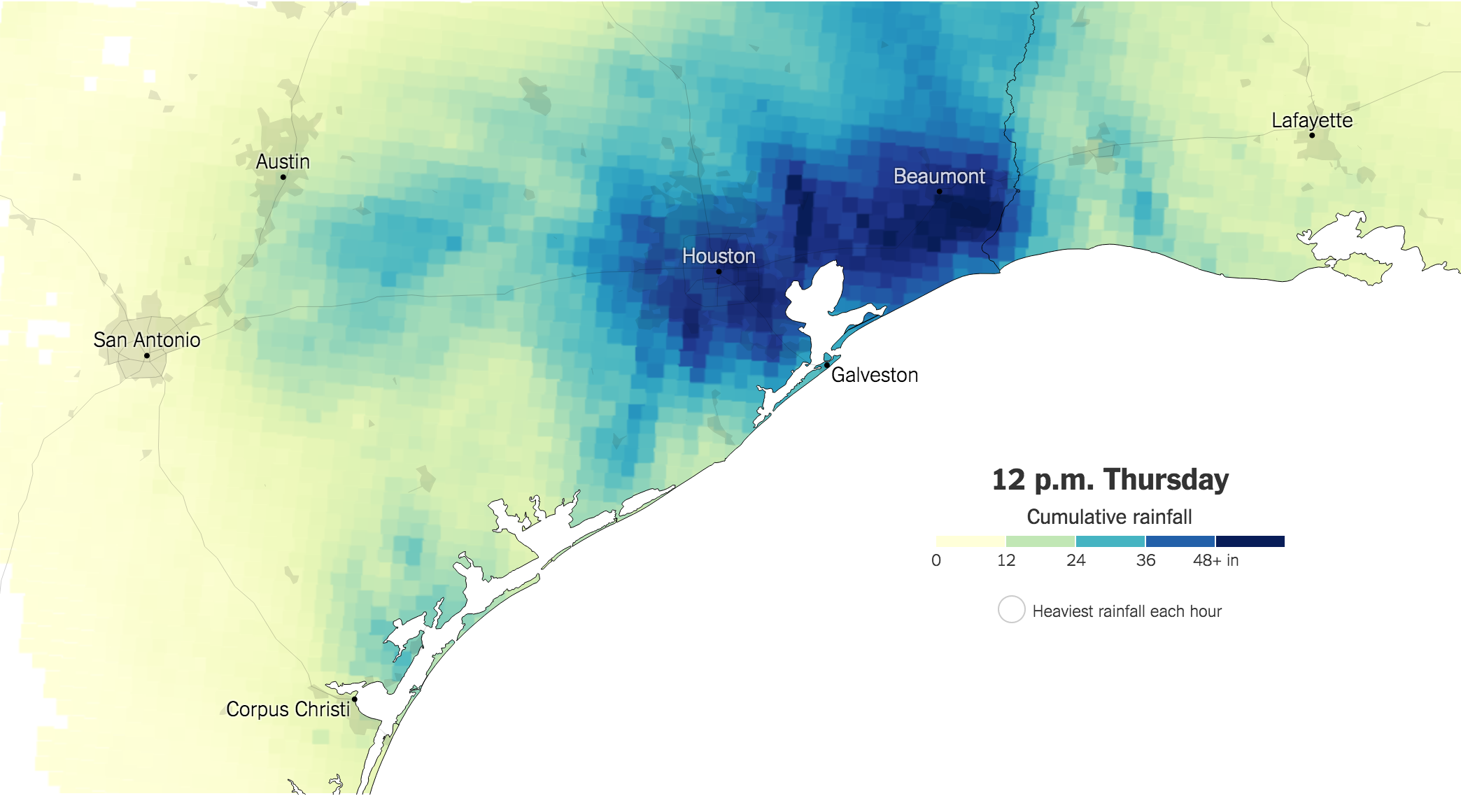
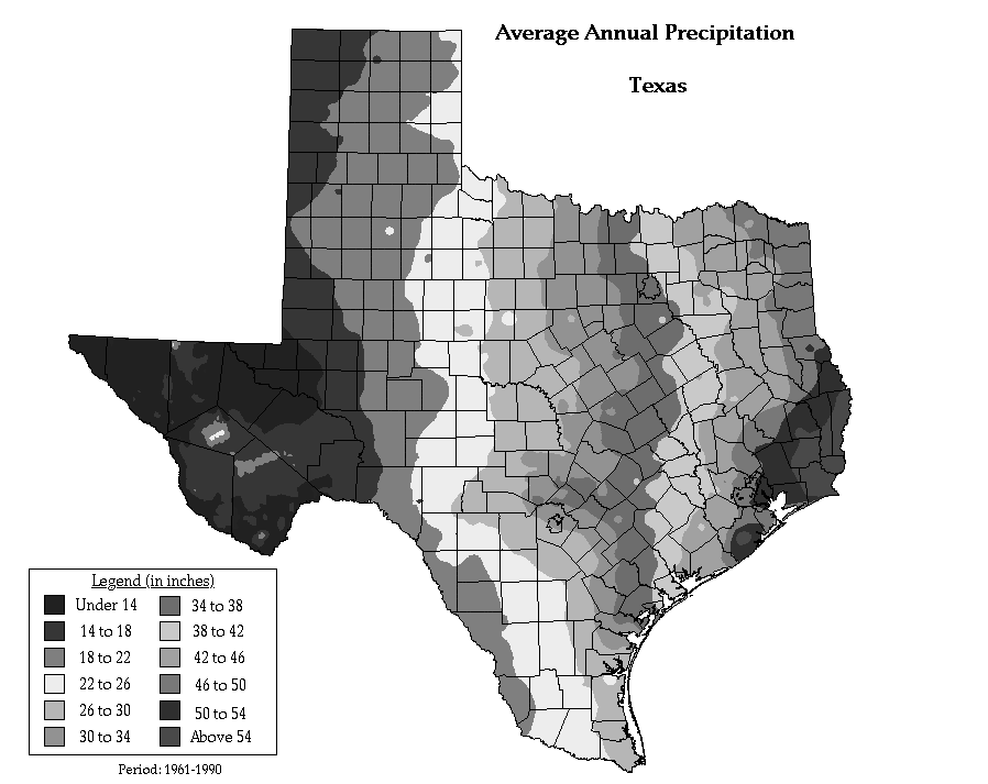
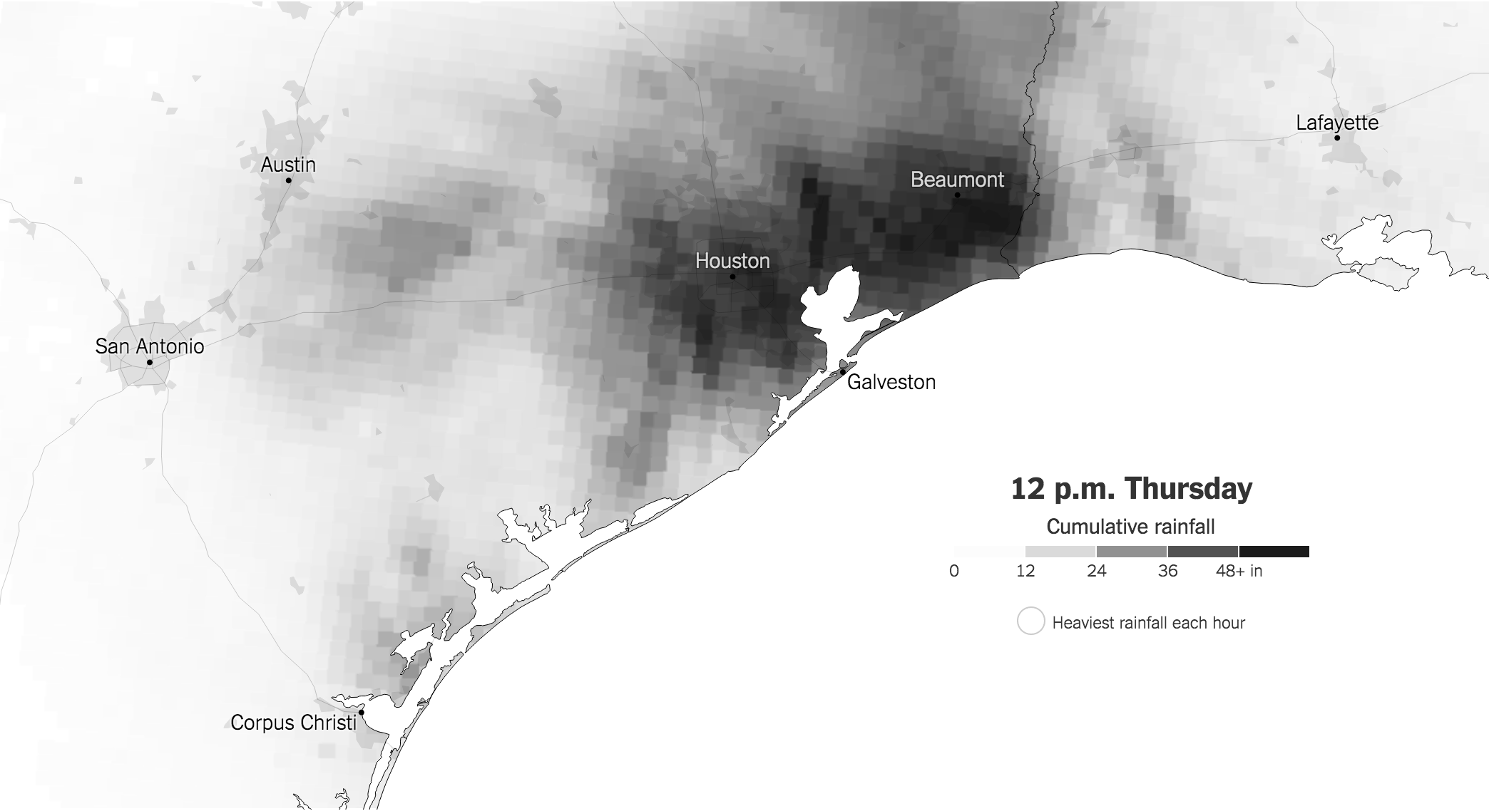
15. #Endrainbow

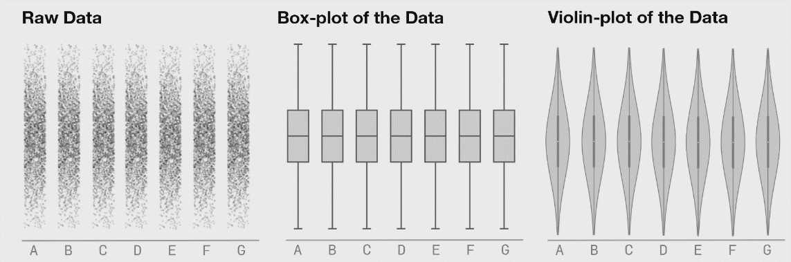
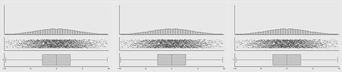
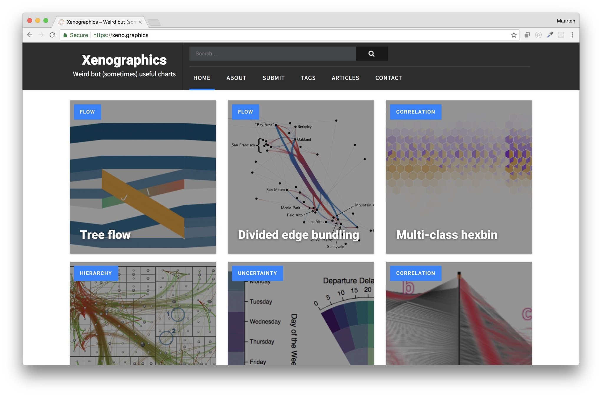
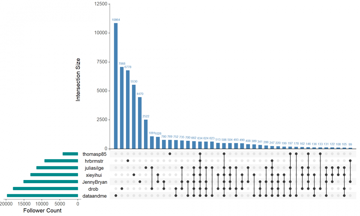
Going beyond bars and lines
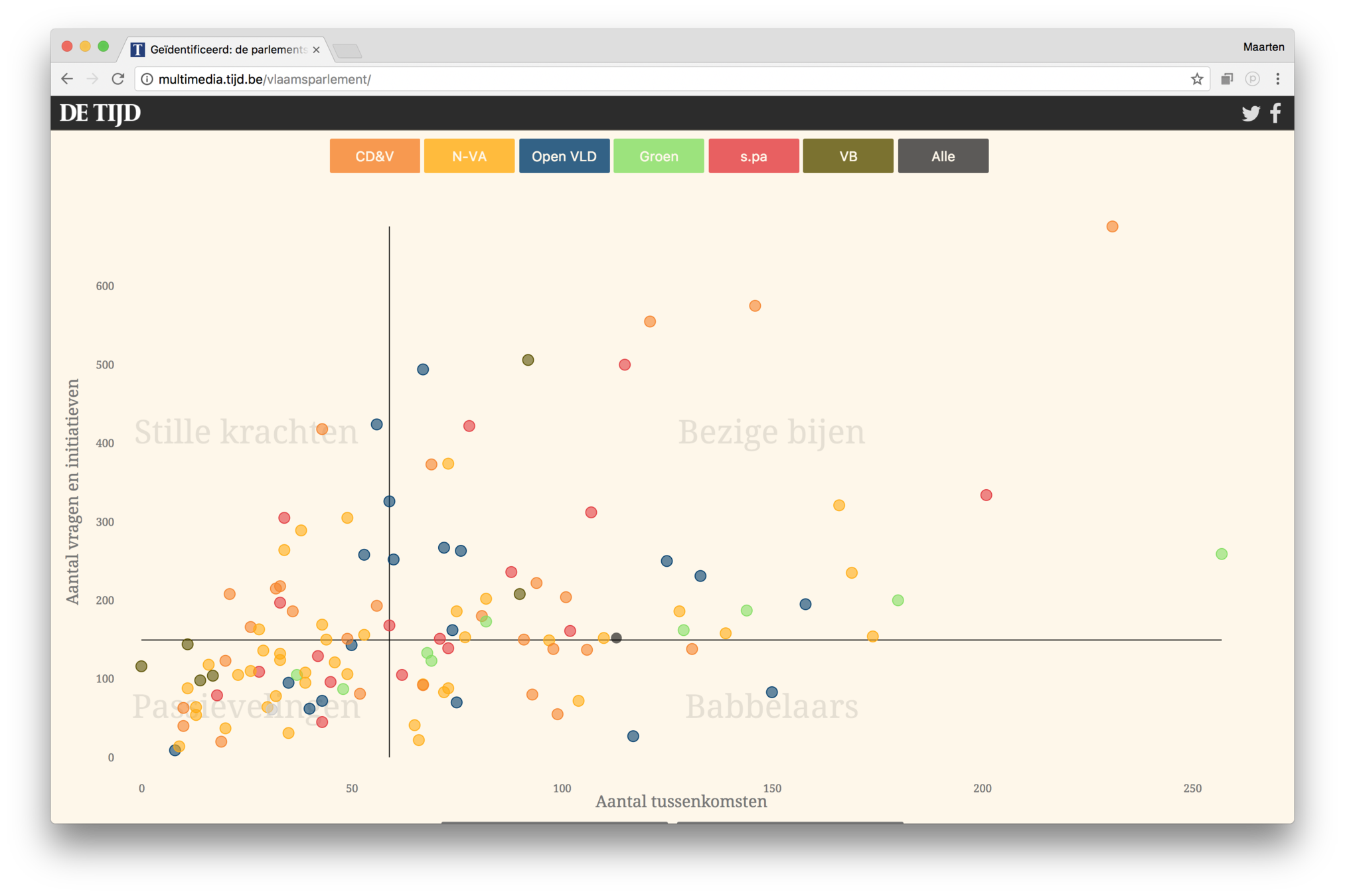
Dots
Connect the dots
Hierarchies
Streams
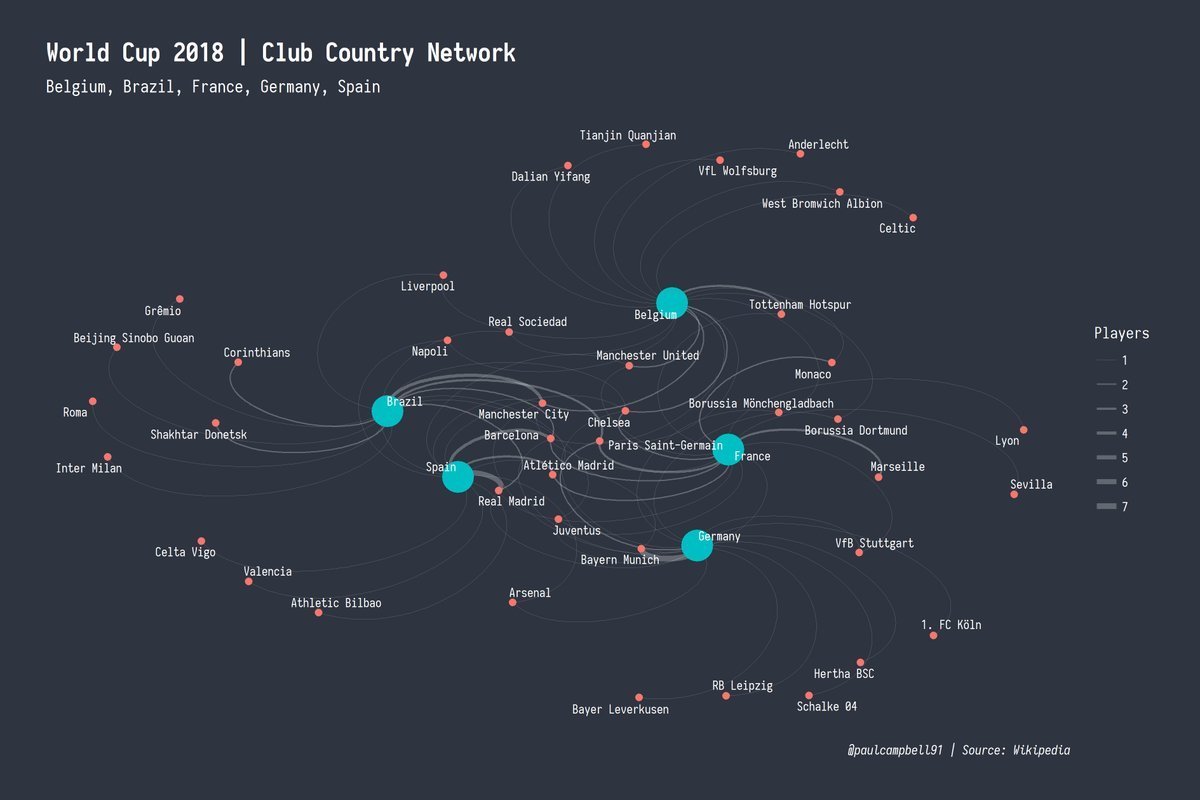
Networks
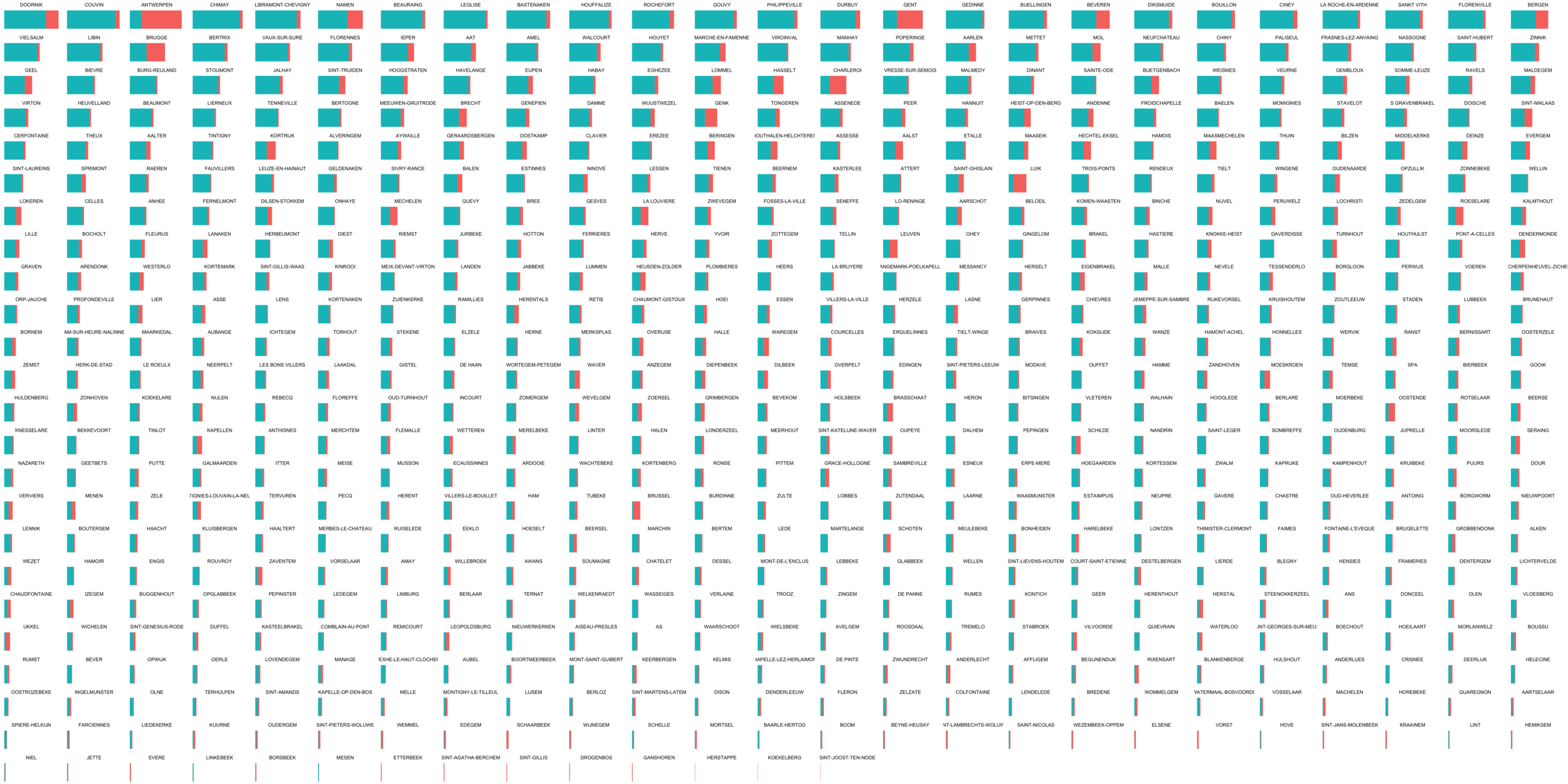
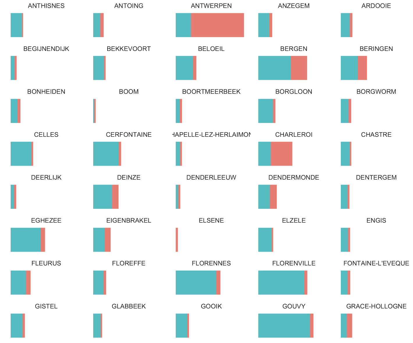
Small multiples
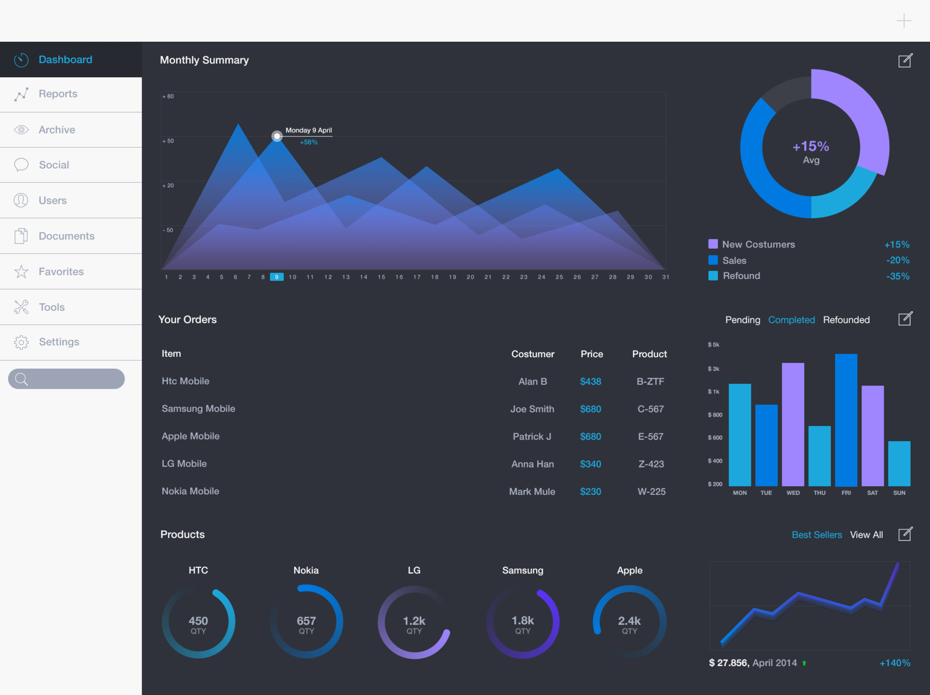
Dashboard design
Why dashboards?
Monitoring
Anwser specific questions
- Everything ok?
- Processes ended?
- Cause of problem?
- Where to invest resources?
Exploration
Gain insights
- Who are our customers?
- How are people using our webshop?
- What are the patterns in our sales?
Monitoring
Anwser specific questions
- Only show relevant data
- User is most important
- Should lead to action
Exploration
Gain insights
- Show all the data
- Data is most important
- Should lead to insight
10 design principles
for dashboards
User centric
NOT DATA CENTRIC
NOT DASHBOARD CENTRIC
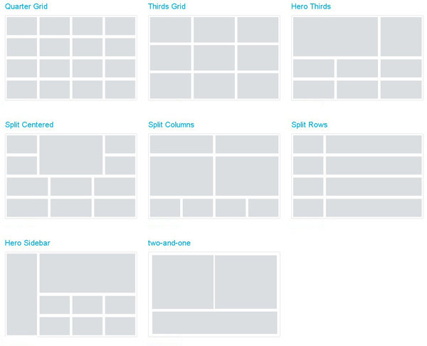
Use the grid
Left top to bottom right