Storytelling, Design &
Data Visualisation
December 10-11
2019
Maarten Lambrechts
@maartenzam
University Medical
Centre, Groningen
simple guides for better communication
Science communication
Principles of graphic design
Introduction to data visualisation
Program
Pitfalls in data visualisation
Data visualisation tools
Data visualisation make over
Tomorrow
Today
14:30 - 17:30
9:00 - 13:00
Science communication
0

"You have to be like the worst tabloid newspaper in the front and the Academy of Science in the back."
Hans Rosling
What is important
How to make
people care
How to present it best
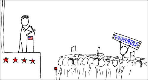
Good journalists know
What's your story?
Design and dataviz
How to tell your story?
What is your story?
I
Problem 1
You know too much


Problem 2
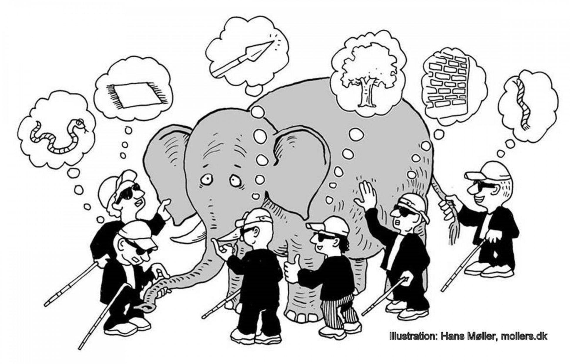
The public doesn't exist
Introducing:
The Message Box
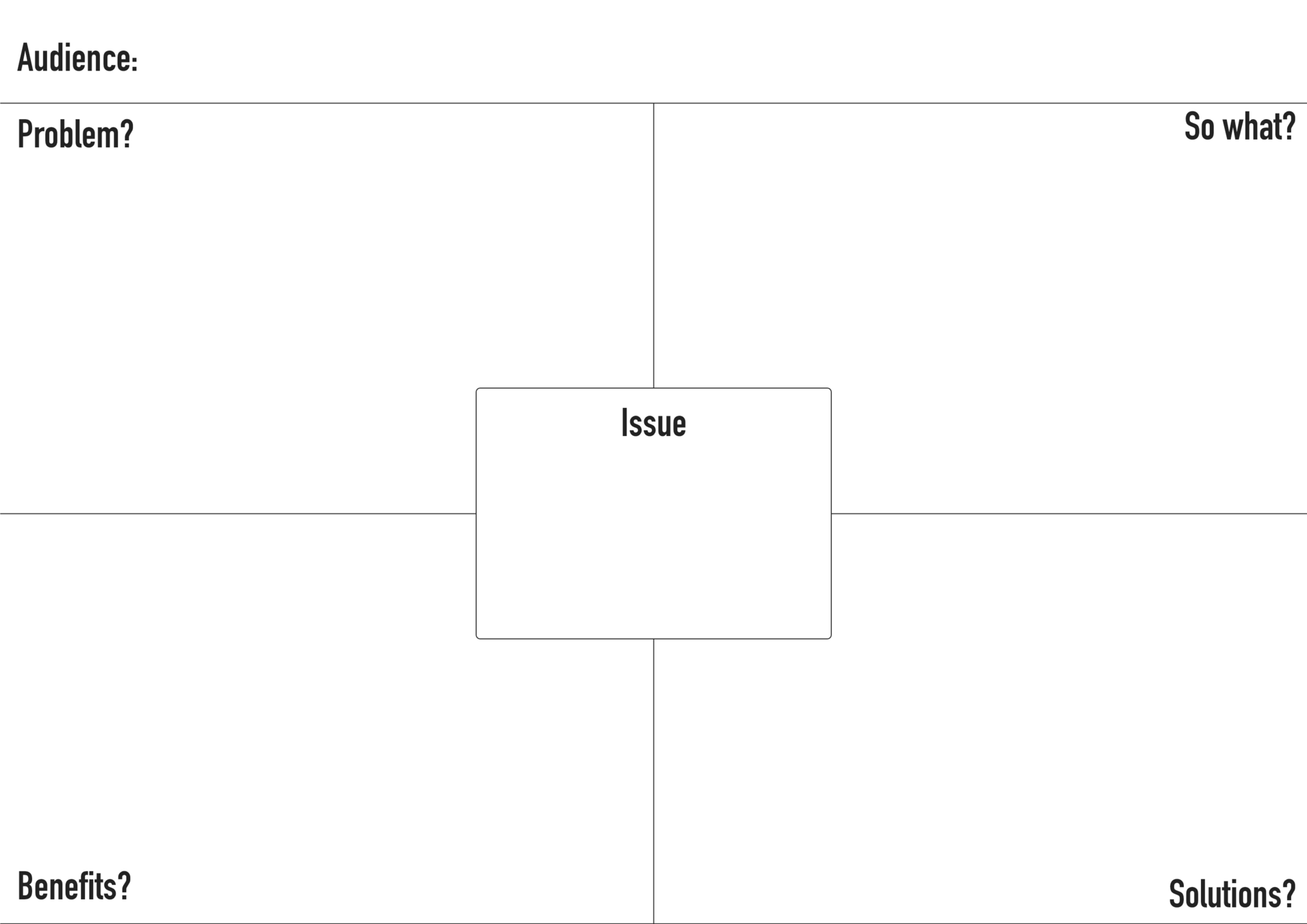
Message box
Keep target audience in mind
Don't worry about wording, but use simple language
Messages may be long at first, should be short finally
Limit messages to 3
Is always work in progress
How to tell your story?
II

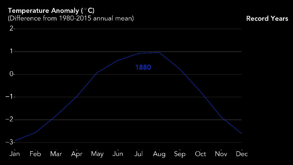
2018
-
0,70°C warmer globally than 20th century average
-
4th hottest year on record since 1880
-
Last 4 years are the record hot years
-
Record low sea ice levels
Stories are everywhere
Paintings, newspapers, games, novels, papers, fairytales, television, sports, religion, advertisement, theater, politics, science, poetry, manuals, ...
Through stories, we
Learn
Understand
Remember
Convey ideas
How?
Setting
When?
Where?
Character
WHO?
Cause & effect
WHAT?
Sensemaking
WHy?
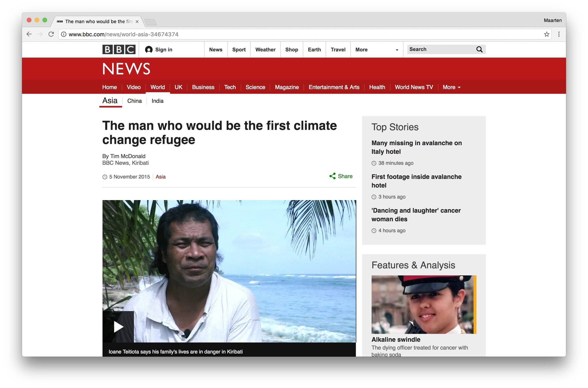
Learn from journalism
The Inverted Pyramid
The News
important details
BackgrouND
5 W's, How?
Journalistic reality
Fixed length
Breaking news comes in
'When in doubt, leave things out'
'Cut from the bottom'
You are not your audience
No jargon
No letterwords
No footnotes
Simplify
Make it personal
Personification
Use a narrator
Put the "you" in the headline
Metaphors & catchphrases
'Rainforests are carbon sinks and produce oxygen'
Don't say
but say
'Rainforests are the lungs of the earth'
'Wrong intake of antibiotics could cause resistance in bacteria'
'Too much antibiotics provokes arms race between drugs and microbes'
'Climate Warming and Disease Risk
for Terrestrial and Marine Biota'
'A Warmer World is a Sicker World'
5 W's
Single story
Causal ordering of events
Everyday language
Appaeling, sensory language
Metaphors and catchphrases
Narrator
Put the 'you' in the headline
Make an appeal
Storytelling
Design
III
"Perfection is achieved, not when there is nothing more to add, but when there is nothing more to take away."
- Antoine de Saint Exupéry
"Graphic designers create and combine symbols, images and text to form visual representations of ideas and messages. They use typography, visual arts and page layout techniques to create visual compositions."
- Wikipedia
"Content precedes design. Design in the absence of content isn't design, it's decoration"
- Jeffrey Zeldman
The Grid
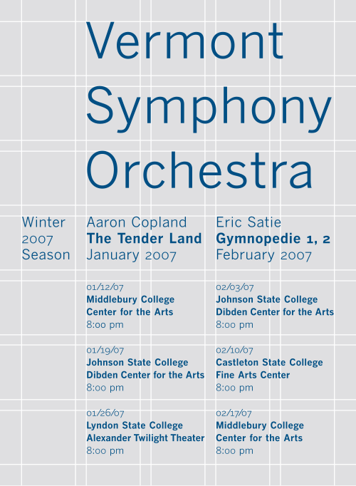
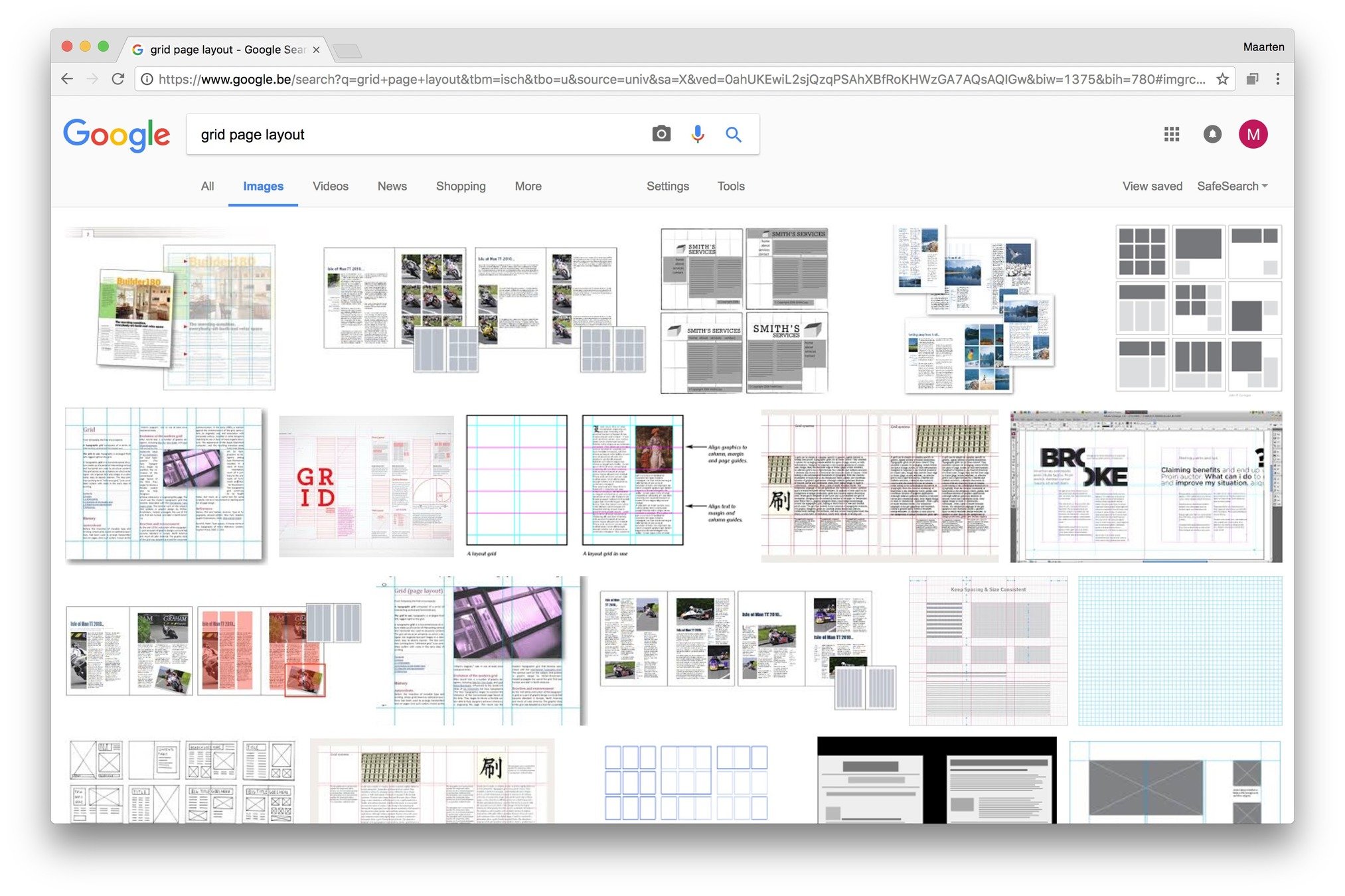
Grids
Let you apply the rule of thirds
Align
Organize
Are flexible
Make readable
Let you brake the grid
Can be applied everywhere
Hierarchy
Hierarchy — it’s a big word, but an easy-to-implement (albeit important) concept when it comes to typography. And this guide will show you how to use it to improve your design projects. Even if you’re not familiar with the term, you’ve likely run into typographic hierarchy many times. Just picture a newspaper, with a headline, subheadline, and body copy. This is a classic example of three levels of typographic hierarchy, an approach that’s still used today, both in print and online. Newspapers from the early- to mid-20th century offer especially exaggerated examples, like this one. These days, our headlines or titles don’t have to be six inches tall to catch readers’ attention, but the image above provides a dramatic reminder of just what typographic hierarchy is all about — organizing and formatting your type choices in such a way that readers or users can clearly see what’s most important, which enables them to easily navigate the layout at a glance and quickly scan to find the information they’re looking for.
Hierarchy — it’s a big word, but an easy-to-implement (albeit important) concept when it comes to typography. And this guide will show you how to use it to improve your design projects.
Even if you’re not familiar with the term, you’ve likely run into typographic hierarchy many times. Just picture a newspaper, with a headline, subheadline, and body copy. This is a classic example of three levels of typographic hierarchy, an approach that’s still used today, both in print and online. Newspapers from the early- to mid-20th century offer especially exaggerated examples, like this one.
These days, our headlines or titles don’t have to be six inches tall to catch readers’ attention, but the image above provides a dramatic reminder of just what typographic hierarchy is all about — organizing and formatting your type choices in such a way that readers or users can clearly see what’s most important, which enables them to easily navigate the layout at a glance and quickly scan to find the information they’re looking for.
Hierarchy — it’s a big word, but an easy-to-implement (albeit important) concept when it comes to typography. And this guide will show you how to use it to improve your design projects.
Even if you’re not familiar with the term, you’ve likely run into typographic hierarchy many times. Just picture a newspaper, with a headline, subheadline, and body copy. This is a classic example of three levels of typographic hierarchy, an approach that’s still used today, both in print and online. Newspapers from the early- to mid-20th century offer especially exaggerated examples, like this one.
Make it scanable
These days, our headlines or titles don’t have to be six inches tall to catch readers’ attention, but the image above provides a dramatic reminder of just what typographic hierarchy is all about — organizing and formatting your type choices in such a way that readers or users can clearly see what’s most important, which enables them to easily navigate the layout at a glance and quickly scan to find the information they’re looking for.

Size
It goes without saying that font size matters: the biggest letters get the most attention
Weight
Weight
Weight
Space
Space
Space
Typography
Sans serif
Serif
Serif
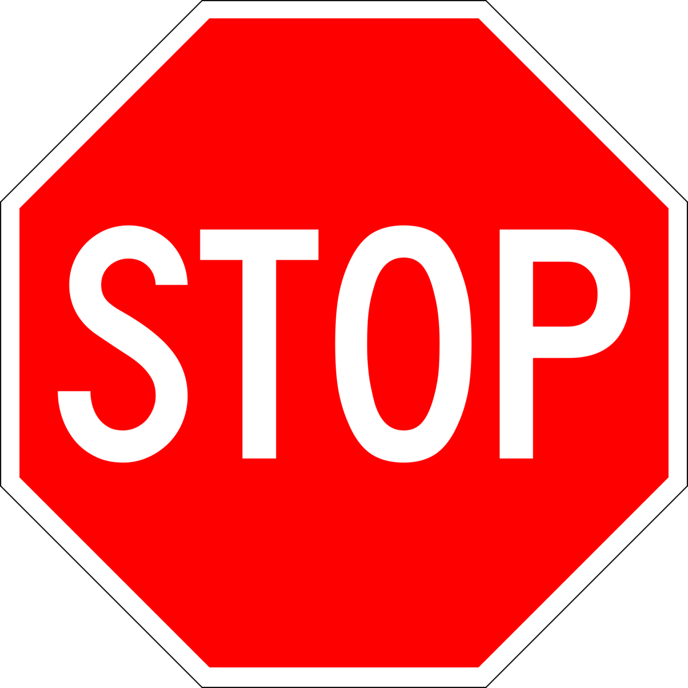
STOP
STOP

To avoid
Comic Sans
Papyrus
Hand written
Times New Roman
Arial
A Sans Serif Title
Longer text in Serif improves readability. Longer text in Serif improves readability. Longer text in Serif improves readability. Longer text in Serif improves readability. Longer text in Serif improves readability. Longer text in Serif improves readability. Longer text in Serif improves readability. Longer text in Serif improves readability. Longer text in Serif improves readability. Longer text in Serif improves readability. Longer text in Serif improves readability. Longer text in Serif improves readability. Longer text in Serif improves readability.
Serif Title
Longer text in Serif improves readability. Longer text in Serif improves readability. Longer text in Serif improves readability. Longer text in Serif improves readability. Longer text in Serif improves readability. Longer text in Serif improves readability. Longer text in Serif improves readability. Longer text in Serif improves readability. Longer text in Serif improves readability. Longer text in Serif improves readability. Longer text in Serif improves readability. Longer text in Serif improves readability. Longer text in Serif improves readability.
Color

Colors have feelings
Banana
Tomato
Orange
Grass
Let colors make sense
Be consistent
The color wheel
Negative space

Hierarchy — it’s a big word, but an easy-to-implement (albeit important) concept when it comes to typography. And this guide will show you how to use it to improve your design projects.
Even if you’re not familiar with the term, you’ve likely run into typographic hierarchy many times. Just picture a newspaper, with a headline, subheadline, and body copy. This is a classic example of three levels of typographic hierarchy, an approach that’s still used today, both in print and online. Newspapers from the early- to mid-20th century offer especially exaggerated examples, like this one.
Make it scanable
These days, our headlines or titles don’t have to be six inches tall to catch readers’ attention, but the image above provides a dramatic reminder of just what typographic hierarchy is all about — organizing and formatting your type choices in such a way that readers or users can clearly see what’s most important, which enables them to easily navigate the layout at a glance and quickly scan to find the information they’re looking for.
Increases legibility
Guides attention
Grid
Hierarchy
Typography
Color
Negative space
Design
Data Visualisation
IV
"As knowledge increases amongst mankind, and transactions multiply, it becomes more and more desirable to abbreviate and facilitate the modes of conveying information from one person to another, and from one individual to the many."
William Playfair, 1786
"Everything that can be expressed in numbers can be represented by lines."
John Playfair
| Year | Imports | Exports |
|---|---|---|
| 1700 | 71,1 | 32,8 |
| 1705 | 74,5 | 40,9 |
| 1710 | 82,6 | 59 |
| 1715 | 87,2 | 77,9 |
| 1720 | 96,8 | 75,2 |
| 1725 | 102,6 | 71,3 |
| 1730 | 96,4 | 64,7 |
| 1735 | 93,7 | 60,5 |
| 1740 | 92,9 | 65,1 |
| 1745 | 92,5 | 74,3 |
| 1750 | 90,1 | 77,4 |
| 1755 | 79,9 | 82,8 |
| 1760 | 76,6 | 117,5 |
| 1765 | 79,6 | 151,8 |
| 1770 | 83,8 | 163,8 |
| 1775 | 90,4 | 175,7 |
| 1780 | 92,7 | 185,4 |


Why visualise?


Explanatory data visualisation
Exploratory data visualisation


The Secret
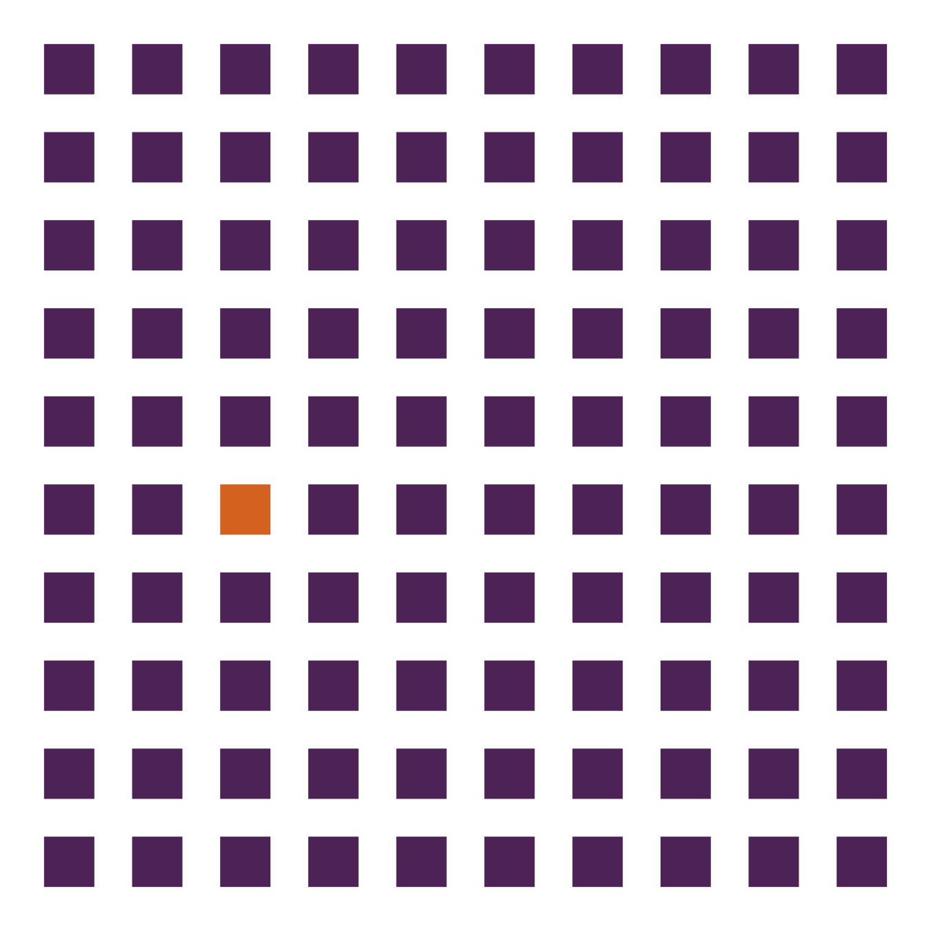
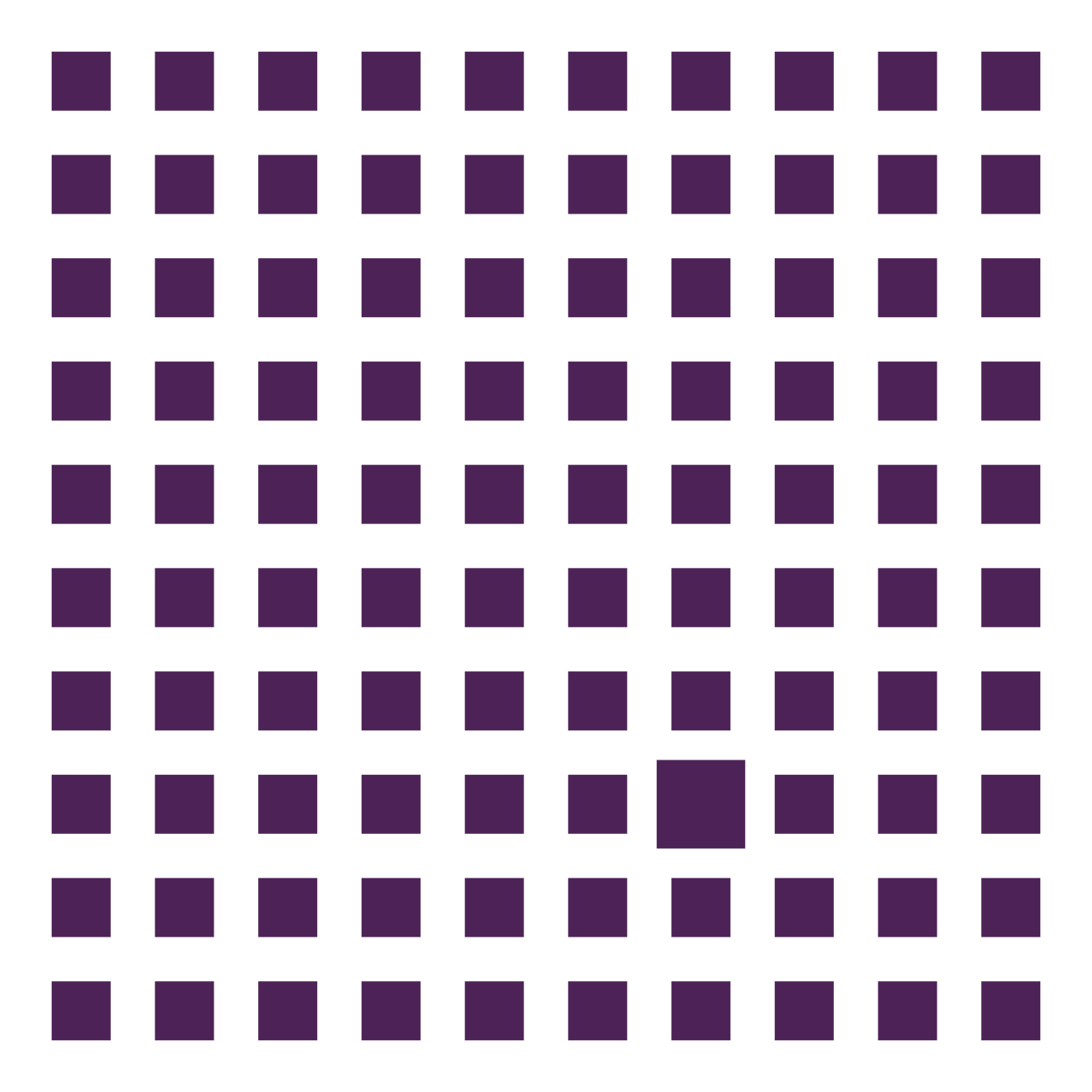
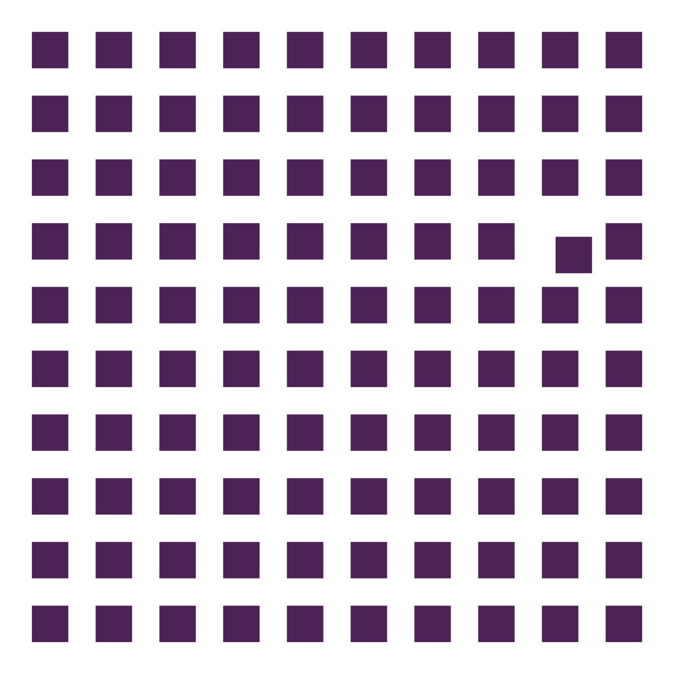
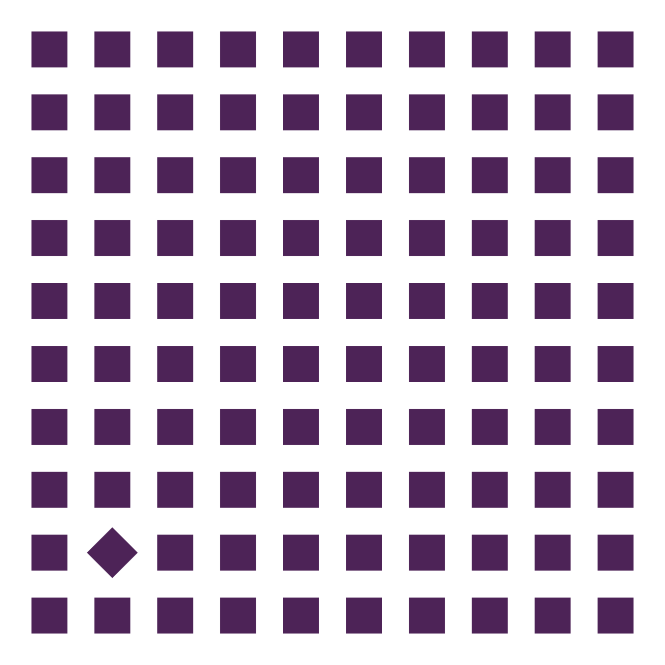
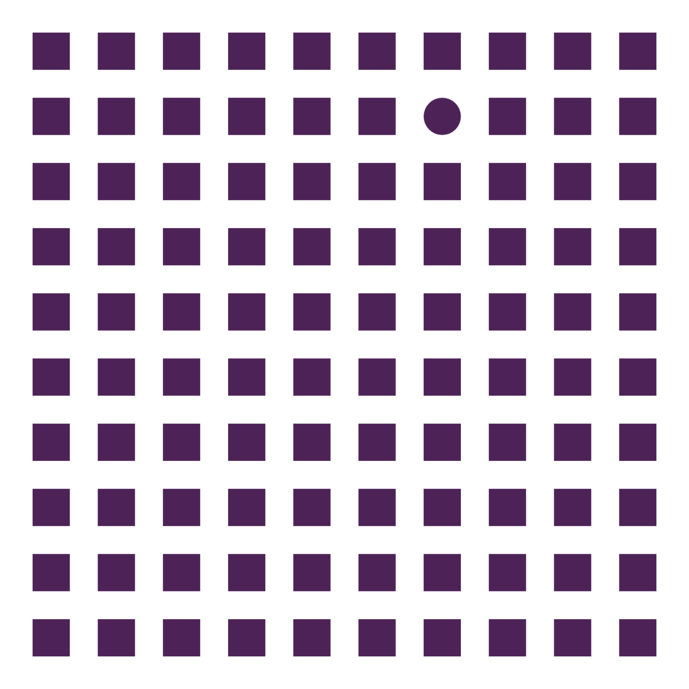
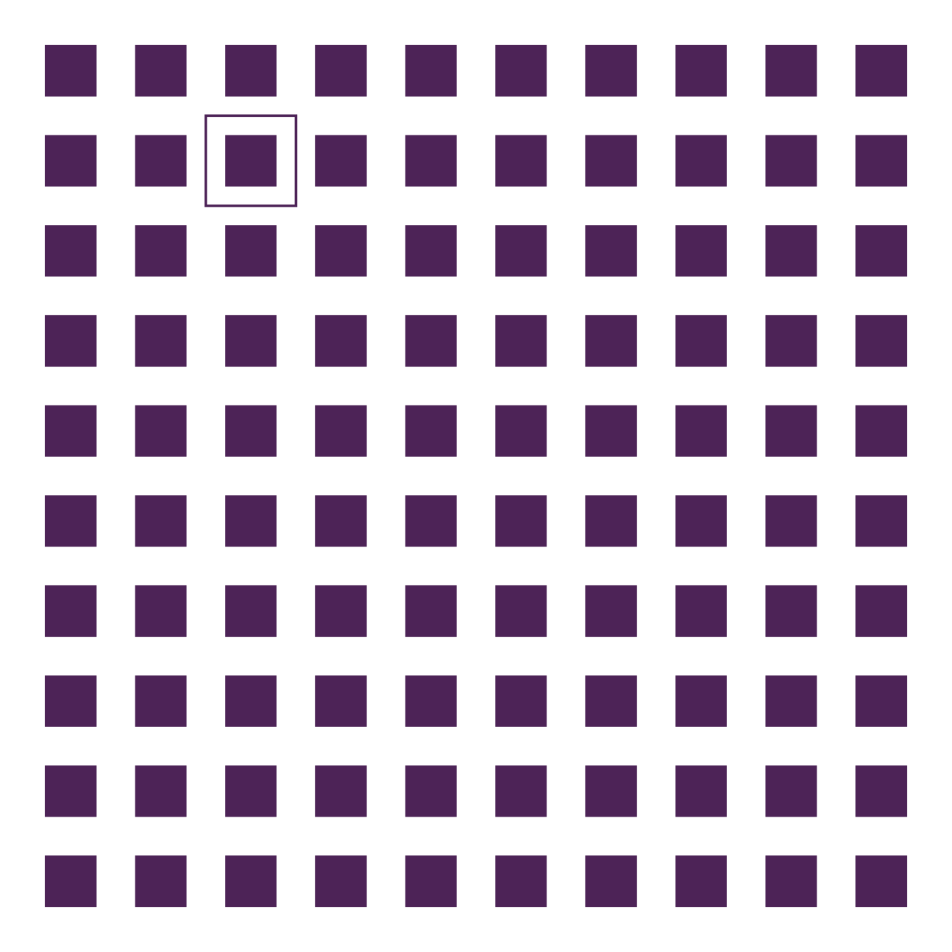
Preattentive Processing
868888609462834719714449648
122286651978794222484779908
939340243123007392183390116
351684124962334339709749742
            868888609462834719714449648
122286651978794222484779908
939340243123007392183390116
351684124962334339709749742


Science communication
Principles of graphic design
Introduction to data visualisation
Program
Pitfalls in data visualisation
Data visualisation tools
Data visualisation make over
Tomorrow
Today
14:30 - 17:30
9:00 - 13:00
Make over
Evaluation of a data visualisation, publication, poster, ...
Suggest improvements based on what you've learned
Bring your own!
Science communication
Principles of graphic design
Introduction to data visualisation
Program
Pitfalls in data visualisation
Data visualisation tools
Data visualisation make over
Today
Yesterday
14:30 - 17:30
9:00 - 13:00
14 pitfalls
And how to overcome them


2. Don't cut bars


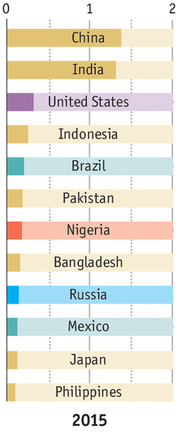
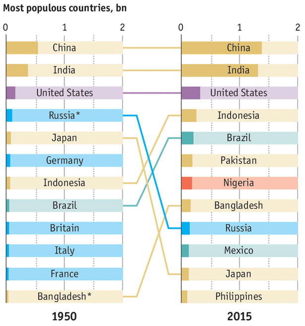
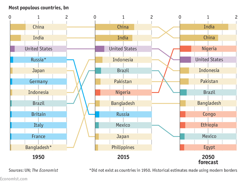
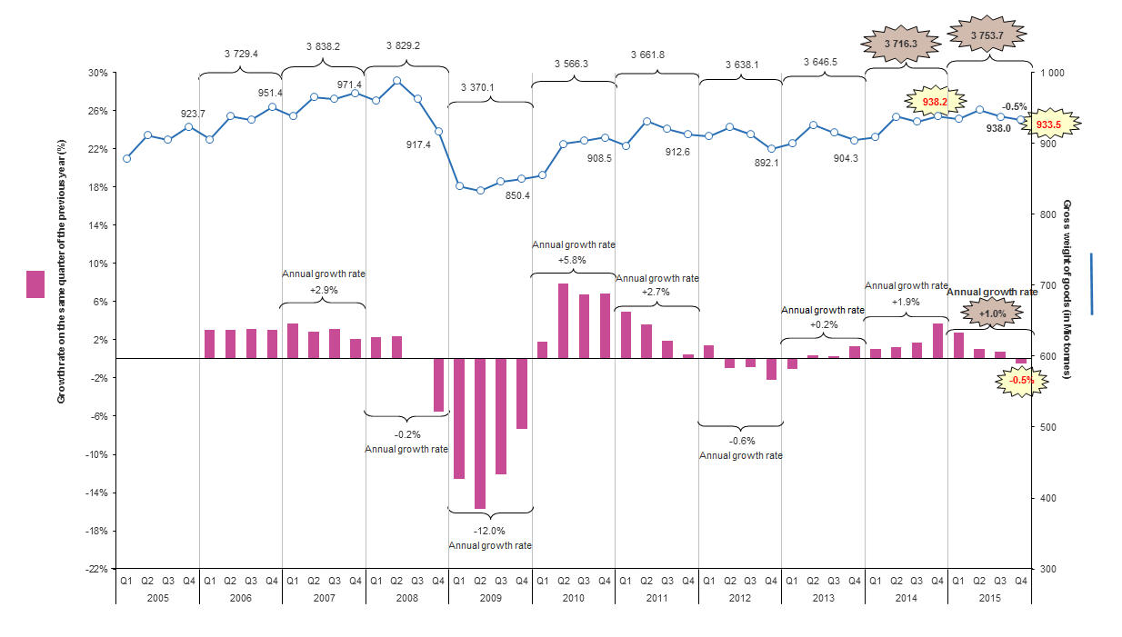
3. Don't cut time


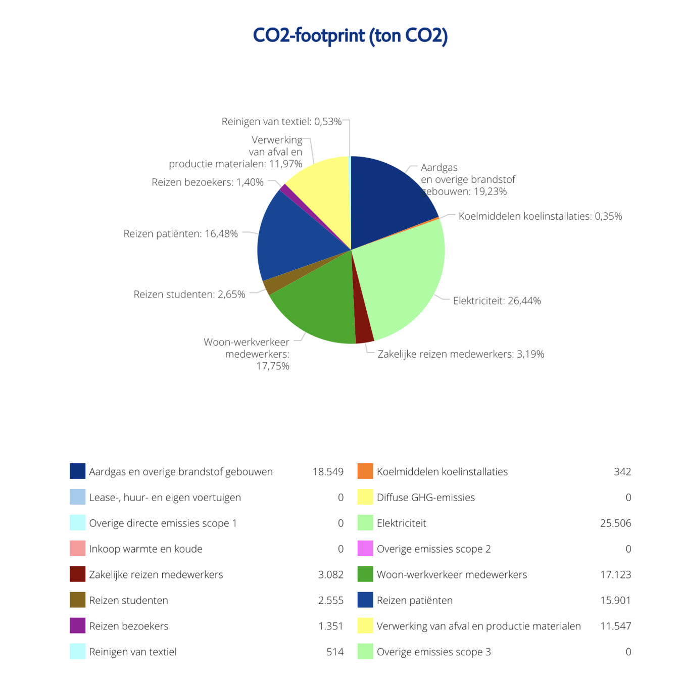
4. Don't square the pies


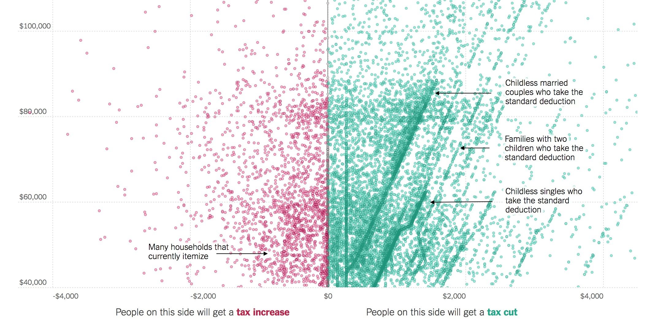
5. Label directly


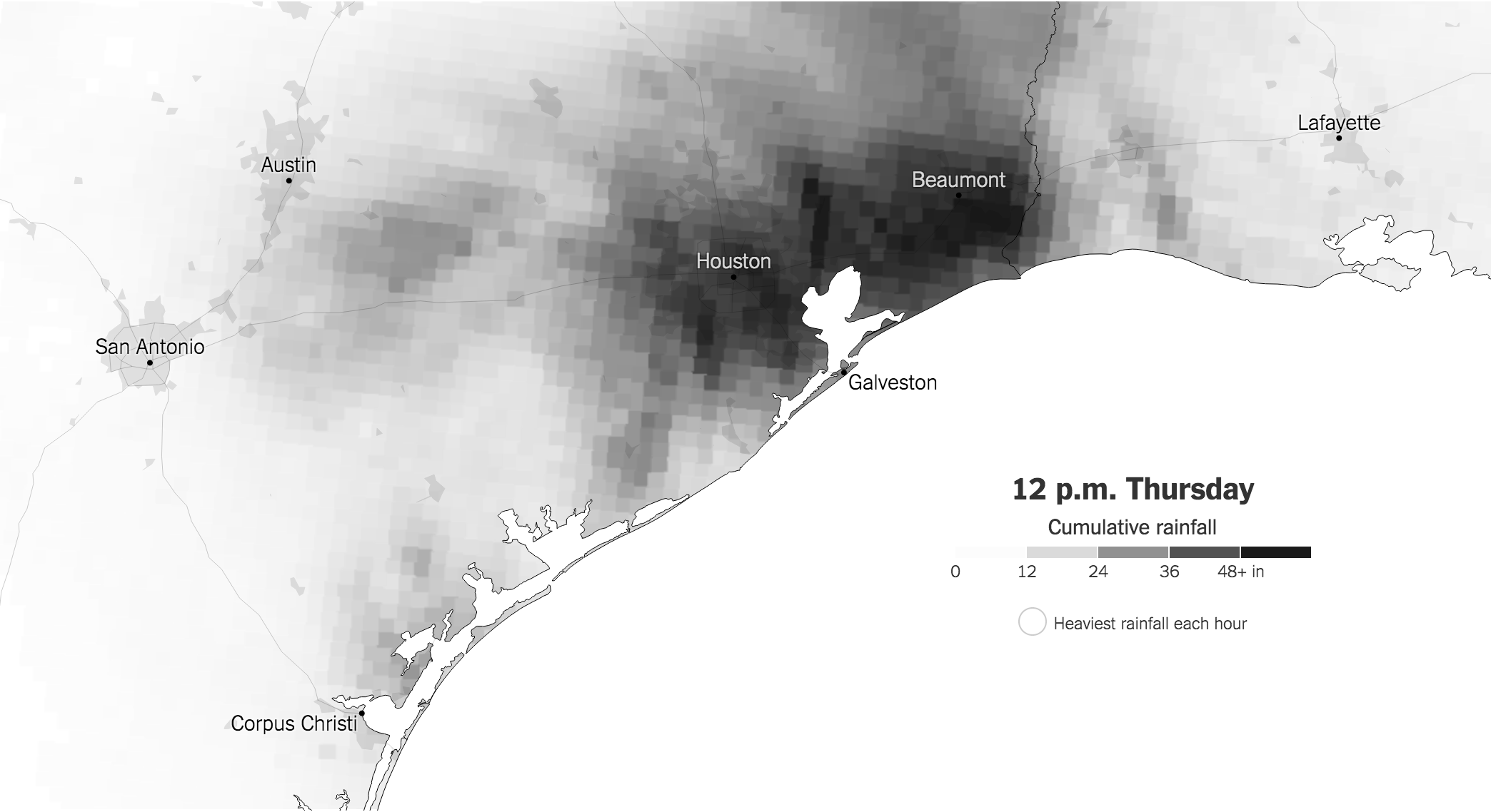
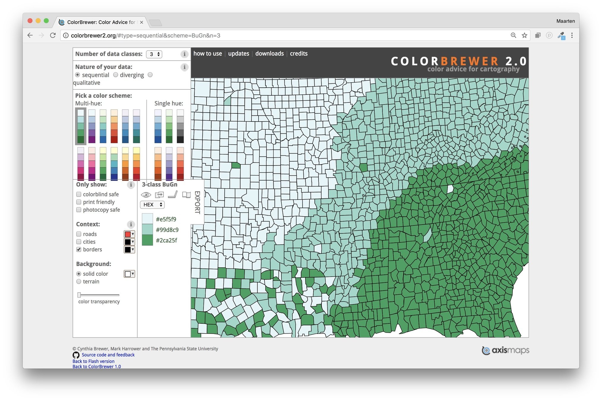
6. Use colors deliberately


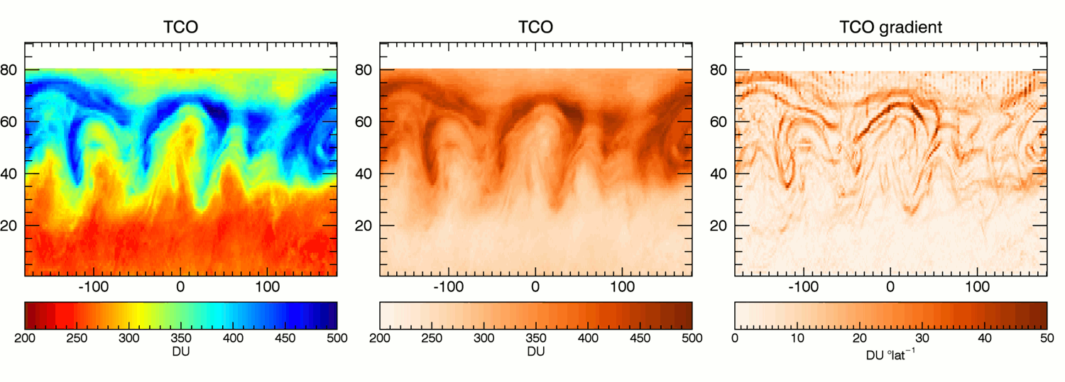
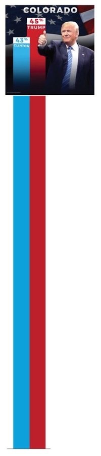
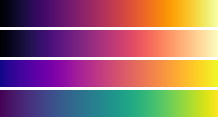
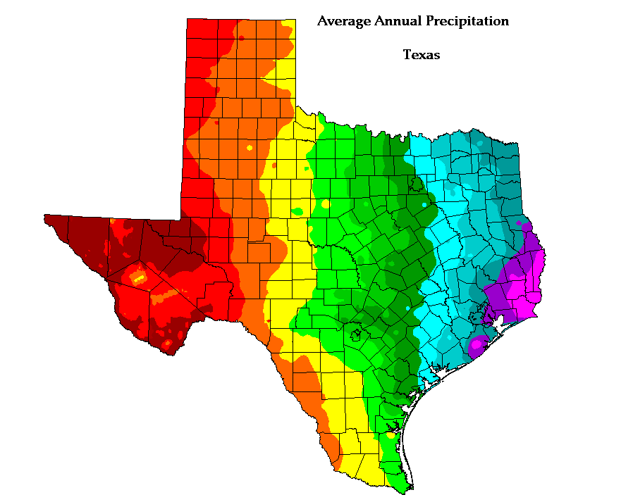
7. #Endrainbow


The annotation layer is the most important thing we do. Otherwise it's a case of here it is, you go figure it out.
Amanda Cox
New York Times


8. Tell the story
with a good title
(a little bit of) color
annotations
9. One chart, one message


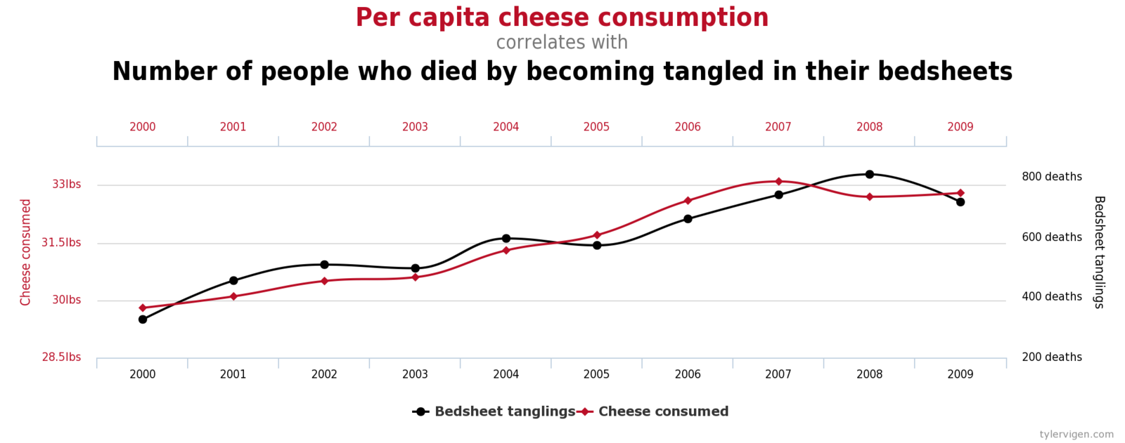
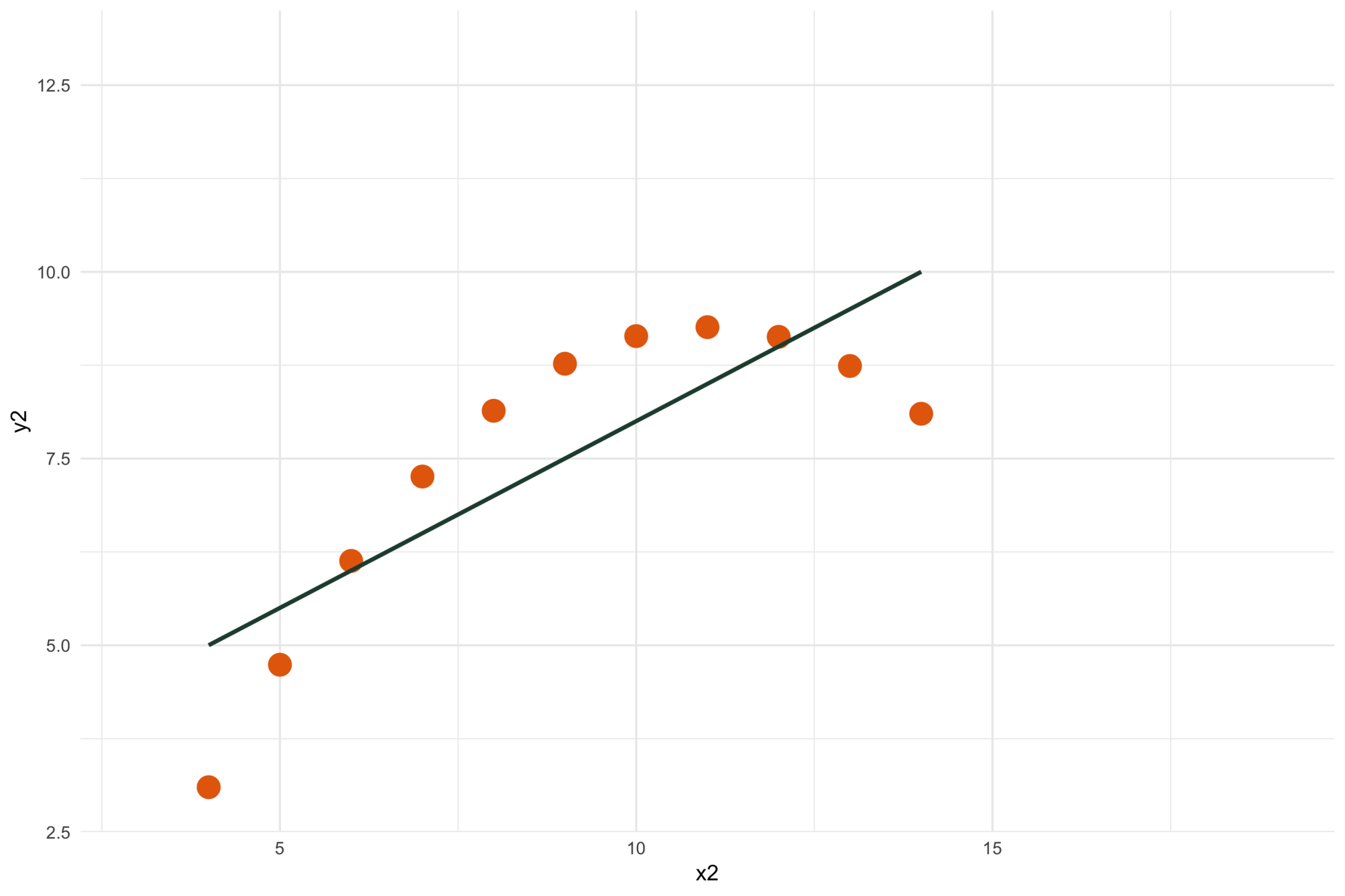
10. Double the axes, double the mischief
And correlation is not causation


11. Don't do 3D
Except when you're the New York Times
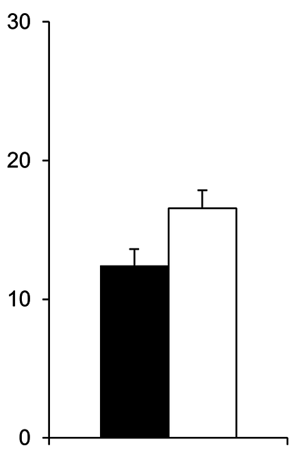
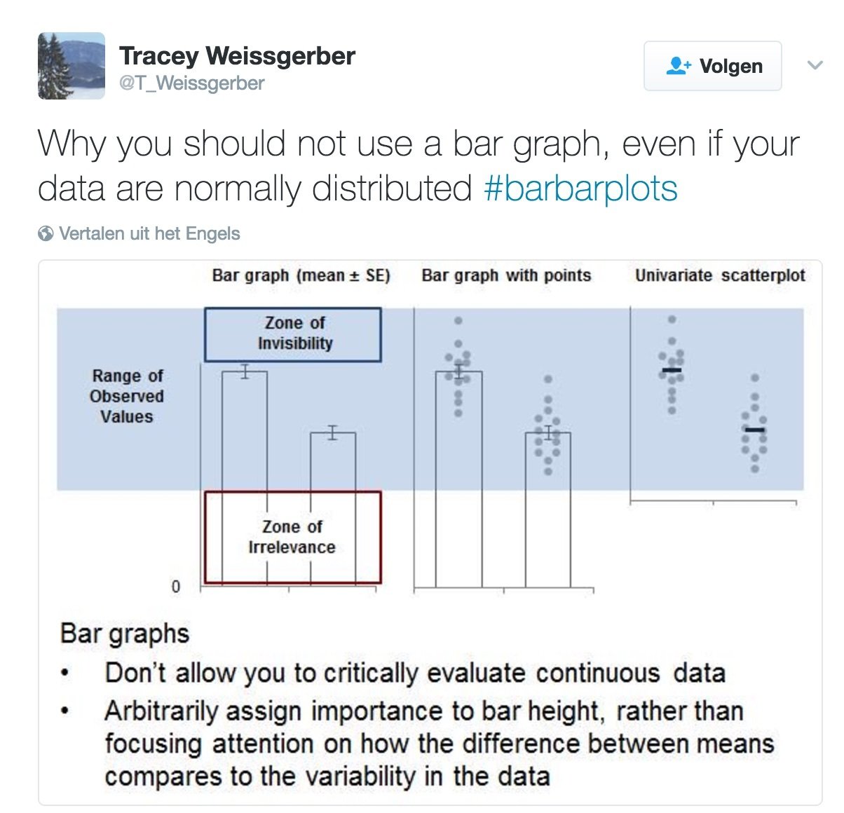
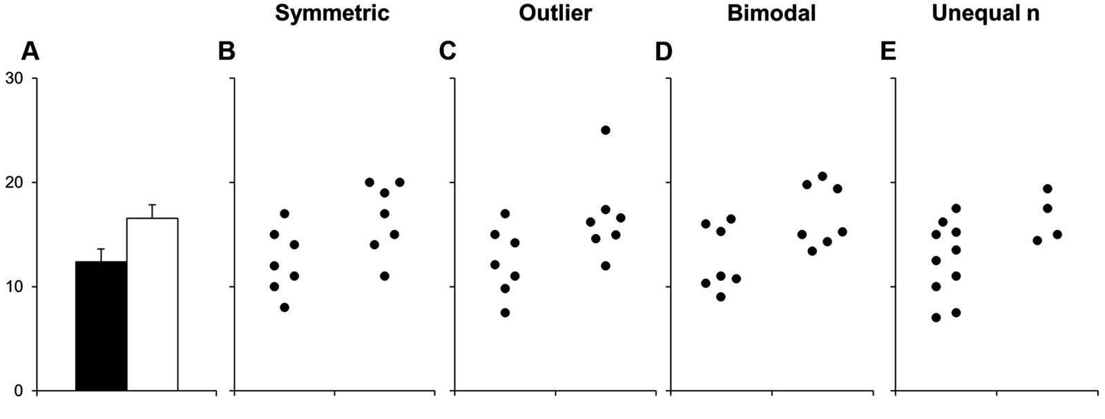
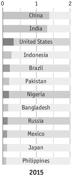
12. Avoid the Zones of Invisibility & Irrelevance
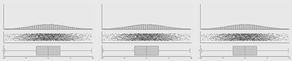
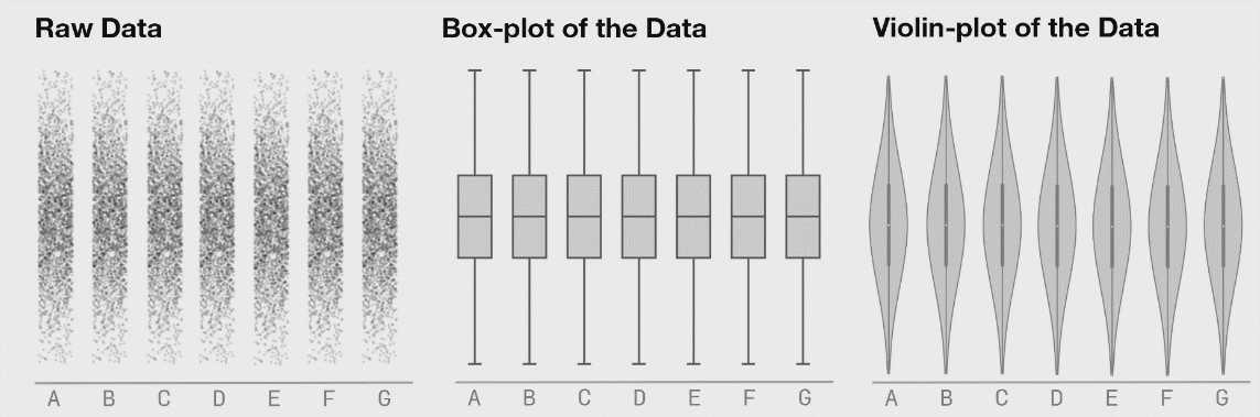
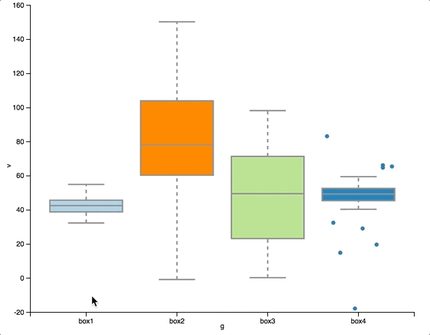
13. Explode your boxplots, show distributions


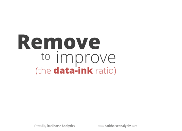
14. Avoid chart junk

Tools
Chart choosers
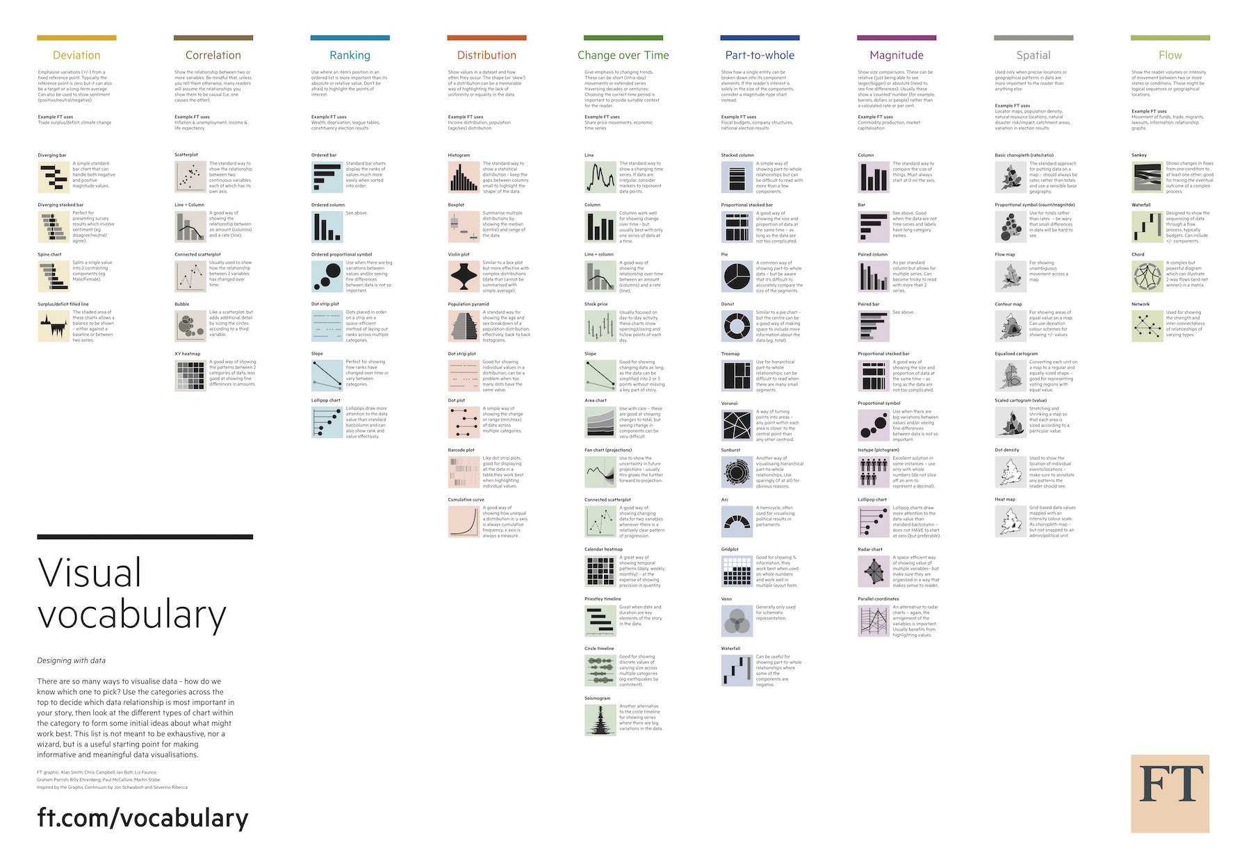
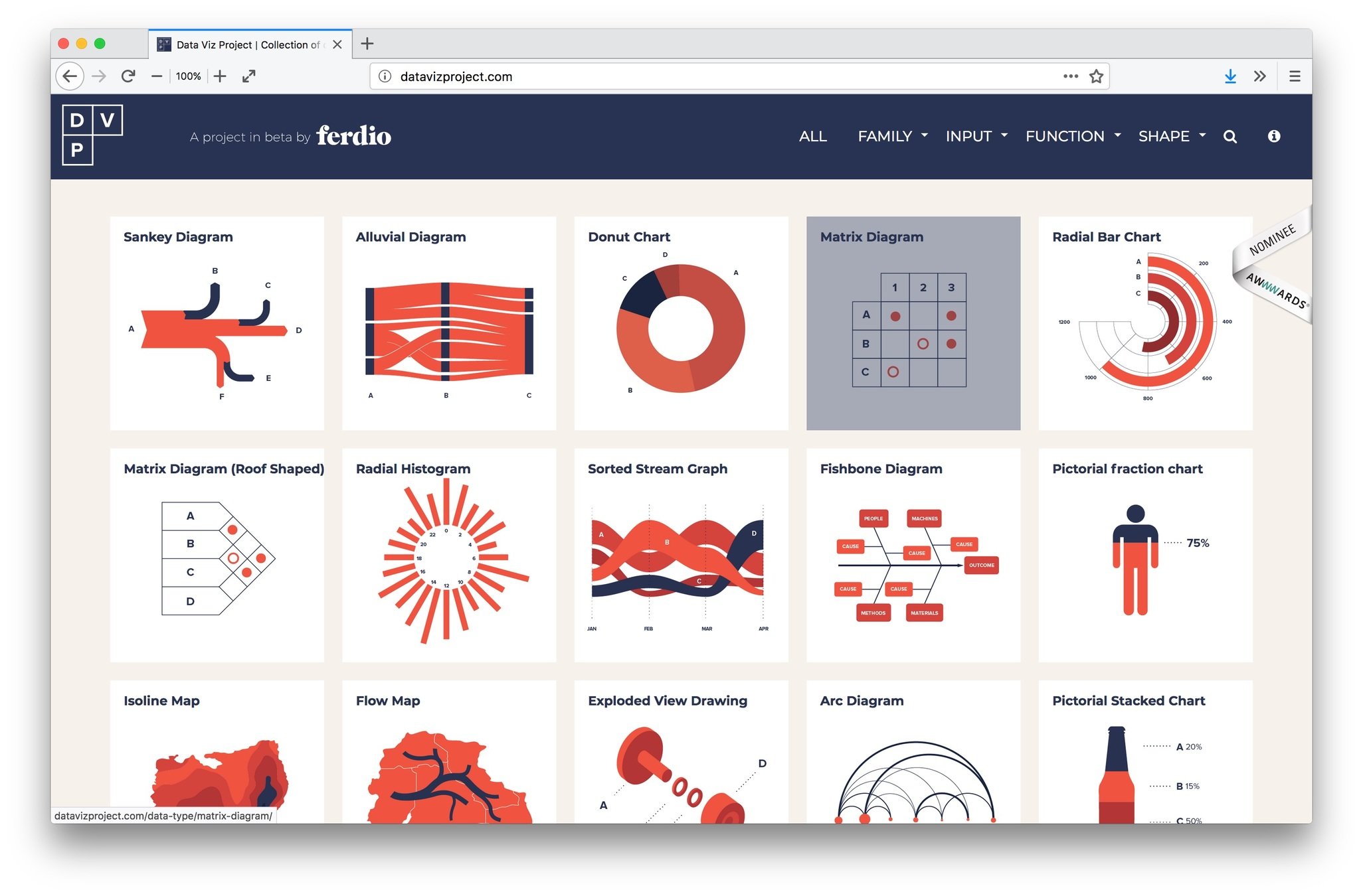
Chartmaker Directory

Make over
Evaluate a data visualisation, publication, poster, ... on:
-
storytelling
-
design
-
data visualisation
Think about/sketch improvements
Share & get feedback
Make over
Use the tools:
-
Message box
-
Visual Vocabulary
-
Data visualisation checklist