Pitfalls in datavisualisation
Brussels
4 March 2019
@maartenzam
Open Belgium
and how to overcome them
Maarten Lambrechts?
18 pitfalls in datavisualisation


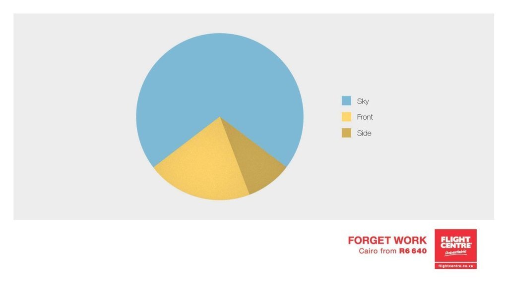

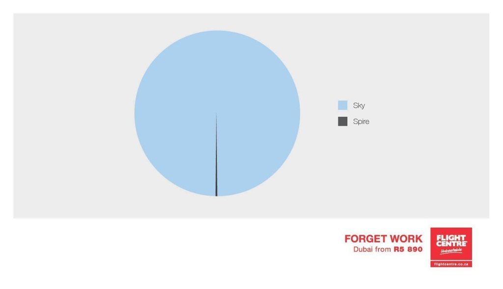


2. Don't cut bars


3. Don't cut time axes


4. Label directly


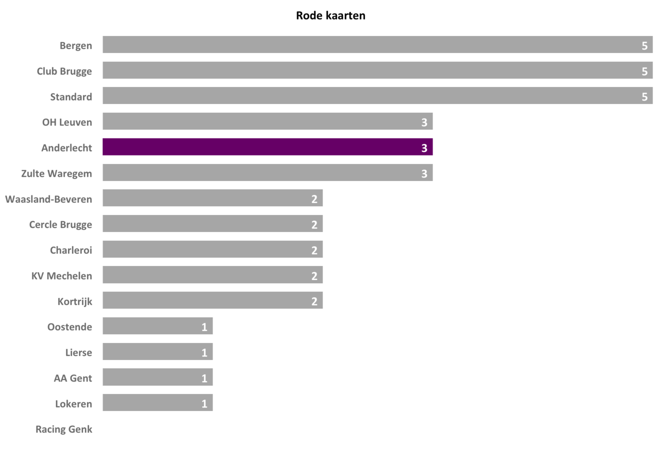
5. Use colors deliberately



6. Avoid chart junk


7. Scale circles by area, not by radius


8. Avoid double axes


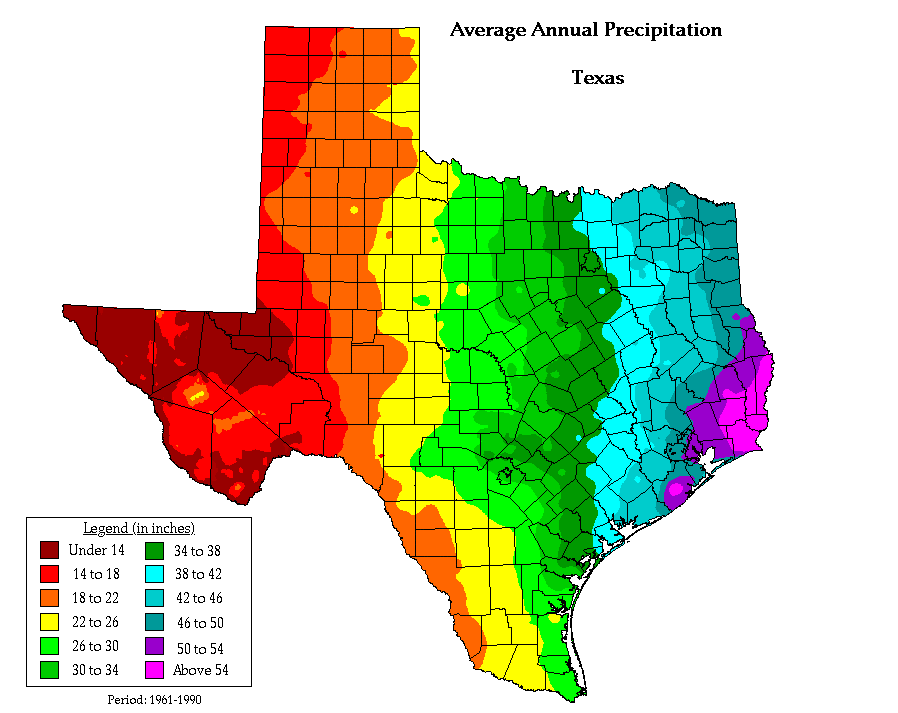
9. Correlation is not causality


10. Don't do 3D
Unless you are the New York Times
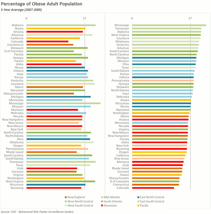
11. Sort on the data


12. Tell the story


13. 1 chart, 1 message


14. Use common scales on small multiples
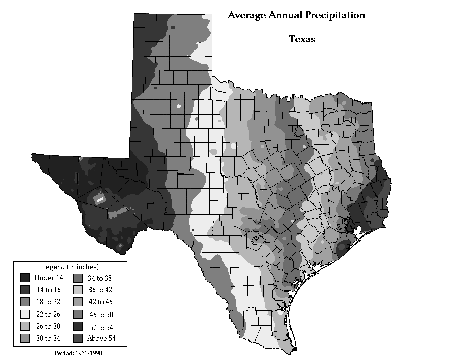
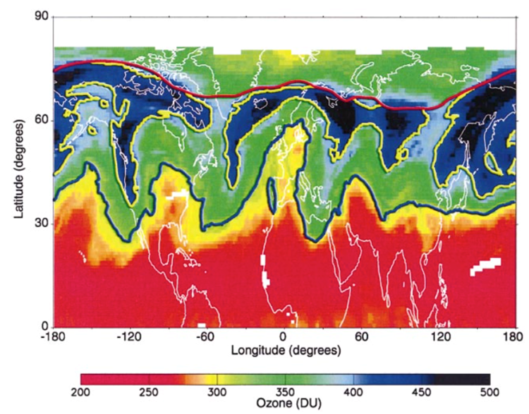
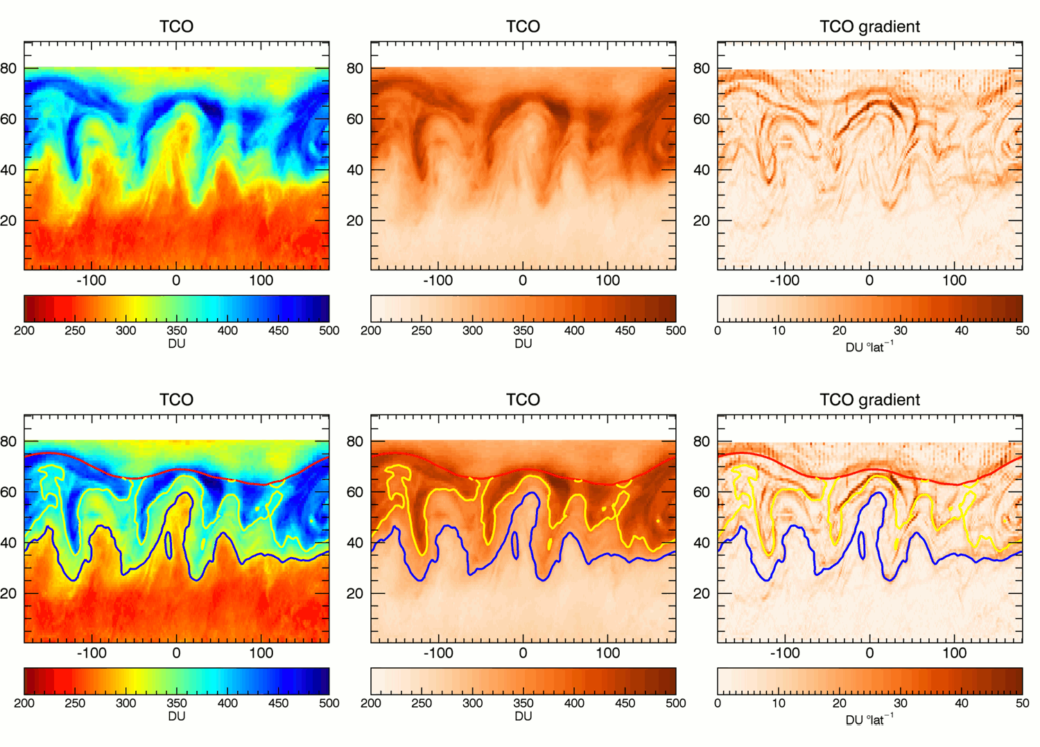
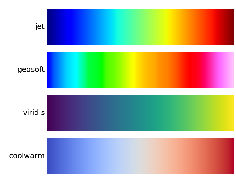
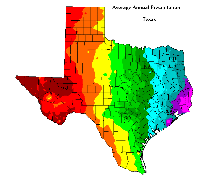
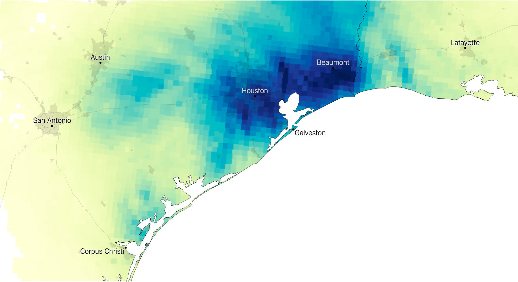
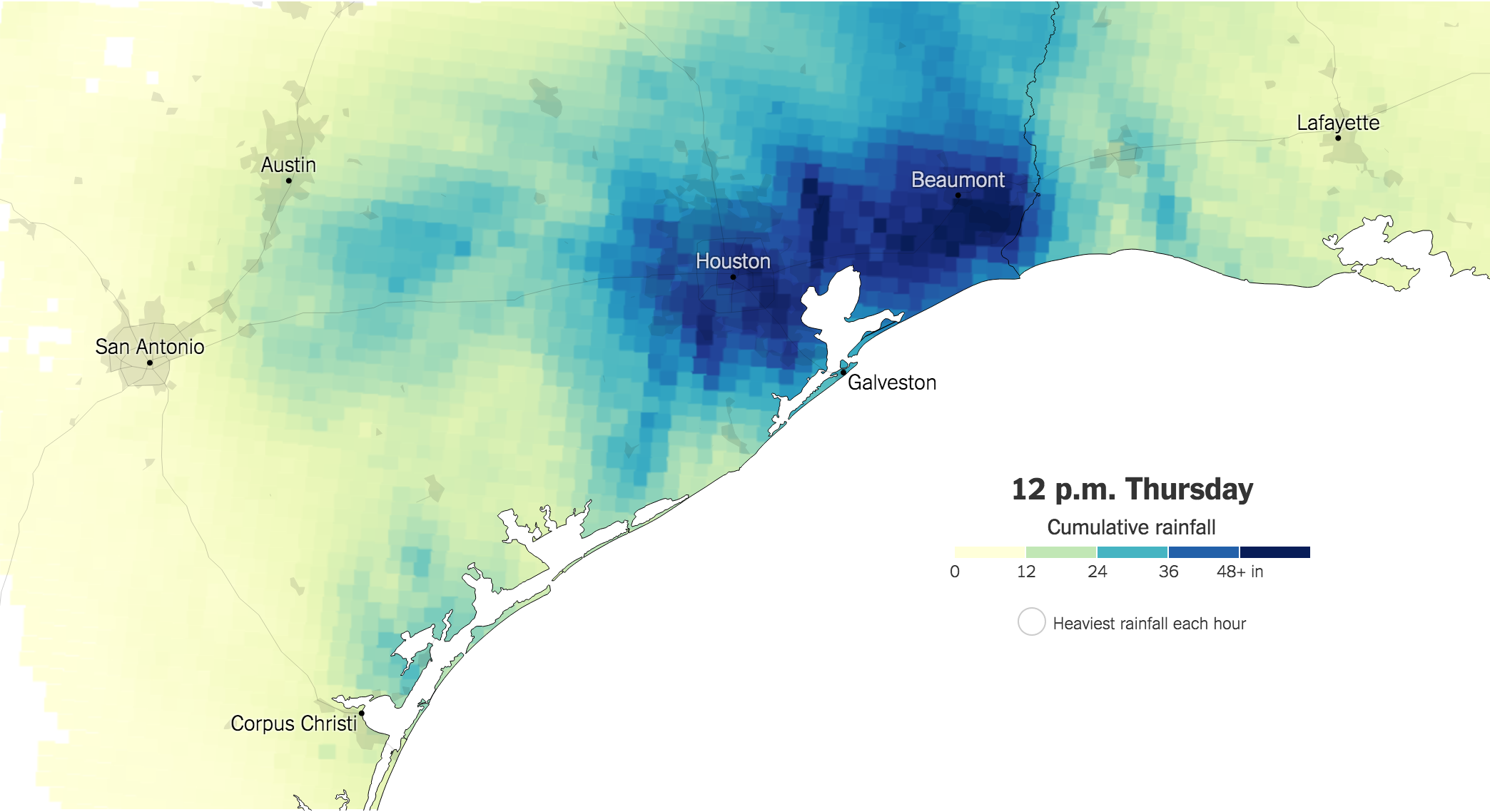
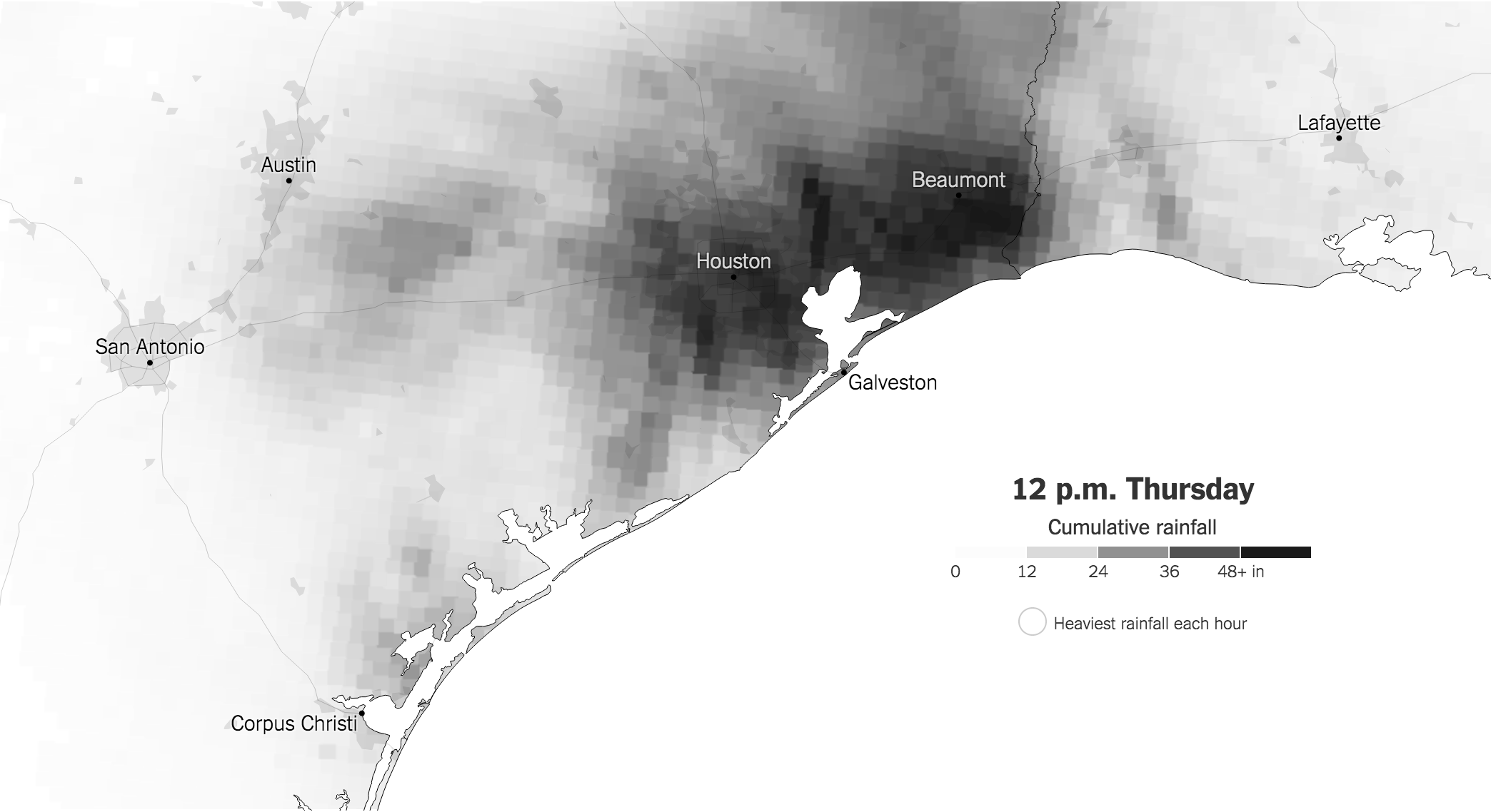
15. #EndRainbow


16. Normalise numbers on maps (per capita, ...)


17. Sometimes the best map is no map


18. All maps lie
Datavisualisation pitfalls
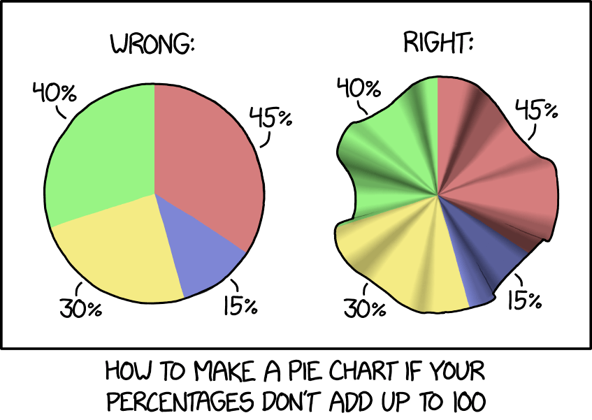
1. Save pies for dessert
2. Don't cut bars
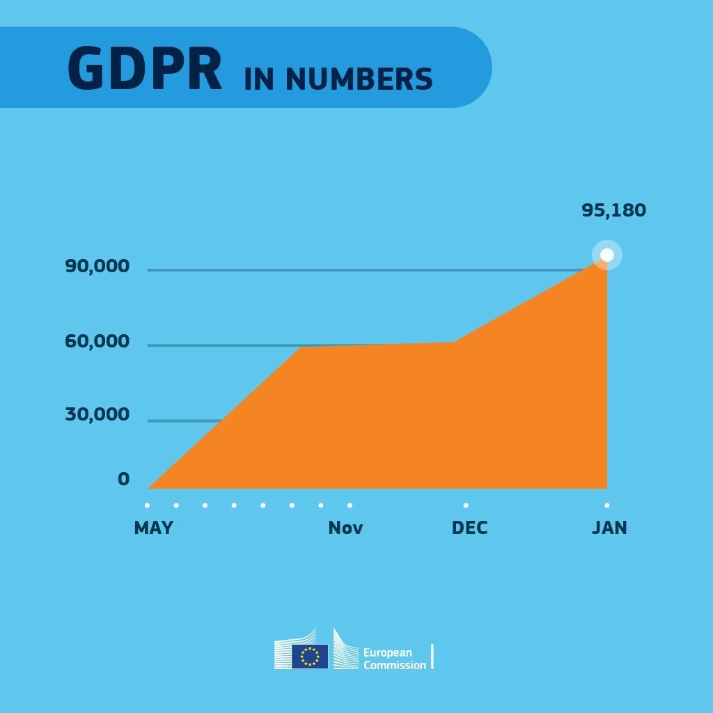
3. Don't cut time axes
4. Label directly
5. Use colors deliberately
6. Avoid chart junk
7. Scale circles by area
8. Avoid double axes
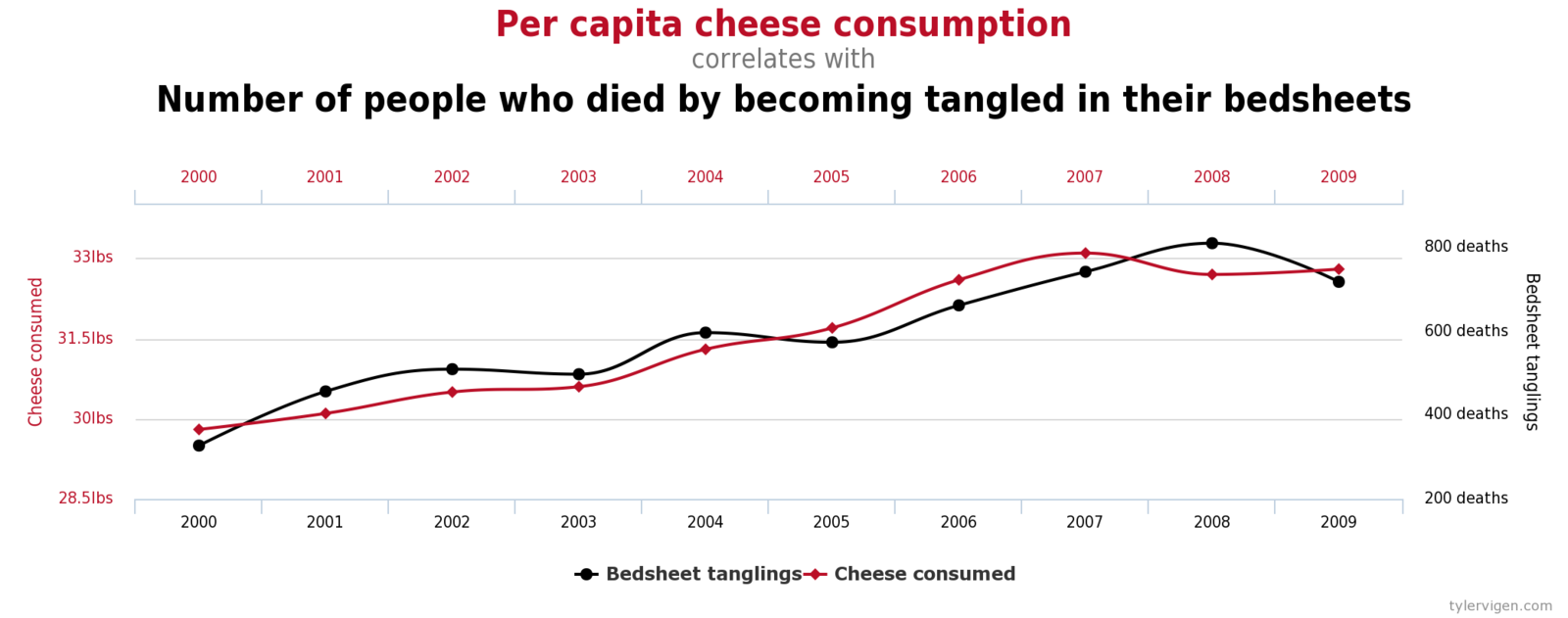
9. Correlation is no causality
10. Don't do 3D
11. Sort on the data
12. Tell the story
13. 1 chart, 1 message
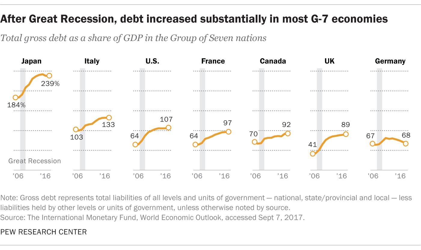
14. Common scales on small mult's
15. #Endrainbow
16. Normalise data on maps
17. Sometimes best map is no map
18. All maps lie
