Analysis of Digipak
By Madihah Hussain
Purpose of a Digipak
Digipak's are used to help promote the artist or brand. Certain aspects of the digipak/ CD cover have a similar aspect as to the music videos which are produced. For example the fonts used is used though out the whole digipak process which allows the artist to be easily recognised. It helps o promote an album, to list the content of the album,to make the CD eye-catching, to use the corporate identity of the artist/band as a recurring theme, to tell us something about the musician and the music behind it, to use art and images to express a message, to store additional promotional materials e.g sleeves within the digipak could includebooklets and posters, to attract not only fans of the music, but also a wider audience.
Use of synergy:

Trademarks:


Trademarks are what make an artist unique and original. Foxes style is very original, her hair is the reason why. In most of her music videos, her hair is shown the same way (curtain style fringe) this makes her recognisable worldwide. Also the type of make up she wears, and how she wears it make her stand out. Think mascara that highlight her eyes, and light pink lipstick; helps her to have an original look as an artist.
Album cover:


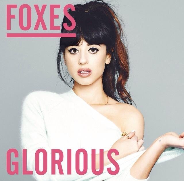
Glorious (Signed Deluxe Album)
Album cover ANALYSIS:
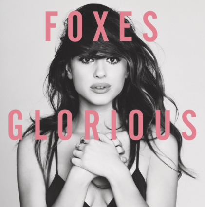
This is the standard CD cover. Immediately, you can tell that it's really simple, however it looks effective. A mid shot is taken of the artists, which is in black and white. This contrast with the pink coloured font which is positioned on top of the images; 'Foxes' is displayed on her forehead and 'Glorious' is displayed on her shoulders. The album cover looks simple and stylish, as most albums covers tend to have simple imagery and fonts that stand out. The typeface is evenly distributed, and the use of colour outs forward a female target audience. The font is used though out the album, and also her official website which creates brand and makes her easily recognisable.
Album cover ANALYSIS:
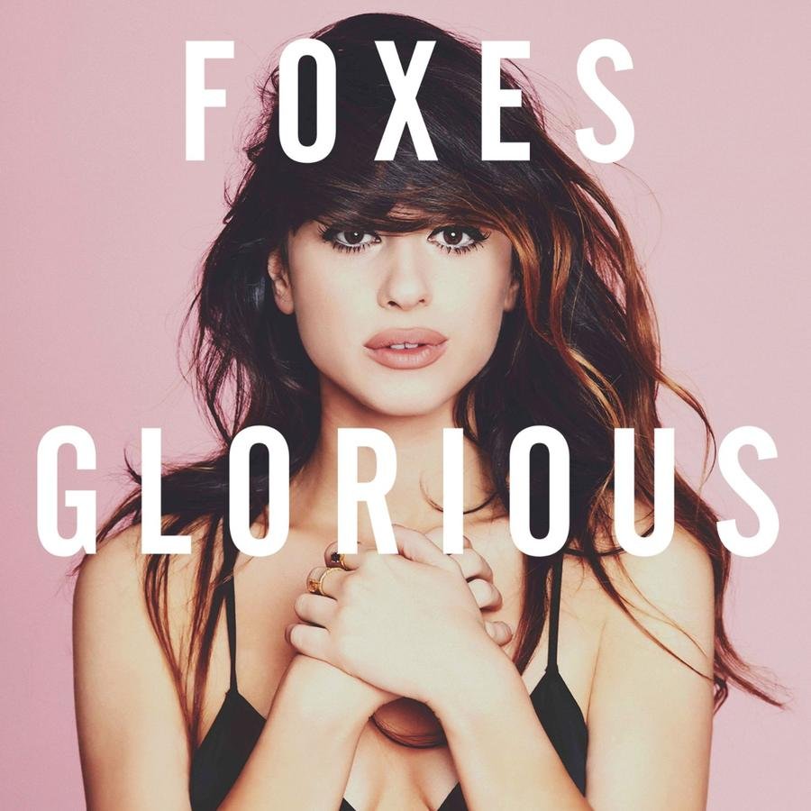
This is GLORIOUS (SIGNED DELUXE ALBUM) which is an extended vision of the album which is also signed by foxes. In terms of the album cover, the imagery used is the same, as well as the font. However everything is inverted. From black and white image of the artist, it has changed to colour, and from the coloured typeface, it has changed to white. They did this so the consumers know the distinction between the standard album and the deluxe album.
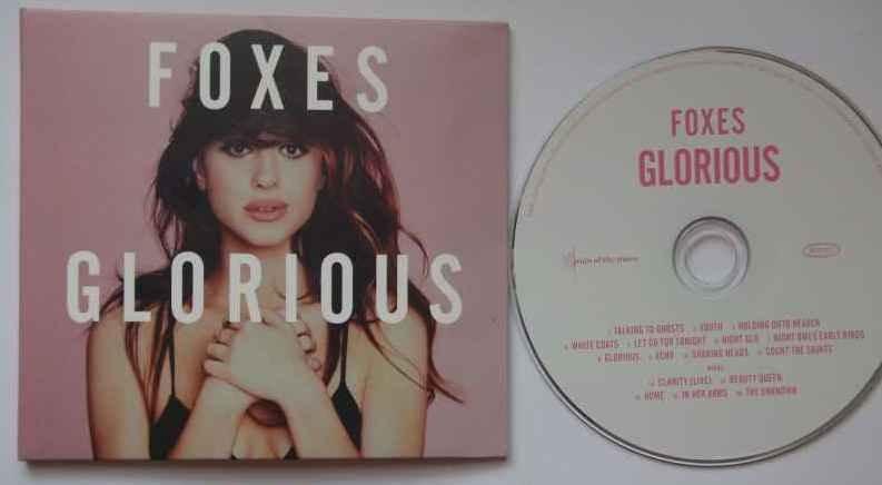
Digipak ANALYSIS:
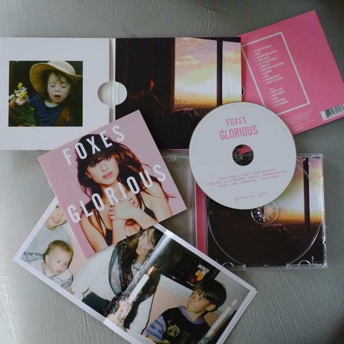
The inside of the album, theirs imagery of possibly the artists life or childhood. It could represent her memories; or in fact her songs could represent her life as she got older. When looking at the actual CD, it's white and pink; again attracting an female audience, and the same font is used though out. The album name is highlighted in bold and in larger scale compared to the artists name. This is to promote the album name, and get it trending. When analysing the back of the album cover, you can see that the same simple technique is use,d as well as the typeface and colour scheme. This allows the audience to identify with the audience. The format of the album cover and back, is the use of grids to help lay out the imagery and font. (De Stijl movement.)
Promotional pictures:


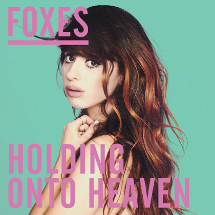

As well as the album, there have been promotional pictures with the title of the song. The colours used is simple and suitable for a female audience. The font used is the same, but in different colours, and the artists name is in the same position each time.