Intro to Maps
Import the cleaned crewlist data to Tableau by connecting to Text file
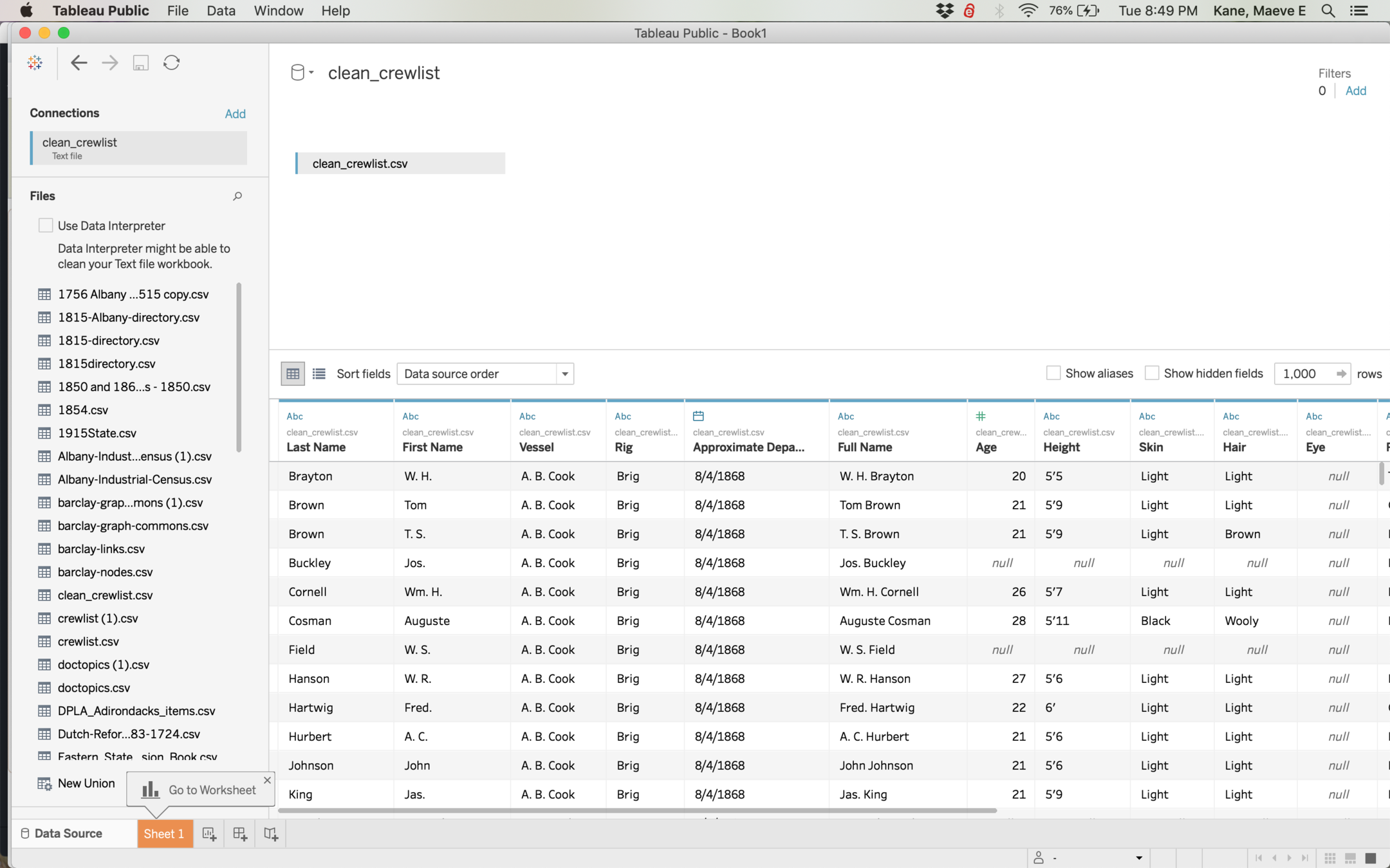
The preview shows that your data is imported correctly, but we don't do any editing here.
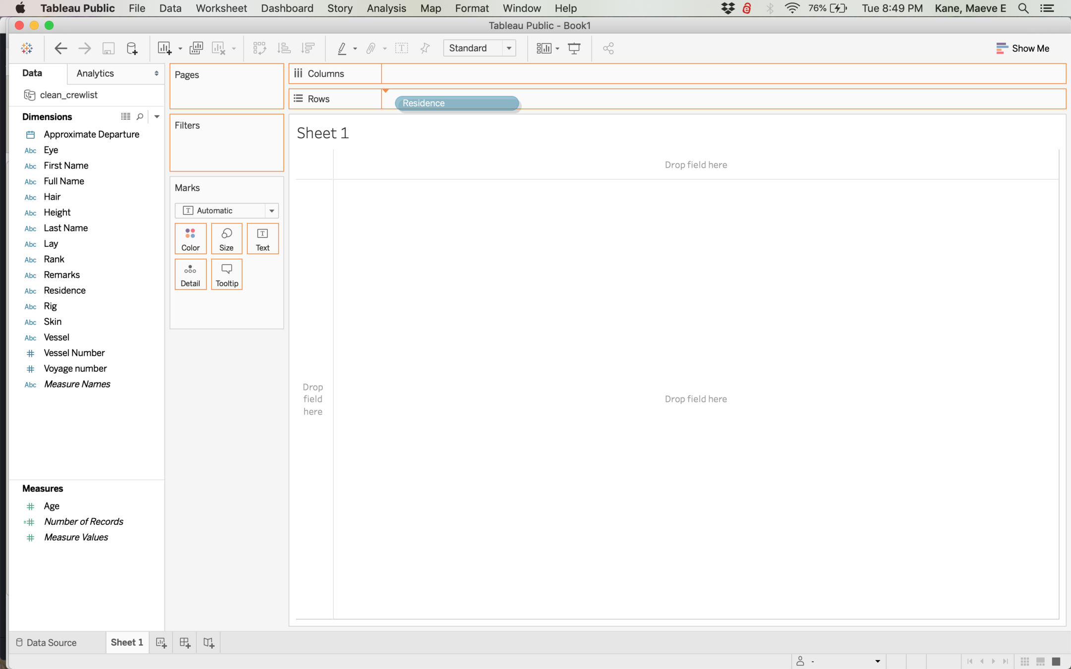
Tableau has a drag and drop interface. Your column names are grouped by their data type: dimension vs measure. A dimension usually can't be added up, a measure can.
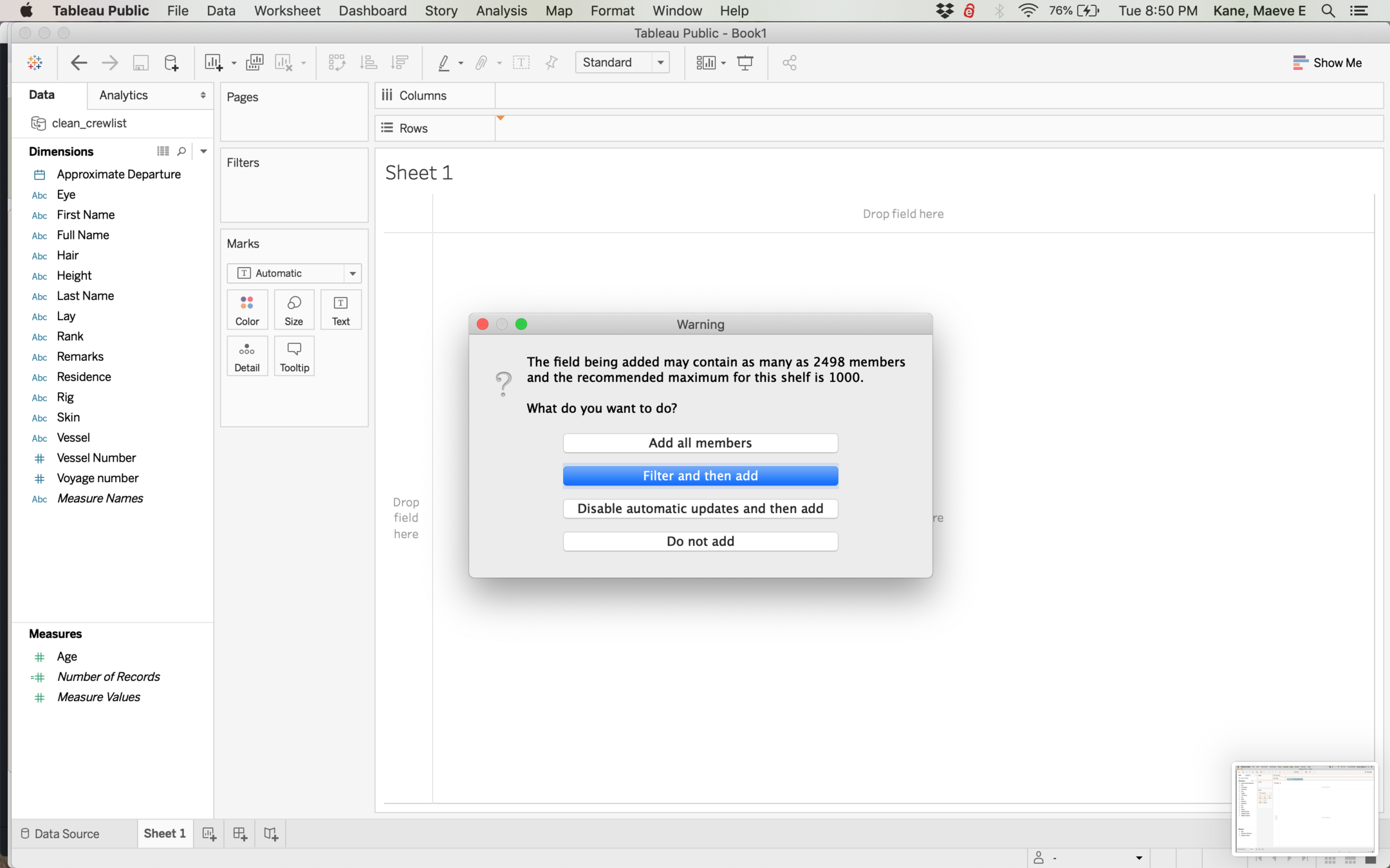
If you have a lot of different values in your category, Tableau will ask if you want to filter, but you don't have to filter. For now, drag City over to columns and add all, then drag Number of Records over to rows.
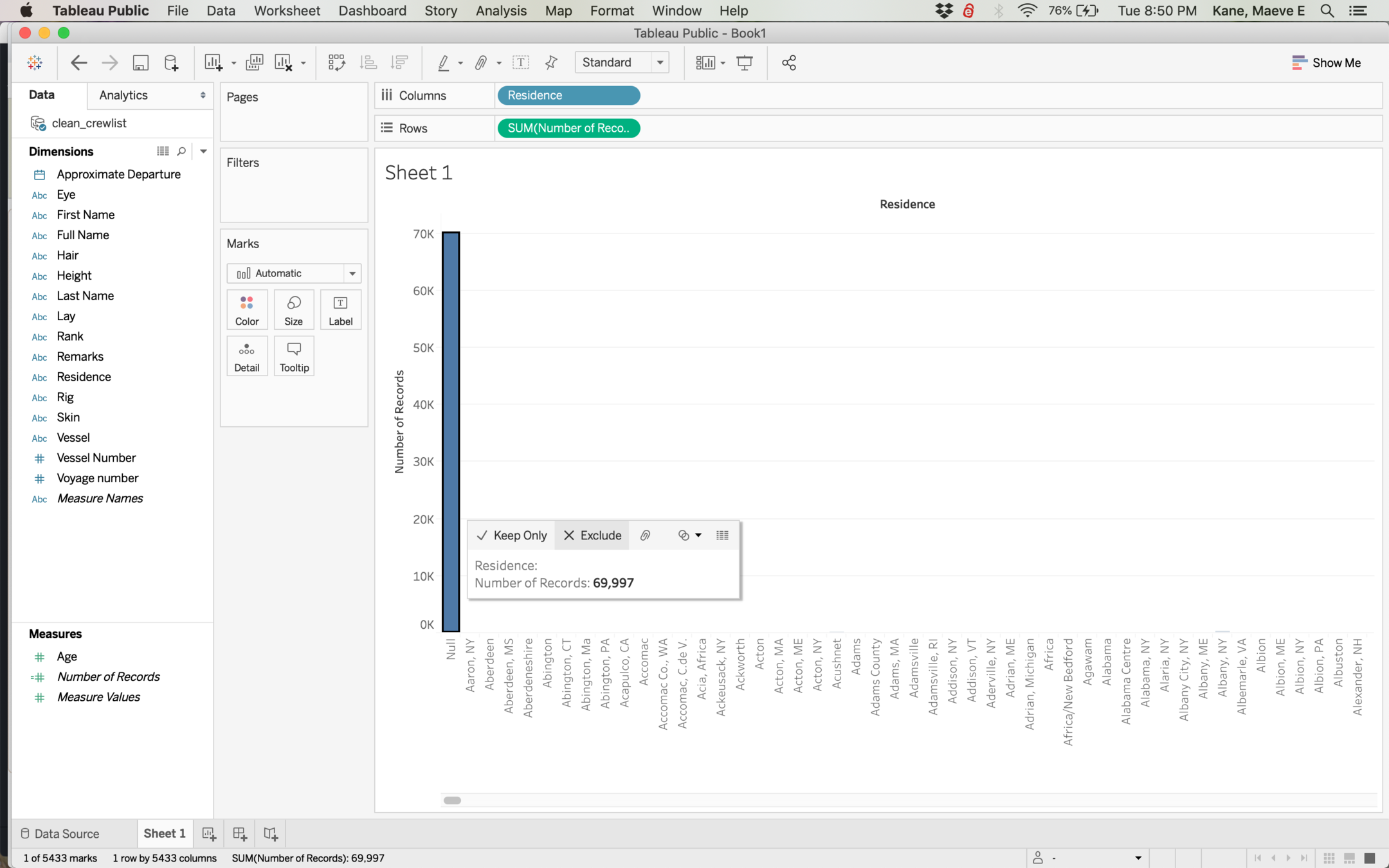
Sometimes we need to get rid of records with no value. You could do this at the filter step, or you can do it visually by clicking the Null column, then selecting exclude.
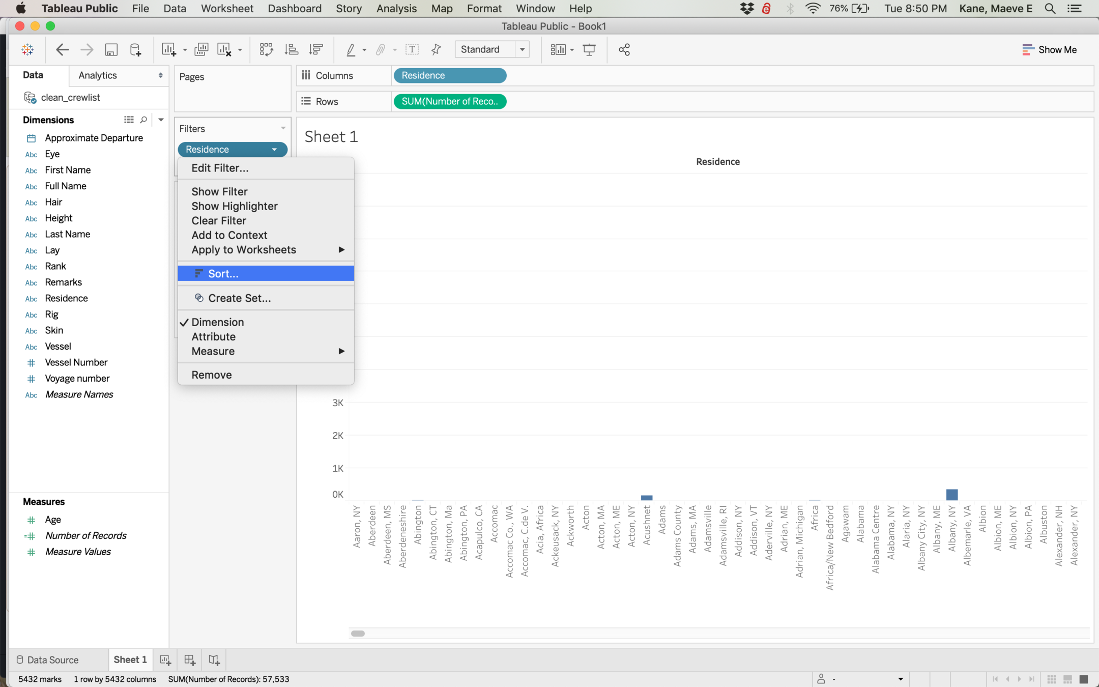
Filters work in Tableau like spreadsheet filters or OpenRefine facets. Let's sort City by clicking the down arrow on the filter pill.

You can sort one field by another field (for example, we could sort cities by state), but for now let's just sort by number of records.
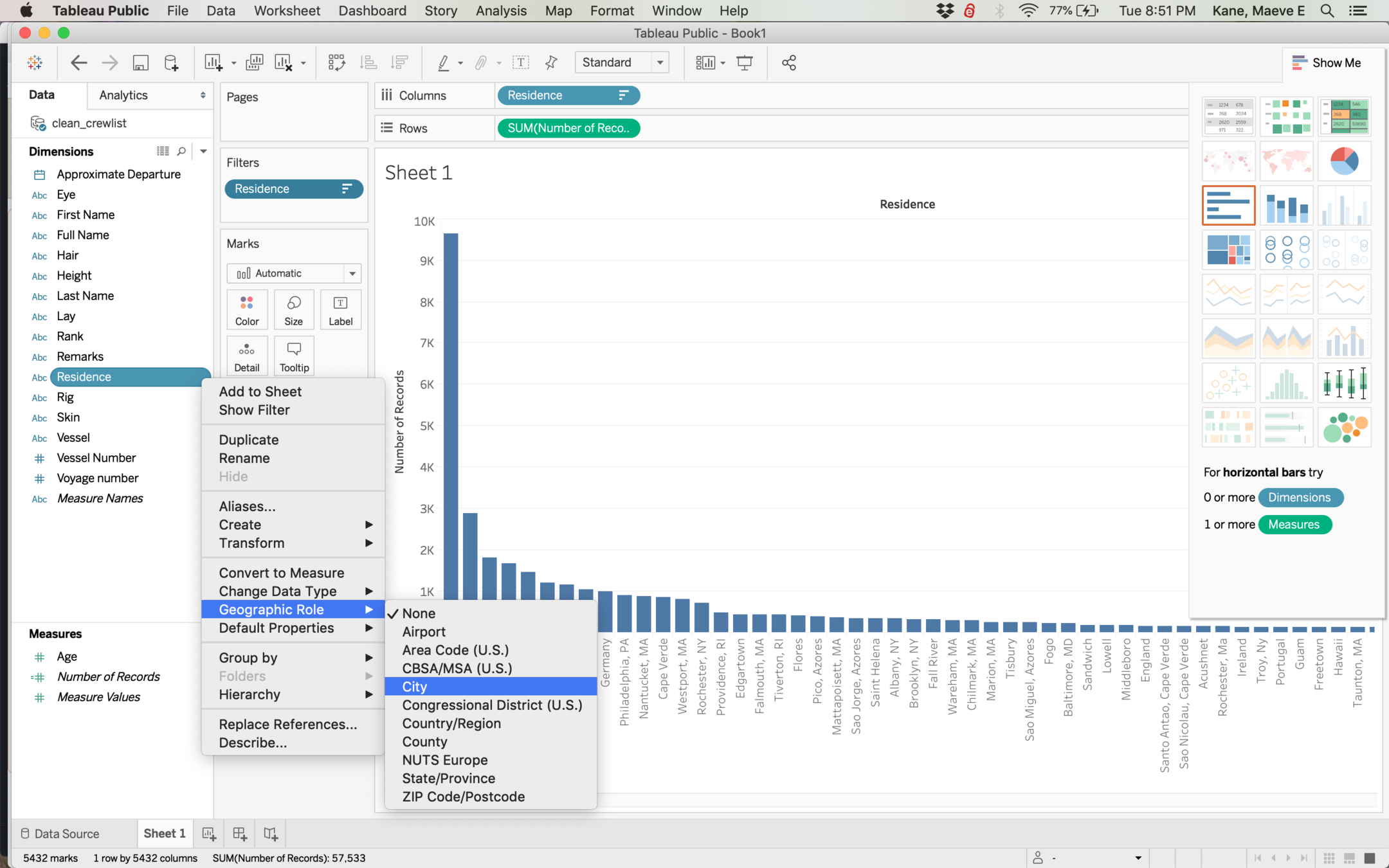
Sometimes Tableau doesn't recognize something as geographic if it has a non-standard name, so we might have to tell Tableau what geographic level our data is.
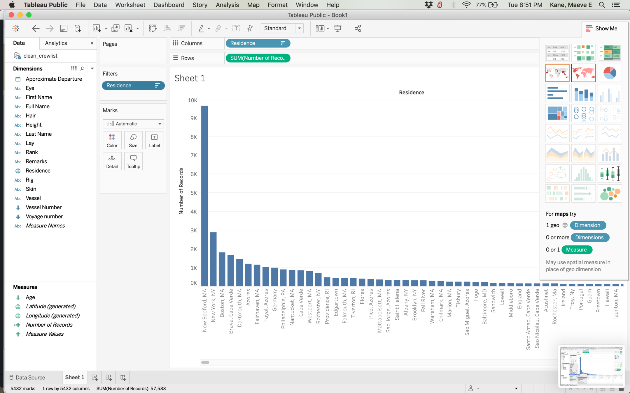
Tableau can make several different kinds of visualizations, and the show me tab can be toggled on and off. If you hover a type, it will tell you what kinds of data it needs. Clicking will reshape your data if it is the correct type.
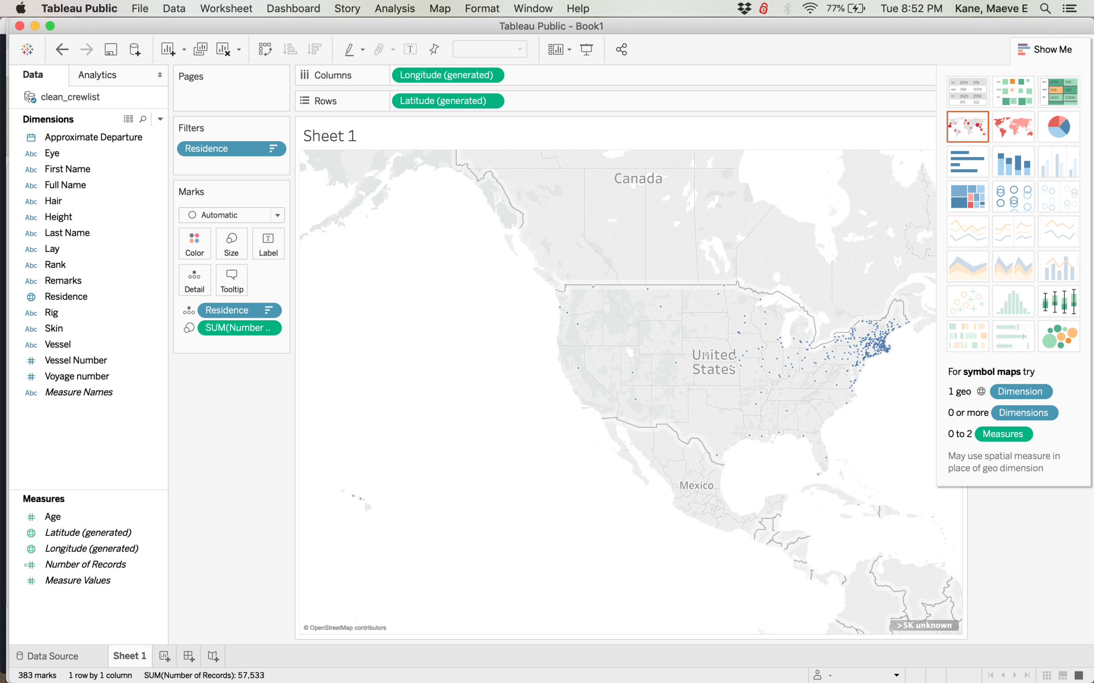
Tableau can do two types of map: points and polygons (or shapes). Let's select points on the left.
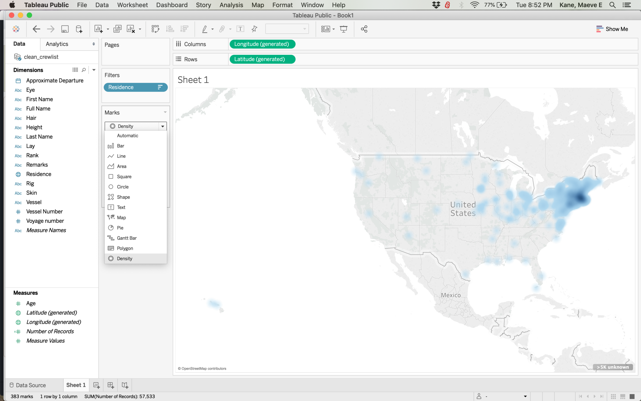
For very dense data, we might want a density or heatmap to better see where our data is concentrated.
Let's start a new project with the 1815 City directory of Albany. Make a map by dragging Latitude to Columns and Longitude to Rows. Note: Do NOT grab the Latitude (generated) item.
Doubleclick the points map to make a map instead of a chart.
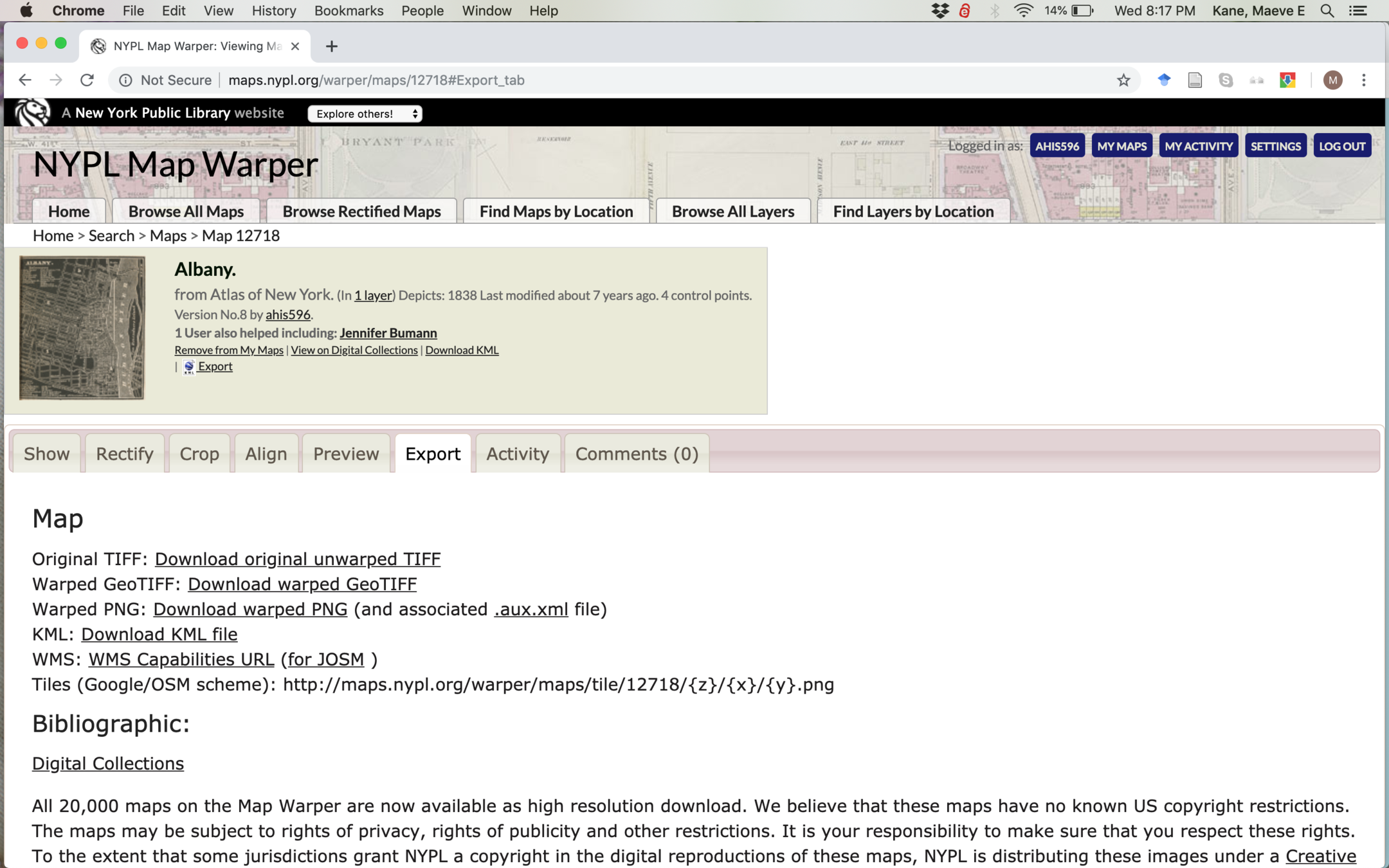
We can add rectified maps to Tableau by grabbing their WMS URL. Right-click to copy the link address (not "for JOSM").
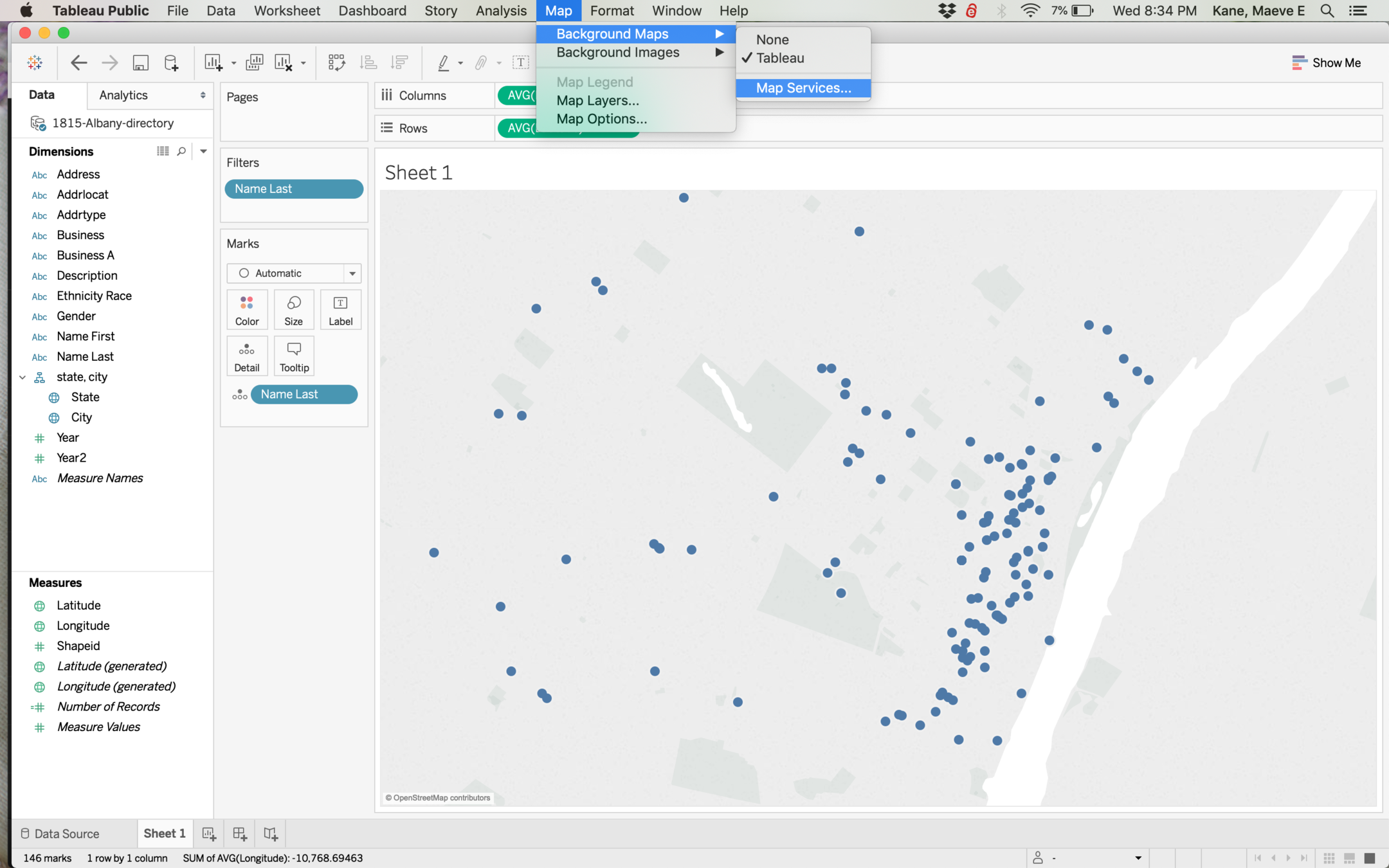
To add this, we go Map > Background Maps > Map Services
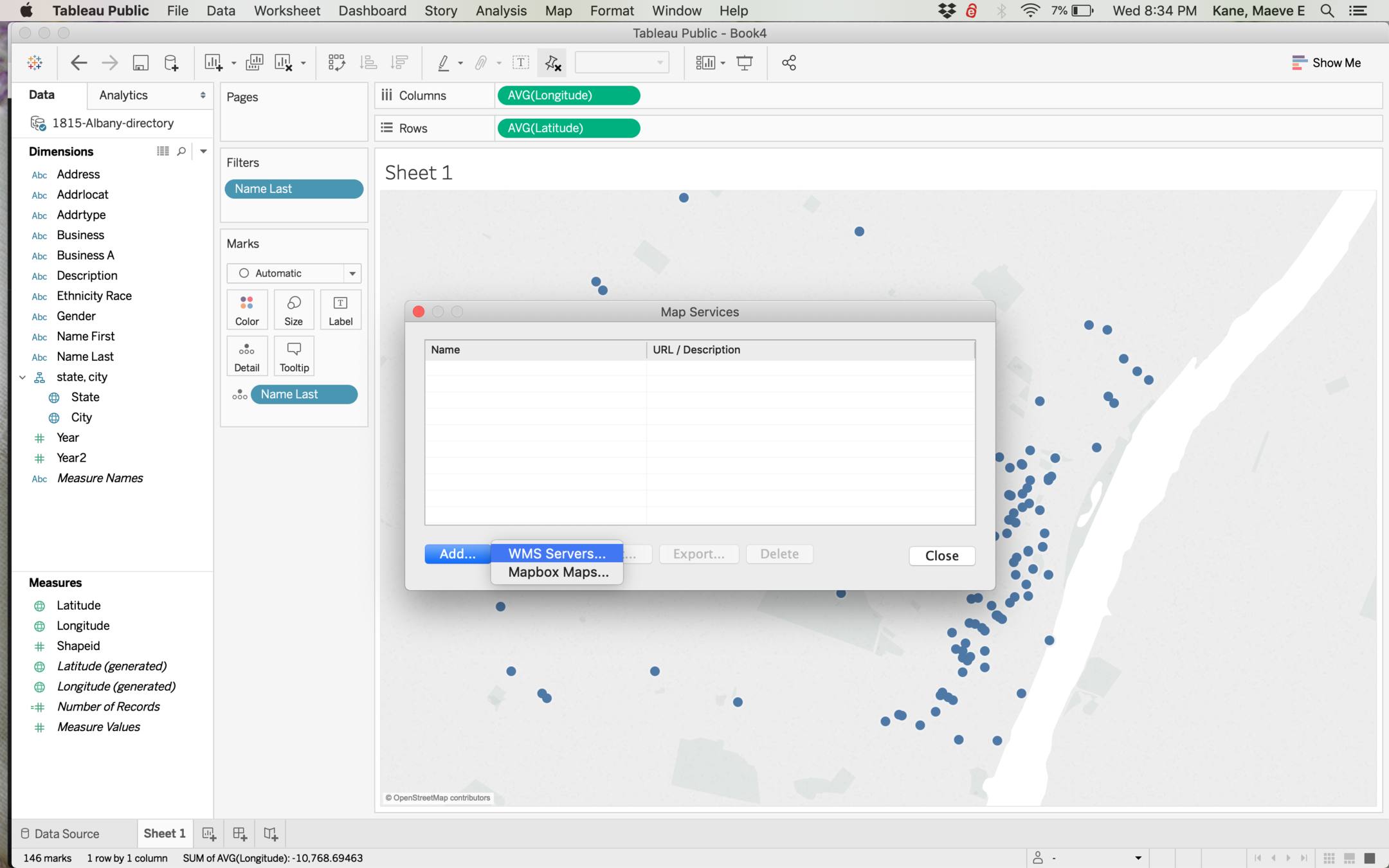
We're adding a connection to a WMS Server, so we select that and paste our URL into the popup box, then click add and close.
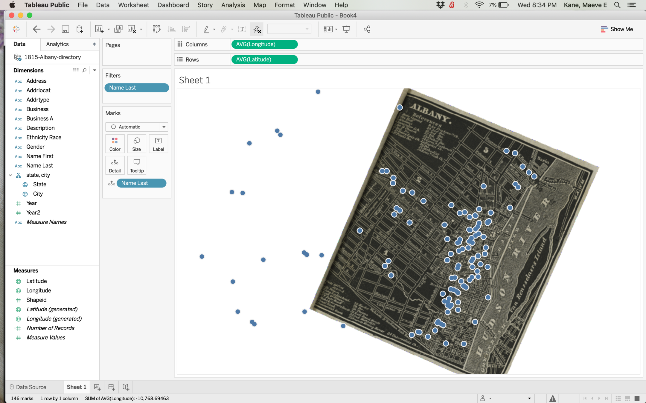
Our historic map will be added in its correct geographic orientation, but unfortunately can't be paired with another map layer underneath it. You can turn this off with Map > Tableau.
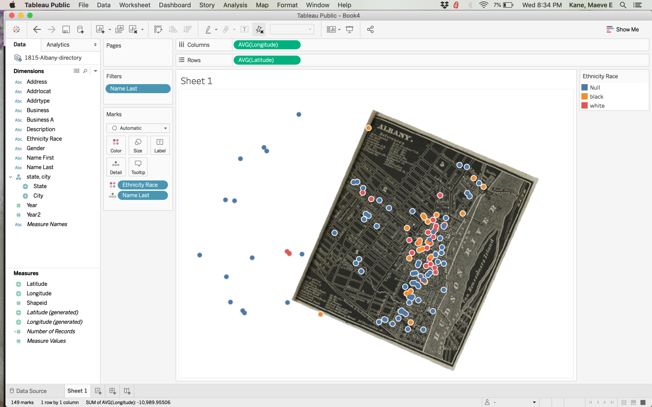
Our points can be styled by dragging any other attribute to color or size.