Intro to Gephi
We're going to start with a simple network of whaling vessels and the residence of their crew members.
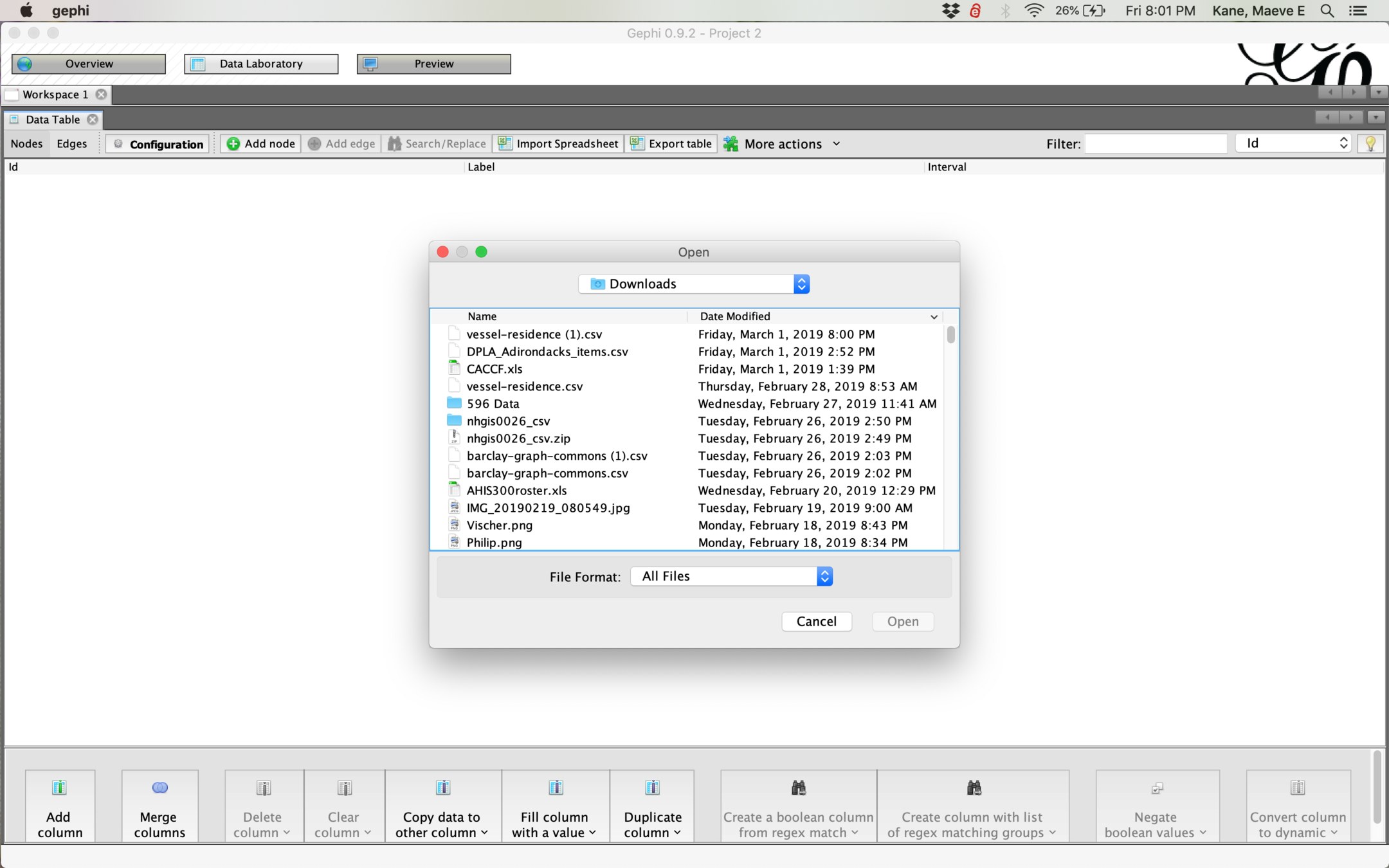
To start a new project in Gephi, open Data Laboratory > Import Spreadsheet and find your csv file.
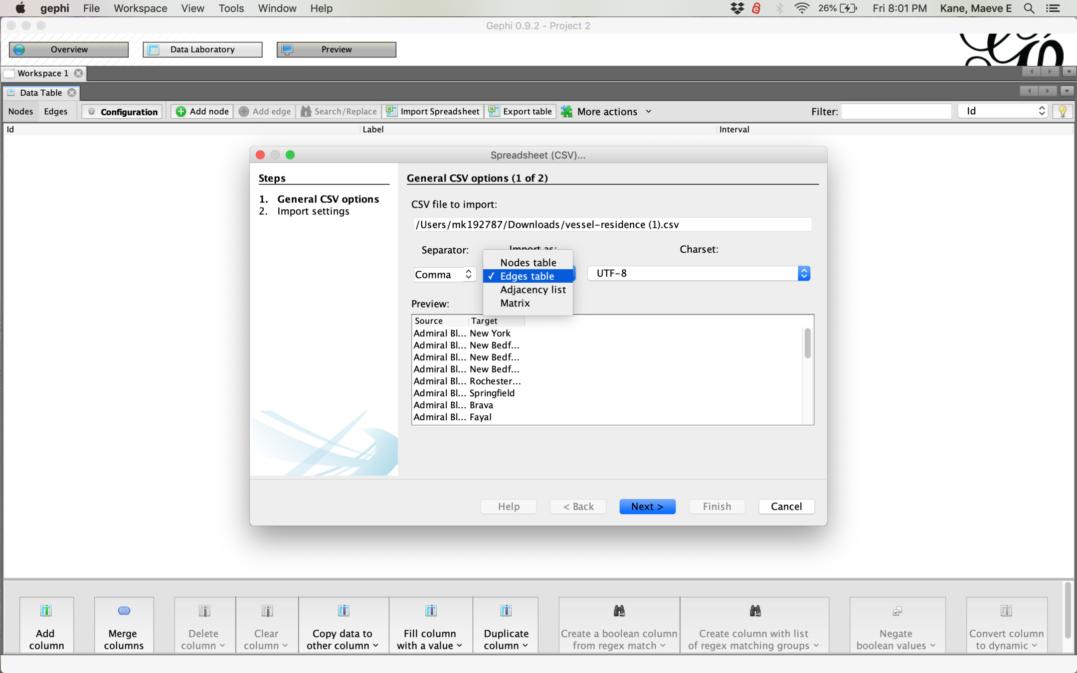
If your csv has a Source and Target column header, Gephi should automatically import it as an edges table, but if not, you can tell Gephi what your csv is.
If your csv already has Source and Target column headers, you shouldn't need to change any of the import settings.
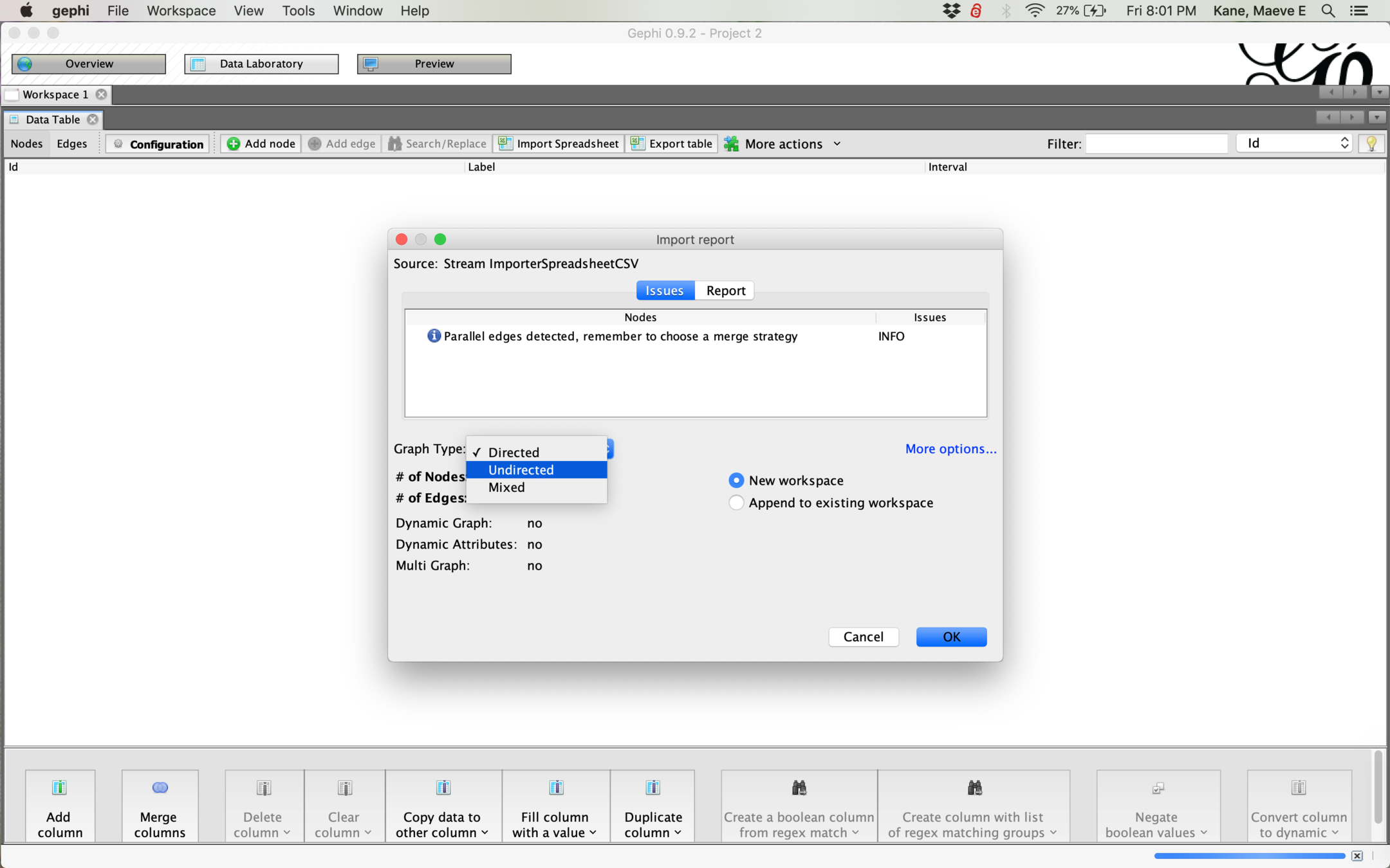
For most networks you want to have an undirected graph, and you will need to change this setting. Having a directed graph will affect your analysis!
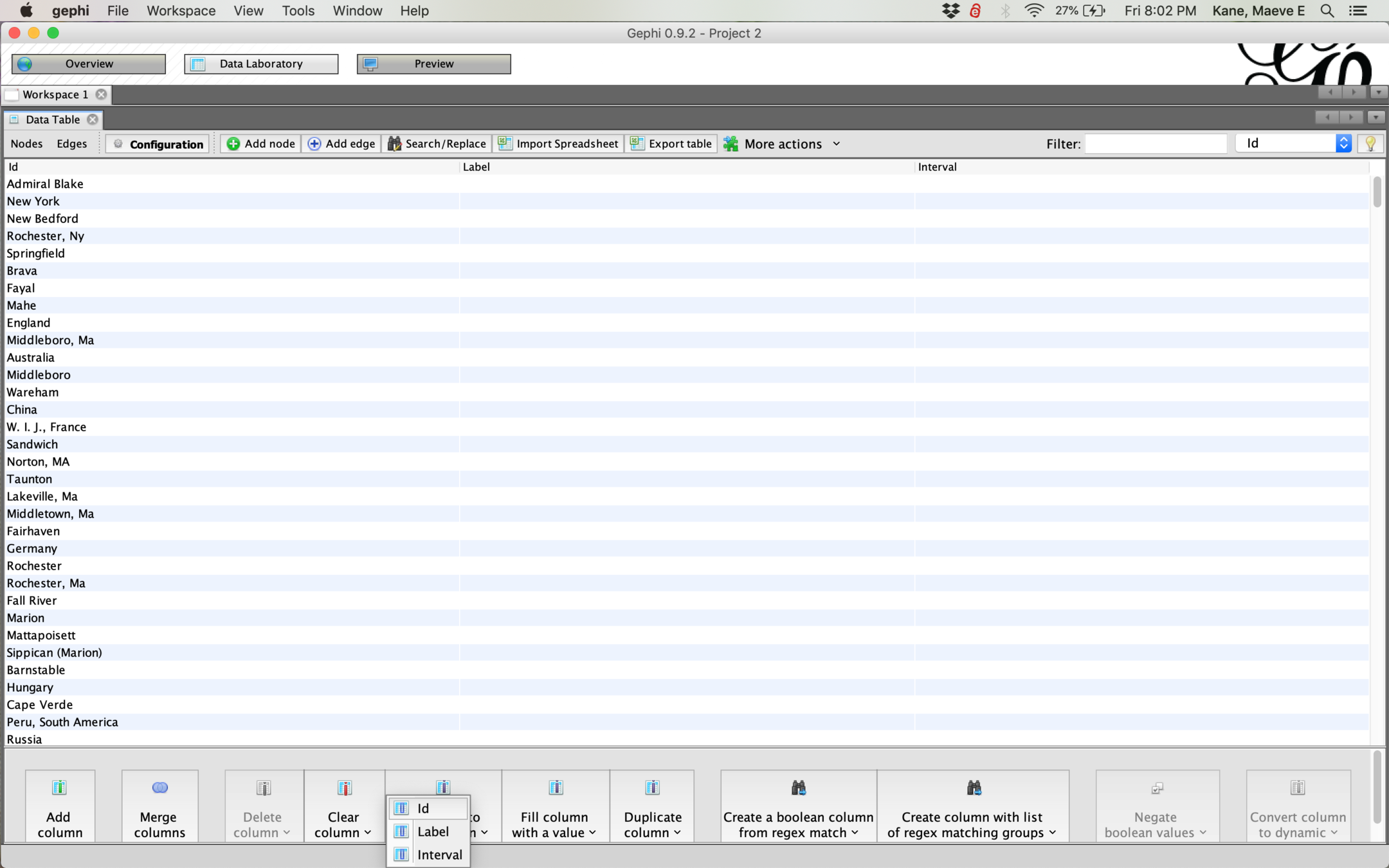
By default, our nodes won't have text labels. To give them labels, in the data laboratory pane, click "Copy data to other column" and select ID
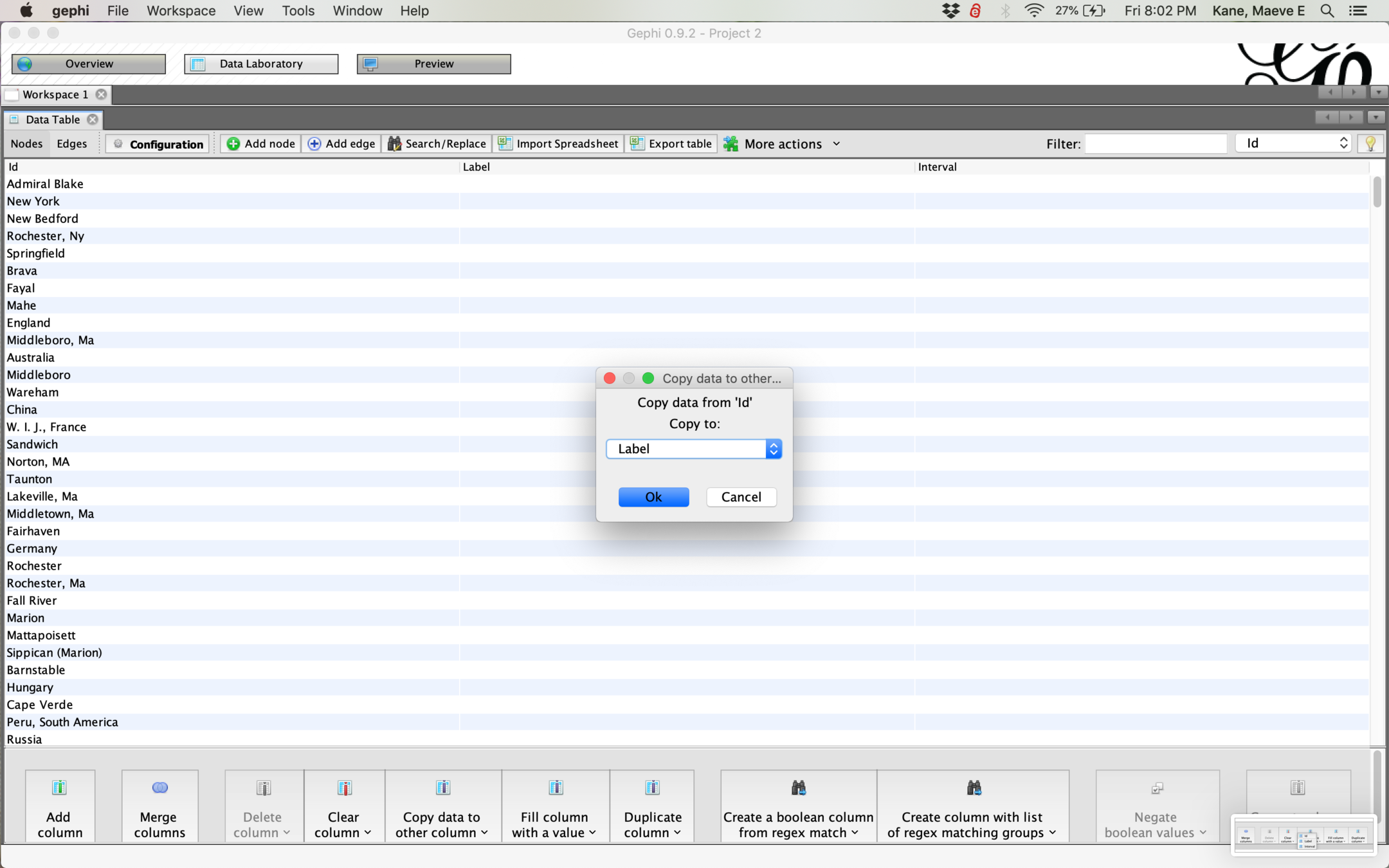
Then copy data from ID to Label to label our nodes.
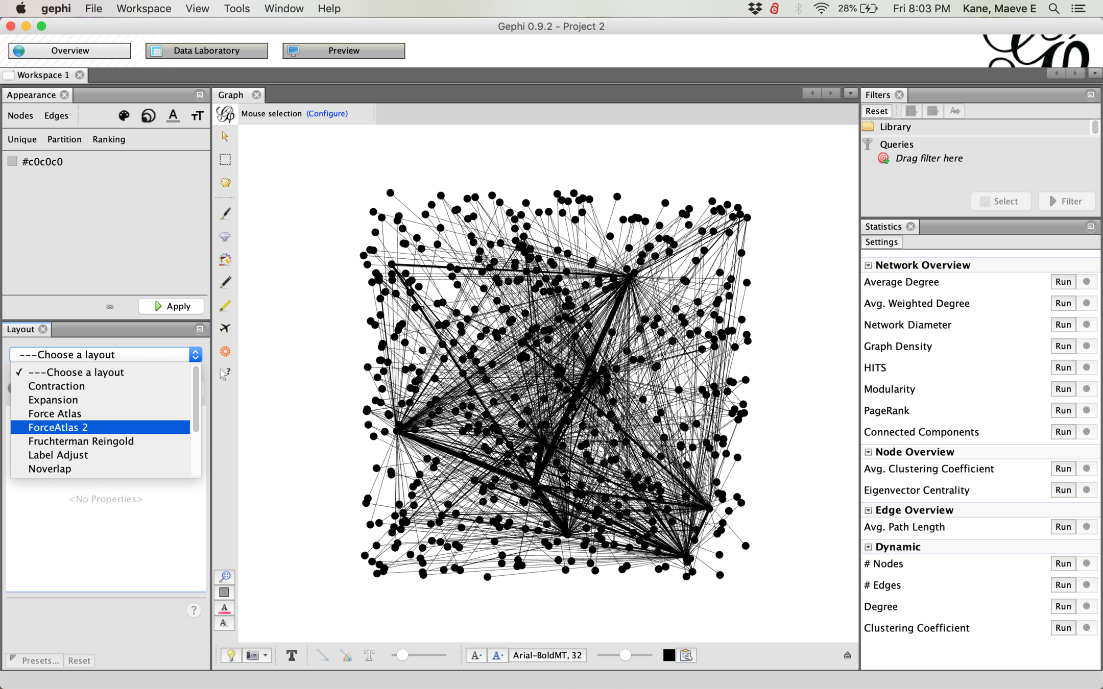
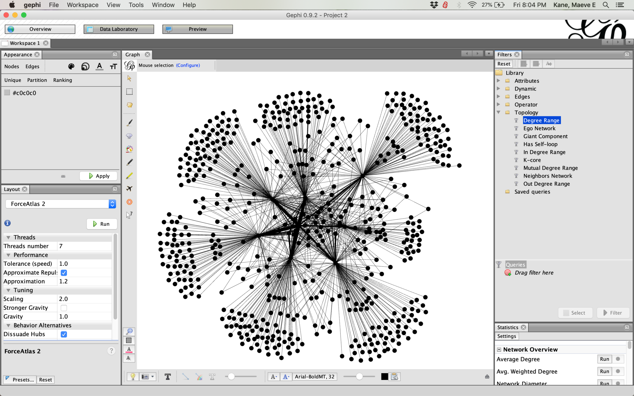
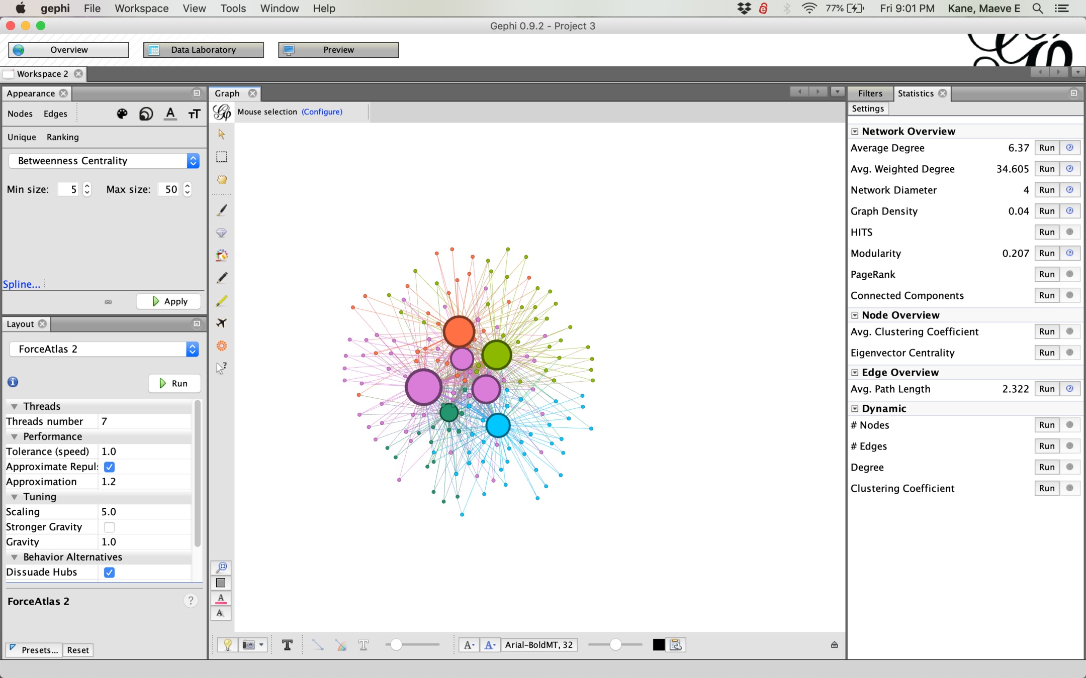
Back in Overview, let's select a layout > ForceAtlas2. These different layouts tell Gephi how to simulate gravity in our network and are a matter of visual preference.
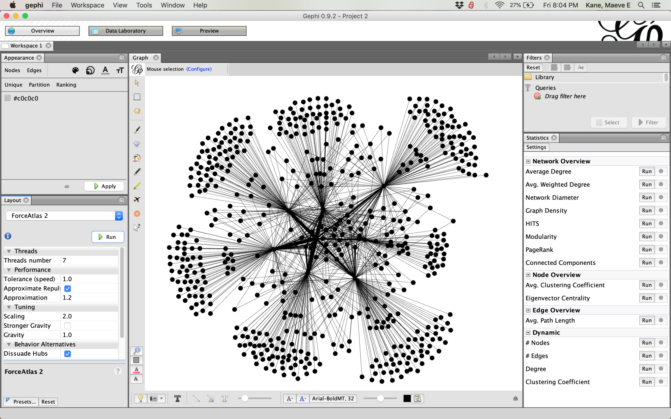
Depending on your network, you might have to tinker to make the gravity stronger or weaker. Dissuade Hubs is also useful to prevent dense clusters. Don't forget to Run and then Stop your layout--if it continues running, it will make everything else run very slow!
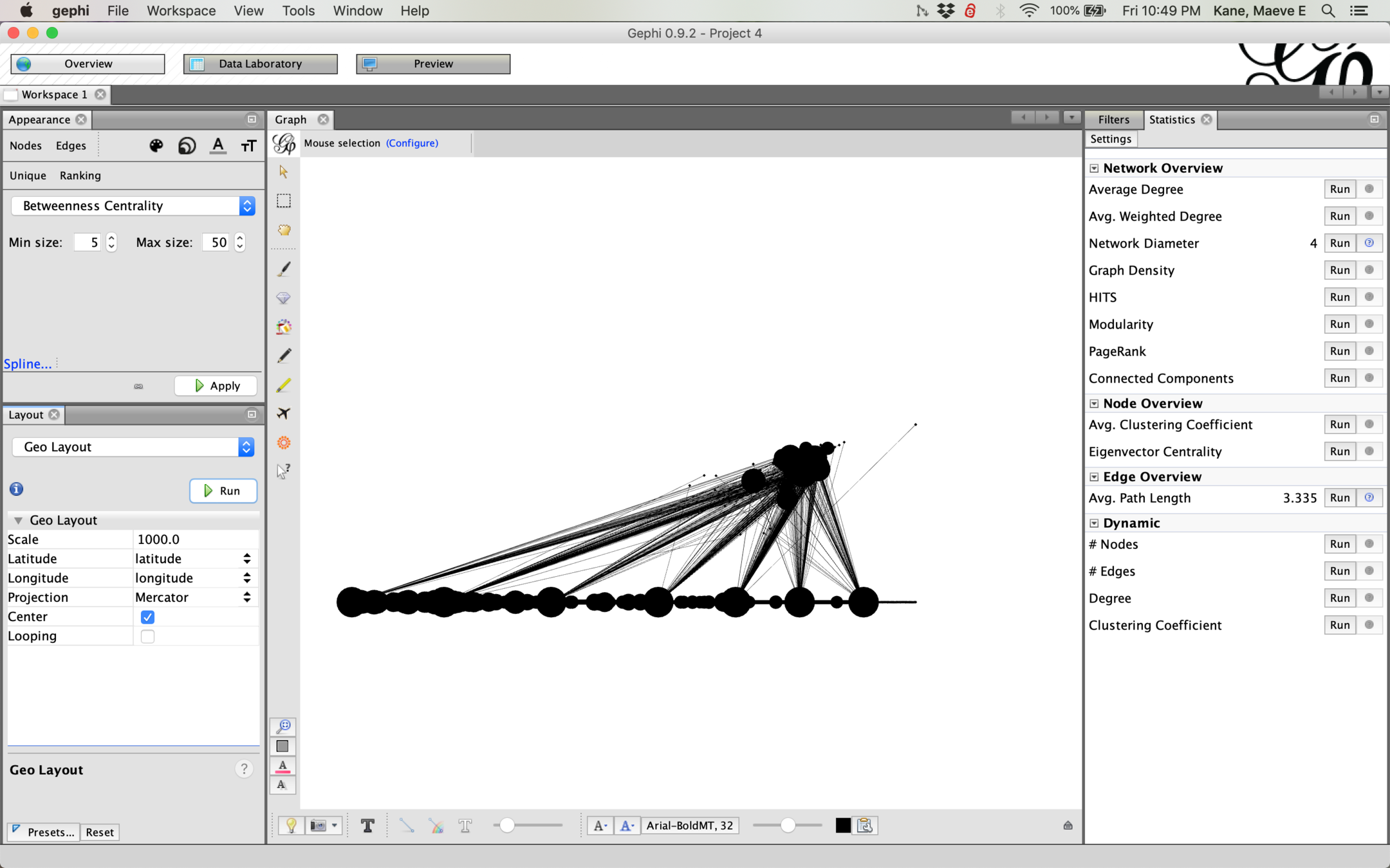
This hub or flower pattern is very common for bimodal networks--it means that we have only a few ships, and on each ship there are many hometowns for different crew members.
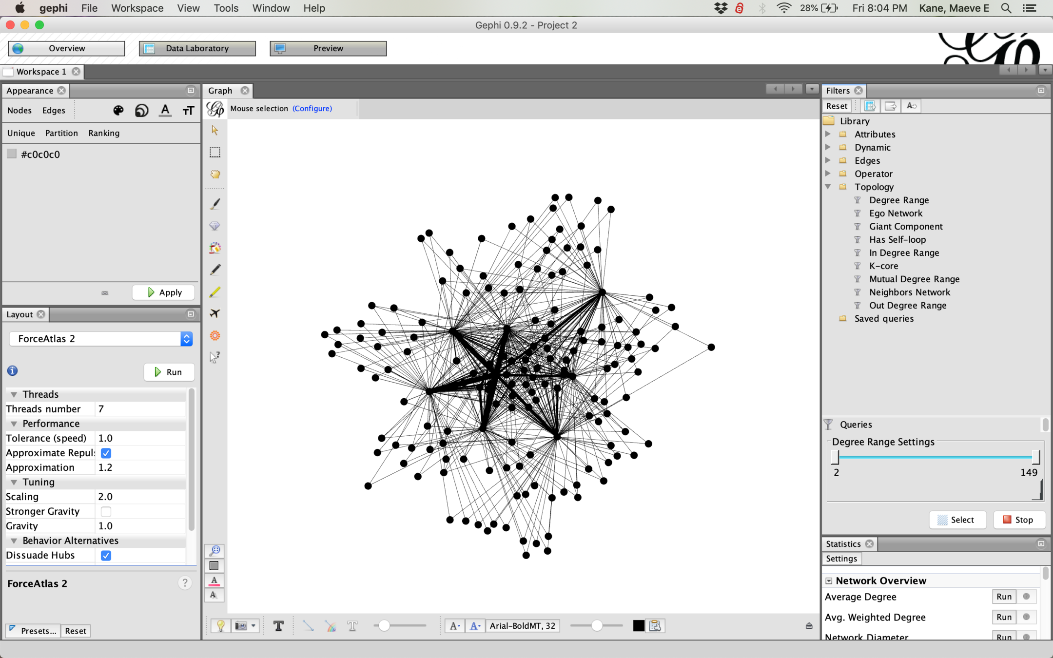
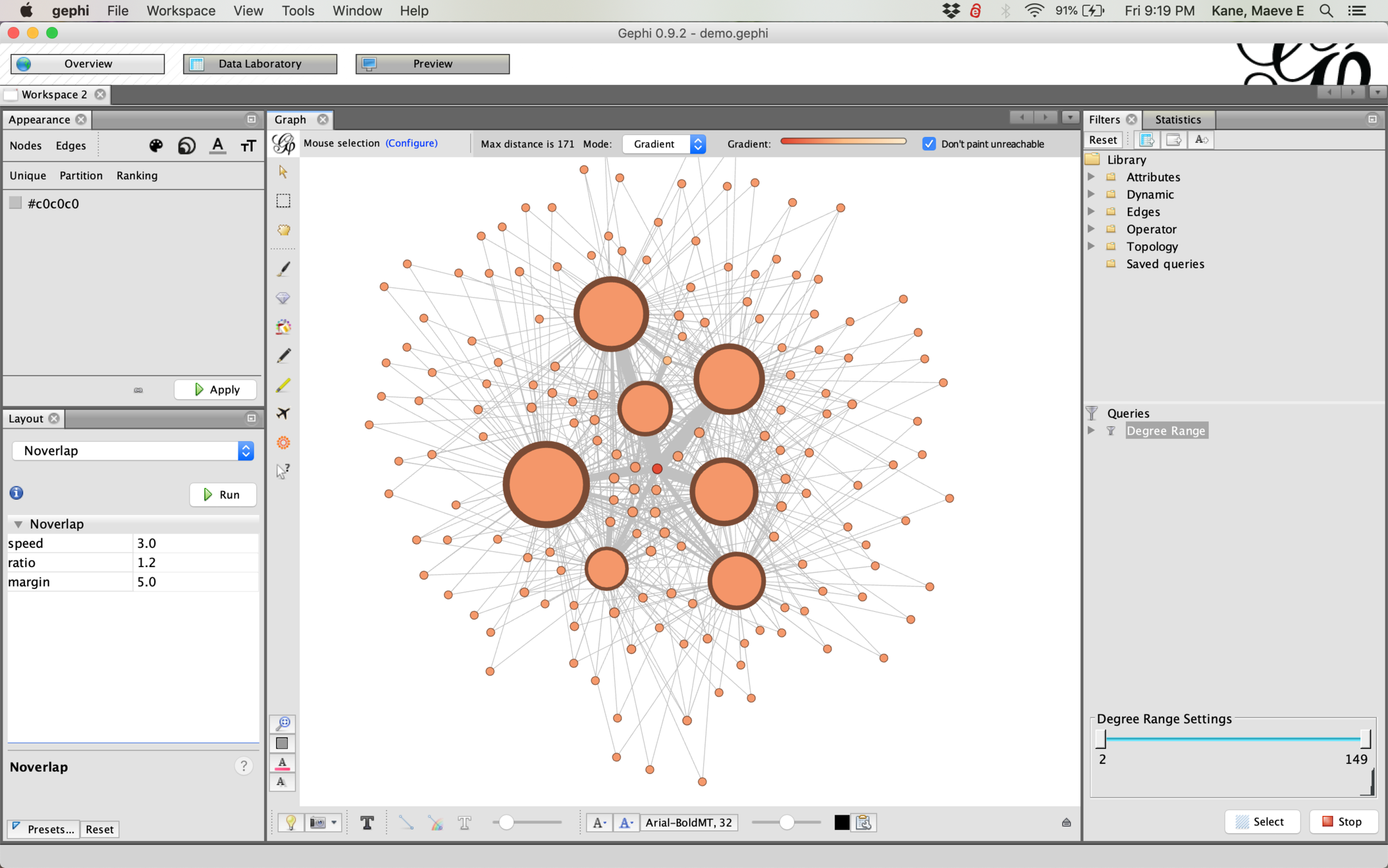
Filters affect both your visual layout and your analysis--if you run analysis on a filtered graph, your analysis will only consider the visible part of the graph. Most filters you will need are under topology and can be dragged down to "Queries"
An Ego Network will find only nodes connected to a specified node.
Giant Component will disregard small clusters not connected to the main network.
Let's filter to only nodes that have connections to at least two others--a degree range with a minimum of 2
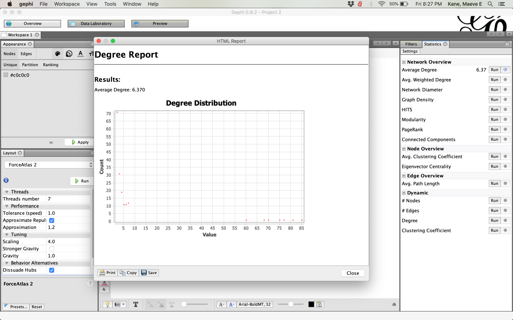
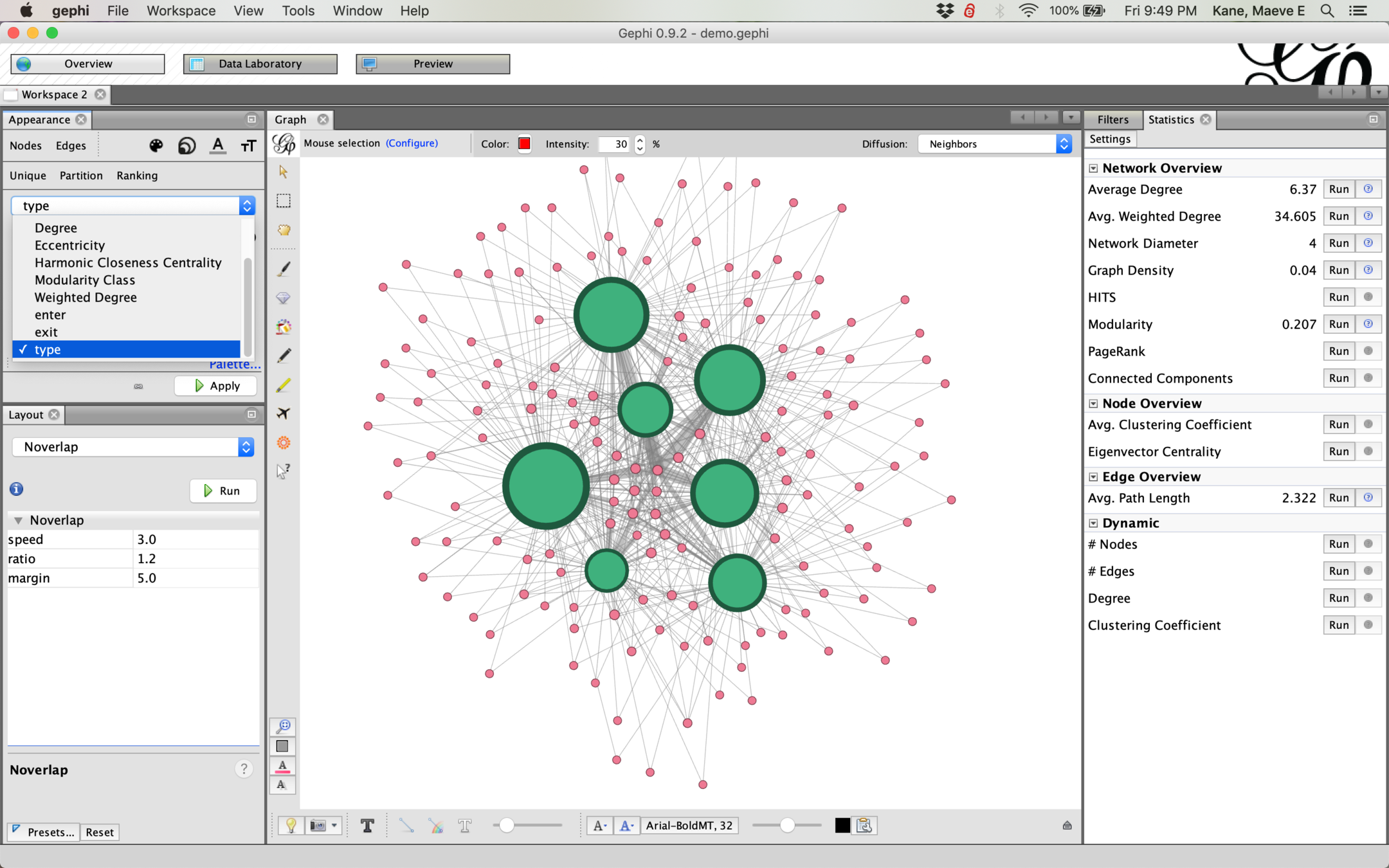
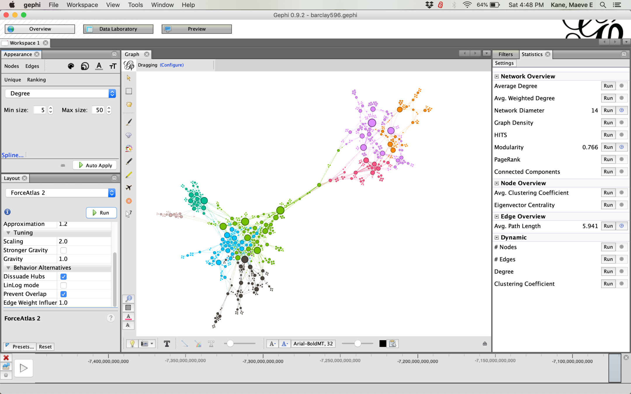
The statistics pane gives us our analysis. Average degree, Network diameter, and Modularity are the major ones we will need. The statistics for dynamic graphs are too computationally intense for most computers, so let's ignore those.
Make sure to read your analysis graphs--they can help you describe your network.
In this case, we have many nodes with a small degree, a few with a very high degree, and a big gap in the middle.
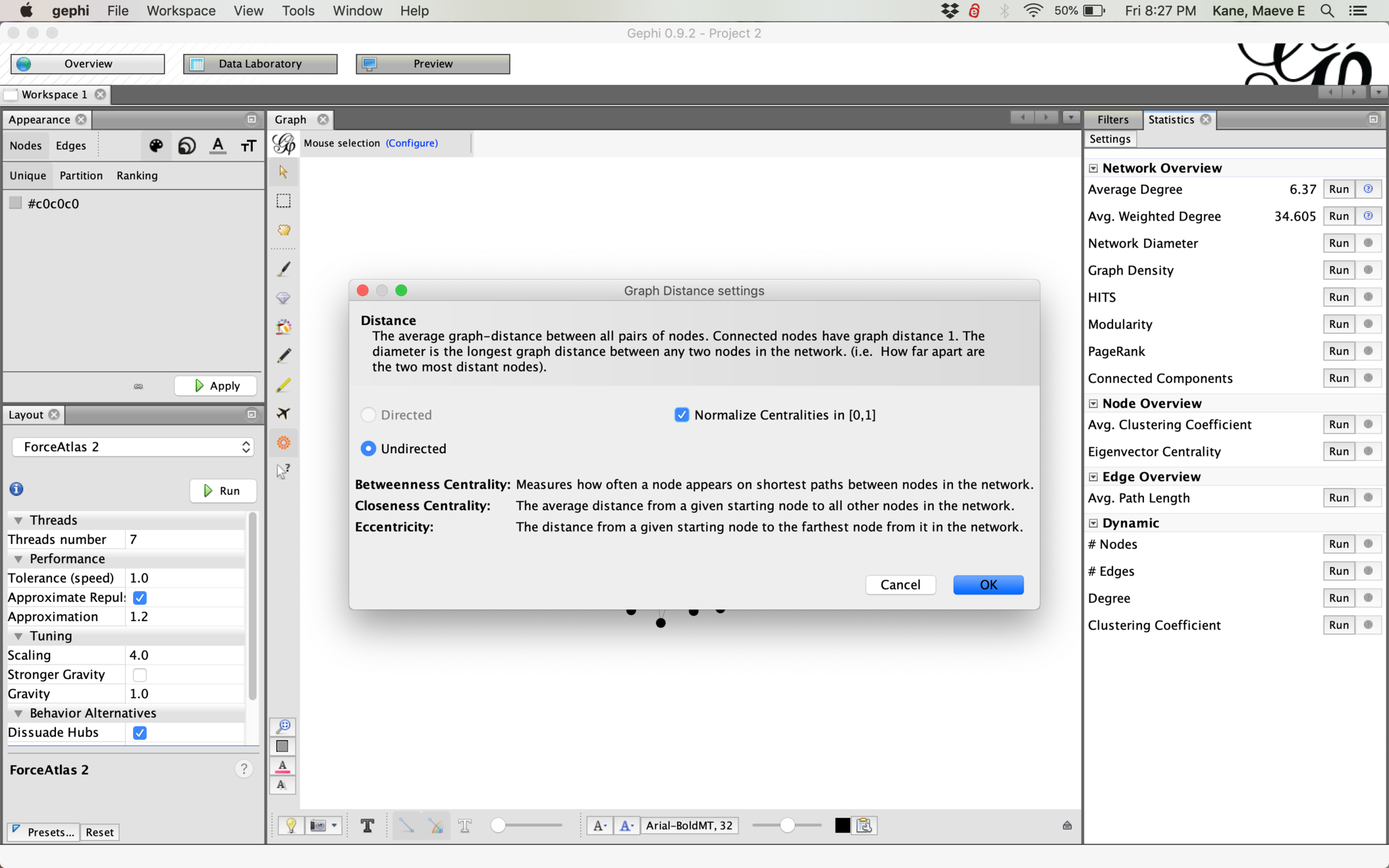
Since we have an undirected graph, make sure to run your analysis undirected as well if given the option.
If your network will change over time, you also want to normalize centralities. This makes it so centrality is measured on a single scale of 0 to 1 instead of relative within the graph and makes it possible to compare across different graphs.

To visually style our graph using our statistics, Appearance > Nodes and then select color or size. Unique will style the whole network in one way, partition is good for discrete categories like modularity/cluster, and ranking is good for continuous data like betweenness.
Remember to hit Apply to make your changes. You can also select minimum and maximum sizes, depending on what you want to emphasize.
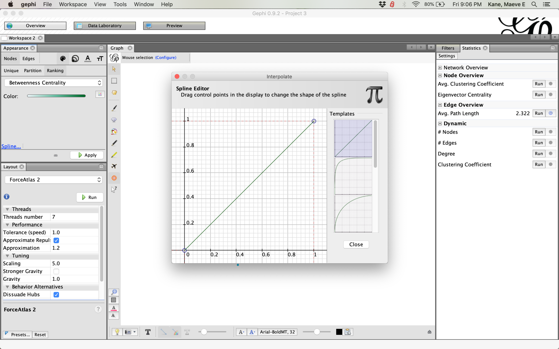
By default, Gephi uses a linear spline to size things. By changing the spline, you change how differences scale. A spline curved up will size small nodes larger relative to large nodes than a linear spline, while a spline curved down will emphasize the larger nodes by making the small ones relatively smaller.
It's not very interesting in this network, but the heatmap tool lets you highlight distance from a selected node to all other nodes. This makes more of a difference in sparser or less interconnected graphs.
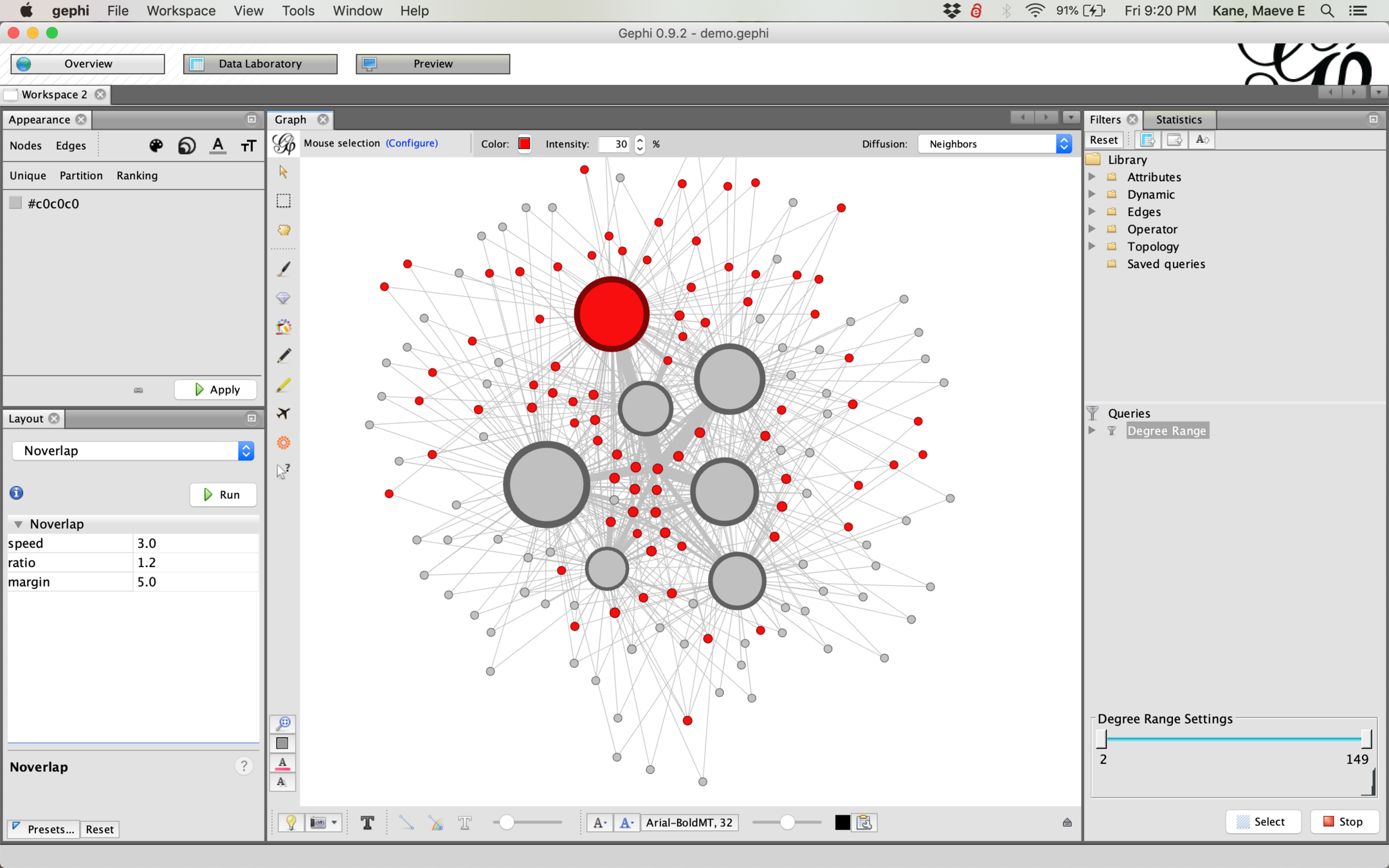
Similar to heatmap, the paintbucket tool lets you select a node and highlight its connected nodes. (Hint: to reset your colors between steps, hit the little reset button)
reset
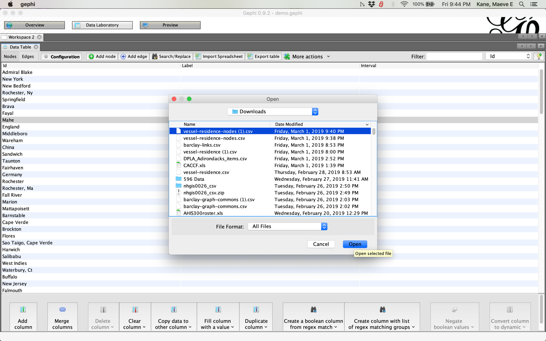
Right now our network is very simple--we only have information about the connections between things, not information about the things themselves. To analyze information about the nodes, we need to go back into Data Laboratory and import a nodes file.
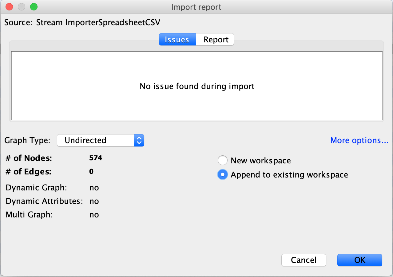
When importing a nodes file, it is extremely important to select undirected and append to existing workspace. If you don't change these, Gephi will make a new project instead of editing your existing one!
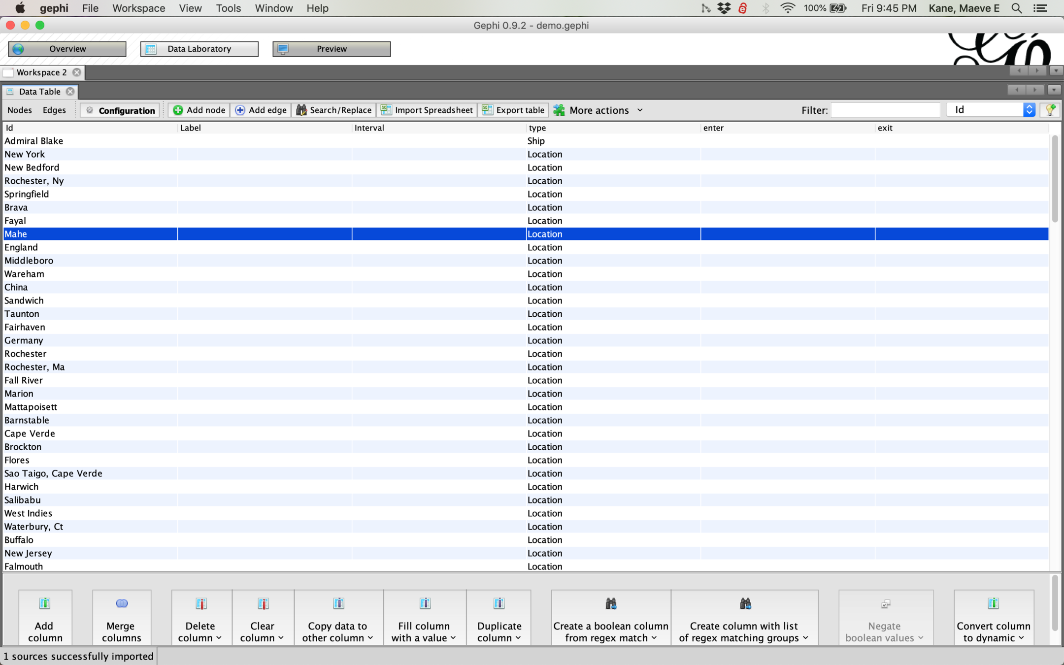
Once our nodes table is imported, we should see new columns in Data Laboratory.
We can then use that new node information to style and filter our network. Filters are available under Attributes > Partition.
Node attributes can be any discrete or continuous type of data like gender, year, age, occupation, type, etc.
This option is not available on the lab computers.
If your data includes geographic information, you can layout your network by latitude/longitude using the GeoLayout plugin. You will need to obtain lat/lon coordinates by geocoding (the week before spring break). This format does not handle nodes with no coordinates well, as you can see below!

A filter on Attributes > Range > latitude will get only those nodes with coordinates, but loses connections to nodes without coordinates.
To use a geographic layout network, make sure to export as an svg to use in other programs.
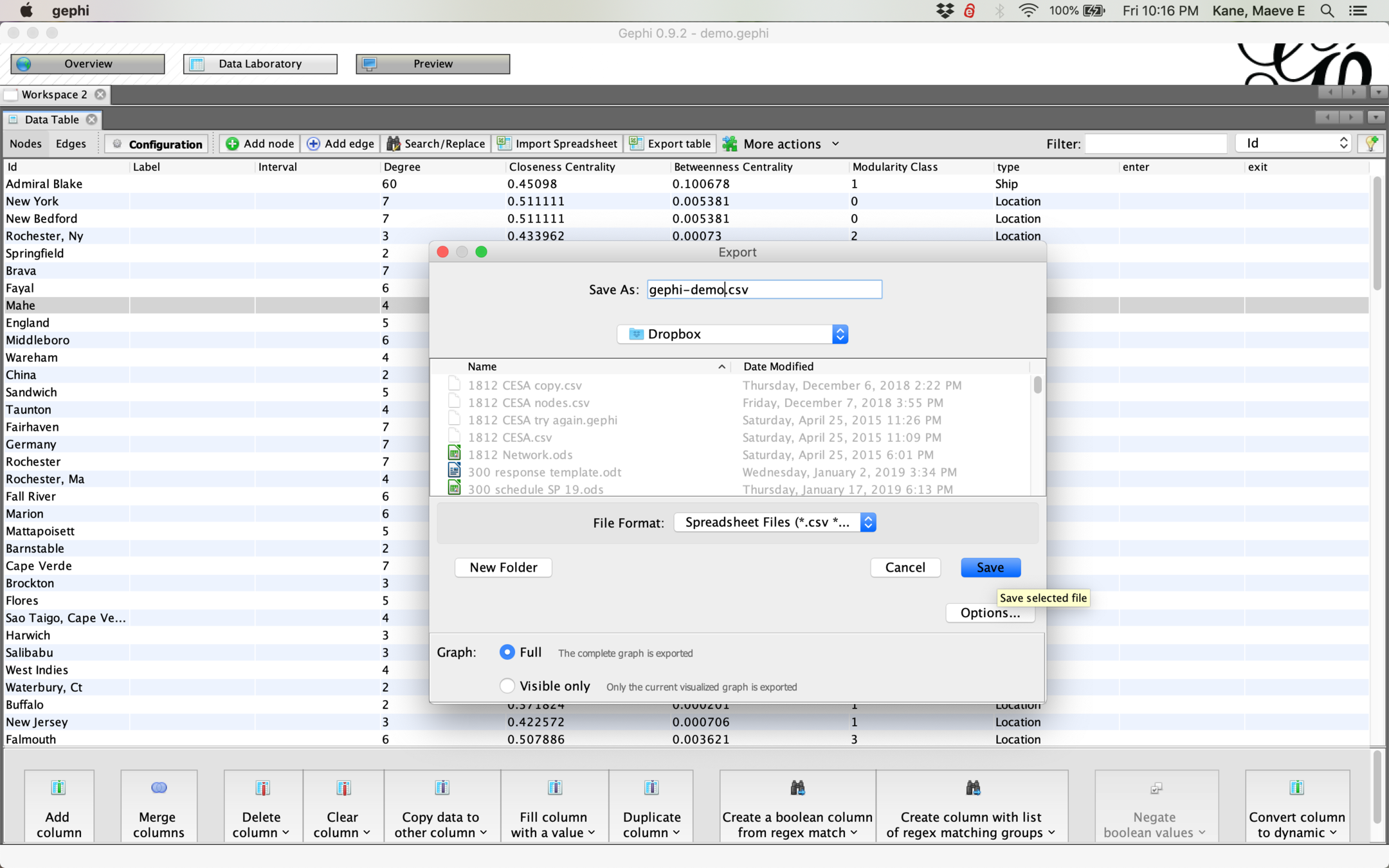
We may want to export our data to further analyze, for example, the average betweenness centrality of male vs. female nodes. To do this, we export table in Data Laboratory and save our csv.
If all your information isn't visible, you may need to toggle it with the lightbulb icon.
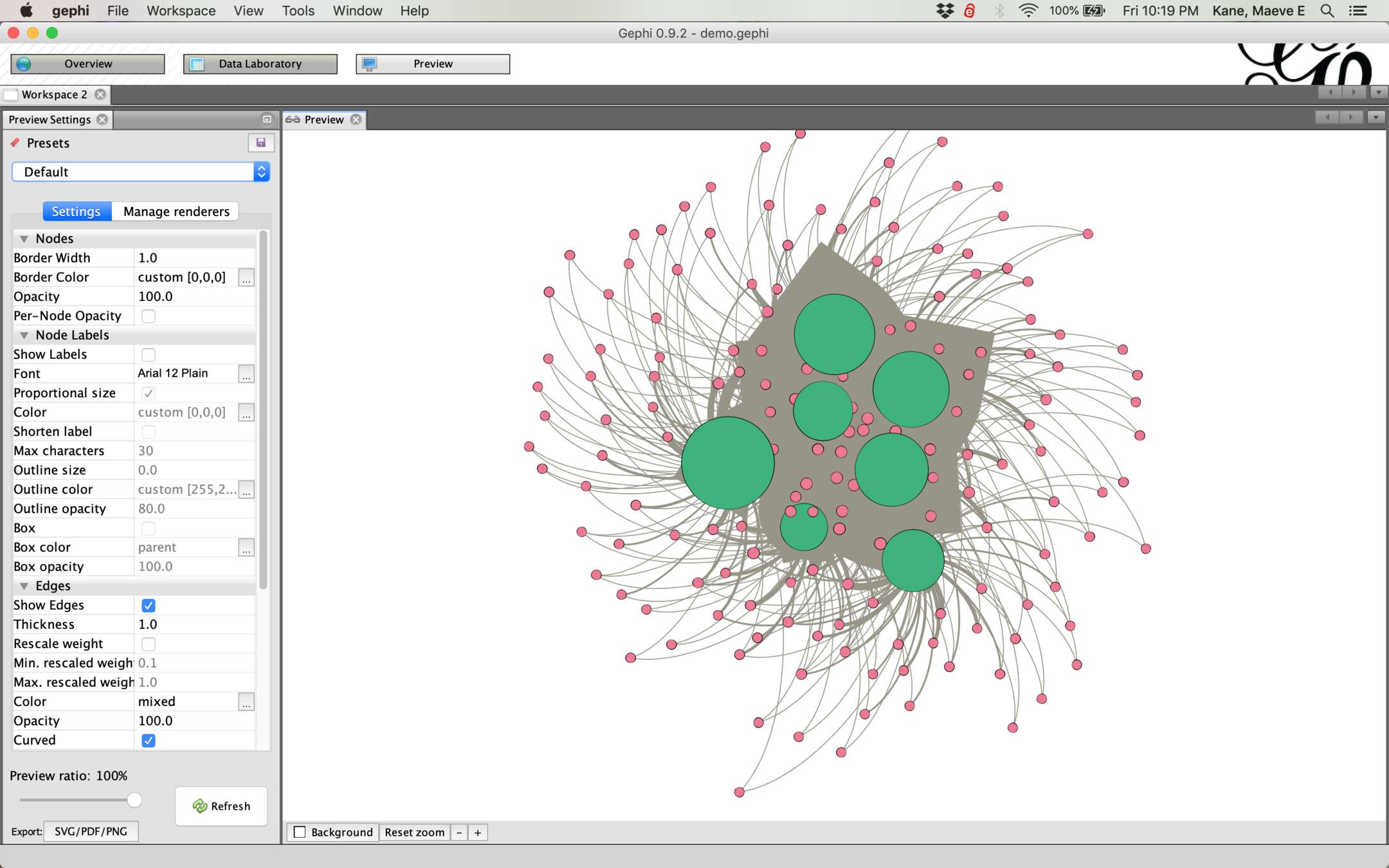
To export an image of our network, we want the Preview pane. If your graph doesn't appear at first, hit refresh.
Try styling your graph with edges > rescale weight, edge opacity, changing node borders, or the preset layouts. You will have to refresh each time you make a change.
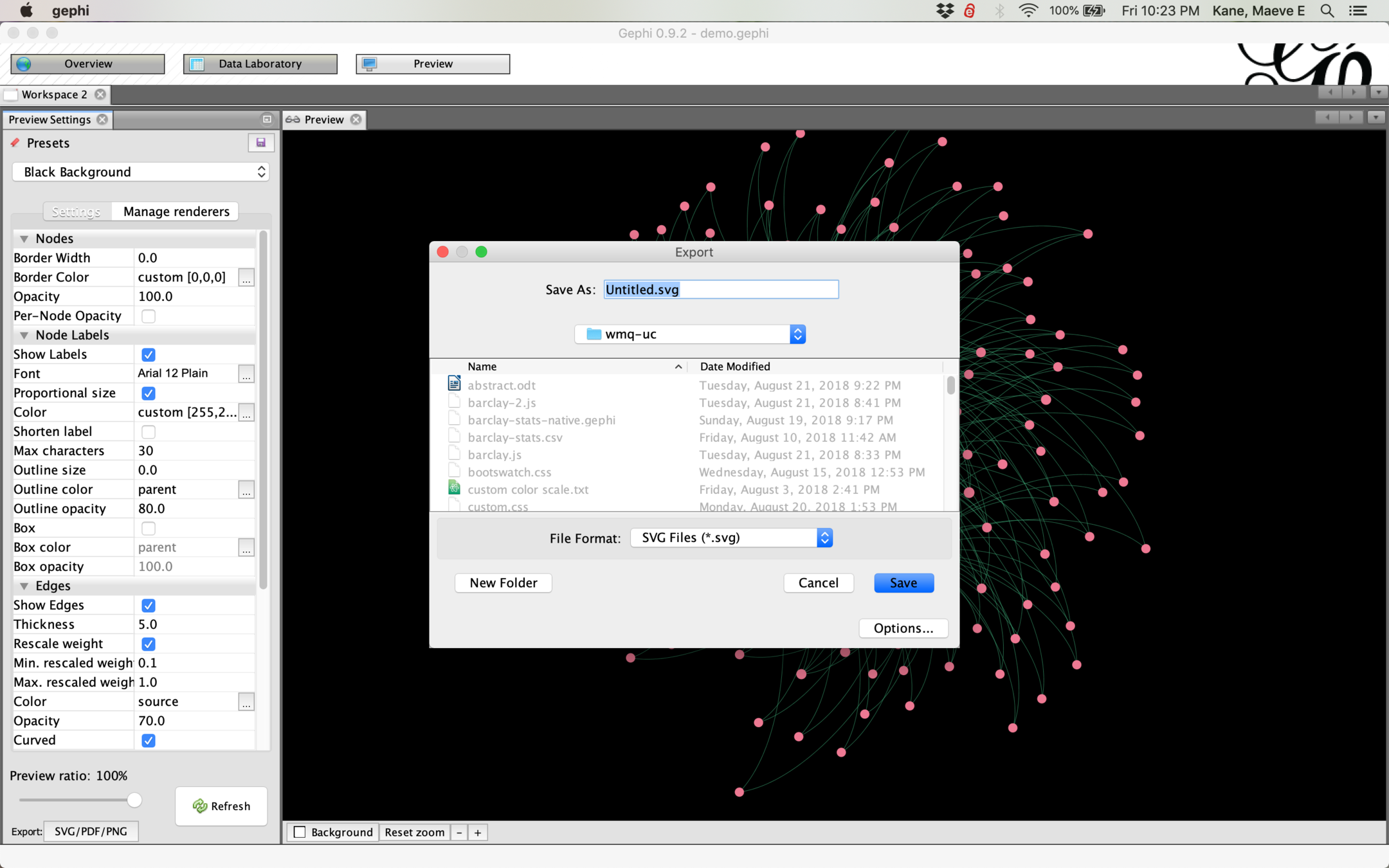
When you're happy with your network, export and save to use as an image elsewhere. In general, you want to save as an svg because this can be zoomed in for more detail than a png.
Let's make a new project using the Barclay edges and the Barclay nodes. Remember, Data Laboratory > Import Spreadsheet, and check your settings. You want an undirected graph with an edges and a nodes table, appended to the current workspace!
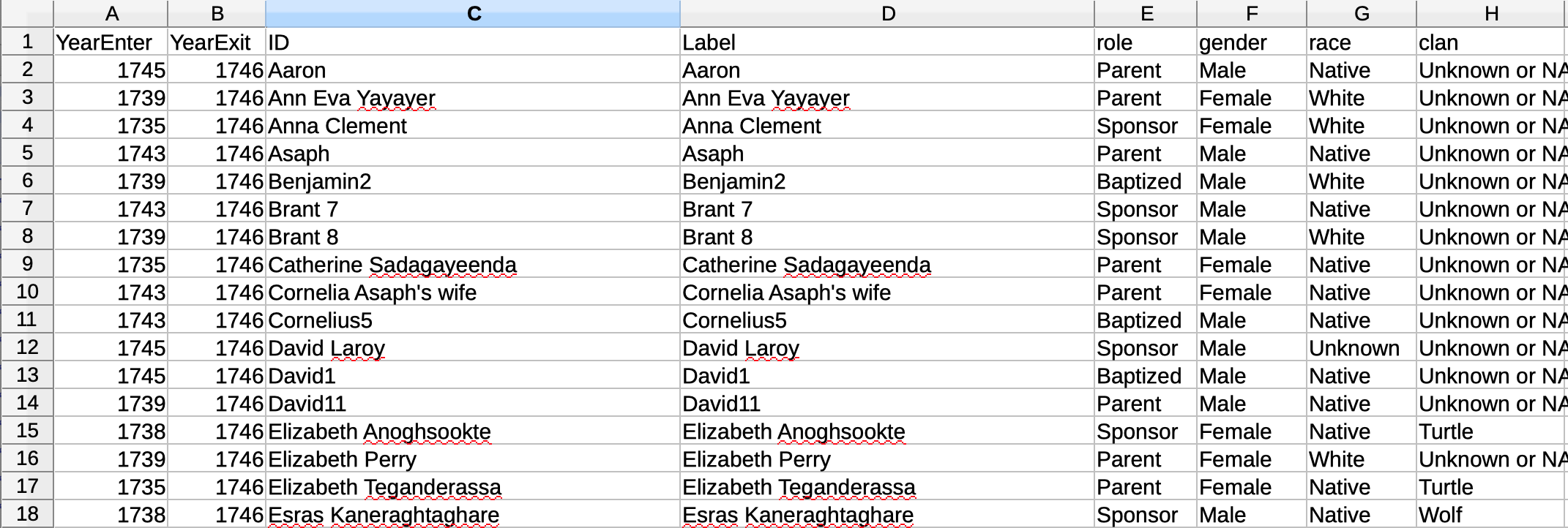
To make a dynamic network which shows change over time, we need at least two columns of dates: enter and exit.
If you want your nodes to remain in the network indefinitely, they should have an exit date equal to the last enter date.
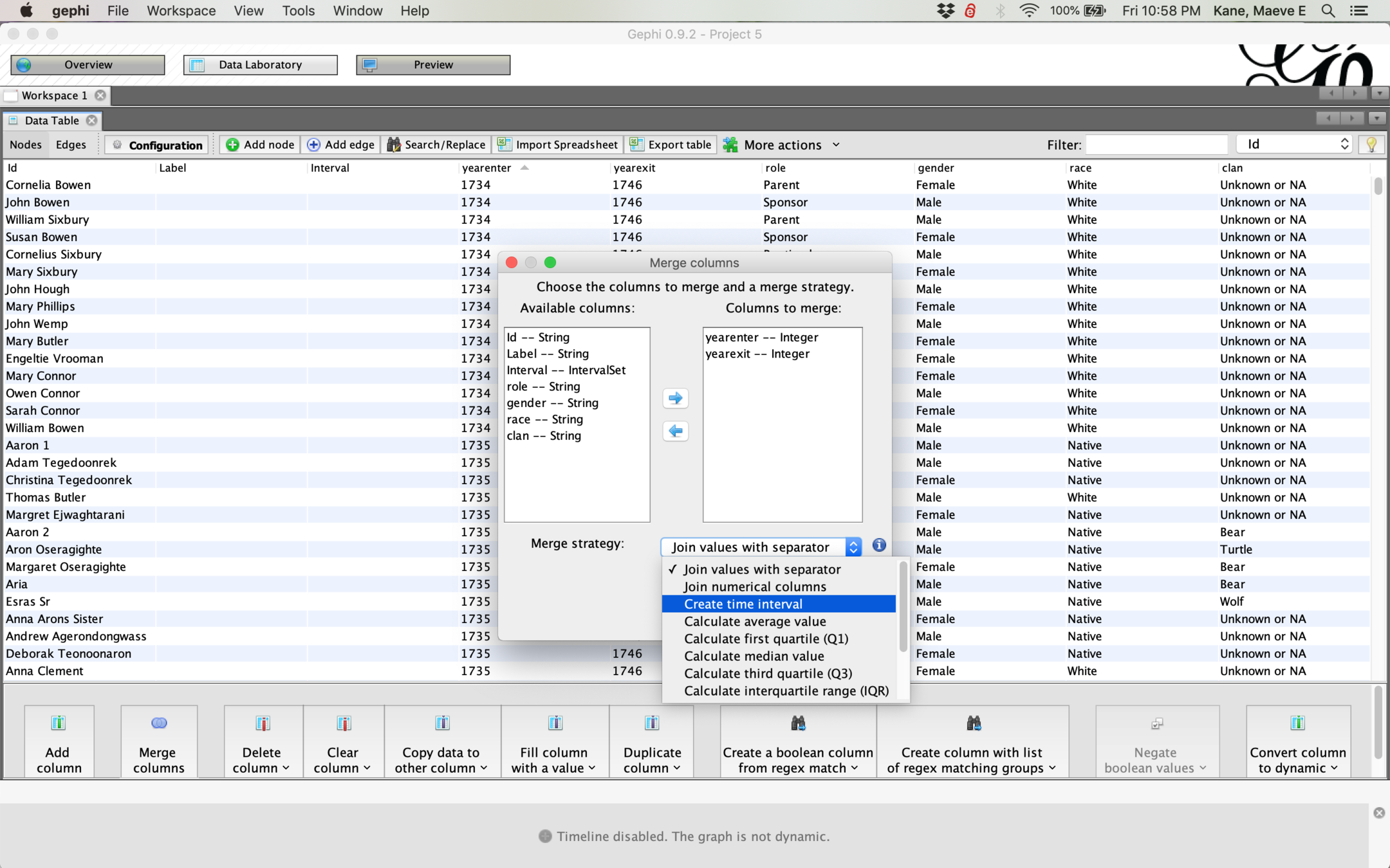
To get Gephi to interpret our dates, we need to merge our two date columns and tell Gephi to interpret the merged column as a time interval.
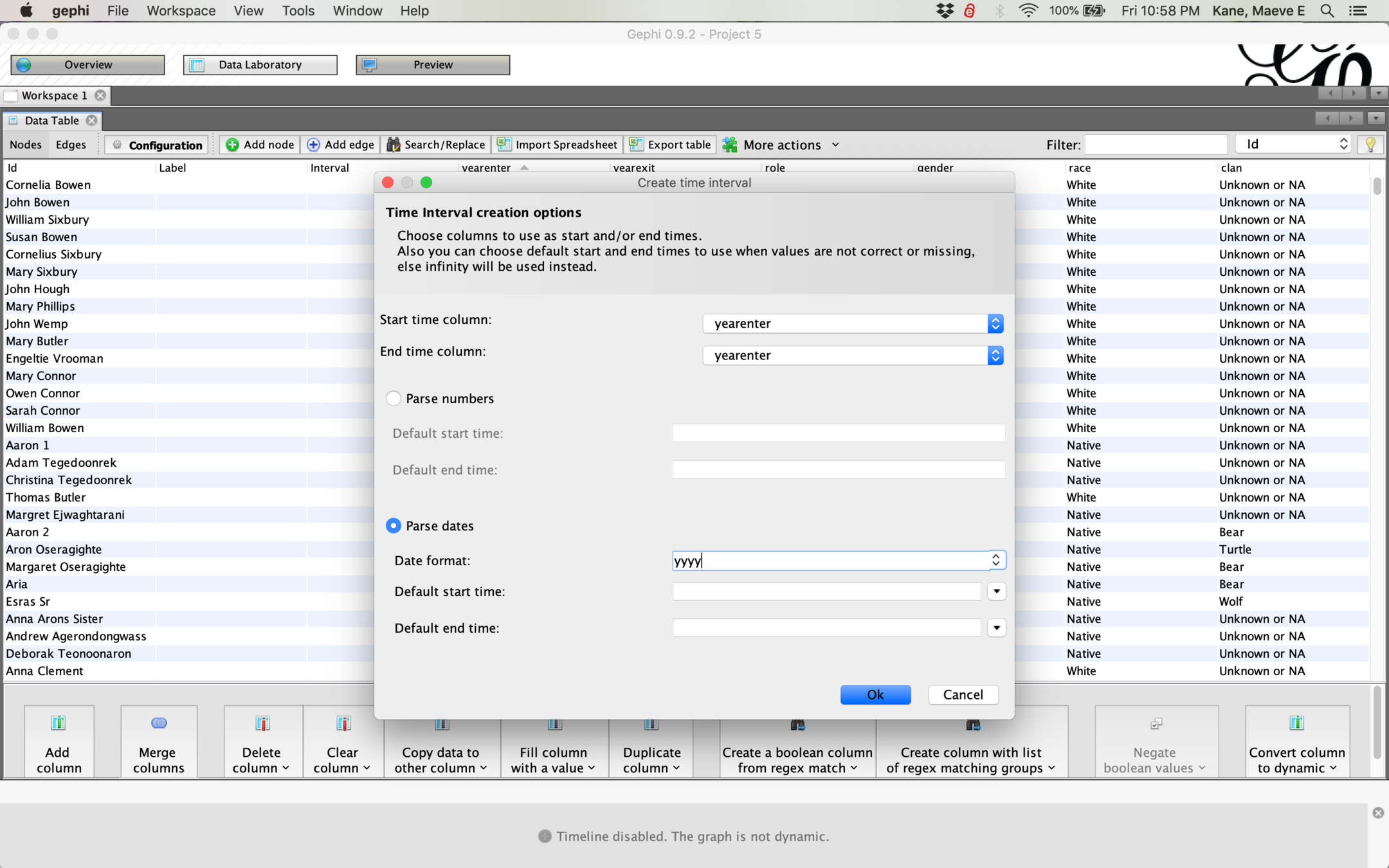
You may need to tell Gephi what format your date is in! If we only have year information, we don't want Gephi to check for months. Change parse dates to yyyy and make sure your start and end dates are different!

To work with our network as it changes over time, select Window > Timeline and Enable Timeline
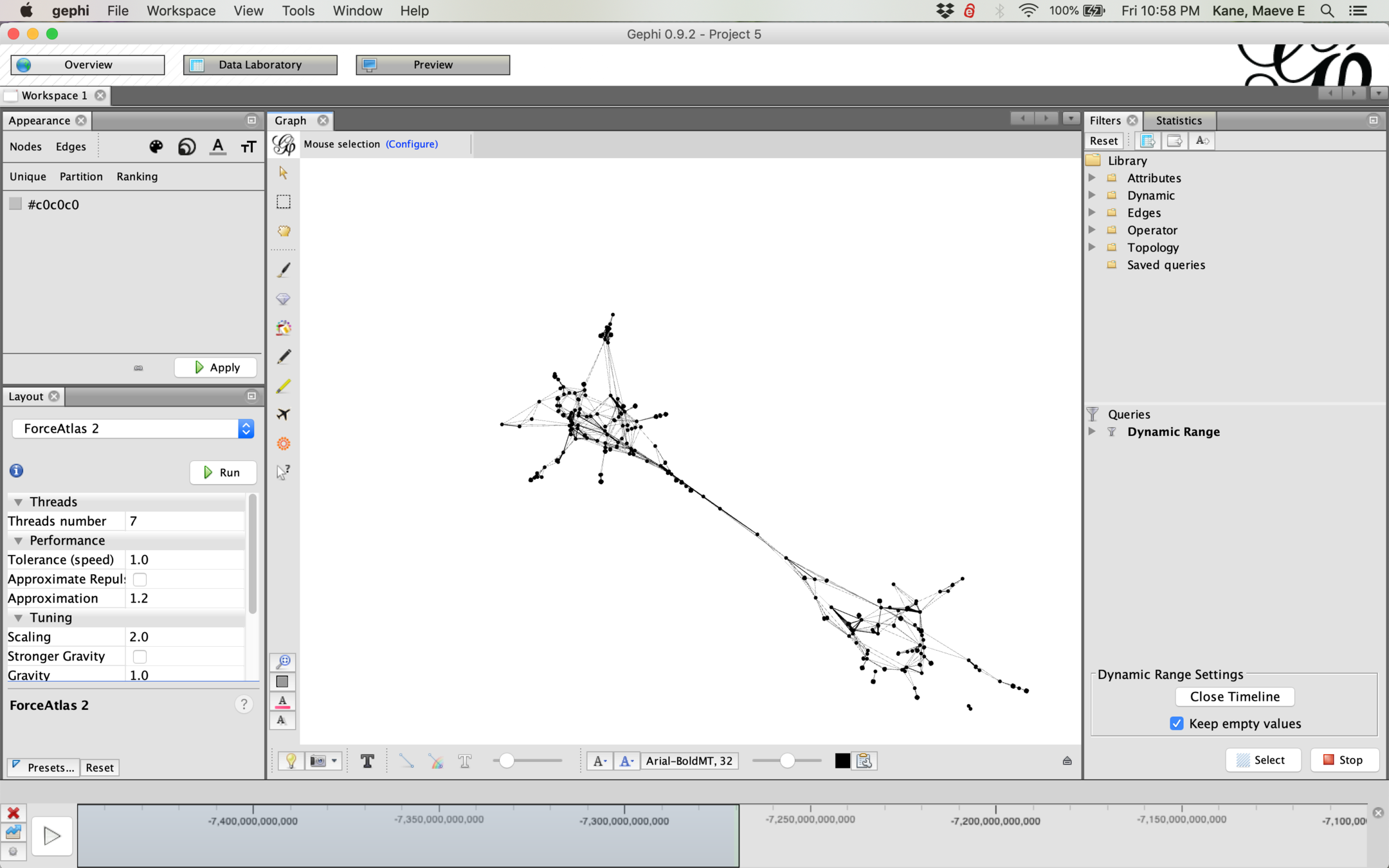
To see how the network changes over time, we need a window to display--hover over the ends of the blue bar and drag it to make the window bigger or smaller, then hit play.
If you have a layout running as you play your timeline, your network will shift organically as new nodes enter the network.
To record this animation, you'll need to record your screen. See these instructions for PC and these for Mac.
You can animate changes in degree (but only degree, all other attributes are static) by clicking the tiny infinity symbol and running Auto Apply while running your timeline. This can also be combined with color styling for attributes or modularity/cluster.
In formatting your own data for a network project, you'll need to make a new csv with only two columns. These columns should have the headers Source and Target. This is your edges sheet. You will want to cluster your source and target names in OpenRefine to make sure that you don't have multiple spellings of the same name, because Gephi will recognize these as two different nodes.
If you want to give your nodes attributes, you'll need a nodes sheet. Each node should only be listed once in your nodes sheet, with its attributes on its row. Your nodes need to have the same spelling as in your edges sheet, and their names should be given the column header ID so that Gephi will match them correctly. You can repeat the name of your node in a column named Label to avoid the relabeling step in Gephi. Your other attributes can be any discrete or continuous data from your dataset, including two separate columns for a start date and end date if making a dynamic graph.
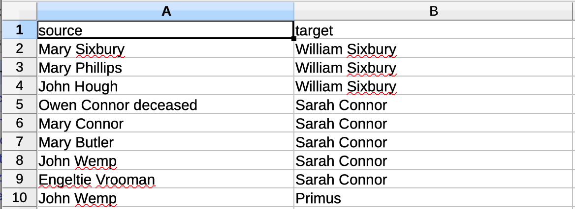
Edge table: only two columns
Nodes table: as many columns as you need. ID and Label will be recognized by Gephi.