Ancillary work comparisons
Real
Mine
CD front and back


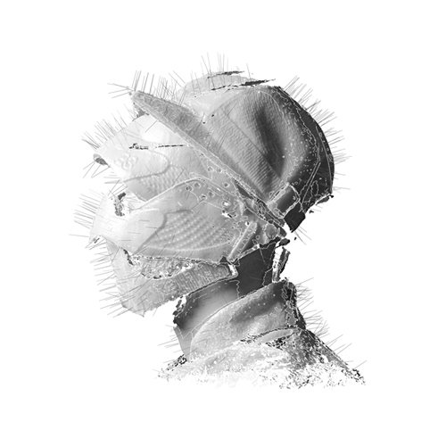
The Woodkid album cover inspired me with its simplicity, this album is also Woodkid's first. The colour scheme continues from the front to the back of the album and simply has a track-listing which i like cause I didn't want the back of the album to be different from the front, and the easiest way to do this was to carry on one colour. owever i did use the convention of using an image of our artist as it is his first album and would be best for exposure.
Inspirations
Mine
CD Inside
For my inside panel image of Blake distorted I got inspiration from James Blake's album cover, James Blake also fits into our music genre. For my CD I took


inspiration from the simplicity of Pusha T's My Name Is My Name album which is simply a white CD with the albums artwork and Woodkids Golden Age CD. I also drew the idea of putting my artists face sideways on the CD from Woodkids album cover, as it was simple and for me connotes royalty or prestige.
Real
Mine
advertisement


For my album advertisement I followed the conventions of using the image of my album cover as my main image, rather than another image connected to the album or artist. I took a lot of inspiration from the Arctic Monkeys album advertisement as I again liked the simplicity of the ad, however I did add more information about the actually album which the Arctic monkeys didn't do. I also followed the convention of using two different font, one from the album where it's from the album and one ariel, used for more information, like on the Magnetic Man example.
