FINAL TASK: MAGAZINE
MAGAZINE CONTENT PAGE
Starting Point
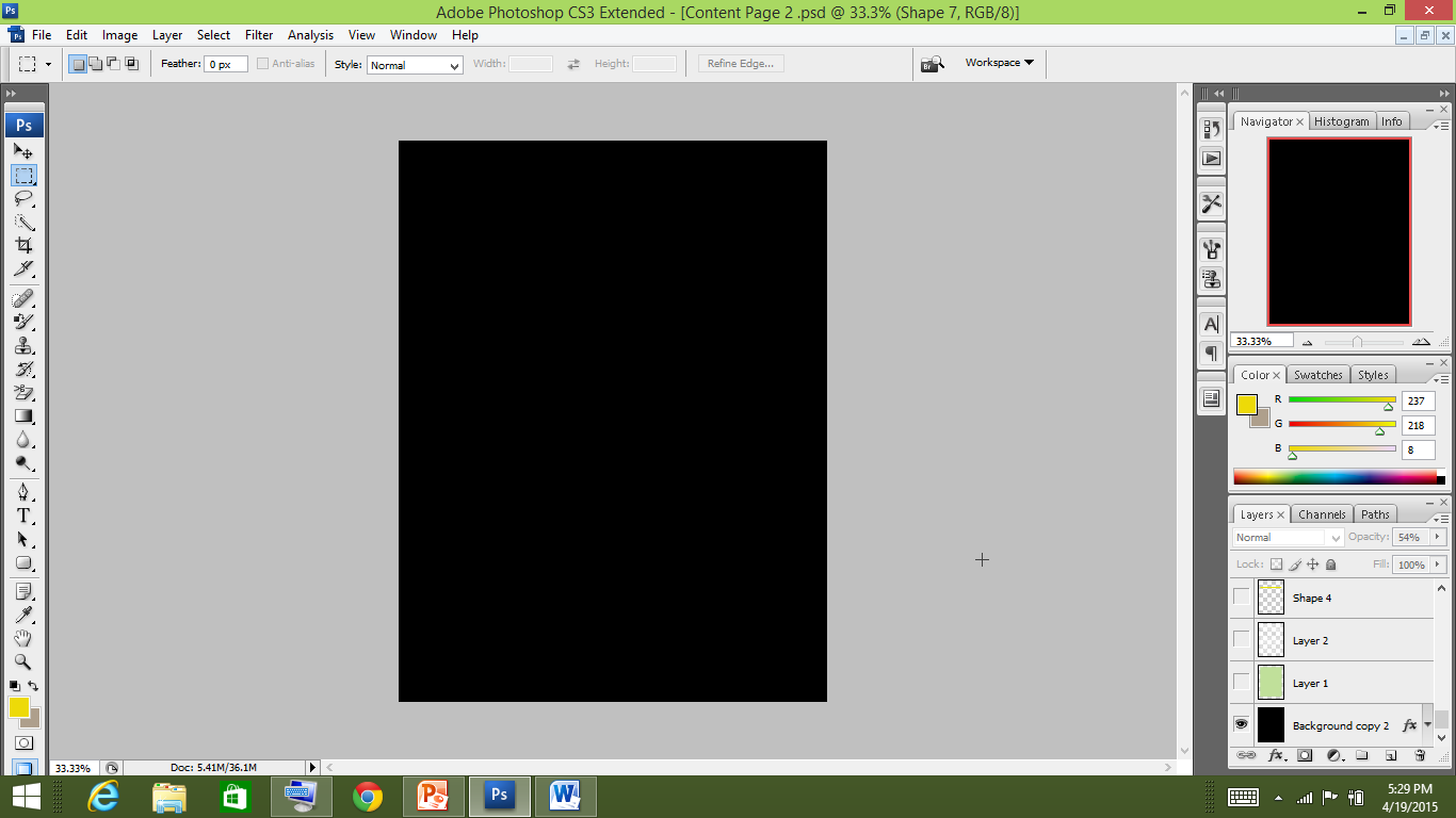
I started with the black background.
This was done so to connect it with the magazine cover
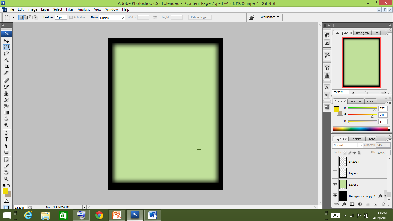
Next, I added a rectangular shape and filled it with light green
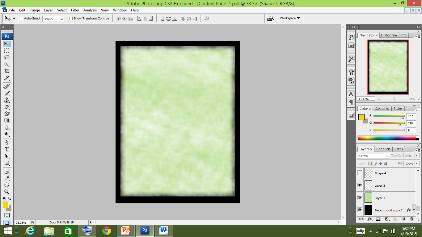
Then I added a texture selecting paint brush tool with a texture and white colour.
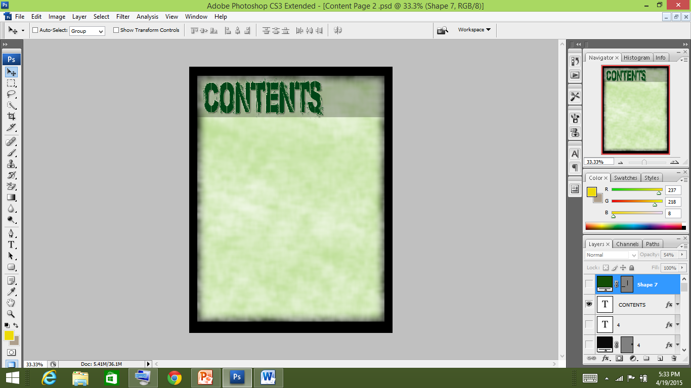
After that, I added the rectangular shape lowering it’s opacity. Then I placed the masthead using the same font as I used in the cover page masthead to connect it with the magazine cover.
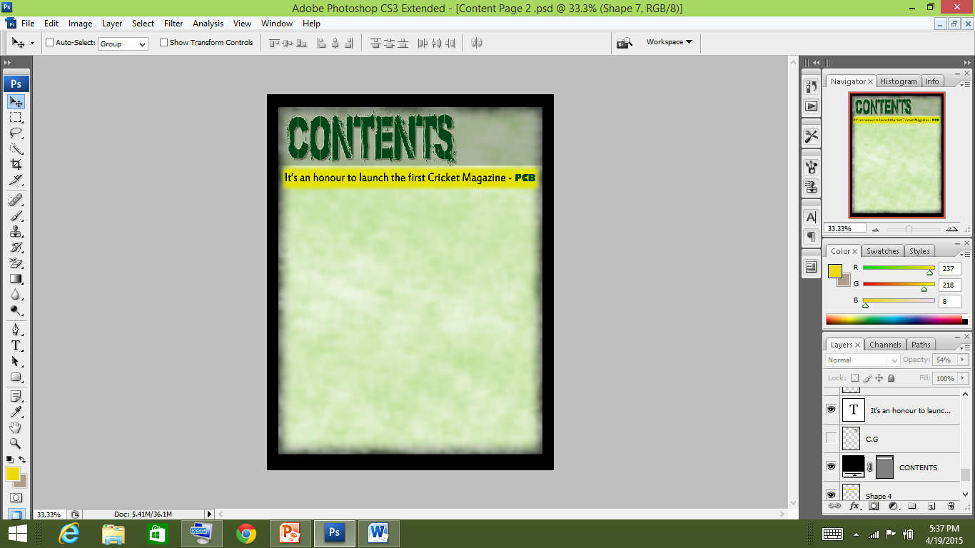
I added a rectangular shape with yellow color and applied gaussian blur. Then I added a line from PCB who has launched the magazine .
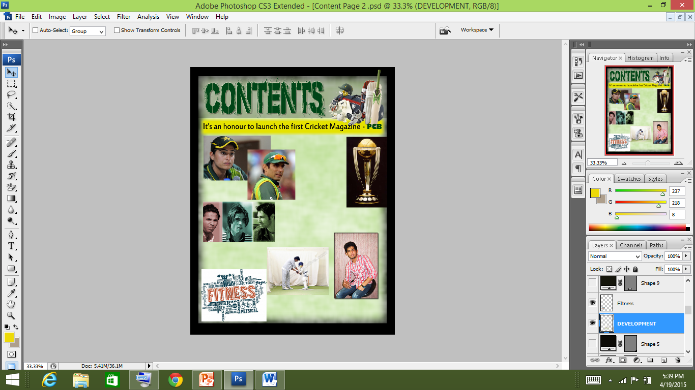
Next, I placed all the pictures on relevant places.
This picture is taken by me. I gave it an inner glow to make it look 3D
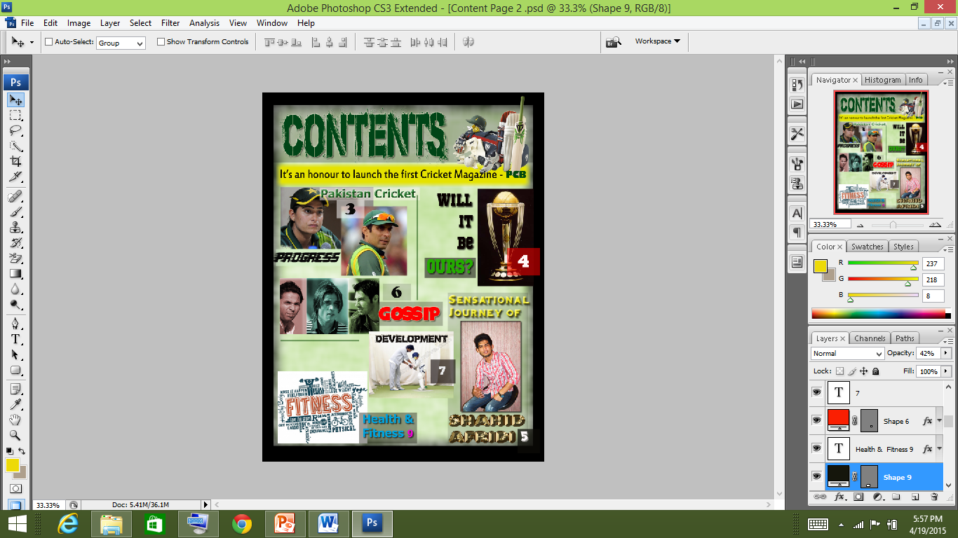
Then I added the ‘Contents’.
In each content name a different font is used adhering to it’s meaning.
Example:
1. Progress: In this I used the barbatrick font which showed motion - progress.
2. Gossip: For this I used the Space Comic font as it is a fun part and people really are fascinated to know about the prevailing issues. This font is bold and colour is also red along with the comic effect it creates.
3. Will It Be OURS: I used the Sports World (TT) font which is bold and connotes seriousness as it is a major tournament. Will It Be is kept black matching with the background of it's image and OURS is kept green symbolising Pakistan Team.
4. Health & Fitness: Tahoma font is used which is simple and a serious font as people take their health seriously.
5. A Special attention is placed to the font of the main cover line - discussed later.

After this, I added the page numbers

READY

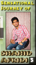
This was TOUGH!
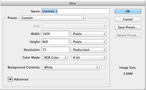
1. I created a new document for this and filled it with black.
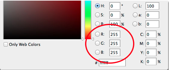
2. I used the Gill Sans Ultra Bold Font and chose white colour by setting R, Gand B values to 255. After that I wrote ‘SHAHID AFRIDI'
3. After that selecting the free transform tool I resized the text.
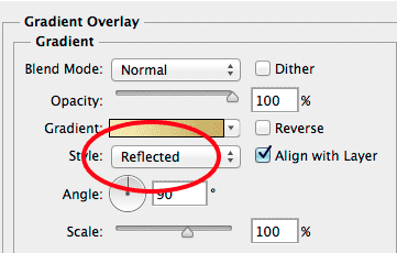
4. Next, making the copy of the text layer I added the gradient overlay selecting the copied layer. Gradient Overlay explained on the next slide
GRADIENT OVERLAY
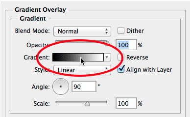
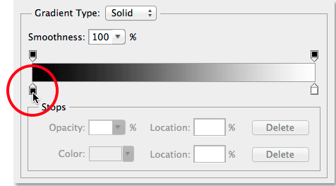
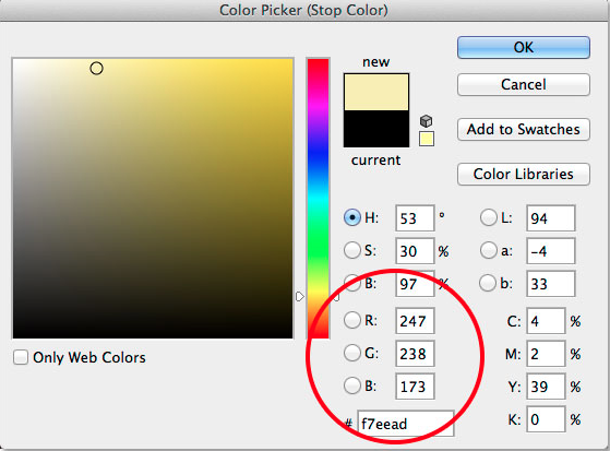
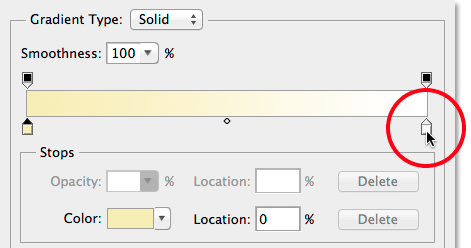
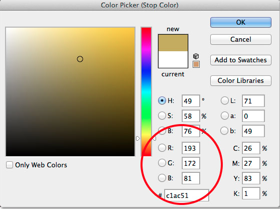
This is how I added the gradient overlay adjusting both the white and the black colour stop. I also saved this preset
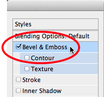
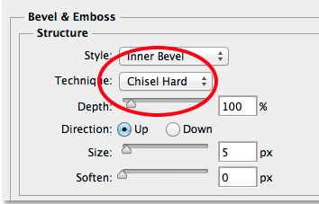
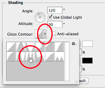
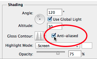
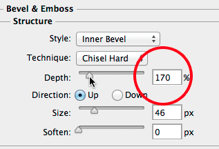
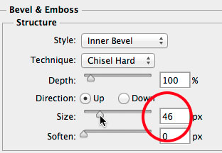
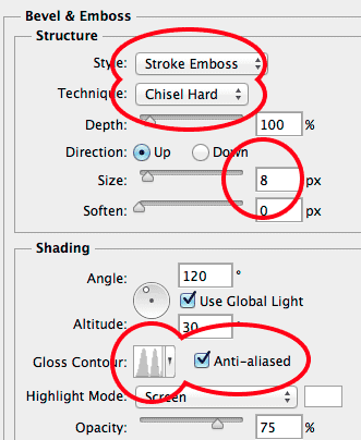
Next I selected the bevel and emboss changing the technique to ‘chisel hard’ and the gloss contour to ‘Ring Double’ while turning the anti aliasing. Then I increased the size to 46 and enhanced th depth to add the lighting effect
After that, I turned on the contour in ‘Bevel and Emboss’ and added the inner glow
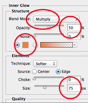
Inner Glow
Structure
Next, I selected the original Type layer and gave it a stroke
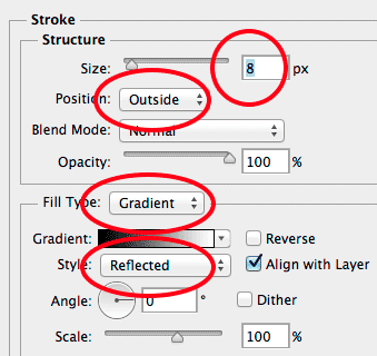
Then, I chose the custom gradient preset that I saved. Next, I applied bevel and emboss to the stroke and also clicked the contour below bevel and emboss.
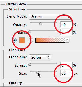
I gave it an Outer glow after that
After this, I selected the copied layer and created a new layer. I selected the brush tool choosing the crosshatch 4 brush and painted random sparkles
USED HERE
THE END :)