Artist Poster Analysis
LORDE
ALBUM ADVERTISEMENT poster
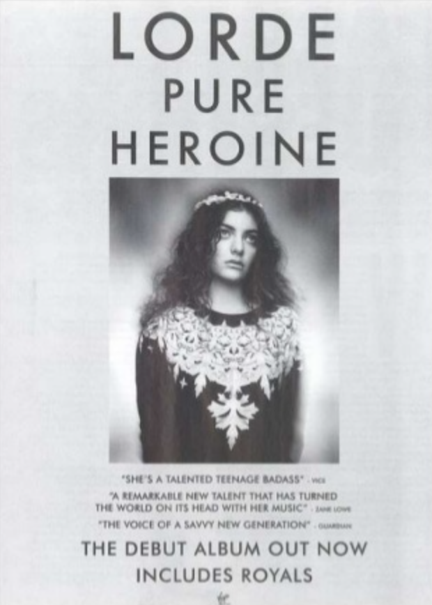
The colour scheme of this poster is muted and in greyscale. This reflects the genre of the artist that the poster is advertising (Indie Pop), as music videos within this genre commonly use a similar colour scheme. The poster appears to have drawn influence from a more old fashioned style of advertisement, shown through both the layout, photograph used and worn effect it has. This is also a common feature of the Indie Pop genre in general- a lot of the music and aesthetics of the genre involve influences from past decades and trends.
LORDE
ALBUM ADVERTISEMENT poster
The photo on this advertisement is central, making it clearly the overall focal point of the poster. The image shows the artist looking upwards, towards the top of the poster where her name and album name are written. This draws the attention of the audience to what is probably the most important piece of information on the poster. The image is in black and white, which works well with the colour scheme of the poster and ties the overall aesthetic of the advertisement together. The artist is not presented in a sexual way, which goes against the typical expectations of a pop advertisement, complying more with the 'indie' aspect of the artist's genre.
LORDE
ALBUM ADVERTISEMENT poster
The font used on this poster is the same as is used on the artist's album cover. This creates an instant sense of recognition for the audience and therefore promotes the artist's work especially well. The font used is simple and bold, standing out against the light background yet still fitting with the overall theme of the poster. I like that this poster uses the same font throughout, as I think that it looks professional and simplistic, however, I do think that some people might perceive this as boring and unimaginative.
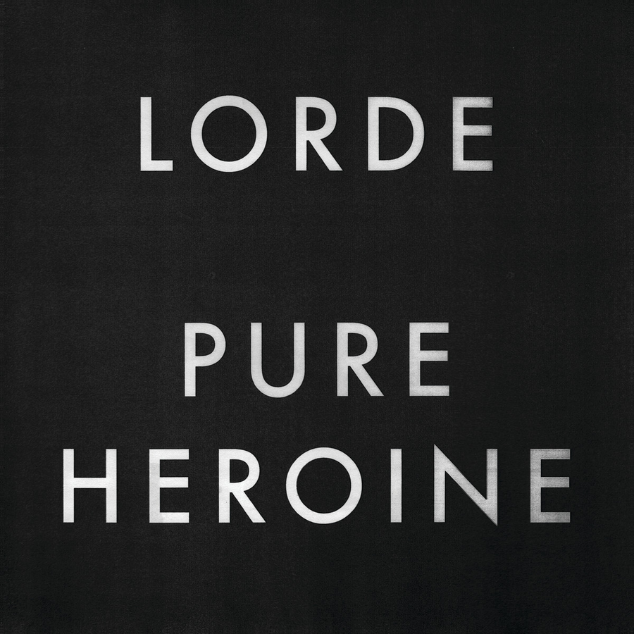
Album cover for 'Pure Heroine' demonstrating usage of the same typeface throughout the artist's branding.
LORDE
ALBUM ADVERTISEMENT poster
The most important information (the name of the artist and album that are being advertised) is listed in a large typeface at the top of the poster, in order to draw attention to it. Quotes from reviews of the album are included in a small font underneath the image on the poster. This shows that they are an important part of the advertising campaign, yet are not intended to be the focus of the poster.
LORDE
ALBUM ADVERTISEMENT poster
Overall, I think that this poster represents the genre and aesthetic of the artist that it is advertising extremely well. The layout and colour scheme make the poster visually pleasing and clearly show the audience what it is being advertised.
james bay
tour/album advertisement poster
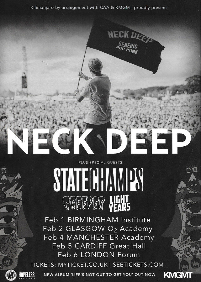
The colour scheme of this advertisement is simple and realistic. The poster is made up of a photo that fades slightly into plain black at the base of the advertisement. I think that this colour scheme is effective as it is not gender or age exclusive- it is likely to appeal to an extremely wide demographic. The artist is featured centrally in the photo, and there is a high level of contrast between him and the lights in the background of the photo. These qualities both draw the attention of the viewer to the artist and emphasise that he is an important part of the advertisement.

james bay
tour/album advertisement poster
The fonts used on this poster are simple, bold and stand out against the background of the image. They match the simplistic colour scheme of the advertisement, and make it appear well put together. The artist's name is written in the same font that is used on his album and single covers, which creates a sense of recognition for the audience. In the bottom right hand corner of this advertisement, there is a small illustration. This image has been used on several of the artist's single artworks, so including it on a poster advertising him creates an easily recognisable and unique element of branding for this artist.
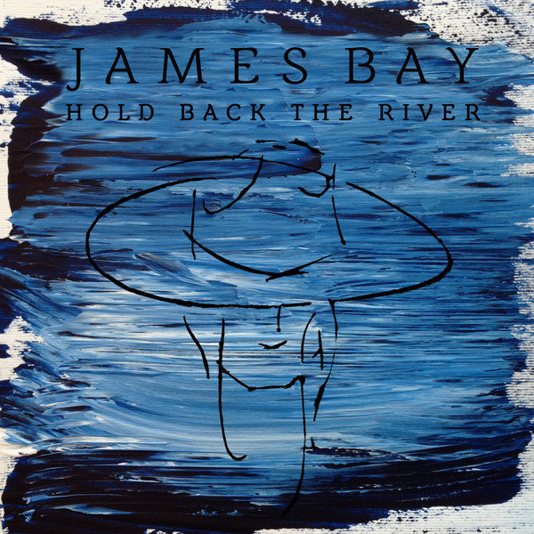
Album cover for 'Chaos and The Calm' demonstrating use of the same font and illustration throughout the artist's branding.
james bay
tour/album advertisement poster
This poster is mainly advertising several gigs, but also mentions the release of the artist's debut album. In the bottom left corner of the advertisement, 'Debut album Chaos and The Calm out now' is written in a relatively small font. The title of the album (Chaos and The Calm) is bolder than the rest of the statement, enforcing the fact that this is an important piece of information for the audience to see.
james bay
tour/album advertisement poster
I think that this poster is extremely successful in advertising the artist, and has included all the information that an audience would need in order to act upon seeing the advertisement. However, I do think that there is almost too much information on the poster, making it look slightly cluttered and drawing less attention to any key information. I would like to try and avoid this when creating my own poster.
NECK DEEP
TOUR/ALBUM ADVERTISEMENT poster
There is no colour on this poster- it is entirely in monochrome/black and white. I think that this is fairly typical of the genre as dark colours are often associated with this style of music. The main photo shows what the audience assumes is the lead singer of the band, performing to a large crowd and waving a flag with the band's name and slogan written clearly in a bold font. This instantly gives the impression that the band are extremely successful and well known, which might make them seem more appealing to some.
NECK DEEP
TOUR/ALBUM ADVERTISEMENT poster
The fonts used on this poster are bold and simple. They are all written in white, so as to contrast with and stand out against the black background on the advertisement. The name of the band that this poster is advertising is written in the biggest font and is positioned above almost all of the other information on the poster, highlighting its importance. Each of the supporting bands names are written on the poster in the same fonts as their respective logos, making it easier for audiences to recognise these lesser-known bands. I think that simple yet bold fonts have been so as not to draw attention from the main image on the poster, which is arguably the most important feature on this advertisement.
NECK DEEP
TOUR/ALBUM ADVERTISEMENT poster
On either side of the tour dates and support acts, there is illustration done in the same style as the cover of the band's most recent album. This ties in with the mention of the band's new album at the base of the advertisement: 'NEW ALBUM: 'LIFE'S NOT OUT TO GET YOU' OUT NOW', and provides an element of iconography to the advertisement. This also provides recognition and familiarity for an audience who are familiar with the band.
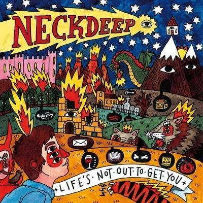
Album cover for 'Life's Not Out To Get You' showing recognisably unique illustration style.
NECK DEEP
TOUR/ALBUM ADVERTISEMENT poster
Overall, I think that it is made extremely clear what this poster is advertising. All of the information that an audience would need is visibly listed and easy to interpret. The poster has the ability to appeal to both fans and people who aren't familiar with the band, and in my opinion promotes the band extremely well.
MARINA AND THE DIAMONDS
ALBUM release poster
I think that this poster really represents stereotypical elements of the Indie Pop genre. The colour scheme of this poster shows high levels of contrast through its use of both light and dark colours. The colours in this advertisement are fairly neutral and muted, which is a common trait used within the Indie Pop genre as a whole. The poster has an overall slightly blurred/static effect, which complies with the expectations of the genre, having clearly drawn inspiration from a past decade. This is a popular theme throughout the Indie Pop genre, making it clear to the audience that the artist being advertised belongs to this genre.

MARINA AND THE DIAMONDS
ALBUM release poster
This advertisement uses a photo of the artist as the background of the poster. This highlights the importance that the artist's image has when it comes to advertising her work. The artist is also central in the image, drawing more attention to her. The photo is the same as used on the cover of the album being advertised, which creates an instant sense of recognition for any audience who were to come across the album in a shop or online. She is pictured looking directly into the camera lens, which creates a direct connection with the audience, capturing their interest. The artist is not presented in a sexual manner, which follows the expectations of the Indie Pop genre. Her hair and makeup has been styled somewhat unusually, emphasising her uniqueness and artistic credibility. This is another common trait within the Indie Pop genre.
MARINA AND THE DIAMONDS
ALBUM release poster
This poster uses only one font throughout. It is the same font that is used on the cover of the album being advertised, further enhancing the audience's ability to recognise the album in shops or online. The font has a static looking glitch-style effect which matches the overall theme of the advertisement, making the poster more visually pleasing. The font is bold and white, which stands out well against the relatively dark background of the advertisement. The most important information (the name of the artist and album being advertised) is listed at the top of the poster in a large typeface, which easily captures the attention of passers-by. The release date of the album is listed at the very base of the poster, which I think balances the layout nicely, while still ensuring that important information has been included.
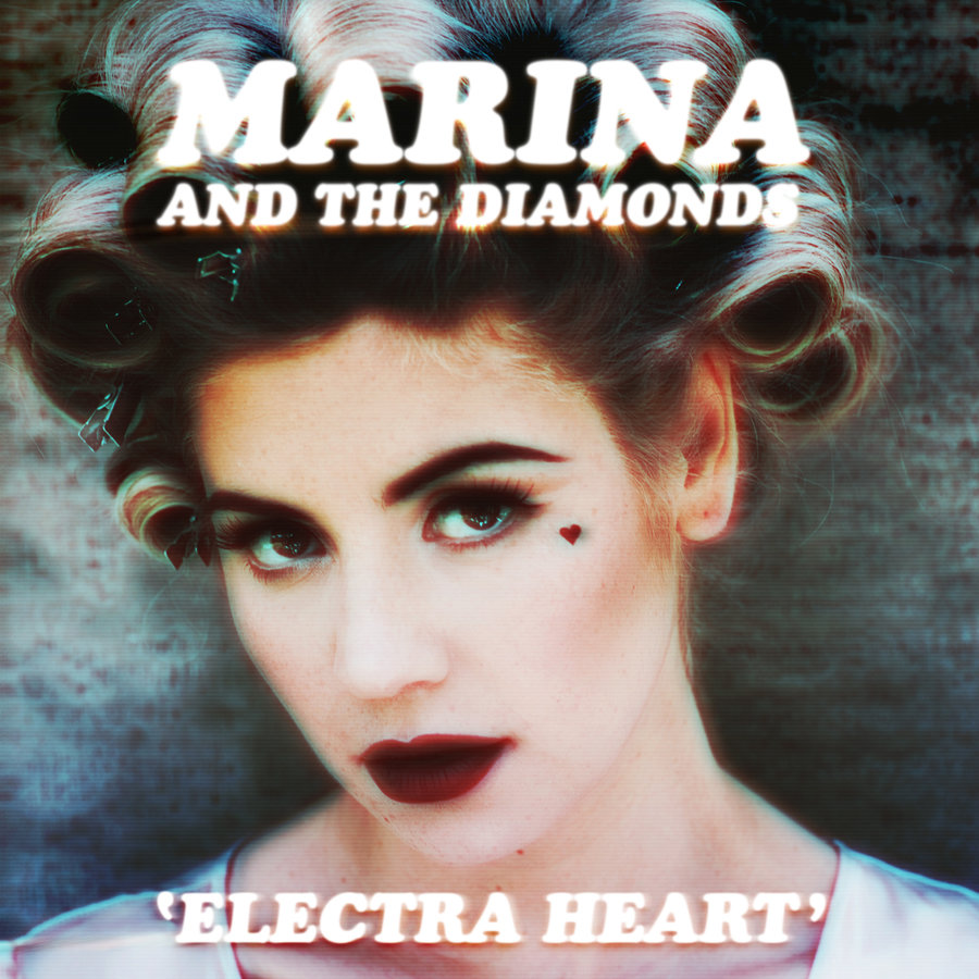
Album cover for 'Electra Heart' showing almost identical design to advertisement poster.
MARINA AND THE DIAMONDS
ALBUM release poster
Overall, I think that this poster advertises the album release in a particularly appealing and effective manner to the audience. At the base of the poster, the name of a popular song by the artist is mentioned as being included on the album being advertised. This has been included to appeal to a more mainstream audience by sparking recognition, as the song received a lot of radio play upon its release. I think that this is a particularly clever feature for an album advertisement to have. I also like the overall theme of the poster, as I think it makes it clear to the audience what type of music is being advertised and is quite artistic and unique.