Evaluation Question Two:
How Effective Is The Combination of Your Main Product and Ancillary Texts?
Overall, I think that the combination of my main product and ancillary texts was quite effective.


Combination of My Digipak and Poster
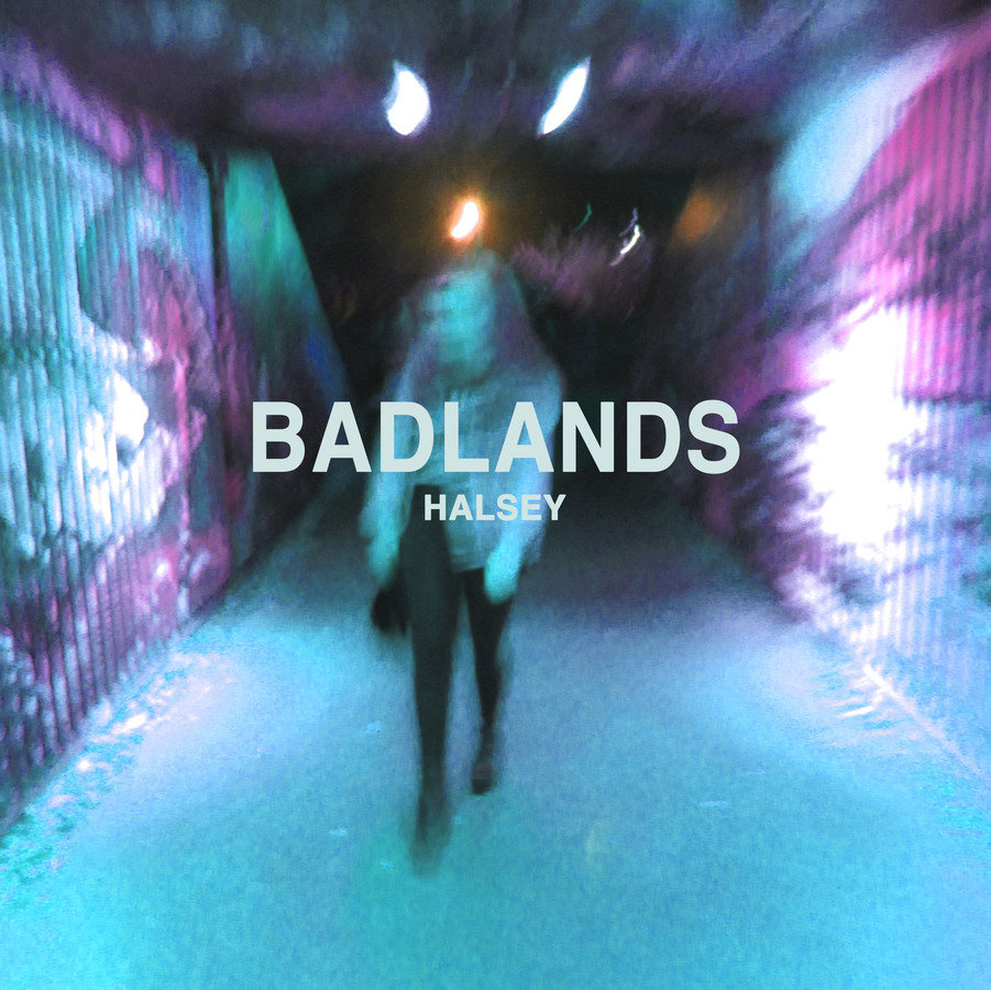
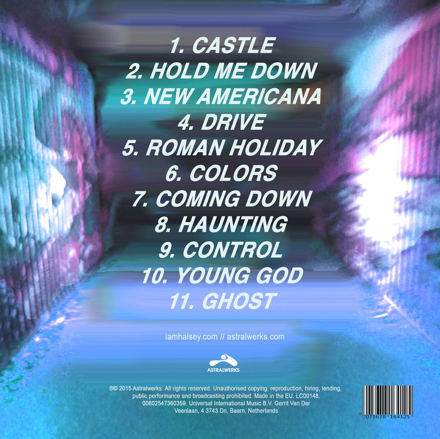
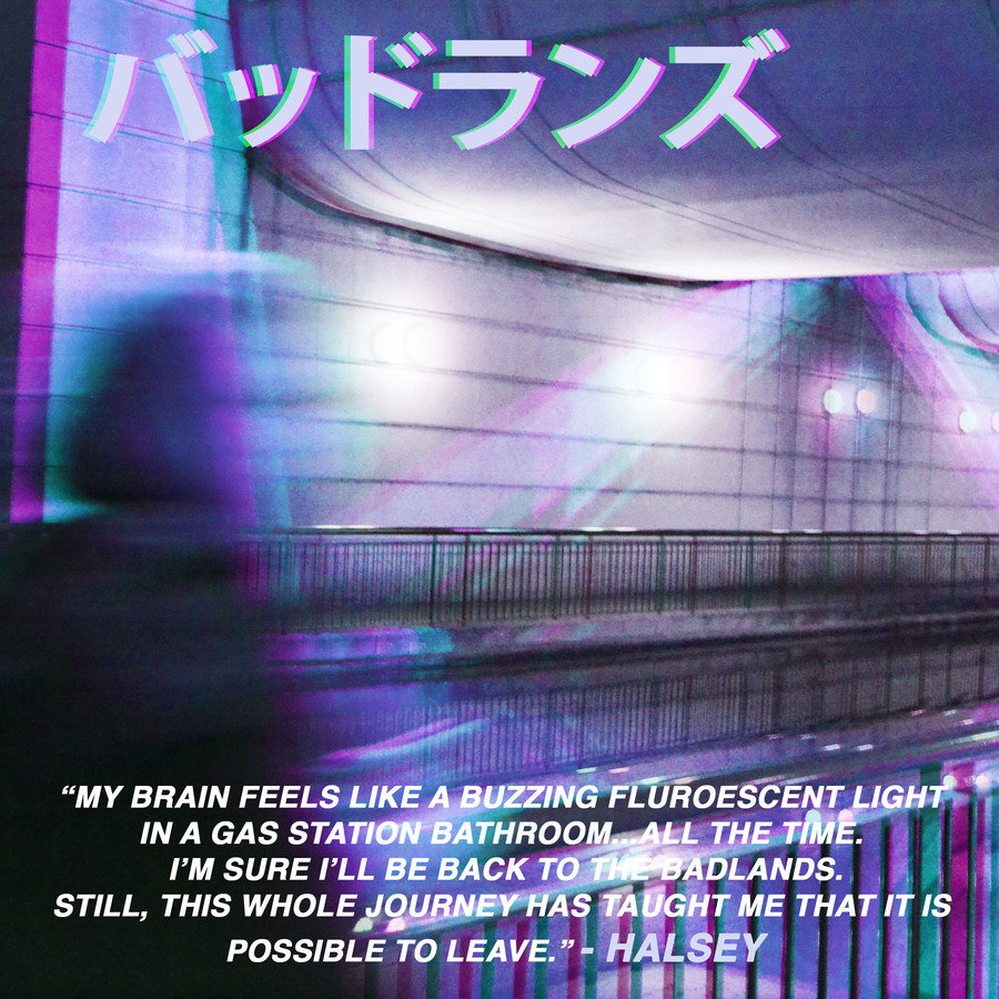
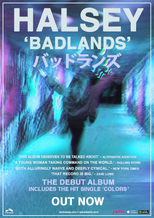
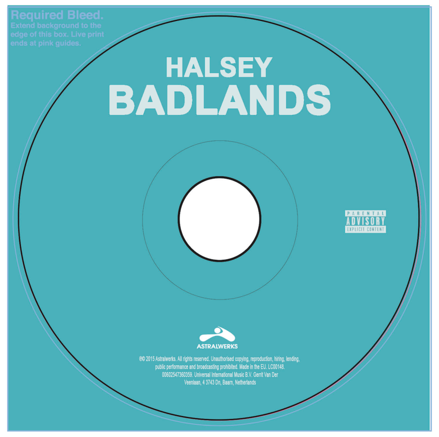
When comparing my digipak and poster side by side, it is clear that they both represent the same artist and album. This is a great example of synergy, which I believe I have achieved by using the same image style, colour scheme and fonts in both products. To make the combination of my digipak and poster more effective, I could have included a thumbnail of the album cover on the poster to ensure that audiences/the public would recognise the album from just seeing the poster.
Synergy
When creating my digipak and poster, I was especially careful to focus on creating synergy between these products. Indie Pop is not an especially mainstream genre, so artists tend to ensure that they have a recognisable brand and aesthetic, and I wanted to ensure that my own products reflected this.
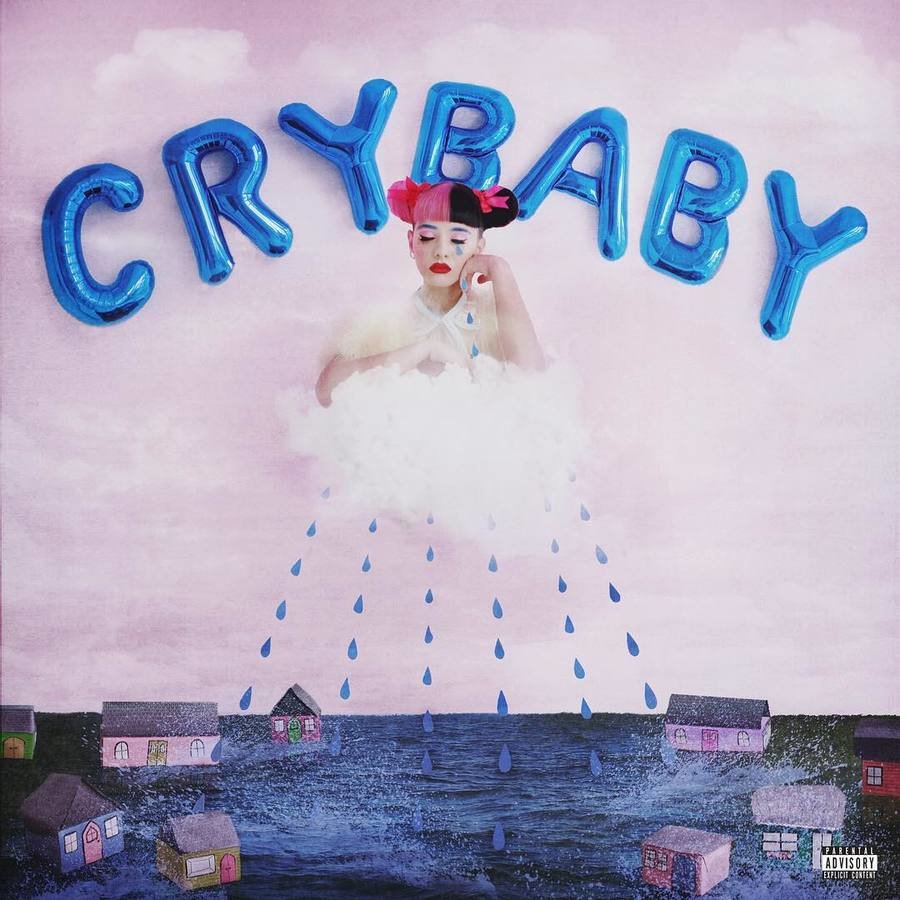
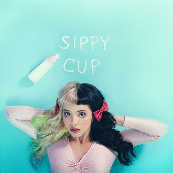
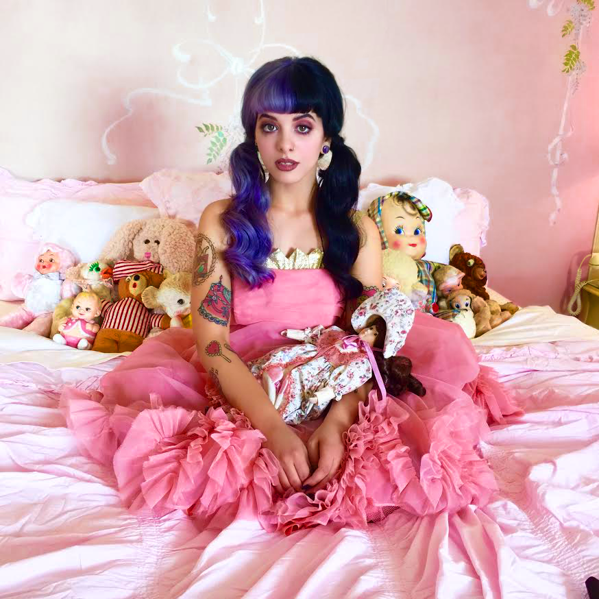
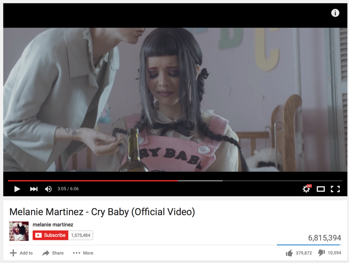
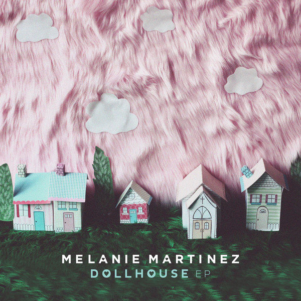
Melanie Martinez is an example of an Indie Pop artist that demonstrates synergy through a unique and clear aesthetic. She maintains a childlike theme and bright, two-toned hair in each of her music videos and album artworks, making her brand instantly recognisable to any audience that may have come across her before. This is a great way to make her music more accessible and to make her more easily identifiable as an artist in a genre that isn't hugely popular in the mainstream market.
Synergy
Looking back, to ensure that the combination of my music video, poster and digipak was especially effective, I think that I could have used images from the filming process or stills from my video to create my digipak and poster. This would have made the synergy between my products more prominent and successful.
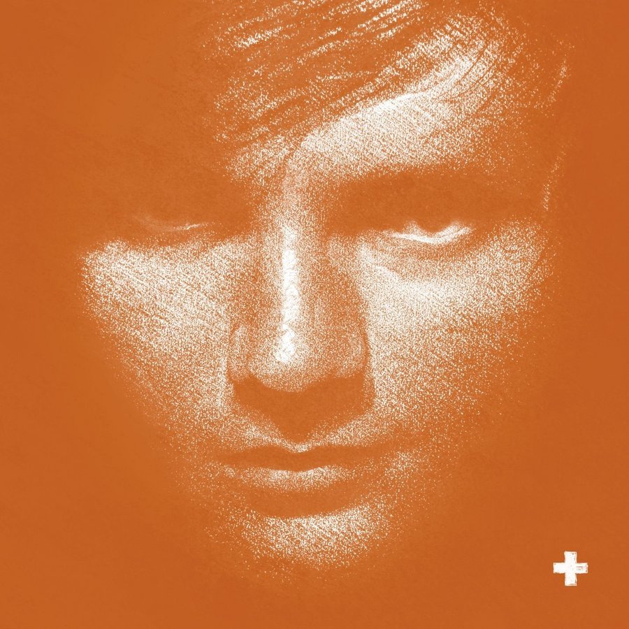
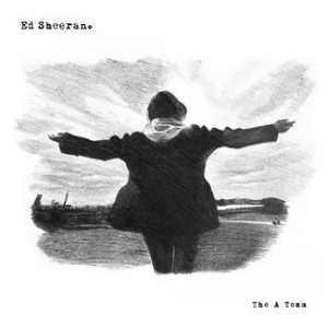
However, as I was creating a digipak for an album, rather than just a single or EP, I think that my decision not to use stills or images from my music video within my digipak and poster was the right one overall. I came to this conclusion through my knowledge of real media products- artists tend not to use stills or images from music videos for album covers, only singles or EPs. An example of this can be seen below- Ed Sheeran's 'The A Team' single artwork is a still from the song's music video, but the cover art for his album '+' is quite different.

Colour Schemes
To ensure synergy between my ancillary texts and my music video, I used very similar colour schemes in all three products. I know that this was successful, as in my audience research survey the most popular answer to "What do you like about the poster?" was that the colours were coordinated with the colours in the video.
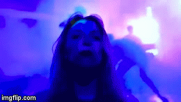
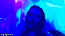
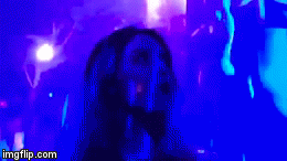
Above: Gifs taken from my music video demonstrating a colour scheme similar to the one used for my digipak and poster.

Style of Shots and Framing
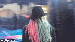
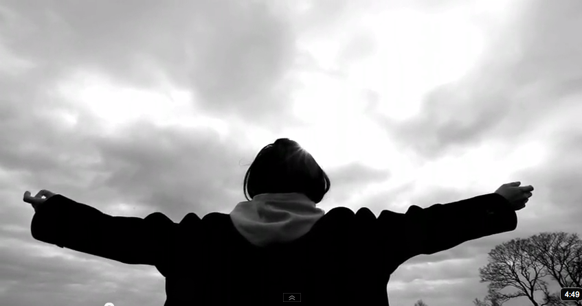
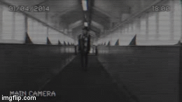
To ensure that the combination of my main product and ancillary texts was effective, I focused on making recognisable links between all three. One of the ways in which I did this was by using similar styles of shots and framing for both the images used in my digipak and poster and my music video. There were several shots in my video where the camera followed the 'artist' (played by me) walking around, so the clips were filmed from behind. On my poster, the photo I used was taken from behind the girl in the image, creating a similar style of framing and camera shot as shown in my music video. My video opens with a long-shot of the 'artist', filmed from in front of me this time. I was framed centrally, highlighting that I was the artist and the person in the video
An example of clips filmed from behind the artist (me) in a style similar to the photo shown on my poster.
that the audience would be focusing on. On the album cover within my digipak, the girl in the image (which is also me) is framed centrally, and the shot looks relatively similar to the opening shot of my music video. This links the digipak and my music video, making them a successful combination.
Editing style
I used this tutorial to learn how to create a glitch/distortion effect on some of the images in my ancillary texts. Using the effect on both my poster and the inside left panel of my digipak created a visual link between the two products, making the combination of them more effective. We used a 3D/distorted effect on a clip at the beginning of our music


video. This forged a visual connection between my ancillary texts and music video through my use of similar editing styles. This made the combination of my main product and ancillary texts effective, however, I think that using the 3D/distorted effect on more clips within our music video would have made it more so.
Representation- Theories
Laura Mulvey coined the term 'Male Gaze', and believes that film audiences must view characters from the perspective of a heterosexual male. Her 'gaze' theory is made up of 3 aspects- how men look at women, how women look at themselves and how women look at other women. The 'Male Gaze' theory states that the camera lingers on the curves of the female body, and the events that happen to her afterwards are largely based upon the male's reaction to this. It also demotes women to the status of objects, and gives the female viewer a secondhand experience of the narrative through identification with the male on screen.
I don't believe that any of my products follow Mulvey's theory as the female body is not really focused on within them, and the 'artist' (who is a woman) is presented as an independent protagonist, not an object. However, I think that Stuart Hall's Audience Reception Theory of preferred reading or theory of negotiated reading could be applied to my products.
The theory of preferred reading is where the audience reads the text the way the author intended them to. The theory of negotiated reading is when the audience reads the text the way the author intended, but also uses their personal experiences and interests to modify their interpretation. I think that the theory of preferred reading would definitely apply to my products as my 'artist' is clearly presented as an independent, confident and free-willed individual, which is what most audiences would be likely to interpret her as. An audience's personal interests or experiences could change the way they see the 'artist' in my video, digipak or poster, meaning that the theory of negotiated reading could also be applied to my products.
Representation
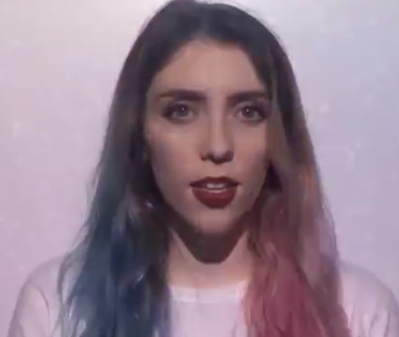
The main character (the 'artist', played by me) in my music video is presented as independent, confident and free spirited through shots depicting her alone travelling to a city and surrounded by people but not looking insecure. In close-up lip synching shots, she looks directly into the camera, as if she is looking at the audience themselves.
She is similarly represented on my digipak and poster, where she is pictured alone in an alleyway/tunnel in each. On the poster image, the 'artist's arms are outspread in the air and she is turned away from the camera in a pose that exudes freedom and confidence. On the front cover of my digipak, she is posed towards the camera openly- still demonstrating confidence and independence. I chose to present her in this way because the artist I used for my products (Halsey) is very much presented this way in real life. This links my products clearly and effectively through representation as the audience would form a similar opinion of the 'artist' from being exposed to each one of my products individually. Indie Pop female life. Not complacent with Laura Mulvey's male gaze theory.